Montblanc JFK Navy Blue Ink Review

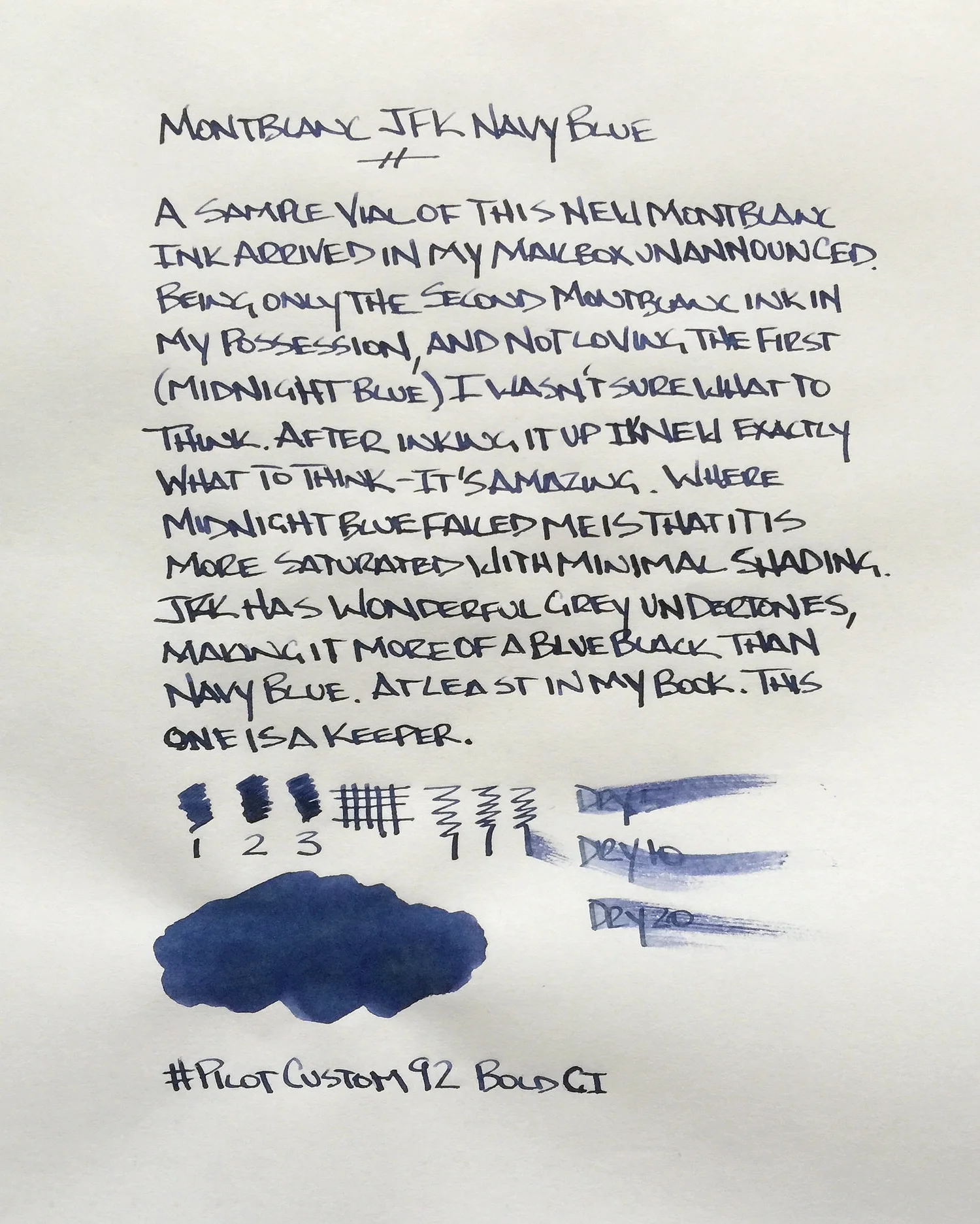
One of the readers of this blog is an ink junkie. I know this because I have received some of the most interesting, hard to find, limited, and discontinued ink samples in my mailbox from him. Sometimes I get the heads up, and sometimes, as was the case with this Montblanc JFK Navy Blue, they just show up.

I’m glad it did too, because this is a pretty great ink. While it isn’t marketed as blue black, one stroke with it makes it clear that it is. The blue is deep, with nice grey undertones. It’s by no means a pure dark blue, which is what I would think an ink named navy blue would dictate.

It reminds me a lot of Pilot Iroshizuku Shin-kai not just in the way it looks, but in the way it shades and the way it performs. There is so much sublte character with inks like these and I think that is why I fall for them. To the naked eye they look like a normal business ink, but upon closer inspection there is a depth and uniqueness you don’t see in any blue ink.

I used up two fills from the sample vial before I went on the hunt to order some for my own stash. It’s a limited edition so you will have to poke around a little bit, but it shouldn’t be too hard to come by. I ordered mine from Fahrney’s Pens, which worked out swimmingly.

One note on the written review below: I used Tomoe River paper, and while it is flat out amazing for dailiy use, it’s not the best for reviews. It crinkles a bit, which manifests itself in odd lighting and shadows, and takes forever to dry, so dry time tests are invalid. I realized all of this once I was done, so after one other review that is already complete I will be moving my ink reviews back to a more standard paper.

Posted on January 23, 2015 and filed under Ink Reviews, Montblanc.

Sailor G-Free Ballpoint Pen Review

(This is a guest post by Dwayne Lively, pen addict, knife collector and writer for DwayneLively.com. You can follow him at: @DwayneLively on Twitter and @blatherama on Instagram.)

I don't understand why the Sailor G-Free needs to exist. It seems more like a proof-of-concept than a product people might be clamoring for.

It’s 300 yen (which as of this writing is around US $2.50 or 1.6 Pounds Sterling). This makes it expensive for a ballpoint, even in Japan.

My first impressions of this expensive pen, though, were not particularly good because it’s ugly.

It has a big Sarasa-style clip and a chunky rubber grip that makes it look like a stretched hourglass. The monster clip, unfortunately, serves as the nock release, meaning you can’t just snap it off and go clipless.

Two versions of the G-Free by Sailor on a Field Notes Red Blooded.

Two versions of the G-Free by Sailor on a Field Notes Red Blooded.

Sailor claims the pen has two special features that make it worth the extra money: hard/soft adjustment and a special low-friction ink.

First, by twisting the nock, the user can adjust a spring that changes how springy the pen feels. For example, if you're writing on a blotter, the hardest setting is fine, but if you switch to a hard surface, you can adjust the pen to make it feel better as you write. This is kind of interesting, but it’s not something I’ve ever wished a pen could do.

On the softest setting, you can almost push the nib back into the pen; on the hardest setting it barely moves. However, there’s not enough difference that it’s worth more money than my Pilot G2 or the 130 yen a UNI Jetstream would cost me. I’m also not sure the G-Free needs seven different levels of adjustment. The difference between 7 (hard), 4 (medium), and 1 (soft) is noticeable, but there’s not much change felt by switching from setting 2 to 3.

Details of the ugly clip and the hard-soft spring.

Details of the ugly clip and the hard-soft spring.

Second, Sailor claims its ink — which as near as I can tell is a gel ink — is specially formulated to have less friction, making for easier and faster writing. They even claim specific percentages for how much more efficient your writing will be.

Although it is smooth, I haven't noticed anything special about the ink except that it only comes in black and there isn't much of it. The black version of the pen is translucent and you can see the refill stops halfway up the pen to allow space for the hard/soft mechanism. The eight different barrel colors available are just for fashion, although each version has the ugly black clip.

You can see the where the ink stops right in the center of the picture.

You can see the where the ink stops right in the center of the picture.

After using both pens for a few days on different types of paper, including Field Notes, Moleskine, Tomoe River and copy paper, I haven’t noticed much difference in the writing experience than I’d get from a standard gel ink pen. The chunky rubber grip section is triangle shaped and I found it awkward to hold at first despite the fact I’ve used a Pilot Vanishing Point for almost 20 years. I eventually twisted the grip around and that made it feel more comfortable.

Although I don’t expect line variation from a ballpoint pen, I was disappointed there was no effect at all on the size of the line by adjusting the hard/soft settings. The line was always the same thickness. That said, I was surprised that although the G-Free is only offered in a 0.7 size, the line from both pens was thin. They actually felt like 0.38 pens.

One final pet peeve is that the nib has a black circle around it, even on the blue version. This has no effect other than to constantly make me think that ink residue was building up on the nib.

The ugly black ring on the nib and some ugly handwriting.

The ugly black ring on the nib and some ugly handwriting.

As of this writing the pen is apparently only available in one physical store (Tokyu Hands in Ikebukuro), the Sailor online store, and at Amazon Japan where you have to buy an 8-pack. In the end, all I have are questions about this pen: Does the Sailor G-Free need seven different adjustment levels especially when there’s no visible change in the line? Is a slight difference in springiness enough to justify the price and the ugly?

The answers, I’m afraid, are “No” and “Not for me”.

Some examples of bad handwriting at three of the seven settings. This was written on a soft surface.

Some examples of bad handwriting at three of the seven settings. This was written on a soft surface.

Posted on January 22, 2015 and filed under Pen Reviews, Sailor, G-Free.

Sailor Jentle Yama-dori Ink Review

image.jpg

(Jeff Abbott is a regular contributor at The Pen Addict. You can find more from Jeff online at Draft Evolution and Twitter.)

Back in July, I reviewed Noodler's Turquoise and came away with an urge to try more blue-green inks. So, here we are — I picked up a bottle of Sailor Jentle Yama-dori on Brad's recommendation. He seems to know a thing or two about good inks, so I figured I couldn't go wrong. Turns out, I really enjoy blue-green inks, and I especially enjoy Yama-dori.

If you listen to the podcast much at all, you'll pick up on a trend with Brad's ink tastes (or just look at the Top 5 lists) — he loves some blue-black inks. I like a good blue-black just fine, but some of them get so close to black that I don't end up using them very often. I like the flare and unique colors of some blue-blacks, but it seems like most are too dark for my tastes. That's where Yama-dori comes in. It's a fairly dark ink, but it's blue-green, shades beautifully, and has a red sheen. It's a delightful ink.

From a standard ink perspective, this is a very well-behaved ink. It dries relatively fast (just after 5 seconds for me in a medium nib), doesn't bleed through, doesn't feather much on cheap paper and not at all on premium paper, and cleans out easily. What really sets this ink apart for me is the color, shading, and confusing red sheen. Yep, red sheen in a blue-green ink. I can't begin to explain how that works, but it's fascinating to watch the pooled up ink give off a red color in certain lights. It looks as if someone wrote some lines with a medium blue-green ink and then came back with a red highlighter to fill in the darker parts later. It's unique, and I love it.

Now, I don't know about you, but I don't know much about pheasants. I don't think I've ever seen one in person. When Sailor calls this ink "copper pheasant," I'm not really sure what to think because I don't know whether pheasants are copper or not. After a quick search, I landed on the green pheasant that's native to Japan. Take a look at the male plumage and take a guess at why Sailor named this ink after it. Pretty obvious, right? Dark green, brilliant blue, and shiny red feathers.

If you want an ink that looks professional but has a unique color, Yama-dori is a great color and behaves well. Personally, ever since I've gotten this ink it's always been in at least one pen. I love the blue-green colors because they're brilliant when you look closely under the light. Yet, it's mild and dark enough to be perfectly legible and professional. It has a royal, mysterious feel to it, and I can't get enough of it.

50 mL of the ink will run $20, which is the normal price for the Sailor Jentle line. The bottle (like the other Sailor bottles) has a nifty cone inset that allows you to easily draw up ink even when the ink level gets a bit low. Also, Sailor gets major points in this bottle design because the mouth of the bottle is extra wide. It's frustrating to get a new ink only to find that your favorite pen is too fat to get into the bottle. Well done, Sailor.

(JetPens provided this product at no charge to The Pen Addict for review purposes.)

image.jpg
image.jpg
image.jpg
Posted on January 21, 2015 and filed under Sailor, Ink Reviews.