Akkerman Shocking Blue Ink Review

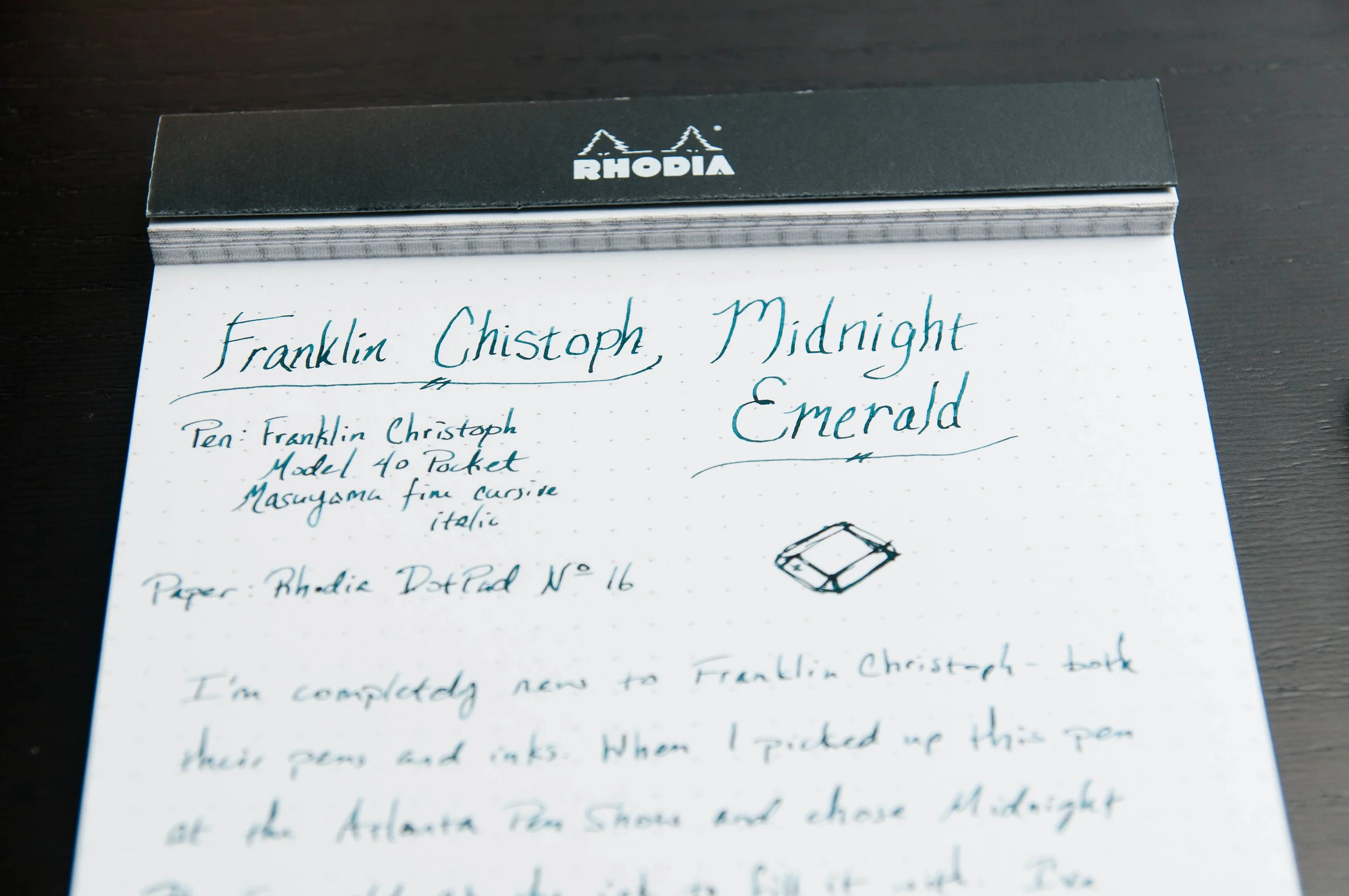
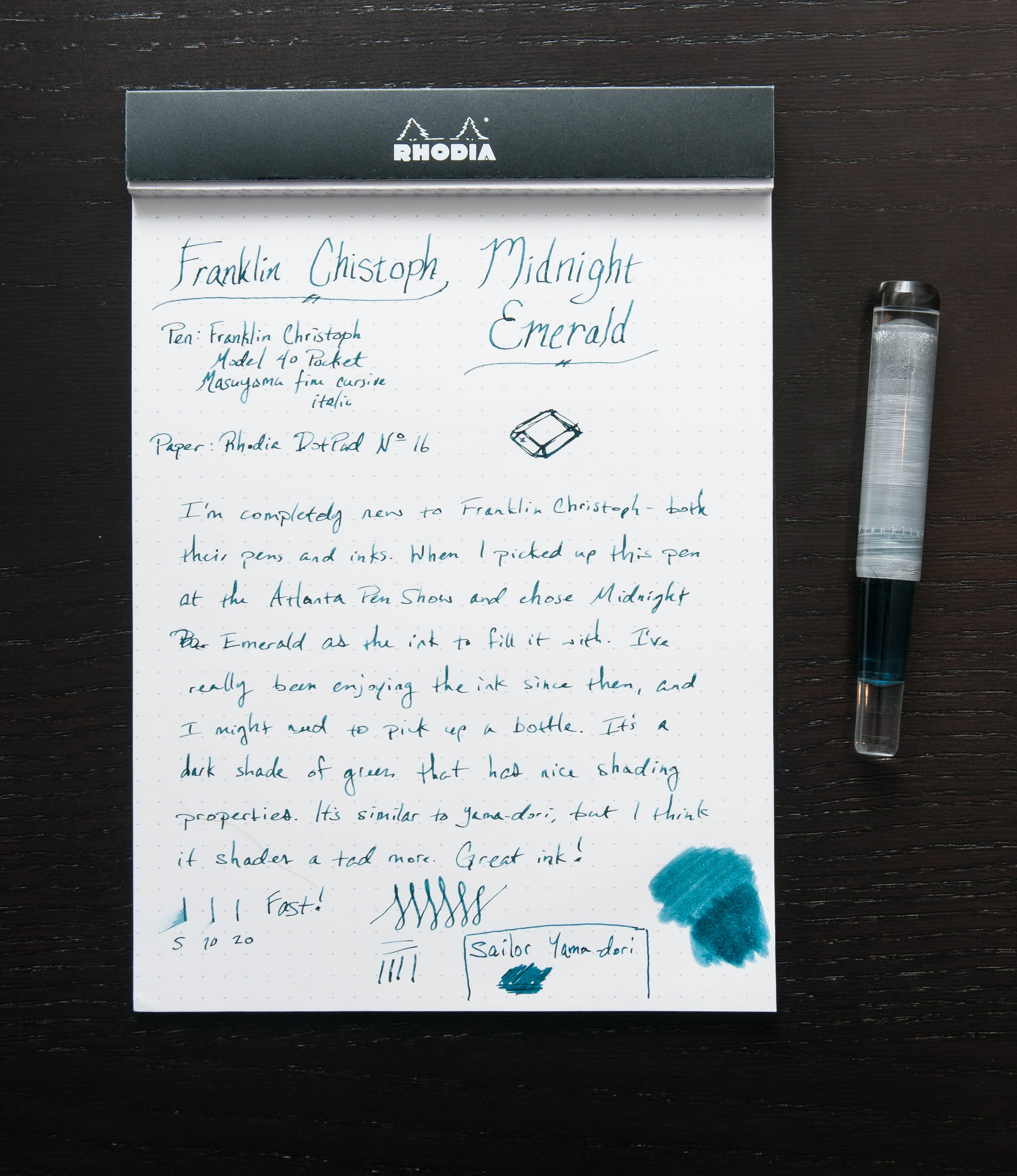
(Susan M. Pigott is a fountain pen collector, pen and paperholic, photographer, and professor. You can find more from Susan on her blog Scribalishess.)

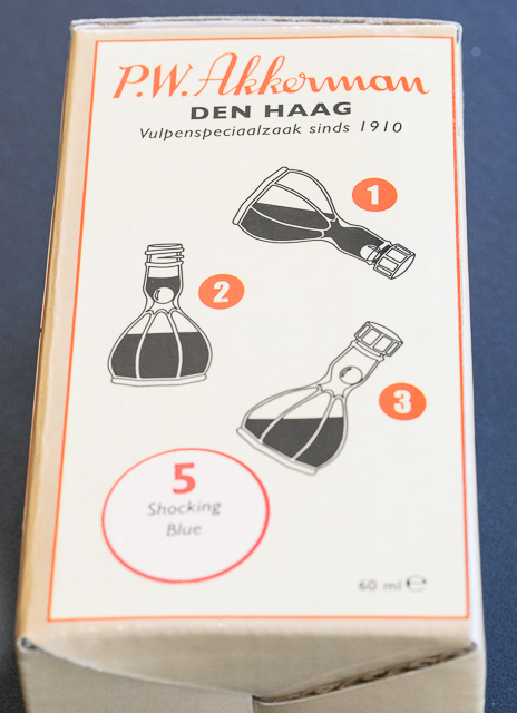
I sought out a bottle of Akkerman Shocking Blue after seeing a close up of the ink on Instagram. Akkerman isn't the easiest ink to find in the USA, but I was directed to Vanness Pens. I had to wait a week or two until they got some in stock, then I clicked on the pay button. At $30.00 a bottle (60ml), this is expensive ink. But, when I saw the beautiful bottle, I understood why. Plus, most U.S. retailers don't carry Akkerman, so it comes at a premium.

The bottle itself is a work of art. It looks like a piece of antique glasswork with facets and a genie bottle shape.

The unique shape of the bottle is also functional. There's a ball in the upper chamber that moves away when you tip the bottle, allowing ink in. You fill your pen, and tip the bottle again so the ink can flow back into the bottom chamber.

The ink flows well in my Montblanc 146 with a stub nib, but it really shines in flex nibs.

I suspect it would be stunning with the Franklin-Christoph 1.9 music nib (hint, hint, Brad). The ink has a slight odor, but it's not overpowering.

The color is simply amazing. It's a vivid blue with incredible shading and a cool purple-red glimmer outline you can see in close up shots. I just wish you could see this with the naked eye, and maybe you can with super-wide nibs.

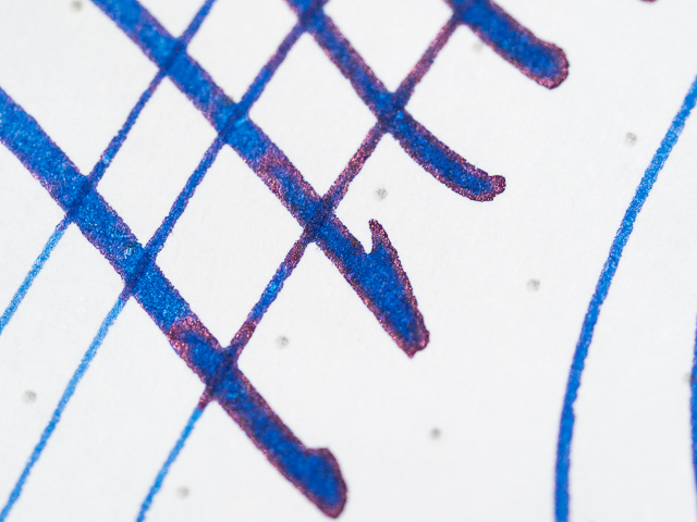
I did a chromatography comparison of Shocking Blue with a few of my other blue inks. The closest parallel was Iroshizuku's Asa-Gao, but the Asa-Gao has purple in it, whereas Shocking Blue does not. I don't know why the purple-red outline I see in the close ups doesn't show up in the chromatography. I made several attempts, and in every case Shocking Blue exhibited only varied shades of blue–no purple, no red.

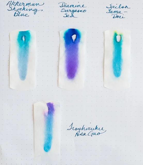
Compared with some other blues, Shocking Blue is a true blue whereas Diamine Sargasso Sea contains lots of purple. Sailor's Yama-Dori is more of a dark turquoise, Iroshizuku's Asa-Gao is close in tone to Shocking Blue, but also contains purple, and Diamine Denim is a blue-black.

Shocking Blue takes some time to dry on the Rhodia DotPad paper. Of course, the wider your nib, the longer it will take the ink to dry. And the paper you use makes a difference. On my Tomoe River paper, the ink dries almost immediately. It's definitely not waterproof, so if that's important to you, you'll want to look elsewhere.

I purchased my bottle from Vanness Pens for $30.00 plus $7.00 shipping. They have great customer service and my bottle was shipped almost immediately.

Please note: the adorable cat is not included with the bottle of ink.

Posted on May 1, 2015 and filed under Akkerman, Ink Reviews.

Pelikan Souveran M1000 Giveaway Winner

In a suprise to no one - myself included - this was far and away the most entries for a giveaway on The Pen Addict. Rightfully so, because the Pelikan M1000 is an amazing pen. I'm fortunate to be able to give this pen away to one lucky reader, who is...

Congratulations Horacio! You have one week to get in touch via the Contact page and I will get the Pelikan in flight to you ASAP.

My thanks to everyone who entered!

Posted on April 30, 2015 and filed under Giveaways.

Franklin Christoph Midnight Emerald Ink Review

(Jeff Abbott is a regular contributor at The Pen Addict. You can find more from Jeff online at Draft Evolution and Twitter.)

One of the purchases I made at the Atlanta Pen Show this year was a new Franklin Christoph fountain pen, but I'm saving that review for later. What I've been really impressed with so far (apart from the pen and nib) is the ink they supplied with the pen — Midnight Emerald. It's a beautiful shade of green that shades nicely and looks great inside the pen.

I've tried several green inks over the past couple of years. Like all colors, there are countless shades and properties to choose from. Luckily, my taste in colors is always changing each month. As part of the buying process, the nice folks at Franklin Christoph offer to fill your new pen with one of their inks. After a quick look at the ink sample sheet, I settled on the Midnight Emerald because it was non-standard and caught my eye compared to the others.

I was a little distracted when first trying the ink because I was mostly focused on the new pen, but after a few lines I started to notice the subtle shading and elegant color of the ink. Huge score with this complimentary ink.

Now, what makes this ink great? Well, like any ink, it comes down to several properties and personal taste. It's a nicely lubricated ink, doesn't feather easily, has nice shading properties, and has a great dark-green color that I love.

To be fair, I haven't tried cleaning it out of my pen yet as I haven't quite gone through it all. I was really hesitant to do an ink swab on the sample page since that's a good amount of ink that I'd rather use when writing, but the swab looks nice too. And, considering that the ink is really well-priced ($12.50 for 59ml), I don't think I'll continue worrying about running out because that means I'll just have the chance to buy a whole bottle.

Compared to several other inks I'm using at the moment, Midnight Emerald is fairly resistant to feathering. Yes, it feathers on cheap paper, but it's minimal. Honestly, it's fairly similar to Noodler's X-Feather, which I happen to still have inked from an earlier review.

And then, there's the shading. I'm a huge fan of inks that have shading properties. Can't really explain why, but I know that shading makes me smile. I like the variation in color and depth. It's adds more character to the pen strokes and adds (subtle) visual interest to the letters. In this ink, it's not extravagant, but it stands out enough to be a delight.

The color/hue is similar to Sailor Yama-dori. When you compare them side-by-side, the differences are fairly obvious, but the basic color is close. Basically, it's a dark green. I wouldn't go so far as to call it a black-green, but it's dark. Only on thin, fast strokes does it turn to a medium green.

Overall, I'm extremely happy with this ink, and I look forward to buying a bottle of this once I run out. As I understand, this is a fairly new ink to Franklin Christoph. If there other new inks are similar to this one, that's a very good thing.

Posted on April 29, 2015 and filed under Franklin-Christoph, Ink Reviews.