Pilot FriXion Ball Slim 0.38 mm

We all love to have friendly arguments over our favorite pens. The Pilot G2 is better than the Uni-ball Signo 207! The Uni-ball Jetstream is better than the Pilot Acroball! The Sharpie Liquid Pencil is better than…well, it’s better than a rock I guess. Maybe.

The basis of all of these conversations is that as individuals, we all have specific needs that need to be met with our writing instruments. A pen that may be perfect for you won’t work at all for someone else. I like to use the phrase “That’s why they make more than one pen” all the time to show it’s ok no not like the same pen as someone else.

While erasable gel ink pens are a highly specific category, they are the only category where it is not ok to like a pen besides the Pilot FriXion. It is at the top of the heap, and nothing else is close in quality or performance. You may not like or have a need for erasable gel ink pens, and that’s fine, but if you do, the Pilot FriXion is the only consideration. Arguments otherwise are not being accepted at this time.

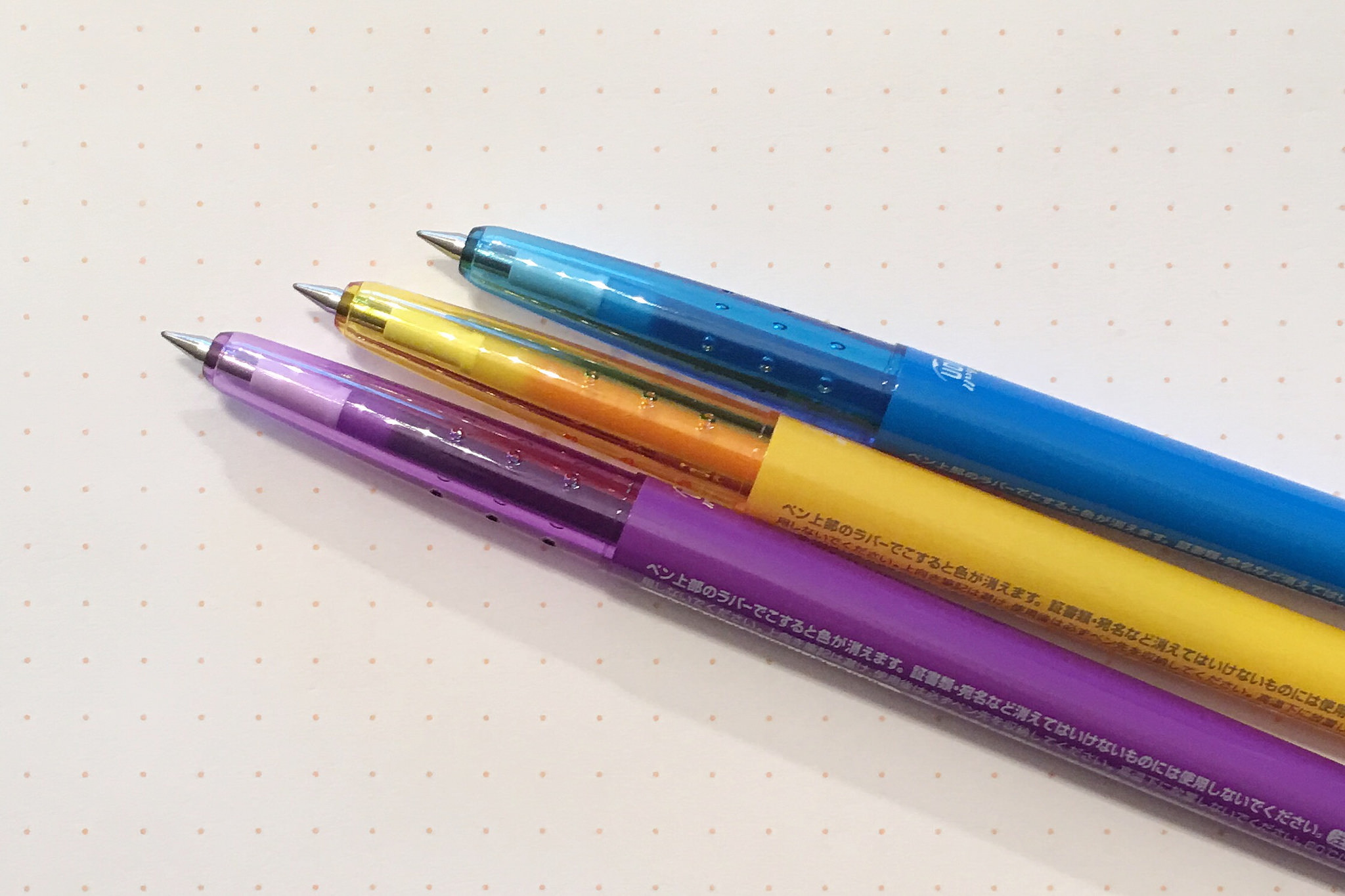
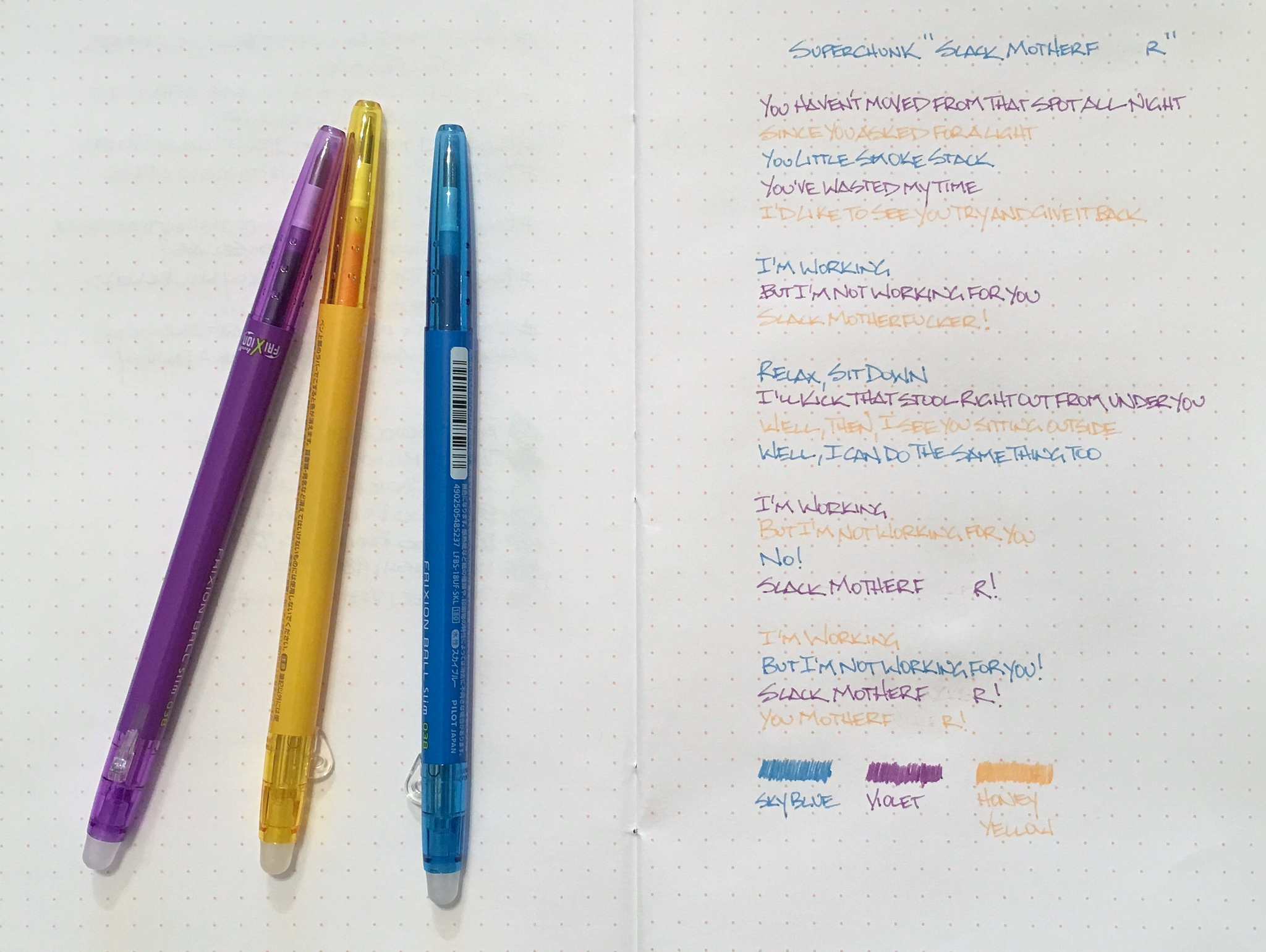
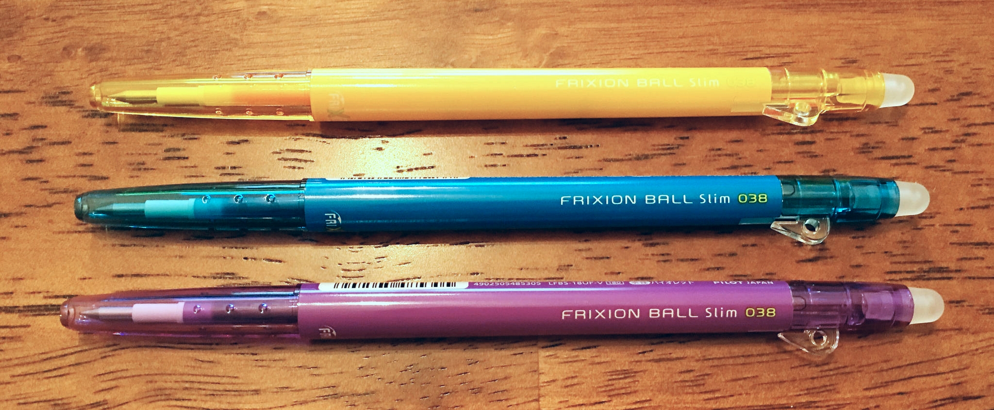
The latest FriXion to cross my desk is the Pilot FriXion Ball Slim 0.38 mm and it is as good as ever. Writing with this pen, you wouldn’t know that the ink is any different in formulation from any standard gel ink pen. That is key. It’s a gel ink pen that happens to be erasable. By friction, no less.

If you aren’t familiar with the FriXion, the ink is thermosensitive. This means the heat caused by the friction of the firm rubber eraser removes the ink from the page. It’s also possible for the ink to disappear if your paper is left in too hot of a location, such as in a car in the summer. Your notes aren’t lost forever though. Pop your notebook in the freezer and your writing reappears. It’s like magic!

I love the slim barrel design of this model. It’s very comfortable to write with for me, and the 0.38 mm tip is right up my alley. The eraser work perfectly as well. The only negative is that the refills are smaller than the 0.5 mm Ball Knock, which uses a G2 sized refill and is only slightly more expensive.

Answering the question “What is the best erasable pen on the market” is the easiest question I get in my inbox. It’s the Pilot FriXion, and nothing else is close.

Posted on November 30, 2015 and filed under FriXion, Pilot, Pen Reviews.

The Pilot Metropolitan Retro Pop: A Review

(Susan M. Pigott is a fountain pen collector, pen and paperholic, photographer, and professor. You can find more from Susan on her blog Scribalishess.)

When I first saw the Pilot Metropolitan Retro Pop pens advertised, I was excited about them. I loved the vivid colors, and I had heard good things about the Metropolitan pens before. So, as soon as I could, I ordered a turquoise Retro Pop from Goulet Pens for $15.00.

I've been using it non-stop since it arrived because, as a university professor, I have a mountain of grading this time of the semester. I figured the Retro Pop would make a great grading pen, and I was right.

The Retro Pop is a metal fountain pen, but it's not at all heavy (26 grams/0.92 oz). It comes nicely packaged in an oval clamshell box with a clear top, so you can see the colorful pen.

The metal is shiny and sparkles in the sunlight. Each pen has a different retro design on one portion of the barrel.

The only other embellishment is the clip which has a few decorative elements on the sides, but is otherwise plain. The cap is a snap on.

The grip is black plastic which is always easier for me to hold than metal since my hands get sweaty, especially while grading research papers.

The pen comes with a squeeze converter and one cartridge, but if you prefer twist converters, you can purchase one for $5.50 more, which I did. Squeeze converters are messy and I don't like the limitations of cartridges. The Con-50 holds a teeny amount of ink, though. I blew through several fills as I graded. But, it's not like the pen is difficult to refill.

The fine steel nib on my Retro Pop is smooth but hard (no bounce or flex). As with most Japanese pens, the fine writes more like an extra fine. I like this size for grading because I tend to write lots of notes all over my students' papers (which I'm sure they love). The nib has been a champ–no hard starts; no skipping. I'm very impressed since this pen is so inexpensive.

The Retro Pop is a relatively small pen. It is 5.43 inches capped; 5 inches uncapped; and 6.02 inches posted. The grip (0.33 inches) is pretty narrow, and my hand gets fatigued after long grading sessions.

The Retro Pop comes in six colors: grey, orange, purple, turquoise, red, and green. At $15.00 (plus $5.50 if you want the twist converter) from Goulet Pens, this is the perfect stocking stuffer or holiday gift for anyone interested in fountain pens. Add one of the mini bottles of Diamine or Iroshizuku ink and a Rhodia pad and you've got a terrific starter kit for someone special. If you want all the colors, you can purchase a set for $84.90.

Pros

  • A smooth-writing, steel nib fountain pen at a terrific price.
  • Lots of bright colors from which to choose.
  • Several filling options (cartridge, squeeze converter, twist converter).
  • Comes in a nice clamshell box that is perfect for gift-giving.
  • Lightweight and suitable size for most people.

Cons

  • Neither the squeeze converter nor the twist converter hold much ink. Plan on re-inking often.
  • The pen is light and thin. People with larger hands may find this pen too small for comfort.
Posted on November 27, 2015 and filed under Fountain Pens, Metropolitan, Pen Reviews, Pilot.

KWZ Iron Gall Blue #1

(Jeff Abbott is a regular contributor at The Pen Addict. You can find more from Jeff online at Draft Evolution and Twitter.)

Iron gall inks aren't something I've experimented with much, as there are plenty of other inks to try that aren't difficult to clean out of your pen if you leave it idle for over a week. Not a big deal, still. And then, there's the archival quality of iron gall inks, but that didn't bring me in either. It wasn't until Brad sent me some samples of some KWZ iron gall inks that I gave them a try.

For those who aren't entirely acquainted with iron gall inks and their unique attributes, Vanness Pens has a page that describes the KWZ iron gall inks, as well as a few cautions against leaving it in pens unused for long periods. Basically, iron gall inks react with the paper when the water evaporates, making a (more or less) permanent mark on the page that grows darker as it dries.

To me, that's the main distinction, and one that I find fascinating to watch, regarding iron gall inks — they dry darker. This isn't normally the case for most fountain pen inks. They either dry a little lighter and less vibrant, or stay roughly the same, minus the sheen of wet ink.

Let's be honest, sometimes I just scribble with this ink to watch it dry over 20 - 30 seconds so I can watch it magically change color.

The particular KWZ iron gall ink I've tried first is called Blue #1. When wet, it looks like a pale, dusty denim color. After it dries, it's a dark midnight blue. It's so dark, I have a hard time discerning the exact color through all the black. But, in proper light, you can tell it's a deep, dark navy with purple and green hints. It's a very pretty ink, especially if you dig dark inks (blue-black fans?).

Like I said, watching this 20-second transition fascinates me.

When writing, the flow is a bit on the dry side. The Monteverde medium nib, which usually flows like glass with most inks, feels like it's dragging a tad. But, even though it feels a little slow, it's still smooth.

There's not a lot of shading in this ink, since it's so incredibly dark. You can see in the swab sample that there are some variations in color, but I never got that result from a nib. Show-through also isn't much a problem with this ink. It's on par in that respect in that you normally can't see it from the back of the page.

Dry time is also normal, coming in around 20 seconds or so in a medium nib. Not fast, but not slow either.

Since this is an iron gall ink, I also brought some water into the equation. If you've ever applied water to any colored inks, you'll probably find in most cases that the ink runs like a brand new red shirt in a load of white laundry. In the case of KWZ Blue #1, the results are impressive. I used cheap 20# copy paper for this test, and the aftermath is very usable. The text is legible, but it also barely bled and feathered. If you need an archival-quality ink in a dark midnight blue, look no further. This is permanent as long as the paper exists.

Cleaning the ink out of pens wasn't difficult. None of my pens laid around very long with the ink in them, so that's something to consider. I imagine it make take considerable more effort if the ink had been idle for a long period. Vanness pens make a special note of saying that stainless steel (which are used in a lot of nibs) is more susceptible to damage than gold nibs. It's nothing to panic about, but just be mindful!

In all, I have to admit I'm pretty impressed with iron gall inks, and KWZ, in general. The only complaint I have is in the name. I wouldn't say it's "misleading," but it's also not informative. Blue #1 doesn't indicate what kind of blue, and the screenshots online can be confusing. It would be great if they had signature names to tell them apart, because the blues all look fairly similar to me.

Apart from that one complaint, KWZ Iron Gall Blue #1 really impressed me. I hope the fascination with watching the ink change color as it dries never wears off. It's definitely worth your consideration.

(Vanness Pens provided this ink sample at no charge to The Pen Addict for review purposes.)

Posted on November 25, 2015 and filed under Ink Reviews, KWZ.