(This is a guest post by Jon Bemis. You can find Jon on Twitter @jtower42.)
Episode IV: A New Pen
"Force Friday," as it was called, was one of the most impressive marketing and merchandising accomplishments I've seen as a consumer. A few teases, a few leaks, and then BOOM, Star Wars swag everywhere. Lego. Furniture. Toys, of course. Apparel. Thursday, nothing. Friday, it was as if though thousands of retailers cried out in joy and were suddenly overwhelmed with shoppers.
I was enjoying watching the hype and goings-on via social media in a sort of detached way when a tweet from a pen retailer popped into my feed and my eyes bugged out like Jar-Jar Binks'. Hands trembling, ears filled with the sound of rushing water, I clicked on a link that included the words "Star Wars" and "pen."
I've been a Star Wars fan as far back as I can remember. I was born after Episode IV came out, but I remember it being shown on network TV when I was a kid, back when you couldn't just pull up stuff on Netflix and VHS tapes were $100 a pop. My parents said I could stay up late to watch if I put my PJ's on before the movie started, and I remember selecting jammies with multi-colored stripes because they looked like blasters firing. On my second date with my future wife, just as the Fox fanfare was playing, I leaned over and whispered to her, "I saw Episode I FIVE TIMES in the theater."" And today, I am introducing my four daughters to the Star Wars universe.
So of course I was drawn to the "fine writing instruments" Force Friday tie-in, the Cross Townsend Star Wars Limited Editions. There were three designs - C-3PO, Stormtrooper, and Darth Vader. These were the pens I was looking for, and I immediately ordered all three.
Little did I know that much of the rest of the pen world was reacting differently. The Fountain Pen Network Facebook page was a wretched hive of scum and villany. Reactions ranged from the ostensibly helpful ("Keep an eye out on Overstock next year") to the rude and nearly unintelligible ("WHAT THE FUGGH?!")
The primary complaint was the price of these pens. They are expensive, no doubt, at $575 each. But in a world where beloved brands like Montblanc and Nakaya START above that price and where it seems like everyone is waiting for a bespoke pen from one of the community's artisanal pen-turners, this hysteria seemed as forced as Hayden Christiansen's line readings..
Even the Pen Addict Podcast hosts got their pokes in:
"They don't LOOK good," opined Myke. "They're not PUTRID," Brad sort-of demurred.
Additional pithy thoughts from the gents included "asinine," "embarrassing," "ridiculous," and "a joke." Against both the tide of public opinion and my better judgment, I posted in the live chat room that I had ordered all three, which Brad noticed. Myke was incredulous. "I didn't BELIEVE him."
I felt kinship with the Star Wars fans that hold a wildly unpopular opinion like "I like the scene Lucas added where Han steps on Jabba's tail," or "the whole midichlorians thing totally makes sense," or "Jar-Jar Binks is my favorite character." I felt the need to defend myself, like Luke deflecting blaster fire while practicing with his lightsaber. I mean, I really liked the look of these pens from the first. But more than that, what really drew me to these pens was that they represented the nexus of two of my favorite things. Whenever I see a product that does that I get a feeling like that product was made just for me.
In the pen world, Retro 51 has nailed this concept. Their special editions are always aimed at different niches - sports fans, space fanatics, dog lovers, retro gamers, even ugly sweater enthusiasts - and typically sell out quickly. Personally, my family and I are huge Disney fans, so I have spent a fair amount of time hunting down Disney Retro 51s and Uni Kuru Togas. There are parallels to Field Notes as well. My favorite edition is Traveling Salesman because I AM a traveling salesman, and I love Two Rivers and Shelterwood for their connections to my beloved home state of Wisconsin. So when nerdy hobby "Pens" intersected with geeky obsession "Star Wars" it was pointless to resist.
Brad swept in like Han Solo in the trench and commissioned, right there on the air, a review of my newest pens for the Pen Addict blog. So here is my review of the much-maligned Cross Townsend Star Wars Limited Editions. (I hope it's not a trap.)
Episode V: The Reviewer Strikes Back
The low-resolution images on some of the retailers' websites have disappointed for the last time. In person, these pens are just stunning. While the basic design of the Cross Townsend is so classic and simple as to nearly be boring, the details added for these editions elevate the pens to something special.

While it looks like a standard brass pen body from a distance, close up the C-3PO is fluent in over six million forms of beautiful. It is gold (of course) and covered with accent lines recalling the curves and circles etched on Threepio himself. The clip is centered in a ring of concentric circles like those in the center of the protocol droids chest, and the caps finial looks like his eye.
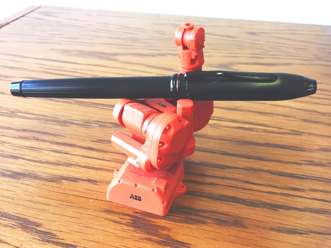
The Darth Vader is deep matte black with Vaderesque pinstripes running the length of the barrel, and the cap has subtle lines recalling the Sith Lord's mask under the clip. A red crystal is set in the caps finial, and while normally I'd scoff at the addition of a Swarovski crystal as a selling point - seriously, what is the deal with Swarovski? Isn't it just, you know, crystal? - it is a nice touch here as a callback to the color of Vader's lightsaber.
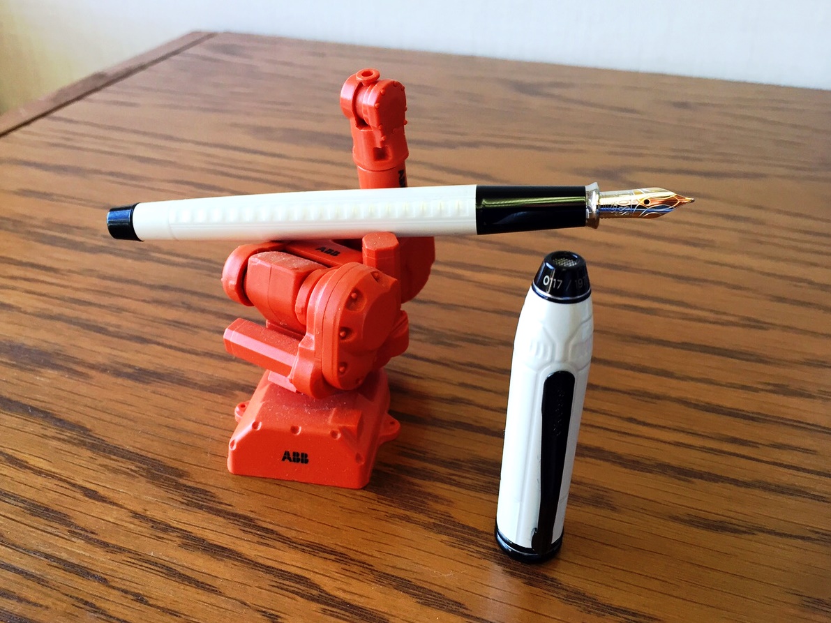
The Stormtrooper is my favorite of the three. The pen is, naturally, stark white with black furniture, and the finial has the mesh pattern of the communicator on the helmet. It's a very simple design but elegantly so, just like the armor for which it is named
The one design quibble I have is a fit and finish concern. Where the barrel and section thread together is meant to be a seamless fit, but the joint is not quite perfect and means there is a tiny mismatch between the barrel and section.
I have read comments that the Cross Click Gel Star Wars editions are better because they sport bolder design elements, including a badge on the clip that identifies the character. Thing is, I really like that the design on the Townsends is subtle. I love the idea that I can be sitting in big important formal meeting and be using my nerdy pen and no one will even know.
These pens look great...but so did the pod race. A good fountain pen is not as random or clumsy as a ballpoint; it is a more elegant writing instrument from a more civilized age. Even so, a bad writing experience will ruin even the best-looking fountain pen. So how do these pens write?
Episode VI: Not Returning the Pens
The nibs on all three were very smooth right out of the box with almost no feedback. They are not "soft" nibs per se, but as with most 18K nibs, these have a little bit of softness and create a little bit of line variation, which is an awesome bonus. Ink flow is fairly wet and broad, and there is little difference between the fine and medium nibs, which are the only available choices. Using the included Cross black cartridge on 80 gram Rhodia paper, there is some very minor ghosting, but no bleedthrough of any kind.
The Townsends are slim, which is a Cross design hallmark, but not so slim as to be uncomfortable to use for extended writing sessions. The section is plastic, which I prefer, and offers a solid grip. The caps post solidly, but being solid brass, make the pen untenably back-heavy when posted.
Overall, I really love the way the pen writes - the quality and tuning of the nib are top notch, and I've enjoyed using them in the weeks since they arrived.
Having never owned a Cross fountain pen, I didn't know what to expect, and part of me was worried I'd be disappointed. I did hesitate (briefly) before I ordered them, but then I remembered some excellent advice. "C'mon, let's keep a little optimism here." Happily, my leap of faith was rewarded. The Force is very much with these pens.