Faber-Castell Ambition Blue Ocean OpArt Fountain Pen: A Review

(Susan M. Pigott is a fountain pen collector, pen and paperholic, photographer, and professor. You can find more from Susan on her blog Scribalishess.)

I really wanted to buy a French fountain pen on my trip to France. I tried several Waterman pens, but the nibs were scratchy and the pens were (in my opinion) over-priced. So, at La Paperterie in Rouen, France, I purchased the new Faber-Castell Ambition Blue Ocean OpArt. I'm calling it my French pen, even though it's a German brand–but I bought it in France, okay?

The city of Rouen

The city of Rouen

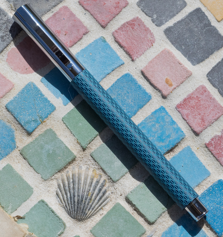
What drew me to this pen is its beautiful dusty-blue body with an engraved, intricate guilloche pattern. Plus, I've found Faber-Castell pens to be high-quality, and this pen does not disappoint.

The pen comes in a solid cardboard presentation box. The inner box, which contains the pen, slides out like a drawer. Faber-Castell offers a two-year guarantee on the pen.

One blue cartridge is supplied, but if you want a converter, you have to purchase it separately (which I did). The converter works well, though it is made of a rubbery sort of plastic, not the hard clear plastic I'm accustomed to with most converters.

The Blue Ocean has a resin barrel with a chrome cap, grip, and posting knob.

The pen is neither lengthy (120 mm/4.75 inches unposted) nor heavy (13 grams, unposted). Posted (159 mm/6.25 inches), the pen feels off-balance because the cap is the heaviest piece. When you put it on the posting knob the balance shifts backwards making the pen uncomfortable to use. I do not recommend posting it.

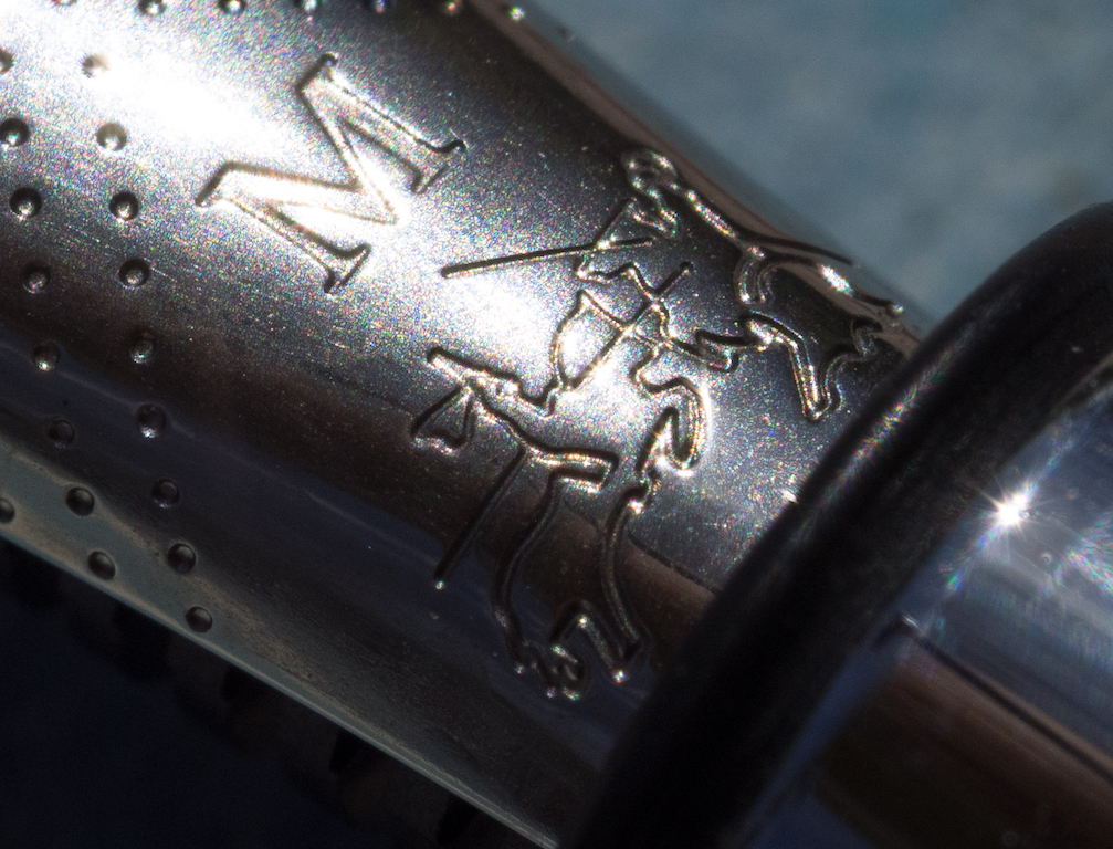
The cap exhibits the usual clean, crisp lines of Faber-Castell pens. It has a simple clip, an engraved circle on the finial, and Faber-Castell branding engraved on the side. It is subtle, and unless you look closely, it's difficult to distinguish the two knights on horses, the emblem of the company. I like subtle branding, and Faber-Castell pens always look classy in my opinion.

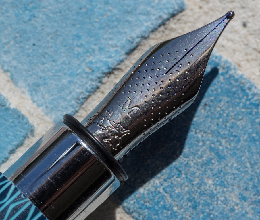
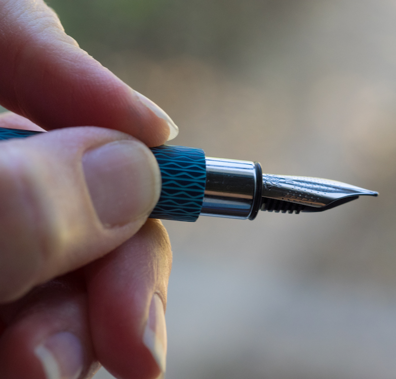
The nib sports the Faber-Castell emblem, decorative dots, and the nib size. It's not the most beautiful nib design I've seen, but it suits the Ambition style.

The nib itself is silky smooth and firm though it has no spring or flex. It wrote perfectly right out of the box, and I've had no problems with it at all. This is an excellent steel nib.

I love the style of this pen, and the guilloche pattern is striking. One of my students noticed the pen in class the other day and said, "Wow! That's a cool-looking pen!" You know a pen is something special when an undergraduate notices it.

That said, the Ambition design does not make for the most comfortable writing experience. The step-down from the barrel to the grip is significant, and the grip is too short to grasp comfortably.

I almost did not purchase the pen because of this. The French saleslady showed me I should hold the pen further back on the barrel, which works, but it feels a bit awkward to me. I generally hold my pens fairly close to the nib. I think, in this case, Faber-Castell chose symmetry and design over comfort in writing.

I paid 78 Euros for the pen which converts to about $88. You can purchase this pen at American retailers like Goulet for $100. That seems a bit pricey for what you're getting: a plastic barrel and a steel nib (though other parts are chrome). I wish the barrel were metal overlaid with the guilloche pattern. It would make the pen feel more substantial in the hand.

Nevertheless, the pen is beautiful and well constructed. The Blue Ocean color is pleasing to the eye and the chrome parts accent it perfectly. I now own three Faber-Castell pens, and all of them write beautifully and look fantastic.

L-R: Intuition Terra, Special Edition Walden, and Ambition Blue Ocean.

L-R: Intuition Terra, Special Edition Walden, and Ambition Blue Ocean.

Pros

  • The Blue Ocean OpArt is a beautiful pen with classy styling.
  • It is less expensive than some other Faber-Castell models.
  • The medium nib is smooth and works perfectly straight out of the box.
  • This is a light and thin pen, so people with small hands will probably find it comfortable (but see below).

Cons

  • The pen does not feel as substantial as the other Faber-Castell pens I own due to the plastic barrel. People who prefer pens with some heft will probably want to avoid this model.
  • Because of the design, the grip section is too short and uncomfortable to hold (the barrel digs into your fingers). So, you have to hold this pen further back from the nib. I have adapted to this, but it might be a deal-breaker for some users.
  • The pen does not come with a converter. You have to purchase it separately (but it is only $5 to $7, depending on where you make your purchase).
Posted on April 8, 2016 and filed under Faber-Castell, Fountain Pens, Pen Reviews.

A Non-Hoarder’s Take on Field Notes (and buying notebooks in general)

(Michelle Guo is a self-diagnosed pen addict ever since she charmed the Faber Castell stand at a stationery fair with her metallic ocean-scape at 9 years old. She ended up leaving with all their paraphernalia and now probably needs Hermione Granger's Undetectable Extension Charm for her pencil case. You can find Michelle on Twitter @misheyxxxooo.)

As a pen addict, I find it inevitable for me to exhibit some hoarding tendencies. Especially when it comes to something like stationery; it is cheap (mostly), useful (usually) and a lot of the times, nice to have (very). For me, it is easier to justify having a variety of pens than it is, say, to have a collection of paintings. As a university student, the cost of purchasing, maintaining and exhibiting paintings is just unjustifiably too much.

But who knows, maybe in a few years-time, I will become a self-proclaimed art addict.

But back to Field Notes.

It is from the Pen Addict podcast that I first became aware of the phenomenon of collecting Field Notes, and I admit, I see how easy it is to be sucked into it. But as the title suggests, I am not a hoarder of them.

Why? Well a bunch of reasons.

Firstly, my being in Melbourne, Australia does not make Field Notes the most accessible product. The closest Field Notes retailer that I have found is an online store located in Sydney, and yet it still takes a week or so for the notebooks to reach my front door. This means that it has to be something that I would literally need to be willing to pay double the price for.

Which then leads to the question of what can justify paying such a price for something as simple or mundane as a notebook. And this can extend to more than just my interest in Field Notes; how can I justify buying a $30 Moleskine when there are definitely more affordable alternatives out there? And then if I do buy it, will I even use it?

The way I have come to justify it is like this; when I buy a pricey notebook, I am not just paying for the product, I am also investing in what that product can hold. What I like about notebooks is that they can have a dual utility, once I have finished using it as a notebook and filling in all the pages, it can then function as a book that has documented a period of my life, depending on what I have filled it with. So for me, there is a degree of correlation between the quality and visual appearance of the notebook, and the contents within it.

The plainer, cheaper notebooks I would just use for mundane purposes, whereas the more expensive or thoughtfully designed ones I tend to save for a more significant purpose. So rather than filling my Field Notes that I have paid $30 USD for with miscellaneous notes, I will use them to document things that are more personal or specific to a various interest of mine. That way, I will use the notebook with the intention of keeping it and looking back to it in years to come. I am a big fan of compartmentalising and categorising things effectively and efficiently in my life, and doing this is very reflective of that. This also means, that even with the progression of technology and the wonderful note-taking apps that now exist on smartphones, I will still buy nice notebooks and, more importantly, use them.

This also helps me curb the initial fear of breaking in a new notebook and putting ink to paper, as I have given them a purpose. As a student, it was very common for me to have to start empty exercise books at the start of every new school year, with a new book for each subject. Now, instead of filling in books with math or spelling, I am filling them with favourite quotes and bucket lists; things that I want to archive and reminisce on in years to come.

Perhaps I am actually just a hoarder of knowledge, and the pens and notebooks that I buy are my way of exhibiting the knowledge I collect.

But then again, that seems like something that is worth hoarding.

Posted on April 7, 2016 and filed under Notebooks, Field Notes.

The Pen Addict Podcast: Episode #199 - It's Almost Like You're a Professional

One more show! One more show!

Myke and I knock out one more episode before we reach Episode #200, which we are recording live in Atlanta next weekend. We didn't phone this one in though - quite the opposite. We talk about Myke's Sweet Tooth, my podcast world tour, Joey Feldman love, and is it possible I am about to buy my first Montblanc fountain pen? All signs point towards yes.

Show Notes & Download Links

This episode of The Pen Addict is sponsored by:

Harry's: An exceptional shave at a fraction of the price. Use code PENADDICT for $5 off your first purchase.

Squarespace: Enter offer code INK at checkout to get 10% off your first purchase.

The Timber Twist Bullet Pencil Kickstarter: Listeners of this show can still benefit from the sold-out ‘Early Bird’ pricing. Just select the ‘NO REWARD’ tier, and pledge $38 for the aluminum, or $40 for the brass. If you live outside the US, you’ll need to add $10 to those prices.

Posted on April 7, 2016 and filed under Podcast.