Pilot Cavalier Duo-Color Body Fountain Pen Review

(Sarah Read is an author, editor, yarn artist, and pen/paper/ink addict. You can find more about her at her website and on Twitter.)

Somehow, in my scramble through the fountain pen hobby, I skipped the Pilot Cavalier. I think a lot of people do--it's not a pen I've heard much buzz about. And that's a bummer, because this is a great little pen.

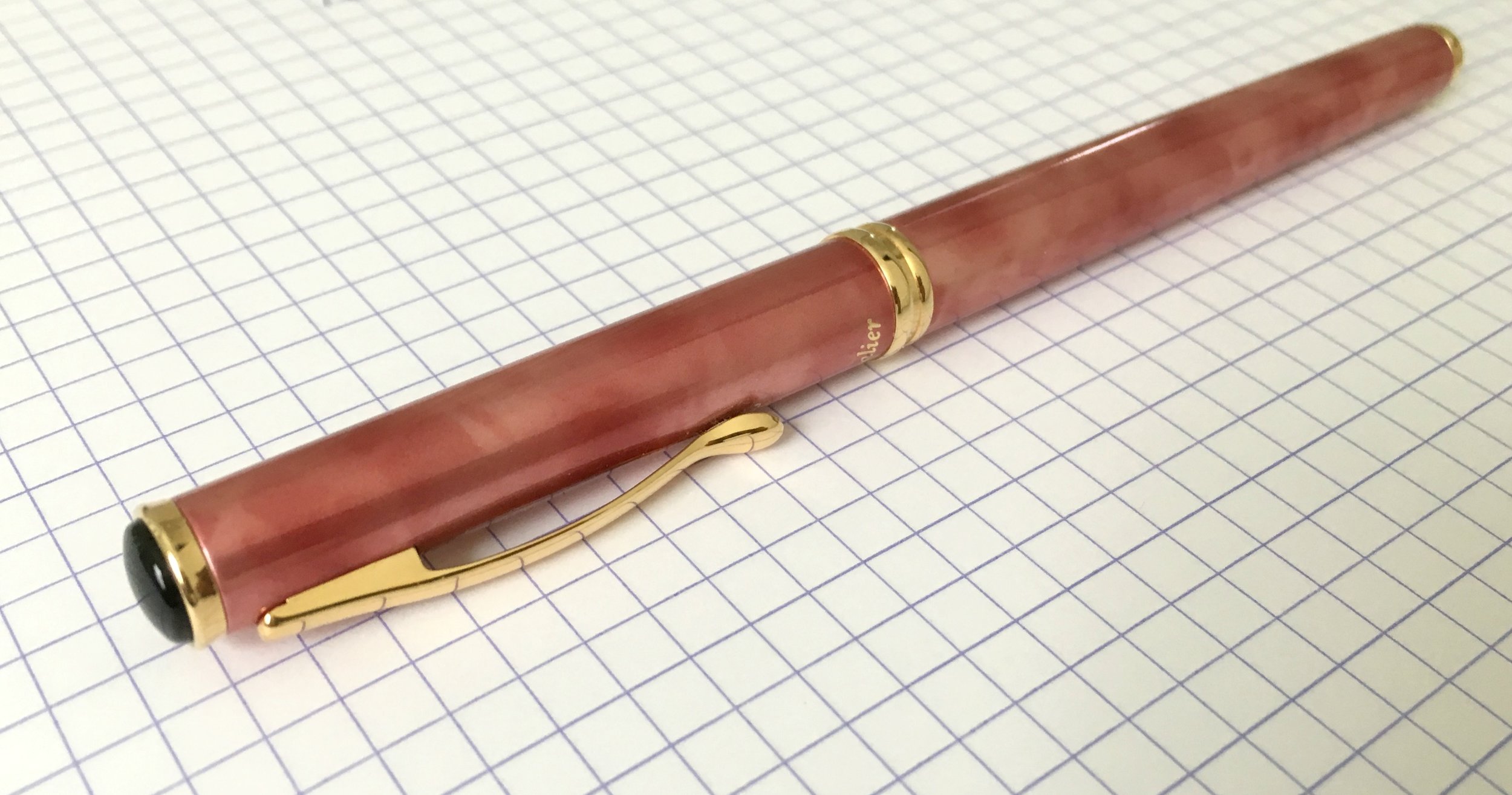
The body is brass, giving it a nice weight, but it's a slim pen, so it isn't too heavy. This special Red & Pink Duo-Color edition is slightly larger than a standard Cavalier, but it's still very slender, which may not be as comfortable for larger hands. That does, however, make it well-suited to the smaller pen loops found in planners and folios. The brass is coated in a lovely marbled pattern. All the colors are gorgeous and rich, and very difficult to capture in a photograph. There's a shimmer to it that just doesn't come though. So you'll have to take my word for it that this is one of those pens that you'll find yourself staring at as you think what to write.

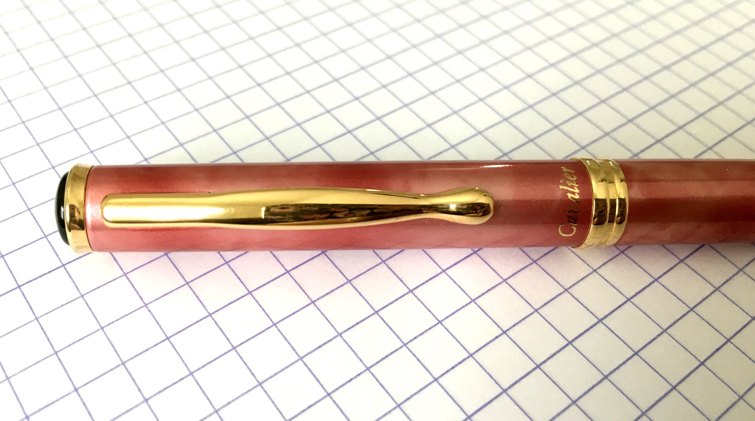
The furniture is gold-plated, the grip section and cap jewel are black plastic, and the nib is gold-plated steel (here in a size medium). The clip is firm--maybe a little too firm--and the cap snaps securely to close. It posts nicely without becoming too long or back-heavy, though the balance does feel better to me unposted.

As much as I prefer threaded caps, I'm developing a real appreciation for snap caps when I need to write a quick note. I have had some instances of the nib drying out slightly when the pen is stored nib-up. When I've stored it horizontally, I haven't had any trouble.

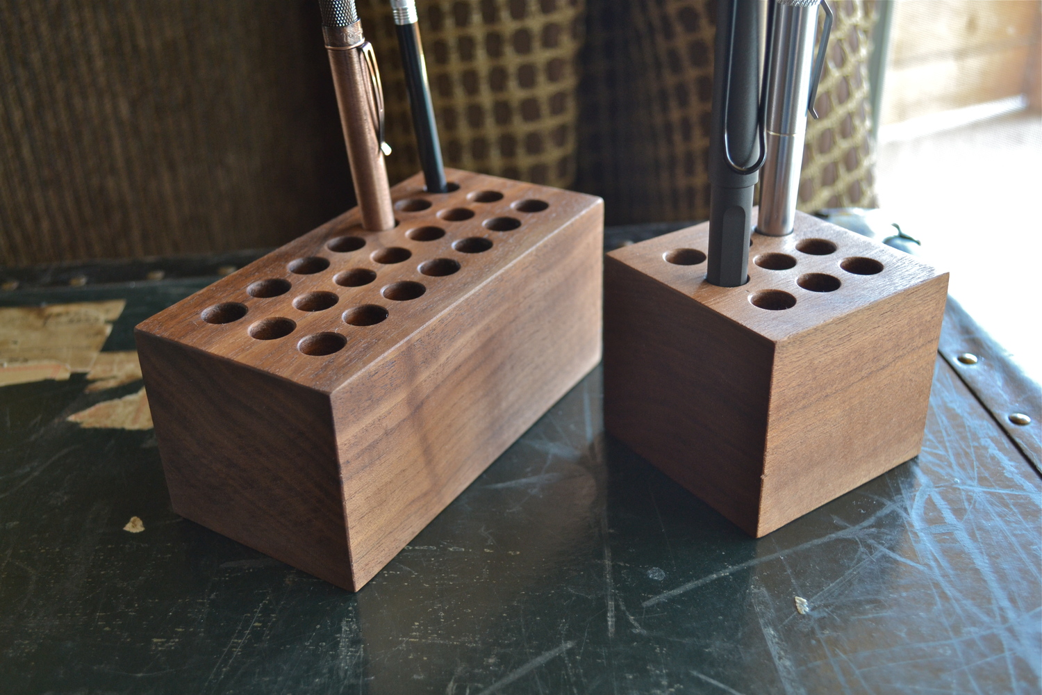
The pen takes Pilot's proprietary cartridges or the con-20 converter. I'm firmly in the camp that despises the con-20 and I wish that Pilot/Namiki would release more fun colors in their cartridges. So this pen will join my Prera and Vanishing Point in the ranks of pens that get their cartridges refilled with an ink syringe.

The nib is a nice wet writer with gentle feedback but no scratch. It's surprisingly springy for a small steel nib and shows some nice line variation. The nib is narrower than the Metropolitan nibs and it wraps around the feed in a way that makes it non-removable. It writes better than the handful of Metropolitans I've tried. There's no skipping or ink starvation--just good, reliable consistency.

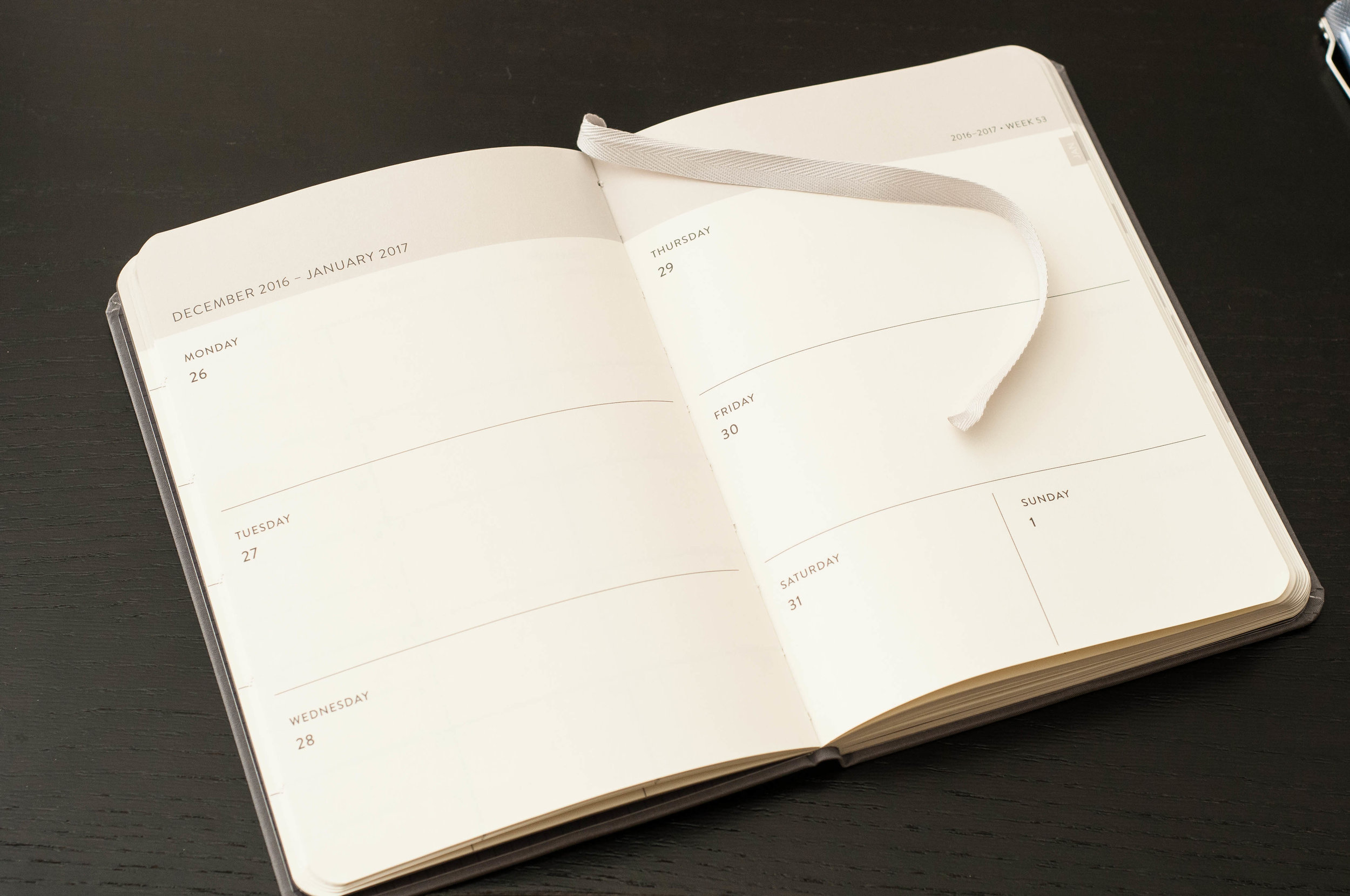
I've been using this pen for daily journaling and as my planner pen, and it's been lovely. It's at a great spot in terms of price and look, I feel. It's a step up from the beginner pens (like the Pilot Metropolitan, Lamy Safari, and TWSBI Eco), but well below the cost of the next-level fancier pens (like the Pilot Vanishing Point, Pelikan M200, or Sailor Pro Gear Slim). It writes, looks, and feels like it could be more expensive than it is. It would make an excellent work/office pen, where you want to look a little bit fancy without exposing a nicer pen to the hazards of the workplace. It's also at a great price-point for a thoughtful gift for someone you'd like to push over the edge into fountain pen addiction.

Even though I missed this pen on my first trip 'round the pen world, I'm delighted to double back and make up for lost time.

(JetPens provided this product at no charge to The Pen Addict for review purposes.)

Posted on December 15, 2016 and filed under Pilot, Fountain Pens, Pen Reviews.

The Pen Addict Podcast: Episode 235 - Baby-Faced Assassin

Who is Mike Dudek? I feel like I know him pretty well by now, but I always learn something new when I talk to him. We discuss new and interesting Kickstarter projects, his vintage Rotring and Pilot collections, and how Dudek Modern Goods fits into his life.

Show Notes & Download Links

This episode of The Pen Addict is sponsored by:

Squarespace: Enter offer code INK at checkout to get 10% off your first purchase.

Harry’s: Use code PENADDICT to get $5 off your order!

Foot Cardigan: Fantastic socks delivered to your mailbox every month. Get 10% off any subscription plan with the code PEN.

Posted on December 14, 2016 and filed under Podcast.

Baron Fig 2017 Planner Review

(Jeff Abbott is a regular contributor at The Pen Addict. You can find more from Jeff online at Draft Evolution and Twitter.)

2017 is quickly approaching, and it's time to get organized. I've had my flings with weekly and daily planners in the past, and they've mostly been abandoned after 2 or 3 months into the new year. The Baron Fig 2017 Planner is a format that I've enjoyed in the past, and I'm aiming to give it a solid try in the new year.

The Baron Fig Planner looks like any old dark gray Confidant that you may have seen. It's sleek and sharp, and it has a classy cloth cover that makes people stare and ask questions. It also features a sleek silver bookmark for keeping track of the weeks as you move through the year. Overall, this is a Confidant on the outside, but a useful planner format on the inside.

Features

This is a planner, so there are several features that are expected, but the Baron Fig also includes some extras that are welcome additions to the standard weekly planner.

First off, the standard planner format. This is a weekly planner, meaning it has a two-page spread for each week of the year. On the left side of the book, you have Monday through Wednesday. The right side of the book contains Thursday through Sunday, but Saturday and Sunday share a section. It's a great format that mimics what I've seen in other planners from major retailers (Day Runner, Moleskine, etc.)

The right side of the book has a gray index marking to show the current month. This makes it easy to flip between months in the book to quickly find something you need in the future or past.

Apart from that, each day is labeled, and there's a handy week number listed in the top right of the right-hand page. Overall, this is pretty standard for planners.

At the beginning of the book, you have a small area to write pertinent contact details, followed by a quote from Heraclitus:

Time is a game played beautifully by children.

I'm not sure what they're trying to say here, but I'll assume that this refers to the way children perceive time as an endless and limitless resource that we can control and spend at will. Adults, as I understand it, are supposed to plan and manage this time responsibly, hence the need for a planner.

After the quote page, you're greeted by a well-laid-out "year at a glance" calendar over a two-page spread. I'll be referring to this many times over the year, though I'm disappointed that the format starts the week with Monday instead of Sunday. This isn't a die-hard preference of mine since I understand other countries and cultures view the beginning point of the week differently, it will take some adjustment on my part to remember that the calendar is slightly different. This would make sense if the notebook came from outside the US, but I'm a little baffled as to why they chose this format from NYC. Either way, it's really handy for gauging the larger picture.

After the big picture 2017 view, you have a two-page spread for each month of the year. This is great for planning out events for the month, and it also adopts the Monday-first mentality.

Immediately following the monthly view, you're dropped into the first weekly view for the planner. This is the real meat of the notebook and likely where you'll spend most of your time. The first week starts on December 26 and ends on January 1, so you get a few extra days in 2016 to ramp into the new year. This is a nice touch.

The days are roughly 3 inches by 5 inches (except for Saturday/Sunday, which are divided length-wise), and there is plenty of room for making a few notes. If you are looking for a planner that will allow you to map out 8 - 14 hours of your day, this is not the planner for you. There's not enough space (for my writing, anyway) to plan out each hour of the day. For that, you're better off looking at other planners such as the Hobonichi Techo. For me, I'll use this notebook for daily goal planning and accomplishment logging. At the end of 2017, I want to look back at this notebook and get a sense of what I was working through each week of the year. It's more of a logbook as opposed to a detailed planner.

Of course, if you don't operate to a strict schedule (say, you track to 3-5 major tasks each day), then this is a great area to write down and track your tasks and goals for the day. As with any planner system, it is exactly what you make of it. Baron Fig have simply provided a construct for you to operate within. You can choose to be as detailed or abstract as you like. That's the beauty of a system like this. In a way, I really like that they haven't included every hour of the day in the planner. It forces you to step back and look at your day as a whole instead of as a collection of menial, micro-managed tasks. (I'm not saying menial tasks aren't important, but maybe they don't belong in this planner).

Lastly, after you run out of weeks in the year, there are about 26 pages of blank dot-grid pages for notes. These pages at the back of the notebook are unnumbered, but you could easily number them to make note references in the planner section. These notes pages are all bound into the notebook without any perforation.

Another thing to mention is the included insert that displays the entire year on one Confidant-sized card. This will find a place on my desk over the year, and while I'm sure it will be misplaced and re-found several times, it will be an invaluable tool in 2017.

Paper quality

Now, once you get past the function of this notebook, you'll be pleased to note that the paper that Baron Fig uses is the same kind they use in the rest of their notebook line. This shouldn't be a surprise, but it's worth noting since some manufacturers inexplicably change paper lineups between special edition releases. What you've come to love (or hate!) in the regular line of notebooks, you'll get the same quality here. For me, this is a huge positive since the paper handles every kind of pen or pencil with ease. It may not be the most fountain-pen-friendly paper in the world, but it does a really good job of handling different nibs and inks. It's a little scratchy, but I love that feedback. Other people may disagree, and it's probably fair to say that this notebook isn't for them. Again, the Hobonichi features Tomoe River paper, which is one of the smoothest, well-behaved fountain pen papers out there.

Gel inks. ballpoints, rollerballs, pencils — these will perform extremely well with this notebook. Fountain pens — your mileage will vary, but I've been very pleased with all of the Baron Fig notebooks I've used in the past.

Conclusion

The Baron Fig 2017 Planner is going to be a staple on my desk over the coming year. I'm excited to give it a year's worth of abuse and see how it lasts through next December. I'm happy that the paper is of a caliber that accepts all kinds of pens I feel like throwing at it, because, let's face it, I'll switch pens about once a week through 2017. There's still a couple of weeks left to order a planner, and I really recommend the Baron Fig if you want a planner notebook that features a clean aesthetic, good paper quality, and a nice macro weekly layout. Either way, time is running out for you to make a 2017 planner decision!


Enjoy reading The Pen Addict? Then consider becoming a member to receive additional weekly content, giveaways, and discounts in The Pen Addict shop. Plus, you support me and the site directly, which I am very grateful for.

Membership starts at just $5/month, with a discounted annual option available. To find out more about membership click here and join us!

Posted on December 14, 2016 and filed under Baron Fig, Planner Reviews.