Robert Oster Signature Ink Review: Hippo Purple

(Susan M. Pigott is a fountain pen collector, pen and paperholic, photographer, and professor. You can find more from Susan on her blog Scribalishess.)

There’s a new Robert Oster Signature ink in town, and this one’s a special edition. It’s called Hippo Purple, and it was made especially for the Hippo Noto Tomoe Notebook, a Kickstarter project.

Image via the Hippo Noto Kickstarter page

The Hippo Noto Tomoe Notebook is a special sub-A5-size notebook (131mm x 208mm) with 500 pages of 68gsm Tomoe River paper. The creators of the notebook named it Hippo Noto because their late son’s favorite creature was the hippo, and “noto” means “notes” in Japanese. You can read all about the Hippo Noto Kickstarter project here. The project ends April 23, 2017, so if you’d like to support it, you’ll need to act quickly.

Robert Oster created a special Hippo-colored ink as a part of the Hippo Noto project. The ink has shades of magenta, ochre, and blue, creating a unique brownish-purple that mimics the color of hippos.

The ink is wet and writes quite well in my TWSBI Eco with a stub nib. It does not exhibit much shading with this nib and is a rather flat color. It is not waterproof. I did my ink testing on Maruman Septcouleur white paper (my usual ink testing paper), not the Tomoe paper that will be in the Kickstarter notebooks.

Although I was able to create some fun ink splats, this ink doesn’t have the gorgeous sheen I’ve found in other Robert Oster inks.

In wide nibs (I used a Pilot Parallel 2.4mm), the ink demonstrates subtle shading. I really like the unusual color.

You can order this special edition Robert Oster ink only through the Kickstarter project. So if you like this unique shade of brownish-purple, be sure to go to the Kickstarter page and pledge $47 for one notebook and a bottle of Hippo Purple ink.

(This ink was provided to Pen Addict at no charge for review purposes.)


Enjoy reading The Pen Addict? Then consider becoming a member to receive additional weekly content, giveaways, and discounts in The Pen Addict shop. Plus, you support me and the site directly, which I am very grateful for.

Membership starts at just $5/month, with a discounted annual option available. To find out more about membership click here and join us!

Posted on April 21, 2017 and filed under Robert Oster, Ink Reviews.

Callifolio Olivastre Ink Review

(Sarah Read is an author, editor, yarn artist, and pen/paper/ink addict. You can find more about her at her website and on Twitter.)

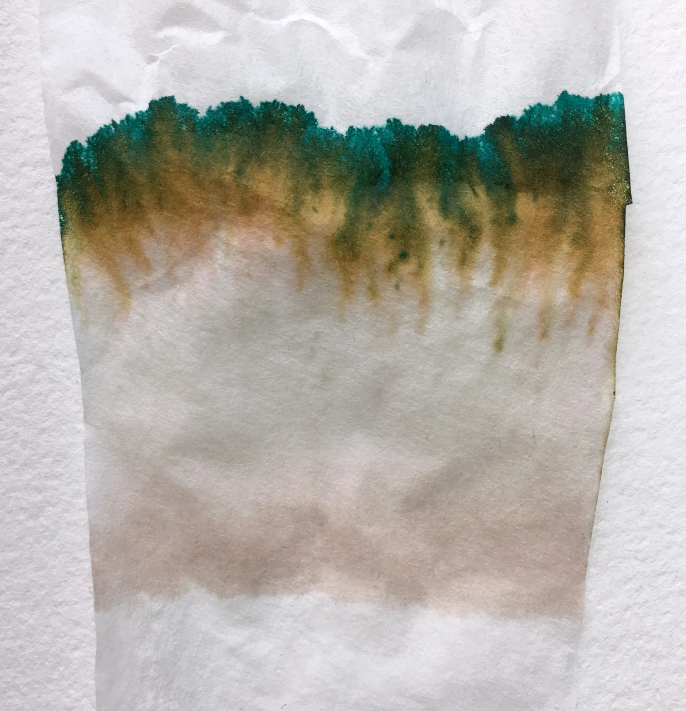
The Callifolio inks from L'artisan Pastellier are a line of non-toxic, non-corrosive, gentle inks made with natural pigments. Olivastre is one of the most saturated colors of the bunch, and the second most fun to say (after Andrinople, of course).

The inks come in 40ml bottles, or 50ml refill pouches. The bottles are interesting. They're the triangular wedge ones that can form a circle if you collect enough of them (or so I hear--it's a theory I'd like to test, as soon as possible). The pouches will only work if you have another container you can pour the ink into, as a pen can't be filled from the pouch itself. But I love the idea of refill pouches--I wish more ink companies would adopt that practice.

The formula is gentle enough that it can be used safely in vintage pens, and the colors can be mixed. I'm anxious to collect a few more colors so I can play mad scientist and concoct my own custom hues of this nice ink. I think that property gives this ink more potential as an art medium, beyond its standard pen-fill purpose.

Olivastre just means "olive green"--and chromatography shows this is a lovely blend of gold, emerald-teal, and some shadow of a warm brown. It's a complex color that shows lovely shading, even with a fairly fine line. It saturates as a deep emerald/olive, and fades to a bright grass green. It's a dark enough color to pass as professional(ish), but bright enough to be fun.

It feels like a dry ink, but it flows very well, especially in a nice broad nib. Though it flows well, it dries quickly. Even on Tomoe River paper, it's dry in around 15 seconds, and seems to dry almost instantly on more absorbent paper. I suspect it would be a workable choice for lefties, though I'd need confirmation on that. But in contrast to some other fast-dry inks, I didn't experience much feathering, even on cheap paper.

It's not water resistant at all. Allowing drops of water to sit for any length of time lifted nearly every trace of the ink from the page. A slight shadow of it can still be seen--but not enough to salvage your notes in a rainstorm. But that's what makes it so easy to clean, and so kind to delicate pens. The more I see people posting about an ink that stained or damaged their pen, the more I want to hug inks that I can trust to be kind to my pens.

Personally, I find this color beautiful. I'm really enjoying using it, and I've got it loaded in several pens, so I can see how it plays with different nibs and papers. I'm decidedly intrigued by the Callifolio line, now, and anxious to try more. They have TONS of colors, including all the shades of blue--and millions of possible permutations when you consider mixing. It's the playground of ink, and it's recess time.


Enjoy reading The Pen Addict? Then consider becoming a member to receive additional weekly content, giveaways, and discounts in The Pen Addict shop. Plus, you support me and the site directly, which I am very grateful for.

Membership starts at just $5/month, with a discounted annual option available. To find out more about membership click here and join us!

Posted on April 20, 2017 and filed under Callifolio, Ink Reviews.