Franklin Christoph Pocket Notebook and Cover Review

(Jeff Abbott is a regular contributor at The Pen Addict. You can find more from Jeff online at Draft Evolution and Twitter.)

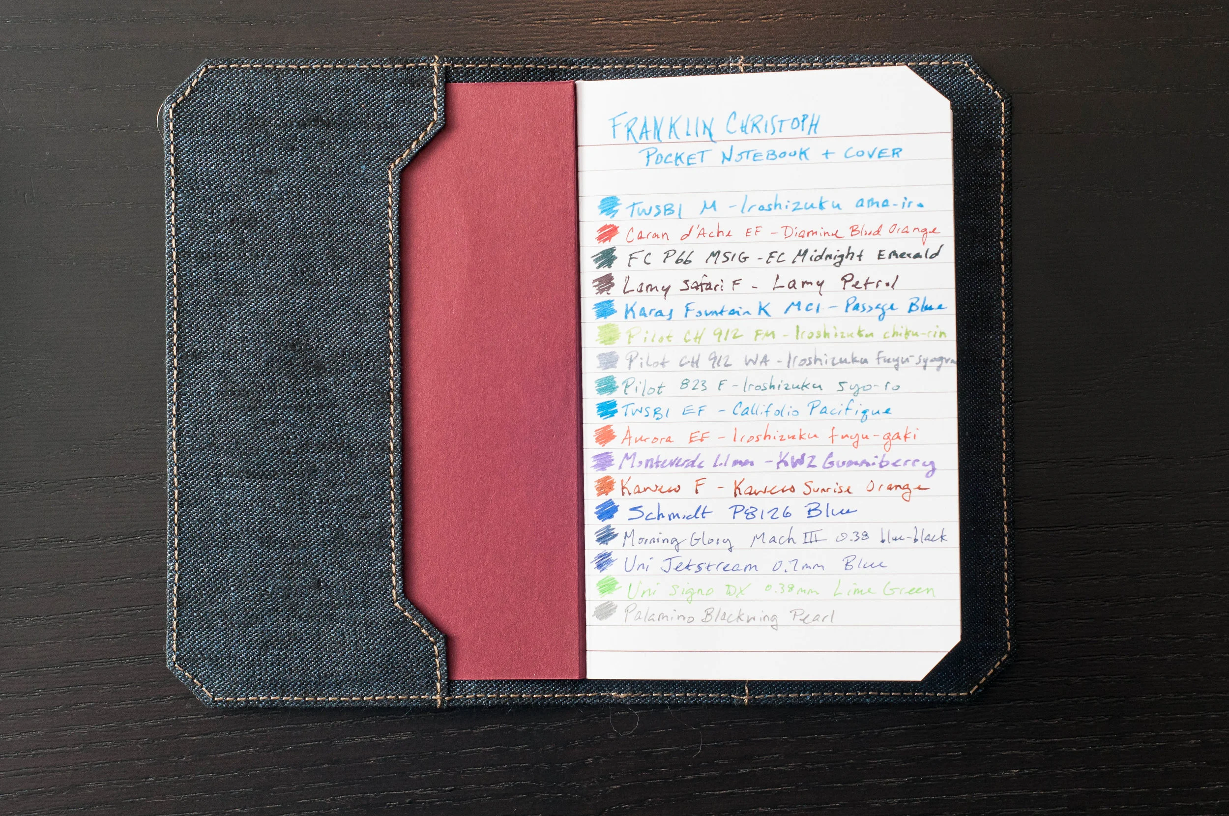
As my collection of pocket notebooks continues to grow, I try to be more selective in what I keep around and purchase. Still, it's hard to pass up a new entry to the popular size. Franklin Christoph have been making paper products for quite a while, but this is my first time trying them out. Whenever you purchase paper products from a fountain pen maker, you can usually assume that the paper will work well with fountain pens. Fortunately, this is the case with the Franklin Christoph Pocket notebooks, and they also have a unique flair to set them apart from the pack.

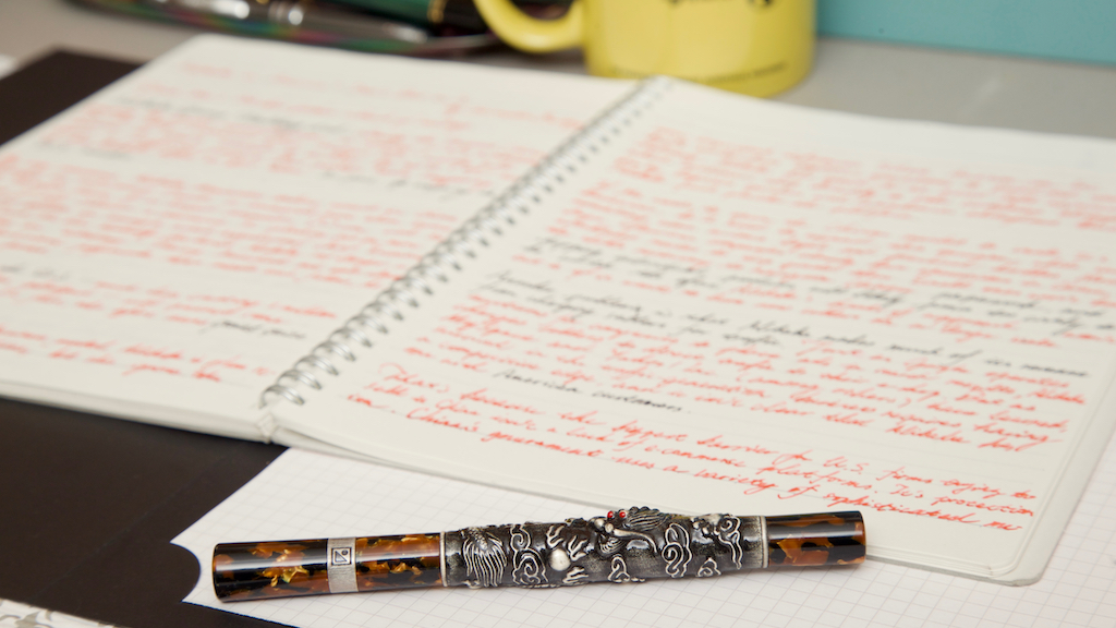
To start things off, let's look at the size of these notebooks. They are the standard 3.5" by 5.5" that we've come to expect from this genre. Each book contains 32 sheets (64 pages), and features some really great bamboo paper. The paper can be either lined, blank, graph, or dot grid. The version I have is lined, and it features a 6mm line spacing. This is the typical spacing size with most Japanese notebooks, and close to "college rule" here in the states. For a pocket notebook, this is a great line spacing. If you like, you can order a 4-pack medley (about $12) that contains one of each format. The normal pricing ($10) is per 3-pack of one kind of paper format.

One unique feature that sets this notebook apart is the corner trimming. Most notebook opt for some sort of chamfered, rounded corner to make sure the corners don't snag and become tattered. Franklin Christoph went with a straight chamfer, which gives the notebook a unique look. It doesn't affect the usability of the notebook, so it's fine by me. I'm not sure I prefer this look, but it certainly doesn't detract from the experience.

One minor nitpick I have regarding the paper is the darkness of the lines in the lined version I have. It's a bit too dark for my tastes, which distracts me from my own writing or doodling. I prefer a lighter line weight so it can easily disappear into the background when convenient.

The cover material is a bit thin, but no different than comparable pocket notebooks. The binding is a tight binding that looks to be high quality, and I've been pretty happy with how it's held up. The pages open easily and don't have much trouble staying open. The same is true when the notebook is closed. It doesn't have an issue staying closed. Depending on the paper format, the cover will be a different color. For the lined version, the cover is a deep red color.

There is branding on the front and back of the cover, but it's minimal. The inside covers feature no writing/branding at all.

Finally: the paper. Made from bamboo, this paper handles different inks pretty well. I've noticed a little bit of bleeding and feathering with some inks, but it's minimal. Same thing goes for show-through. Depending on the ink/nib, you'll notice a fair amount of show-through on the back of the page. For me, my results varied. For pen/ink combos that resulted in lots of show-through, I wasn't able to comfortably use the back page. In general, the paper is fountain-pen friendly, smooth, and a nice off-white color.

In general, the Franklin Christoph pocket notebook is a great option in the pocket notebook space. I'd recommend trying one out with your next order or pen show visit.

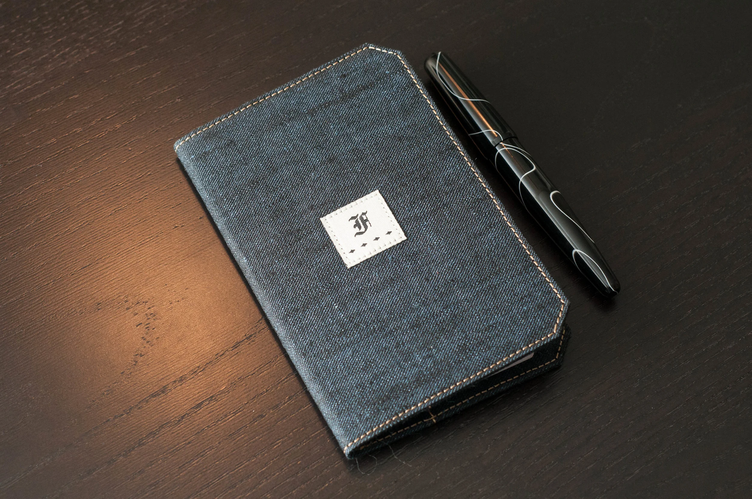
As a bonus, I've also been using a fabric notebook cover from Franklin Christoph. There are several options available, both fabric and leather, and they're priced competitively. And, since the notebooks are a standard size, these covers will also fit other pocket notebooks (like Field Notes, etc.) as long as they adhere to the same size and trimmed corners standard.

The cover I have is the Linen Blue fabric. It has a nice denim look and features a tasteful Franklin Christoph logo centered on the front of the cover, as well as a smaller logo on the back. The logos are also made of fabric and are sewn into the cover.

In the fabric covers, you have the option of Linen Blue, Linen Brown, Suite Gray, and Suite Blue. They all cost $20 each, which is a pretty good deal.

They also offer these covers in leather. The FxCel Black and FxCel Brown covers are only $25, which is also a great price.

The covers feature pockets in the front and back with which to hold the notebook covers. I'm using mine with only one notebook, and it's pretty snug and secure. Although, you can fit two notebooks into one cover. This presents a nice option if you'd like to carry more than one notebook in a convenient cover.

The size of the cover is large enough to protect the notebooks, and it seems to be made pretty well. I can't see any wear so far, but I'm sure the fabric will fade a bit as it is used more. The tan stitching around the edges is a nice touch to the overall aesthetic. If you purchase a notebook cover, it comes stocked with one ruled notebook.

Overall, I've been enjoying the Franklin Christoph cover as a compliment to the notebook. It adds a degree of protection and also convenience if you want to easily carry two notebooks as one. The fabric is a nice departure from the standard leather fare, but you also have a couple of leather options if that's your preference. Again, check them out next time you're at a pen show, or throw one into your cart with your next order!

(Franklin-Christoph provided this product at no charge to The Pen Addict for review purposes.)


Enjoy reading The Pen Addict? Then consider becoming a member to receive additional weekly content, giveaways, and discounts in The Pen Addict shop. Plus, you support me and the site directly, which I am very grateful for.

Membership starts at just $5/month, with a discounted annual option available. To find out more about membership click here and join us!

Posted on September 13, 2017 and filed under Franklin-Christoph, Notebook Reviews.

Fuliwen 803: An innovator of High-end Modern Chinese Pen

(This is a guest post by Frank Dong. You can read more from Frank at his blog Frank Underwater.)

Intro

Established Chinese fountain pen brands, such as Hero, Piccaso, Jinhao, have been dedicating at selling pens at low price while ignoring their premium lineup. They do have pens that are quite expensive, but I just can’t call them the premium pens, for too often those pens were either clumsy homages to Western flagship pens or super limited customized ones for diplomatic occasions, which, of course, are not built for pen users like us.

And, for the emerging brands, ranging from TWSBI, Linmo, to the recently resurrected Wing Sung, they still needs more time to gaining their momentums as well as price tags.

Wondering whether the originality and creativity still exist among modern day Chinese pen makers, during my last job at a design studio in Shanghai, I began to explore the real innovators among temporary high-end Chinese fountain pens if there was any.

And the result was the unveiling of an amazing product: Fuliwen 803.

A Hidden Craftsmanship

What happened in the first place was an old and bad-edited article from the official site of CHINA WRITING INSTRUMENT ASSOCIATION. In that post, I spotted a pen that was unlike anything I have ever seen before. It was made in 2003 and, under the name Fuliwen (富利文). The model number was not mentioned in that article. Still, I got the model name of this pen from a customs official in Tianjin Harbor: Fuliwen 803. I also heard from him a short in-side-baseball story about its manufacturer: the brand Fuliwen, was joined by some senior engineers from Hero Pen Factory and is still in business, which means, I can still get one Fuliwen 803.

The weather in Shanghai in the early July felt like a boiling Chongqing hot pot, intense, humid, and torturing hot—but when the parcel containing the well-crafted box of the Fuliwen-803 arrived, I was chilled out.

Comparison with an Aurora Benvenuto Cellini

Out of the box, it features a design that is just unseen in any other Chinese pens: the straight, balanced main body mimics the old-time safeties subtly. Attached to the main body were two bare gold and brown celluloid finials in subtle curves, softening the general profile impression. But most importantly, besides all the orchestra of curves and colors, the obvious highlights of this pen are the casted dragon sculpture spread all the way across the main barrel. It pictures an imperial dragon chasing a dragon ball fiercely, speeding across the cloud. An oxidized accent was added into the silver metal used to depict the chasing scene. This material may not be sterling silver, but it does convey a feeling of solemnness and luxe.

As for the writing mechanism, it features a legit 18k gold nib and a cartridge/converter filling system. The ellipse nib, which was stamped with the Fuliwen logo and specs in a rather modern and sleek way, occupies almost all the length of the clip-less front cap, it will show up right after you unscrew it. The factory grinding of this nib is very round, prone to the style of a solid ball point. It smoothly writes a broad line after getting started and could be pushed a little bit, making it an excellent instrument for signing off documents or scribbling several words into the memo.

The pen has a price tag roughly 176 dollars by the time of my purchase, and now it will set you back 278 bucks since after Fuliwen shifted their pricing earlier this summer. It is still a nice pricing tag, due to its uniqueness. With that said, I am not implying that this pen is the perfect Chinese fountain pen, cause this model does have a series of small issues to fix, which I shall reveal in the next chapter.

A dragon’s journey to the West

I carried this pen almost every time I got a chance to a pen show. And it impressed people a lot with both its superior design and craftsmanship and sometimes, interestingly, its defects.

Right after purchasing, I noticed there are two major flaws in the Fuliwen 803:

  1. First, the round-ground nib doesn't promise a seamless start every time you use it, which may probably have something to do with the baby-bottom effect caused by the grinding which is too round.
  2. Second, the filling system was coping with the speed the ink goes out, either during writing or during overnight evaporation. When I write nonstop for 1 pages, it could stop for a while before the nib gets wet again; the same thing happens when I put the pen unused for a while.

But isn’t the process to fix a weird temper fountain pen the best fun part of playing with those analog devices? So, things happened just so naturally when I wandered through the ballroom of this year’s Philly Pen Show with this pen in my case.

Mr. Bedford, whose family owned the Quill pen, tried this Fuliwen803 during that show and asked me how much he should pay if he wants this pen directly from me, right there.

That was my first pen show here in the states, and I was more prone to cautious; naturally, when I was asked that question, I remained silent for a while and decided not to cash in this pen. The main reason was the two writing defects I was having with it.

Mr. Bedford expressed his appreciation of the design of this pen, nonetheless, and introduced his friend, Susan Wirth, who was working at the other end of her large booth at that time. Later, Susan nominated this pen directly when I was writing with it before her: “This pen is beautiful, honey!” Anyone who knows her will understand what would happen next. She was just so passionate and charismatic she spots something unique, and in my case, she grabbed my pen in seconds and began to inspect it, while at the same time complimenting the delicate carving of the dragon sculpture.

Raised up in China, I was a little bit overwhelmed by her appraisal. With my inherited habit to downplay a little bit when somebody is appraising your stuff, I revealed the flowing issue to her.

Susan working on this pen

To my surprise, Susan did not seem to be scared away by those flaws, and she began her adjusting of the nib right after my confirmation. She handed that to me minutes later, and as she wished, it stopped skipping instantly. Then, she threw out a question with a mysterious smile on her face: ‘Tell me what kind of ink did you use?’

‘Noodler's Dragon’s Napalm, I think it’s an amazing color to match this fantastic pen…’

‘Oh, honey, you should never do that!’ Susan interrupted in a way almost like criticizing. ‘Barbara, bring me a cup of water!'

While she was rinsing the pen intensely, she told me to avoid the Boutique ink, such as Noodler's Ink or Private Preserve, which might cause the instability of flowing in this Fuliwen.

I want to make it clear that I am still not sure about the logic behind such claim since it's hard for me to denounce the whole ink lineup of a brand based on simply one or two of its product’s records. But I still appreciated what Susan did and managed to do to improve that pen during and after the Philly show.

Despite the ink philosophy, Susan was still into this pen, and we even nailed a deal to get it a cursive italic grinding by her, and I will pay her for all the modification and improvement she has done to this pen. The date for her to hand this pen back to me was the Long Island Pen Show.

The morning at the Long Island show, I was surprised by the fact that my pen was on the waiting list of Richard Binder rather than lying down around Susan's territory. Some mysterious stickers were also attached to the barrel, saying "not my work," and "tubby," etc.

Susan’s tag and Binder’s grinding of this pen

“I am sorry honey, I just couldn’t get it right on my own, so I sent it to Binder. I didn’t want to ruin this beauty, hope you understand!" Noticed by my confusing mindset, Susan explained.

She pulled out her leather pad and wrote a check, handed it to Binder, and turned around to me, " we will stick to the original price we agreed before, not Binder’s."

Obviously, the number she paid for Binder was certainly much more than I should pay her. What a sincere and emphatic pen lover!

Five-clawed = Imperial Dragon

Sitting before Mr. Binder’s booth, he told me the dragon cast in this pen was actually an unusual one; it is a five-clawed imperial dragon. For the first time, I came to realize there is a classification of Chinese dragon caused by the number of claws: while a typical Chinese dragon has four-clawed hands, the very dragon that was only used by the emperor is five-clawed. Ironically, when I was living in China, no one has ever told me how to tell the difference between different numbers of claws.

‘Now you know this.’ Smiled Binder.

As for those stickers with strange jargons, Binder told me that that it is actually a technique used by Susan for years: a tagging system built to convey pen ideas.

Thanks to the works of Susan and Binder, after the Long Island show, the nib-improvement project for this pen was finally done. Although I am still entry level in the world of English calligraphy, I can tell this cursive italic nib is well brewed. It is an enormous enrichment of the value proposition of this pen: the previous ball point like grinding was just too safe and unimpressive when presented in its dramatic chassis.

The MARK II & some afterthoughts

By the time Susan was working on her own to improve my first Fuliwen 803, I had sent an inquiry to Mr. Dai, the product manager of the Fuliwen Pen Factory in Shanghai, for lending me another Fuliwen 803. I was hoping in this way I can compare it side by side with the improvised version later, and write something about it. He agreed, and a pair of the high-end Fuliwen pens was delivered to me the next week.

Stripping off the package, I found the new Fuliwen 803 a different version of 803, though it bears the same model name. For the sake of the clarity, please allow me to call it the Fuliwen 803 MARK II.

Fuliwen 803 MARK II

The physical dimension of this pen is different from the previous one, it just feels heavier and thicker. This is mainly due to the beefed-up sculpture in the main barrel, through the general layout and pattern of the dragon was not changed. A thick layer of clear lacquer totally changed surface texture. Sadly, the details of the dragon were discounted due to this layer of coating. Besides the clear coat, the eyes of the dragon were painted in red pigment, which according to Susan and some participants of the Long Island show, were somehow both evil and amusing.

Comparison between MARK I and MARK II

Inside the pen, the feed got changed as well—maybe the factory also noticed the flow issue so that they improve the feed? This feed ends in a way quite like the feed of a Montblanc 146. The converter also got upgraded, too, changing from a friction-fitting one into a skewing-fitting one.

However, the nib remains the same, including the lame ball point grinding, which makes it a great sample to compare with after I got my pen back from Long Island.

Nib Comparison

To keep its original factory tastes, I did nothing to the Mark II. Generally, it feels chunkier in hand, which motivates me to write in a way even bolder. I filled this pen again with the same boutique ink, Noodler’s Dragon’s Napalm, to conduct a long-time writing test, which it performs well: no sign of skipping has occurred after 3 pages of powerful writing. Although the improved the feed seems to have solved the problem related to ink-transporting, the air tightness began to be a new problem: oneday morning when I pulled it out from the sleeve, I got a huge railing effect just like what I have got it the Mark I. It is actually a wide-spread issue I have found among my collection of Fuliwens during the past year.

Testing the MARK II

To double check its compatibility with ink, I changed the ink into something Susan actively supporting, Aurora Blue Black, and the railing effect never occurred again, even after several days of not being touched. So, the conclusion is that this Noodler’s Ink is remaining a challenge for the improved filling system. Anyway, compared with Mark I, it has got a huge improvement in delivering the ink.

A Pair of 803

However, beyond the Mark I and Mark II Fuliwen 803, recently I have spotted that the current version of the 803 Fuliwen is displaying at its only store is actually again a different version. This version, let’s call it Mark III, seems to be a mixture of design. According to the detailed photos, it inherits the bright sides of the two variants I have used: its feed and colored dragon eyes resemble remarkably similar to the Mark II, while the surface processing of the casting is exactly repeating the best practices of the Mark I.

Although Fuliwen is not doing a great job in specifying each variant of its flagship product, I am still happy to see that they are still reiterating this product. On the paper, the Mark III should be the best version on the market, if they have solved the final issue of airtightness.

Endnotes: The existence of this article could not be achieved without my ex-boss, Yanzi from MORE Studio (Shanghai), who supports my project there effortlessly, and Susan along with Mr. Dai, whose generosity and entrepreneurship makes this product available to us, and Brad, who kindly accepted my guest-posting request and gave me a flexible schedule. You can find more about my journey in discovering the emerging Chinese pen brands at my blog Frank Underwater.

Posted on September 12, 2017 and filed under Fuliwen, Fountain Pens, Pen Reviews.

Kaweco Sport Stainless Steel and PenBBS Ink now at Vanness Pens (Sponsor)

Kaweco makes the best pocket fountain pens, and the newly released Kaweco Sport Stainless Steel may be the best of an incredible bunch. Vanness Pens has this, and all, models of Kaweco ready to ship, with free shipping on US orders over $40.

The Sport Stainless Steel features a fully stainless steel barrel, made to withstand all of your every day carry needs. When posted, it provides a full-sized writing experience, and when capped it is a compact, portable, and sleek pen that can slide into the smallest pockets. The Sport Stainless Steel comes in nib sizes ranging from EF to BB.

PenBBS inks are the newest ink brand to land at Vanness Pens, with over 35 shades currently available. This Chinese brand started over a decade ago as a project from a fountain pen message board, and has created over 100 inks during that time. Vanness now has the 60ml bottles and 4ml samples available, with a wide range of colors to choose from.

Vanness Pens makes it easy to shop for all of your pen, paper, and ink needs with a huge inventory and free US shipping on orders over $40. My thanks to them for sponsoring The Pen Addict this week.

Posted on September 11, 2017 and filed under Featured Sponsor.