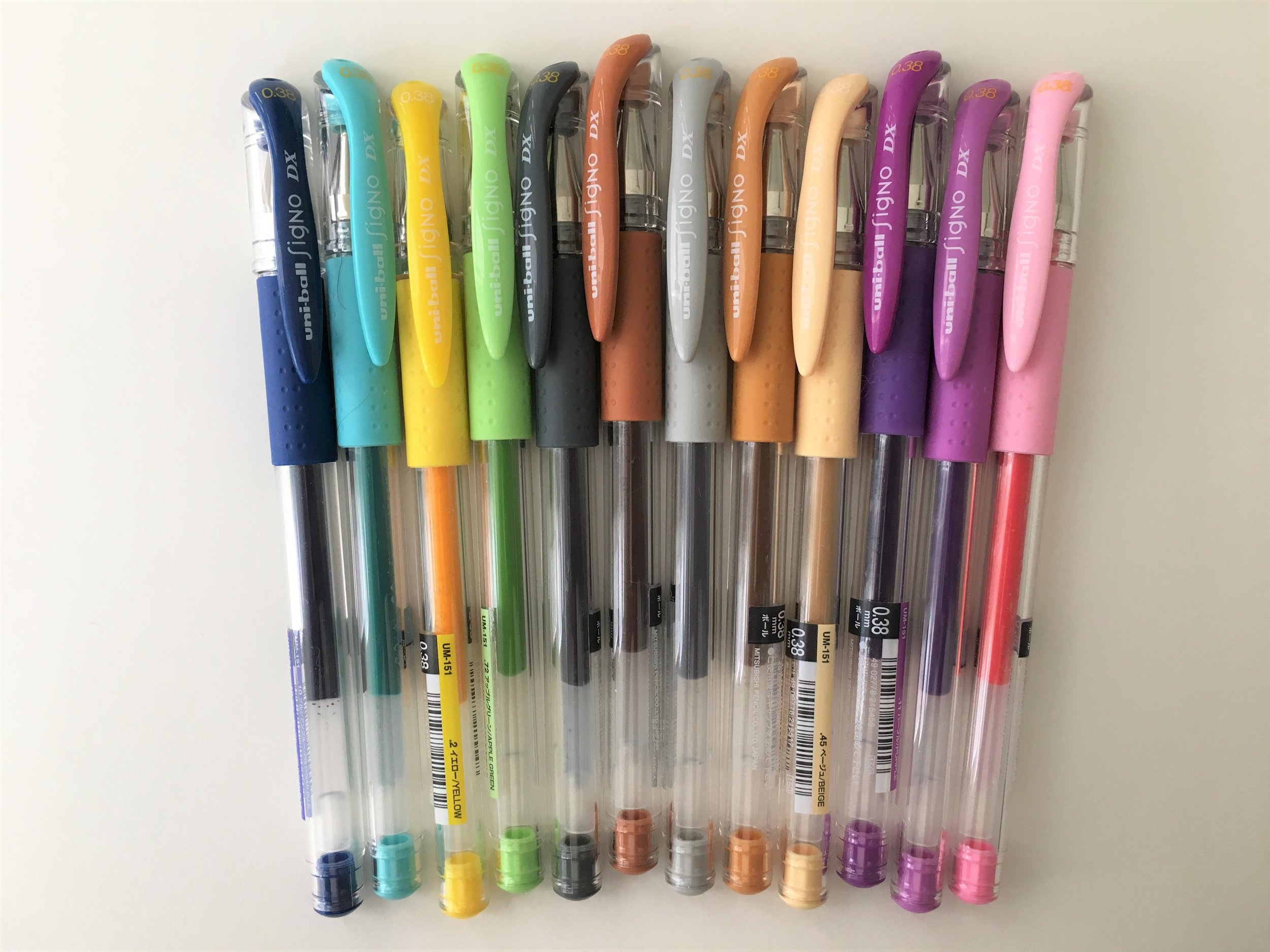
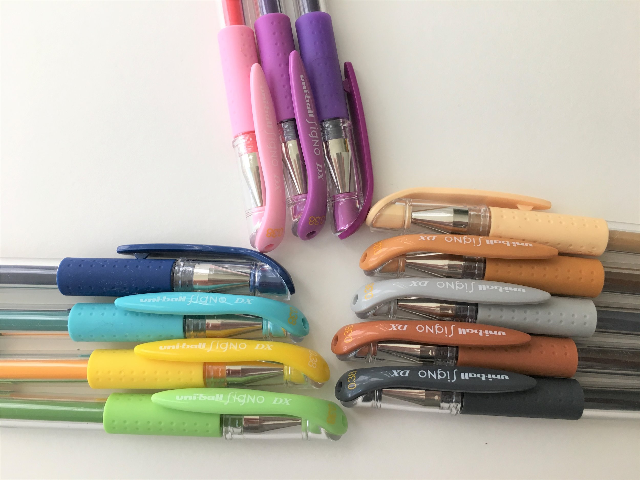
Prussian Blue is a beautiful (but totally office appropriate) bright navy color. It doesn't feel like the standard blue, but has a little extra zing to it.
Blue Green is a fresh aqua color, a necessity for any pen assortment.
Apple Green is an essential acid color. Despite its lightness, it is readable--which is good, because I want to use it forever.
Dark Grey may be my new favorite. It's classy and moody at the same time. In some lights, it almost has a blue-black quality to it.
Grey is pale, but readable, and almost silvery.
Purple is a spunky color—more like a Lisa Frank magenta shade than a true purple.
Lilac follows in purple's footsteps. It's bright and fun.
Light pink is neon cotton candy perfection.
Brown is more of a dark mustard color. Much more nuanced than the name implies.
Khaki is a rich caramel. It looks more like food than pants, to me.
Beige is a lovely creamy ivory. Difficult to see on white paper.
Yellow is a very bright shade. One that, if seen in nature, probably indicates neurotoxins.