Lamy Vista Ballpoint Review

(Jeff Abbott is a regular contributor at The Pen Addict. You can find more from Jeff online at Draft Evolution and Twitter.)

Back in 2012, I was just beginning to develop an interest in fountain pens and the plethora of options that come along with this versatile writing instrument. Toward the beginning of that slippery slope, the Lamy Vista fountain pen found its way to me. It wasn’t the first or second pen I bought, but it was definitely in the first five. That being said, the Vista has always had a special place in my collection.

Like so many of Lamy’s products, it’s available in several different versions. While the Lamy Vista fountain pen was my intro to this product, I recently picked up a ballpoint version. While my first thought is that the ballpoint pen is "less than" the fountain pen version, I soon realized that my assumption was way off-base. The Lamy Vista ballpoint is a fantastic ballpoint pen that echoes the quality feel of its fountain pen cousin.

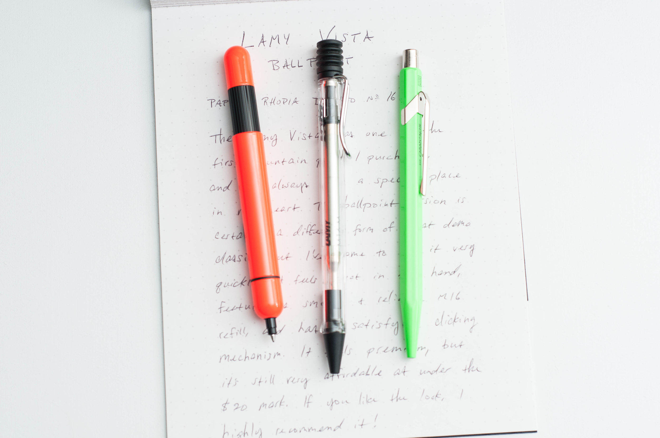
On the outside, the Vista ballpoint looks similar enough to the flagship fountain pen version, but there are some noticeable differences that pop out. For one, this is a retractable pen, so there is no cap. Instead, there’s a funny looking click mechanism on top that is covered by a soft, flexible rubbery material—and it’s so much fun to press. The nock mechanism has an incredibly satisfying sound, and the spring requires a decent amount of pressure to operate the click mechanism. You will not accidentally extend or retract this pen.

Like the Vista, Safari, and AL-Star pens, the Vista ballpoint also has a contoured grip section. While not as aggressive as the capped fountain pen variants, the finger positions are the same and will likely divide people based on opinions in the same way. I like the feel of the grip, but I use a "standard" three finger grip when writing. Your mileage may vary due to this opinionated design choice, but it’s nothing new for the brand.

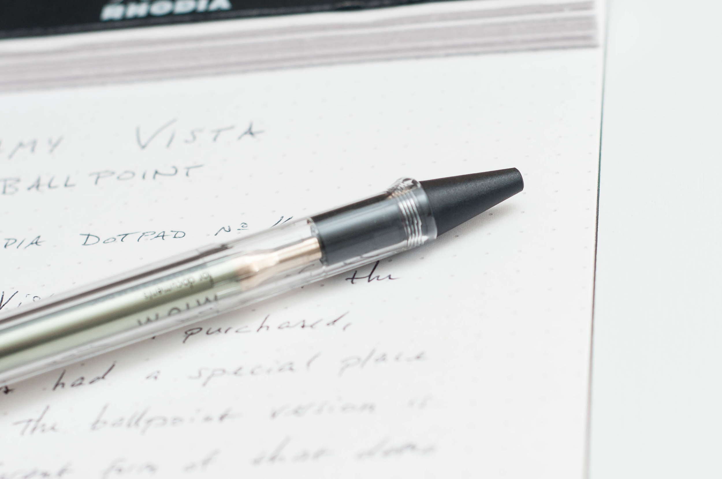
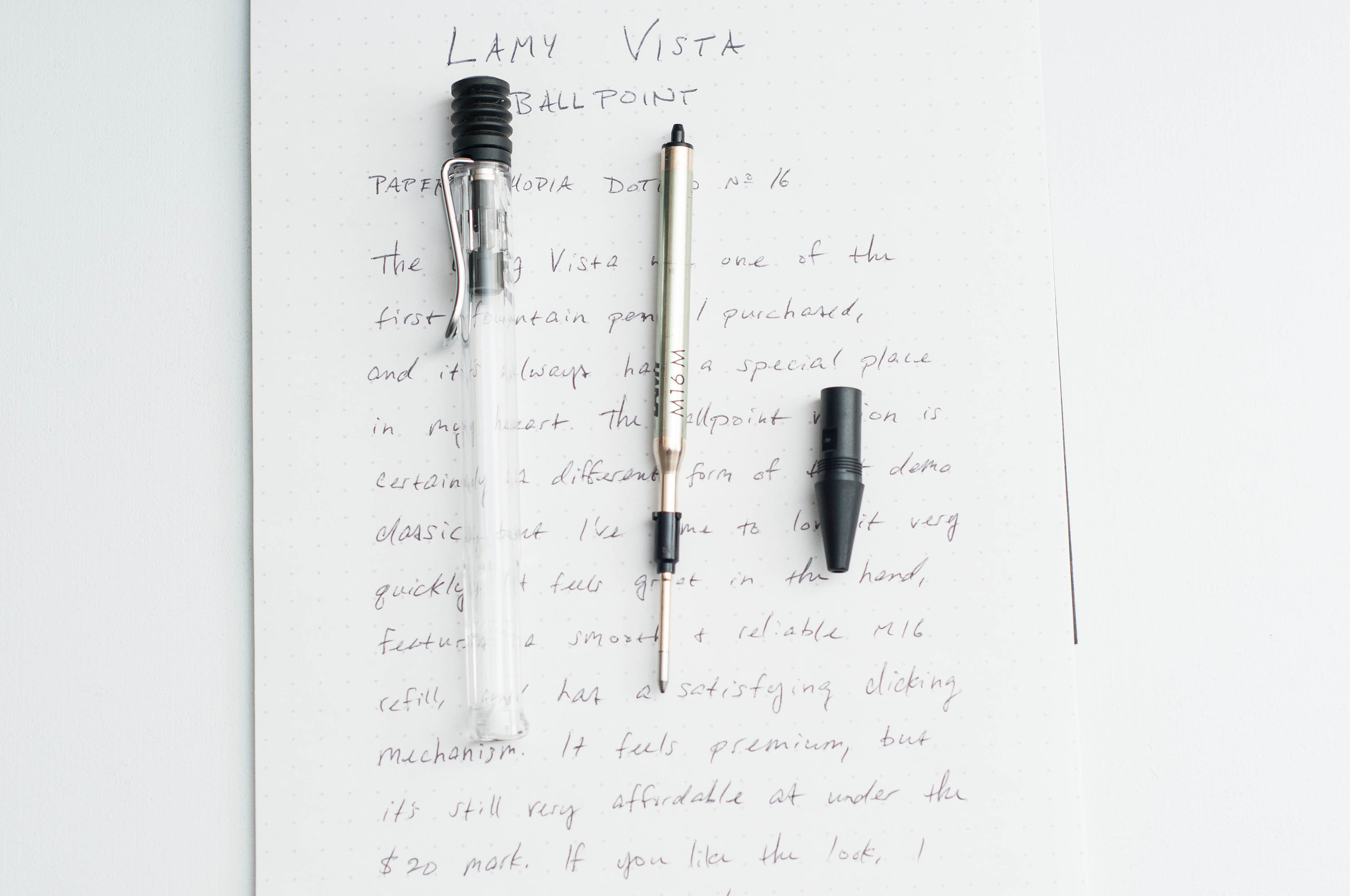
The clip on the ballpoint pen is a bit shorter and smaller than the capped version, but it’s still strong and useful. Finally, the tip of the pen unscrews to give you access to the refill. The only branding on the pen is on the barrel opposite the clip. The shiny "LAMY" logo is sometimes hard to see against the translucent barrel, but you can also see the branding on the refill inside.

So, how does this thing write? As far as ballpoint refills go, this one is great. I love the Lamy Pico as well, and this feels like the same refill, albeit just a bit shorter. It’s a smooth writer with just enough feedback to keep you informed of your pen strokes. The ink is dark and consistent. I haven’t had any issues with ink globbing up, skipping, or thinning out while writing. It’s a truly enjoyable ballpoint experience. I’d hope so since the refill is a quarter of the price of the pen!

Overall, the Lamy Vista is a stylish ballpoint pen that I’ve really enjoyed using. The translucent barrel is an eye-catcher, and the click mechanism is addictive. Throw an excellent refill on top, and you’ve got a great $20 pen. You can usually pick it up for a few bucks cheaper, though.

(Vanness Pens provided this product at no charge to The Pen Addict for review purposes.)


Enjoy reading The Pen Addict? Then consider becoming a member to receive additional weekly content, giveaways, and discounts in The Pen Addict shop. Plus, you support me and the site directly, for which I am very grateful.

Membership starts at just $5/month, with a discounted annual option available. To find out more about membership click here and join us!

Posted on April 11, 2018 and filed under Lamy, Ballpoint, Pen Reviews.

Sonic Toga Return Pencil Sharpener Giveaway

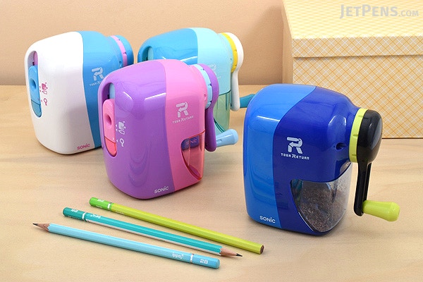
Image via JetPens

Japan makes the best stationery goods on the planet, and the Sonic Toga Return Pencil Sharpener is a prime example of their awesomeness. This is a fun and functional product that can’t help but put a smile on your face every time you use it. I’m giving one of these sharpeners away, and the winner will be able to pick any one of the four colors to adorn their desk.

Read the rules below, and enter away!

Posted on April 10, 2018 and filed under Sonic, Pencil Sharpener, Giveaways.

Architect Nib vs. Stub Nib

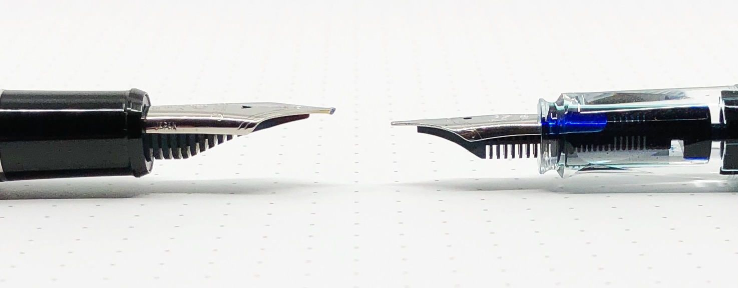
One of the most frequent questions I get asked at a pen show is “Do you have an architect nib grind I can test out?” I try to bring the one that I have, a Platinum 3776 broad nib modified into an architect nib by Dan Smith. I don’t always remember it, so I figured I would do a quick comparison between an architect nib and stub nib so you can see what this grind has to offer.

Let’s start with this: Pictures will never do an architect nib justice. It has a completely different feel when writing, more than even the sharpest cursive italic nib offers. It requires a consistent writing angle to reach its full effect, and no amount of practice is ever enough. It’s a commitment, as the ~$60 price tag for just the grind tells you.

Once you get it, it can be a complete blast to use. The line variance is enormous, and the exact opposite of what you get from a stub or cursive italic nib.

For this comparison, I put my TWSBI ECO-T with a stock 1.1 mm stub nib to the test. I figure it is a fairly normal stock stub nib to compare to that many people may have used. And as stated above, the architect grind was done on a broad Platinum 3776 nib for full effect. The more nib tipping for an architect grind for a nibmeister to work with, the better. Also, the more line variation you will have.

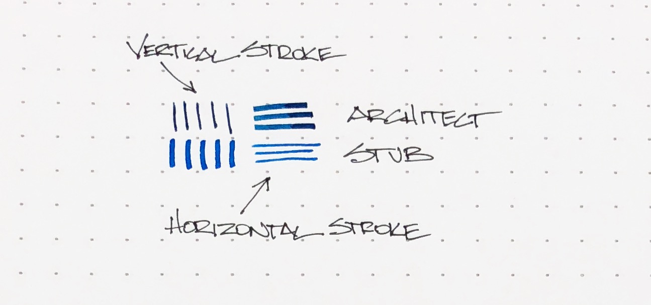
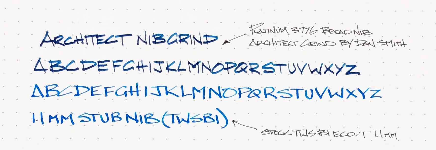
You can see in the picture above, the architect nib gives you thin vertical strokes and wide horizontal strokes. The stub nib is essentially the opposite, but with wider thin lines. When writing the alphabet, you can see how the line thicknesses caused by the shape of the nibs compare. Letters like E, F, and T with very defined, angular strokes show this variance. H may be my favorite.

I write with a blocky architecture style to begin with, so at a quick glance you may not notice a ton of difference. Rest assured, the feel of the nib is very different. I have to pay more attention with the architect nib, and force myself to slow down. The architect nib isn’t the best with curved shapes, and I would hesitate using it for cursive handwriting due to the angle of the nib. I’m sure it can be done, I’m just not sure how enjoyable it would be.

The architect nib is designed for sharp, straight lines, and that’s what it does best. The more letters I put down on the page, the more I notice the different effect this nib provides. As much as I love it and have fun with it when I use it, it is not an all day, every day writer for me. But, I’m glad I have it, and I’m glad to let you try it out whenever you see me at a pen show. I’ll make sure I have this pen with me, inked up and ready to write!


Enjoy reading The Pen Addict? Then consider becoming a member to receive additional weekly content, giveaways, and discounts in The Pen Addict shop. Plus, you support me and the site directly, for which I am very grateful.

Membership starts at just $5/month, with a discounted annual option available. To find out more about membership click here and join us!

Posted on April 9, 2018 and filed under Architect Nib, Pen Reviews.