The Making of “Pink Robots”

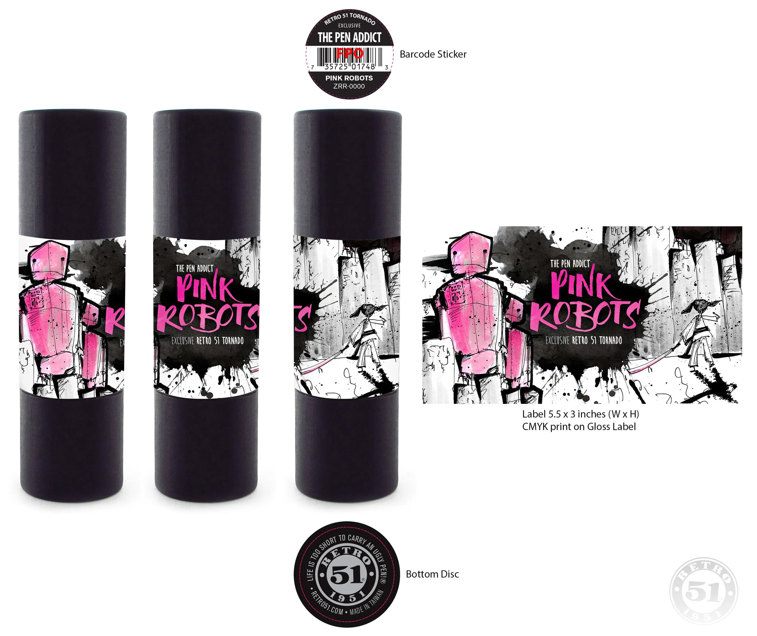
My latest limited edition pen design from Retro 51 has been released, and I couldn’t be more excited about it. Titled “Pink Robots”, this pen was a huge stretch for me, both personally and professionally.

I shared the story of its creation with Pen Addict Members over a month ago, and wanted to share it publicly today. I hope you enjoy.


When I decided to make my first Retro 51 two years ago I was a nervous wreck. I knew I wanted something basic, but with a few tweaks to make it different than the standard Retro 51 Tornado. Of course it was going to be orange, but what else could I do with it?

I worked with Retro 51 on that original design for weeks. Dozens of mock-up, tweaks, and changes. I was sweating this one hard! I had never done anything like this before, design-wise or money-wise.

Even the minimum order of 300 units had me completely freaked out. Could I sell all of these pens?

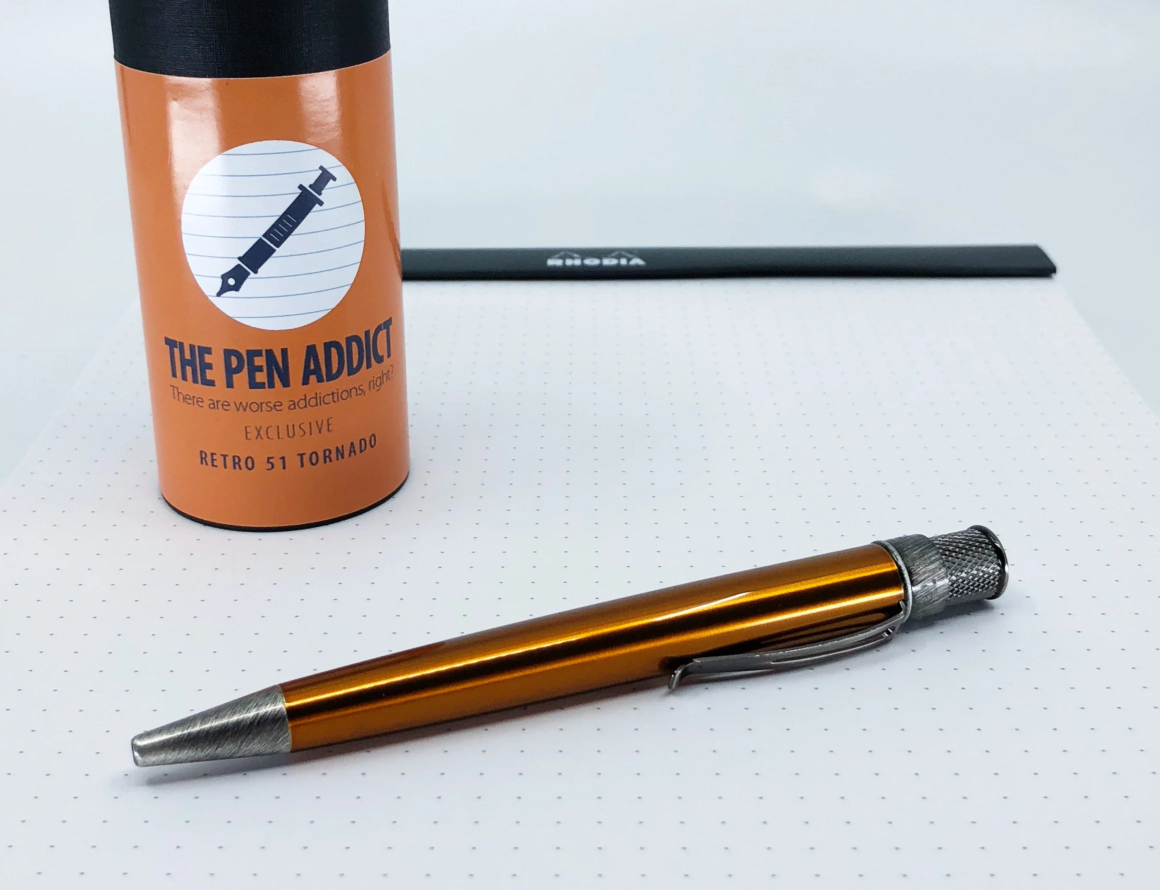
Turns out, I could. Fairly quickly I might add. The success of this project gave me the confidence to do more the next year.

I wanted to do something fun for round two, and that culminated in working with my friend Michael Jacobs and using his wonderful Ice-O-Metric design for the pen. It turned out amazingly well, and was everything I wanted it to be. It was cool and fun and a completely perfect design for a Retro 51 collaboration.

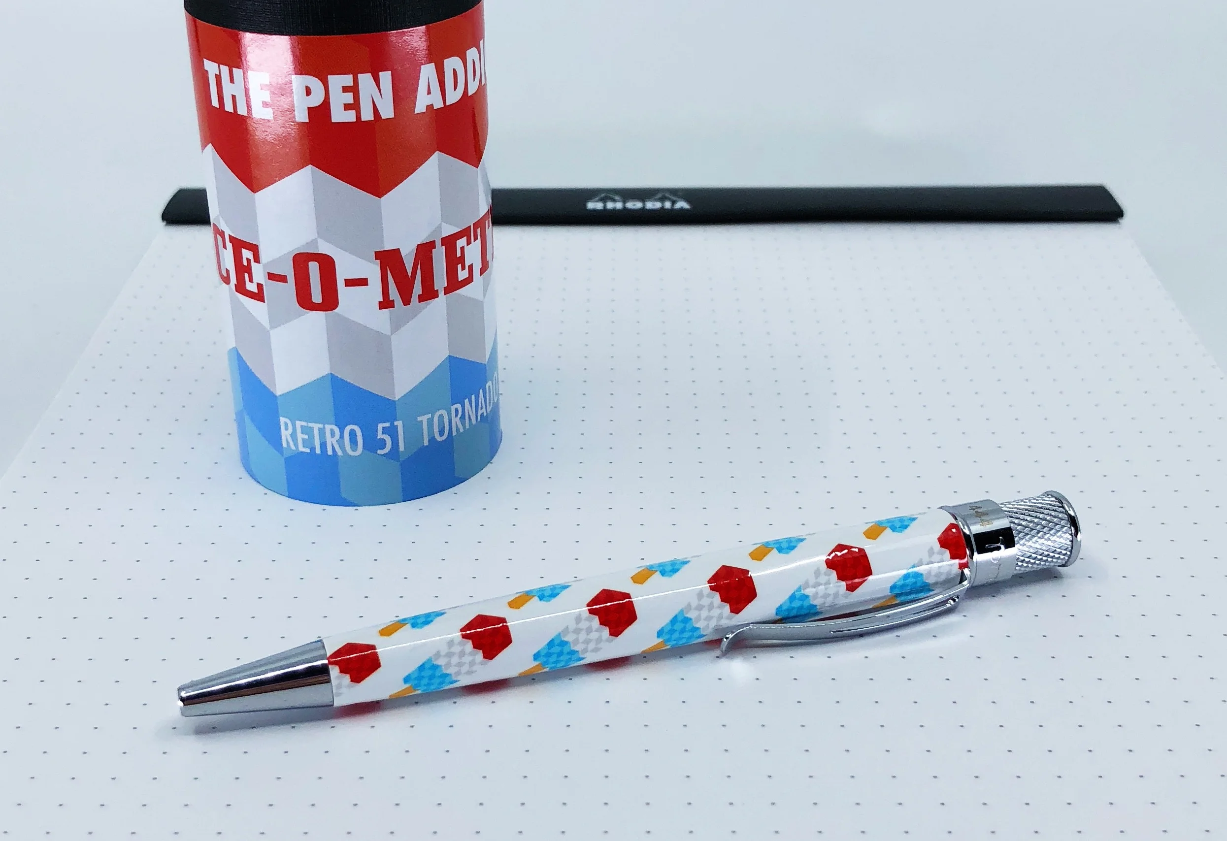
It was so perfect, in fact, that I doubled the amount of pens I ordered to 600. They sold well too, and as of this writing, there are less than 50 pens left for sale.

That leads us to the third iteration of the Pen Addict Retro 51, which I want to share with you today.

The first edition was basic, as I got my feet wet with the process of creating a pen design. The second edition was fun, as I believe all pens should be, and is a killer addition to any writing arsenal.

The third edition is personal.

Anyone who knows me knows I am a music fan. All of you members are probably like “Yes, Brad. We get it. You like the tunes!” I talk about it a lot, because it means a lot to me. And, over all of the years of my life, some music sticks with me more than the rest. It helps me to relax, to think more clearly, to get me through tough times, to pinpoint memories and places and things. At a basic level, it is entertainment. Other times, it is more.

To me, Yoshimi is more.

The Flaming Lips released “Yoshimi Battles the Pink Robots” in 2002 to great critical acclaim. If you’ve never heard of The Flaming Lips - much less any of their music - I wouldn’t be surprised. Their uniqueness is very much an acquired taste. It took me years to come around to them and their sound. “She Don’t Use Jelly” isn’t exactly representative of a band that has been making music for over 30 years.

Why I latched on to Yoshimi as a song at the time is still a mystery to me, but I felt something there. Who is Yoshimi? What is she all about? Why is she fighting the Pink Robots?

One of the great things about music is that the stories behind the lyrics are often nebulous. Flaming Lips frontman Wayne Coyne says the song is about fellow artist Yoshimi from a Japanese band called the Boredoms, because she sounds like she is fighting monsters when she sings. Many who listen to the album as a whole say it is about love. A decade after the album’s release, Coyne created an off-Broadway musical where Yoshimi is battling cancer, represented by Pink Robots.

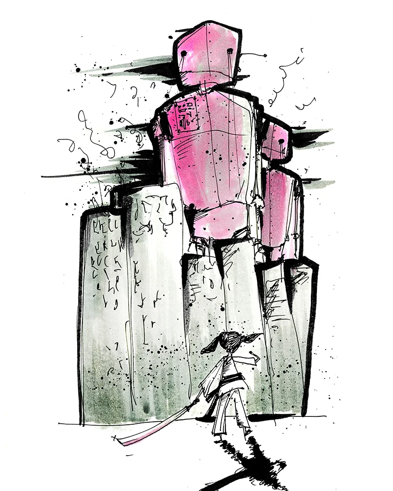
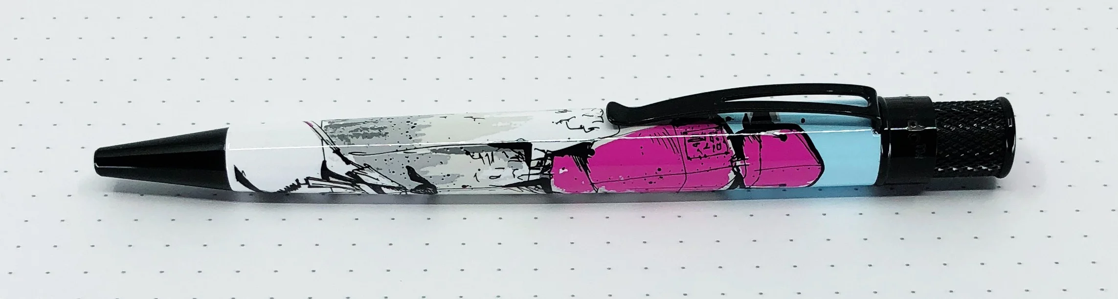
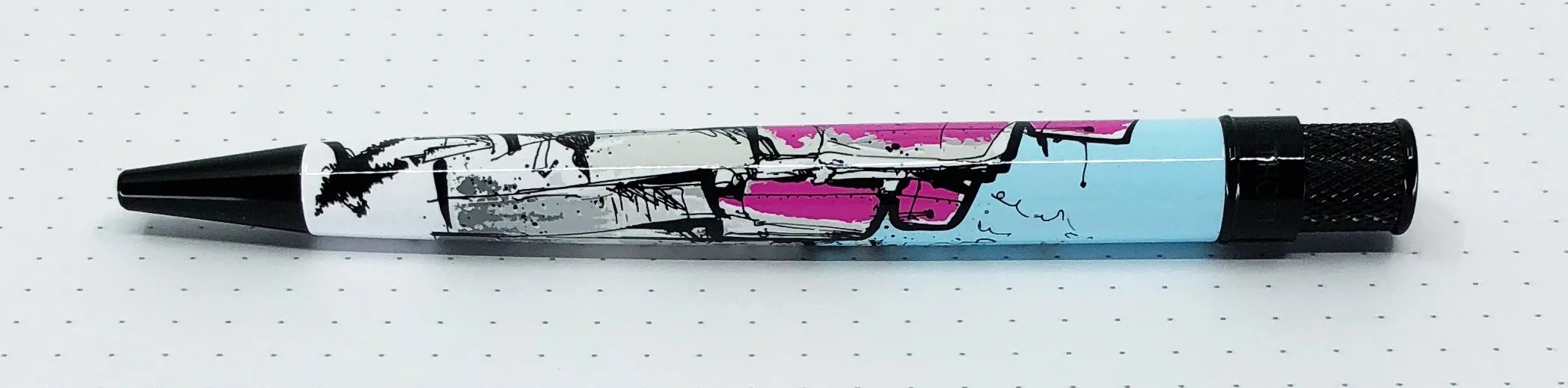
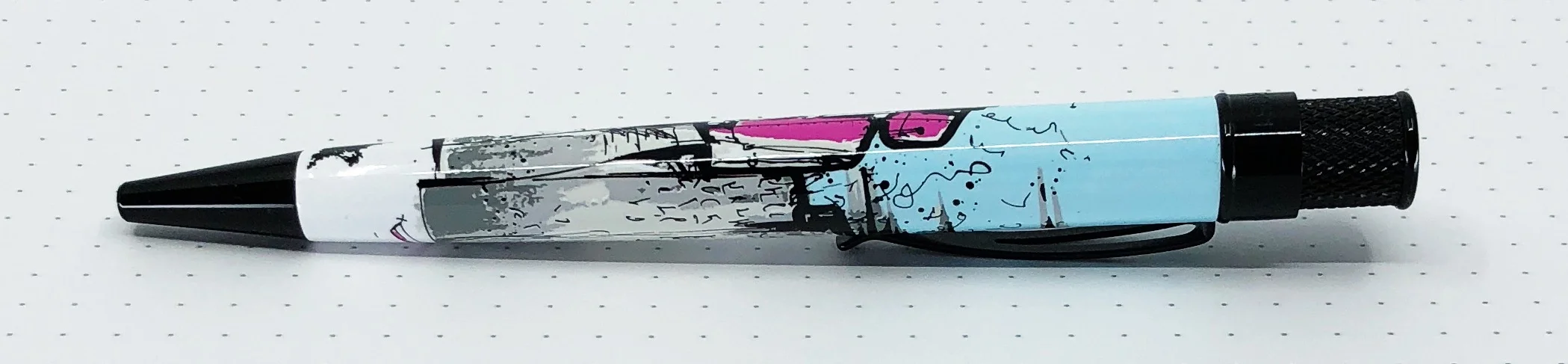
A few years ago, my friend Matthew Morse blindsided me with a piece of artwork he created. Titled “Go Yoshimi Go!”, it features Yoshimi, sword in hand, ready to stand her ground against the giant Pink Robots. It’s such a moving piece to me because Yoshimi is a hero who has the uncanny ability to stand up to whatever the Pink Robots represent to you. It could be your own personal fight against health issues. It could be depression, or anxiety. It could be oppression, or racism. It could be as simple as a college course whose ass you are about to kick. Yoshimi can be anything you need her to be.

And that’s why I love her, and need her in my life. She helps me through the tough times, through the daily fights and challenges that come my way. And now I can have her with me on a daily basis.

When I first approached Matthew to use his artwork for this pen, I was nervous. Not that he would say no - in fact he was all for it - but that I could pull off this project as a whole. Getting personal is rarely the best business decision. But, as you likely know by now, I never let business interfere with who I am as a person and what I stand for. I’m making this pen for me, if no one else.

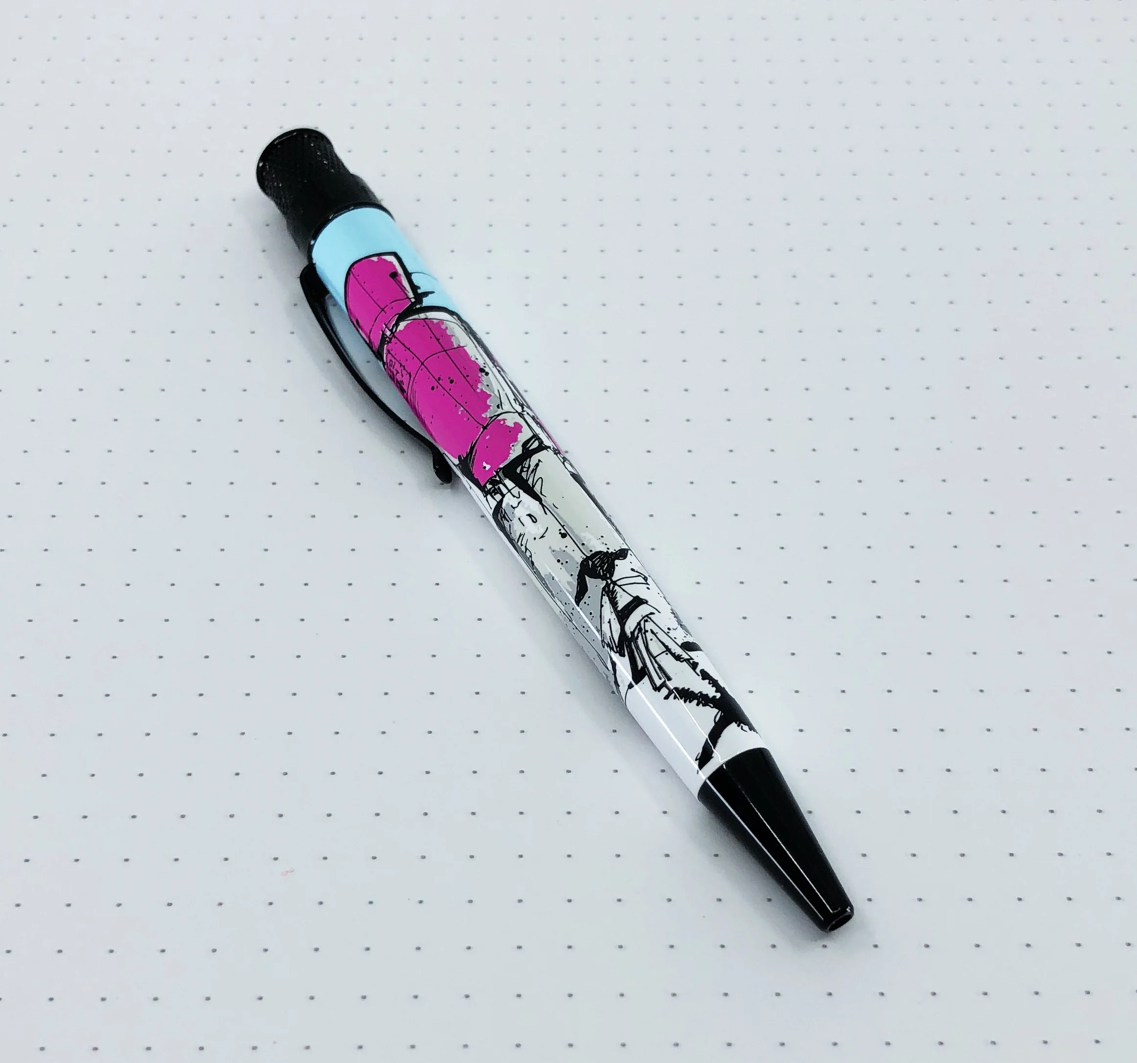
The end result came out wonderfully, and I can’t wait to share it with all of you. “Pink Robots” is slated to arrive in late September, and as Pen Addict members, you will get first crack at it. I’ll have more information on pricing and shipping as we get closer to release. (Note: The pen is available now to everyone.)

Thank you Matthew, for collaborating with me on this project, and thank you, amazing readers, for allowing me to share my story with you.

Posted on October 12, 2018 and filed under Retro 51.

illo Sketchbook Review

(Sarah Read is an author, editor, yarn artist, and pen/paper/ink addict. You can find more about her at her website and on Twitter.)

I could tell as soon as I opened the packaging that the illo Sketchbook was pretty snazzy. Far too snazzy for my poor art skills. Fortunately, I live with a talented artist who was willing to put this book through thorough tests.

The sketchbook has a hard cover with a faux leather feel and the brand name subtly debossed on it. The color is a charcoal gray, which looks nice with the silky blue bookmark ribbon. There is an elastic band closure and a pocket in the back to hold any loose scraps of paper.

The sketchbook comes in two sizes: 8 x 8 or 10 x 10--both are square, designed to allow easy posting to apps like Instagram without having to crop anything out of the picture.

The binding is sewn and it lies perfectly flat with no training or spine-bending necessary. Even the first few pages lie flat right out of the package. I've seen some very fancy notebooks fail that test, so I was quite impressed with the binding.

There are 112 pages of 122 lb/180 gsm super white paper. The paper is not acid free, so I would hesitate to recommend it for professional artists, but it should be fine for student artists, especially if they'd be practicing with a wide variety of media.

This paper did well with pencil, colored pencil, markers, and one of the heaviest applications of paint I've seen in a while. The thick paper didn't even flinch, even when black paint was spread all across the back page of an illustration with a light blue watercolor wash. From the front, the peaceful island bird has no idea that one page over lies the deep black of space and the burning inferno of our sun.

The paper is coated, so there may be some longer dry time for wet media, and powdery pigments may smear a bit if you're not careful. The product is aimed at students who may need that versatility in function, rather than an artist who specializes in one form of media and needs paper that's engineered to that specific purpose.

And the price is aimed at students, too. The 8 x 8 notebook is only $16.75, and the 10 x 10 is $24.99. There are less expensive sketchbooks, but illo wanted to provide top quality at a reasonable price, and I think they've come pretty close. If the paper was acid-free, I'd be recommending it for everyone--I think that's an oversight on their part. But the build is very good and the versatility is great. I think it will continue to hold up to my resident artist's abuses and it will make a nice keepsake to showcase his fabulous talent.

(illo Sketchbook provided this product at no charge to The Pen Addict for review purposes.)


Enjoy reading The Pen Addict? Then consider becoming a member to receive additional weekly content, giveaways, and discounts in The Pen Addict shop. Plus, you support me and the site directly, for which I am very grateful.

Membership starts at just $5/month, with a discounted annual option available. To find out more about membership click here and join us!

Posted on October 11, 2018 and filed under illo, Sketchbook, Notebook Reviews.

Pentel EnerGel Permanent Gel Ink 0.5mm

(Jeff Abbott is a regular contributor at The Pen Addict. You can find more from Jeff online at Draft Evolution and Twitter.)

The Pentel EnerGel line of pens has been around for quite some time and enjoys a healthy level of popularity due to how easy they are to find in big box stores. They're known for the dark, rich line that the gel lays down, and there's good reason that many people swear by them.

If the EnerGel is already so good, how can you improve it? Well, one way is to offer a variant of the pen that provides waterproof and fade-resistant gel ink. That's exactly what the Pentel EnerGel Permanent Gel pen sets out to do.

On the outside, the permanent ink version of this pen looks exactly like a normal EnerGel, minus the slight accent color variations. The click mechanism is the same, the grip section is the same, and the clip is the same. As an added bonus, the barrel is made up of 54% recycled material.

When writing with this pen, it's easy to compare it to the normal EnerGel since it shares the same product name. But since this variant features a new ink formula, it doesn't write exactly like its older sibling. It's still a smooth feel with plenty of ink flow, and the colors are bright and pleasing. The ink delivery is consistent and there aren't any issues with skipping. The pen itself is quite light, so it's easy to hold and manipulate on the page.

Where it differs is hard to put your finger on at first, but it comes down to the different ink formula. It looks and acts like a regular EnerGel, but the ink color and line isn't quite as bold and sharp. In both the black and blue pens, I sometimes noticed a small amount of railroading in the line, which I've never experienced with the standard EnerGel pens, regardless of tip size.

By no means am I saying that this pen doesn't write well — not at all. It's a great pen that writes well, dries fast, and leaves you with the assurance that it's as permanent as ink can be. The difference here is that it just isn't as nice to use as the standard EnerGel pen, which is already a tall order.

The waterproof nature of this ink is no joke. I tried several different paper types and patterns for this example, hoping that one would show up well in photographs. The ink is so resilient to water that it's almost impossible to capture with a camera. Let's just suffice it so say that the only way you can tell water was added to the page is due to the rippled texture of the paper where the water evaporated. The ink is completely unaffected by the water.

There are many waterproof or archival quality pens available on the market today, and they all have some kind of trade off. They may not write as well as your favorite pen, they normally aren't offered with many colors or other options we're used to, but they fulfill a very specific purpose. In the case of the Pentel EnerGel Permanent Gel pen, it excels at hitting the mark.

The Pentel EnerGel Permanent Gel pen is available in 0.5mm and 0.7mm tip sizes with an option of Black, Blue, or Red in both sizes. At just under $3, they're a great deal considering the specific purpose. If you need a waterproof ink, this pen should be on your list!

(JetPens provided this product at no charge to The Pen Addict for review purposes.)


Enjoy reading The Pen Addict? Then consider becoming a member to receive additional weekly content, giveaways, and discounts in The Pen Addict shop. Plus, you support me and the site directly, for which I am very grateful.

Membership starts at just $5/month, with a discounted annual option available. To find out more about membership click here and join us!

Posted on October 10, 2018 and filed under Pentel, Energel, Pen Reviews.