Posts filed under Ink Reviews

Colorverse Extra Dimension & Warped Passages Ink Review

(Jeff Abbott is a regular contributor at The Pen Addict. You can find more from Jeff online at Draft Evolution and Twitter.)

It seems like it's only been a couple of years since the Colorverse ink brand exploded onto the stationery scene, along with their break-neck pace for releasing gorgeous space-themed inks. I've always wanted to collect all the various ink colors they sell for all the reasons Colorverse make them: They're beautiful colors and they are all based on real scientific concepts and space exploration. It's a dream come true.

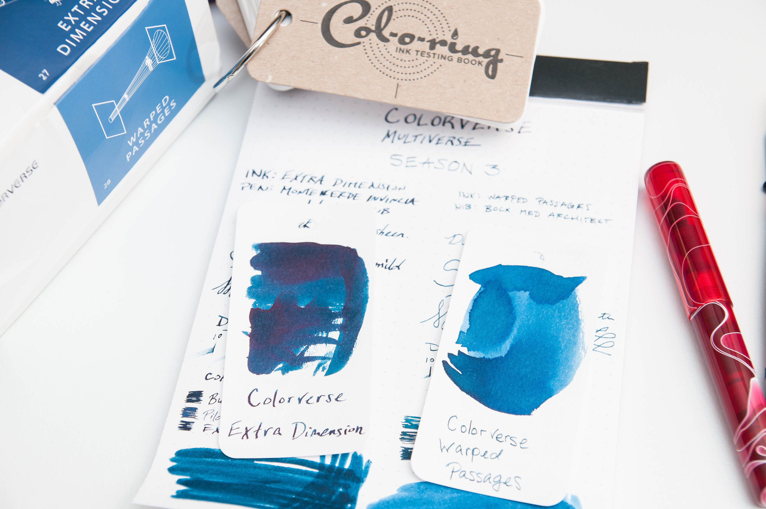
Alas, there are far too many inks in the line to purchase them all. But one of the latest batches I've tried out is the Extra Dimension & Warped Passages set. This set contains a large bottle (65 ml) of Extra Dimension and a small bottle (15 ml) of Warped Passages. These colors are both beautiful blues at different ends of the spectrum. Extra Dimension is a dark, almost black, blue, while Warped Passages is a light, dusty denim. The multiverse series are based on concepts of harmony and symmetry, so it only makes sense that these two colors compliment each other so well.

Before going into the behavior and individual characteristics of these inks, I'll start by saying that they both behave very well. The flow is just right, I haven't had any issues with nibs drying out or flow problems after a while of non-use. Cleaning out pens is easy, and I haven't noticed any adverse effects. Like Colorverse claim, these inks are gentle on your pens, and I can attest to that fact.

Starting with Extra Dimension, there are depths to this color that unfold with the right nib. It's largely a blue-black ink with a fair amount of shading, but you can also detect some red sheen in certain light if you put down enough ink. I absolutely love red sheen in blue inks, and the subtle change in color is splendid after the ink dries.

Along with the blue-black qualities, you can also pick out some green/teal if the ink is spread out enough. Personally, I wish more of this hue was visible under normal writing conditions. You can really only see it clearly when swapping lots of ink. Perhaps with the right nib, this color would shine.

Dry time is a bit lengthy with this ink, but it isn't excessive. Somewhere between 18 and 24 seconds seems to be the magic time. Don't let the dry time deter you from picking up this ink unless that's a hard requirement for you.

Warped Passages is a color that made me unsure for the first few minutes of use. It's pale, dusty, and unassuming. But when you really look at the depth of the color and (especially) compare it alongside Extra Dimension, this color takes on a whole new quality. Under normal writing circumstances, this feels like a medium blue with great shading qualities. In the bits of shade, you can pick out hints of green, just like the Extra Dimension ink. These hints of green in both inks really delight me, and I'm not sure I'll ever use one of these inks without the other. They beg to be used together.

While this dusty blue is lighter than its larger sibling, it's still a medium blue that suits office environments well. It shades nicely, giving it a lot of visual interest on the page. I see this ink easily becoming one of my favorites. It's just a shame the bottle is so small!

These, again, are two different inks. Extra Dimension is the larger of the two, coming in at 65 ml. Warped Passages is only 15 ml, which is similar to a few sample vials. Unfortunately, you can't purchase these inks individually. They're meant to be a complimentary set, and I can't agree more. I just wish the two bottles were the same size!

(JetPens provided this product at no charge to The Pen Addict for review purposes.)


Enjoy reading The Pen Addict? Then consider becoming a member to receive additional weekly content, giveaways, and discounts in The Pen Addict shop. Plus, you support me and the site directly, for which I am very grateful.

Membership starts at just $5/month, with a discounted annual option available. To find out more about membership click here and join us!

Posted on January 30, 2019 and filed under Colorverse, Ink Reviews.

Robert Oster Honey Bee Ink Review

2018 was an ink desert for me. The inky landscape exploded, and I was overwhelmed. That feeling made me slow way, way down on ink acquisitions, but in 2019 I am getting back into the ink game. I am interested in testing out new colors and types of inks, and, primarily, things outside of my wheelhouse. It’s time for me to mix it up!

While Robert Oster Honey Bee wouldn’t be considered a stretch for many people, this is not a color normally found on my ink shelf. I’ve had similar shades pass through some of my pens for a single fill here and there, but nothing I’ve been committed to using on the regular. I think Honey Bee might change that.

If you look closely at the online samples you will see a lot of the orange that drew me in to choosing it, but in actual use, you see more of the brown and yellow that you would expect from an ink called Honey Bee.

With my new focus on inks, I will also need to use wider nibs to really see what the inks are all about. My blue black, orange, and turquoise inks work well in my favorite extra fine nibs, but to see what an ink like Honey Bee is all about, I need to break out the stubs. Plus, I jumped at the chance to go matchy-matchy with my beautiful Stylo-Art Kinpaku and Pilot SU nib. Swoon indeed.

On the page, Honey Bee reminds me of the color of raw honeycomb. It has light browns and deep yellows and golds. It’s almost more of a light caramel, blonde roast coffee color. And I like it. I’m getting a good amount of shading too, which is what I want from my inks more than anything. The shading characteristic is not something a gel or rollerball ink pen can output on to the page.

Like some of my other favorite inks (Sailor, Pilot, Diamine, etc.) Robert Oster inks always perform well, and Honey Bee is no exception. It is the perfect combination of flow, wetness, lubrication, and saturation. It’s right in the middle across the board, and that is what I want in an every day writing ink.

Choosing an ink is always a challenge. Over the years, I’ve learned what I liked, and resisted branching out to try new things. That could mean a new brand, a new category, or even, like Honey Bee, something as simple as a new color. I’m going to keep experimenting, and when I find something interesting, you can bet I will be sharing it with you.

(JetPens provided this product at no charge to The Pen Addict for review purposes.)


Enjoy reading The Pen Addict? Then consider becoming a member to receive additional weekly content, giveaways, and discounts in The Pen Addict shop. Plus, you support me and the site directly, for which I am very grateful.

Membership starts at just $5/month, with a discounted annual option available. To find out more about membership click here and join us!

Posted on January 14, 2019 and filed under Robert Oster, Ink Reviews.

Cult Pens + Diamine Maureen and Robert Iridescink Review

(Note: I'm not sure I've had a harder time accurately capturing two ink colors than these. It was challenging, and I'm still not happy with the results. No matter the lighting setup, I never fet I did them justice. YMMV.)

Over the past year or two I have taken a passive stance on two of the most popular ink trends: Shimmer and sheen. While I have admired them from afar, I haven’t wanted to use them myself. I’m not a big risk taker when it comes to fountain pen inks, although the siren’s call of their results on the page is breaking me down.

If I am going to head down one of these two shiny paths, sheen seems to be more my thing. And when I saw the first pictures of the new collaboration from Cult Pens and Diamine, I knew I was done for. Maureen and Robert are the ones for me.

Just look at the stock pictures and you will see why I am so enamored. The purple ink of Robert has a beautiful greenish-gold sheen, and Maureen’s deep and saturated blue ink pops with red. And these are not passive, slightly on the edge of the line, sheens. They are full-bore, 50-75% coverage sheens, if not more.

The kicker with these inks is do you like this type of effect when writing? Some people live for it. Others can do without. Big sheening inks have never been a priority for me because of my use of primarily extra fine nibs. Finer lines inherently don’t show off the ink properties as well, but Maureen and Robert are here to change my mind.

I inked up Maureen in my Pelikan M805 Ocean Swirl with an EF nib. This nib is essentially a Japanese Broad in line width, so I knew it would show off most of the ink properties, and it did. This is a rich, saturated blue, and I immediately though of Parker Penman Sapphire. Maureen may be a shade darker, but the way this ink behaves is awfully similar.

Robert was put into use in my Pilot Falcon. I purposely chose this soft fine nib to see how the ink would perform, and I have to say, it’s better than I thought. It may be the two nib choices, but I assumed I would prefer Maureen over Robert. I assumed incorrectly, as I’m enjoying the purple and green sheen out of the Falcon nib more.

To get the full effect of the sheen, you need to use a coated paper - like Rhodia - or the magic capabilities of Tomoe River. Basically, a paper where the ink takes longer to dry than is sometimes acceptable. That is the tradeoff to get the beautiful sheen of these inks to pop. Using them on a faster-drying paper like Leuchtturm deprives you of the main feature of these inks.

Swabs on Tomoe in a lightbox

With specialty inks like this, my main concern is: “Will I be able to use these for more than special occasions?” For Maureen and Robert, undoubtedly yes. I’ve enjoyed general every day writing with them, but I do make sure to use Rhodia for the most part. When I’ve used them on my favorite Nock and Studio Neat notebooks I haven’t enjoyed them nearly as much. I think you may even be able to get away with these in an office environment - if you bring your own paper.

Finally, and as I mentioned on the podcast recently, I have a soft spot for fun names, and fun stories about how they came to be. Fountain pen inks named Maureen and Robert? Sign me up!

There are many factors to consider when making a buying decision, and these inks tick all of my boxes. They are fun, functional, innovative, and have a great story behind them. They are also priced well, at £9.50 in the UK, or approximately $10.50 per 80ml bottle, minus the VAT. Big thanks to Cult Pens for send these my way for review.

(Cult Pens provided this product at no charge to The Pen Addict for review purposes.)


Enjoy reading The Pen Addict? Then consider becoming a member to receive additional weekly content, giveaways, and discounts in The Pen Addict shop. Plus, you support me and the site directly, for which I am very grateful.

Membership starts at just $5/month, with a discounted annual option available. To find out more about membership click here and join us!

Posted on October 22, 2018 and filed under Diamine, Ink Reviews.