March Sponsor Spotlight

Image via Pen Chalet

Sponsor support is very important to me here at The Pen Addict. My sidebar advertisers put their faith in me to deliver good value for them month in and month out, and I want to shine the light on the best of the best for you. If you are shopping for pens, paper, inks, and more, please check out these great companies and see what they have to offer. Some recent highlights:

JetPens has the brand new Lamy AL-Bronze lineup in stock, which includes the fountain pen, rollerball, and ink bottles and cartridges.

Pen Chalet launched the new Pelikan Edelstein Star Ruby Ink of the Year edition, and has several bottles of previous years releases as well.

Goldspot has all of the latest styles from Leonardo Officina, including bright spring colors like Hawaii Blue and Yellow Sun.

Anderson Pens has one of the best vintage and slightly used pen marketplaces online. A quick look at their New Arrivals shows products as varied as Pilot Vanishing Point Limited Editions to vintage Parker Jotters.

Posted on April 1, 2019 and filed under Sponsors.

Robert Oster Blue Water Ice Ink Review

My most used ink color list looks something like this:

  1. Blue Black
  2. Orange
  3. Bright Blue
  4. Purple
  5. Bright Green

Blue Black ink goes in any every day writing pen and nib combination. Stock Fine Japanese nibs for example. The same goes for Orange, although it will find its way into finer nibs more often than Blue Black. Bright Blues, on the other hand, tend to find their way into the extreme ends of the nib spectrum. XXF, UEF, and PO on the fine side, and big stubs on the broad side. I almost never use them in the middle range of nib sizes.

Why is that? Bright Blues offer the perfect amount of character and readability for the nibs I use them in. Blue Black inks are arguably more readable on the micro side of the ledger, but will lose their character when the line is that fine. Conversely, they are a bit boring on the wide end. There are inky exceptions, of course, but in general terms I find this to be the case.

Orange inks look cool in micro nib sizes, but they are more difficult to read. Wide nibs tend to show off their brightness, but they often lack the big shading and sheening characteristics that other colors have.

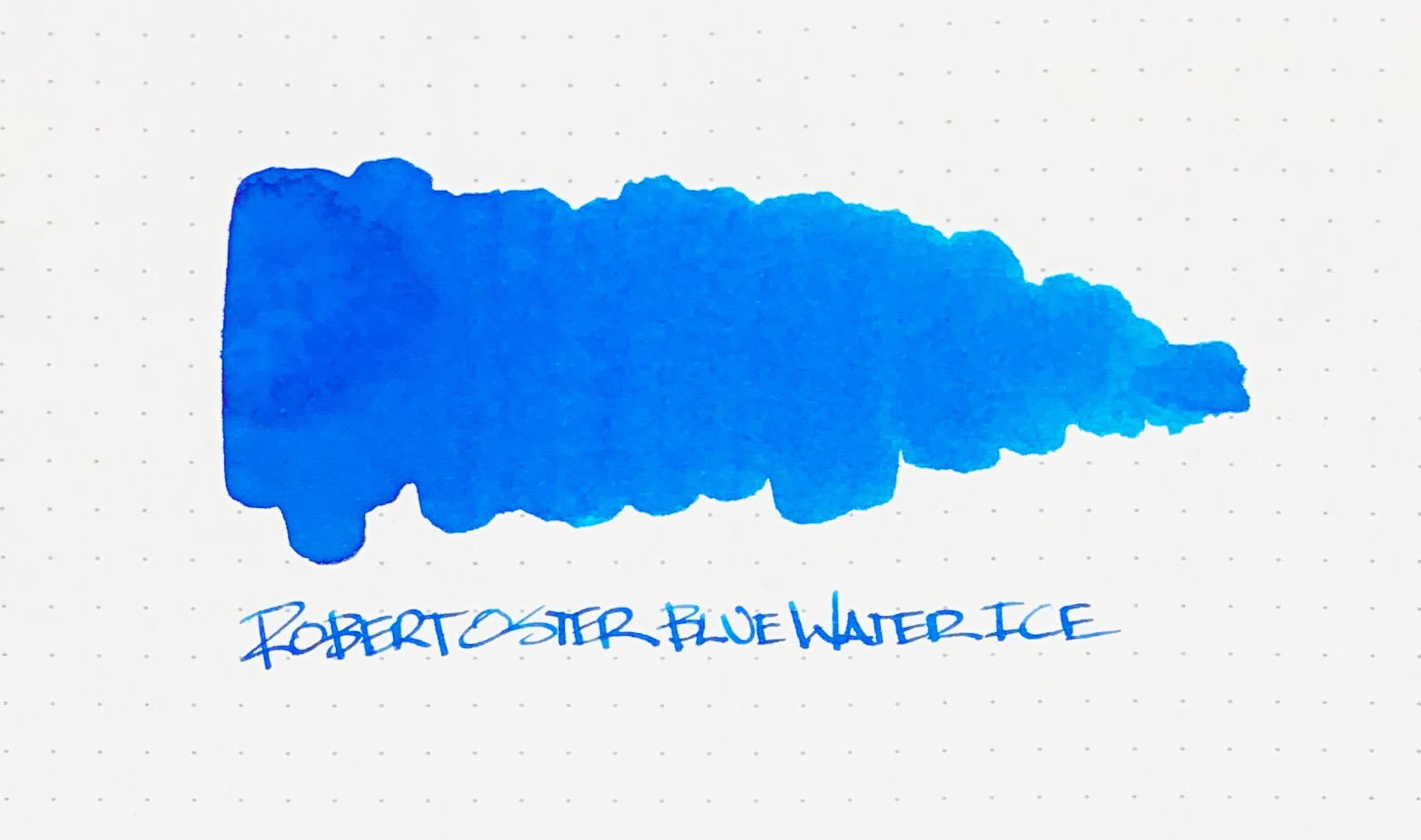
Bright Blues, like Robert Oster Blue Water Ice, are my favorite in nibs that aren’t covered by Blue Black and Orange. For this review, I used my Pelikan M805 Demonstrator with a Medium nib modified to a stub by Dan Smith. As wide as stock Pelikan nibs already are, this made the line somewhere around a 1.0 mm stub, which shows off the characteristics of Blue Water Ice wonderfully.

This is a moderately shading and light sheening ink. There is good color variation within the line, and the edges show off a bit of red sheen that stands out the more characters there are on the page. In pictures and swabs I thought it would be similar to Pilot Iroshizuku Kon-Peki and Sailor Sky High, but in use it is lighter and greener, despite what my premier photography skills show in these images.

Because of that lightness, it is the perfect stub nib Bright Blue ink. It would be difficult for me to choose Blue Water Ice over Kon-Peki, for example, in something like my Pilot Custom Heritage 912 with PO nib. It would work just fine, but it wouldn’t be the best experience for me.

And that’s what fountain pen inks are for me: An experience. Finding that perfect match of ink color, nib, pen, and paper is something all of us fountain pen fans strive towards. That’s why we obsess over the little things, such as one ink being perfect for a fine nib, but not necessarily a medium nib. That’s why when we find that combination we go to it over and over again. And that’s what I find so fun about this crazy little hobby of ours.

(I'm fairly certain I bought this ink from Vanness Pens at a pen show in 2018 but I honestly can't recall the specifics. Maybe I got it for free.)


Enjoy reading The Pen Addict? Then consider becoming a member to receive additional weekly content, giveaways, and discounts in The Pen Addict shop. Plus, you support me and the site directly, for which I am very grateful.

Membership starts at just $5/month, with a discounted annual option available. To find out more about membership click here and join us!

Posted on April 1, 2019 and filed under Robert Oster, Ink Reviews.

Misfill, Indiana Jones Edition

Each week in Refill, the Pen Addict Members newsletter, I publish Ink Links as part of the additional content you receive for being a member. And each week, after 10 to 15 links, plus my added commentary on each, I'm left with many great items I want to share. Enter Misfill. Here are this weeks links:

Art world Indiana Jones finds lost Picasso after 20 years of searching (It's Nice That)

Krishna Lyrebird Blue Black (Inkdependence!)

The Passport Index 2019 (Passport Index)

Tracing her Lineage (Connect Savannah)

Colorverse Morning Star (by STALÓWKA)

How I Use My Notebooks: Running Planner (Writing at Large)

Poluma Dot grid Bullet Journal (Comfortable Shoes Studio)

Caran d'Ache Amazon Ink (Gourmet Pens)

Minimal Travel Packing List: 2 Years Living Out of One Bag (Carryology)

Notebook Review: NAVA Design Haiku Notes - A5 Notebook (The Well-Appointed Desk)

Samantha Brown's Favorite Carry-on Essentials (Travel + Leisure)

Field Notes: Instagram Polls (Part 2 - Spring Editions) (Three Staples)

Saying Goodbye: Sometimes It’s Not That Hard (Fountain Pen Quest)

First Impressions: Pineider Arco Collection Limited Edition with 14k "Quill" Nib (The Gentleman Stationer)

Artist Kailash Babu carves works of art out of pencil tips (The Hindu)

The code (José Naranja)

Flex Nibs Part 1: Defining Flex (Pen Thoughts)

Review: Papier Plume Bayou Nightfall (Alt. Haven)

Amazon Basics No.2 HB Pencil (Write eXperience)

I tried bullet journaling for a month (ABC News)

Want to catch the rest, plus extra articles, reviews, commentary, discounts, and more? Try out a Pen Addict Membership for only $5 per month!

Posted on March 31, 2019 and filed under Misfill.