The Pen Addict Podcast: Episode 389 - I Like Lists

I’m not gonna lie - I’m surprised Myke did it. And I’m so glad that he did! I loved going through his desk list, and could have interrupted him about 100 more times than I already did. We also discussed my Top 10 Stationery Products of the Decade, and took a peek at another new Rotring for 2020.

Show Notes & Download Links

This episode of The Pen Addict is sponsored by:

Squarespace: Make your next move. Enter offer code PENADDICT at checkout to get 10% off your first purchase.

Harry's: Quality shaving and grooming products, at a fair price.

Posted on December 13, 2019 and filed under Podcast.

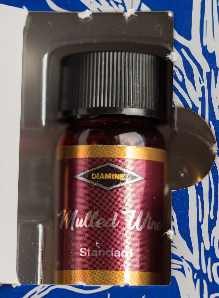
Diamine Inkvent Calendar Day 13

(Susan M. Pigott is a fountain pen collector, pen and paperholic, photographer, and professor. You can find more from Susan on her blog Scribalishess.)

The holiday season is usually a time when we come together to enjoy hot beverages--at least in the northern hemisphere. Obviously, hot chocolate comes to mind. But there are more “adult” beverages as well, such as mulled wine. I’ve never tasted this particular holiday drink, but red wine simmered with cloves, cinnamon, spices, and cider sounds tantalizing.

Diamine’s Mulled Wine ink isn’t tasty, but it does evoke the beverage with a dark burgundy hue. This is a standard ink, so it doesn’t have any sheen or shimmer, but it has a tiny bit of shading if you use a flex nib.

Mulled Wine is a bit darker and has a bluer cast to it compared to yesterday’s ink, Noel. Plus it’s a standard ink whereas Noel contains sheen. The two inks are otherwise quite similar. If you prefer a burgundy ink without sheen, then you’ll definitely like Mulled Wine.

I’m not sure why Diamine chose to put two very similar inks on successive days in the calendar. It’s not a big issue, especially if you like red inks, but these two inks are so close in hue, you’d think they would have put one or the other elsewhere in the lineup.

(Cult Pens provided the Diamine Inkvent Calendar to Pen Addict free of charge for review purposes.)


Enjoy reading The Pen Addict? Then consider becoming a member to receive additional weekly content, giveaways, and discounts in The Pen Addict shop. Plus, you support me and the site directly, for which I am very grateful.

Membership starts at just $5/month, with a discounted annual option available. To find out more about membership click here and join us!

Posted on December 13, 2019 and filed under Diamine, Inkvent, Ink Review.

Diamine Monboddo's Hat Ink Review

(Sarah Read is an author, editor, yarn artist, and pen/paper/ink addict. You can find more about her at her website and on Twitter. And check out her latest book, Out of Water, now available where books are sold!)

If you've ever found yourself worried that Diamine might someday run out of ideas for new ink colors, fear not! Inspiration is everywhere. With Diamine Monboddo's Hat, inspiration was drawn from a purple top hat. This is one of the inks that Diamine created in collaboration with the Fountain Pens UK Facebook group, and while I'm not a member, and therefore the inside joke here is a bit lost on me, I can certainly appreciate a good purple ink.

This is a great jewel tone purple with just the right balance of pink and blue. It's bright enough that it feels like a modern lilac, but it's still got an air of classic purple about it. Not too wild, but still exciting. In terms of both color and sheen, this ink falls right in between Lamy Dark Lilac and De Atrementis Alexander Hamilton —two very sought-after inks in their own right. With that in mind, I think this may be a very popular color. And like all Diamine inks, it behaves very well in the pen and on paper.

I had heard of this ink's reputation for sheening, so I loaded it up in a wet, broad Pelikan, hoping to see some drama on the page. I didn't get much sheen with plain writing on Clairefontaine paper, but on the Col-o-ring card where the ink pooled, it practically looks like an olive gold foil. I can't even see much purple under the sheen, in places. The color combination between ink and sheen is striking. The olive gold is a very Victorian tone, while the purple is just a bit too modern, taking the overall effect into a decidedly Steampunk territory. I like it.

There's a very long dry time on this ink, though the broad nib certainly accounts for some of that. I never did get a fully dry test line before reaching the threshold of "might as well just get up and go make a cup of tea while I wait for this to dry." Drip tests showed that it isn't very water resistant, but if you gently blot your spill instead of wiping it away or letting it sit, you can still see a ghost of the line left behind. Chromatography showed a fairly predictable progression of purple tones.

This bottle is 80ml, in a slightly fancier version of Diamine's squat, cubed, blown glass jar. It has a lovely vintage-looking label on it and a gold cap that almost matches the sheen on the ink. It retails for about $16, which is an excellent price for such a generous portion of a snazzy ink like this. If you like purple inks, and sheen delights you, this is one you need to have in your collection.

(Cult Pens provided this product at no charge to The Pen Addict for review purposes.)


Enjoy reading The Pen Addict? Then consider becoming a member to receive additional weekly content, giveaways, and discounts in The Pen Addict shop. Plus, you support me and the site directly, for which I am very grateful.

Membership starts at just $5/month, with a discounted annual option available. To find out more about membership click here and join us!

Posted on December 12, 2019 and filed under Diamine, Ink Reviews.