
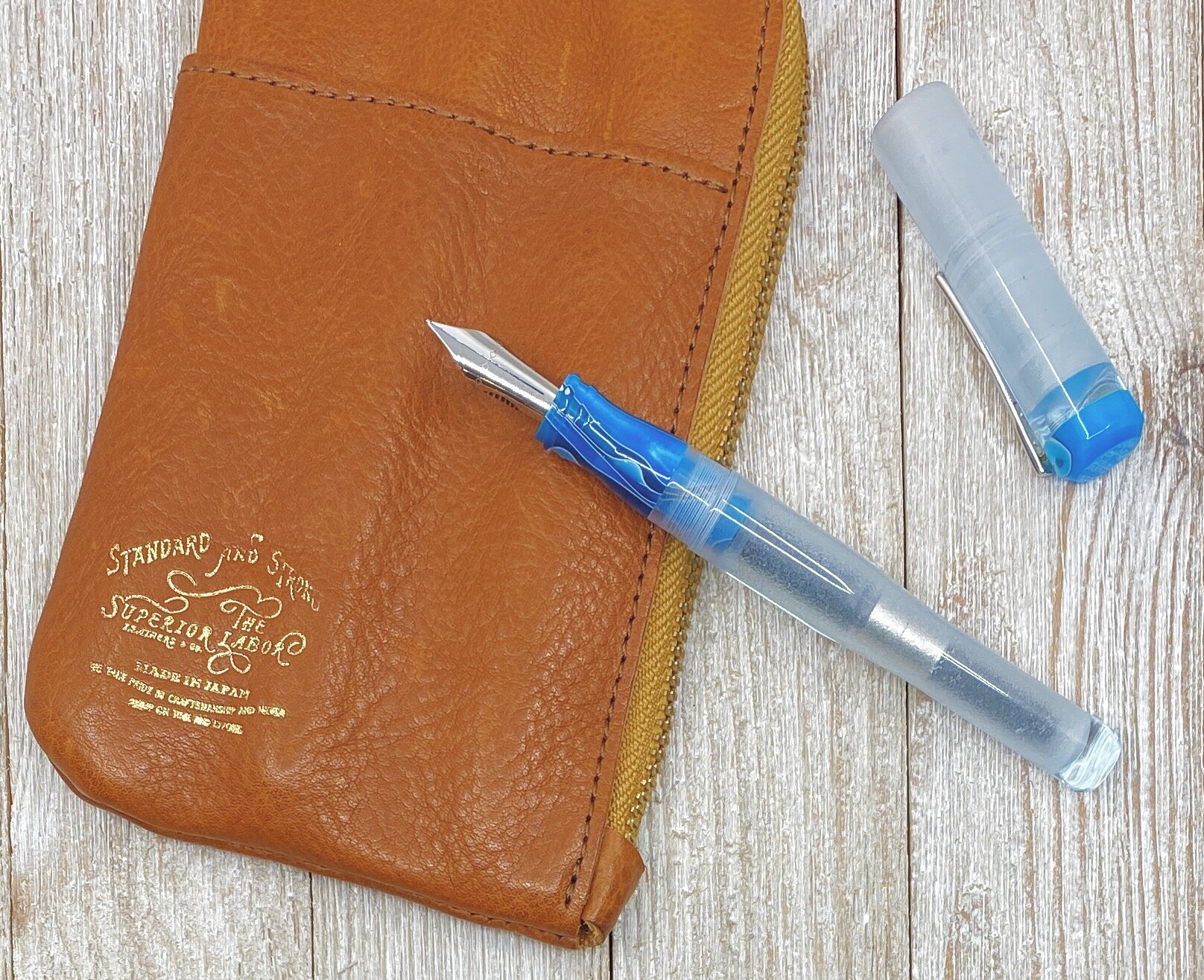
My flex nib writing style will never be confused for the glorious strokes of Azizah at Gourmet Pens, or the frolicking fun of Ana at The Well-Appointed Desk. But my style is my style, and I love the flair that flex nibs add to my block print writing style.
The latest flex nib to cross my path is the Franklin-Christoph #6 Steel Extra Fine, and it’s a good one. Now, you know my stance on nearly all modern flex nibs - they should be classified as soft nibs, not flex, for the most part - and this F-C nib is no different. But, as with other modern flex nibs I’ve tested, that doesn’t mean it isn’t excellent in it’s own right.

The F-C steel flex nib is characterized by the lengthy slit running up almost 90% of the exposed nib, along with slight scallops carved out of the wings. This type of steel nib is not new to the market, but it is the first time one has crossed my desk.
From strictly a flex perspective, there is a good amount of line variation, but not a massive range like you get from vintage flex nibs or dip nibs. Nor should there be. That’s the expectation from those nibs - not this one. And that is the expectation you should have going into any modern flex nib purchase.
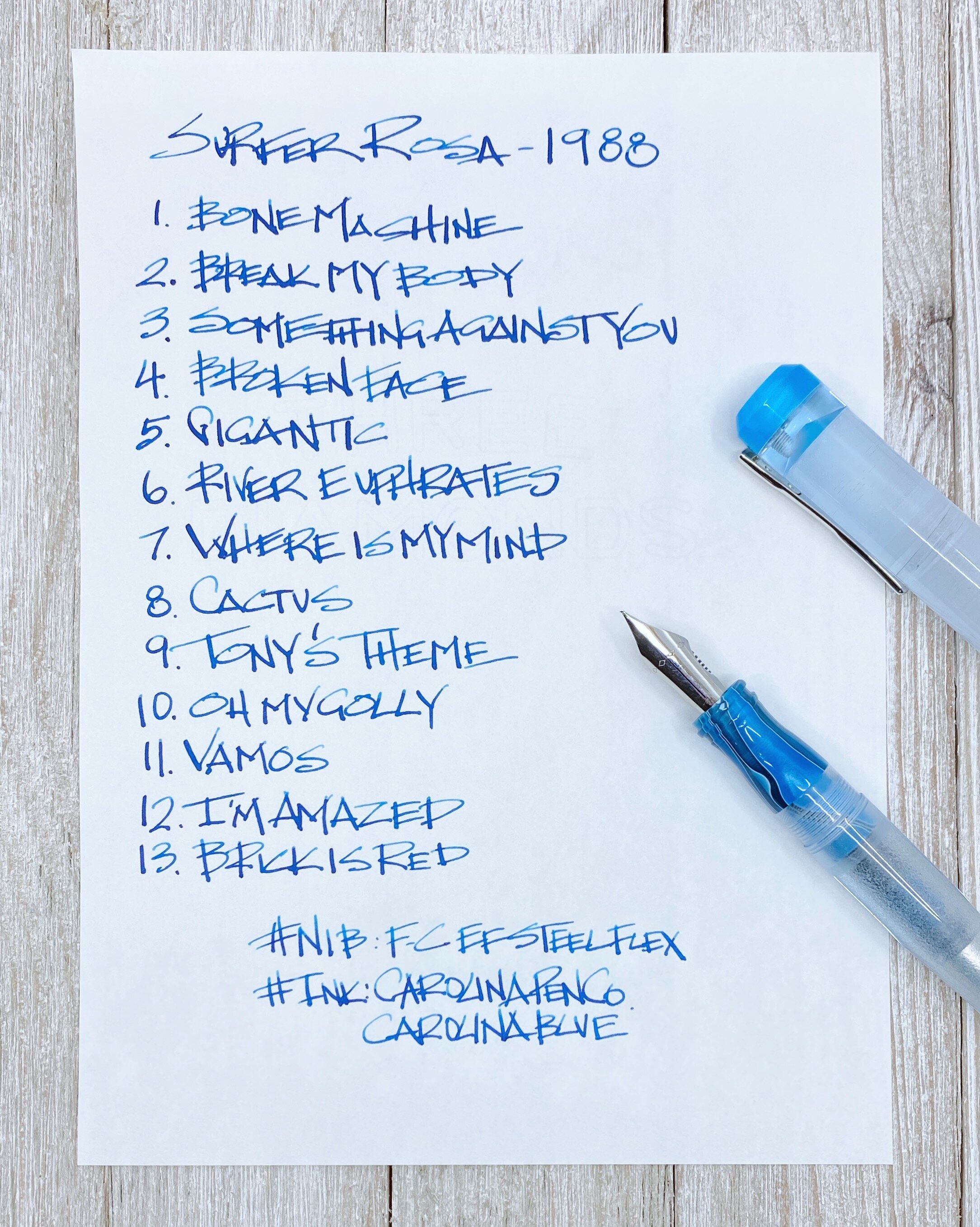
For my handwriting style, this nib helps my letters pop off the page. My heavy hand spreads the tines on the downstroke for wide lines, then relaxes for thinner lines from side to side. For a nib marked as EF I would like to see a finer fine line, but that’s a minor complaint for a nib that writes so well.

I compared this nib to two other soft nibs in my collection - the Aurora Optima Flex, and the Pilot Falcon - to get a feel for how similar or different they are. I assumed the Falcon would be an outlier, and it was. It has a much finer fine line, and a narrow wide line, but it might have the widest range if you know how to use it properly.
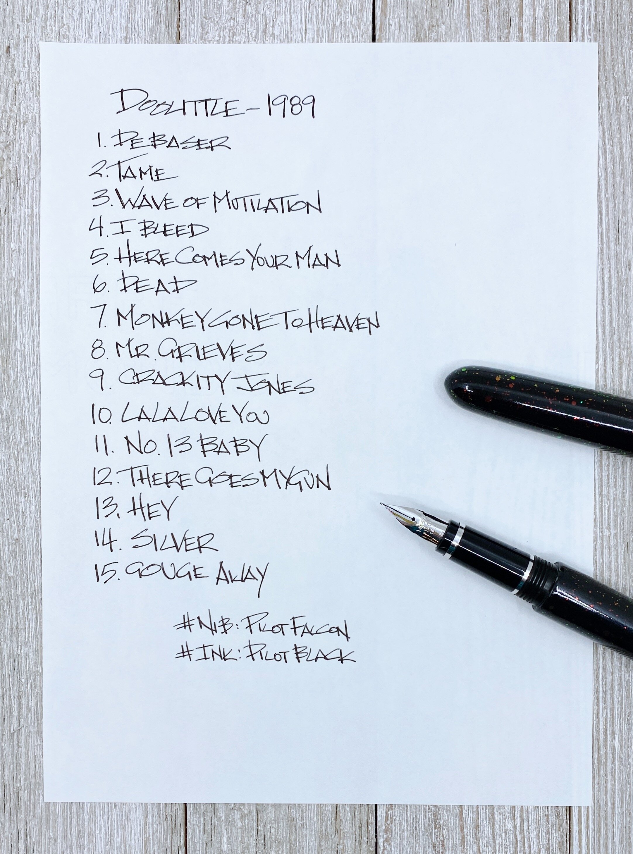
The other two are shockingly similar. I’ve talked about how much I enjoy writing with the Aurora flex nib due to how cool it makes my handwriting look, and the Franklin-Christoph is similar to that. Shockingly similar I’d say. They both begin with a fine line and expand to a broad line. There is definitely a good amount of variation - you just begin from a wider place than with a nib like the Falcon.

I added a Sailor King of Pen stock medium nib to the comparison to show a baseline of how these soft nibs make my handwriting appear. It’s noticeable to me in person, but may not translate as well in pictures.

So what’s my verdict on the Franklin-Christoph #6 Steel Extra Fine nib, from a non-flex friendly writer? It’s pretty great. I think I’ve already convinced myself to pick up one or two more and have them ground even finer to see what I can really do with the nib. Do I have a flexy future?
(Franklin-Christoph provided this product at a discount to The Pen Addict for review purposes.)
Enjoy reading The Pen Addict? Then consider becoming a member to receive additional weekly content, giveaways, and discounts in The Pen Addict shop. Plus, you support me and the site directly, for which I am very grateful.
Membership starts at just $5/month, with a discounted annual option available. To find out more about membership click here and join us!