

Not only did Fontoplumo sponsor the blog last week for the launch of the Kaweco Sport Coral Guilloche fountain pen, they sent me one of these beautiful pens to give away. For this contest, I’ll be sending out the Gold trim model with a Fine nib. Read the rules below, and get to entering!
TWSBI Blue Black Fountain Pen Ink Review
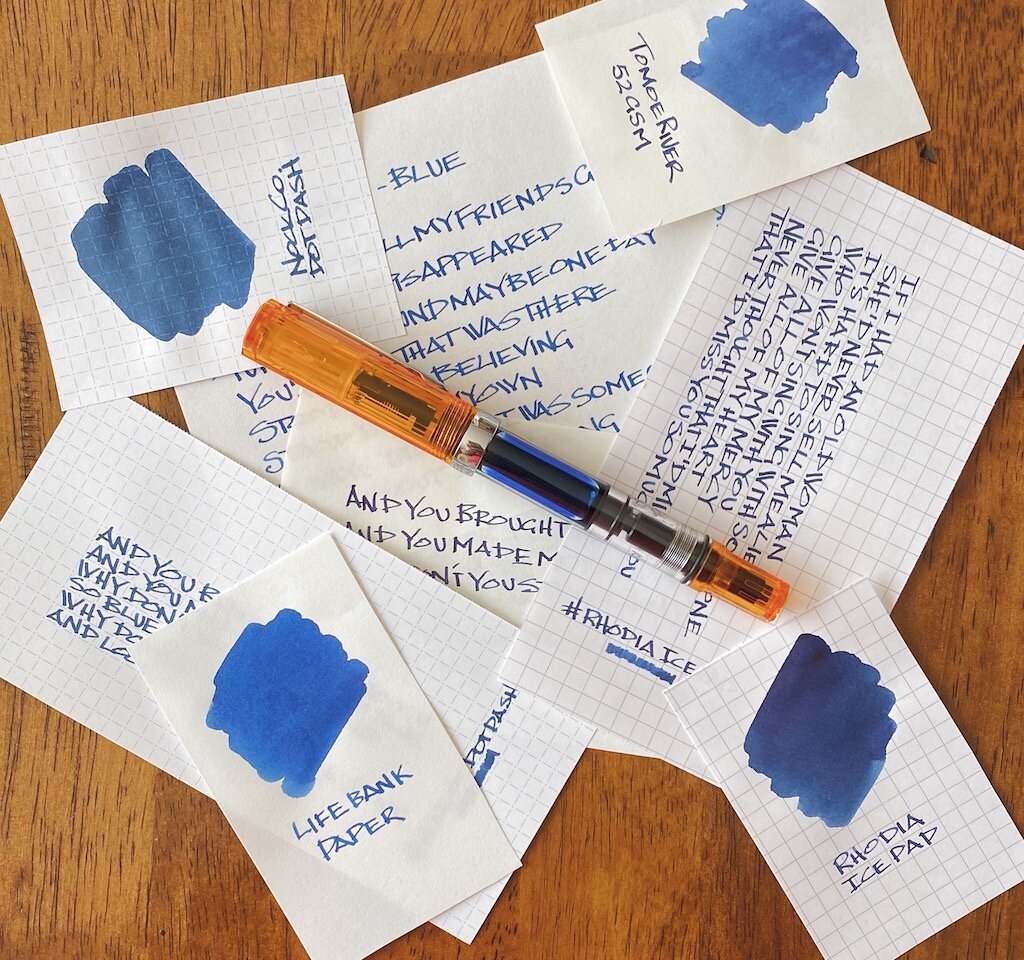
Like many of you, I love to express myself through fountain pen ink. There are dozens, if not hundreds, of outrageous colors on the market that make me smile, and make the letters on the page look amazing. As cool as those inks are, there is always a need for classic colors, and TWSBI Blue Black is the latest and greatest.
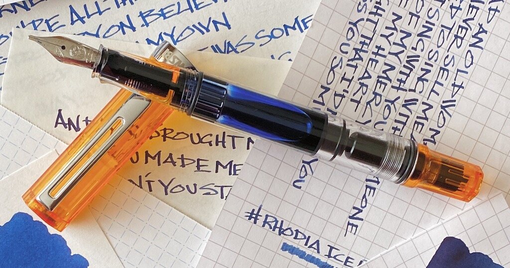
I appreciate how TWSBI launched their new ink lineup. They dropped a six-pack of bright colors in quality packaging, allowing customers to sample one, or all of them, in smaller 18 ml bottle sizes. Following that release, TWSBI expanded the lineup with core colors - Black, Blue, Red, and Blue Black - that form the baseline for what is expected from a pen manufacturer that is producing their own inks.

While stock colors aren’t designed to set Instagram on fire, they are expected from any company bringing out their own ink to use with their full pen lineup. And TWSBI did it correctly in my book, with large, 70 ml bottles, and for a reasonable price of $18.
As a verified blue black ink aficionado, you know this was going to be the first one I tested out. I’m sure I’ll get more questions about the black - everyone needs a great black - but blue black is more my style when I’m picking out a standard color ink. In fact, it is the ink color that made me want to use fountain pen inks in the first place.
What makes a classic blue black ink in my opinion? Equal blue and black representation, and no hints of any other color except grey.
That combination is what I expect from the basic blue black ink in any fountain pen lineup. Now, there are variants of blue black that have a red sheen, a wider color range, and different undertones (all things I prefer in my most used blue blacks,) but for this ink, none of that is necessary.
TWSBI, ya basic. And I mean that in the best way possible.
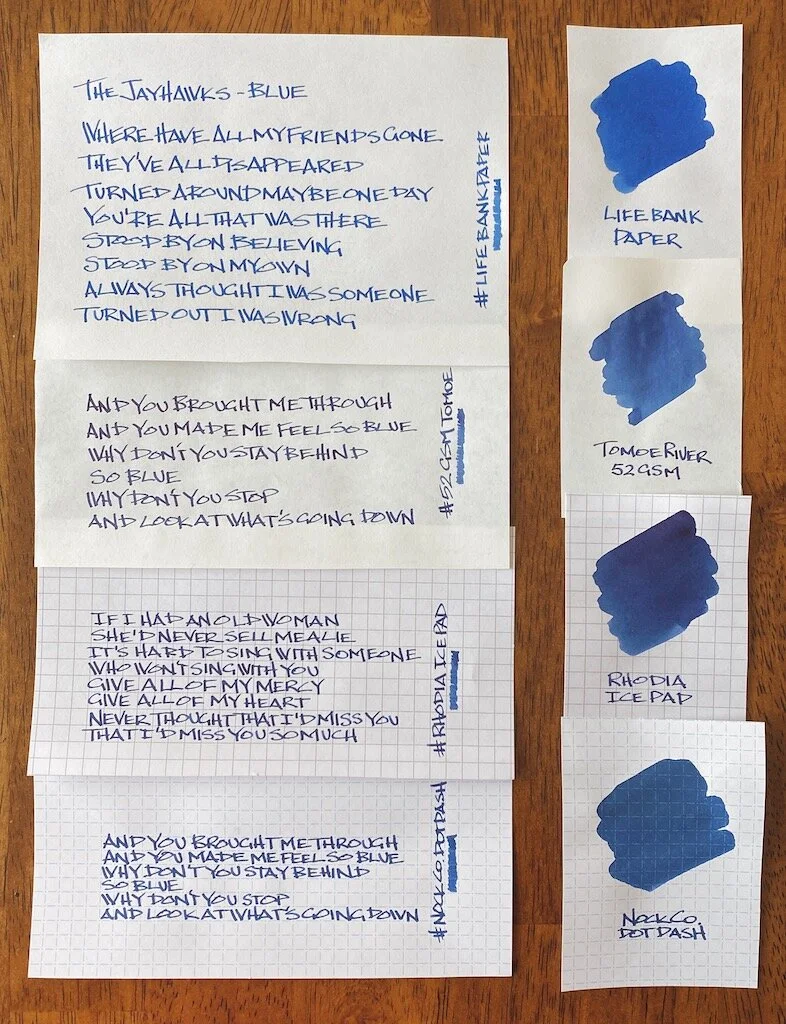
I tested this ink on several types of fountain pen friendly paper, all with different characteristics. You can see how much your choice of paper makes a difference in the color the ink appears.
My handwriting on the Life Bank Paper showed the most accurate color representation, although a heavy swab of ink on the same paper made the ink appear the bluest. Tomoe River paper showed off a darker tone, primarily because the ink stays on the surface of the page more. There is very little sheen on Tomoe River, and less shading than I expected.

The darkness really popped on Rhodia - maybe too dark for what I want from this ink. And on the big swab it tried to sheen, but there is really nothing there in that category. The drier paper of the Nock Co. DotDash showed a mid-range color, closer to the Bank Paper than the other two, which makes sense.
Out of the entire batch, TWSBI Blue Black looks the best to my eye on the Life Bank Paper, although it is pretty great anywhere I’ve used it so far.
And that’s what I expect more than anything from a house ink such as this one. Sure, you can get the premium Botanist gin for your G&T, but some days, maybe those heavier writing days, call for the house brand. TWSBI has made a pretty good one that is worth inking up any day of the week.
(JetPens provided this product at no charge to The Pen Addict for review purposes.)
Enjoy reading The Pen Addict? Then consider becoming a member to receive additional weekly content, giveaways, and discounts in The Pen Addict shop. Plus, you support me and the site directly, for which I am very grateful.
Membership starts at just $5/month, with a discounted annual option available. To find out more about membership click here and join us!

Misfill, Moonlight Edition
Each week in Refill, the Pen Addict Members newsletter, I publish Ink Links as part of the additional content you receive for being a member. And each week, after 10 to 15 links, plus my added commentary on each, I'm left with many great items I want to share. Enter Misfill. Here are this weeks links:
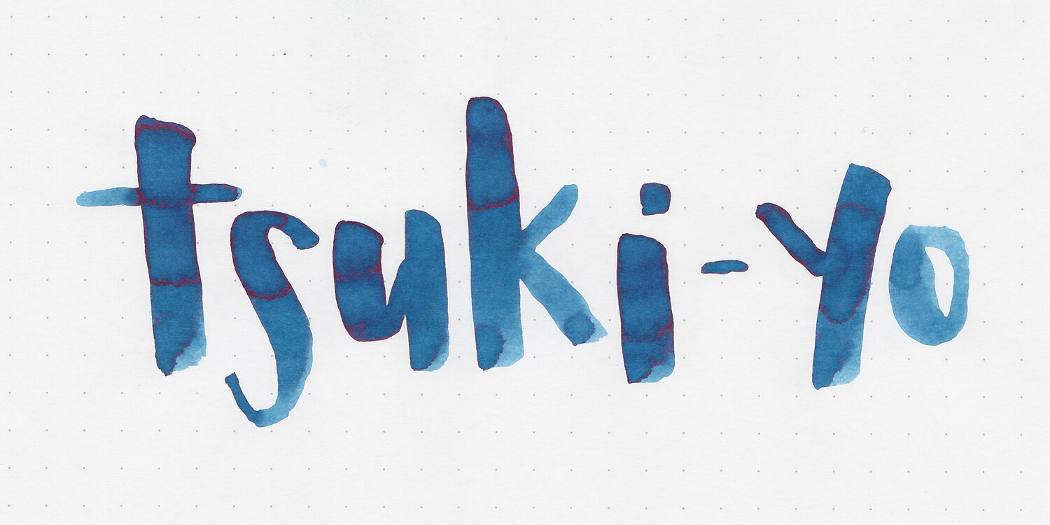
— Ink Review #1064: Pilot Iroshizuku Tsuki-yo (Mountain of Ink)
— Originals Of Their Time: Darlings Of The 1930s (The Pelikan's Perch)
— Soft Vinyl Saga: MITSUME and the Art of Japanese Sofubi Toys (Tokyo Fashion)
— Recommended Soundtracks from Mobile Games (Kottke)
— Pens in Rota – Do we use all our pens enough? (dapprman)
— Notebook Addict of the Week: Gary Varner (Notebook Stories)
— Zebra Mojini Highlighters Review (Pennabler)
— Create A Simple Landscape Using Fountain Pen Ink And Water (Nick Stewart)
— Clairefontaine Triomphe Writing Paper Review (Fountain Pen Love)
— Radical Ink (Crónicas Estilográficas)
— This is the 2020 notebook for Wake Stationery (Waki Stationery)
— The Story of Two Monks and a Woman (Kottke)
— Musgrave Tennessee Red (Pencil Revolution!)
— Scenes from NY NOW and the National Stationery Show, 2020 (The Gentleman Stationer)
— Visconti Homo Sapiens Bronze Age Review (or Falling in Love with Fountain Pens Again) (Writing at Large)
— LEGO Note Bricks For Your Note-Taking Needs (Design You Trust)
— Zebra 3 Series of Pens - the quality Solution for Corporate Stationery Closets (Write eXperience)
Want to catch the rest, plus extra articles, reviews, commentary, discounts, and more? Try out a Pen Addict Membership for only $5 per month!