

(Susan M. Pigott is a fountain pen collector, pen and paperholic, photographer, and professor. You can find more from Susan on her blog Scribalishess.)
Montegrappa is one fountain pen brand I’ve never tried. I was poking around on the Casa della Stilografica website one day and came across a striking blue pen. It was a deep blue with turquoise swirls. I was entranced.
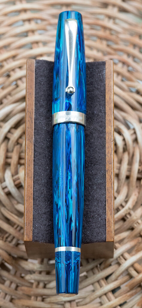
Anyone who knows me understands that I have a crazy thing for blue pens. So, despite the rather steep price (€ 569) and the fact that I had no prior experience with Montegrappa, the Mia Sea at Dusk fountain pen stole my heart.

The pen arrived from Italy in a sage green outer box and an engraved wooden inner box with a hinged lid. I must say, Montegrappa did a great job packaging this limited edition pen.


In person, the pen is, simply put, spectacular. The resin looks like brush strokes in rich oil paint.

With solid silver furnishings, this pen has substance and class. The top finial is engraved with the Montegrappa logo. The clip tapers to a roller-ball tip for easy attachment to pockets or papers.

The cap band is engraved with “Montegrappa” on the front and “2020 Italy” on the back.


The barrel threads are also made of silver, which is a special touch, and there are silver rings at the end of the grip and around the piston knob.

You’ll find the limited edition number engraved on the bottom finial.

The Mia is a large pen (but not over-sized). It measures 137mm capped, 125mm uncapped, and 157mm posted. It is heavy, however, because of all the metal furnishings. It weighs 31.6g uncapped and 43g posted. The grip tapers. At its narrowest, it is 10.1mm and at its widest it is 12mm.
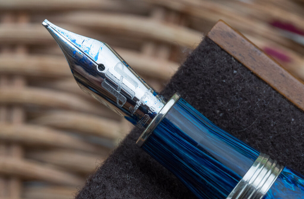
The 18k rhodium-plated nib is engraved with the Montegrappa logo, the name Montegrappa, and the gold content. There’s no scroll work to complicate the simplicity of the nib design.

I purchased my Mia with a 1.1mm stub nib. When it arrived, I noticed that the pen was writing poorly--hard starts, scratchy, skipping. I took macro photos of the nib and discovered the tines were misaligned.

But Casa della Stilografica and Montegrappa took care of the problem gracefully. I had to ship the pen back to Italy, but the nib was repaired and returned speedily. Now those tines are perfect.

The 1.1mm stub writes beautifully. It offers a thick line with enough sharpness that it could be called a semi-italic nib. The ebonite feed provides plenty of ink for a smooth, wet writing experience.


I will say this pen blows through ink very quickly, but it’s easy to refill with the piston system. This is one aspect of Montegrappa that is different from my experience with other piston fillers. The Mia piston makes a ratcheting sound the entire time you turn it. That freaked me out a tiny bit the first time I rinsed out the pen. But now it just sounds kind of cool. One thing to note: the piston knob is a little loose and jiggles if you shake the pen (don’t shake the pen!). That said, I haven’t noticed any sound coming from the knob during normal use.

I am quite impressed with my first Montegrappa. This is one solidly built pen. I love its heft, the feel of the pen in my hand, the silver accoutrements, and the (now) fantastic stub nib. I find myself gazing at the beautiful resin and enjoying its depth and painterly qualities.

The Montegrappa Mia Limited Edition comes in two colors: Sea at Dusk and Chrysocolla (turquoise). 120 pieces were made in each color. I bought mine from Casa della Stilografica, but I’m not sure if they have any more in stock.
(I purchased the Montegrappa Mia Sea at Dusk from Casa della Stilografica with my own funds.)
Enjoy reading The Pen Addict? Then consider becoming a member to receive additional weekly content, giveaways, and discounts in The Pen Addict shop. Plus, you support me and the site directly, for which I am very grateful.
Membership starts at just $5/month, with a discounted annual option available. To find out more about membership click here and join us!