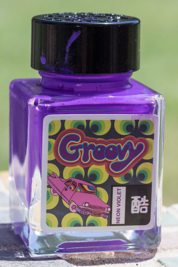
Kala Tribute to Neon “Groovy Neon Violet” Ink: A Review

Kala Tribute to Neon “Groovy Neon Violet” Ink: A Review

(Susan M. Pigott is a fountain pen collector, pen and paperholic, photographer, and professor. You can find more from Susan on her blog Scribalishess.)

Kala Ink is a new brand that I’d never heard of until Brad sent me a bottle to review. The ink is made in Taiwan, and the “Tribute to Neon” series is quite unique. The colors in the series are bright, opaque, waterproof, and look wet even after they dry.

Groovy Neon Violet is a neon purple color that leans toward the pink/purple side of the color spectrum. On the Col-o-dex card, the ink comes out rather flat in the swab. But in writing, swirls, and splats, you can see how the ink maintains a wet appearance even after drying. (This card was created over three weeks ago!)

Kala Tribute to Neon “Groovy Neon Violet” Ink

The ink exhibits good shading/pooling on Rhodia Dot Grid paper with the Noodler’s Triple Tail Flex Nib (reviewed here). The ink is completely waterproof.
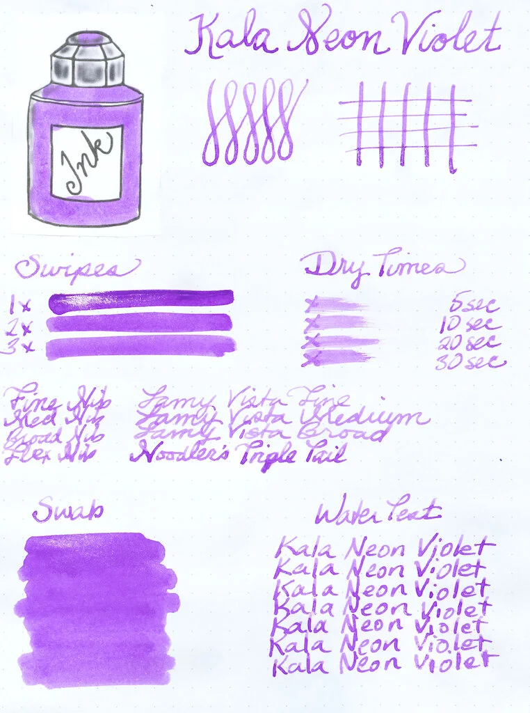
Kala Tribute to Neon “Groovy Neon Violet” Ink Test

In finer nibs, the ink looks lighter and the shading/pooling is not as evident.

Kala Tribute to Neon “Groovy Neon Violet” Ink Nibs

Kala Neon Violet is the first waterproof ink I’ve ever tested. This stuff really is impervious to water, making my chromatography test rather useless. Alas.

In super wide nibs, like my Handwritmic Ruling Pen, the ink exhibits excellent shading and pooling. I apparently did not wait long enough for the ink to dry, and stacked other papers on top of this one. That accounts for the blotchiness you see where the ink pooled.

Kala Tribute to Neon “Groovy Neon Violet” Ink Writing

When I first opened the bottle, I wasn’t sure if Kala Neon Violet was actually for fountain pens. I had never seen such an opaque, thick ink. It isn’t quite the consistency of acrylic paint, but that’s what came to mind when I looked at it. I inked up my Noodler’s Triple Tail thinking that, if the ink didn’t come out of the pen, it wouldn’t be the end of the world. I actually left the ink in the pen for several weeks before cleaning it (not recommended). Most of it rinsed out pretty easily, though a bit remained in the threads and piston. I wouldn’t use this ink in any of my really expensive pens, and best practice would be to clean out your pen immediately after use to avoid stains.

Kala Tribute to Neon “Groovy Neon Violet” Ink Piston

Kala Neon Groovy is the most unusual ink I’ve used. I love how opaque it is and the wet finish it leaves. It’s really quite fun to write with (wet, smooth, and good flow) and excellent for art.

Kala Tribute to Neon “Groovy Neon Violet” Ink Mandala

You can purchase Kala Tribute to Neon “Groovy Neon Violet” Ink from Shigure Inks for $12.00 (30 ml). Neon Violet is currently out of stock, but you can sign up for an email to be notified when it’s available again.

(The Pen Addict purchased this ink from Shigure Inks at full retail price.)


Enjoy reading The Pen Addict? Then consider becoming a member to receive additional weekly content, giveaways, and discounts in The Pen Addict shop. Plus, you support me and the site directly, for which I am very grateful.

Membership starts at just $5/month, with a discounted annual option available. To find out more about membership click here and join us!

Kala Tribute to Neon Groovy Review
Posted on July 10, 2020 and filed under Kala, Ink Reviews.

The Pen Addict Podcast, Episode 418: Today I Hate Paper

My wallet was primarily manipulated this week, with the launch of the the latest release from Leonardo Officina Italiana in collaboration with Carolina Pen Company. Myke and I discuss that, plus several new Sailor tidbits, and a change to Tomoe River paper.

Show Notes & Download Links

This episode of The Pen Addict is sponsored by:

ExpressVPN: High-Speed, Secure & Anonymous VPN Service. Get 3 months free with a 1-year package.

Posted on July 9, 2020 and filed under Podcast.

Esterbrook Camden Composition Fountain Pen Review

Esterbrook Camden Composition Fountain Pen Review

(Sarah Read is an author, editor, yarn artist, and pen/paper/ink addict. You can find more about her at her website and on Twitter. And check out her latest book, Out of Water, now available where books are sold!)

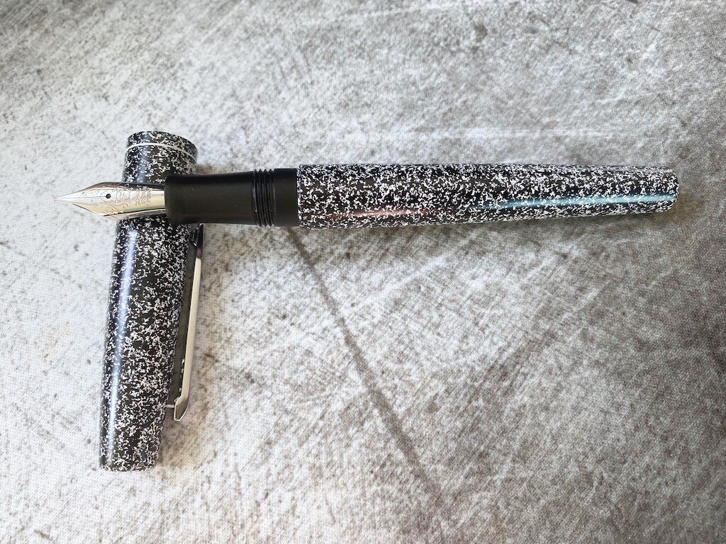
Stationery with a stylish nod to another type of stationery? That's a winning aesthetic. I still remember my first composition book, purchased for my high school biology class. I had always been tempted by those elite-looking books when school shopping, and I wanted one. They looked so much cooler than notebooks. I didn't want to just "note" things, I wanted to "compose" them. And I needed those marbled covers and cloth binding to do it, I was certain. I reveled in the use of that composition book--my biology labs were written up with the elaborate precision that would later manifest in my bullet journals. I still can't resist a good composition notebook, and I couldn't resist the Esterbrook Camden Composition Fountain Pen, either. I mean, look at it.

Esterbrook Camden Composition Fountain Pen

Full disclosure: this is my first Esterbrook of any kind. I've played with the vintage ones, but I've never owned one, an I haven't made any foray into the new brand until now. So I can't draw any comparisons under the Esterbrook name, but I can speak to its individual quality.

Esterbrook Camden Composition Fountain Pen Nib

I love this pen. Not just because it's stylish and nostalgic, but because it's an overall excellent pen. It has a metal body with a paint-spatter marble effect overlaid on it. The surface is slightly textured. It's weighty, but not heavy--it just feels sturdy, but is very comfortable to hold and is balanced enough to not cause hand fatigue. It doesn't post well, however--it's shallow, over-long, and unbalanced when posted. There is a springy clip on the cap. The cap is a twist closure, and has a "cushion closure" that feels bouncy as you close and open it. You have to press it in and then twist to close it, but this ensures a nice seal, so there is no nib dry-out.

Esterbrook Camden Composition Fountain Pen Open

The grip section is resin, according to some online specs, though it doesn't feel like resin. the texture feels almost like carbon fiber, though some places are saying aluminum. I'm betting it's brushed aluminum. It's very comfortable to hold, with a slight contour that prevents finger slipping. The threads are smooth, and while there's a step between the grip and body, it's not sharp or intrusive.

Esterbrook Camden Composition Fountain Pen Section

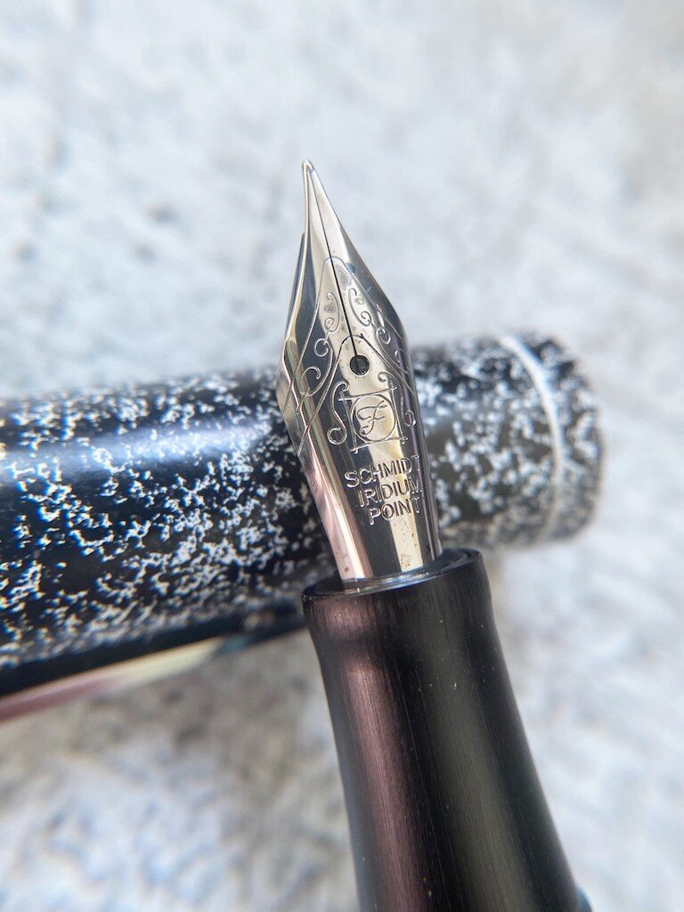
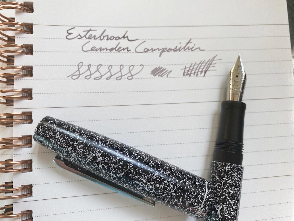
The nib is a #6 Schmidt steel nib, available in F, M, and B. It writes well, with a perfect balance of wetness and feedback. It's a very smooth writer, and the performance combined with the feel of the pen in the hand makes it a pen that I keep reaching for.

Esterbrook Camden Composition Fountain Pen Writing

The MSRP for this pen is $195, with most stores offering it for around $156. It's a very fair price. Right now it's available in Lime “Spring Break" Green, and “Back to School" Black, with promises of a fall red color coming in a few months. There are only 250 each of these limited-edition beauties, so I wouldn't wait, if you're as smitten as I am. The only downside? I don't know of any classic-looking composition books that have fountain pen friendly paper. If you know of one, please drop me a line!

(Kenro Industries provided this product at no charge to The Pen Addict for review purposes.)


Enjoy reading The Pen Addict? Then consider becoming a member to receive additional weekly content, giveaways, and discounts in The Pen Addict shop. Plus, you support me and the site directly, for which I am very grateful.

Membership starts at just $5/month, with a discounted annual option available. To find out more about membership click here and join us!

Esterbrook Camden Composition Fountain Pen Box
Posted on July 9, 2020 and filed under Esterbrook, Fountain Pens, Pen Reviews.