Sailor Pro Gear Slim Blue Dwarf Fountain Pen Review

Sailor Pro Gear Slim Blue Dwarf Fountain Pen Review

(Jeff Abbott is a regular contributor at The Pen Addict. You can find more from Jeff online at Draft Evolution and Twitter.)

After all these years of being involved with the pen community, I finally got around to picking up a premium Sailor fountain pen for myself. I've used plenty of them before, but just haven't purchased one for myself. I knew I didn't want one of the standard black models, so when the new Blue Dwarf limited edition crossed my feeds one day, I knew that was the one that would push me into this category.

Sailor Pro Gear Slim Blue Dwarf Fountain Pen

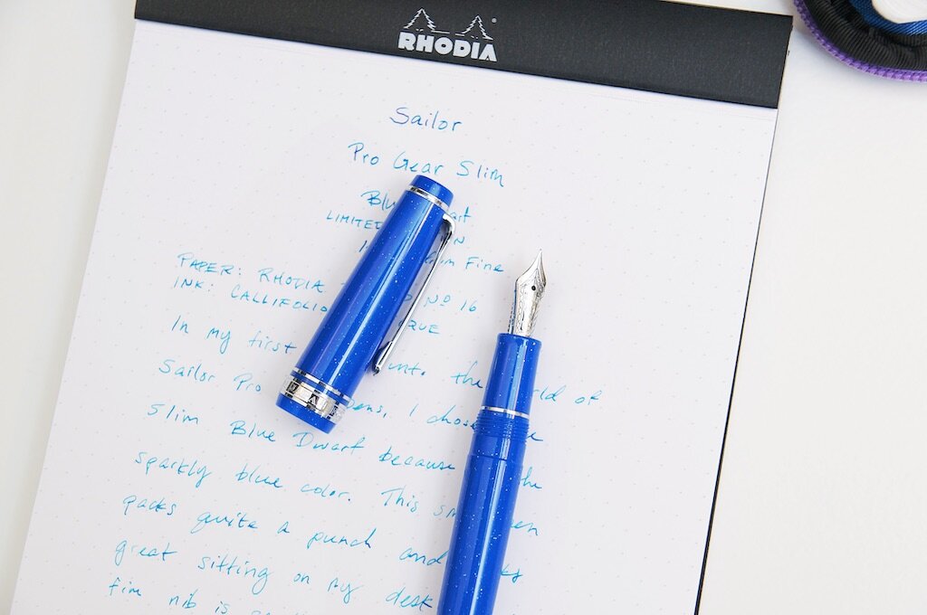
I have several different models of Sailor's sub-$120 fountain pens, and they've all been "meh" in my mind. They're good pens, but there's nothing special about them. No matter how much more expensive they are from the High Ace Neo, they just couldn't justify the price for me. I just couldn't resist the sparkly blue color, and the limited edition aspect just expedited my decision-making process.

When deciding which nib to pick for this particular pen, I only had my own memories to compare against since I don't own any other gold-nibbed Sailors. I remember the nibs running incredibly smaller and harder than other brands, and knew I didn't want a needle-like tip for my first purchase. Since I've had really good experiences with the medium fine nibs on my Pilot pens, I decided to give that a shot for the Blue Dwarf as well. I like the "small-but-not-too-small" size that offers a nice feel and allows the ink to express it's characteristics a bit as well.

Sailor Pro Gear Slim Blue Dwarf Nib

At $200, this pen wasn't quite an impulse purchase. If I wasn't already actively looking for a Sailor to add for my collection, I probably would have passed on it. I had been leaning toward the regular Pro Gear size instead of the slim, but the sparkly blue body just pulled me in. For $200, I feel like this pen is accurately priced based on the quality of materials and overall fit-and-finish. My only gripe is that they didn't include a cartridge converter automatically. I added the $8 converter to my order without hesitation, but it does seem like an oversight on Sailor's part when you're past the $100 mark for a pen that definitely needs some type of filling mechanism. To offer a comparison, the Pilot Custom 78 and Custom Heritage pens include a converter or use a piston-filling system, and they're often below the $200 mark. Sure, the Blue Dwarf is much more pleasant to look at, but the lack of a converter just feels annoying.

Sailor Pro Gear Slim Blue Dwarf Converter

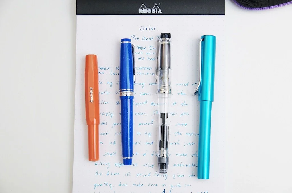
Aside from my converter complaints, the pen is an absolute delight. It's small and easy to carry around, and it also feels really sturdy despite its small size. It's really well weighted and feels comfortable when writing posted or non-posted. It's a versatile writer in the sense that I can pack it in the smallest cases but still enjoy all-day comfort when using it for longer writing sessions.

Like I remembered from using other Sailors, the nib is quite stiff and smaller than my other medium fine nibs. While the nib is stiff, it's still quite soft as it moves across the page. It writes very smoothly out of the box and has excellent ink flow, if not a tad on the dry side. I can get a small amount of flex out of the nib by applying pressure, but it's a minimal bit of variation. Honestly, I don't feel comfortable trying to flex this nib because of how stiff it is. It's certainly not meant to vary line width much at all. The 14k gold material is there to provide some cushion to the writing experience — nothing more.

Sailor Pro Gear Slim Blue Dwarf Writing

Despite the stiff nib, this is still an extremely comfortable and easy-going pen to use. Regardless of the paper I've tried with it, it always glides across the page with ease. Even if I forget to cap it after a few minutes, the ink still flows easily. Likewise, if it's been capped for a few days without any use, it starts writing almost immediately.

Sailor Pro Gear Slim Blue Dwarf Review

The color of the material used in the pen is a bright, cheery blue with specks of glittery silver material. The name Blue Dwarf refers to a theoretical type of star, which is where I think the glittery material lends itself to the overall aesthetic. From JetPens:

It is inspired by the wonder of blue dwarf stars, which have been predicted by astrophysicists but will not arise in our universe for trillions of years. The blue dwarf is an inspiring reminder that, as incomprehensibly ancient as the universe seems, there is still far more yet to come.

The build quality of this pen is just astounding. There's no wonder Sailor pens are as pricey as they are. You're paying for excellence in quality and materials, and it easily shows every time you pick this pen up. It's such a delightful writing instrument to use and equally delightful to see laying on a table.

Sailor Pro Gear Slim Blue Dwarf Comparison

The Sailor Pro Gear Slim Blue Dwarf is a limited edition, with only 1,500 being produced worldwide. If you like this pen and want to pick one up for yourself, make sure you act quickly!

(JetPens provided this product at no charge to The Pen Addict for review purposes.)


Enjoy reading The Pen Addict? Then consider becoming a member to receive additional weekly content, giveaways, and discounts in The Pen Addict shop. Plus, you support me and the site directly, for which I am very grateful.

Membership starts at just $5/month, with a discounted annual option available. To find out more about membership click here and join us!

Sailor Pro Gear Slim Blue Dwarf Rhodia
Posted on October 21, 2020 and filed under Sailor, Fountain Pens, Pen Reviews.

Getting Inky in October

(This is a guest post by Brian Draghi. You can find more of Brian’s work on Instagram @Sketchscape)

I wanted to describe my process for my March of Robots and the current Name-Your-Own-tober for this post. I am not a professional artist, but this process works for me and what I use for my hobby. I like to use many references to what I draw, whether it's online research or my book collection the I've collected over many years. Some people may have an issue with artists using reference photos, but it's suitable for a couple of reasons. Most artists aren't good at using memory sources, especially if you are doing any photo-realistic illustration. Two- it's always ideal to use source material from actual environments or as real sources as possible. The more practice you have from real life, the faster your work becomes, and the experience helps with future sketches.

Art Supplies

Tools of the Trade

Prismacolor Col-erase pencils, blue or red

Kuru Toga Advance mechanical pencil

Pilot Color Eno mechanical pencil

Electric sharpener

Tombow Mono click eraser

Pentel Kerry mechanical pencil

Copic Multiliner

ShinHan Touch markers

White Prismacolor pencil

White Verthin pencil

White Faber Castell Pitt Artist Pen brush

Prismacolor Toned Tan paper squares

Nock Co. Brasstown case

Nock Co Chimneytop case

Lihit Labs Smart fit case

The Prismacolor Col-erase pencils are my go-to pencil of choice for laying down the beginning sketch before ink. I like these pencils for two reasons. They don't smear as regular graphite lead does, and they erase quite well without much effort. I tend to have a heavy hand, so these leads are more forgiving than traditional graphite.

My favorite mechanical pencil in my Uni Kuru Toga advance for two reasons. The lead rotation mechanism continually rotates the lead while sketching, allowing the same consistent line without variation. The Kuru Toga also features the ability to retract the guide pipe for the lead to protect it from getting bent or poking a hole in my case.

Kuru Toga

I'm particular about the pencils I use for the highlights, and some provide a brighter look for the more intensive highlights. I favor the Prismacolor white pencils using both the Verithin version, a more rigid type of lead, and the colored pencil version with a softer lead. The Verithin creates cleaner edge lines and outlines, and the white-colored pencil has a more soft waxy core used for more blending. I tend to favor the Faber Castell brand and the German Edding brand of white markers. These tend to be more of a pigmented water-based ink, with some brands being more opaque than others.

Markers

The markers of choice are the cool greys of the ShinHan Touch marker. These are cheaper markers than the popular yet more expensive Copic markers that professionals use, but they work well and blend well on the page. Many marker brands available react differently to certain paper types and having different shades for each color. As the digital format has become more accessible to more artists, these traditional mediums can be overlooked. I still prefer the tactile feel of using conventional tools on actual paper rather than a digital screen.

Nock Co Chimneytop

The paper choice is the Prismacolor Toned Tan squares, which provides a nice manageable size to create sketches promptly. The toned paper works well with white pencils and allows you to create highlights that you wouldn't achieve with regular sketch paper.

Nock Co Brasstown

Most of my sketching supplies are stored in my trusty Nock Co. Brasstown case. The Brasstown is from the original Nock Co. Kickstarter I backed in 2013 and still use it today. It is my favorite case because it stores everything in a nice protected rolled out tongue. Everything is presented organized in a row without having to do a search and rescue for my supplies. The Brasstown also makes it convenient to carry my supplies on long trips or to go on vacation.

Lihit Lab

Let's get into the step by step process I used to create my March of Robots illustrations back in March and the process I will use this month. My March of Robots covered the Droids of Star Wars theme, and I'll be showing a few examples of my sketches and the processes used to create these fun droids.

Step one: Reference, Reference, and more Reference

I look at as much visual information as I can to figure out the look of what I’m sketching. Photos are ideal, but real-life examples are even better. Many artists may frown upon using too much reference, but I’m just not the type that remembers every detail from memory. I need as much reference to influence my sketches without having to take into account any guesswork.

Rough Lines

Step two: Rough sketch

I block out the basic shapes and composition of my droid, making sure that the design fits on the page, and the construction is good. I try to keep everything as light as possible, especially since I tend to have a heavy hand. I want to be able to erase everything if something doesn't work, which happens regularly. I'm guaranteed never to get something quite right the first time. I either need to adjust proportions or composition within my sketch. I'll often work out some basic thumbnails on a scratch piece of paper to get the construction down for the final image. I can always transfer things from one sketch to another instead of having to start over.

Solid Lines

Step three: Solid lines

Once I get a composition that works out, I will make my pencil lines a bit darker before heading into inking. This process allows me to see where I need to ink my lines before color. This step also allows me to include those small details like some design elements and the armor's worn look. This is what I like to call authentic battle damage, now that I have all the lines finalized for inking.

Step four: Inking time!

I usually tend to use the Copic Multiliner or the Faber-Castell Ecco Pigment since they do not bleed when you have use markers on top of the line. I use multiple different tip sizes for inking, depending on the details. Use a smaller point for tiny details and have a larger tip to show more contrast with the form closest to you. I usually use fineliners that do not bleed when you apply markers over them, so it does not mark the piece. Many artists tend to use the opposite approach and apply markers first and then inking after to give the markers a chance to dry. This approach avoids having to be more careful but does take more planning to make sure where you are placing your inking lines.

Highlights

Step five: Highlights

I focus on the highlights first before I start the primary base color of my sketch. This gives me the ability to gauge where most of the main highlights are located. It's easier on the saturated sections to apply white pencil to blend in more directly to paper than using it over the marker after the fact. I sometimes tend to block the highlights first before I lay down the primary base color, so I don't overlook them when adding the overall base color.

Color Finish

Step six: Color

I keep a scratch piece of toned paper next to my sketch to test the markers for my chosen colors. I usually make small swatches of color thumbnails directly on the page to see if the color palette works. I pull out these markers first since they will be the primary markers I'm using during the sketch.

I test out the markers to see how they handle the paper I'm using to sketch for two reasons. First, check if the markers are still saturated and not dried out. The second is to test how the markers react to the paper material. Certain marker brands react differently to paper; some are more saturated, while others tend to bleed more.

Step seven: Shadows

Once the primary colors are down for the sketch, I'll block in the shadows of the image. I usually use my cool greyscale markers for any dark shadows. I'll blend over each marker until it's the right gradual shade. I am always more comfortable working light to dark than the opposite way; you can still make it darker. Doing the opposite tends to be more challenging to correct and lighten and adjust after lying down darker lines.

Once the shadows are complete, I work on the extra details that give a sketch a little bit more character. I'll take my fineliner to work on some weathered look of a droid. I'll make some extra scratches and distressed wear to highlight some authentic battle damage that a droid may have encountered over the years. This gives it a more realistic look and adds character to my piece.

Final step: Final touches

Once I'm happy with the render and adding details, I'll go back over my sketch, add extra highlights, and add additional inking for the outline that I missed or make the edges a bit more crisper. Using markers and adding highlights tends to wash out some of the inking lines, so I'll attend to those lines with another coat. Once the extra details are finished, I'll typically add a color box behind the image that creates a bit of contrast and distinguishes the piece from the page. The lighter the image, the darker the background, and so forth.

Sometimes it's an actual image that I'll add to the background that you instantly recognize, and other times I may suggest an image by adding a shadow on the background. Adding a shadow may be a more lazy route, but it lets the viewer use their imagination to suggest what might be happening in the background. The point is to break up the image and give your sketch more contrast and make it more attractive to the viewer without having too much detail.

Last thoughts:

My process isn't too different from other artists using various supplies and techniques. I enjoy seeing the process of other artists that highlight certain materials. It's always great to discover new products I've never heard of before or something I never considered using to create my work. That’s probably why I'm addicted to Kickstarter, but that's another story. New materials never make you a better artist, but it is always fun to try new things or create a different process that works better for you.

My art background has fueled my interest in learning about different types of materials and lead me to get into the world of fountain pens. I would have never considered using fountain pens ten years ago, but it's great to expand myself and try more things. Get your pencils, pens, and ink ready!

Posted on October 19, 2020 and filed under Sketching, Art, Guest Post.