Franklin-Christoph 02 Intrinsic in Maya Blue with a Masuyama Medium Cursive Italic: A Review

Franklin-Christoph 02 Review

(Susan M. Pigott is a fountain pen collector, pen and paperholic, photographer, and professor. You can find more from Susan on her blog Scribalishess.)

I own several Franklin-Christoph fountain pens and have reviewed many of them on Pen Addict. I purchased a special edition Intrinsic back in May and realized I had not yet written a review of this model.

The pen is packaged in a simple white cardboard box and Franklin-Christoph's signature zippered pen case. Although these cases used to be made of leather, now they are made of "suit grey" fabric.

Franklin-Christoph 02

The 02 Intrinsic model is unique in its shape, with a barrel that tapers sharply from the center. This is so that the cap can post deeply onto the pen and maintain good balance--something that often fails on other pens when you post caps. This is the first fountain pen I use posted because of the ingenious design.

Franklin-Christoph 02 Barrel
Franklin-Christoph 02 Posted

I was lucky enough to get a special edition Intrinsic in Maya Blue. I love the colors of this model. There are darker translucent blue sections at the finial, top of the grip, and at the barrel bottom. The remainder of the pen is lighter blue and frosted.

Franklin-Christoph 02 Finial
Franklin-Christoph 02 Barrel End
Franklin-Christoph 02 Frosted

The pen is medium sized, measuring 146.1mm/5.75 inches capped, 149mm/5.85 inches posted, and 131mm/5.15 inches unposted. Without ink the pen weighs 20.71 grams. It's incredibly well balanced wither you use it unposted or posted, but I like the balance better with it posted (it gives the pen more heft).

Franklin-Christoph 02 Cap

The cap has a relatively small clip engraved with diamonds. The Franklin-Christoph name is also engraved lightly near the bottom of the cap.

Franklin-Christoph 02 Clip
Franklin-Christoph 02 Branding

The pen comes with two blue ink cartridges and is supplied with a Franklin-Christoph-branded converter. You can also eyedropper the pen if you wish.

Franklin-Christoph 02 Converter

The grip is comfortable even though there are threads near the top where the nib is inserted. The threads are raised and serve as a lip to keep your fingers in position. Once again, thoughtful design is evident in the details of the pen.

Franklin-Christoph 02 Threads

I opted for a steel medium cursive italic ground by Mike Masuyama. This is one of the best nibs I've received without additional tuning. It is absolutely stellar--smooth with crisp lines that offer good variation.

Franklin-Christoph 02 Nib 1
Franklin-Christoph 02 Nib 2

You can see that the down strokes are wide and the side strokes are thin as you would expect with a cursive italic.

Franklin-Christoph 02 Lines

I love how my handwriting looks with this nib.

Franklin-Christoph 02 Alphabet
Franklin-Christoph 02 Alphabet Close

The nib offers excellent flow and there's no skipping or hard starts. Writing with it is pure joy.

Franklin-Christoph 02 Writing

I created a pattern with the pen, primarily using the thin side strokes it produces. Not only is it great for writing, but it's also wonderful for drawing.

Franklin-Christoph 02 Pattern

Although you can't get the Intrinsic in Maya Blue anymore (unless FC decides to do another run), you can currently get the model in Black and Cinnamaroon, Ghost, and Smoke & Ice. It starts at $175 with stock steel nibs. You can opt for other variations, such as FC's "SIG nib" for an additional cost. Masuyama no longer does special grinds for Franklin-Christoph, but you can now get nibs ground by Nagahara for an up-charge of $25.00.

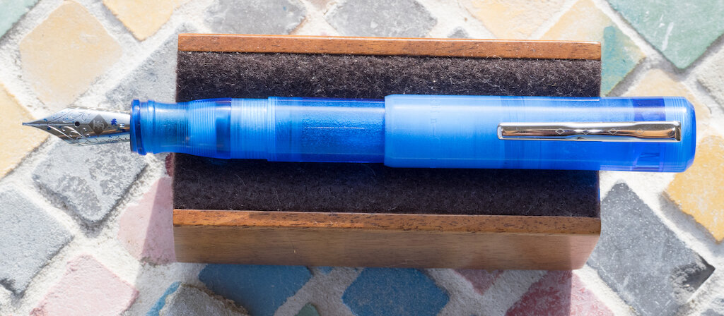
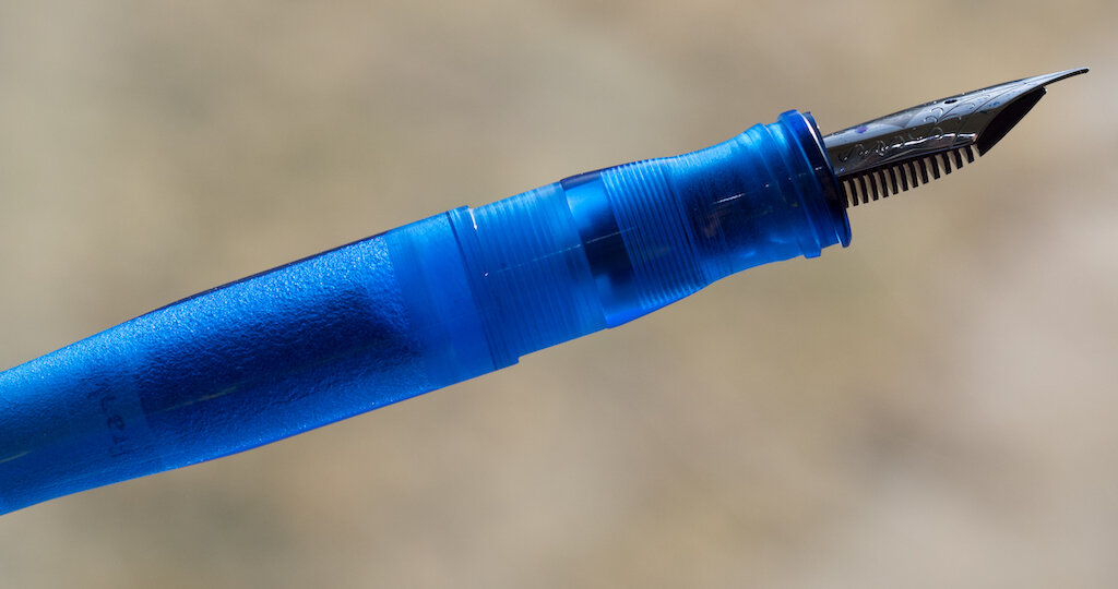
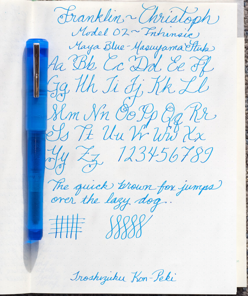
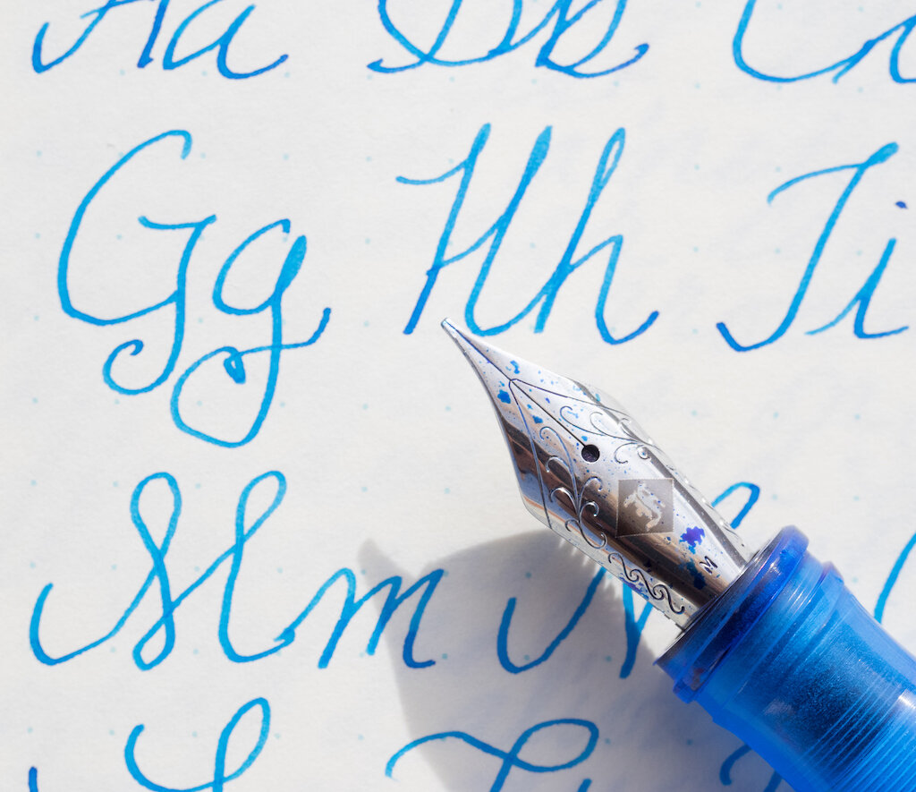
The 02 Intrinsic might just be my favorite Franklin-Christoph model so far. I love its unique shape and that I can post the cap without disrupting the balance of the pen. Maya Blue is a fantastic color with lovely contrasts between translucent dark blue and frosted light blue. If you are interested in getting Franklin-Christoph pens in special color combinations, you should sign up for their newsletter so you get advance notice of special releases.

(I purchased the FC 02 Intrinsic in Maya Blue with my own funds.)

Franklin-Christoph 02 Fountain Pen
Posted on January 8, 2021 and filed under Franklin-Christoph, Fountain Pens, Pen Reviews.

Van Dieman's Ink Sample Review, Part 1

Van Dieman's Ink Review

(Sarah Read is an author, editor, yarn artist, and pen/paper/ink addict. You can find more about her at her website and on Twitter. And check out her latest book, Out of Water, now available where books are sold!)

I have a small treasure chest of Van Dieman's ink samples to review! Which means reveling in multicolored inky fingers for weeks, and sharing the joy with you all. Here is the first installment of three reviews of this line of inks.

Van Dieman's Elizabeth's Violet Eyes
Van Dieman's Elizabeth's Violet Eyes Chromatography

First up is from their Hollywood series—Elizabeth's Violet Eyes, inspired by Elizabeth Taylor. It's a lovely balanced purple, not too warm or cool. It's well behaved and shows some nice shading. It's a wet ink with a longer dry time, and it survived with some faint lines remaining in the water drip test. This ink had some lovely chromatography, splitting from bright pink to magenta, to a bold turquoise. It's easily the most practical of the ones I reviewed for today, and while it's tame enough to be an everyday ink, it has a nice bit of excitement to it, too.

Van Dieman's Enchanted Woods Shimmer
Van Dieman's Enchanted Woods Shimmer Chromatography

The next ink I tried was the Enchanted Woods Shimmer from the Midnight series. This one is a bright emerald green with a silver shimmer to it. It's not shy on the bling, either. You could probably use this ink to signal passing airplanes. This ink has great character, showing some shading even through all that shimmer. It has a slow dry time, no water resistance, and the chromatography shows a beautiful yellow-green-blue progression. The ink description indicates that it is supposed to have a red sheen in addition to the silver shimmer, but I could not get one to materialize, even where the ink pooled.

Van Dieman's Ruby Slippers
Van Dieman's Ruby Slippers Chromatography

The third ink I tested somehow out-blings the Enchanted Woods. It's another from the Hollywood series, this one called Ruby Slippers. Wicked witches will no doubt be in hot pursuit of this ink. I don't recommend it for fountain pens, though, for several reasons. One, its very wet and feathers dramatically. Two, the particles settle almost immediately and require constant agitation to remain suspended. And three, it's highly water-resistant, and I'd be concerned about staining. Even in the ink description on the Vanness site it suggests dip and brush pens for this ink.

Van Dieman's Huon Midwinter Festival
Van Dieman's Huon Midwinter Festival Chromatography

The last one I reviewed this week was the insanely gorgeous Huon Midwinter Festival, from their Tassie Seasons line. This ink is enchanting. It's a rich sepia with an antique gold shimmer that makes me think of pirates. The chromatography for this ink was like watching a fireworks display--or a bonfire. From char brown to smokey purple to bright orange and yellow--this is clearly a complex ink. However, I strongly advise against using this in a fountain pen unless it it one that is easy to disassemble and clean. I let my sample vial sit for some time while I waited to get to this review, and when I picked it up to use it, I could not get the shimmer particles to come away from the plastic wall of the vial. Even with shaking, they stayed stuck. I had to knock the vial against my desk several times to get the shimmer to disperse. I assumed it was because it had sat for a few weeks. So I set it back down while I reviewed the other inks. When I picked this one back up to review, the same thing happened again, even though it had been sitting for less than an hour. I don't think these particles will behave nicely in a pen feed. For dip pens or brushwork, though, this is one of the prettiest browns I've ever used.

Van Dieman's Huon Midwinter Festival Sparkles

I still have six other colors to review, but my impression so far of the Van Dieman's inks is that they are very good with color, and all-in with their shimmer, but they fall more into the category of art-supply inks than writing inks. Which is not a bad thing--but I don't know if that is their intention. I do know that I would not put two of these four into a fountain pen. And I also have concerns about being hunted by flying monkeys.

(Vanness Pens provided this product at no charge to The Pen Addict for review purposes.)


Enjoy reading The Pen Addict? Then consider becoming a member to receive additional weekly content, giveaways, and discounts in The Pen Addict shop. Plus, you support me and the site directly, for which I am very grateful.

Membership starts at just $5/month, with a discounted annual option available. To find out more about membership click here and join us!

Posted on January 7, 2021 and filed under Van Dieman's, Ink Reviews.