

If you snoozed, you loozed! Ok, that’s not a word, but I’m going with it anyway. Just like you are going to enter this giveaway for the amazing, and no longer available, Vintage Writing Paper Pad from The Well-Appointed Desk. Ana dropped these a few weeks ago in a couple of batches, and they went fast! This is your notice to follow her site for more cool stationery goodness (such as “The Deliverator”). But for now, I have two of these pads to give away, so get to entering!
Vanness Pens x Robert Oster Hemp Fountain Pen Ink Review
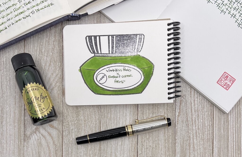
It takes a lot to get me to like a green ink.
Akkerman #28 Hofkwartier Groen is far and away my favorite, and is a top five personal ink, regardless of color. The green is bright, no doubt thanks to a hefty dose of yellow in the mix, and shades wonderfully. It’s flat-out fun to use.
Well down the line after that shade comes the classic Rohrer & Klinger Alt-Goldgrun, primarily because it is weird as heck, and shades like a beast. It’s one of those inks that once you see it in person you know you have to have it. Faber-Castell Viper Green is a more traditional shade of green, but has an electric/searing nature in its tone. This would fall into an everyday writing green, but with a bit of an edge.

That’s mostly it for my green use, at least until I took a chance on Hemp, one of the three Vanness Pens collaborations with Robert Oster. This one is going into the rotation, most likely as my second green behind Akkerman #28.

Green inks are a short list for me, although I can’t explain why. Unlike blue, orange, or purple, green has to be a little weird for me to use. Traditional greens in the Kelly or Forest shades need not apply. Yellow undertones are good, which brings out the brightness, and having odd questions come to mind, like “What color of frog is this?” only serve to make it more fun.

I wasn’t sure what color Hemp would actually be. Was this to represent fresh growth, or in a processed for production phase? It’s definitely the former, with a good combination of established green in the middle, and the youth of yellow around the edges.

In my bank paper Musubi Notebook I saw more shading than I expected, using an Aurora Optima with a Medium gold nib. On Rhodia, the color was more flat, but bright (and had a loooong dry time.) On Tomoe River paper, the range of darkness showed up. The swab on the Col-o-ring Oversize is the best representation of the color that I see when writing with a nib.
The only remaining question I have at this point is how the ink will look on the page in one of my finer nibs. will the brightness and character still show up? I hope so, because I’ve answered the other important question - do I like this ink - already. And now I’m ready to use it more.
(I bought this ink from Vanness Pens at a discount.)
Enjoy reading The Pen Addict? Then consider becoming a member to receive additional weekly content, giveaways, and discounts in The Pen Addict shop. Plus, you support me and the site directly, for which I am very grateful.
Membership starts at just $5/month, with a discounted annual option available. To find out more about membership click here and join us!

Misfill, Pen-enabling Edition
Each week in Refill, the Pen Addict Members newsletter, I publish Ink Links as part of the additional content you receive for being a member. And each week, after 10 to 15 links, plus my added commentary on each, I'm left with many great items I want to share. Enter Misfill. Here are this weeks links:
— The joy of pen-enabling good friends (mnmlscholar)
— Forsaking All Others (From the Pen Cup)
— Analogue Planning and Task Management in Covid Times (Writing at Large)
— Snippets: Schon, John Garnham, Pebble, GLP, Cross (UK fountain pens)
— TWSBI Vac 700R Iris (dapprman)
— Ink Overview: Sailor Manyo Series II Part 2 (Sakura, Shirakashi, Ukukusa and Ume) (Macchiato Man)
— Pen Review: Sakura Ballsign Knock Gel Pen (0.6 mm 5-Color Metallic Set) (The Well-Appointed Desk)
— Devendra Banhart Exchanges Breath and Rhythm for Pencil and Ink (Hyperallergic)
— Van Dieman’s Apricot on Midori MD (Inkcredible Colours)
— Handwriting Practice with Fountain Pens Kaweco Art Sport Cursive Italic from Toronto Pen Company (Gourmet Pens) — Sleeves (Peter Saville Sleeve Design)
— Savannah green and terra red (Bleistift)
— Brush Pen Review: Pentel Extra-Fine Pigment Ink (The Well-Appointed Desk)
— Redditor invented ‘Paper Civ’ while dreaming of playing Civilization (PCGames)
— Ink Review #1411: Caran d'Ache Ultra Violet (Mountain of Ink)
— New Pens (My Supply Room)
— Two Weeks with the New Parker 51 (Penquisition)
— Notebooks I'm Using Now: February 2021 (Notebook Stories)
— Monteverde Garnet on Rhodia (Inkcredible Colours)
— Narwhal Origional Fountain Pen Review (My Pen Needs Ink)
— Love typography? Now you can smell like it! (Creative Boom)
Want to catch the rest, plus extra articles, reviews, commentary, discounts, and more? Try out a Pen Addict Membership for only $5 per month!


