Ferris Wheel Press Sketchbook - A Quick Look from a Non-Artist

(Kimberly (she/her) took the express train down the fountain pen/stationery rabbit hole and doesn't want to be rescued. She can be found on Instagram @allthehobbies because there really are many, many hobbies!.)

I remember the last shipment that Brad sent me with items for review and my thought was, holy cow, did he ship a brick? Apparently the answer is “yes”, because among the box of various pens and inks was this sketchbook from Ferris Wheel Press. Aside from “holy crap, this thing is big and heavy!”, my other thought was “But Brad, I don’t draw/sketch/art, what the heck am I going to do with it?” Throw ink in it, of course! Coincidentally, I recently bought three Ferris Wheel Press inks from Vanness Pens, so I thought they’d be a great set of inks to try in the notebook. So let’s see how it performs!

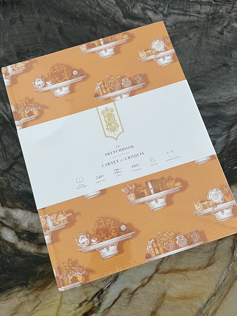
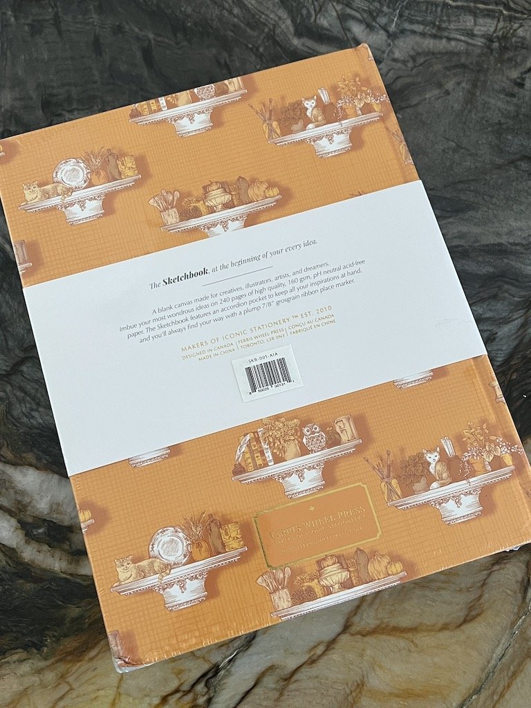
The Ferris Wheel Press Sketchbook, which retails for $40 USD, comes in 4 colors: Moss Park Green, Three Steamboats, Timeless Blue, and the one I’ll be reviewing today, Autumn in Auburn. It is a large sketchbook (7.75” x 10” x 1.25”) and heavy, as it contains 240 pages of 160 gsm white paper. It is acid-free (so good for attaching photos) and has an accordion pocket in the back as well as a wide grosgrain ribbon bookmark..

Ferris Wheel Press Sketchbook

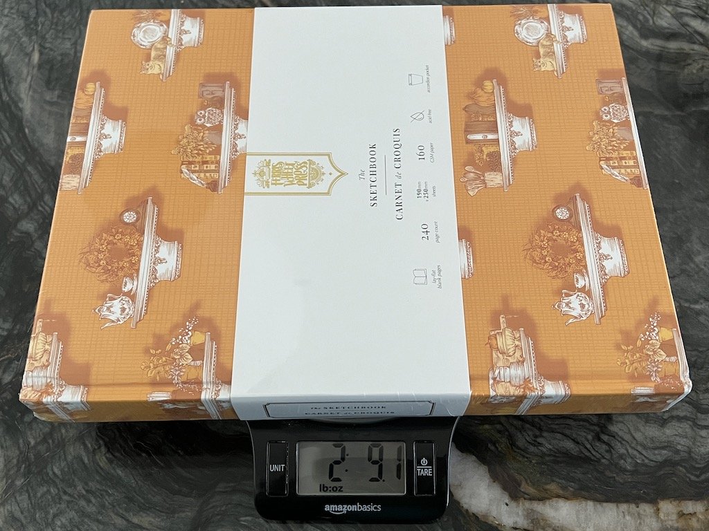
I wasn’t kidding when I said this is a heavy book. 2.91 lbs (or 1.166 kg) - It’ll only get heavier as you fill it up with ink, paint, etc.

Ferris Wheel Press Sketchbook

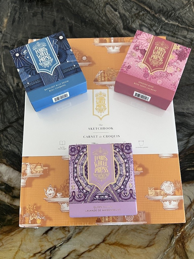
These beautifully packaged inks are going to get a test run inside!

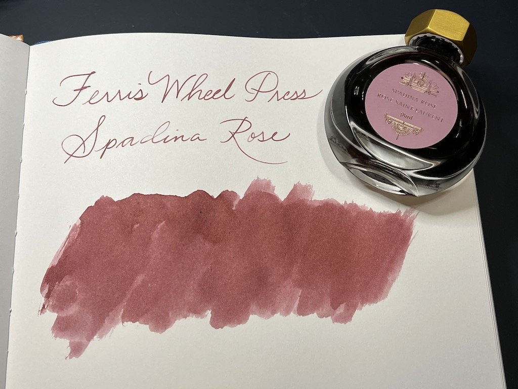
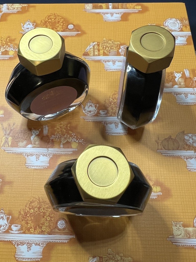
Ferris Wheel Press came out with three inks for their Fashion District Collection earlier this spring: Bathurst Blue Denim, Queen Allium and Spadina Rose.

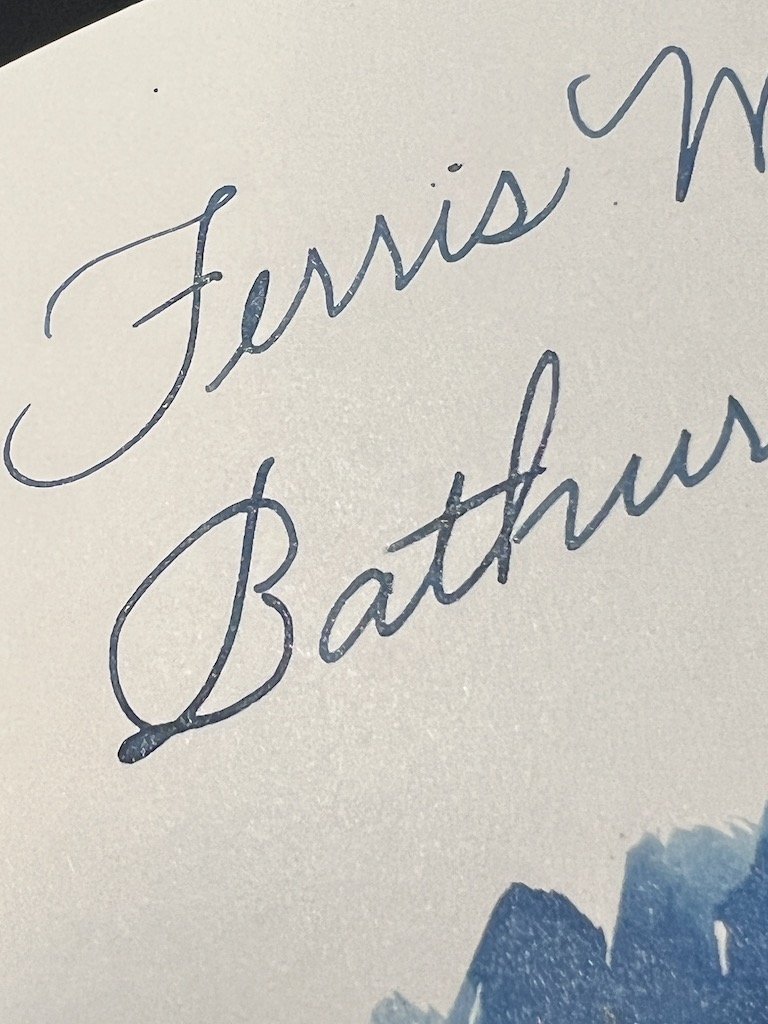
Bathurst Blue Denim is a lovely muted, dusty blue with subtle gold shimmer. The shimmer does show up in writing samples but it’s not overpowering, which is nice. Even with shaking the bottle vigorously, the shimmer particles settled into the bottle pretty quickly so keep that in mind and make sure you gently rock the pen back and forth periodically to distribute the shimmer. I didn’t have any problems with clogging in the ST Dupont Initial D, which has a steel medium nib. The ink has a medium to slightly dry flow, which gives it a bit of shading as well.

Ferris Wheel Press
Ferris Wheel Press

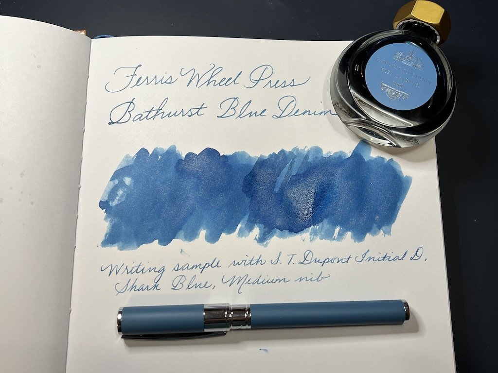
It’s a little hard to photograph but the shimmer is there.

Queen Allium is a light purple/mauve ink with gold shimmer and behaves similarly to the Bathurst Denim Blue.

Ferris Wheel Press
Ferris Wheel Press

Last but not least is Spadina Rose which is a medium reddish pink color but does not contain any shimmer. It also has medium to slightly dry flow and has some shading.

Ferris Wheel Press

All three of these inks look great and I’ve been enjoying using the Bathurst Blue Denim in the ST Dupont so far. My only gripe isn’t about the inks but the bottle design - they are so narrow but tall, that it is very easy to knock over the bottle. The designs of the bottles and boxes are stunning but not very practical.

Ferris Wheel Press

I almost knocked the bottles over several times during the swatching process.

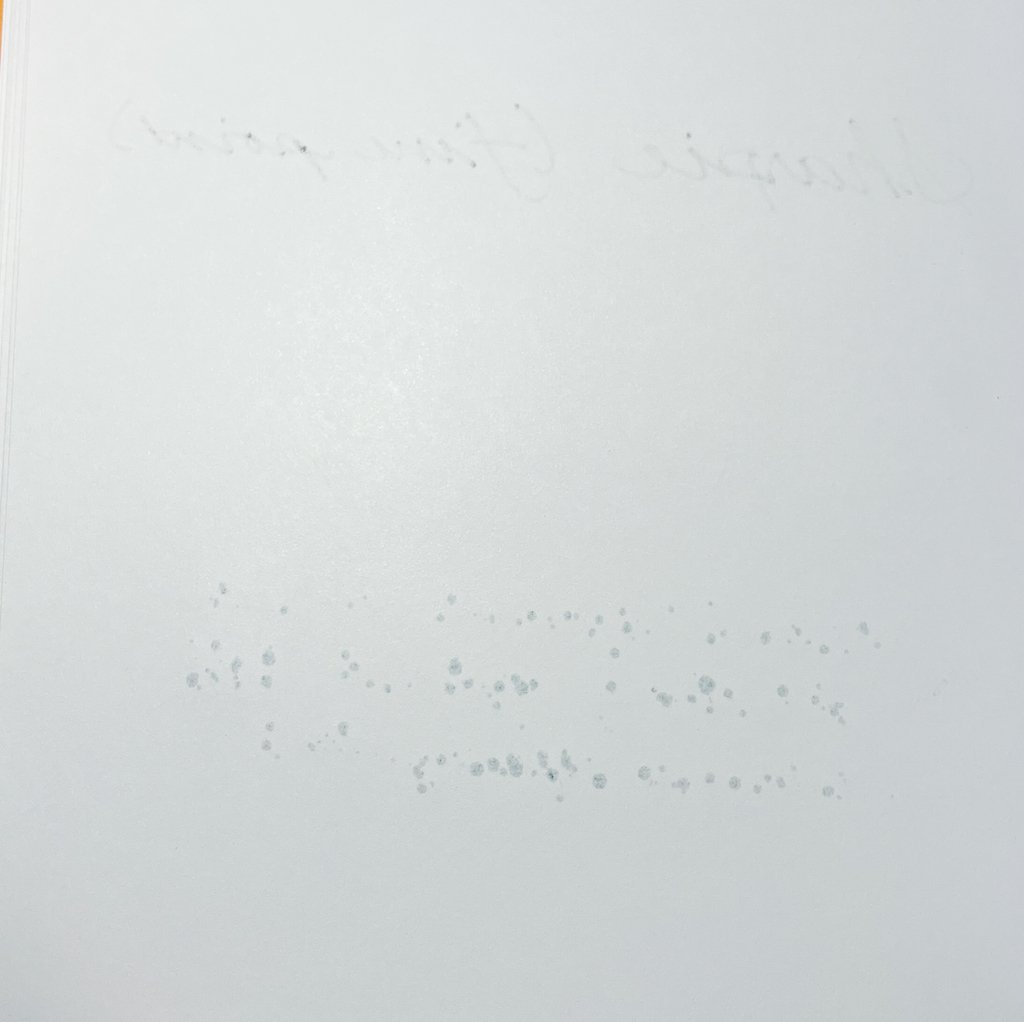
When laying down the swatches with a paintbrush, I noticed dark “specks” forming from the paper. Most of them weren’t noticeable once it was dry but I saw more with the Spadina Rose swatch, maybe because it didn’t have any shimmer and therefore the specks were more visible.

Ferris Wheel Press

You can see some of the paper texture coming through while Bathurst Blue Denim was still wet. The dry swatch above doesn’t show much of that.

Ferris Wheel Press

Some darkers specks were still visible on the paper after Spadina Rose had dried.

Ferris Wheel Press

Some spotting on the back with the wetter portions of the swatches.

One of the features of the Sketchbook is lay-flat pages, but I didn’t get any of the pages to actually lay flat. Maybe I have a different definition, but I expected the pages to stay open without needing to be held down AND not to have the inside edges to curve.

Ferris Wheel Press

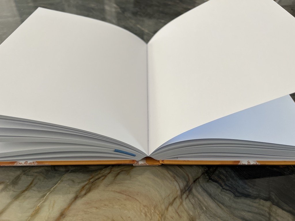
Would you consider this “lay flat”? ‘Cause I don’t.

Ferris Wheel Press

I had to hold it down and even then it wasn’t totally flat.

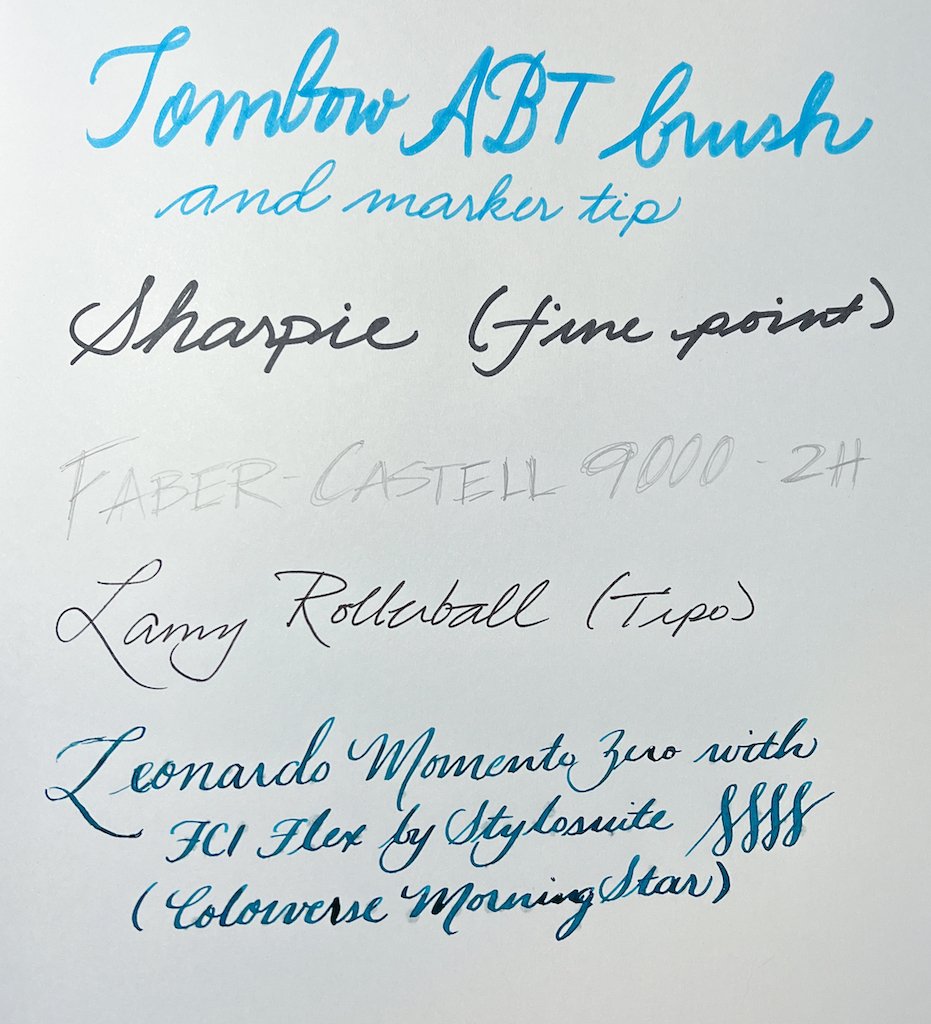
As I mentioned before, I’m not an artist so I don’t have a lot of other “media” to use in the sketchbook but I did try some writing samples with a Tombow dual tip marker, Sharpie, pencil, rollerball and a fountain pen with a flex nib. The paper is fairly smooth with a little bit of texture without feeling bumpy or rough, so using the different writing instruments felt fine. There was some mild spotting on the reverse side from the Sharpie and the flex nib. For the flex nib, which writes pretty wet, you can see that the spotting affects the front side too.

Ferris Wheel Press
Ferris Wheel Press

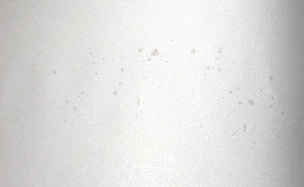
Spotting on the back with the Sharpie and flex nib media.

Ferris Wheel Press

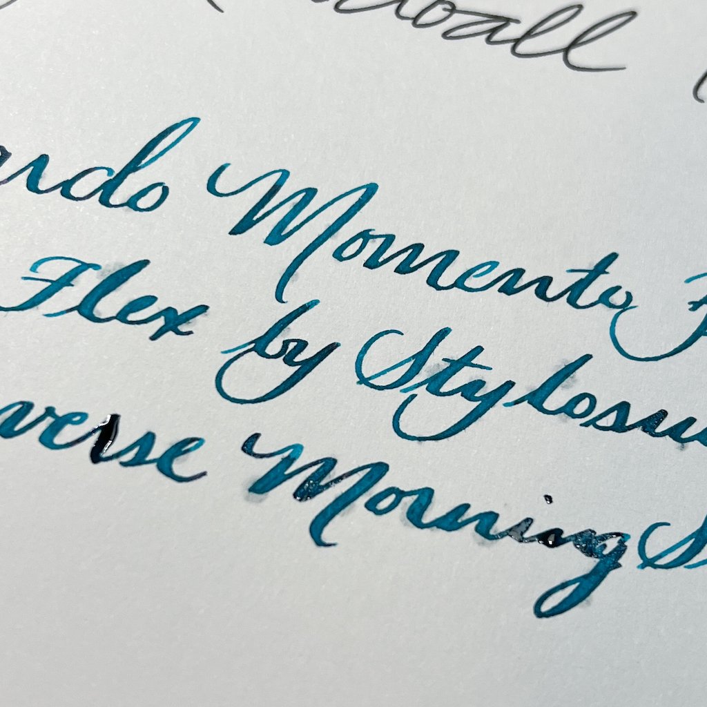
Spotting on the front with the flex nib.

As someone who doesn’t draw or sketch, I have a difficult time imagining toting around a large, thick, 2 pound book for sketching. Ferris Wheel Press does make an A5 size with half the pages (120), so that might be a better option. It also doesn’t really lay flat, which is one of their selling points. And when you add that there is some spotting with certain media, including wet fountain pens/inks, and it’s tough for me to recommend this. But if the size/weight isn’t an issue and you plan to use other “dry” media like standard pens, pencils or maybe pastels, etc., the Ferris Wheel Press Sketchbook would make a beautiful addition to your collection.

(Vanness Pens provided this product at no charge to The Pen Addict for review purposes.)


Enjoy reading The Pen Addict? Then consider becoming a member to receive additional weekly content, giveaways, and discounts in The Pen Addict shop. Plus, you support me and the site directly, for which I am very grateful.

Membership starts at just $5/month, with a discounted annual option available. To find out more about membership click here and join us!

Posted on May 20, 2022 and filed under Sketchbook, Notebook Reviews, Ferris Wheel Press.

Monarca Arena Blanca Ink Review

Monarca Ink

(Sarah Read is an author, editor, yarn artist, and pen/paper/ink addict. You can find more about her at her website and on Twitter. And check out her latest book, Out of Water, now available where books are sold!)

Monarca Stationery inks are so tempting. I love the names, the look of the bottles, and the wooden stand for the bottle with the pen rest (a limited offering, I believe). There's a lot to like about what they're up to, including an array of great colors.

Monarca Ink

I love brown and sepia toned inks, so I was curious to try this pale sand color from them. Arena Blanca means White Sands, and that's a great name for this color. It's a very soft, warm brown and quite pale. It's one of those ink colors that won't work for folks who want bold, saturated colors. It's not an ink you could read easily in low light or use on kraft or brown-toned paper, but it has tons of character on regular paper.

Monarca Ink

This ink shades like crazy, and it looks so much like a watercolor painting of a shoreline. It's a very peaceful color and I dig it. Heavier application, or where the ink pools, creates a bolder brown. There is no sheen, but the shading is so intense a sheen would be too much.

The color is a complex one, and the chromatography was wild. There's a grey base, with shell pink, peach, and soft goldenrod, with a light skim of blue. The breakdown is as pretty as the ink itself.

Monarca Ink

There is no water resistance to this ink--it washes away quickly, just like its namesake. The dry time was quite slow, and I had to add a 30-second mark to see if it would stop smearing, and even that streaked a little. Dry time on this one is "eventually."

I do have two nitpicks with this ink, though. One, the stock picture sent to retailers looks absolutely nothing like the actual ink color. Look to reviews for a more accurate shade. And two, the opening of the bottle is far too narrow for easy filling. Even my narrower pens had trouble, and my Pilot 823 didn't fit at all.

Monarca Ink

This ink will be filed in my "lovely but impractical" category, which I use more often than you'd think. At $20 for a 30ml bottle, it's about mid-range on price. Not inexpensive, but not alarming. It's a fair price. Overall, I like it a lot, despite my nitpicks.

(Monarca Stationery provided this product at no charge to The Pen Addict for review purposes.)


Enjoy reading The Pen Addict? Then consider becoming a member to receive additional weekly content, giveaways, and discounts in The Pen Addict shop. Plus, you support me and the site directly, for which I am very grateful.

Membership starts at just $5/month, with a discounted annual option available. To find out more about membership click here and join us!

Monarca Arena Blanca Ink
Posted on May 19, 2022 and filed under Monarca, Ink Reviews.

Kokuyo Trystrams Field Sketch Book Review

Kokuyo Trystrams Field Sketch Book Review

(Jeff Abbott is a regular contributor at The Pen Addict. You can find more from Jeff online at Draft Evolution and Twitter.)

While Field Notes certainly corners a lot of the market in the pocket notebook category, that doesn't mean the 3.5x5.5 inch format is the only player in town. There are plenty of other small pocket notebooks out there, and I'm already interested in larger formats in this category.

I've seen a few of these Japanese field notebooks on Instagram over the years, but they haven't really caught on in the US. The slightly taller format gives you about an inch of extra vertical writing space, so it's definitely worth a look if you're ever feeling cramped by the standard 3.5x5.5 format.

Kokuyo Trystrams Field Sketch Book

The Kokuyo Trystrams Field Sketch Book is a hard-covered notebook with 40 sheets of thin 3mm graph lined paper inside. The weight of the paper isn't listed, but I'd guess it's somewhere in the 70-80gsm ballpark. The notebook is 3.7 x 6.5, which is just a touch wider and a full inch taller than most popular pocket notebooks on the market today. This notebook is still easy to pocket and store in a bag, but that extra inch of vertical space is more useful than you might think.

Kokuyo Trystrams Field Sketch Book

The threaded binding is sturdy and easy to open and close. When first using the book, it doesn't like to lay flat or stay closed, but this gets better with a little time and use. After going through a few pages, my notebook easily lays open and stays shut.

The pages are simply grid lined with a 3mm spacing. It's a tiny grid, but it does the job. The lines are a dark gray and are very noticeable. I'd prefer a lighter ink or even a dot grid pattern instead, but it's not terrible. The pages aren't numbered and there aren't any spaces for a date or anything else. Very utilitarian!

Kokuyo Trystrams Field Sketch Book

The paper used in this notebook is pretty thin, which is great when it comes to the overall thickness of the notebook, but it also means you can't get away with using any nib and ink combo without noticing some pretty severe show-through on the back of the page. That's not to say it performs poorly — quite the opposite actually. This paper handles inks and nibs better than the standard Field Notes paper, but doesn't come close to something like Clairefontaine or Rhodia. If you're using a gel pen or pencil, you don't have to worry at all. Certain fountain pen inks and liquid rollerball inks will bleed through pretty bad depending on the ink formula. In most of my testing, the results are okay-ish and I'm fine with writing on both sides of the sheet as long as the ink I'm using doesn't show through too much.

Kokuyo Field Sketch Book

The purpose of a portable field book is to be utilitarian, and you'll be fine with any properly matched writing instruments. Although, I am confused that Kokuyo chose to deboss "SKETCH BOOK" across the front cover, as this paper is hilariously thin compared to any proper sketch book paper. I know these terms can be used quite loosely, but just be aware: if you're looking for a sketch book that can take watercolors, this is not the notebook you're looking for.

With just 40 sheets, you'll get just about as much use out of it as any other pocket notebook, but this one will definitely take more of a beating, thanks to the resin hardcover. At just $5 a notebook, it doesn't break the bank either. It's a bit pricey compared to Field Notes, but remember that this notebook is a hard cover, has better paper, and is a little larger.

At $5, it's a great impulse buy to add to your cart to try out with your next order. The notebook comes in nine colors, so good luck picking out your favorite. This blue version I have is handsome, but I'm eyeing that Grayish Blue or Original Green for next time.

(JetPens provided this product at no charge to The Pen Addict for review purposes.)


Enjoy reading The Pen Addict? Then consider becoming a member to receive additional weekly content, giveaways, and discounts in The Pen Addict shop. Plus, you support me and the site directly, for which I am very grateful.

Membership starts at just $5/month, with a discounted annual option available. To find out more about membership click here and join us!

Kokuyo Trystrams Field Sketch Book
Posted on May 18, 2022 and filed under Kokuyo, Notebook Reviews.