The Pen Addict Podcast: Episode 533 - Emotional Support Stationery

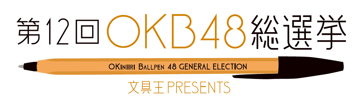
OKB48

It’s time to get out and vote for your favorite pen at OKB48! Myke and I break down last year’s top ten, and I introduce an update to my Top 5 Pen In The Store. I also give an update on several new pens I have been putting to the test over the past month.

Show Notes & Download Links

This episode of The Pen Addict is sponsored by:

Kanilea Pen Co: Choose your Aloha today!

Pen Chalet: Click the ‘podcast’ link at the top of the website and enter the password 'penaddict' for this week's special offer, and to get your code for 10% off.

Posted on October 6, 2022 and filed under Podcast.

Visconti Sepia Ink Review

Visconti Sepia

(Sarah Read is an author, editor, yarn artist, and pen/paper/ink addict. You can find more about her at her website and on Twitter. And check out her latest book, Out of Water, now available where books are sold!)

Sepia is such a good staple ink color. Or colors, I should say, as "sepia" seems to be a catchall label for anything brownish. Visconti's Sepia is a classic brown. It's the color of milk chocolate and teddy bears, and while I would say that it's more standard brown that what I, personally, would consider sepia, it's a great ink.

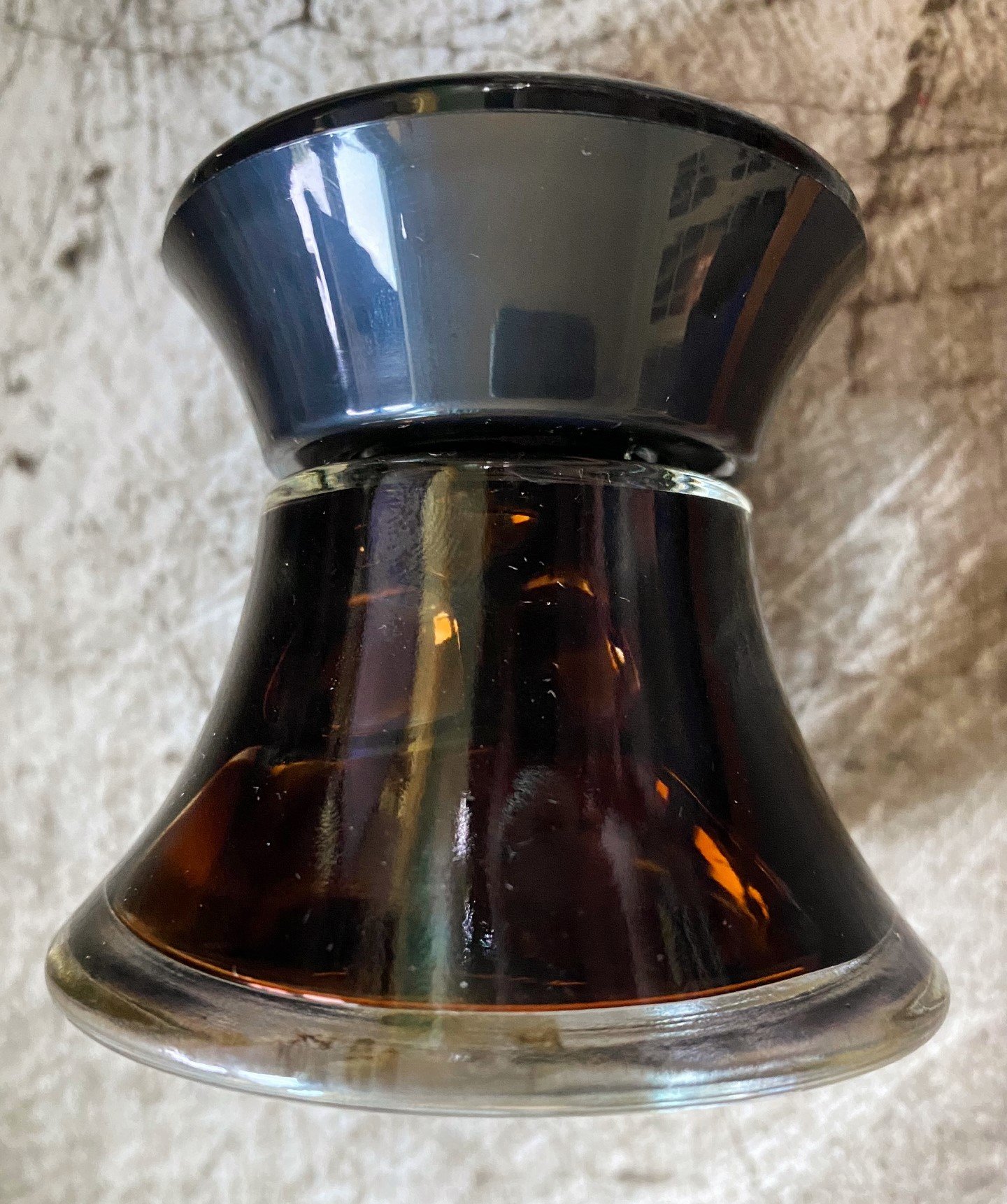
The ink comes in a glass bottle with a unique, very Visconti V shape. The wide base makes it easy to fill from. You would have to try pretty hard to knock this bottle over. I do wonder if filling will be trickier when the ink becomes shallow, but there is a plastic insert in the bottle that is designed to prevent that challenge. I can't say how well it works, as I never seem to get to the bottom of any of my ink bottles.

Visconti Sepia

While the color of this ink is very rich, it's otherwise fairly plain. There's almost no shading, no shimmer or sheen. It's a utilitarian brown. It also doesn't bleed or feather. It does have an unusually long dry time, which surprised me a little, as the ink feels dry when writing with it. It also has a little bit of water resistance. Where water drops were dabbed or wiped away, you can still see faint lines where the ink was. It wouldn't be enough to prevent catastrophe if a notebook was soaked, but it might survive a sprinkle.

Visconti Sepia

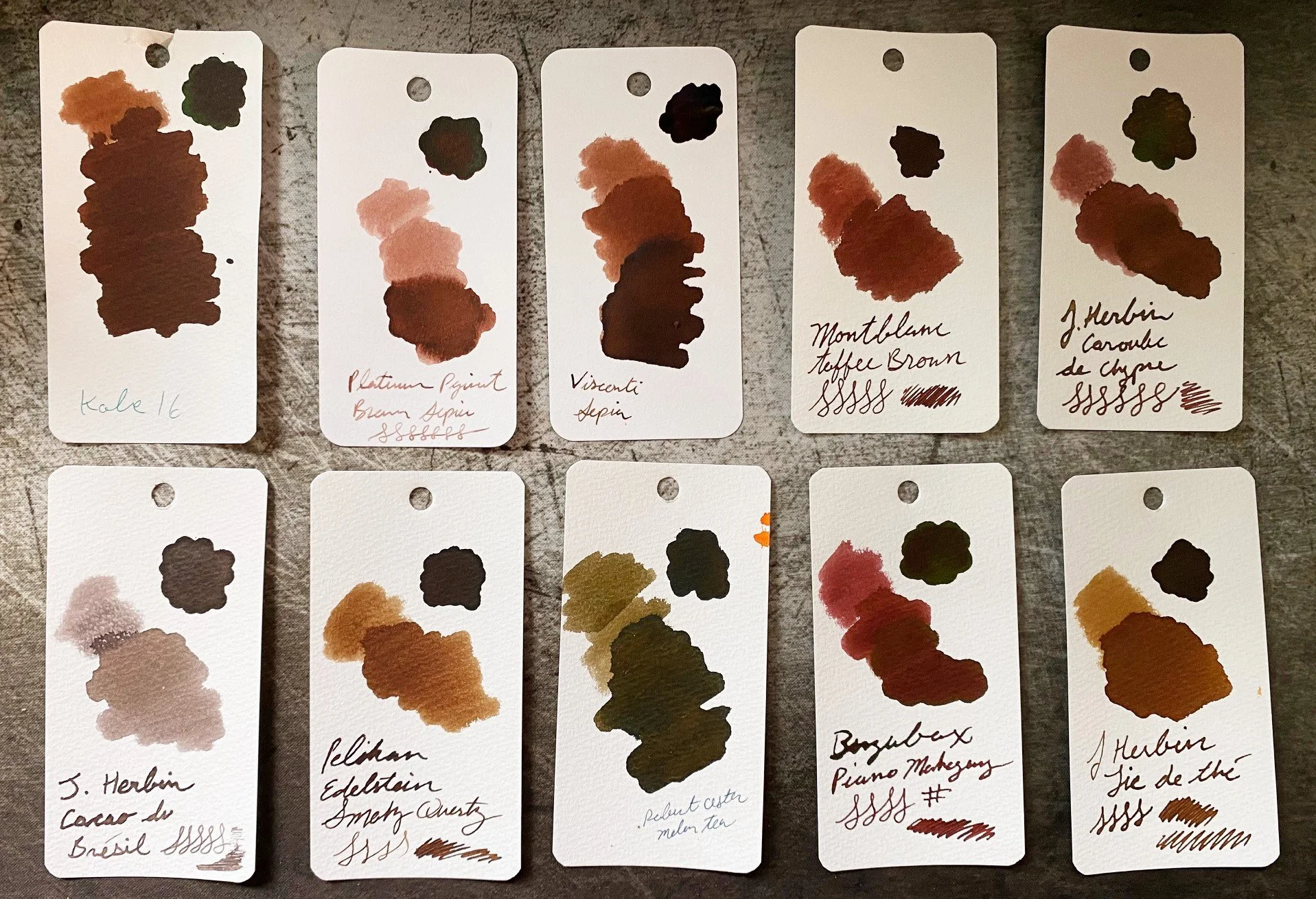
Chromatography for this color started off fairly predictable--a warm brown separating into shades of other orangey-browns, but then it gave us a surprise pop of violet-blue at the end. Perhaps that's to cool the color down a bit, though it still reads warm to me on the page. Compared to similar browns, it most closely resembles Mont Blanc Toffee, though it goes much darker with heavier application.

Visconti Sepia

This is a rather large bottle of ink, clocking in at 50ml, and it sells $35. I think that's slightly expensive, but color-wise, not a bad choice if your favorite flavor of sepia is chocolate.

(Vanness Pens provided this product at a discount to The Pen Addict for review purposes.)


Enjoy reading The Pen Addict? Then consider becoming a member to receive additional weekly content, giveaways, and discounts in The Pen Addict shop. Plus, you support me and the site directly, for which I am very grateful.

Membership starts at just $5/month, with a discounted annual option available. To find out more about membership click here and join us!

Visconti Sepia
Posted on October 6, 2022 and filed under Visconti, Ink Reviews.

Wearingeul The Mind Fountain Pen Ink Review

Wearingeul The Mind Fountain Pen Ink Review

(Jeff Abbott is a regular contributor at The Pen Addict. You can find more from Jeff online at Draft Evolution and Twitter.)

At this point, I'm not surprised at all to have an in bottle in my hands from a company that I've never heard of before. In fact, it's pretty exciting because you can be pretty certain that whatever ink is inside will be both well-behaved and visually interesting. The fountain pen ink market is booming, and that's great news for us.

The latest ink to cross my desk is from a Korean company called Wearingeul. The Mind is part of an ink series that focuses on different literary figures. The Mind represents Natsume Sōseki, a Japanese author from the early 20th century. I haven't read any of his work, but this ink introduced me to his name, which means I now have several things in my reading queue. I'm a big fan of ink naming schemes that introduce you to other subjects.

Wearingeul The Mind Fountain Pen Ink

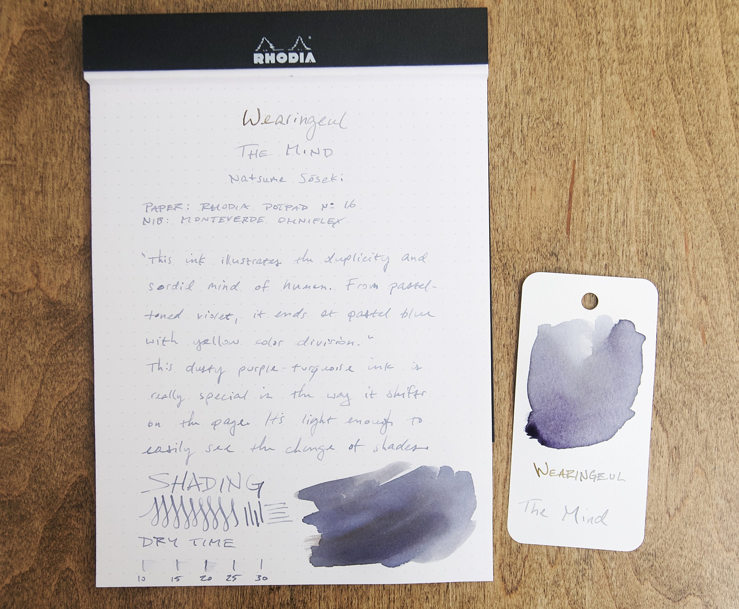
The Mind is a subdued purple ink with decent shading and a faint yellow sheen that looks great on paper. I'm not sure who did it first, but Wearingeul is another ink company that includes a Pantone code that corresponds to the ink hue. In this case, it's Pantone 5405 U. To my eye, this looks like a blue gray, which is really similar to the average color that I see from this ink on paper. There's a bit of shading and sheen that creates some hue variation, but it stays true to this main color.

This ink illustrates the duplicity and sordid mind of human. From pastel-toned violet, it ends in pastel blue with yellow color division.

It's a great color, but I struggle to see the violet. Maybe it's just my eyes, but it just looks blue gray to me. After holding some Pilot Iroshiku Fuyu-syogun next to this ink, I can't tell them apart! I might've just confused my brain, but whatever I did has had a permanent effect. Either way, it's still a fantastic color.

Wearingeul The Mind Fountain Pen Ink

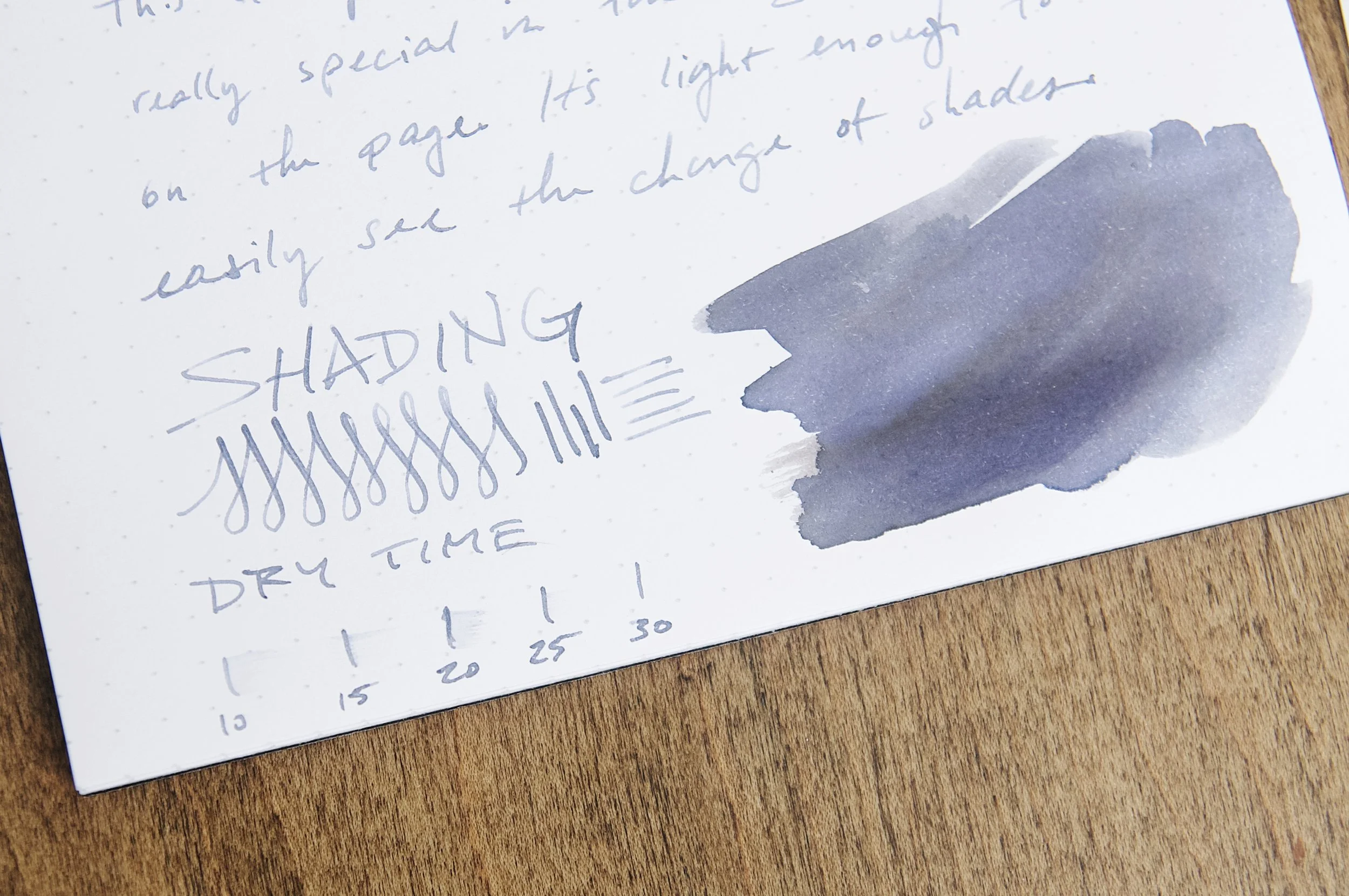
The blue gray tones vary back and forth a bit with the ink shading, but the yellow sheen is what really interests me. It doesn't show up easily, and hardly ever at all in a normal nib. Swatching the ink is the best way to observe the sheen, but that's not really a normal way to use ink. If you use a large enough nib, you'll see a bit of shading, but not nearly as much as I'd like to see.

The Mind behaves really well in the pen. It starts smoothly, doesn't bleed or feather, and flows really well. It's pleasant to use and makes any good nib shine. The only area where this ink doesn't impress is dry time. This is a slow drying ink, coming in anywhere from 20 to 30 seconds. The Monteverde Omniflex nib I used for this test normally operates like a wet fine nib, so these times should be fairly comparable for a lot of different nib sizes. 20 to 30 seconds is a long time!

Wearingeul The Mind Fountain Pen Ink

Speaking of drying, that's where this ink lost some of its allure for me. The dry-on-the-page color is a dusty blue-gray like you see in the photos. When writing with this ink and while the ink is still wet, it does have more of a purple hue. I like the wet color a lot, and I wish it kept more of that after the ink dried.

The Mind comes in a 30ml bottle and runs for $20. If The Mind isn't to your liking, I suggest you look around at all the other colors they have to offer. There are some really beautiful inks in their collection that I'd love to try some day. I really look forward to what they come up with next.

(Goldspot provided this product at a discount to The Pen Addict for review purposes.)


Enjoy reading The Pen Addict? Then consider becoming a member to receive additional weekly content, giveaways, and discounts in The Pen Addict shop. Plus, you support me and the site directly, for which I am very grateful.

Membership starts at just $5/month, with a discounted annual option available. To find out more about membership click here and join us!

Posted on October 5, 2022 and filed under Ink Reviews, Wearingeul.