
“Swing by the table later. I’ve got something for you.”
When a pen maker stops me in the hallway of a pen show and drops that on me I instantly have a new number one priority at the show.
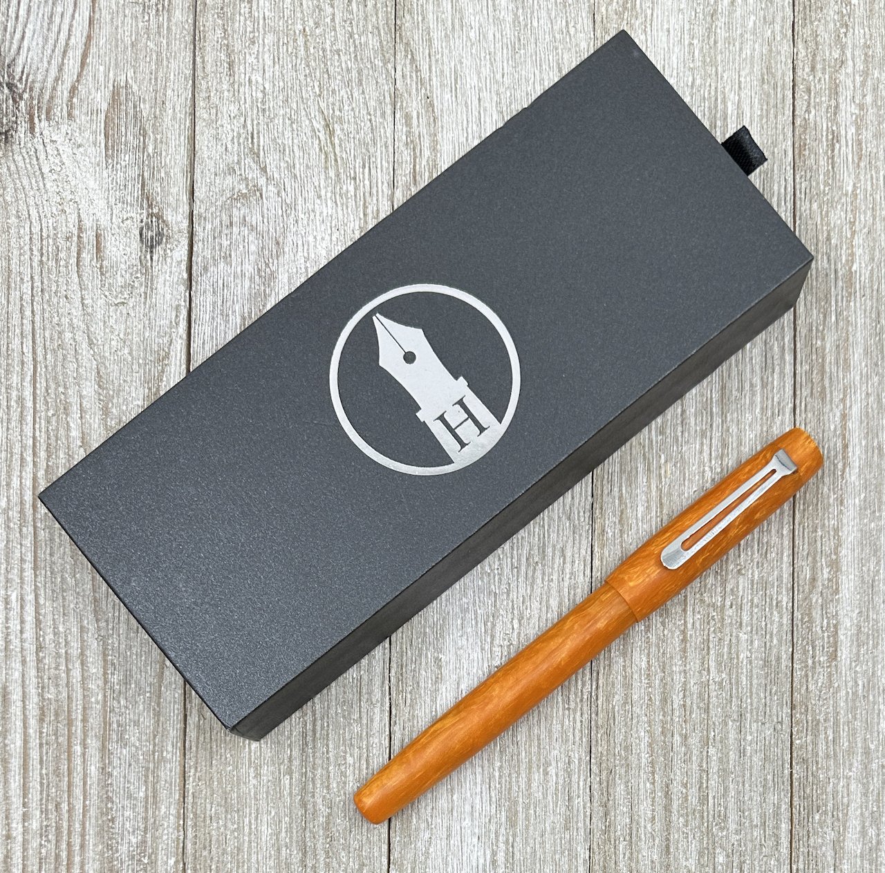
In this case, Greg Hardy of Hardy Penwrights was speaking my love language, and I made a point to drop by his table at the earliest opportunity.
What he had for me served two purposes. One, he wanted me to test a specific design of his that he thought I would like, and two, he wanted to got full “Pen Addict” on the design just for me. Needless to say, both of those things had me pretty excited.
The pen model is the 10-R Retro, which Greg designed to take on the size and feel of vintage fountain pens. In short, from the product page:
“the Retro is designed for our customers who appreciate the size and feel of vintage pens while wanting the ease of using a modern pen.”
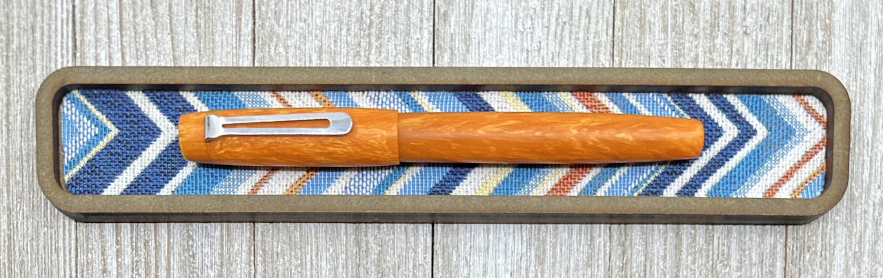
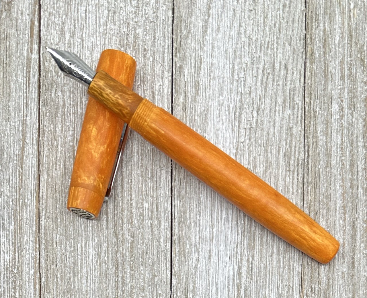
The funny thing is that if Greg never told me the inspiration behind this pen, the words “vintage” or “retro” would have never crossed my mind. My initial thoughts were that this is a perfectly shaped pen for my tastes. It features a slightly narrower than standard barrel, a slightly shorter length cap and grip section, a classically shaped stainless steel clip, and a #5 Bock nib (more on that in a minute.)

The most important part of the 10-R is what you can’t see: an integrated metal sleeve beneath the grip section. This makes every bit of difference in this pen. I knew it felt great when I uncapped it, but I didn’t know exactly why until Greg told me to unscrew the barrel. There, I saw the insert that made all of the difference.
So yeah, this is a smaller, narrower fountain pen. If you like that style like I do then the 10-R Retro is one to look at.

Kaweco Sport #5 nib (left) vs. Bock #5.
The nib is another consideration. As I mentioned, it is a Bock #5, which is slightly wider across the shoulders of the nib than comparable nibs from Jowo or Schmidt. This one is firm and fine, and writes well. It should, as Greg had it tuned by Kirk Speer at Pen Realm before giving it to me.
At this point, if it sounds like Greg was setting me up for a review that couldn’t fail, well, you would be right. I mean, did you see the Orange Sherbert material by Tim Crowe at Turnt Pen Co. that he used? Oh by the way, Greg made a custom finial, too. All. The. Things.

Price wise, the 10-R Retro checks in at $275, which I think is at the top end for this pen. That makes sense as it is made in smaller batches compared to the 10-T Traveller, which runs $185 but has certain economies of scale built in to allow for a lower price. For me, I prefer the 10-R design, and the differences it has over standard barrel shapes.


This pen was a gift from Greg, and I’m thankful for the opportunities I have to meet makers like him, and share in his creations. Thanks Greg!
Enjoy reading The Pen Addict? Then consider becoming a member to receive additional weekly content, giveaways, and discounts in The Pen Addict shop. Plus, you support me and the site directly, for which I am very grateful.
Membership starts at just $5/month, with a discounted annual option available. To find out more about membership click here and join us!


