The Pen Addict Podcast: Episode 588 - Thick Paper Means Fountain Pens Work

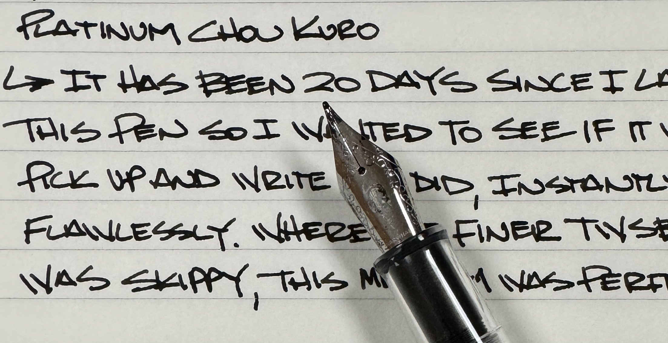
We have some great stuff for you in this week’s episode, including my commentary on Platinum Chou Kuro, Fountain Pen Day prep, a projectile pen update, and two Horror Stories for your enjoyment!

Show Notes & Download Links

This episode of The Pen Addict is sponsored by:

Pen Chalet: Click the ‘podcast’ link at the top of the website and enter the password 'penaddict' for this week's special offer, and to get your code for 10% off.

Retro 51: Life's too short to carry an ugly pen. Shop now and use the code PAJOLLY for a special treat with your shipment.

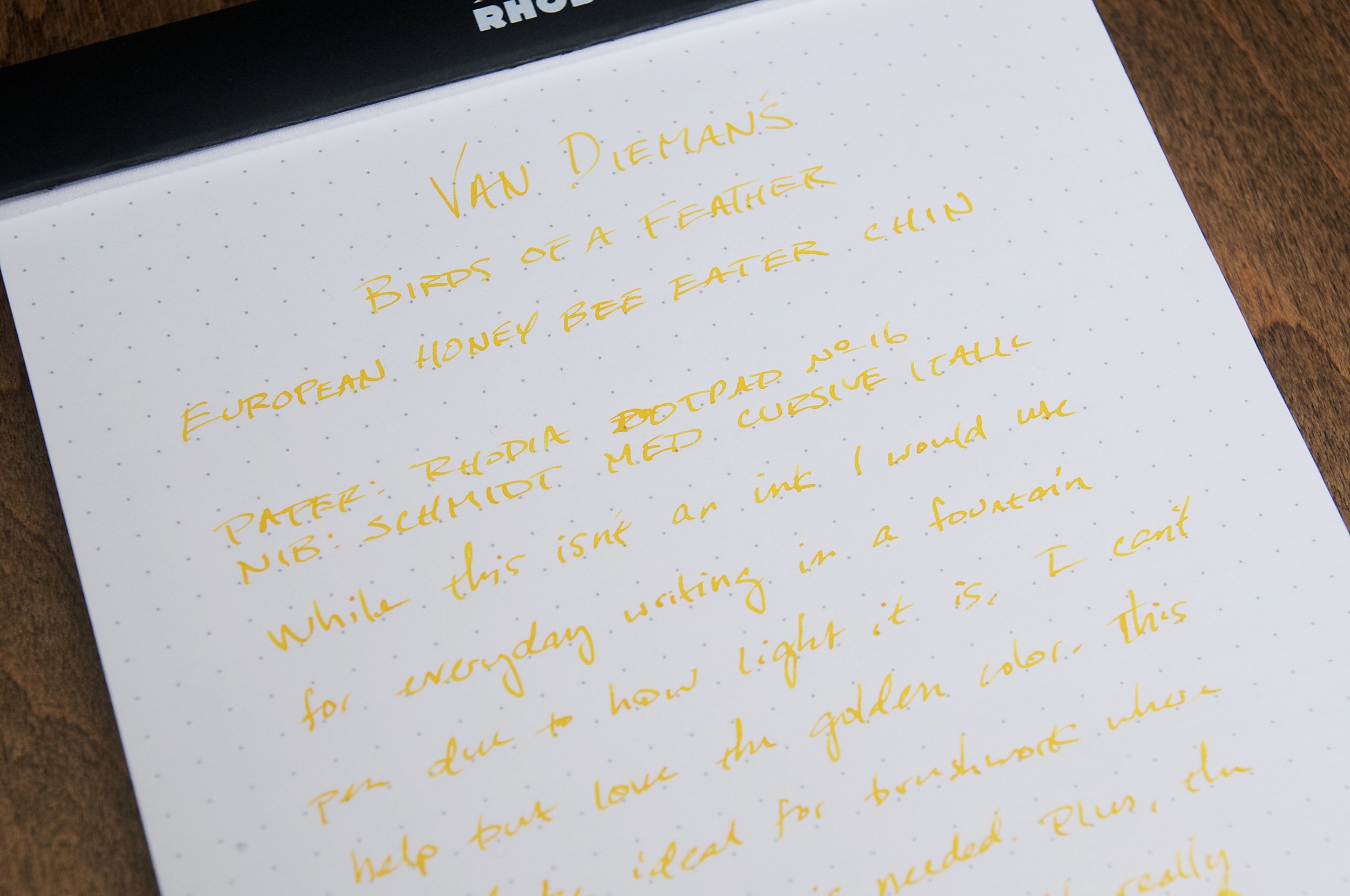
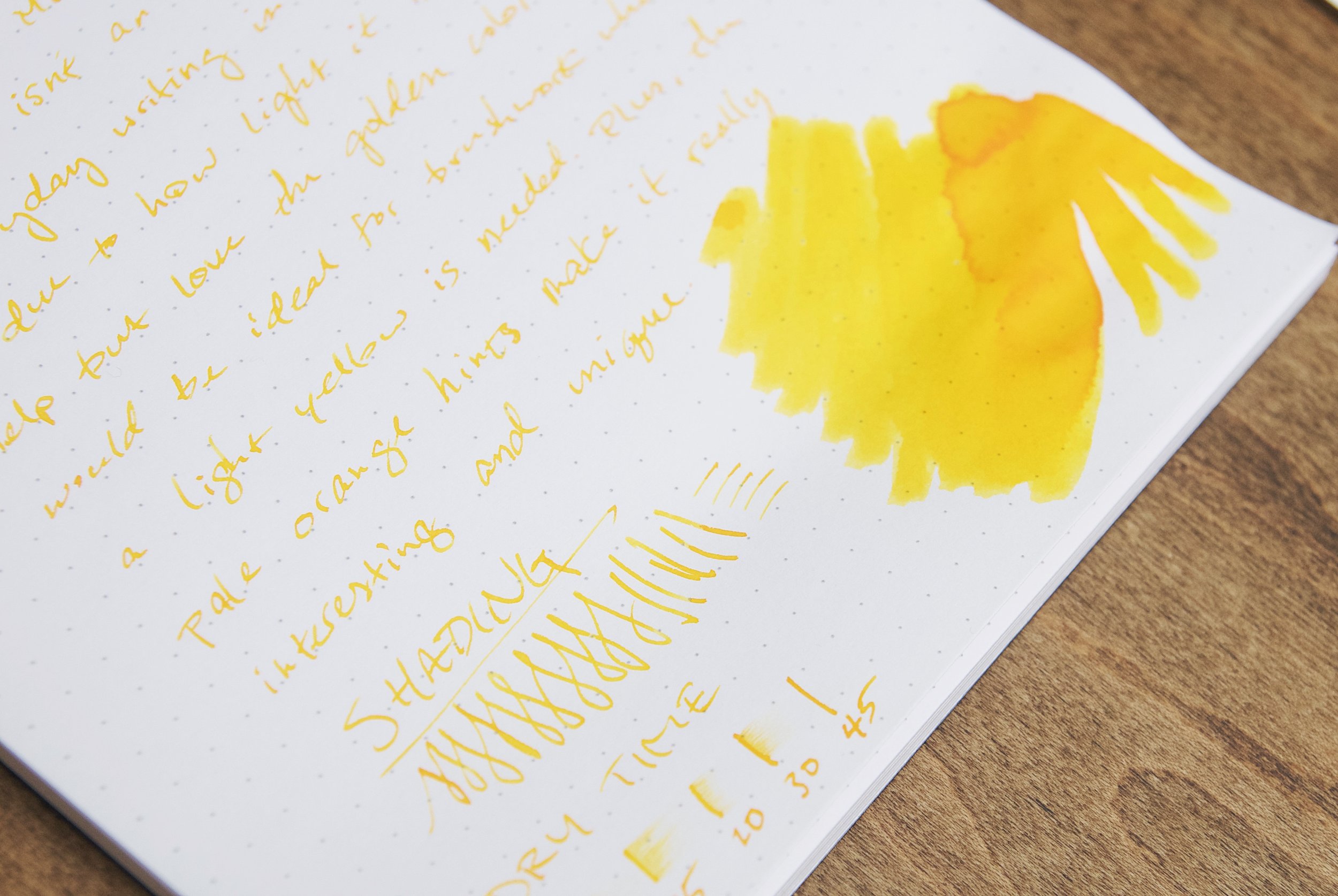
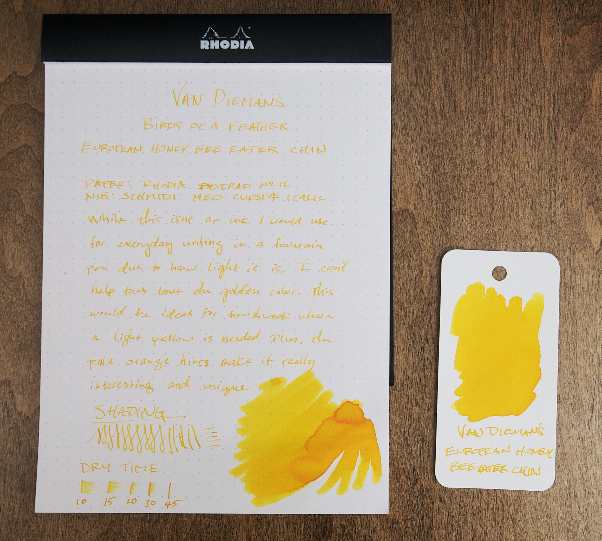
Platinum Chou Kuro Review https://www.penaddict.com/blog/2023/10/30/platinum-chou-kuro-black-ink-review

Posted on November 2, 2023 and filed under Podcast.

Gravitas Pocket Fountain Pen Full White Delrin Review

(Sarah Read is an author, editor, yarn artist, and pen/paper/ink addict. You can find more about her at her website and on Twitter. And her latest book, Root Rot, is now available for pre-order!)

When I received my Gravitas Quark, there was a stowaway in the package. There, nestled in with the expected items, was a leatherette pen sleeve, and inside that was the best hitchhiker ever--a white Delrin pocket fountain pen. I hadn't yet tried any of Gravitas's standard pocket pens, so this was a very welcome addition to the collection.

The most striking thing about the Delrin material is how light it is. The pen hardly weighs anything at only 13g capped or posted. The light weight makes it easy and comfortable to write with, and the Delrin warms in the hand, so there's no fatigue even with very long writing sessions.

The pen is shaped similarly to a Kaweco pocket pen, where the cap covers most of the body. That keeps it compact when closed, and then when posted, the long cap transforms it into a full-sized pen. The end finials are both shaped to a sharp point, and one side of the cap is machined flat to serve as a roll-stop. The grip section is finely textured to prevent slipping, and it has a nice tapered shape that is easy to hold.

The nib it comes with is one of Gravitas's own nibs, which fits Jowo nib units. It also comes with a wee plunger converter, though it also takes short international cartridges. It also comes with two O-rings, one on the grip section threads and one on the cap threads, that add extra security if you want to eyedropper the pen. I haven't tried eyedroppering it yet, but I plan to next fill.

The nib writes very smoothly with good ink flow. The only issue that might annoy some users is that the texture of the grip traps ink when filling from a bottle, so there may be some discoloration between cleanings. Some inks might even cause some staining to the white material there. This doesn't bother me, personally--I like inky grips as much as I like inky fingers--but I know some folks who hate it. Maybe go for the black Delrin, if that's you!

This pen sells for 90 Euros, or around $95. While that's a lot compared to the similar-appearing Kaweco, this Delrin material makes a huge difference in quality that's reflected in that price. This is a tough, workhorse pen. Which is good, because it's inked up for NaNoWriMo, and it's time to put it to work.

(Gravitas Pens provided this product at no charge to The Pen Addict for review purposes.)


Enjoy reading The Pen Addict? Then consider becoming a member to receive additional weekly content, giveaways, and discounts in The Pen Addict shop. Plus, you support me and the site directly, for which I am very grateful.

Membership starts at just $5/month, with a discounted annual option available. To find out more about membership click here and join us!

Posted on November 2, 2023 and filed under Gravitas, Fountain Pens, Pen Reviews.

Van Dieman's European Honey Bee Eater Chin Ink Review

(Jeff Abbott is a regular contributor at The Pen Addict. You can find more from Jeff online at Draft Evolution and Twitter.)

I really admire the level of bird knowledge that Van Dieman's possess, and I really enjoy the result of all that knowledge when it comes to their ink naming process. I'm no stranger to the Birds of a Feather collection from Van Dieman's. Each ink represents not only a specific bird, but a specific color of that bird's plumage. It's incredibly specific and I always learn about a new bird species with each of these inks. The latest of this collection to cross my desk is European Honey Bee Eater Chin. While not my favorite name, it's a surprisingly interesting yellow ink.

When it comes to yellow inks, you already know that you'll likely need a specific use case in mind prior to purchasing. Since they're so light, they don't tend to work well on typical light colored papers. It's not much fun to use a beautiful ink on a paper that doesn't allow the ink to show its full personality, and that's exactly the problem I see with European Honey Bee Eater Chin (known simply as EHBEC from here on). The golden yellow color is absolutely delicious, but you have to use it with the right paper to see it.

It's probably safe to guess that most fountain pen inks are intended as daily writing colors for typical paper (white, off-white, ivory, cream, etc.). There are outliers, sure — some inks are meant specifically for highlighting over other inks. In this case, you need a light-colored hue with plenty of transparency, but you also want an ink formula that doesn't cause other inks to bleed, feather, or smudge when used on top. EHBEC is a typical writing ink (I don't believe it's intended to be a highlighting ink), but I think the best way to use this ink is for ink drawings instead of writing. For someone that uses fountain pens for drawing, this color is something I assume would be fun to use to bring some golden yellow brightness to a drawing or illustration.

While the color isn't great on white paper, it's still legible if there's plenty of light. But this ink really shines when contrasted by nearby dark colors. I've always marveled at how much a tiny smidge of white or a similarly light color can dramatically change a drawing that's already full of color. This yellow is a great accent color.

Writing with this ink is typical for Van Dieman's inks. It's well-behaved — it starts easily, flows smoothly, and doesn't feather or bleed. Due to the light hue, nothing at all shows through to the back of the page. The ink is a little dry in terms of how the nib feels when writing (meaning it feels like the ink lacks lubrication), but there's plenty of flow for quick jots or shading strokes.

There's a small amount of shading that comes out in broader strokes (or in swatches or shading) that hints at a mild orange color hidden beneath the intense yellow colors. I wouldn't say the ink shades a lot, but there is a small amount of consistent shading that adds just enough orange character to catch my eye and make me smile.

I'm not an artist by any means, so I'm not sharing any of my doodles here — but I'm really pleased by how this ink interacts with others. It complements whatever I put it next to. While it will never be a daily writing option for me due to the difficulty in reading what I've written, I'll still keep it around for making accents and creating contrast.

If you haven't already, take a minute to admire the namesake bird. The pop of color on the bird's chin/throat is exactly how this ink acts on paper. The chin is such a small part of this bird's plumage, and I see several other colors that would also make fantastic ink colors.

This is a fascinating ink color that really respects the original inspiration, and this is why I find the Birds of a Feather collection so interesting. If you'd like to try it out, you can pick up a 4ml sample for $4.25 or a 30ml bottle for $17 over at Vanness Pens.

(Vanness Pens provided this product at a discount to The Pen Addict for review purposes.)


Enjoy reading The Pen Addict? Then consider becoming a member to receive additional weekly content, giveaways, and discounts in The Pen Addict shop. Plus, you support me and the site directly, for which I am very grateful.

Membership starts at just $5/month, with a discounted annual option available. To find out more about membership click here and join us!

Posted on November 1, 2023 and filed under Van Dieman's, Ink Reviews.