

I’m digging into the TWSBI ECO stash this week, and joining the rave with the Glow Purple Fountain Pen. It’s Purple on the outside, and glows Blue in the dark - which is where we all do our best writing, of course. I have one with a Steel Extra Fine nib to give away this week, so read the rules below and enter away!
IKKAKU by Nahvalur Gradient Urushi Fountain Pen Review

The story of Nahvalur as a brand has been an interesting journey, to say the least. As a stationery fan, it has been fun to see them begin with what many would consider an entry level fountain pen, continue to refine that same pen model over the years, and quickly escalate into new models, materials, and designs. Slow and steady has not been their mantra, and so far, it is working out.

The IKKAKU series, for example, is the pinnacle of their product range. Think Namiki, as it relates to Pilot - a sub-brand of the more well-known main lineup, where all bets are off as far as creativity and craftsmanship go. IKKAKU has already seen close to ten designs released, with the latest - the three pen Gradient Urushi Collection - launching earlier this month.
Each of the Cinnabar Red, Vermillion, and Scallion Green - the model I have been loaned for this review - go through a months-long creation process. Urushi lacquer art requires the repetition of coating, sanding, polishing, and drying dozens of times to end up with the finished product. I love the light, airy feel these pens and this process brings to my own writing experience.

I chose the Scallion Green model to review for two reasons: One, while each pen has a raden gradient sprinkled down the cap, it is most noticeable in this model, and two, the transition into the black grip section was the most visually appealing of the three models. Both Cinnabar Red and Vermillion have a much harsher transition, and on a pen defined by its gradient, I think it could be better represented into the section.
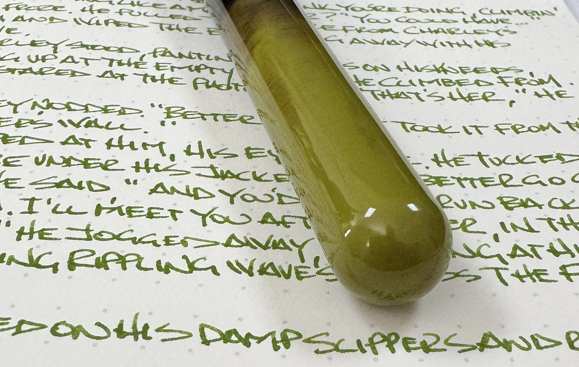
Speaking of gradients, the layering application of the urushi looks wonderful. As someone who owns a range of different urushi pens with different finish qualities, I appreciate this one as much as any. The Scallion Green color is darkest, and deepest, at the end of the barrel, and slowly gets lighter as it traverses down the barrel, ending with stray green brush strokes in black lacquer. The solid black then transitions into the aforementioned galaxy of raden, with the heaviest application near the top of the cap. All three pens follow this same pattern, with their respective colors.

The pen is fitted with a Fine 14K gold nib, manufactured in-house by Nahvalur. Combined with the feed, I have found the flow to be excellent, and would even call it a wet writer as it is currently set up. Obviously, there are specific ink and paper characteristics to consider, so your mileage may vary. The nib is soft, with a little bounce in it, so the lines are wide for a Fine nib, at least as compared to something like a firm steel Jowo Fine nib. The line width relates closely to the German manufacturers (Faber-Castell, Lamy, Pelikan,) more than anything else. The nib was smooth and properly aligned right out of the box, and I didn’t have to adjust it at all. I have enjoyed writing with this pen from the moment I inked it up.

While you will see rare instances of urushi lacquered pens with a piston-filling mechanism, that is an outlier, so Nahvalur uses the standard international cartridge/converter filling system. All of my urushi pens use a similar setup, and work well.
The final, and possibly most important, talking point of the IKKAKU Gradient Urushi pen is the price. At $699 for any of the three models, this is an expensive pen. That said, I believe it is priced fairly for the amount of time and the level of craftsmanship required to produce pens like these.

Nakaya Piccolo, left. Nakaya Portable, right.

Pilot Custom 743, top. TWSBI ECO, bottom.
If I were to break it down even further and focus on my personal value proposition for this pen, I’d want to see two changes to better justify adding this pen to my collection. First off, the grip section needs to be lacquered to match the barrel. This goes for the model I reviewed, but even more so, the other two models. Different brands handle this differently, and there is no wrong way, but it is something I would like at this price point. Secondly, I want a more substantial, and unique, clip design. I’m not a fan of this thin style of clip Nahvalur likes to use on many of their pens, and it stands out to me even more here. If IKKAKU is your premium offering, differentiate the clip somehow.

Red stripe ebonite base.
I like what Nahvalur is doing with their brand as a whole. A company who can make quality pens at every price point will always have my attention. I look forward to the continued experimentation of not only their standard pens, but with the IKKAKU lineup as well.
(Nahvalur loaned this product to The Pen Addict for review purposes.)
Enjoy reading The Pen Addict? Then consider becoming a member to receive additional weekly content, giveaways, and discounts in The Pen Addict shop. Plus, you support me and the site directly, for which I am very grateful.
Membership starts at just $5/month, with a discounted annual option available. To find out more about membership click here and join us!

Misfill, CAPS Edition

Each week in Refill, the Pen Addict Members newsletter, I publish Ink Links as part of the additional content you receive for being a member. And each week, after 10 to 15 links, plus my added commentary on each, I'm left with many great items I want to share. Enter Misfill. Here are this weeks links:
— CAPS ’24 – The California Pen Show (The Poor Penman)
— California Pen Show Wrap-Up (The Well-Appointed Desk)
— My First Pen Show (The Cramped)
— Sunshine after rain, by Nishijima Katsuyuki (ZEN in TECHNICOLOR)
— Ultem® Fountain Pens – Hype or Here to Stay (dapprman)
— Vinta Summer Green (Inkcredible Colours)
— Lamy Dark Lilac (2016) vs. Lamy Dark Lilac (2024) vs. Lamy Blackberry - YouTube (inksplat!)
— An archive of illustration from c.1950-1975 (Modern Illustration)
— E Wolff & Son and Arthur Johnson Merge (Pencil Fodder)
— Review and Giveaway...the Benu Viper (Figboot on Pens)
— Iroful Fountain Pen Friendly Paper Review | Better Than Cosmo Air Light? (Blake's Broadcast)
— Why Writing by Hand Is Better for Memory and Learning (Scientific American)
— Root Map. (Present & Correct)
— Pen review: Retro 51 P-51 Mustang (idipbananasintocoffee)
— Pen Pit Stop : Parker Sonnet SE18 Atlas / Journey (inkxplorations)
— A Home For My Stickers using My Cottagecore Apothecary Jar (The Life of a Crafty Gardener)
— Zhanjiang Liu embraces unpredictability in his chaotic pen and ink drawings of daily life (Creative Boom)
— Step Into a World of Contemporary Japanese Art at New Exhibition in New York (Spoon & Tamago)
— Extra Fine Writing explains: vacuum-filling fountain pens (Extra Fine Writing)
— Anderillium Cephalopod Inks, Part 2 (Mountain of Ink)
— Journaling Series: On Starting a Journal (Writing at Large)
— What’s What 2/18-2/24 2024 (Line Variation)
— The Best Writing Pens, According to Authors, Artists and Creatives (Buy Side from WSJ)
Want to catch the rest, plus extra articles, reviews, commentary, discounts, and more? Try out a Pen Addict Membership for only $5 per month!


