
(Kimberly (she/her) took the express train down the fountain pen/stationery rabbit hole and doesn't want to be rescued. She can be found on Instagram @allthehobbies because there really are many, many hobbies!.)
Growing up, I always looked through mail order catalogs and wished for the day I could get stationery with my name on it. I don’t know what I was going to do with it but it always seemed like a neat idea. When we first moved to our house, one of the first things I did was place an order for address labels since I was still paying a lot of the bills by mail (gasp!). And prior to that, the last time I had any stationery personalized was our wedding invitations. Fast forward to now and I get personalized items in the mail whether I want them or not - usually in the form of address labels or notepads, from organizations wanting donations. Pro tip: if you want address labels, just make a donation to a non-profit and eventually you’ll get more address labels than you could possibly ever use, lol.
Some time ago, a friend mailed me a note on their personalized stationery - a card complete with engraving and monogram, and in a lined & addressed envelope too. I absolutely loved getting something so fancy - it made me feel extra special. I was immediately struck with the need to have something like that for those special occasions when a generic-card-from-a-box isn’t enough. So I gave Jeremy Saumere of Flax Pen-to-Paper a heads-up that my next visit would entail picking out personalized stationery.
Consultation appointments are recommended (but not required) so the team can give you their full attention. Expect to spend at least a couple hours for your first visit. Three hours isn’t unheard of if you want to look through all the binders and don’t quite know what you’re looking for (like me). You can also spread it out over multiple appointments if you aren’t able to decide after the first session (all appointments/consultations are free). The initial visit needs to be in-person so you can not only see the colors but also feel the texture of the papers and print process. After the first meeting, the team can do virtual consultations, if needed. Jeremy did a follow-up virtual meeting with me because some of the options I chose had been discontinued.
Custom stationery is a personal thing and should reflect your personality, likes/dislikes, and use cases. Everyone will be different so looking for “popular” or “trendy” items kind of defeats the idea of personalized stationery. It was very helpful for me to have Jeremy to bounce ideas off of because it can be hard to pick between the various options, especially when they start looking more and more similar. He wasn’t helping me just because we’re friends - this is part of the free consultation service & experience that they provide.

Companies use large binders to show off their catalog of personalized items. There were more binders than this at the shop!
I knew that I wanted flat note cards, as opposed to folded ones, and I didn’t need paper for letter writing. I also wanted something a little more budget-friendly, so Jeremy pulled out a few binders for me to look through. After flipping through a few binders, I ended up liking more of the items from The Rytex Company.
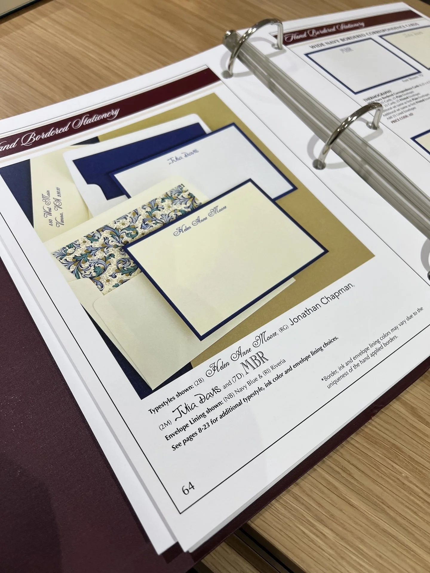
I liked the simplicity and elegance of a color bordered card and I loved the liner of the envelope.

Could you tell I really liked this envelope liner?

Some of the pages include actual samples so you can see the colors and feel the textures of the paper, print process, envelopes, etc.

I also looked at some mini note cards (index card-sized.)

Each item has a price code (like AA, AB, AC, etc.) with prices that include the item (card, sheet, etc.), cost for plain envelopes, printed, or lined (envelope would have a decorative paper inside, not that there are lines in/on the envelope), and price per set of 25.
After picking the items that I liked (and checking the price sheet), I also had to figure out paper color, font, ink color, and print process, which is how the ink is applied to the paper. The print standard print processes are Engraving (raised using an engraving plate), Letterpress (pressed into the paper with a plate), Embossing (raised text, usually with no color), Thermography (mimics engraving using a heat process and resin powder), Lithography or Flat printing (single color process), and Foil Stamping.

Different print processes on various papers and ink colors. Each company has their own “swatch book” with their available papers, print processes and colors. I picked Thermography because of the texture.

You can see that different processes can lead to subtle variations in colors and shades (top/left row is Charcoal, the other is Grey Suede.)
After flipping through a couple of binders multiple times, I ended up picking some mini cards and larger correspondence cards and then it was font picking time.

Pages and pages of different fonts to choose from.
I had a hard time imagining how my name would look once it’s all put together, so I opted to get digital proofs. Prices for digital proofs depend on the company - some offer a free proof, and others charge $15 per round of proofs, etc. It takes a few days to turn around digital proofs. Proofs are entirely optional and not required to place the order.

I ended up picking the top one because I liked the spacing between the letters and I liked the L better. The print at the bottom felt a little too cold and formal for what I wanted. (Note: this image was made by cropping/combining the images I got from Rytex. The actual proof image included my home address on the envelope.)

I loved how fun and whimsical this looked and thought it would be perfect for the times when I wanted to send a more casual note.
Once I reviewed and signed off on the proofs for spelling, color, font, etc., my order was shipped a couple weeks later directly from The Rytex Company. Shipping is not included in the price and is typically in the $13-25 range - more if you need rush or international delivery.

So excited to open up these boxes of stationery!

These mini cards are the perfect size for short notes!
I picked the Thermography process which resulted in a darker font color on the mini cards, so it didn’t quite match the envelope liner as well as it would have had I chosen a different process. This was something I didn’t pay much attention to since I was getting a bit overwhelmed/overloaded by the time I got to picking the process. I think if I was local to the shop, I wouldn’t have tried to cram all the browsing and decision-making in one session. And I definitely would take a bit more time looking at, and understanding the differences between the various print processes and that the digital proofs don’t factor in color differences as a result of the selected print process.

OMG, these came out so awesome! I love how these cards are “so not me” but also “yeah, totally me” at the same time!
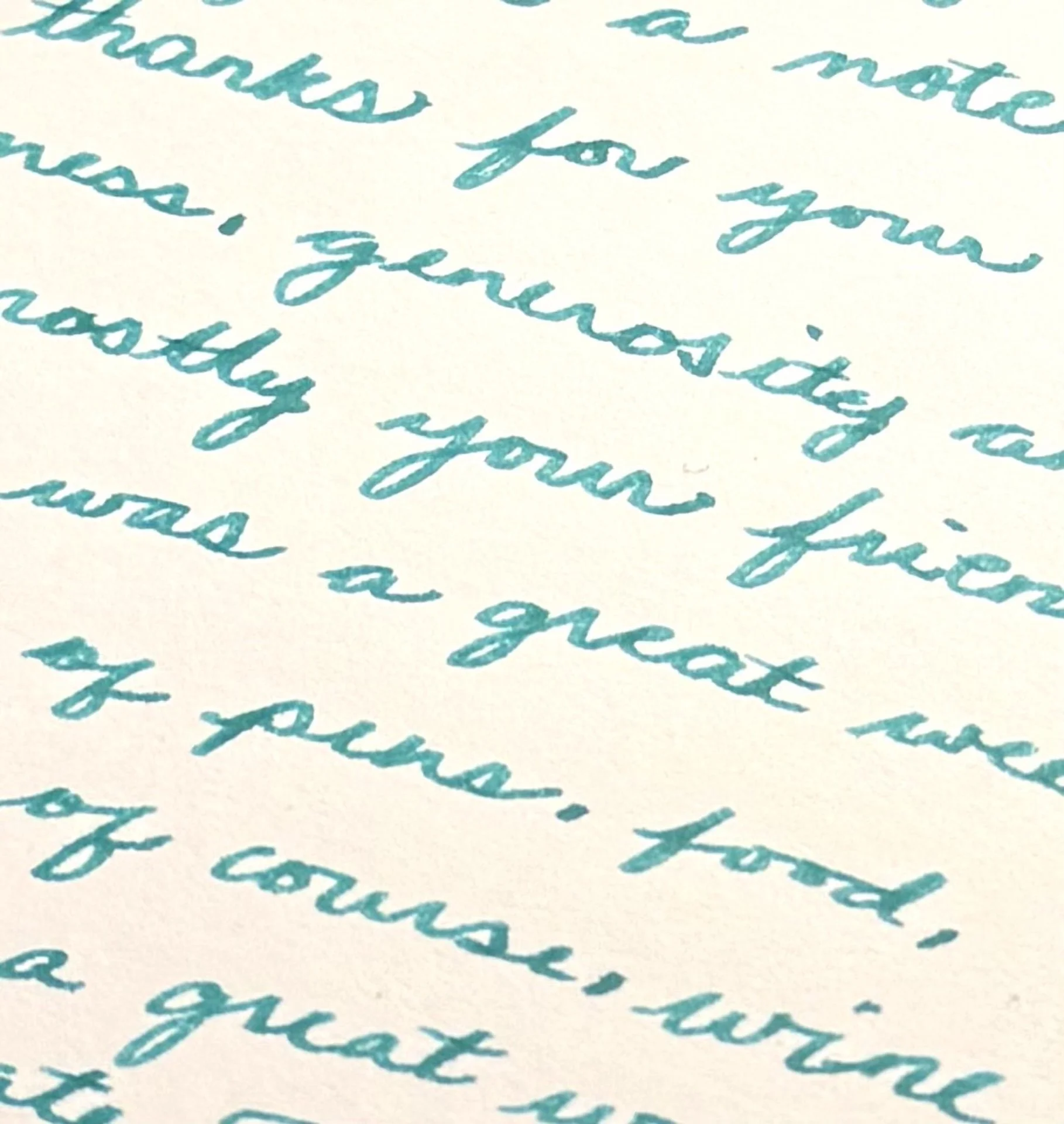
A writing sample on the mini card to thank Jeremy for all his help. Written with a Pelikan M800 with a Medium CI by Masuyama and inked with Laban Poseidon Green.
Personalized stationery isn’t for everyone and yes, it is more expensive than a box of cards (though if you want to go that route, I love the cards by Crane which are classic and also fountain pen friendly). But when you want to send something special with your personal touch, I highly recommend it. Jeremy has graciously offered a 10% discount (excluding shipping), but it’s only available from now through the end of March 2025, so reach out to them so you can get your own stationery too!
(Disclaimer: All products were purchased by me. Thank you to Jeremy for the consultation, your patience, and the discount 🙂!)


