

The Kaweco Collector's Edition Honey Fountain Pen is one of their sweetest releases in a while. I’m a big fan of Yellow-tone pens, and this one, with a gold-plated Extra Fine nib is perfect. I’m also including one of Kaweco’s new Mini Folding Converter with it. Read the rules below and enter away!
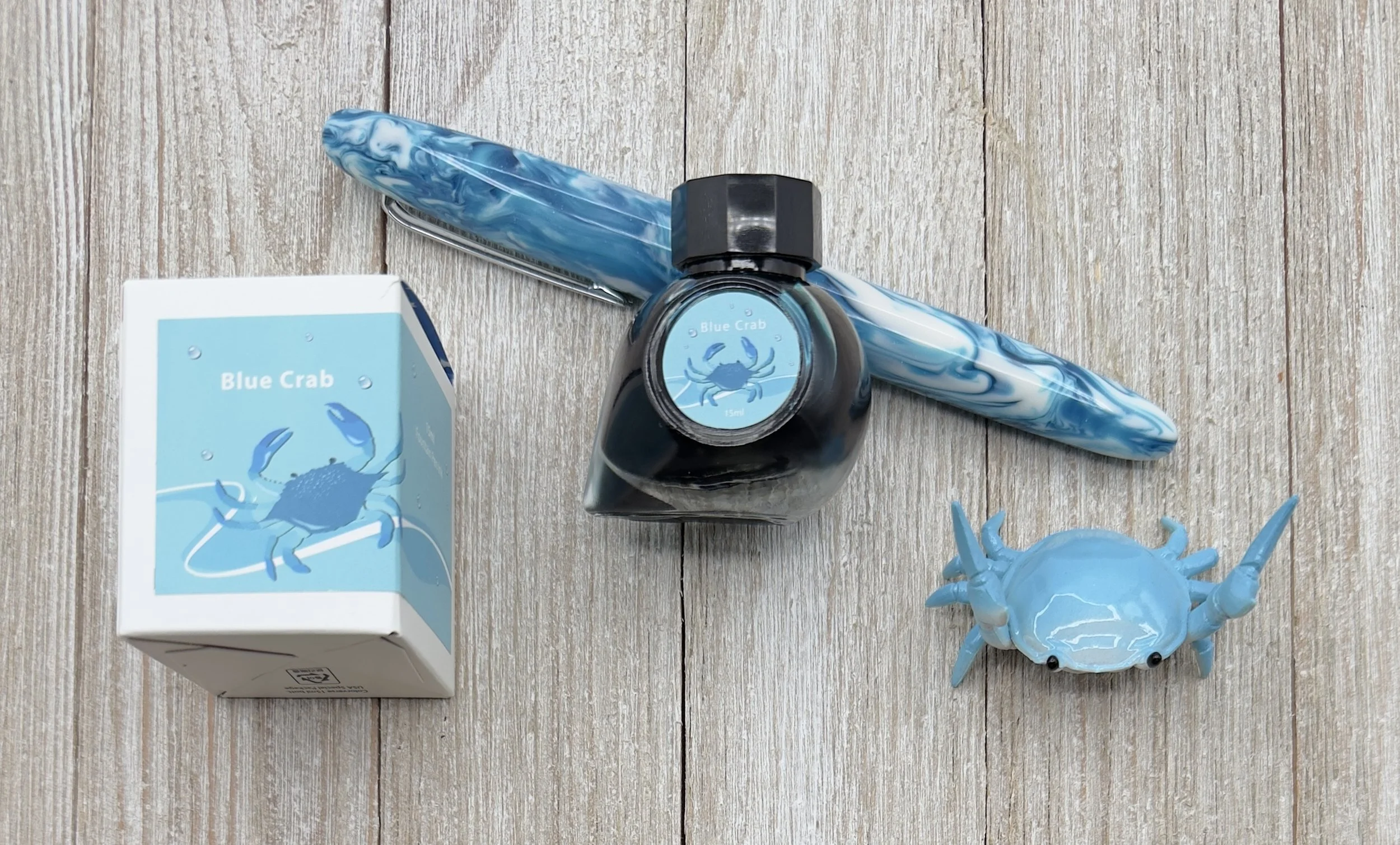
Colorverse Maryland Blue Crab Ink Review

Let’s be clear about something: I’m easily enabled. There are tiers of enabling, though. For example, “Hey Brad, LAMY has a new release, have you seen it?” Whether I answer that question with a yes or a no, I’m already on my way to buy whatever it is to get a look at it.
A much lower tier would be something like Blue ink. I have a Blue ink infestation on my ink shelf as it stands right now, with many shades represented. So when someone says, “Hey Brad, you should check out Colorverse Maryland Blue Crab, it’s an interesting Blue ink,” I have no business even considering adding yet another Blue to the collection.
But we wouldn’t be here now if I didn’t buy it, would we?
Once I looked at the swatch of Blue Crab, I did think it looked interesting, so I added it to my cart. Once it arrived and I inked it up, it looked better than I expected on the page. The best part about it is that I can’t exactly explain why.
Blue Crab was created by Colorverse to represent Maryland, as part of their USA 50 States series. These large sets are always fun to play around with, seeing what they come up with to represent - in this case - States. And Blue Crab for Maryland? How perfect is that. What did you think they would choose, Natty Boh?
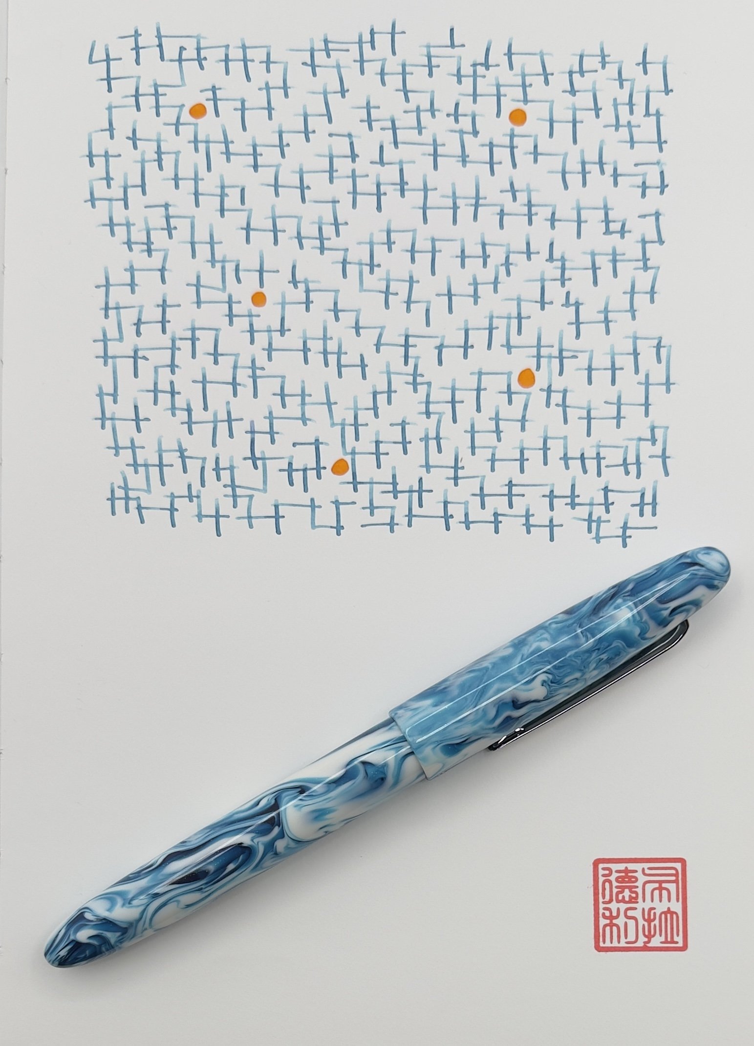
The description of this ink is listed as “pale sky blue ink with medium shading,” and while I agree with the shading description (which I love, btw,) I’m not sure I would call the color pale. Dusty maybe? Is there a difference between pale and dusty even? I’m not sure, but my point with Blue Crab, and the challenge I’m having, is how to describe it.
There are many ink descriptors we like to use - bright, saturated, light, dark, moody, etc. - and I’ve yet to be able to nail down this one. It’s weird and normal, odd and fun. It makes me like it more that I can’t define it specifically.
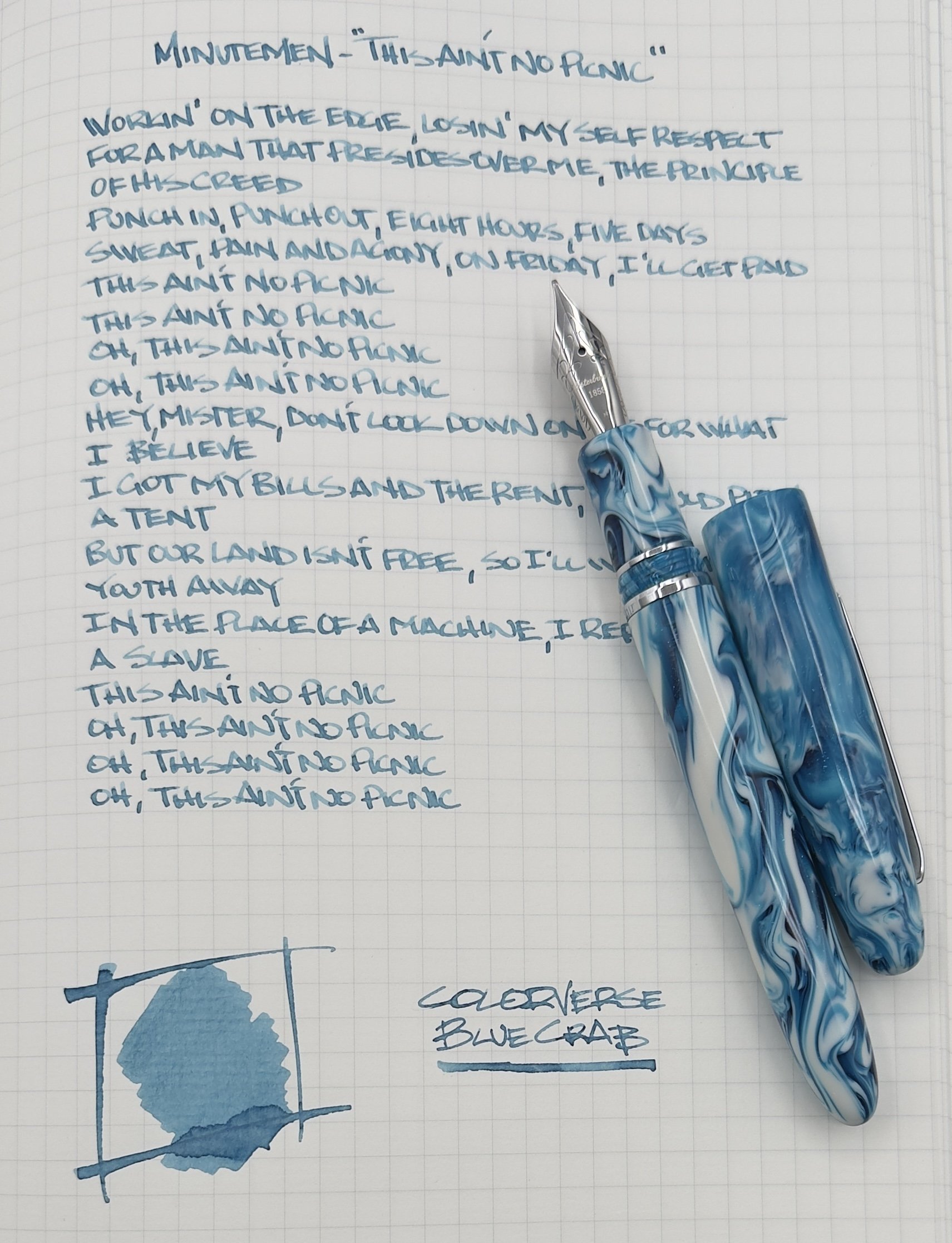
I used a prototype Esterbrook (sorry!) with a Journaler nib grind with Blue Crab, and I love the pairing. My letters look so good, mainly because of the shading the ink has. The grind, similar to a Stub nib, helps pull and pool the ink within my letters, from top to bottom, giving them that cool two-tone look we call shading. It’s my favorite aspect of this ink, and has me wanting to write more and more with it.

There are no performance or color downsides to Colorverse Blue Crab, but the bottle leaves a lot to be desired. I don’t mind 15 ml ink bottles, but the opening is so small that you are only getting a converter or syringe inside of it to fill your pen. I can deal with that, but if you aren’t prepared, that could be annoying. Also, at $13.50, it’s not exactly cheap per milliliter. There are many better values on the market.
In the case of Colorverse Maryland Blue Crab, I wasn’t going for value. I was going for CRABS! And I got them, in the form of a color I look forward to using frequently. Nicely done.
(Vanness Pens provided this product at a discount to The Pen Addict for review purposes.)
Enjoy reading The Pen Addict? Then consider becoming a member to receive additional weekly content, giveaways, and discounts in The Pen Addict shop. Plus, you support me and the site directly, for which I am very grateful.
Membership starts at just $5/month, with a discounted annual option available. To find out more about membership click here and join us!

Misfill, Butterflies Edition

Each week in Refill, the Pen Addict Members newsletter, I publish Ink Links as part of the additional content you receive for being a member. And each week, after 10 to 15 links, plus my added commentary on each, I'm left with many great items I want to share. Enter Misfill. Here are this weeks links:
— May Butterflies Ink Palettes (Mountain of Ink)
— Please Do Not Eat the Zines (KBBBlog)
— Lamy Petrol (2025 version) (Inkcredible Colours)
— Live from the 2025 Chicago Pen Show! (Inkdependence)
— Q1 2025 Carries (Everyday Commentary)
— Everyday Karas Basik.001 Review (The Poor Penman)
— Paper Systems and their Uses (Rachel's Reflections)
— Discarded Packaging and Labels Find New Life in Kelly Kozma's Vibrant Patchworks (Colossal)
— How Will Tarrifs Affect The Skate Industry? (Jenkem Magazine)
— Hooligan Georgia (Figboot on Pens)
— Finally a fountain pen you can use as a tactical baton (Extra Fine Writing)
— Ink Swatch Wednesday: A Hodgepodge (Cheryl Lindo Jones)
— The Paper Mind Tranext Notebook Review (Blake's Broadcast)
— Notebook Review: Logical Prime (Notebook Stories)
— Outsized impact (Stationery🍕)
— Ink review: Endless Alchemy Mocha Mousse Delight (The Well-Appointed Desk)
— "Emigre Fonts: Type Specimens, 1986–2024" Book (Core77)
— April-May’s Currently Inked Fountain Pens (Writing at Large)
Want to catch the rest, plus extra articles, reviews, commentary, discounts, and more? Try out a Pen Addict Membership for only $5 per month!


