Dominant Industry Takasago Ink Swatch Paper Review

(Kimberly (she/her) took the express train down the fountain pen/stationery rabbit hole and doesn't want to be rescued. She can be found on Instagram @allthehobbies because there really are many, many hobbies!.)

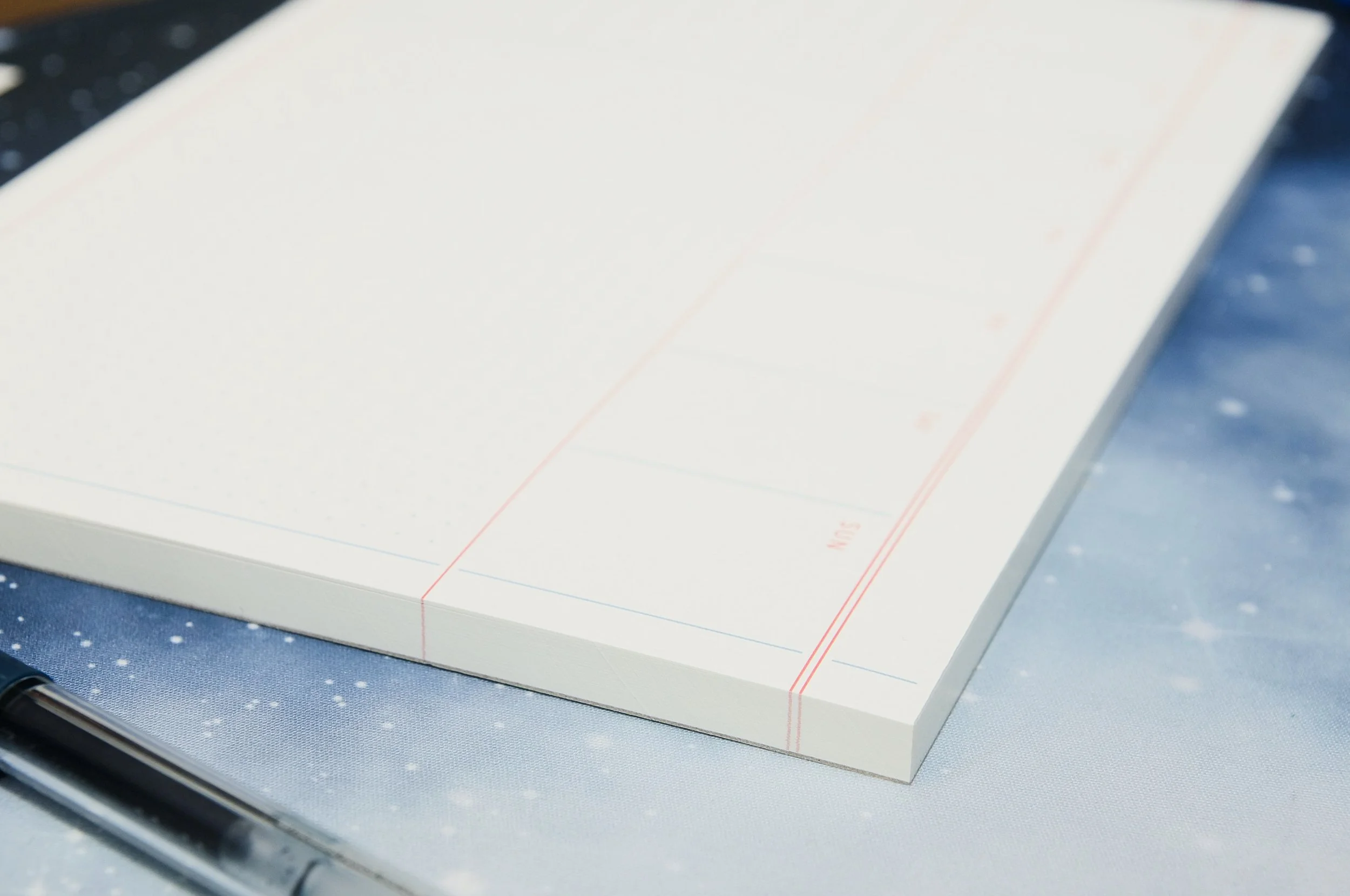
As if I needed more ways to swatch my inks, I couldn’t pass up the opportunity to try the swatch paper from Dominant Industry. The Dominant Industry Takasago Ink Swatch Paper measures 2” x 3.5” or 50 x 90 mm and comes in 3 designs of 40 cards each, packaged in a small cardboard case. Note that the packaging doesn’t say “swatch cards”, that’s just what I’m calling them in this review.

Dominant Industry Takasago Paper Ink Swatch Review

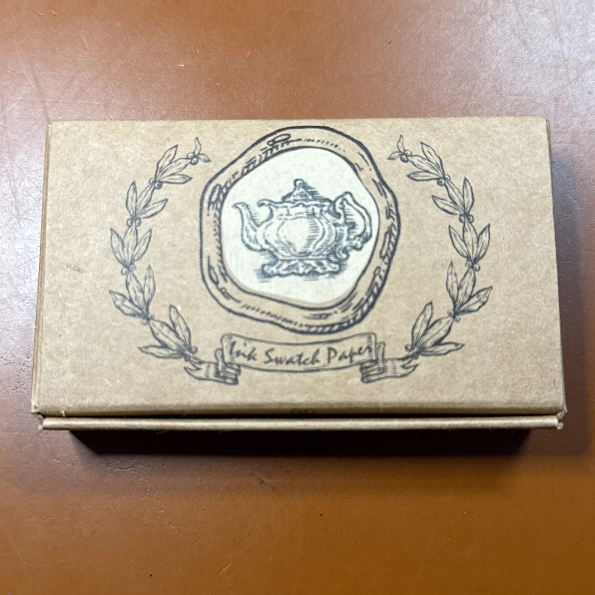
Box of Dominant Industry Takasago Paper ink swatch cards.

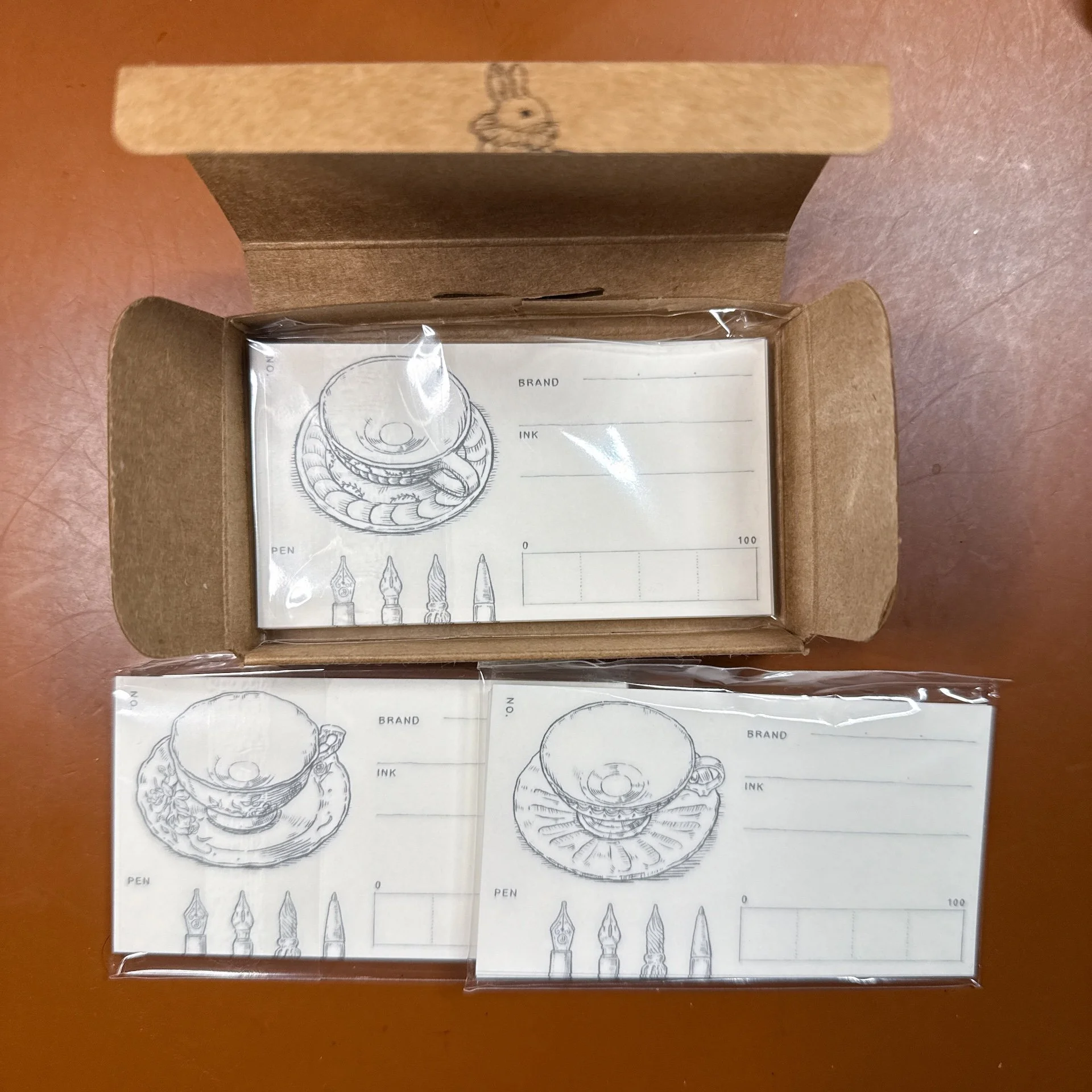
This is the Tea Time set - with 3 different designs.

Each one has a teacup image on the upper left, designs of writing tips on the bottom left (fountain pen, dip pen, glass dip pen, marker or pencil - not sure what the fourth one is, to be honest), space for Brand and Ink names, and a bar with 4 segments to color in as you see fit.

Testing notes:

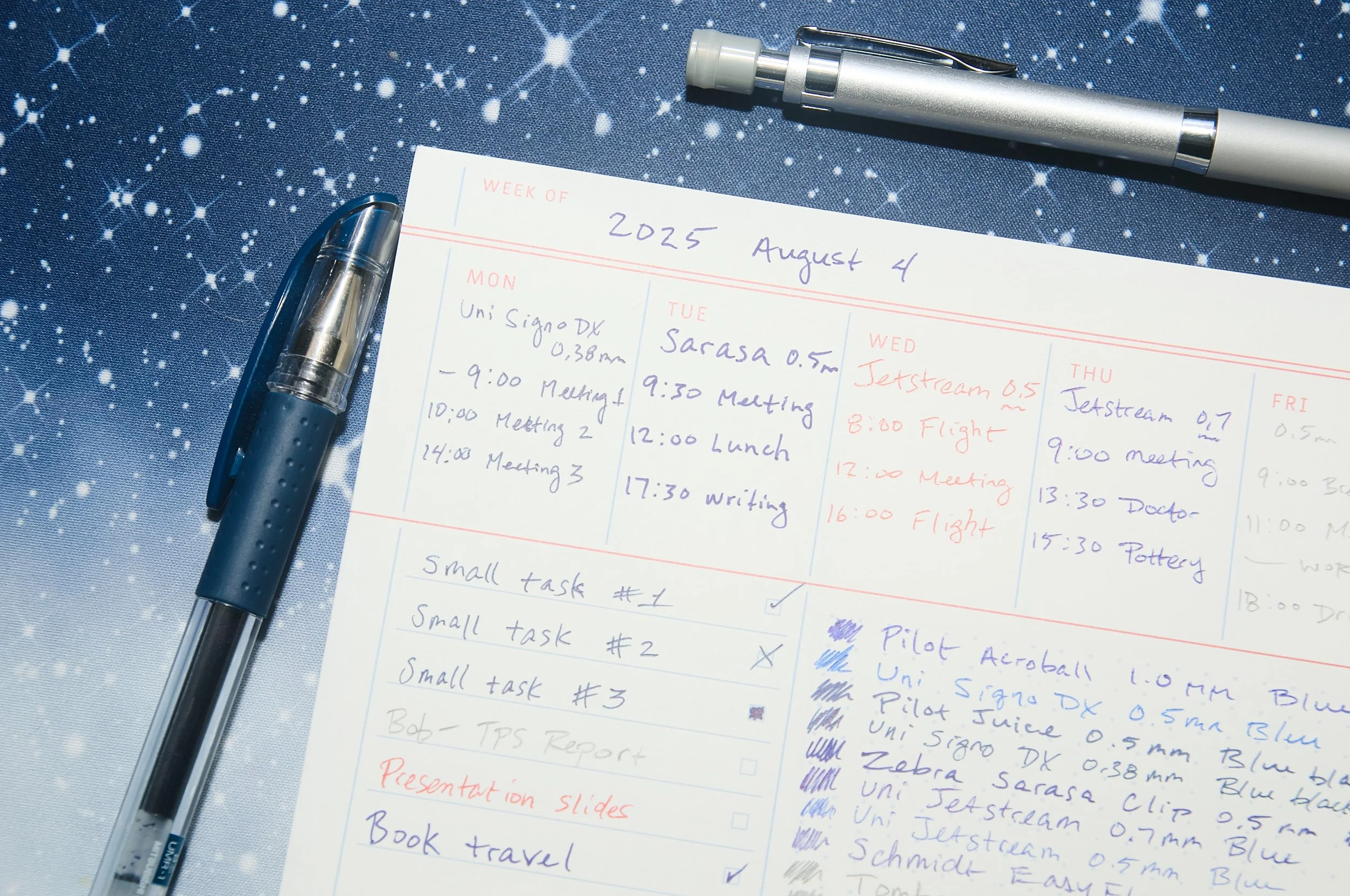
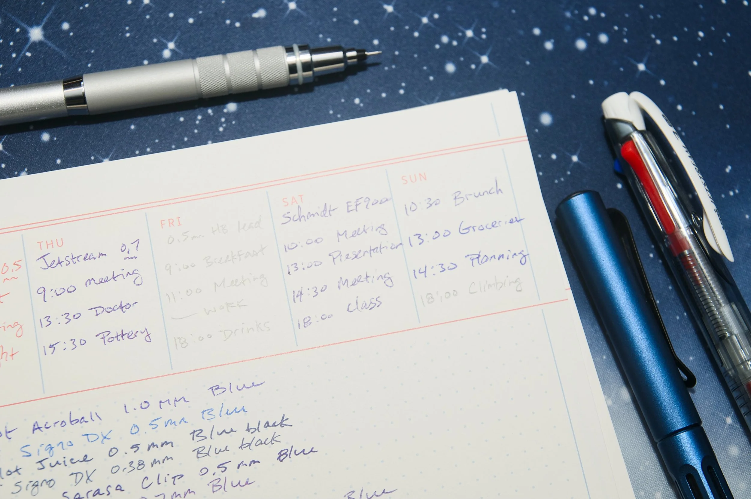
  • I used the Stainless Steel Kakimori dip nib in my trusty Kaweco clutch pencil holder to make the swatches and writing samples.
  • I used the DI swatch cards and Col-o-Ring cards (my go-to for swatch cards) for comparison.
  • I did not rinse the nibs while swatching the same ink on different cards/paper. I definitely rinsed after I was done swatching each color.
  • For the bottom right bar, I swatched from left to right to fill the whole space, then dabbed extra ink on the second half of the bar to make it darker.

I started out staying on brand and swatching some Dominant Industry inks.

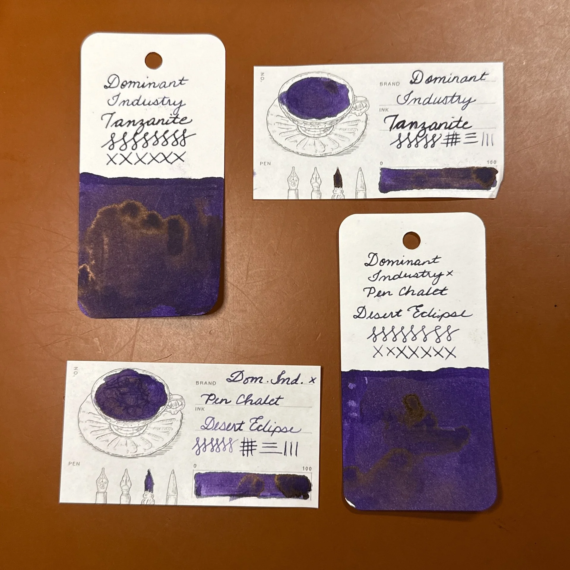
DI Tanzanite (top) and Pen Chalet exclusive Desert Eclipse. Both are very similar dark purples with a bit of copper sheen, with Tanzanite being a touch darker. DI swatches are similar to Col-o-Ring.

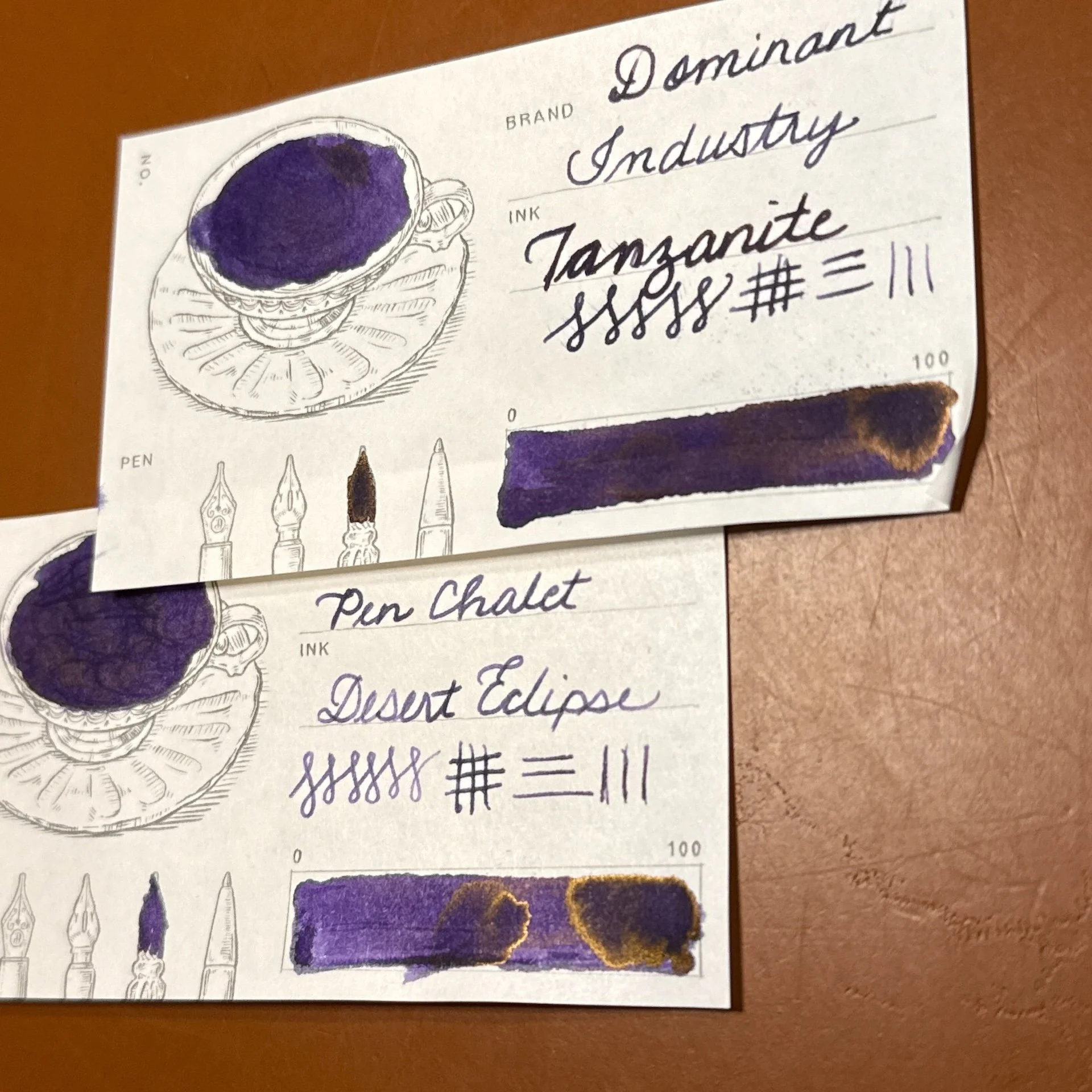
You can see that the DI cards also show some of the copper sheen.

Two more DI x Pen Chalet inks: Arizona Sky Crimson (top) and Arizona Sky Citrus. (bottom) Both DI cards are similar to Col-o-Ring.

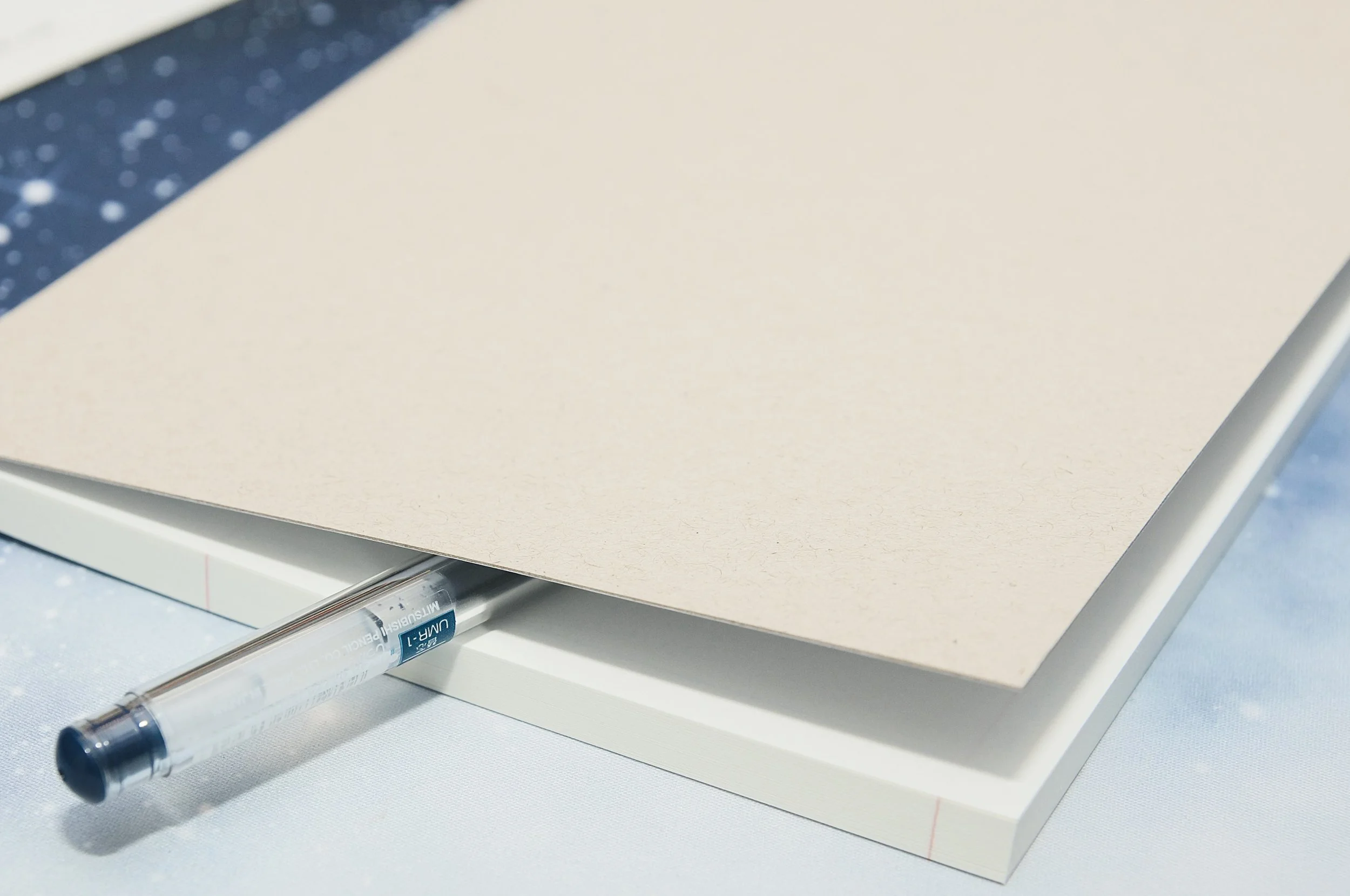
The cards are made from Takasago 87.9 gsm paper which happens to be the same weight as #5 in the Yamamoto Fountain Pen Friendly Paper Collection Vol. 7, but I can’t tell if they are exactly the same or not. The paper is very smooth to write/swatch on, and while it’s very thin, there was minimal ghosting and zero bleedthrough.

I wanted to make sure that the DI cards also worked well with other inks, so I swatched a few other brands too.

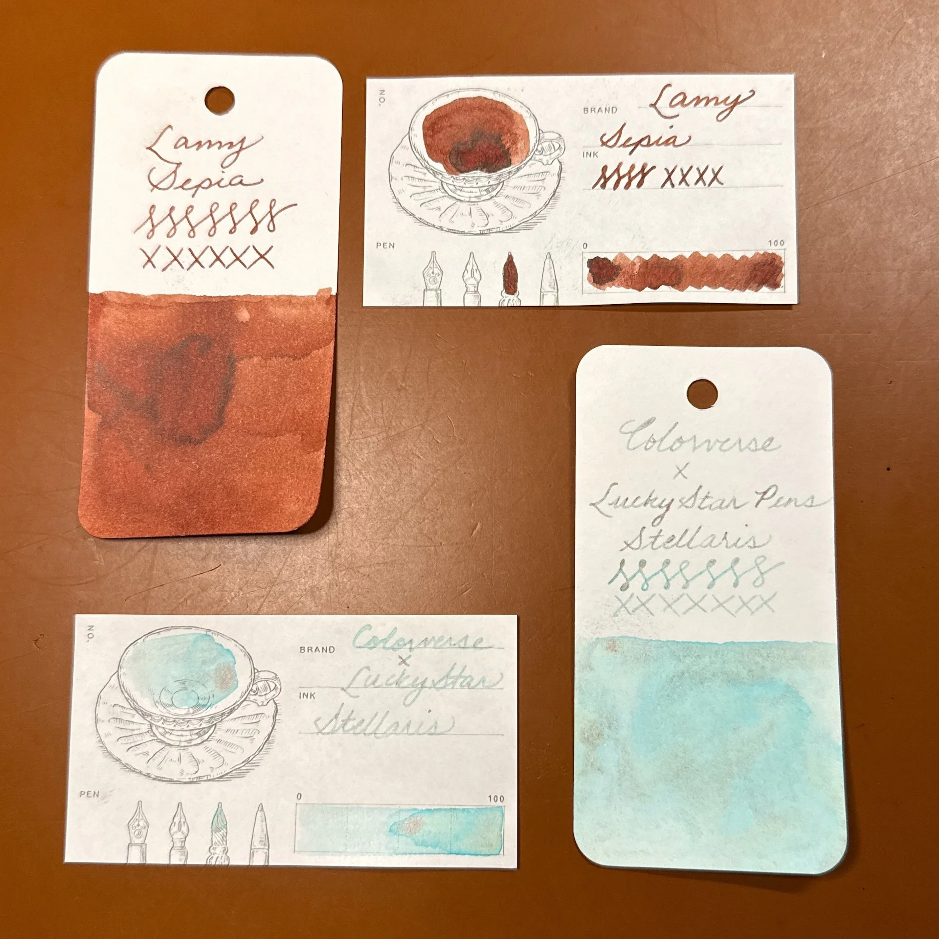
Lamy Sepia (top) and Colorverse x Lucky Star Pens Stellaris (bottom) - Both matched the Col-o-Ring. Sepia is a “straightforward” red-brown ink with a little bit of shading, while Stellaris has copper/rose gold shimmer, which showed up in both swatches. It also shows the turquoise outlines in the darker parts of the swatch.

I can go on with the various inks that matched the swatches on the Col-o-Ring, but what fun is that? There were other inks where the swatches were similar but a little bit off. Here are some examples:

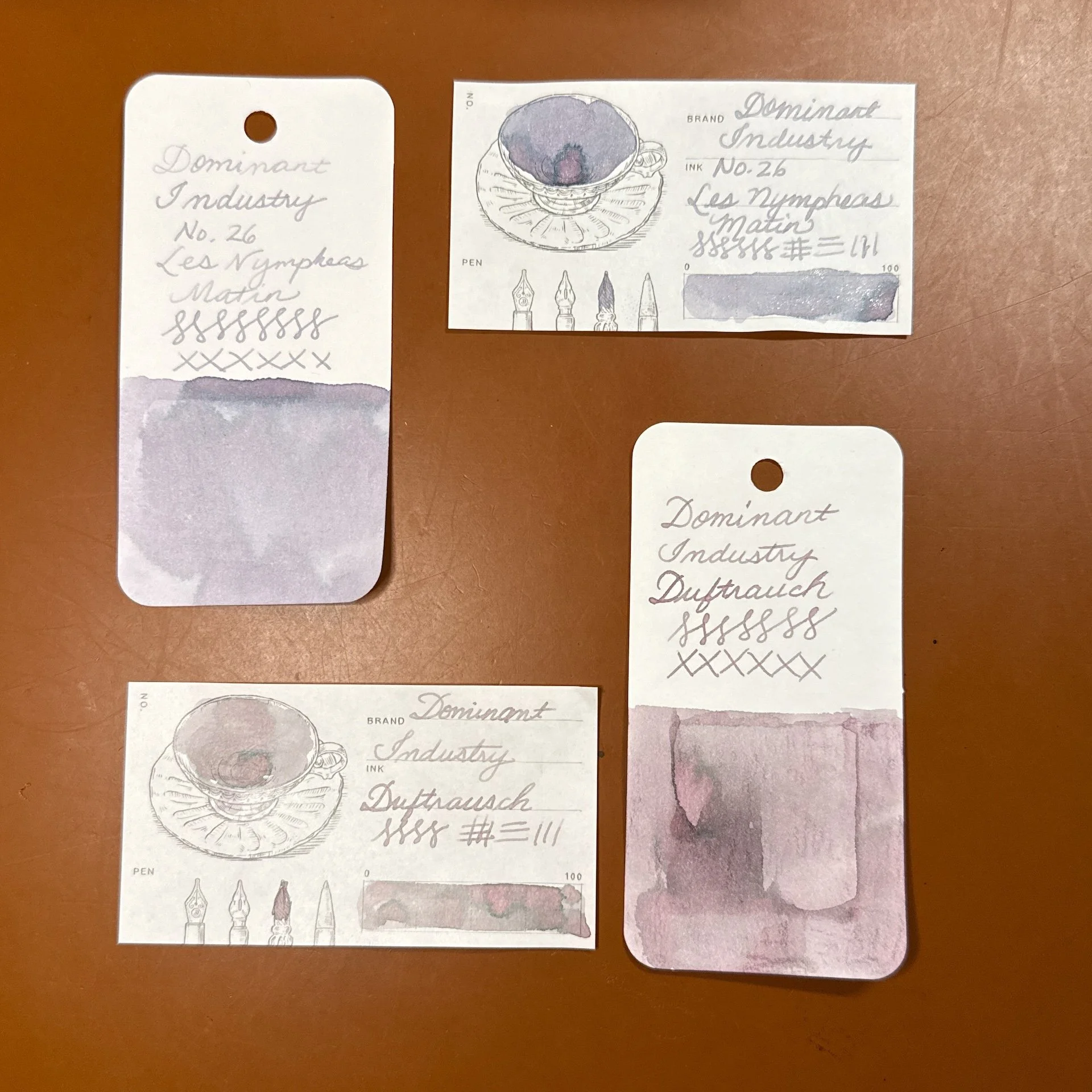
Dominant Industry Les Nympheas Matin (top) and Duftrausch (bottom) Nympheas is pretty similar on both the Col-o-Ring and the DI card, with the card showing a touch more purple, and the Dufrauch showing more pink on the Col-o-Ring vs a little more grey on the DI card.

This isn’t as easy to see in the pictures, but Anderillium Pompadour Cotinga Burgundy (top) is browner on the DI card than Col-o-Ring (which had some water drops resulting in bright pink spots). On the bottom, Anderillium Roseate Spoonbill Pink is a lighter pink in both the DI writing sample and the swatch. Only when I went over the same part of the bar multiple times, was the pink as dark as the Col-o-Ring writing or swatch.

Then there were some swatches that had me questioning whether I swatched the right ink or wrote down the right name and yes, I double-checked and it was not a mistake.

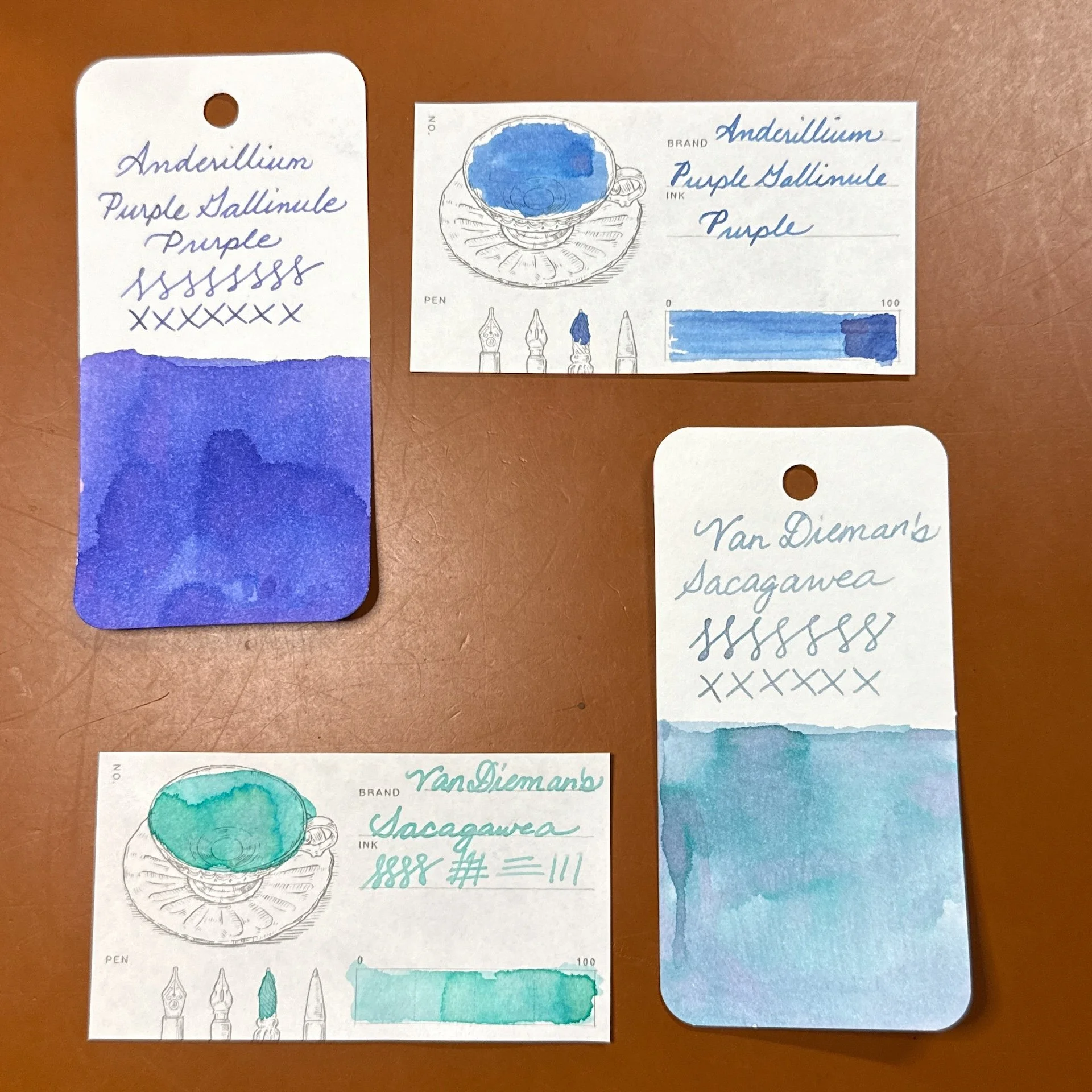
Anderillium Purple Gallinule Purple (top) is practically blue on the DI swatch card, while being somewhere between blurple and purple on the Col-o-Ring. You can also see some of the purple peeking out on the DI swatch card. The Van Diemena’s Sacagawea is a gorgeous dusty blue/teal/purple chromashader with a bit of shimmer on the Col-o-Ring card but is a mint green with a hint of light pink/grey.

Lest you think this must be a chromashading issue, there were no problems with these two chromashaders that I happened to swatch today either. There were also no problems with other inks from those brands.

Wearingeul Enki (top) on Col-o-ring, Wearingeul Instant Film Color Swatch card and DI card - you can see the subtle purple shading on all 3 of these swatch cards. Ditto for this gorgeous chromashader Mung Shing by Hosia Ink Studio.

I swatched 22 inks on the DI and Col-o-ring cards and really only had 2 inks look drastically different on the DI card, and maybe 4 that were a little different. Needless to say, as with any paper and ink combo, your mileage may vary with some inks swatching the same on the DI cards as other cards/paper. I won’t bore you with additional photos, but I compared my Col-o-Ring swatches to swatches done in my Hobonichi Weeks (52 gsm Tomoe River paper) and Endless Recorder (68 gsm TR) and they were what I expected, so it was really the DI Takasago paper for a few of these inks that was the differentiator.

As I mentioned earlier, this is a thinner paper so I don’t think it would hold up as well to the constant flipping that I subject my Col-o-Ring cards to. I would definitely put them in a binder to protect them.

A pack of 120 sheets of the Dominant Industry Takasago Ink Swatch Paper retails for $13.00, but you can often find it for less. It is a cute way to swatch your inks as long as you are aware that some inks might look different on other papers.

(Disclaimer: The Dominant Industry Takasago Ink Swatch Papers were purchased at a discount from sponsor Pen Chalet. Lamy Sepia and Anderillium inks were from past reviews. All other inks (including the DI inks) and Col-o-Ring are my own.)

Posted on August 8, 2025 and filed under Dominant Industry, Paper Reviews.

The Pen Addict Podcast: Episode 677 - I Don’t Do Ratings. 9/10

Swimming Pool Room

The newest space at the D.C. Pen Show - the (former) Swimming Pool Room!

The Washington D.C. Fountain Pen SUPERSHOW is a wrap, and I’m back to tell the tales. And you know what? All of the tales were good. Great even. I break down my trip in this episode, but not before Myke and I get into it over Hobonichi’s recent statement on their paper.

Show Notes & Download Links

This episode of The Pen Addict is sponsored by:

Enigma Stationery: Unique items, top brands and hard-to-find imports. Get a free gift and free US shipping on orders of $50 or more.

HelloFresh: Get 10 Free Meals + a Free Item for Life!

Posted on August 7, 2025 and filed under Podcast.

Paperian Flat Checklist A5 Notepad Review

Paperian Flat Checklist A5 Notepad Review

(Jeff Abbott is a regular contributor at The Pen Addict. You can find more from Jeff online at Draft Evolution and Twitter.)

Paperian is a new-to-me stationery brand that has a collection of handy notepads that will be at home on any desk along with other stationery or tech paraphernalia. Paperian is a Korean company based in Seoul that have a lot of compelling products on display. Today, we'll take a look at the A5 checklist notepad.

Paperian Flat Checklist A5 Notepad

The Paperian Flat Checklist Notepad is an A5 notepad with a pliable glued binding that makes it easy to tear out sheets when you're done for the week. There are 60 sheets in the pad, so you should get more than a year of use out of one pad if you use one sheet per week. The paper is a little on the thick side at 100 gsm, but it has a nice, smooth texture that is easy to write on. The color of the paper is an off-white color that I'd say is a bit more white than the typical ivory paper. I like the color of the paper, and it doesn't negatively affect the ink colors.

Paperian Flat Checklist A5 Notepad Pages

There are a few sheet style and size options, but the one I have is called Checklist, and it features a 7-day calendar along the top, a checklist area on the left, and a larger dot-grid notes area with taking up the rest of the space. The top of the page has a space to write in the date or duration of the week. There's a lot of space, so go nuts! Aside from the Checklist style, you can also get Graph, which is 2/3 graph paper on the left, and lined paper on the right third. The bottom right has the only branding, which is a Flat logo and a positive slogan: "Organize all of your thoughts, ideas, and plans that come to mind." It's really small and doesn't detract from any of the usable space on the page.

Paperian Flat Checklist A5 Notepad Writing

Before we jump into the page format, let's see how this paper performs with different types of pens and ink! For something that I'd likely keep on my desk all the time to jot down notes or plan out my week, I want something that can effortlessly deal with all types of pens and ink since I tend to have all sorts of writing instruments around. The 100 gsm paper feels nice. It's smooth and has a small amount of texture that provides a nice amount of feedback when writing. The paper doesn't seem to have any coating on it, so ink dries quickly. With a couple of fountain pens I tried, the ink quickly bled and feathered a bit, making the lines look a lot wider than they do on other paper. This wasn't the case with all of the fountain pens, so it's likely down to the combination of the ink and paper. Ballpoints, hybrid ballpoints, gel, rollerball, felt-tip, graphite, and wood-case pencils all work beautifully with this paper.

Paperian Flat Checklist A5 Notepad Format

The format is where this notepad starts to lose me. Everything is so small! I can write small when I need to, but it's not my default and not something I'm looking for in a desk notepad. The blocks set aside for the days of the week are too small to be useful for me. I'm not able to write down more than one useful piece of info per day without running out of space. The tasks section is also a bit small, requiring small writing. The checkboxes are also comically small. The dot-grid notes area is less of a problem due to the open nature of a grid layout.

Paperian Flat Checklist A5 Notepad Week

For my own use, I'd only use very fine pens with this notepad so I could write small and take advantage of the layout. Gel pens 0.5 mm and smaller, ballpoints 0.7 mm and smaller, and mechanical pencils with 0.5 mm lead or smaller is the sweet spot for this notepad. I think my favorite pens to use with this pad are 0.38 mm gel pens and 0.5 mm hybrid ballpoints (like the Jetstream or Acroball). Anything larger makes this pad less useful.

Paperian Flat Checklist A5 Notepad Back

If you like writing small and using ultra-fine pens, this might be a good format for your weekly planning and notes. For everyone else, I'd suggest the A5 Graph option instead.

The Paperian Flat A5 Checklist notepad is $10.50, but you can also pick it up with a graph layout or a full-month calendar layout. And, they have several smaller options too. This notepad is well-made and aesthetically pleasing, but it just doesn't scratch the itch for me. I love that they've laid it out as a horizontal A5 pad and that the sheets tear out easily and cleanly. While this notepad isn't something I'll reach for, I look forward to seeing other products from Paperian!

(JetPens provided this product at no charge to The Pen Addict for review purposes.)


Enjoy reading The Pen Addict? Then consider becoming a member to receive additional weekly content, giveaways, and discounts in The Pen Addict shop. Plus, you support me and the site directly, for which I am very grateful.

Membership starts at just $5/month, with a discounted annual option available. To find out more about membership click here and join us!

Paperian Flat Checklist A5 Notepad Backing
Posted on August 6, 2025 and filed under Paperian, Notebook Reviews.