
(Kimberly (she/her) took the express train down the fountain pen/stationery rabbit hole and doesn't want to be rescued. She can be found on Instagram @allthehobbies because there really are many, many hobbies!.)
It’s time to put my money where my mouth is and start using the things I own. Like this paper testing kit from Yamamoto Paper which I bought at the San Francisco Pen Show last year (and which Brad also gave me for review). Former Pen Addict writer, Susan Pigott, did a two-part review of the first Paper Collection part 1 and part 2, which I highly recommend if you haven’t read it before. I will be following my own random “testing method” for the current Fountain Pen Friendly Paper Collection, Vol. 7, which I will refer to as PC. I don’t remember seeing Volumes 2-6, and they weren’t listed on Yamamoto Paper’s website, so I am assuming that they just jumped ahead to 7. The pack contains 5 sheets each of 16 different papers, all of which are reported to be fountain pen-friendly.
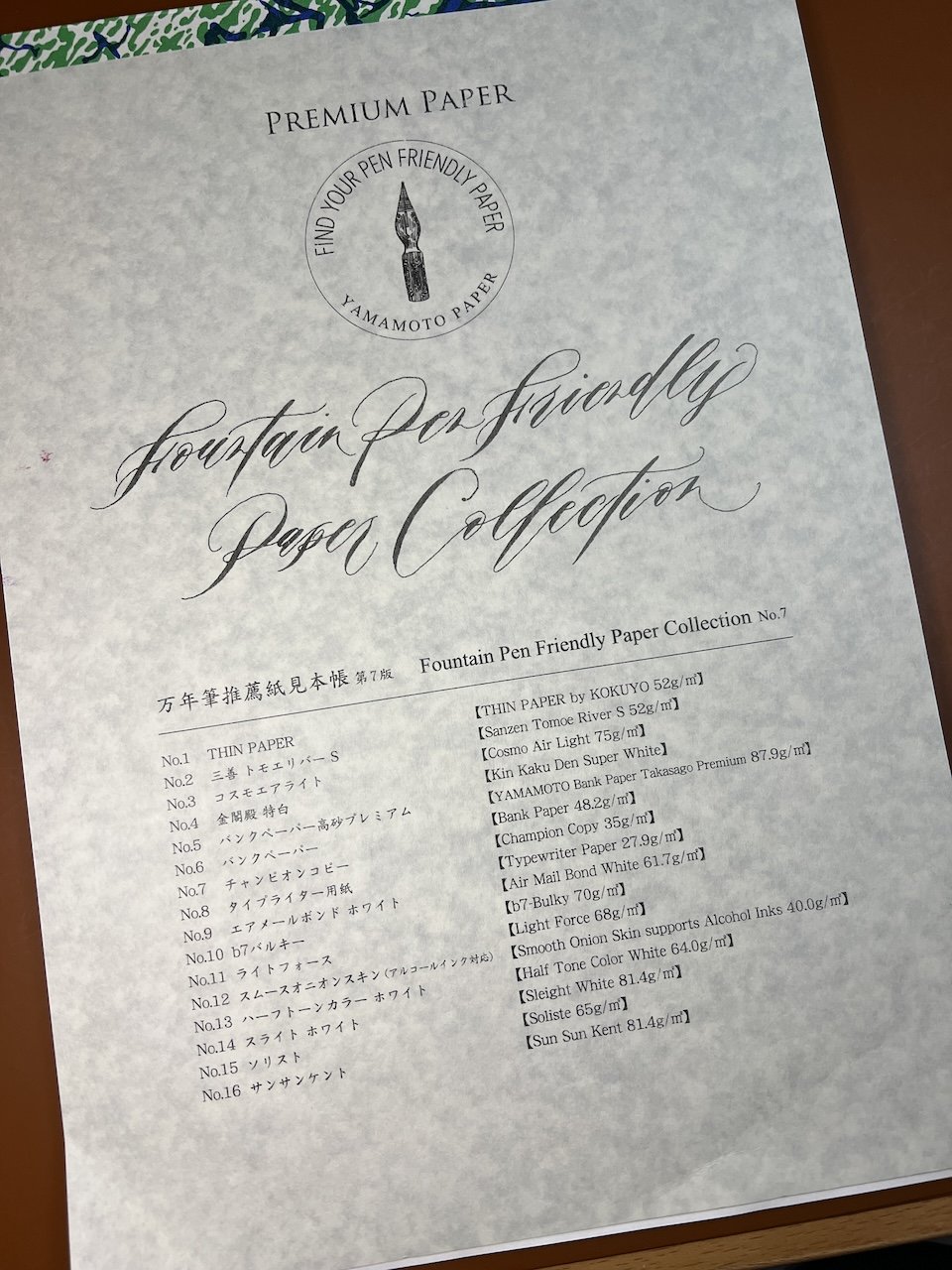
Yamamoto Paper’s Fountain Pen Friendly Paper Collection, Vol. 7 (The cover and the individual cover sheets are a mottled grey color; it’s not my crappy photography skills this time.)
There are 16 papers and they are listed on the front cover as follows:
- THIN PAPER by Kokyuo 52gsm
- SanzenTomoe River S 52 gsm
- Cosmo Air Light 75 gsm
- Kin Kaku Den Super White
- YAMAMOTO Bank Paper Takasago Premium 87.9 gsm
- Bank Paper 48.2 gsm
- Champion Copy 35 gsm
- Typewriter paper 27.9 gsm
- Air Mail Bond White 61.7 gsm
- B7-bulky 70 gsm
- Light Force 68 gsm
- Smooth Onion Skin supports Alcohol Inks 40.0 gsm
- Half Tone Color White 64 gsm
- Sleight White 81.4 gsm
- Soliste 65 gsm
- Sun Sun Kent 81.4 gsm
I will review the first 8 in this article and save the second 8 for a future article (either next week or the one after).
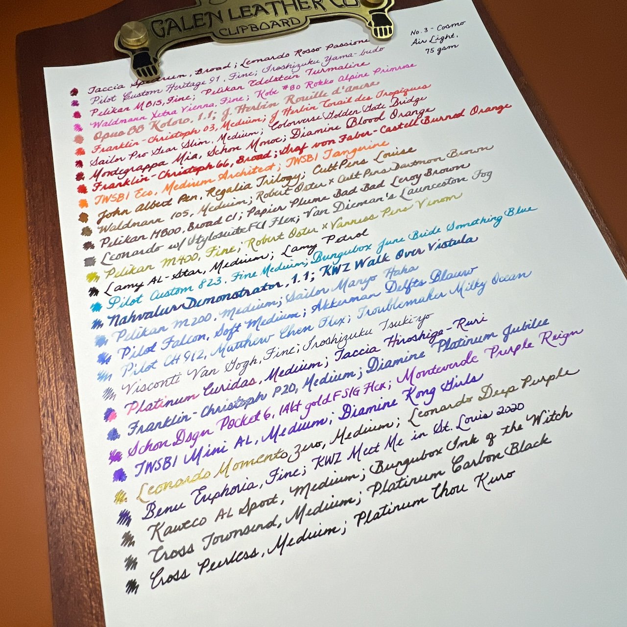
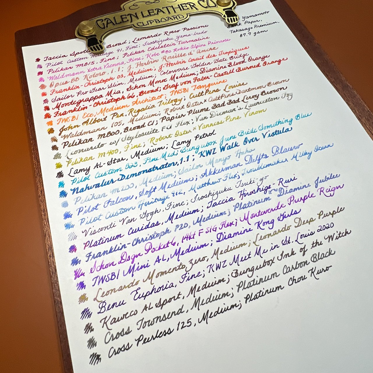
I will use my currently inked pens to write the name of the pen/nib/ink combination. I plan to use a mix of shimmer, sheening, shading, chromashading and “regular” inks, as well as gold and steel nibs, wet/average/dry writers, and different nib sizes. Basically, a variety of whatever is inked up without me having to ink more pens up, lol. Then, I will rate each of them according to texture, fountain pen ink friendliness, color accuracy, weight (using a subjective feel vs the actual gsm). For ghosting, I flipped the paper over and put it on a blank sheet of paper to determine the level of ghosting. I did not rank them from 1-8 but I’m sure I will have my favorites as well as ones I didn’t like as much.
Lastly, there will be pictures of (1) the paper description sheet, (2) the inked page, (3) closeup of some inks, and (4) sheerness (by leaving the guidesheet underneath), and occasionally (5) the back if there’s something worth noting. Let’s get started!
Kokuyo Thin Paper, 52 gsm


Texture - The paper is quite smooth and nice to write on. Flex, stub, fine, stacked, medium, grinds - every pen felt great writing on the paper.
FP Friendliness - High - It handled all of the different pens and inks with ease, with one exception, the KWZ Meet Me in St Louis 2020, which had spots of bleed through on the back. Otherwise, there is minimal ghosting, so the back side is usable.
Color Accuracy - High - My “metric” for color accuracy is Van Dieman’s Launceston Fog, which is a complicated green/brown chromashading ink. While difficult to capture in photos, it picked up the colors. It showed sheen from Taccia Hiroshige-Ruri, and was also great for shimmer and shading inks too.

Shade with the Leonardo, shimmer from the Pelikan, Sheen from the Lamy - it all looks good.
Weight - Lightweight paper that didn’t feel too flimsy nor too substantial.

It was easy to see the lines.
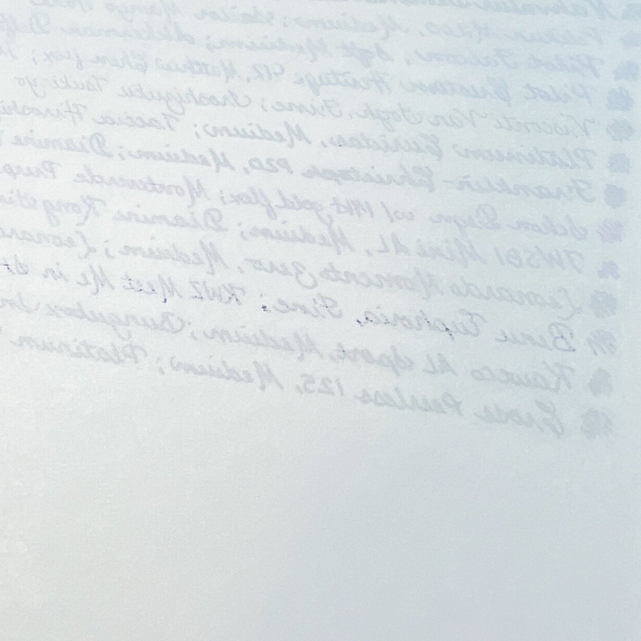
The bit of bleedthrough from KWZ StL, but that was it.
Sanzen Tomoe River S, 52 gsm


Texture - Similar to the Kokuyo, the Sanzen Tomoe River S paper (TRS) is fairly smooth and pleasant to write on.
FP Friendliness - High - Like the Kokuyo, TRS was able to handle the various nibs and pens I put on it, though it had just a few more spots of bleedthrough than the Kokuyo. Minimal ghosting so the backside is still usable.
Color Accuracy - High - Colors were on par with the Kokuyo writing samples.

Nice shading on the Sanzen TRS, but Haha should have a touch of purple which I don’t see.
Weight - Despite being the same gsm as the Kokuyo, this TRS paper felt slightly “thicker”.

Definitely not as sheer as the Kokuyo.
Cosmo Air Light, 75gsm

Texture - Slight texture to the paper, lending an almost “squishy” feel to it, depending on nib and writing surface (you’ll notice the squishiness if you’re writing on a few sheets). I wouldn’t call it rough but it’s not glassy smooth like Kokuyo or TR.
FP Friendliness -High - zero bleedthrough, minimal ghosting. Backside is definitely usable.
Color Accuracy - Medium High to High - Colors were pretty accurate, though the Launceston Fog looked more grey than green/brown. Sailor Manyo Haha’s tinge of purple was more visible on CAL than the others.

Yay! A tinge of purple from Sailor Manyo Haha!
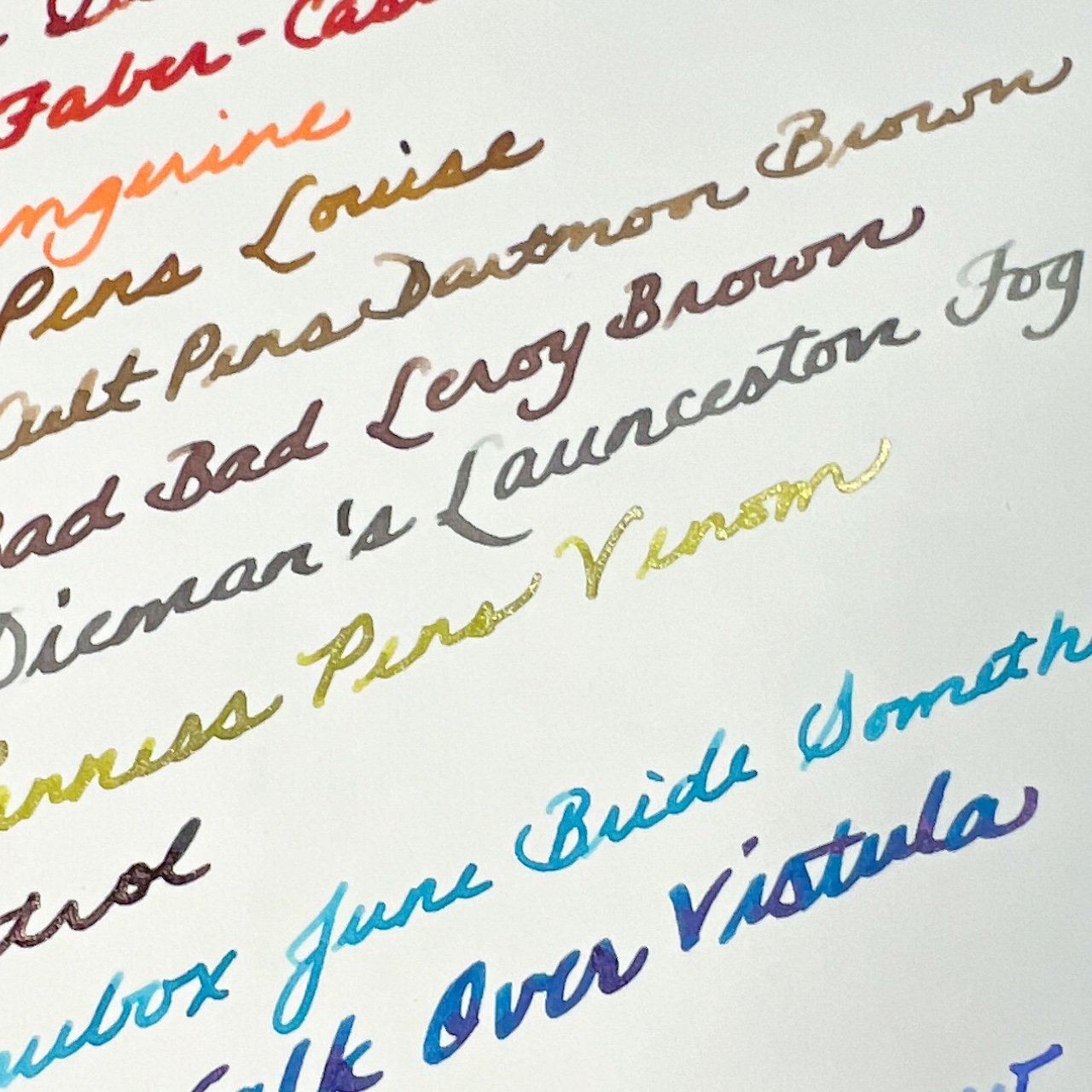
Launceston Fog loses some of its green/brown shading on CAL 75.
Weight - Not surprising, a 75gsm sheet of paper is going to feel thicker and heavier than the others. Probably wouldn’t be my choice if you’re a multi-page letter writer like I am.

This was one of the hardest papers to see the guidesheet.
Other - This paper is being discontinued so your ability to find it may be limited. Also, CAL came in other weights, with 75 gsm being the one that many notebook makers use. CAL is also more susceptible to hand oils, so you may get spots where ink doesn’t want to soak into the paper. Blotter paper or anything in between your hand and the paper can help prevent that. I did not experience that during this experiment.
Kin Kaku Den Super White


Texture - Very textured - reminded me of a combination of parchment paper on the front (like you’d use for baking) and a bit of mulberry or similarly textured paper. There are two sides to the paper and they don’t feel the same. The side that is “face up” is the one I wrote on and the back side is the more texturedside.
FP Friendliness - Medium - While the paper withstood all the different inks and nibs I used on it, it was not a pleasant experience. Flex nibs and ground nibs would catch and scratch - the architect felt the worst on this paper. Other times, ink just didn’t want to soak into the paper. I had a heck of a time getting stubs to write on it because it felt like only the middle of the nib was the only part touching the paper, so it felt lopsided and the lines weren’t as wide as with the other papers. So while there wasn’t any bleedthrough or feathering, all the lines were thinner and took several attempts to write because it was like writing on wax. Medium ghosting.
Color Accuracy - Low/Medium - While the color tones were accurate, they weren’t very interesting. Inks didn’t shade as much, sheen was minimal (except for the Leonardo Deep Purple, which is a really nice sheener).

I had a hard time getting the softer nibs like the Pilot Falcon and the 912 with a Matthew flex to write on this paper.
Weight - I was unable to find a weight for this paper, but I would guess that it’s ~65 gsm.

Moderate ghosting.

Other - This was the one paper that I absolutely disliked using because it would catch on nibs, inks just didn’t want to flow onto the paper and inks’ different properties just didn’t shine.
Yamamoto Bank Paper, Takasago Premium, 87.9 gsm

Texture - Glassy smooth, pens glided on the page, but in an almost out of control way.
FP Friendliness - Medium high, though some of my nibs had a hard time getting started on the ultra smooth paper. The shading inks were the ones that were the most problematic. They weren’t unusable, just extra light on top compared to other papers. No bleedthrough, minimal ghosting.
Color Accuracy - High, the colors were accurate but as noted above, inks shaded more on this paper and some pens would hard start due to the smoothness.
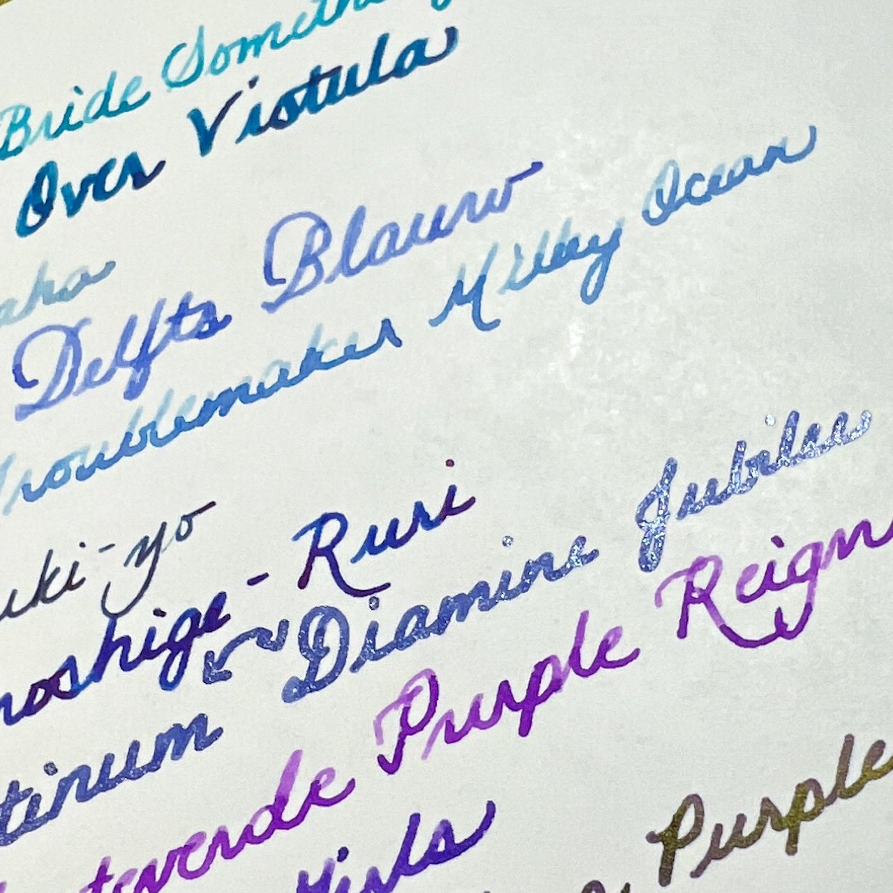
Troublemaker Milky Ocean was particularly “shady” but it also hard-started the most on this paper.
Weight - Despite being heavier than CAL 75gsm, this felt a little lighter and thinner.

Surprisingly sheer for a heavier gsm paper.
Bank Paper, 48.2 gsm
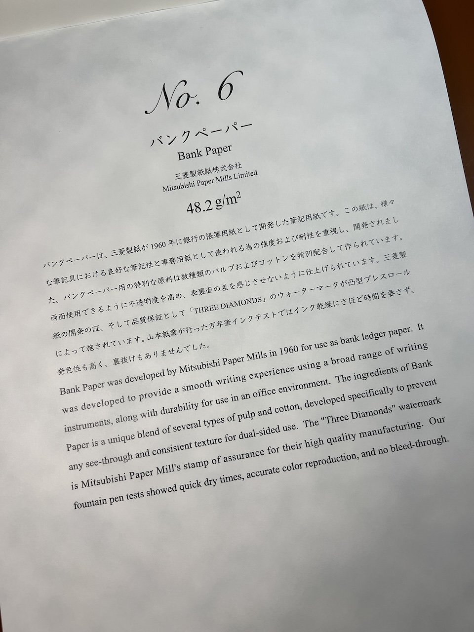

Texture - Smooth, but I wouldn’t describe it as glassy like the heavier version.
FP Friendliness - Medium high, it had similar problems of the heavier Bank Paper and the lines were finer as well. No bleedthrough but a fair amount of ghosting which was expected. Writing not recommended on the back side.

Color Accuracy - High - same as the heavier paper above, where some of the shading inks were very light on the top half of the strokes.

See the top half of the Pocket 6 writing? It’s lighter on top. But look at the sheen on the Momento Zero (that’s a dark purple ink with gold sheen!)
Weight - Not surprising, this is a lightweight paper. Just on the border of what I would consider “crinkly”.

Champion Copy, 35 gsm


Texture - Smooth, a bit more than the Bank Papers FP Friendliness - Medium High, handled most nibs and inks without issue, but it feathered with KWZ Meet Me in St. Louis (not surprising), Graf von Faber-Castell Burned Orange (a little surprising but it was in a wet broad nib) and Van Dieman’s Launceston Fog (another wet flex nib). Some bleedthrough (with KWZ) and high ghosting - do not write on both sides..

Color Accuracy - High, some shaders were less shady, while others were a little more. Overall, good color representation as well as sheen and shimmer.

The Leonardo with the Stylosuite nib and Launceston Fog ink was a bit feathery.
Another bit of feathering from KWZ Meet Me in St. Louis.
Weight - Very lightweight and crinkly.

Other - Pleasant to write with even though it was thin and crinkly, which surprised me.
Typewriter Paper, 27.9 gsm
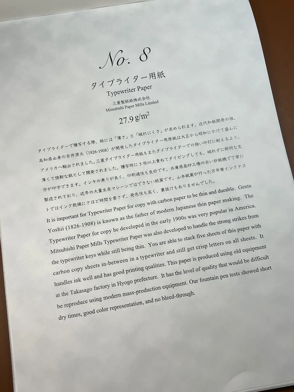

Texture - Smooth, similar to Champion Copy FP Friendliness - High, similar to Champion Copy but with less feathering and bleedthrough. The architect felt a little scritchy across the paper even though it’s fairly smooth. Lines were thinner than on other papers. Some bleedthrough with KWZ StL ink, high ghosting - do not write on both sides.

Color Accuracy - High, though some inks seemed a touch lighter than on other papers like Papier Plume Bad Bad Leroy Brown.

Lighter shade of Papier Plume ink but look at how pretty Launceston Fog is! This photo is of the paper against a brown background, so you can see a bit of the “texture” and thinness of the paper.
Weight - The lightest and crinkliest paper, but still felt soft (not rough).

After all was said and done, this was a very fun exercise and a great way to use a bunch of pens. It was interesting to see how each pen/ink would behave on the different papers. I have used Kokuyo Campus paper but not the Thin Paper and was surprised at how much I liked it. It was the first paper in the pack and set a high standard for the rest of the first half.
This was my first time trying the Sanzen Tomoe River S paper and it was fine. I don’t want to compare it to old Tomoe River because it seems unfair to do so since it’s no longer made, so I only compared it to others in this bundle. I have used CAL 75 before and liked it but it felt so thick compared to the others, that it was less of a favorite than I thought it would be. The Kin Kaku Den was the only one which I really disliked using because the texture would catch my nibs and make inks not want to flow.
The Yamamoto 87.9 gsm Bank Paper was a bit of a surprise - it felt so smooth and slick that I thought it would be the best paper, but it felt slippery and gave me some trouble with hard starts (it’s not the pen or ink because they behaved well on other papers). I was worried when I got to the 48.2 gsm Bank Paper but I liked it more than the heavier version. And the last two thin/light papers were sleeper hits for me. I could totally imagine writing letters with these papers, albeit only on one side. I loved the sound of the crinkling and their smoothness was pleasant to write on.
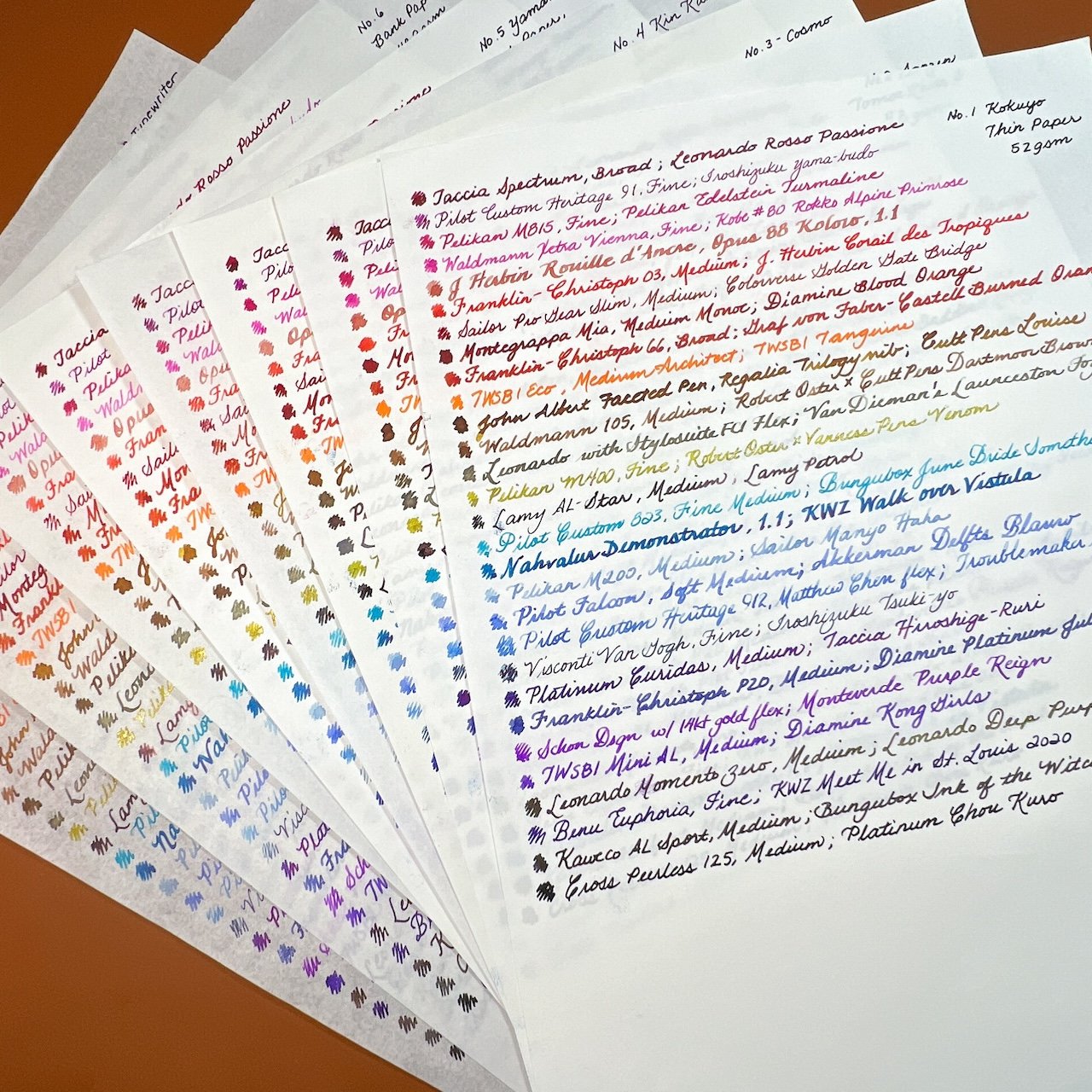
Inky rainbows make me happy!
For the most part, all of the papers were fountain pen-friendly though some handled the wetter inks better than others. Most of them also represented the inks pretty accurately, though some didn’t show off the nuances of shading as much as others, or muted some of the colors (like CAL 75 muting Launceston Fog into a grey). Your preferences for paper smoothness, thickness, texture and crinkliness may give you different favorites. I think my top 3 would be Kokuyo THIN Paper, Sanzen TR, and Typewriter Paper. Looking forward to the second half of the pack and finding out if any of them will unseat these three!
This paper pack is available directly through Yamamoto Paper, or through site sponsors JetPens and Vanness Pens
(Disclaimer: The paper pack was purchased at the 2022 San Francisco Pen Show from the Yamamoto Paper table.)


