
(This is a guest post by Michael W. Harris. Michael is a librarian and teacher by trade, but professional serial hobbyist by life. His pictures of hikes and the occasional stationery or watch related items can be found on Instagram @thetemptrack.)
In any hobby, there are certain things that are legendary. These could be rare first editions of books, misprinted baseball cards or comics, limited edition releases, or just items that were underappreciated in their day so quickly came and went from the market. In some of my childhood hobbies these included the 1990 Fleer Billy Ripken card that did not have the obscenity on the end of bat blacked out or Fantastic Four #110 with the cover colors reversed, giving it an otherworldly vibe.
However, we are here for pens and inks, and since you have already read the title, you know where this is going: Parker Penman inks. When I first entered the hobby proper around 2018, I quickly heard tales of a legendry, nigh mythical, ink called “Parker Penman Sapphire.” This grabbed my attention for a few reasons: 1) my first bottle of ink, gifted along with my first pen, was Parker Quink Black and I, of course, had heard of Parker pens, and 2) blue is my favorite color.
I knew the ink was hard to find, but I had also heard a lot of conflicting information. It was problematic, it was pulled because of complaints of customers, it was a “sheen monster,” and so on. Being an overeducated librarian who likes nothing more than a good research challenge, I turned my google-fu skills towards sorting fact from fiction along with experiencing this ink—and the entire Penman line—for myself. This was a path that eventually led me to the inks’ creator, Dr. Leighton Davies-Smith, and conducting two interviewswith him (PDFs via Dr. Davies-Smith site and generously provided by Pennant Magazine.) The unexpected surprise was learning that he was working on creating his own doppelgängers of the original Penman inks!

Possible Parker Penman Sapphire Dupes.
The topic of a good “dupe” for Sapphire is one that has been a long discussed on blogs and YouTube videos. There are a number of them out there such as Straits Pens Poorman’s Sapphire, Private Reserve DC Supershow Blue, Sailor’s Sailor, and many more. However, there are many other great colors in the Penman line, all of which fetch prices that I would dub “crazy, banana pants” for something that has a finite number of uses. So, please allow me to help you save some money—along with time and eBay alerts—and tell you to just buy the Scribe inks made by Dr. Davies-Smith. Don’t want to take my word for it? Then, let the pictures tell the story.
Note: I am not a professional ink reviewer like Ana at Well-Appointed Desk, Kelli at Mountain of Ink, Mike at Inkdependence, Yagan at Macchiato Man, or any of the numerous contributors here. As such, my testing set-up was limited. I used a J. Herbin glass dip pen and letter opener on both a Rhodia dot pad and Tomoe River Cream 52gsm—I have no idea which version of TR it is.
So, without further ado, let’s go to the tape.
Ebony vs Onyx

For all ink testing images below, the top image is on Rhodia Paper, and the bottom image is on Tomoe River 52 gsm paper.

Black is probably my least favorite ink color, so maybe I am biased, but of all the Scribe recreations, Onyx is the most lacking compared to Ebony. It is lighter overall, not only because my first swatch of Ebony was a bit chaotic due to it being my first attempt, and is most noticeable when the lighter sections lean gray, which is quite apparent on the TR swabs. This is a problem with a lot of black inks, though, so I can understand why there are die-hard Ebony fans out there who value how dark it is.
Mocha vs. Jamocha


Brown is a hard ink to do right, and an easy one to do wrong. Is it too red, too orange? Just a simple brown can be kind of boring. Mocha is a good middle of the road brown which does resemble to color of coffee beans, especially in its more saturated portions. For Mocha vs. Jamocha, I would say they are nearly identical. So, if you are on the hunt for a good, darker, middle brown, this would be a great one to go with.
Emerald vs. Malachite

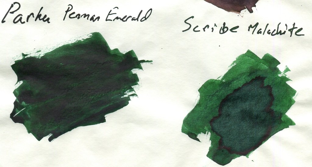
I am slowly building up to the most well known and popular colors of Penman, and it is with Emerald that we move into what this line is most well known for: sheen. These inks were super-saturated, especially for their day—the line launched in the early 1990s and to learn more you should read my first interview about how these colors came about. Emerald has a red sheen to it and is a great ink. However, the first run of Emerald had issues with clogging and the ink was quickly reformulated for its second batch. Unfortunately, I have a bottle that seems to be from the first batch and so lays down a darker swatch than the Malachite. That being said, I believe Malachite to be true to what the original Emerald would have looked like and the red sheen is clearly visible on the TR swatch.
Important note: Dr. Davies-Smith advises to NOT dilute—or rehydrate—your old Penman ink with water. This is something that many forum posts will tell you to do. However, doing so runs the risk of also diluting the other chemicals in the ink that prevent fungal growth and thus can increase the chance for mold developing in your ink.
Ruby vs. Garnet


If I have a second favorite ink in the Penman line, it is Ruby. The dark, “Malbec red”—as a friend of mine put it—color of Ruby, with its green sheen, is one of the few non-blue inks I love to use, and is a shade of red that does not immediately scream high-school-English-essay-mark-up (is this showing my age?). Garnet manages to capture that color well while still not quite matching its vibrancy. There is a slightly more muted color to it, though it still has the green sheen which is such a great characteristic of the original ink. However, it is really quite close.
Sapphire vs. Indigo

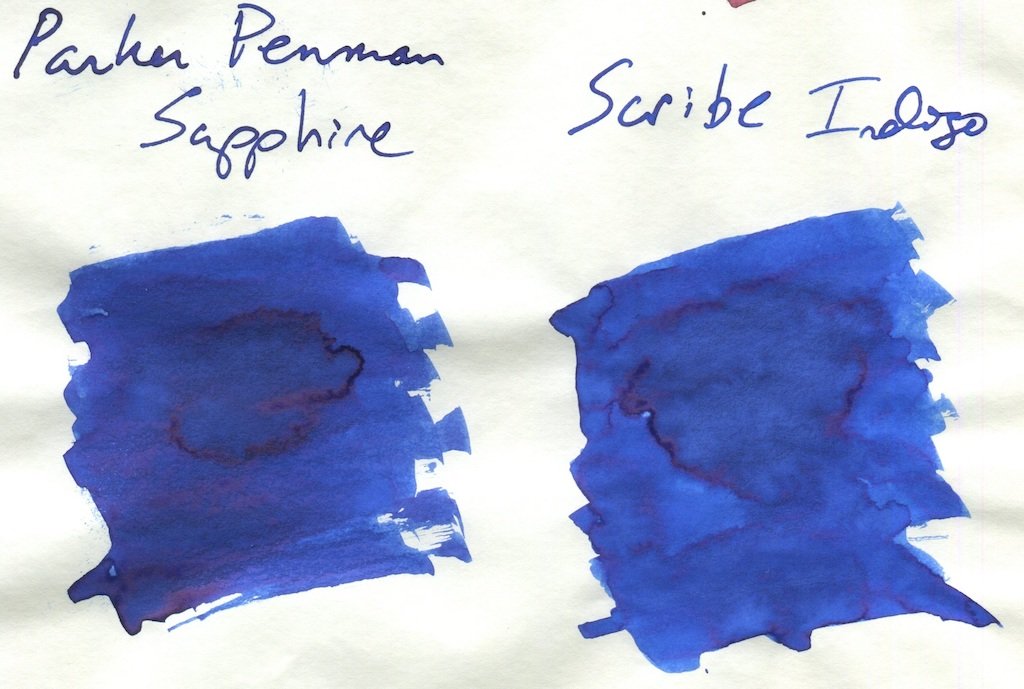
Here we go…so short answer: if you want probably the closest dupe to Parker Penman Sapphire, no questions asked, this is the ticket. Don’t spend $100 or more on a bottle, just get Scribe Indigo. I have looked at many blue inks, including many considered “close” to PPS, and Indigo is one of the closest I have seen. I think my bottle is maybe just a bit darker, but again, twenty plus years of evaporation has the effect or making the dyes more concentrated.
Honestly, I really do not have much more to say. I use my bottle of Sapphire somewhat irregularly (in the vain hope of “saving it”), and doing these swabs have reminded me of just why I love its color. It POPS off the page. It is a bright blue, but is also dark, and the sheen is fantastic. It is not the washed out “school blue” of the Parker Quink line, it is not too dark or even moving into the blue-black range. It is a blue that is just…blue. Like Yves Klein Blue. I don’t know what else to say…it is just…blue. This is why PPS is the famous blue ink, so do yourself a favor and get Scribe Indigo to experience it for yourself.
Closing Thoughts
The Parker Penman line is legendary for many reasons, and Sapphire is among those “unobtanium” inks unless you lay out more money that one should pay for ink. Beyond such mythical status, the line was also truly innovative for the day. As I discuss in the articles linked above, when formulating the inks, Dr. Davies-Smith considered multiple methods to achieve what we call the “sheen” effect of the ink. Parker wanted an ink with some iridescent qualities and the first thing they tried was flecks of mica in the ink (what we now call shimmer), which was discarded for all the reasons why shimmering ink can be troublesome—imagine your typical fountain pen user in the ’90s having to deal with a shimmer ink!
So, you have an ink debuting in the 1990s that utilized the oversatured, sheening qualities celebrated now, but that also toyed with shimmer. In addition to that were the distinctive glass bottles which utilized a plastic insert to assist with filling! While any of these are considered fairly typical for today, in the 1990s they was incredibly new. However, over twenty years ago, the oversaturated qualities could cause problems with those who may not practice good pen hygiene, and the lines’ price was higher than the typical bottle of ink. These reasons are likely why the line was discontinued in the early 2000s, after which it passed into legend.
Luckily, you do not have pay going eBay rates for a bottle of Penman to experience the line. You can order directly from Dr. Davies-Smith via his ScribeTC website—he is a technical consultant for the stationery industry—by clicking on the “Request a Free Consultation Link,” or you can also purchase them from Kirk Speer’s PenRealm site.


