Posts filed under Architect Nib

Sailor Pro Gear Classic Graphite Lighthouse with Zoom Architect Nib: A Review

(Susan M. Pigott is a fountain pen collector, pen and paperholic, photographer, and professor. You can find more from Susan on her blog Scribalishess.)

Long ago I owned a Pelikan M200 with a fine Architect nib (also known as a Hebrew/Arabic Nib). It was a lovely, delicate thing, ground by the great Richard Binder. But, when I originally ordered it I was young and naïve, new to fountain pens, and I didn’t realize that the fine nib would not give me the line variation I craved for Hebrew characters. I eventually sold the pen.

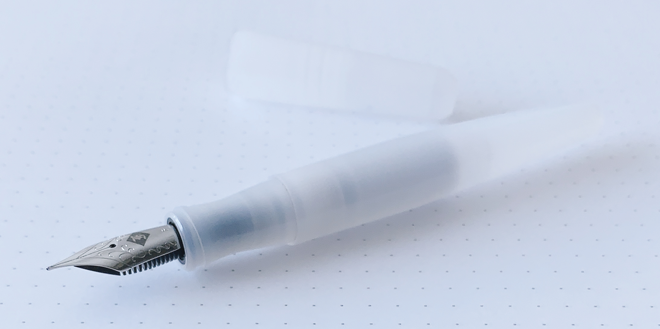
I’ve been itching to try a Sailor Zoom nib with an Architect grind, and I knew exactly which nibmeister I wanted to do it: John Mottishaw at nibs.com. Deciding on a Sailor pen for the nib was extremely hard (so many choices), but I eventually settled on the Sailor Pro Gear Classic Graphite Lighthouse. This surprised me a bit, because why would I want a “boring” gray pen when Sailor has so many bright, cheery colors? I don’t know. I liked the subtle color and the clear finials on both ends, and a more “sober” pen seemed somehow fitting for writing Hebrew.

Even though the Sailor Graphite Lighthouse is a North American exclusive, it comes in a basic Sailor box. The only thing differentiating it from a regular Sailor is a bookmark--woot?

The pen itself is a dark gray color with rhodium trim, which complements the color perfectly.

As stated earlier, the cap and barrel finials are clear, offering a special detail that makes the pen look unique. I just wish it lit up like a real lighthouse!

The Pro Gear Classic is a small to medium-sized pen--small if you don’t post it and medium if you do. It measures 5.1 inches/130mm capped, 4.5 inches/115mm uncapped, and 5.9 inches/150mm posted. It’s a light pen, weighing only 25 grams capped and 16 grams uncapped with the converter filled with ink. I usually like much larger pens, but for some reason I’ve gravitated towards Pro Gear Classics. I own several of them.

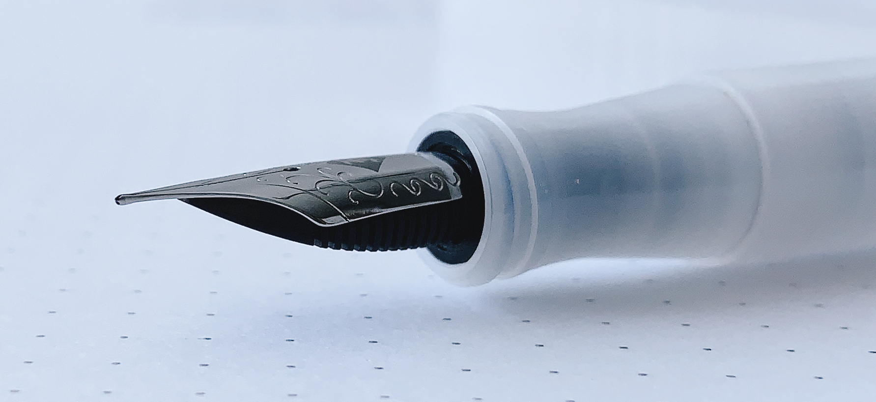
The real story with this pen is the nib. All Sailor nibs are gorgeous, with beautiful scroll work and the Sailor anchor inscribed above the gold content.

The Zoom nib is like an extra broad but with a triangular shape and lots of tipping. It’s the perfect choice for an Architect grind.

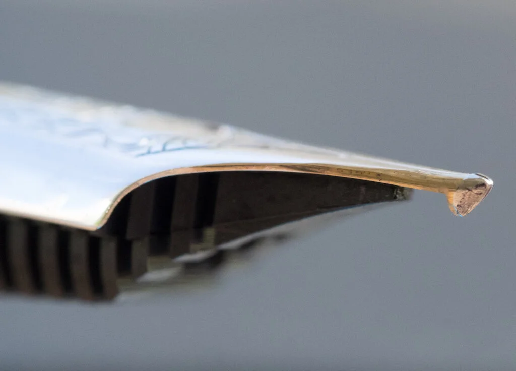
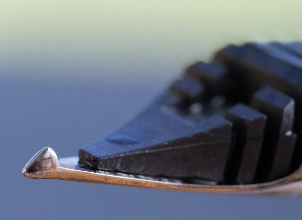
I asked John to make my Architect “forgiving,” so he smoothed it out more than a traditional Architect grind so I could use it to write cursive.

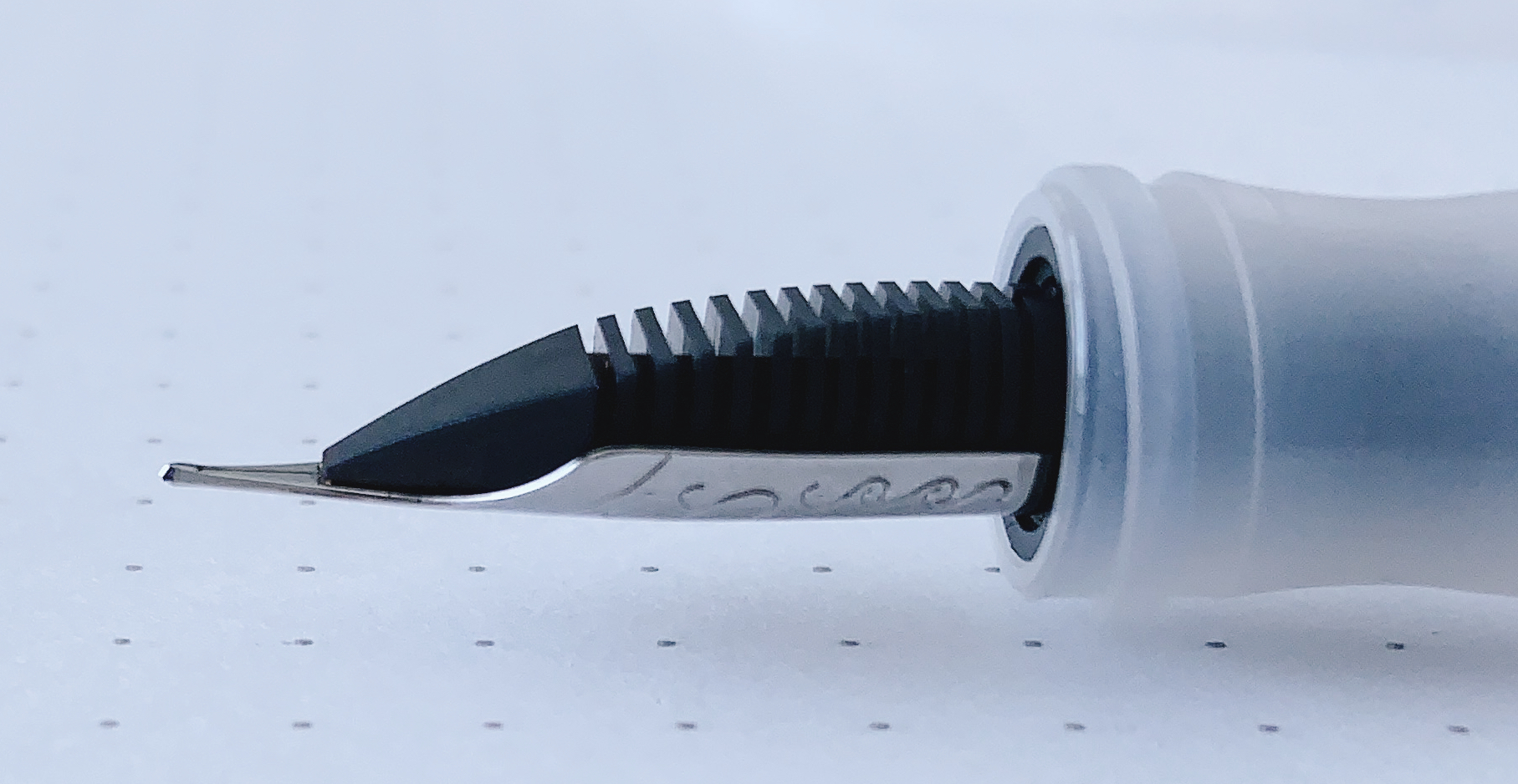
It’s absolutely perfect--smooth and juicy, but I can also get clean vertical and horizontal strokes for Hebrew and block letters.

Upside down the nib writes extra, extra fine. I’m unlikely to use the nib this way, but it’s a nice option if you want to write marginalia.

I inked the Graphite Lighthouse with Sailor Ink Studio 123, and the two pair together beautifully. I can write in my usual cursive style with this nib, and the pen simply floats over the paper.

I am absolutely thrilled with this pen and the Zoom/Architect nib. Even though the Pro Gear Classic Graphic Lighthouse is mostly sold out, you can, of course, order almost any Sailor with a Zoom nib from nibs.com and request an Architect grind. If you do block printing more than cursive, you’ll definitely want a classic Architect grind. But, if you’re like me and want an Architect that allows you to do cursive as well, just ask John for a more forgiving nib, and he will send you the perfect grind.

(I purchased the Sailor Pro Gear Graphite Lighthouse with my own funds.)


Enjoy reading The Pen Addict? Then consider becoming a member to receive additional weekly content, giveaways, and discounts in The Pen Addict shop. Plus, you support me and the site directly, for which I am very grateful.

Membership starts at just $5/month, with a discounted annual option available. To find out more about membership click here and join us!

Posted on October 4, 2019 and filed under Sailor, Fountain Pens, Architect Nib, Pen Reviews.

NibGrinder Micro Architect Nib Grind Review

The NibGrinder Micro Architect grind is the Pilot Hi-Tec-C 0.3 mm of nib grinds.

If you have followed me for any length of time then you know that the Pilot Hi-Tec-C 0.3 mm is one of my all-time favorite gel ink pens. You also know that I rarely, if ever, recommend it. It is fine almost to the point of obscene, and extremely finicky. It hard starts and can be uneven, but when it is going good, it makes my handwriting look amazing.

These words are exactly how I feel about this nib grind.

Mark Bacas, the man behind NibGrinder, sent me this nib after the 2018 Atlanta Pen Show. It was one of those experiments that I get involved in frequently. “Hey Brad, I think this is right up your alley.” My friends know me well.

Mark called this a micro architect grind, but it is no different than any standard architect nib grind. It just happens to be on a finer stock nib than most architect nib grinds. An architect grind generally works the best on broad nibs to give the nib grinder a larger area of manipulation, while giving the consumer a smoother writing experience. Since this is a North/South angled grind, as opposed to East/West like a stub (see the previous link), the wider the nib, the smoother the writing experience.

What would the results be if you applied this grind to a finer-nibbed pen, like this steel Jowo F nib? For me, the results are amazing, but not without challenges.

First and foremost, the nib is sharp. This means there is a small sweet spot on the nib, and your writing angle better hit it. You run into this with standard architect nib grinds as well, but you have more wiggle room. Angle of attack matters with this pen more than any other pen I own.

Writing pace matters, too. I’m a fast writer, and to get the full effect of this nib grind, I had to slow it down. I’m ok with this because the results are worth it, but I dug the tip of the nib into the page more than once on a south to north stroke. That stroke should be eliminated with most architect grinds, but even more so with one this fine. I have to slow it down.

If you have a bad writing angle and incorrect pace, your results will be inconsistent. The ink flow will be poor, as will the line consistency. You will also end up with paper fibers stuck in the nib, so keeping my brass shim handy was important.

Bringing this full circle, I feel like my comparison is correct. What I get from this micro architect grind is the same thing I get from the Pilot Hi-Tec-C 0.3 mm gel ink pen. It can be a troublemaker if you aren’t ready for it, but when it goes right, it is fantastic.

(NibGrinder provided this product at no charge to The Pen Addict for review purposes.)


Enjoy reading The Pen Addict? Then consider becoming a member to receive additional weekly content, giveaways, and discounts in The Pen Addict shop. Plus, you support me and the site directly, for which I am very grateful.

Membership starts at just $5/month, with a discounted annual option available. To find out more about membership click here and join us!

Posted on May 6, 2019 and filed under Nib Grind, Architect Nib, Pen Reviews.

Architect Nib vs. Stub Nib

One of the most frequent questions I get asked at a pen show is “Do you have an architect nib grind I can test out?” I try to bring the one that I have, a Platinum 3776 broad nib modified into an architect nib by Dan Smith. I don’t always remember it, so I figured I would do a quick comparison between an architect nib and stub nib so you can see what this grind has to offer.

Let’s start with this: Pictures will never do an architect nib justice. It has a completely different feel when writing, more than even the sharpest cursive italic nib offers. It requires a consistent writing angle to reach its full effect, and no amount of practice is ever enough. It’s a commitment, as the ~$60 price tag for just the grind tells you.

Once you get it, it can be a complete blast to use. The line variance is enormous, and the exact opposite of what you get from a stub or cursive italic nib.

For this comparison, I put my TWSBI ECO-T with a stock 1.1 mm stub nib to the test. I figure it is a fairly normal stock stub nib to compare to that many people may have used. And as stated above, the architect grind was done on a broad Platinum 3776 nib for full effect. The more nib tipping for an architect grind for a nibmeister to work with, the better. Also, the more line variation you will have.

You can see in the picture above, the architect nib gives you thin vertical strokes and wide horizontal strokes. The stub nib is essentially the opposite, but with wider thin lines. When writing the alphabet, you can see how the line thicknesses caused by the shape of the nibs compare. Letters like E, F, and T with very defined, angular strokes show this variance. H may be my favorite.

I write with a blocky architecture style to begin with, so at a quick glance you may not notice a ton of difference. Rest assured, the feel of the nib is very different. I have to pay more attention with the architect nib, and force myself to slow down. The architect nib isn’t the best with curved shapes, and I would hesitate using it for cursive handwriting due to the angle of the nib. I’m sure it can be done, I’m just not sure how enjoyable it would be.

The architect nib is designed for sharp, straight lines, and that’s what it does best. The more letters I put down on the page, the more I notice the different effect this nib provides. As much as I love it and have fun with it when I use it, it is not an all day, every day writer for me. But, I’m glad I have it, and I’m glad to let you try it out whenever you see me at a pen show. I’ll make sure I have this pen with me, inked up and ready to write!


Enjoy reading The Pen Addict? Then consider becoming a member to receive additional weekly content, giveaways, and discounts in The Pen Addict shop. Plus, you support me and the site directly, for which I am very grateful.

Membership starts at just $5/month, with a discounted annual option available. To find out more about membership click here and join us!

Posted on April 9, 2018 and filed under Architect Nib, Pen Reviews.