One of my favorite things about the various fountain pen Inkvent calendars is not revealing a new color each day, but rather, the end result popularity contest. Companies collect user feedback to see which colors were user favorites, and remake them to sell individually the following year.
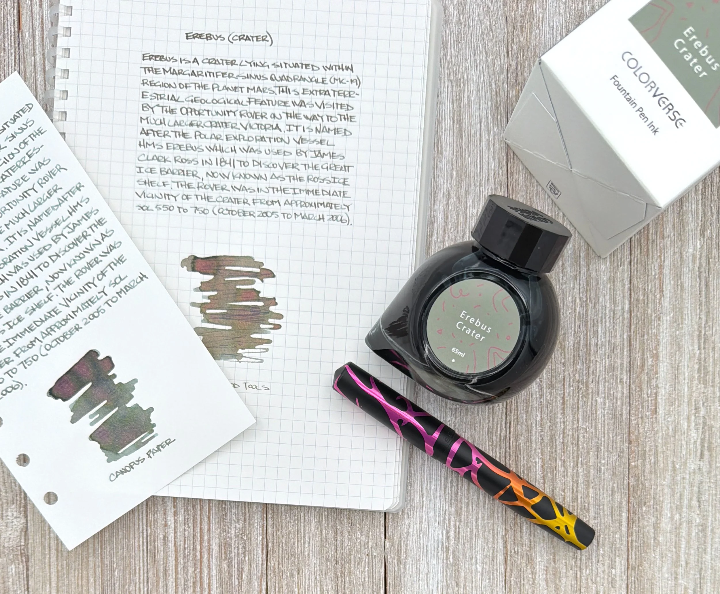
Colorverse does a fantastic job with both the Inkvent concept and popular vote, and this year’s picks are a standout. My overall favorite of the three inks - Erebus Crater, Follow The Water, and Polar Night - is still to be determined, but my favorite writer of the bunch so far is Erebus Crater.
To understand this ink on the page, I had to first look at where the name came from. Erebus Crater is found on Mars, and is a remnant of erosion across its 350 meter width. If you have ever seen Martian photography, you would assume this is Brown, rocky ground, and you would be right. That would make for a good ink in my book, but I don’t think that’s what Colorverse is going for here.
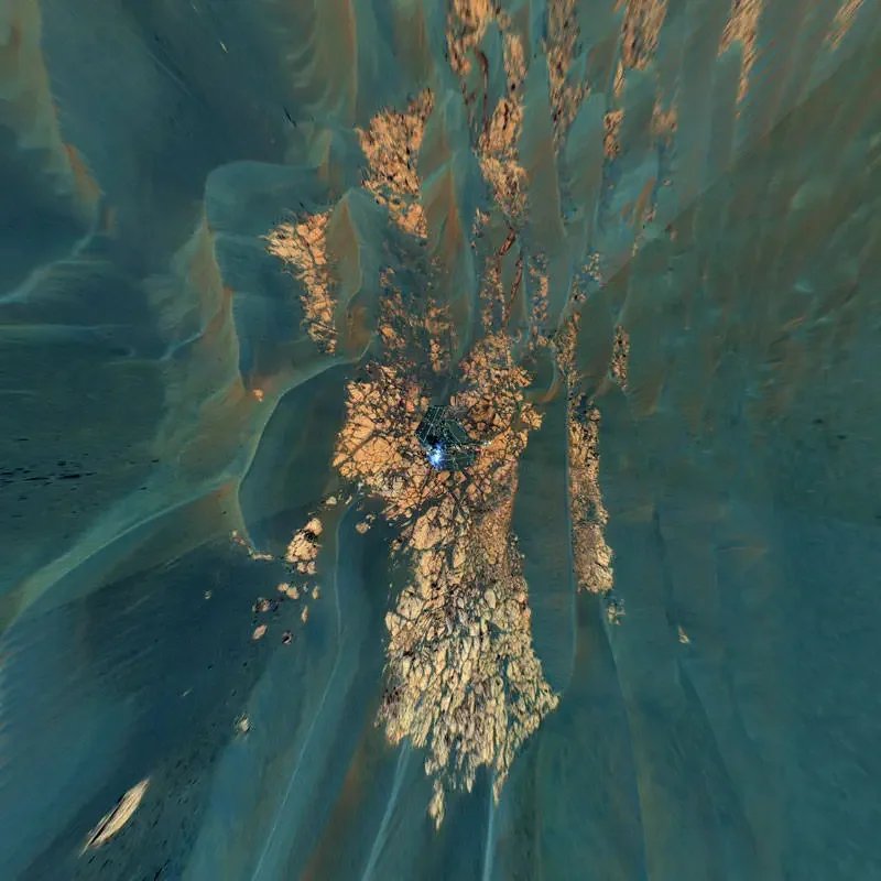
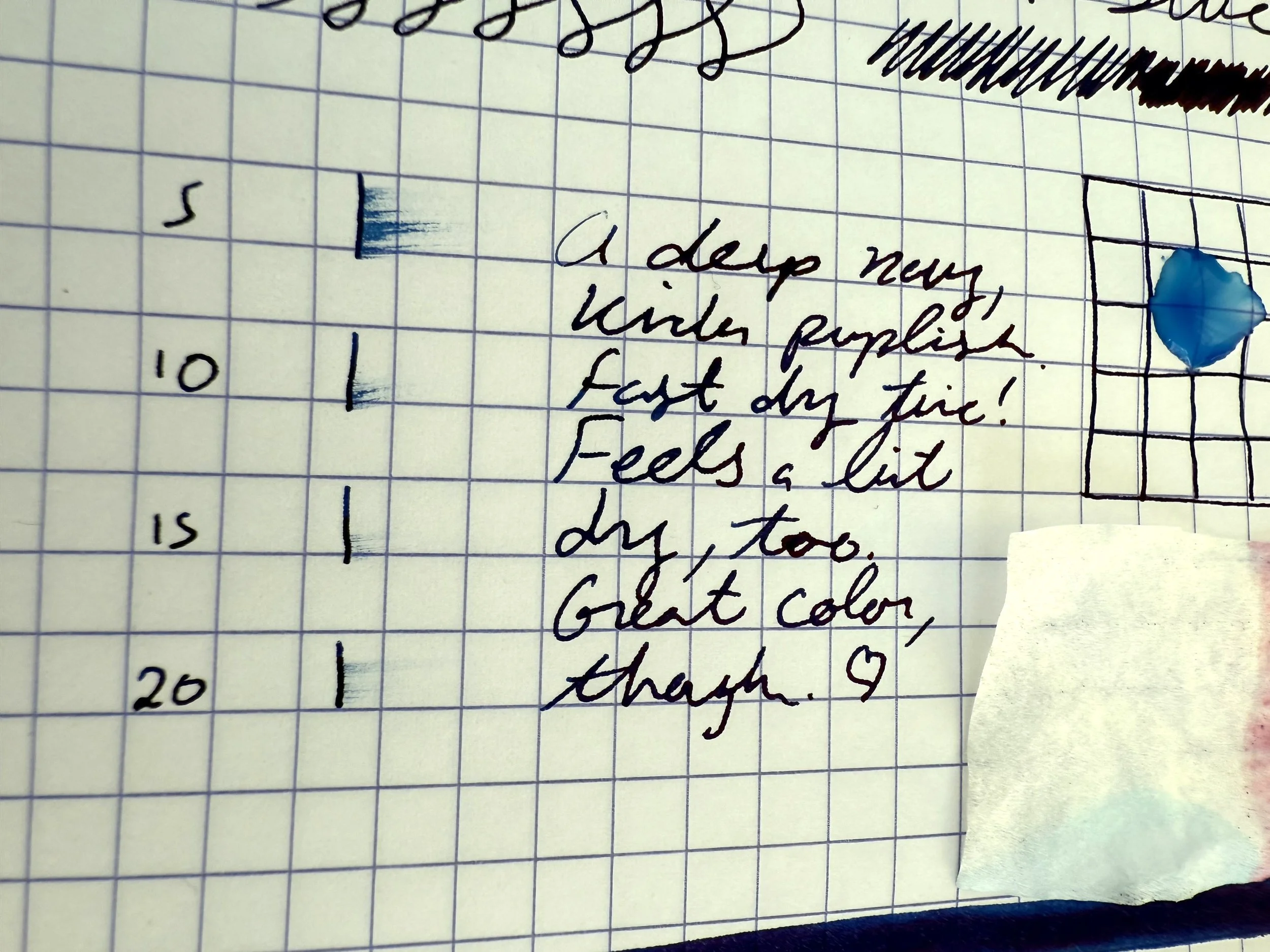
Have you heard of false-color imagery? Me neither, until I saw the combination of images above from NASA. That’s when the color of Erebus Crater began to make sense. The ink is a weird Blue/Brown/Green mixture that not only looks different when wet than when dry, but appears differently depending on the page. As I was testing it, all I could think of was The Dress. What color is it? Whatever color you see depending on your writing setup.
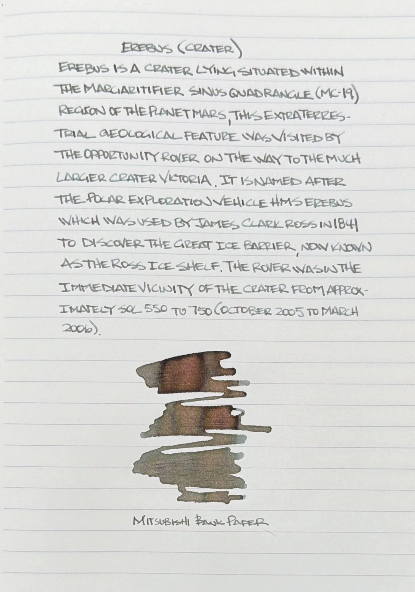
Mitsubishi Bank Paper.
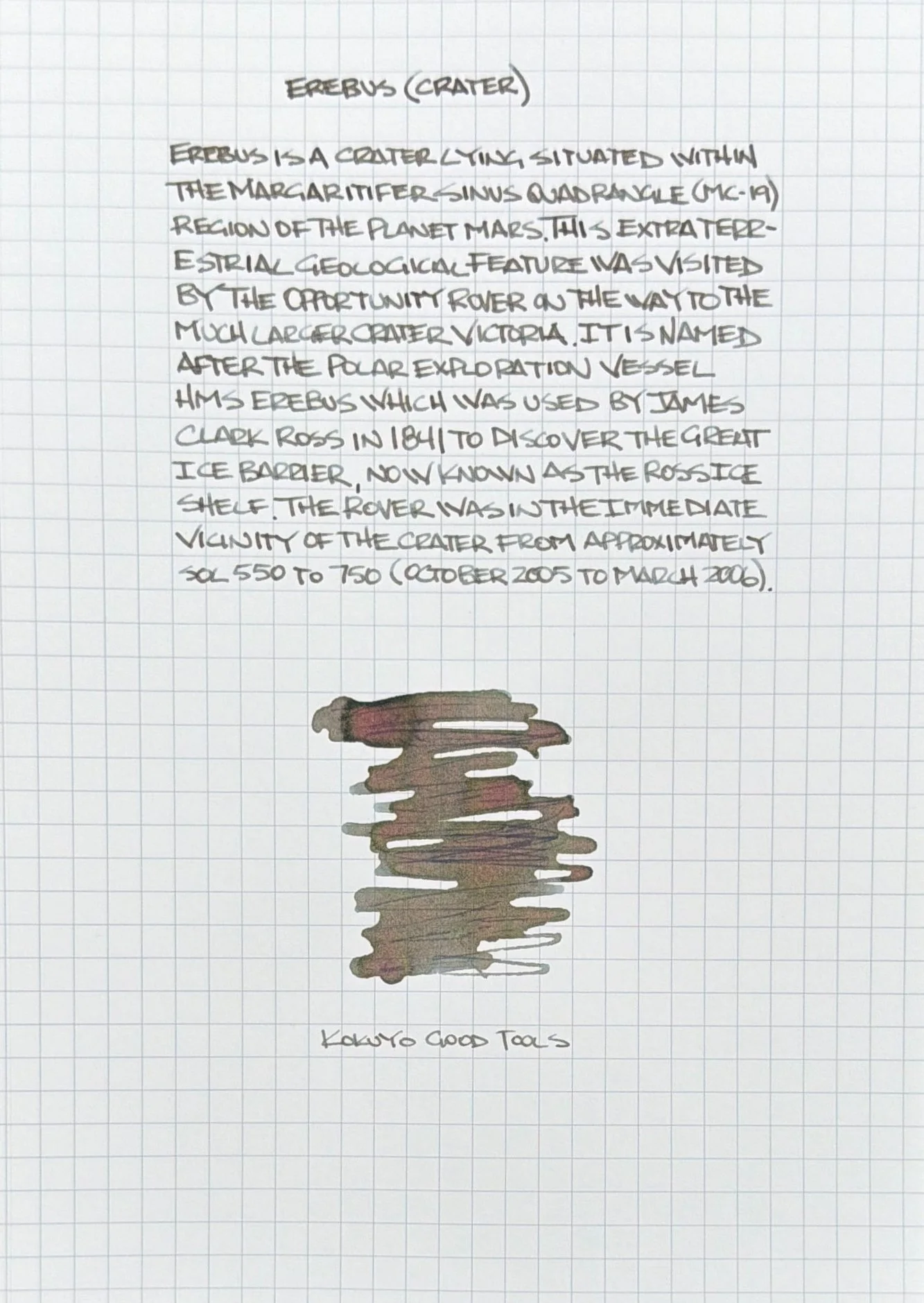
Kokuyo Good Tools Paper.
Watch the lines trun from Blue when wet to Brown when dry on Kokuyo Good Tools Paper.
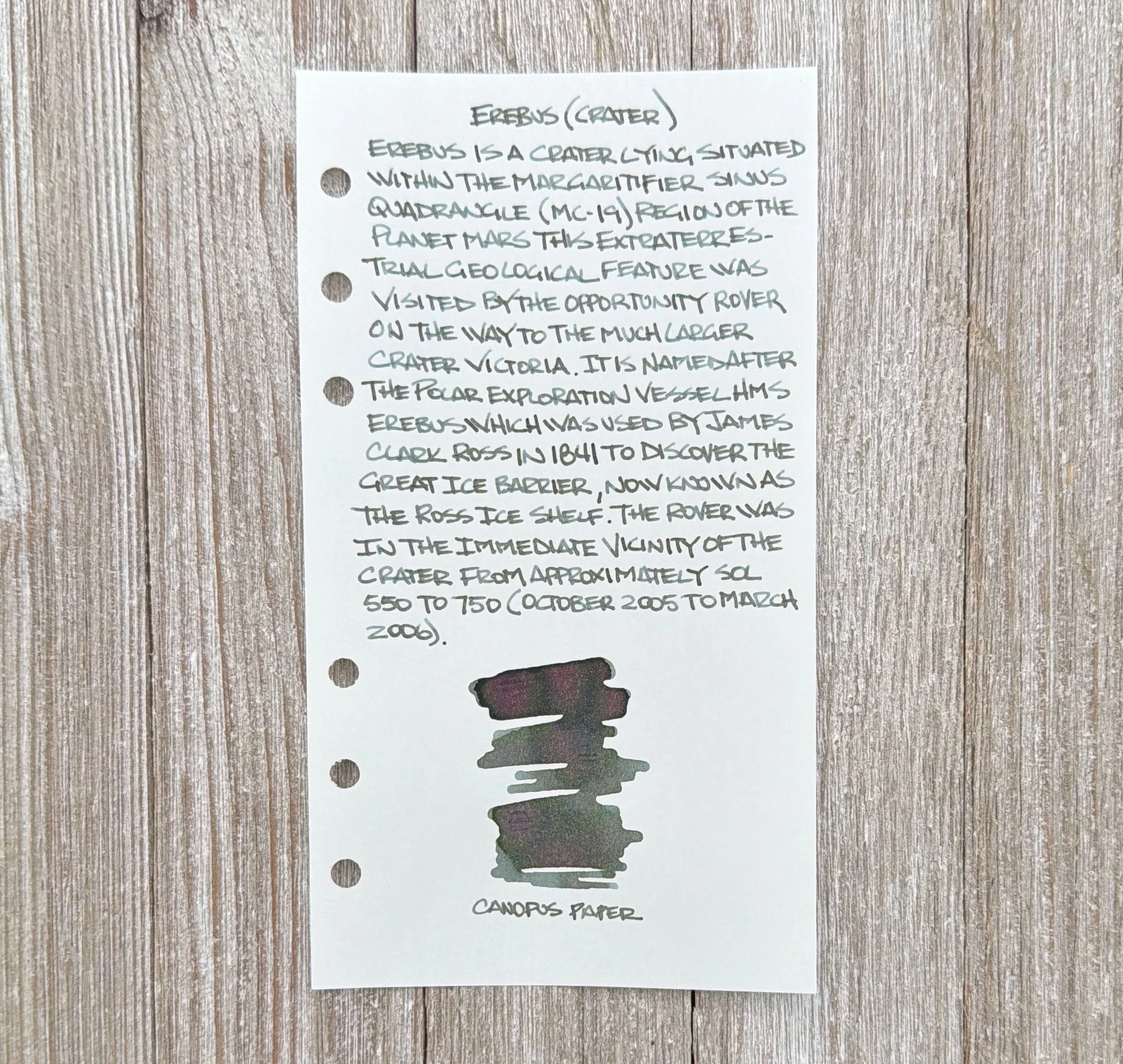
Canopus paper.
What I see is mostly Green, with undertones of Brown, with Blue peeking out on the edges or in the shading. It’s fascinating, and one of the most fun writing inks I’ve used in a while. I could create 10 different swatches on 10 different papers and I’m convinced they would all be different in some fashion.
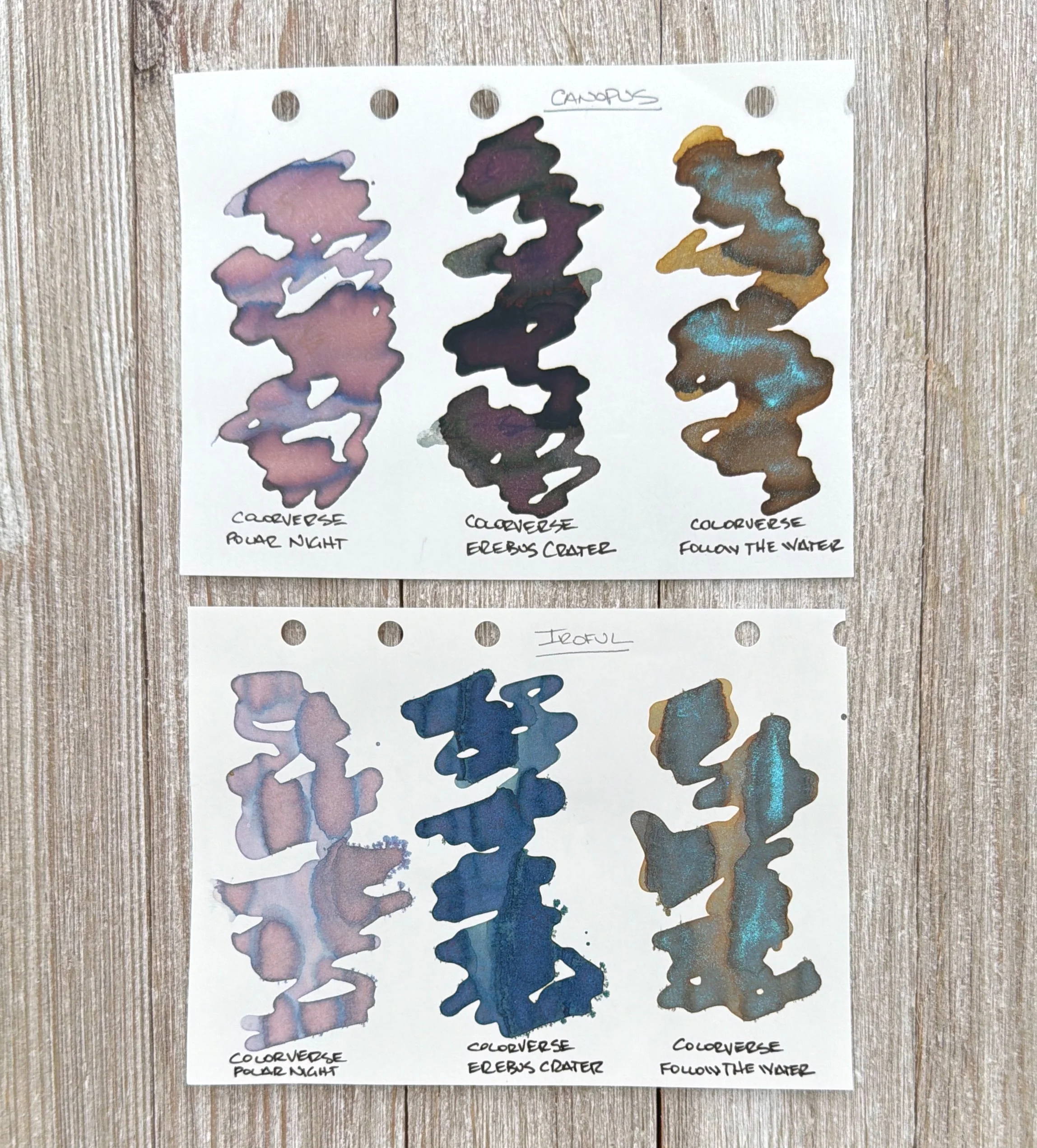
Colorverse ink swatches on Canopus (top), and Iroful Paper. Erebus crater is the center swatch on both.
That may be untenable for a work situation, but Erebus Crater is a blast to use otherwise. I’m not sure I would like it as much in one of my Extra Fine nibs, but it would work. I do think it thrives in wider, wetter writing situations.
Blue lines in my Yoseka notebook.
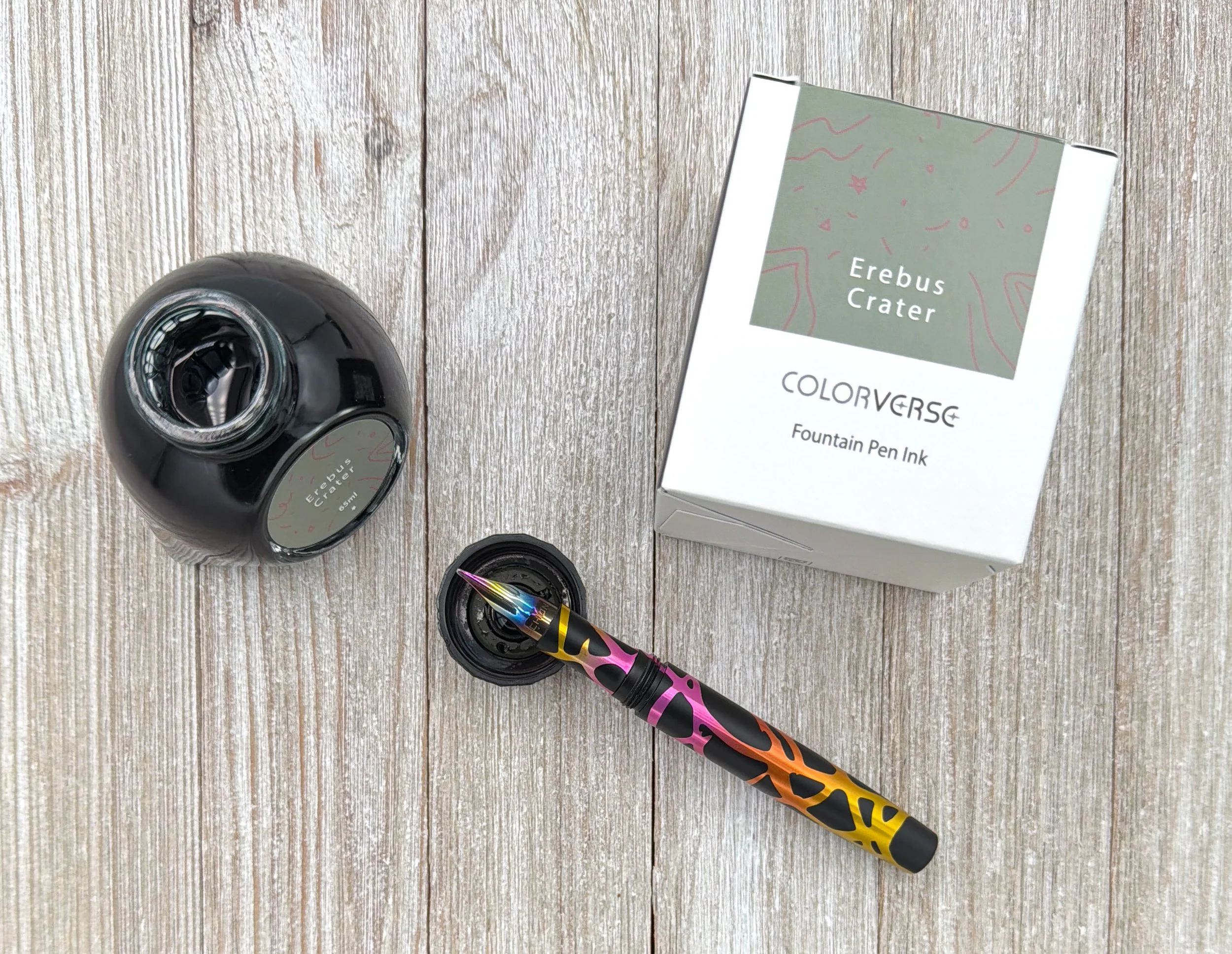
Colorverse Erebus Crater is $29.50 for a 65 ml bottle. Not cheap, but it is a big bottle. That’s good, because I think it is going to be seeing a lot of use from me.
Why are all of my favorite weird inks in this Brown/Green category? It looks like that is a topic that needs to be explored soon.
(This product was purchased from Dromgoole’s at regular price.)
Enjoy reading The Pen Addict? Then consider becoming a member to receive additional weekly content, giveaways, and discounts in The Pen Addict shop. Plus, you support me and the site directly, for which I am very grateful.
Membership starts at just $5/month, with a discounted annual option available. To find out more about membership click here and join us!