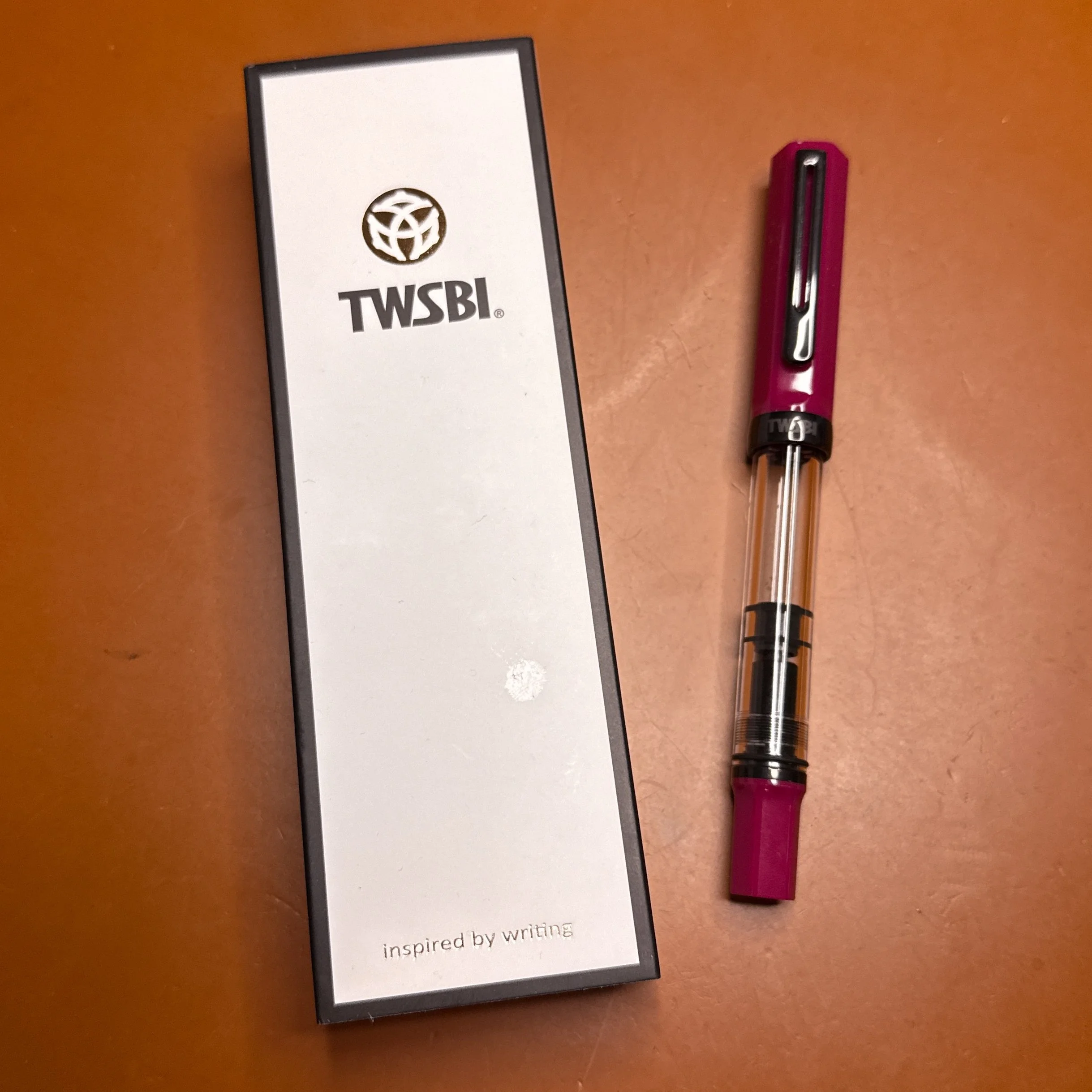
(Kimberly (she/her) took the express train down the fountain pen/stationery rabbit hole and doesn't want to be rescued. She can be found on Instagram @allthehobbies because there really are many, many hobbies!.)
I’ll confess that I haven’t done a whole lot of ink swatching since vacationing at my in-laws over the holidays and getting through Inkvent 2025 (and part of Colorvent 2025). As soon as January hit, it was back to school and the pen show kicks off with the Philly Pen Show, and the ensuing travel/packing/unpacking/mess/exhaustion. Sometimes I feel like swatching inks is less urgent than other topics like show recaps, reviews, reading, exercise, etc, so it often gets put on the back burner. But, as I said in my 2026 goals and intentions article, I’d like to get my swatching percentage from 66% to 75%, and there’s no time like the present, so here we go!
I picked the following inks in a somewhat random order, but there was some rhyme & reason to it. The first six were acquisitions from the Philly and CA Pen Shows and the last four were picked based on (1) being a different brand, and (2) different colors from the first six. The list is largely collaborations but that was not intentional. This isn’t going to be an ink review, but more of a quick look with a few comparisons.
- Monteverde x Bucks Bespokery Fairmount
- Monteverde x Bucks Bespokery Wooder
- Sailor 2026 Pen Show Exclusive
- Kobe x 2026 CA Pen Show California Teal Blue
- Diamine x Galen Leather Anatolia
- Diamine x Galen Leather Zeugma
- Ink Institute x GourmetPens Ice Fog
- Wearingeul A Kidnapped Santa Claus
- Ferris Wheel Press Aurorealis
- Esterbrook x TheCoffeeMonsterzCo Forgotten Iced Coffee
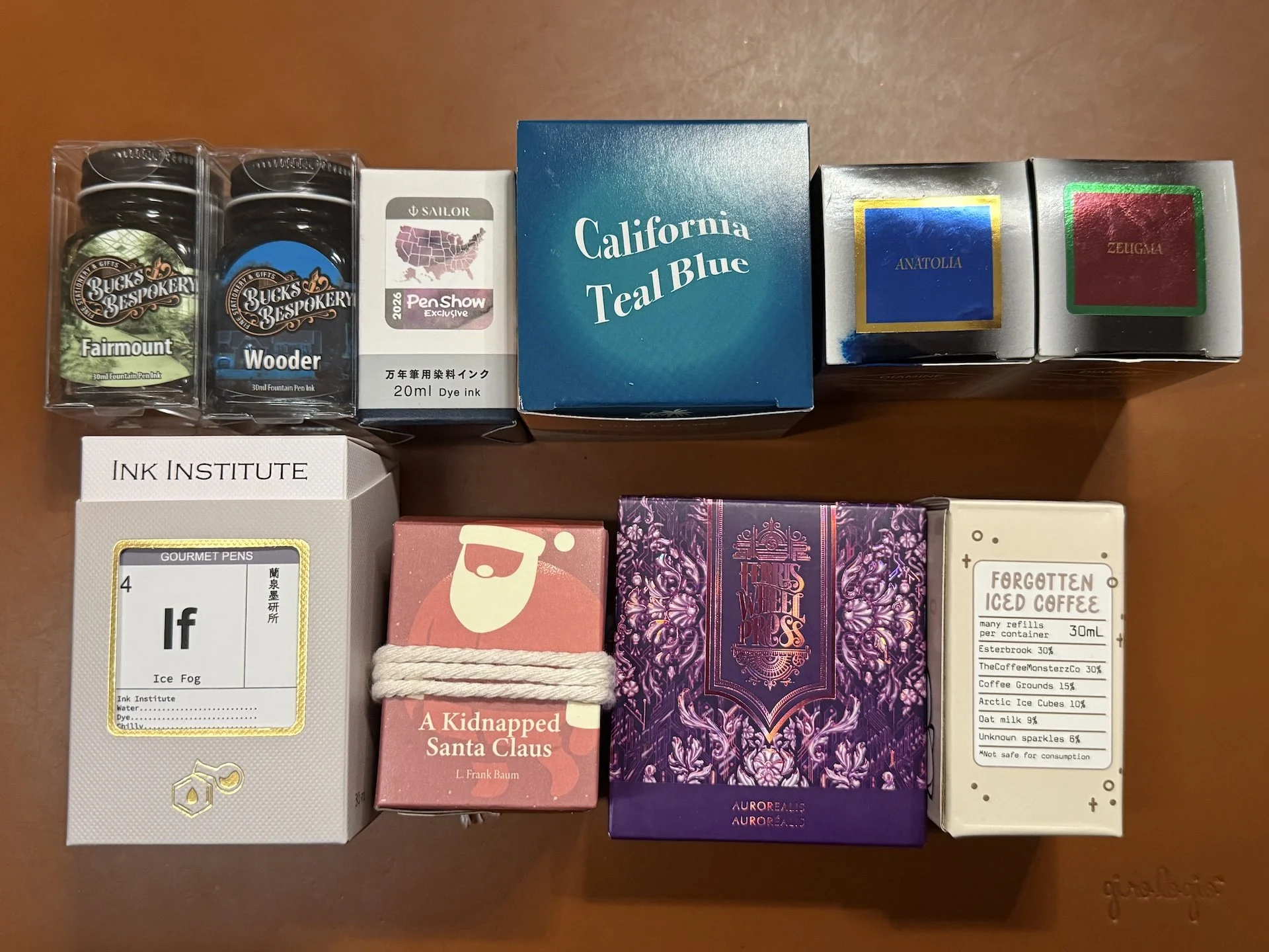
Top row: Inks 1-6, bottom row: inks 7-10
As usual, my swatching was done with a Kaweco clutch pencil holder with a Kakimori stainless steel dip nib and Col-O-Ring and Wearingeul swatch cards.
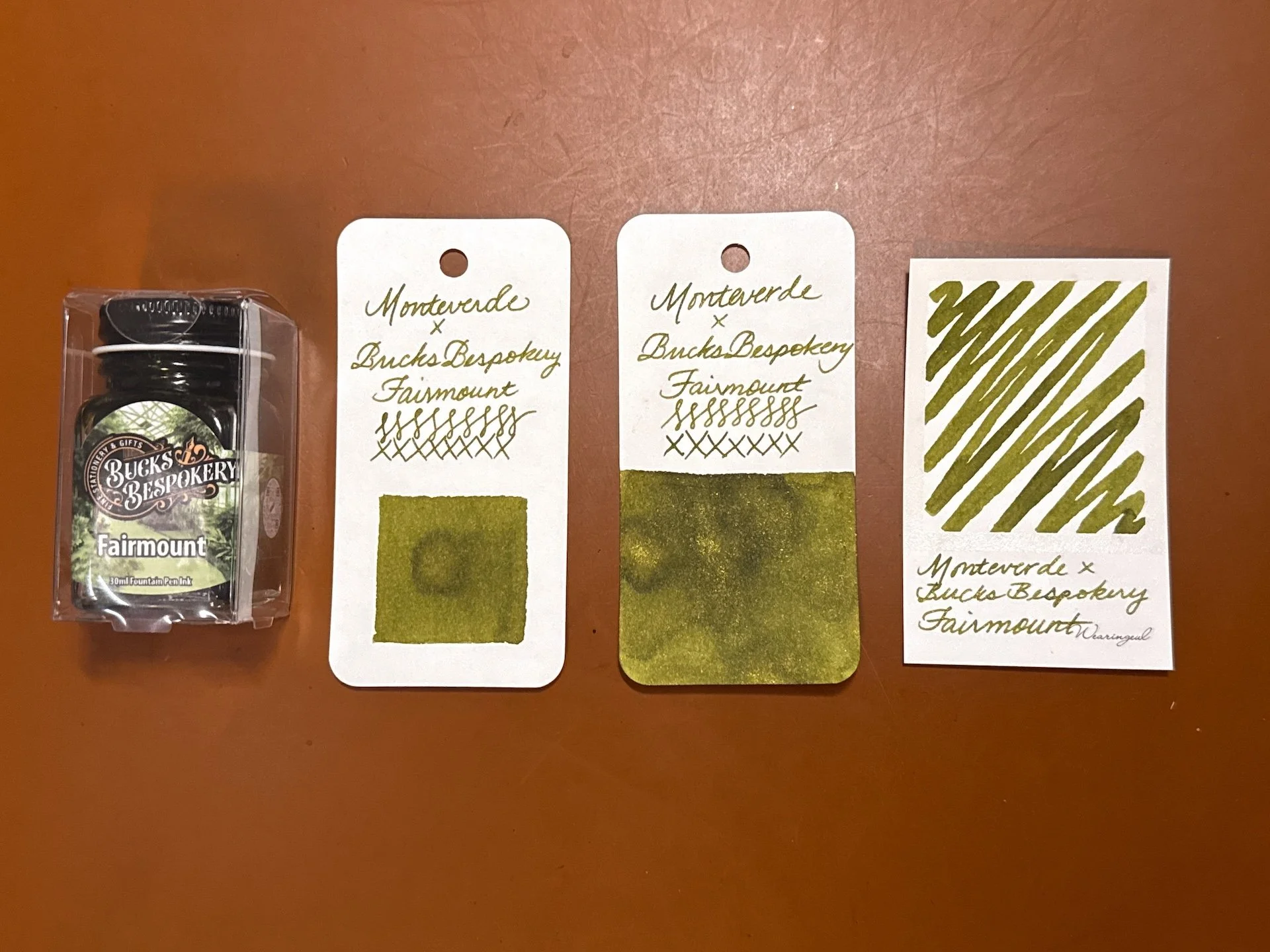
Monteverde x Bucks Bespokery Fairmount is an olive green ink with gold shimmer.
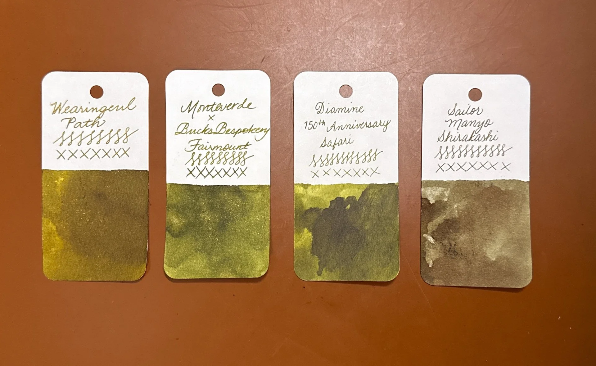
Inks similar to Fairmount include Wearingeul Path (a bit too yellow/gold), Diamine 150th Anniversary Safari (without shimmer), and Sailor Manyo Shirakashi (too brown).
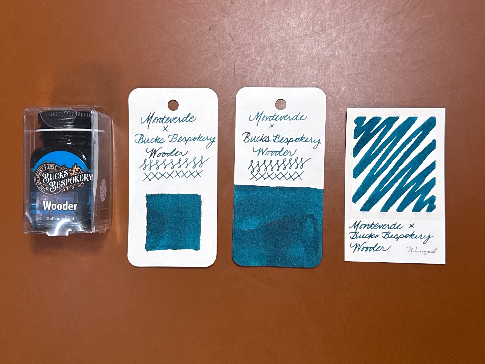
Monteverde x Bucks Bespokery Wooder (aka “Water”) is a blue teal (it’s not leaning, it’s definitely blue, but not a true blue.)
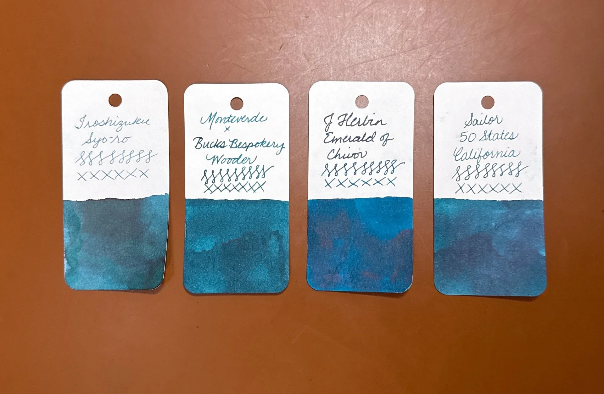
Inks similar to Wooder include Iroshizuku Syo-ro (too green), J Herbin Emerald of Chivor (with shimmer, and a bit too blue), and Sailor 50 States California (very close but just a hint more blue).
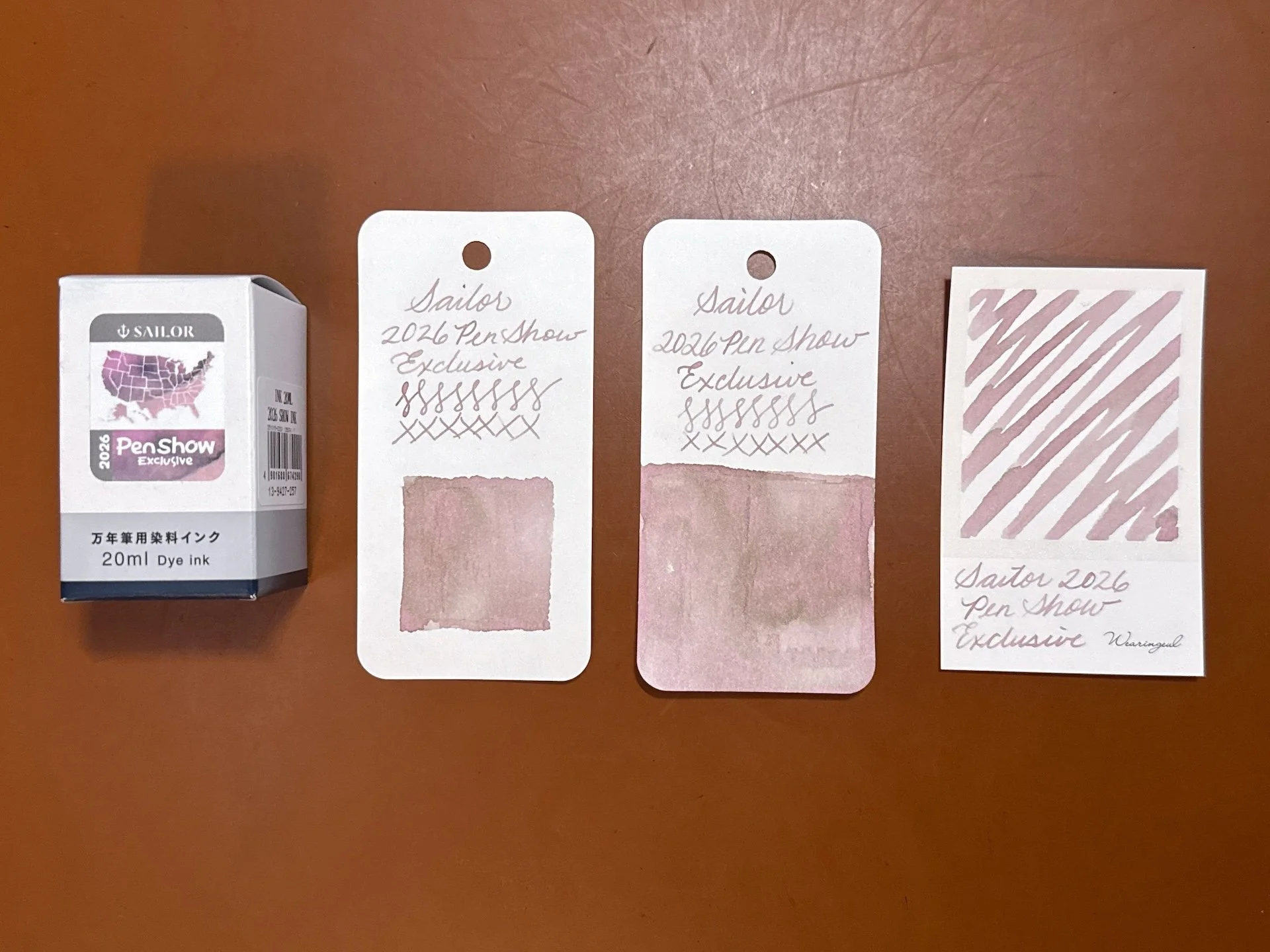
Sailor 2026 Pen Show Exclusive is a dusty pink chromashader with hints of grey and green.
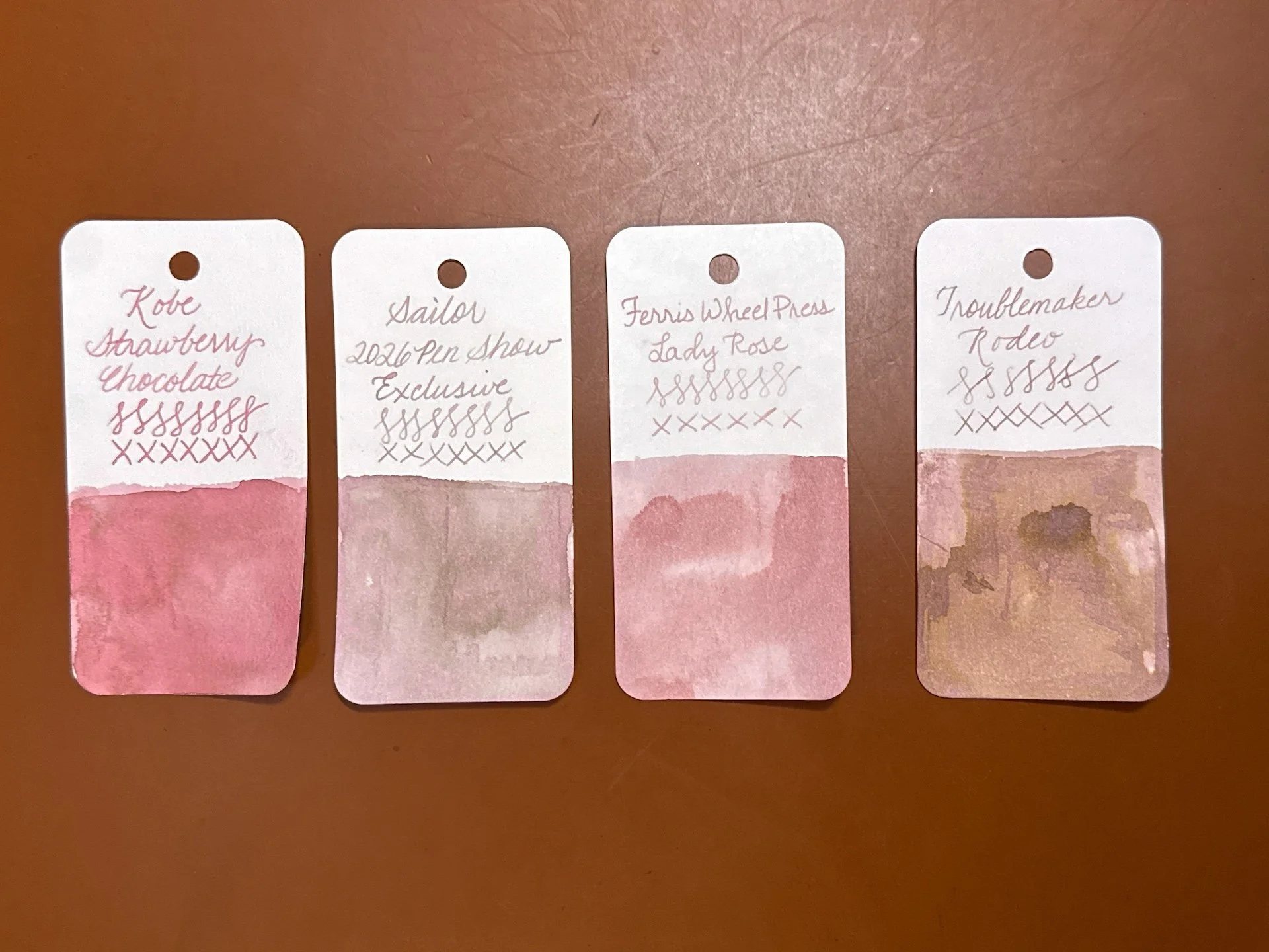
I don’t have a lot of inks similar to the Sailor 2026 ink but Kobe Strawberry (too pink/red/dark, Ferris Wheel Press Lady Rose (also too pink but getting there), Troublemaker Rodeo (probably the closest, but it’s too warm/brown.)
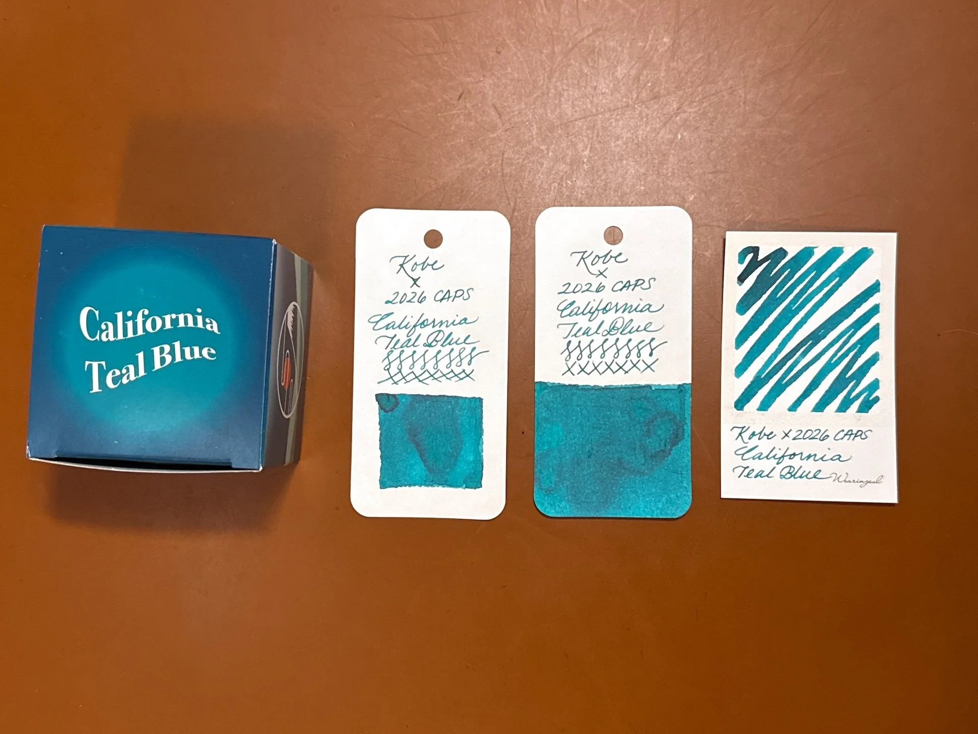
==kobe== Kobe x 2026 CA Pen Show California Teal Blue is a, uh, teal blue, lol. 🙂
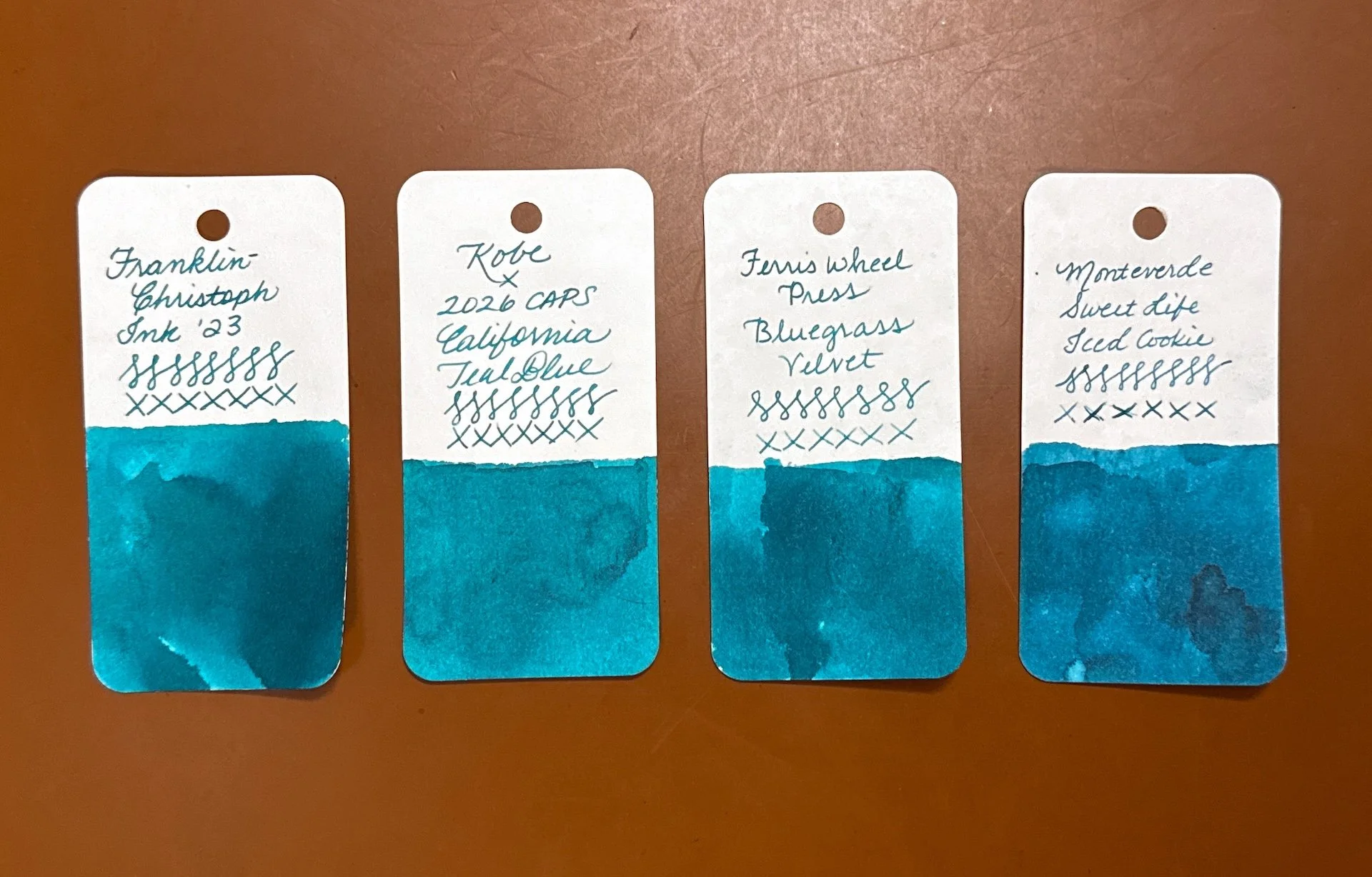
Inks similar to California Teal Blue include Franklin-Christoph Ink ‘23, Ferris Wheel Press Bluegrass Velvet, and Monteverde Sweet Life Iced Cookie (a touch too blue.)
Note: I swatched the next two inks as “Diamine x Galen Leather”, but it’s possible that it was a Turkey exclusive, as opposed to a Galen exclusive. Sorry, too lazy to re-swatch them 🙂
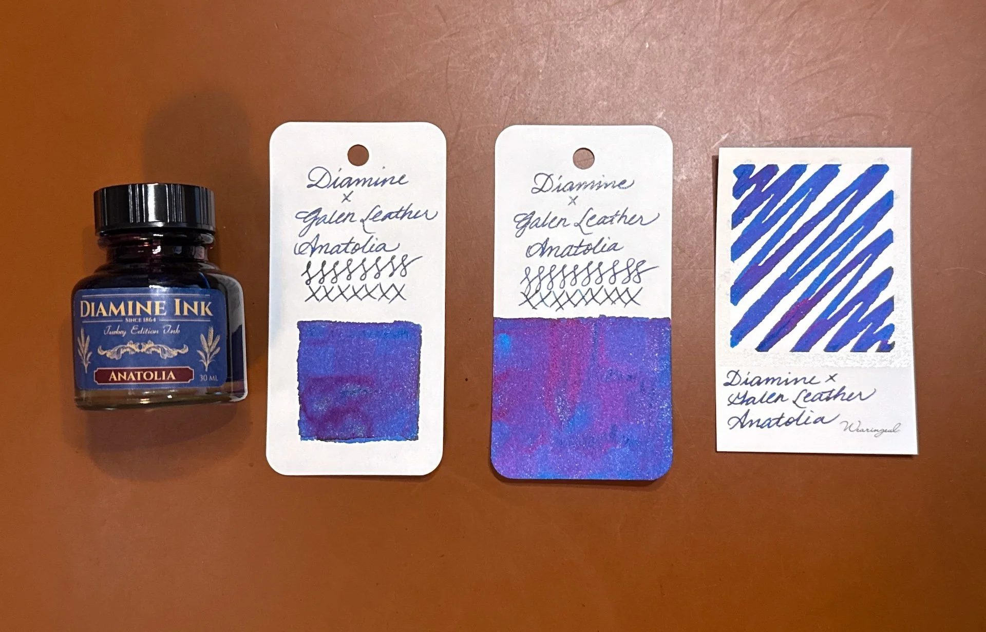
Diamine Anatolia is a rich, deep blue with gold and green-gold shimmers and a not-too over-the-top red/magenta sheen. I had to show the bottle because I love the bottle shape and label.
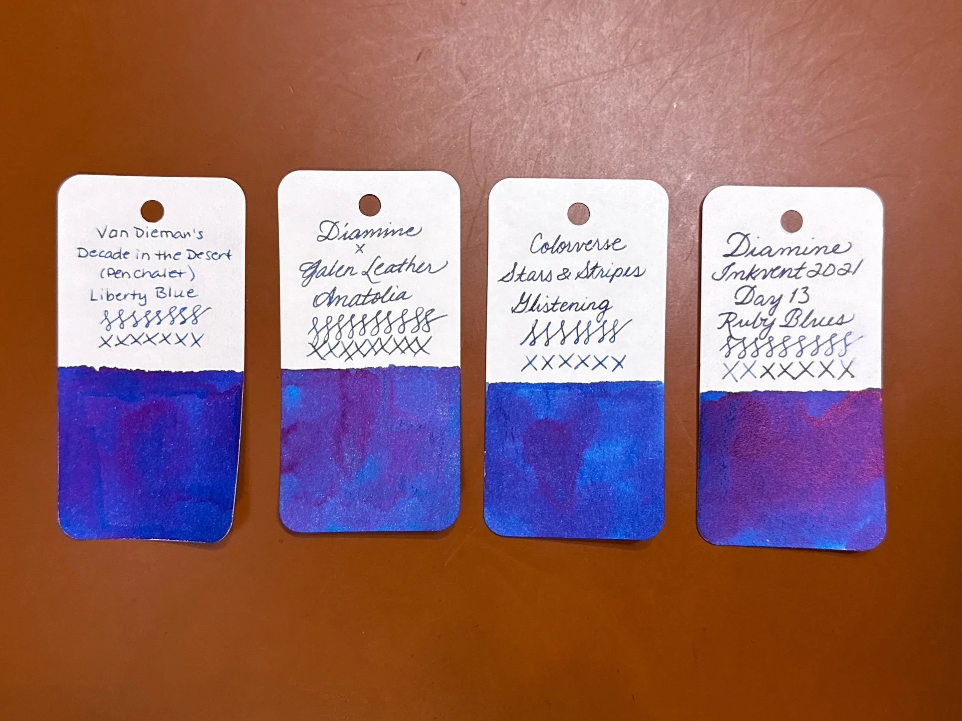
Inks similar to Diamine Anatolia include Van Dieman’s x Pen Chalet Liberty Blue (no shimmer), Colorverse Stars & Stripes Glistening, Diamine Inkvent 2021 Ruby Blues.
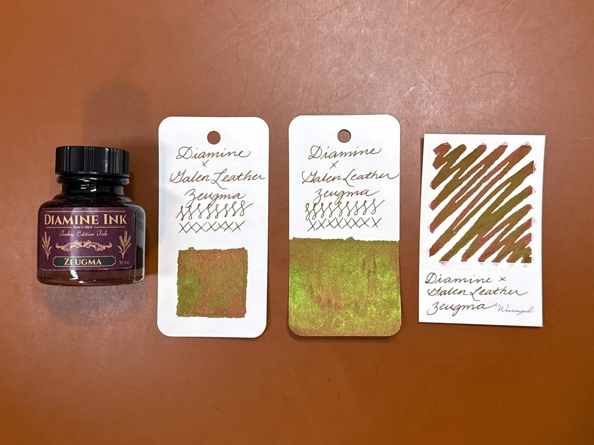
Diamine Zeugma has, according to Galen Leather’s website, red wine tones with a green sheen. I would say that the base color is more of an orange-leaning brown as opposed to red, but that might depend on paper too.
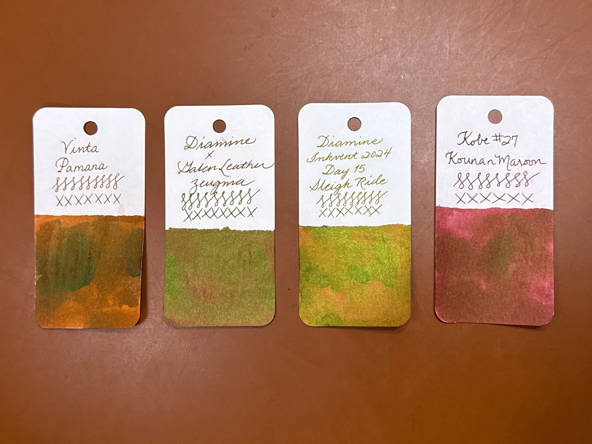
Inks similar to Diamine Zeugma include Vinta Pamana Heritage Brown (one of my favorite browns), Diamine Inkvent 2024 Sleigh Ride (base is more similar to the Vinta than Zeugma), and I put the closest red wine-colored ink that sorta matched the base, Kobe #27 Kounan Maroon, and that doesn’t look like it because of Zeugma’s sheen.
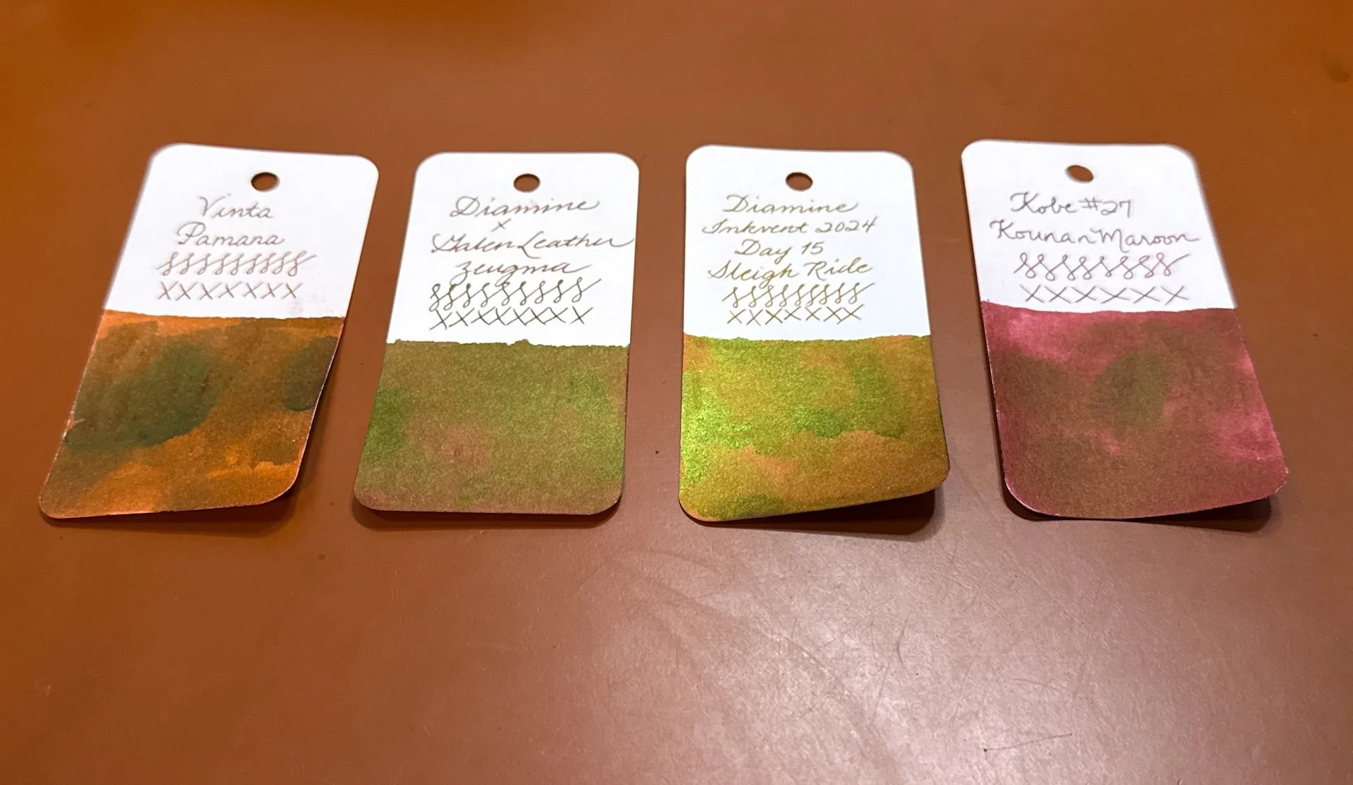
It’s still very sheeny at an angle, but you can almost see the reddish undertones of Zeugma in the bottom left section of the swatch.
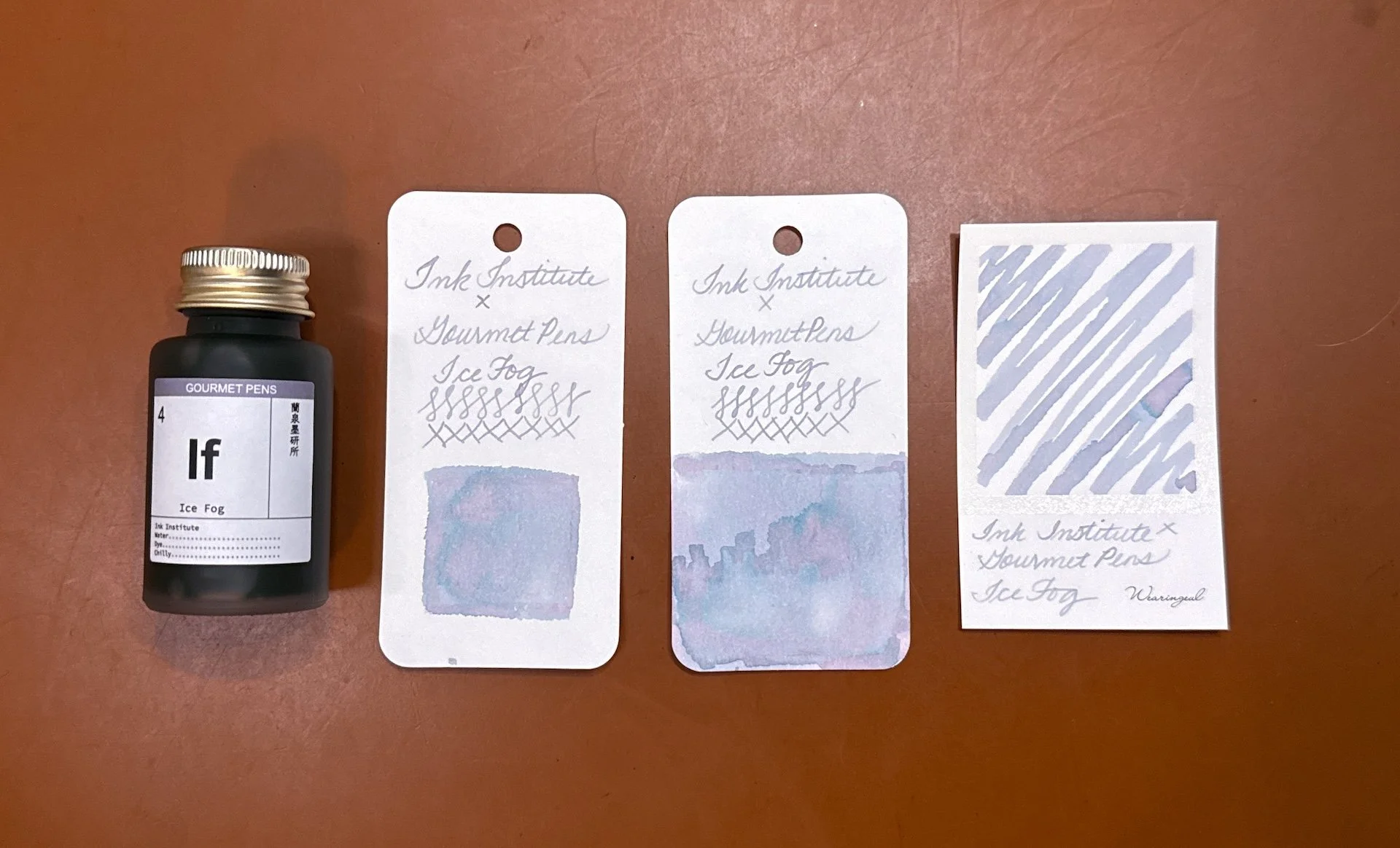
Ink Institute x GourmetPens Ice Fog is an enigmatic chromashader because it can be grey, pink, purple, or all of the above, and occasionally, with hints of blue.
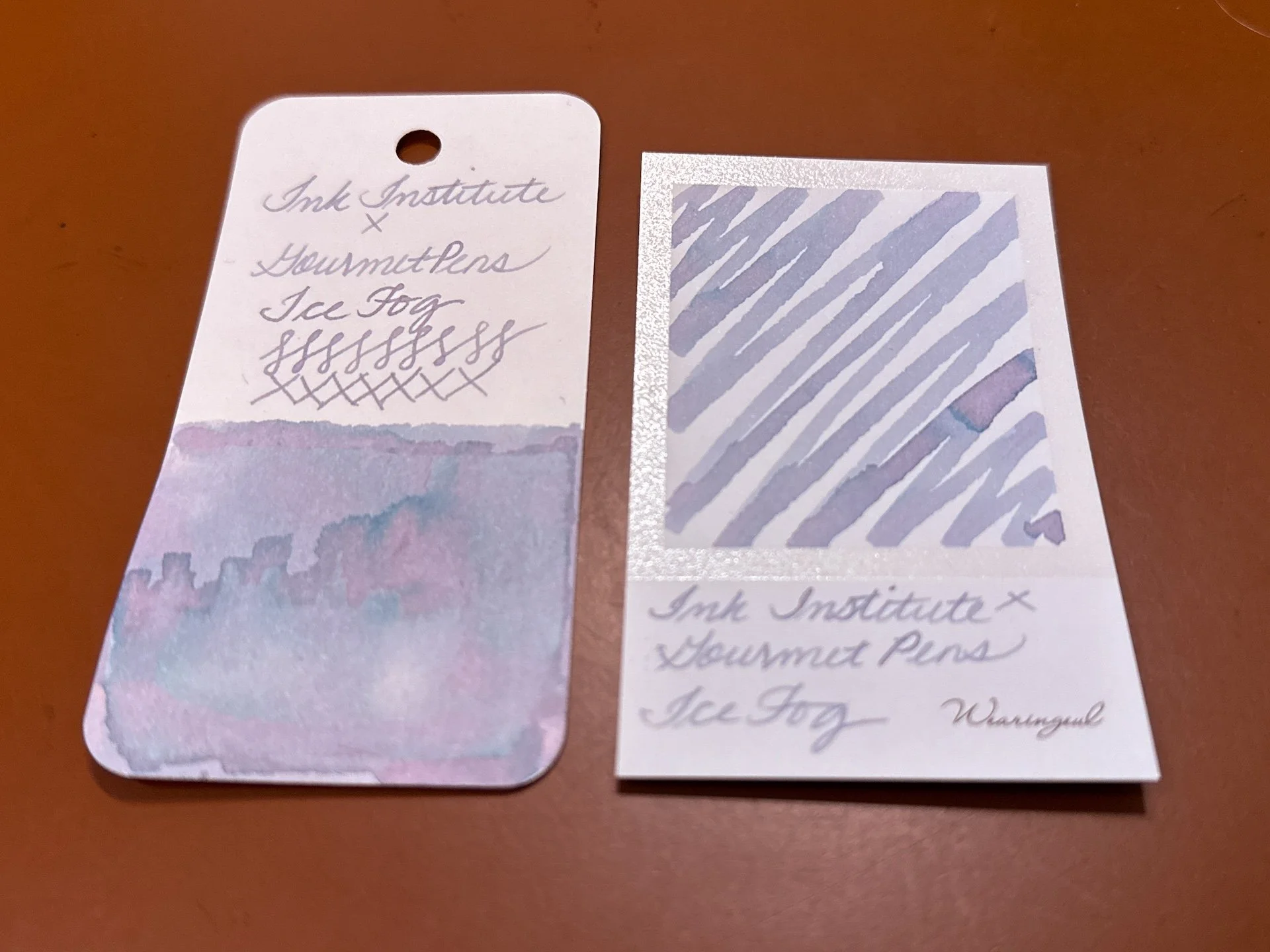
An angled closeup so you can see the various shades that Ice Fog has to offer.
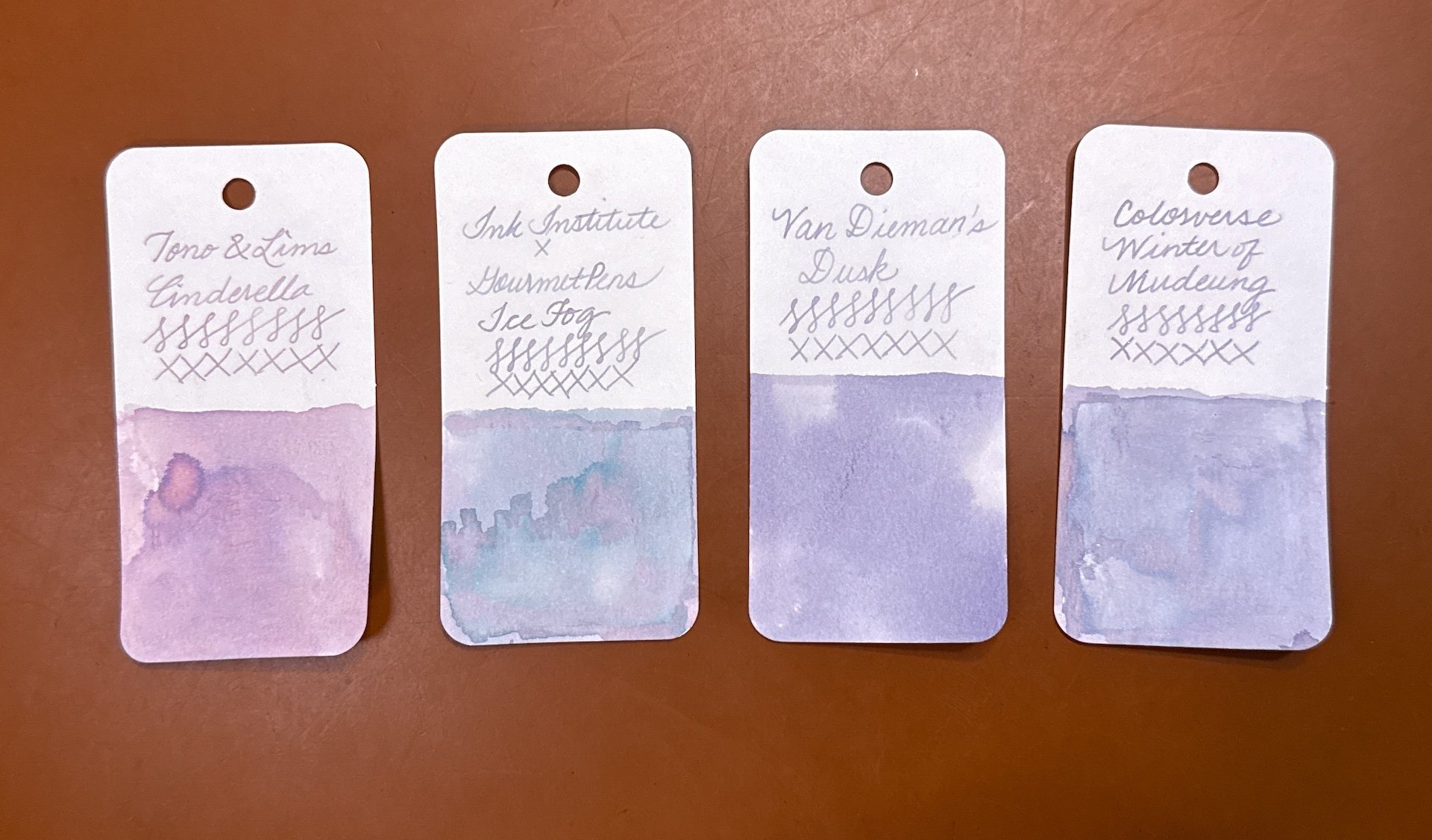
I don’t have a lot of inks in this range, but here are some: Tono & Lims Cinderella (too pink), Van Dieman’s Dusk and Colorverse Winter of Mudeung (both of which are too purple, and not enough chromashading).
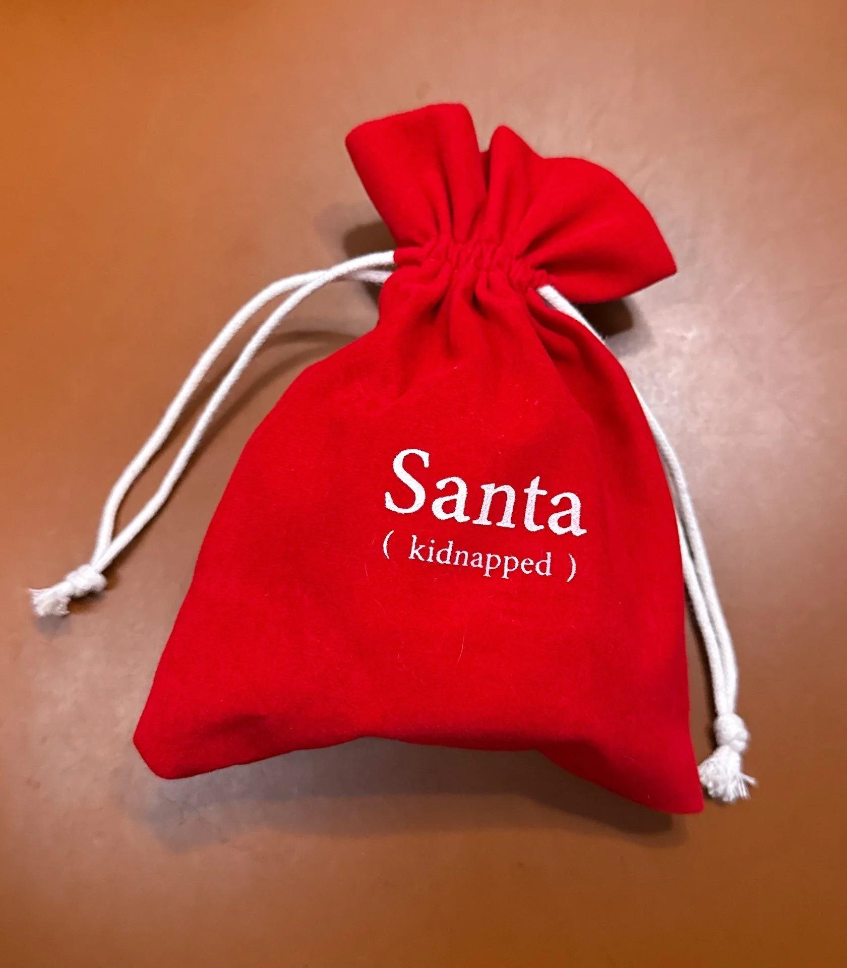
Wearingeul A Kidnapped Santa Claus deserves dedicated pics for the best ink costume!! The ink comes in this red bag that says “Santa (kidnapped)”.
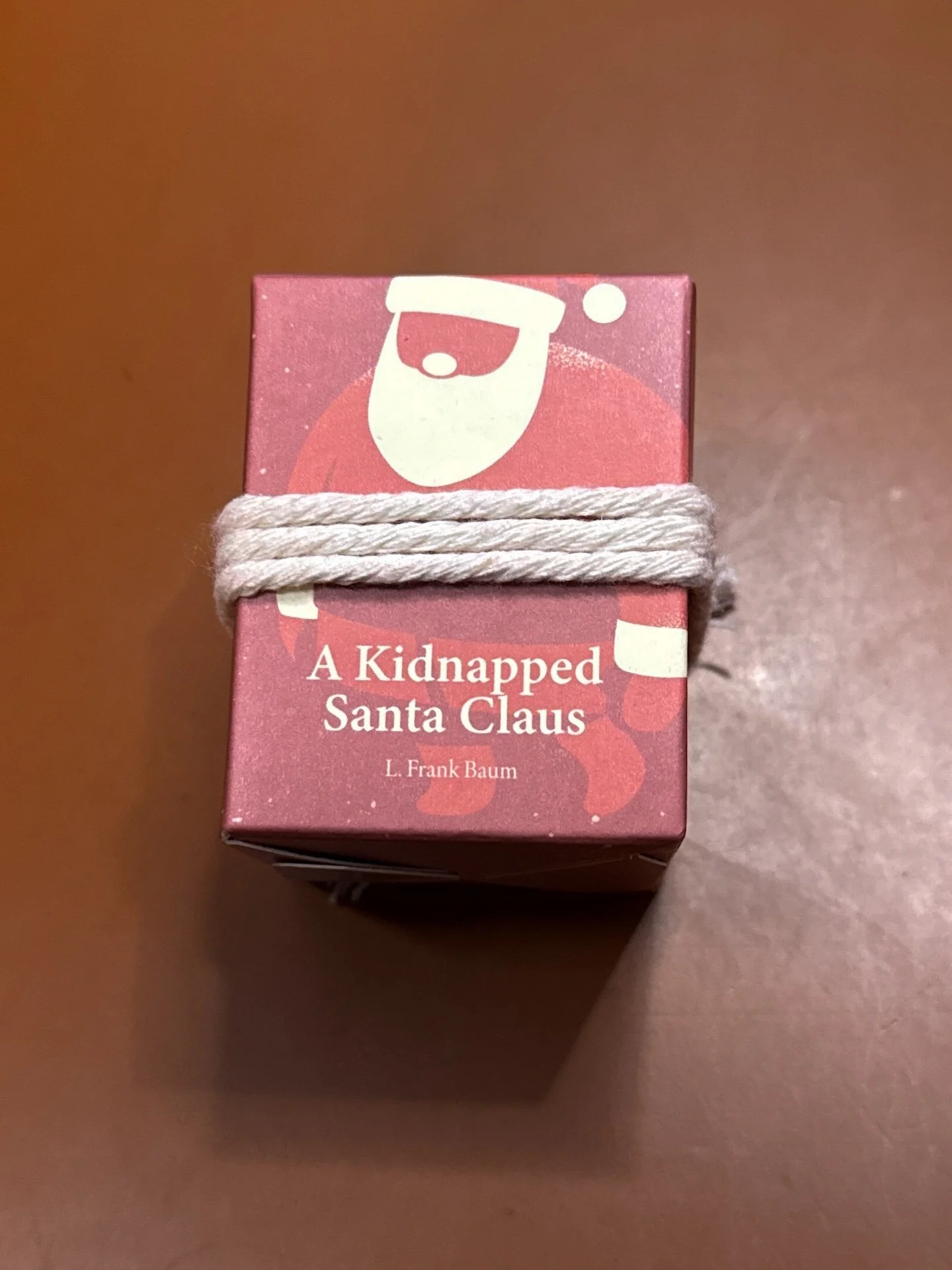
Santa is printed on the box with actual rope tying him up!
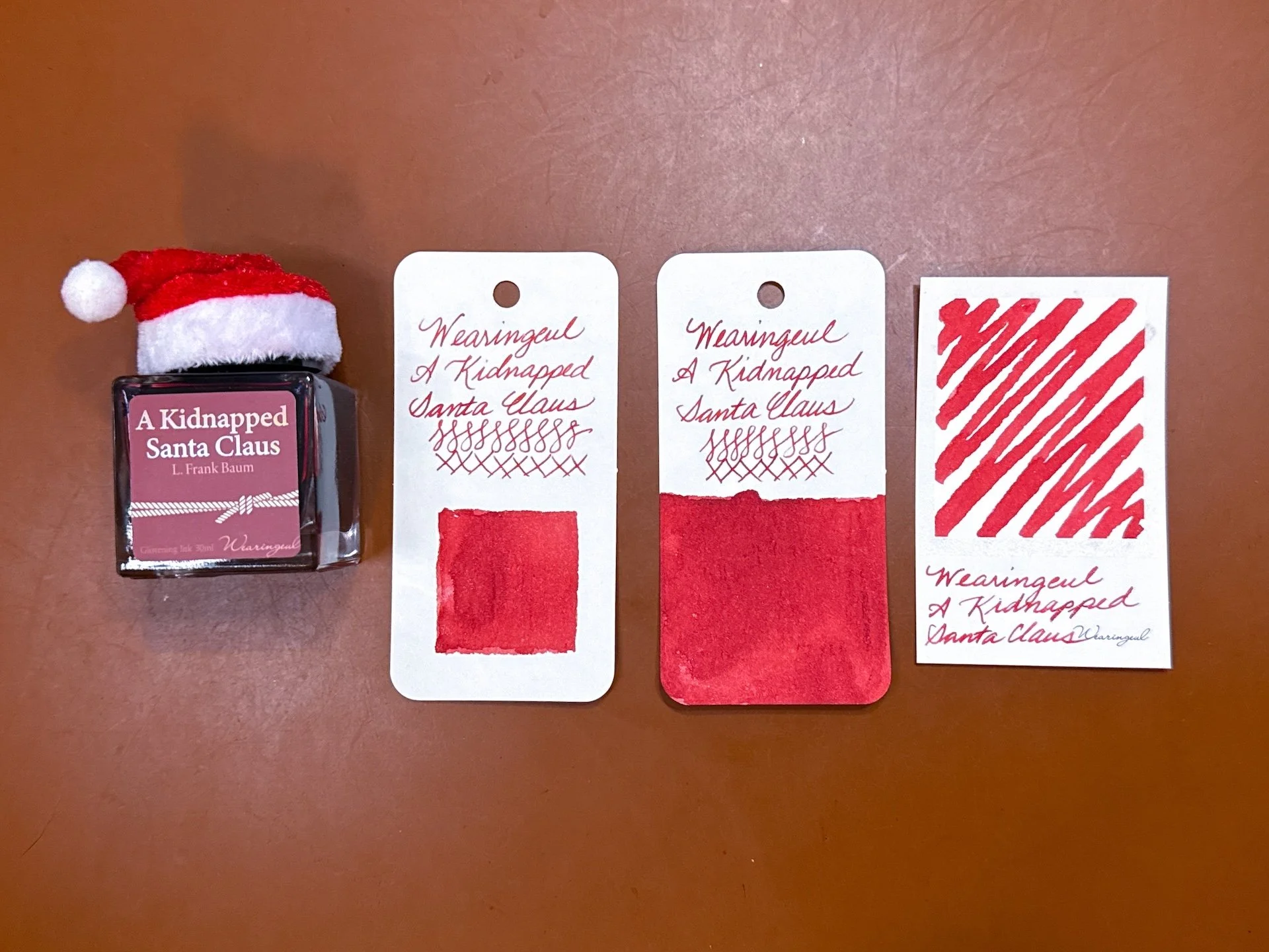
The Santa hat atop the bottle is just chef’s kiss! As one would expect, A Kidnapped Santa Claus is a red ink!
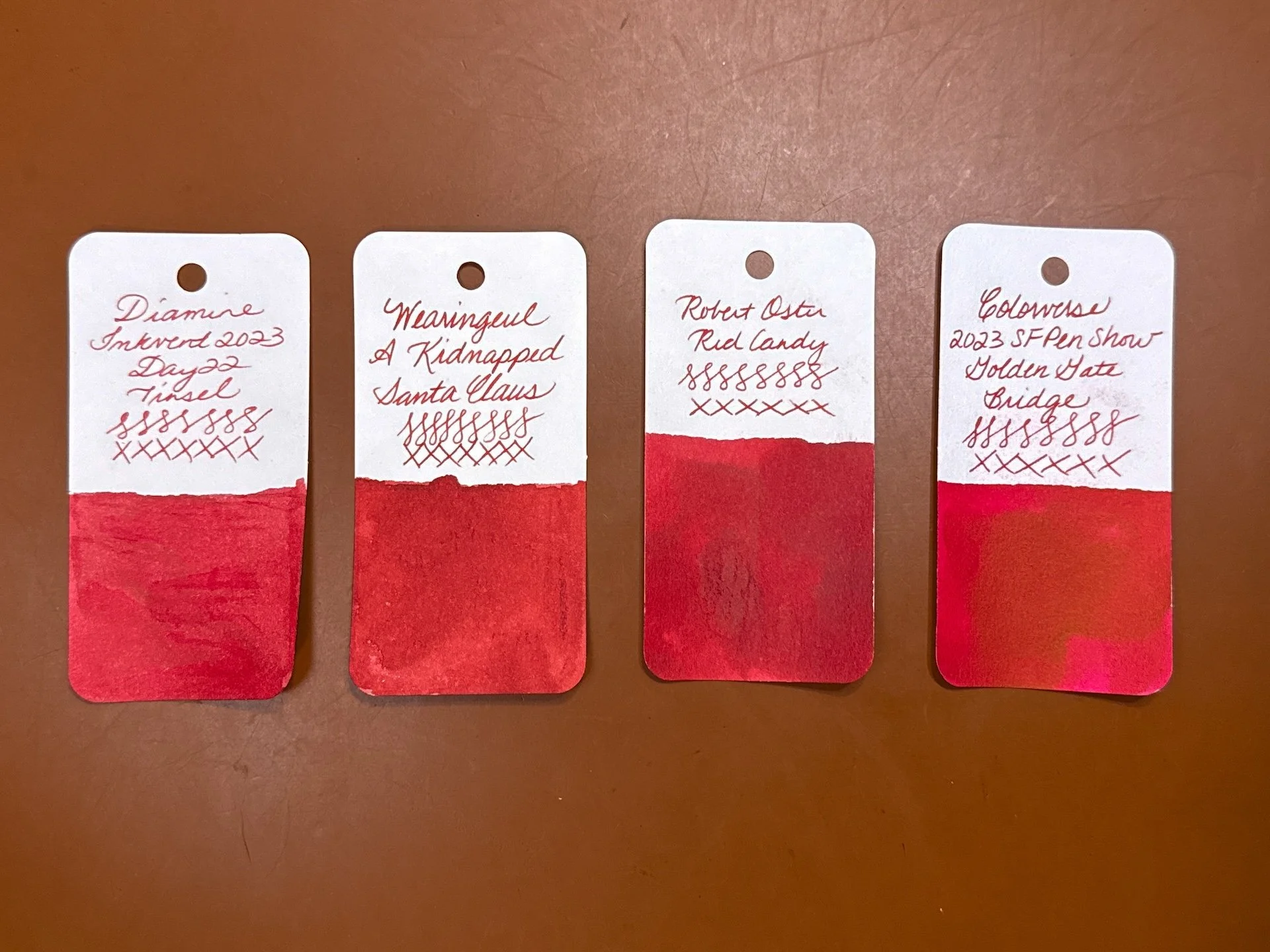
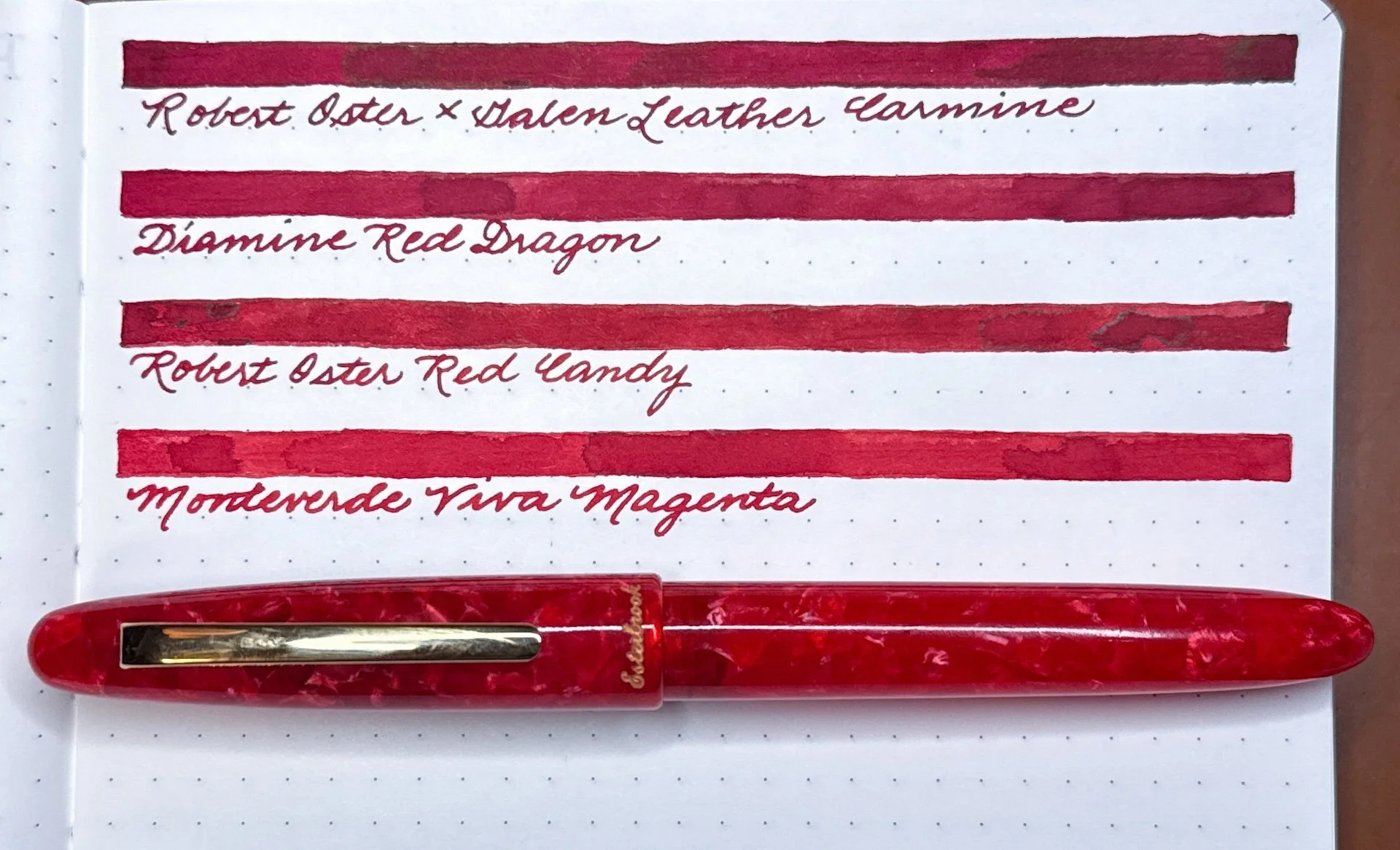
Inks similar to A Kidnapped Santa Claus include Diamine Inkvent 2023 Tinsel (a touch too pink), Robert Oster Red Candy (a touch too dark), and Colorverse 2023 Golden Gate Bridge (a very close match!).
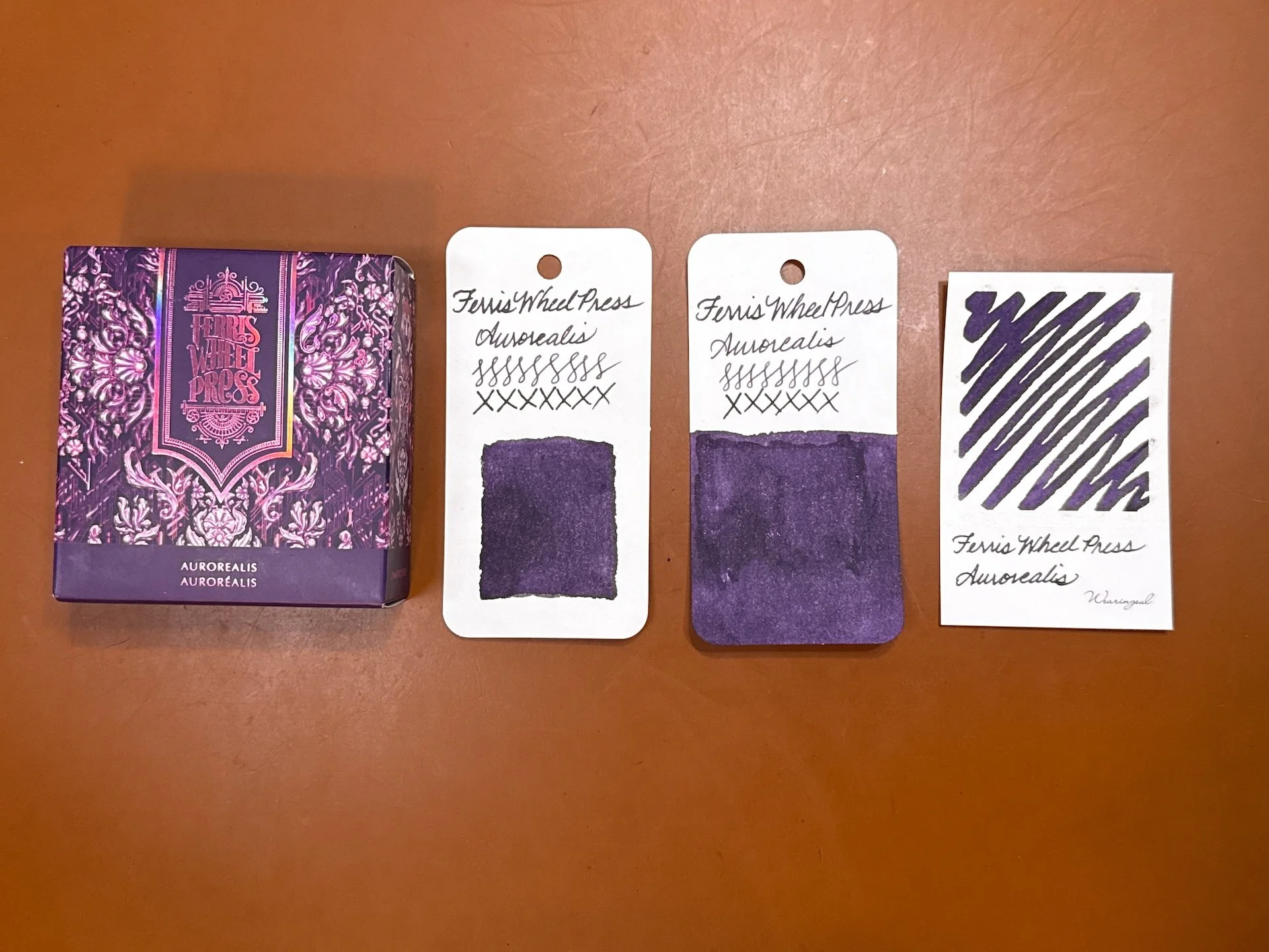
Ferris Wheel Press Aurorealis is a dark blue purple (as opposed to a red purple) with a pink/magenta shimmer.
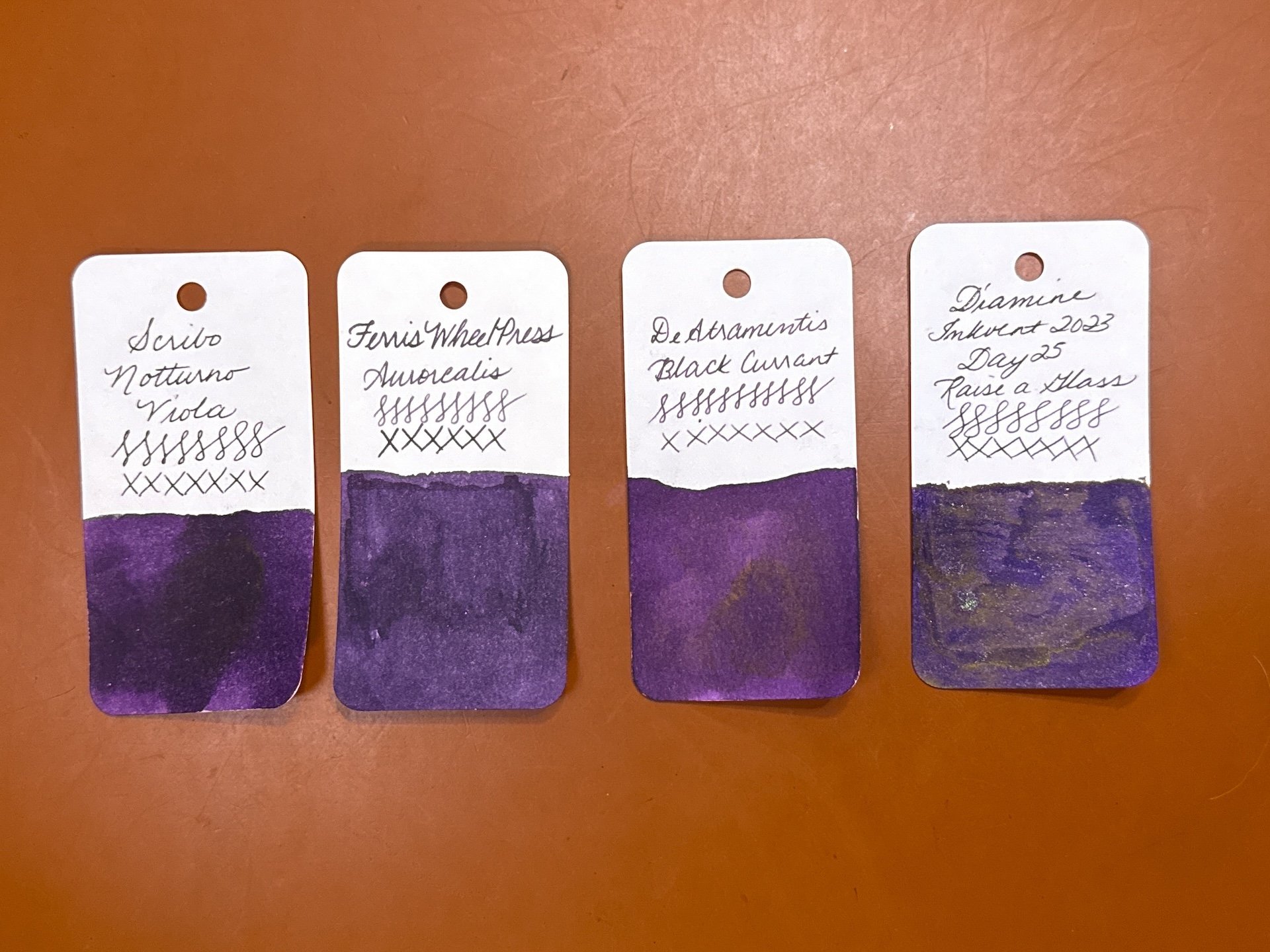
Inks similar to Aurorealis include Scribo Notturno Viola (no shimmer and a touch too red), DeAtramentis Black Currant (no shimmer and also too red, but more similar IRL), and Diamine Inkvent 2023 Raise a Glass (a bit too dark but similar with different shimmer and sheen).
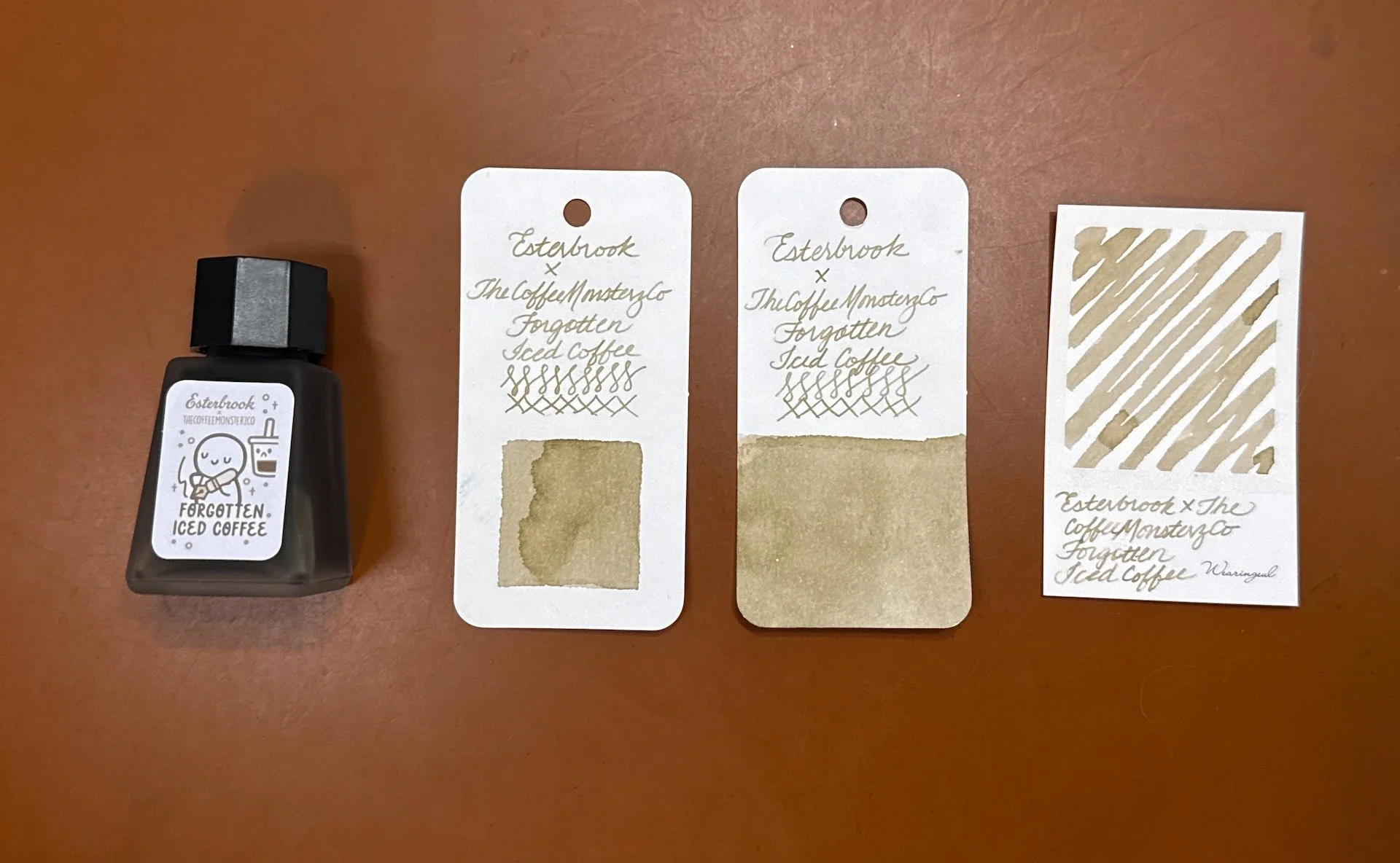
Esterbrook x TheCoffeeMonsterzCo Forgotten Iced Coffee is a light dusty brown shading ink that is showing up a touch on the yellow side in pictures.
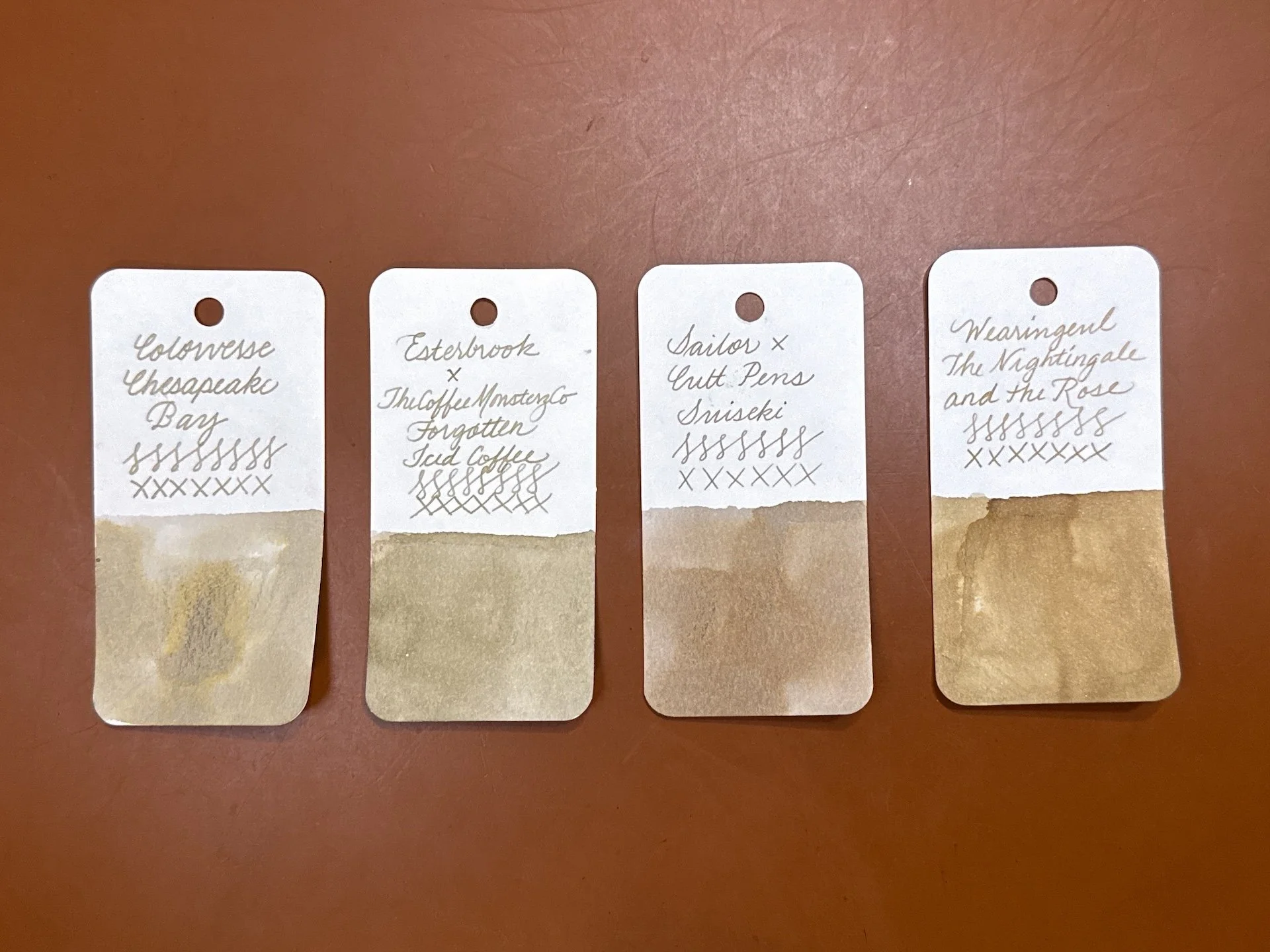
Inks similar to Forgotten Iced Coffee include Colorverse Chesapeake Bay (too light and grey), Sailor x Cult Pens Suiseki (too brown), and Wearingeul The Nightingale and the Rose (this has shimmer and is a bit too yellow in pics but more similar IRL.)
I wasn’t planning on inking any pens up with these inks, but after swatching them, I changed my mind - can you guess what I picked?
I just couldn’t get over the Sailor 2026 Pen Show exclusive ink! I’m not really a pink person, but the dusty pink with a hint of green and brown were just too cool to wait for an inking! The Ink Institute x GourmetPens Ice Fog was another “what the heck is this color” ink that I had to DM Azizah about because I couldn’t figure out what color it was or was supposed to be! She reassured me that my bottle was fine and my eyes aren’t going bad - it can be so many colors depending on paper and nib!
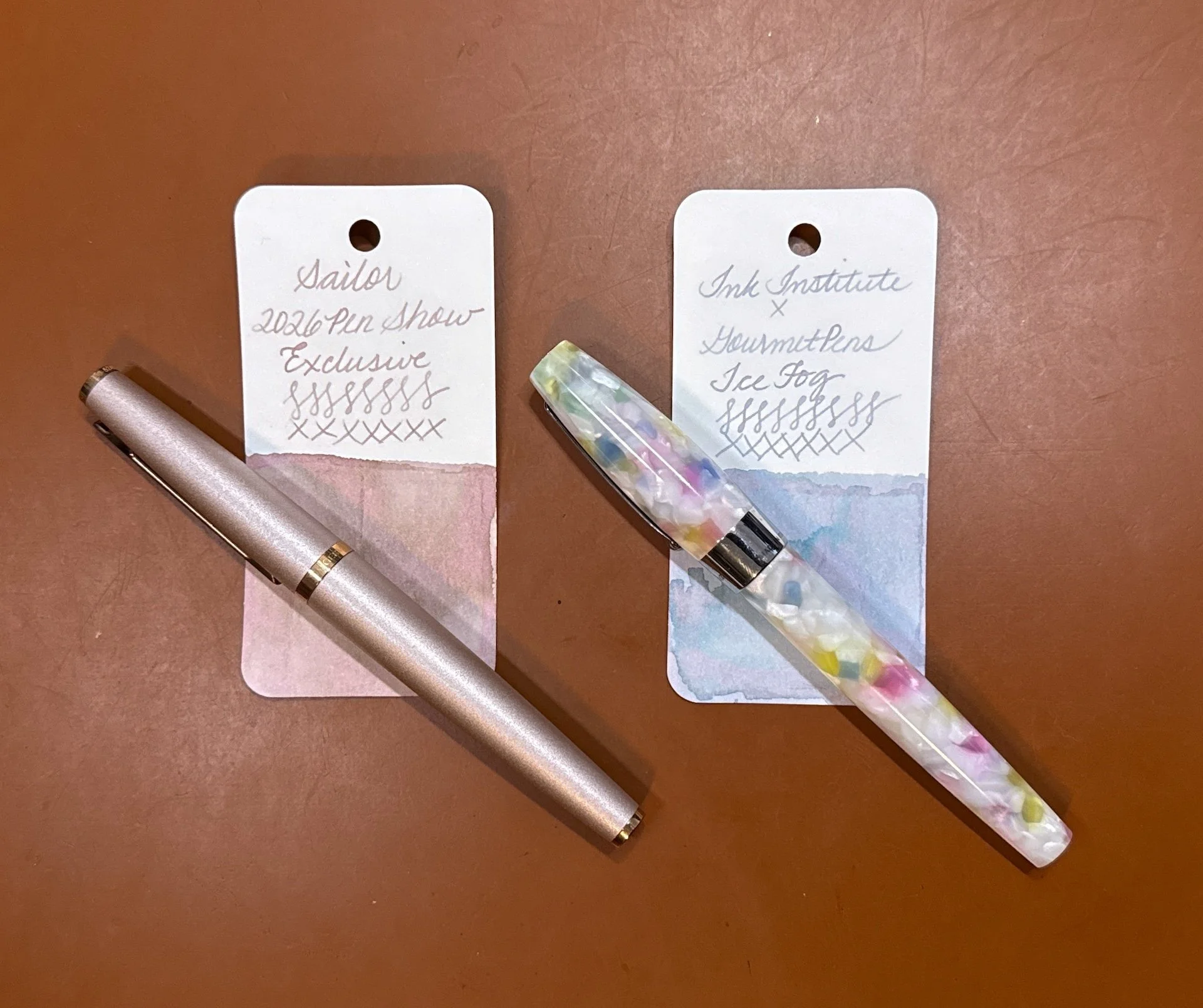
Sailor 2026 Pen Show Exclusive with the Otto Hutt 06 in Seashell Pink with a Medium steel nib, and Ink Institute x GourmetPens Ice Fog with the Montegrappa Fortuna Marshmallow with a Medium steel nib (y’all know that Medium is my fave nib size, right?)
Well, after all that, I’m still very much at 66%, but let’s be real, swatching 10 ink isn’t gonna move the needle much, but it’s a start! And after seeing all these fun colors, I’m excited to be back on this swatch wagon!
(Disclaimer: All products were purchased by me at regular price (or with the occasional store discount code.)
Enjoy reading The Pen Addict? Then consider becoming a member to receive additional weekly content, giveaways, and discounts in The Pen Addict shop. Plus, you support me and the site directly, for which I am very grateful.
Membership starts at just $5/month, with a discounted annual option available. To find out more about membership click here and join us!