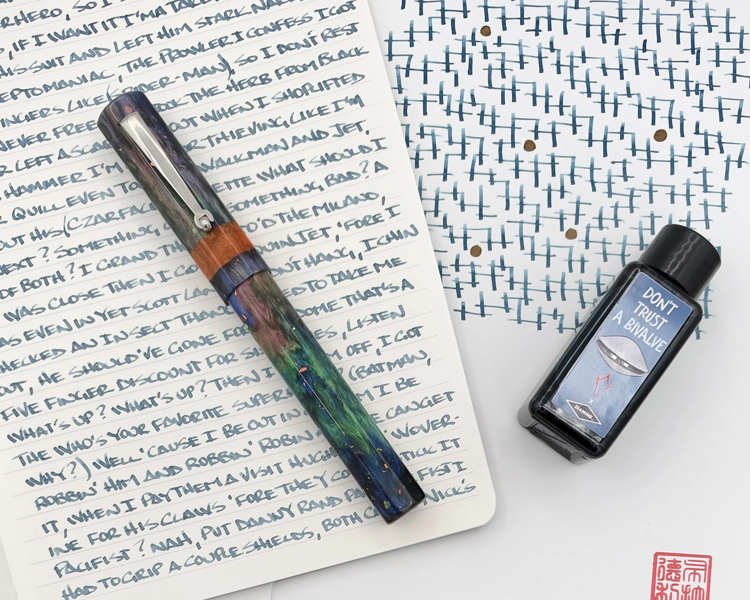
When you are naming a pen model after after the eight-legged horse Norse god Odin rode in on, you better get it right. Luckily for us, Hinze Pen Co. always gets it right, and the Sleipnir model is just the latest example of their craftsmanship.
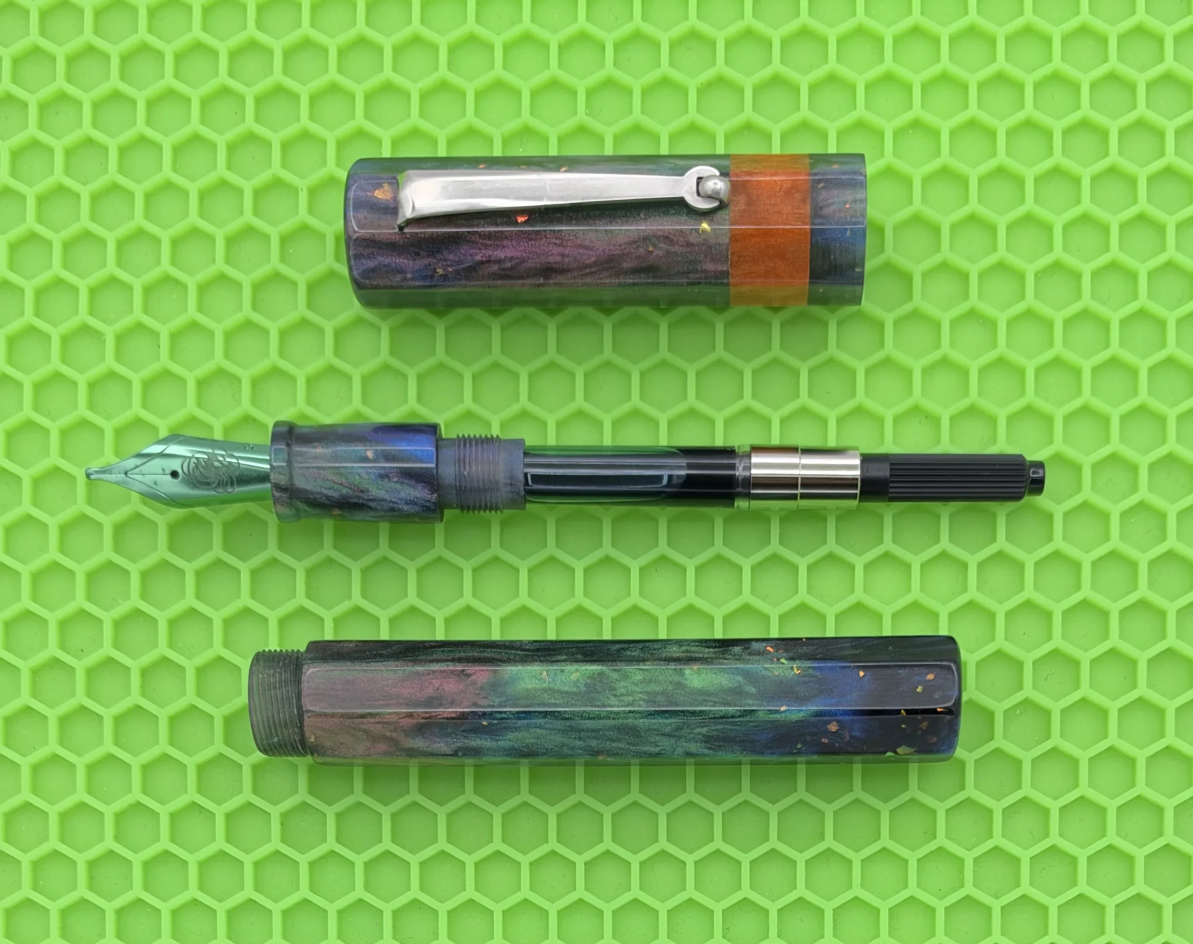
When you are dealing with a magical creature as inspiration, how do you bring that forward into a pen design? For starters, how about an eight-sided barrel, matching the number of the mythical beasts legs. If eight sides weren’t enough on its own, they are built around a big barrel, befitting the story being told through this pen.
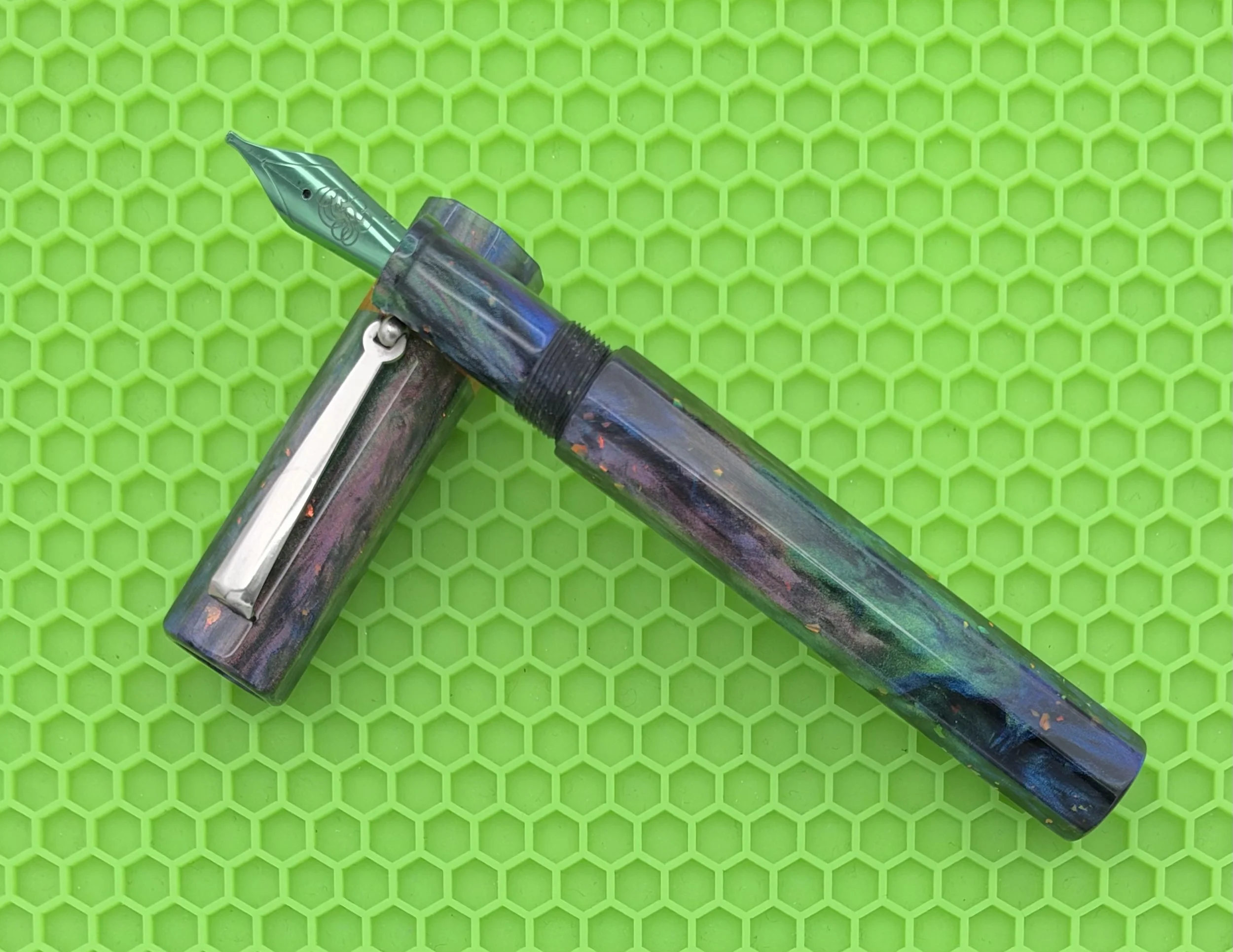
The diameter of the Sleipnir model is the main consideration when thinking about this pen. Large barrel pens are not for everyone, and this one, checking in at 14.5 mm at its widest point will be too big for some. In general, I prefer narrower diameter pens, but I have a few in my collection around this size that I enjoy because the overall feel of the pen works in my hand.
To me, feel is made up of the combination of weight, balance, and grip section design. On any pen, all of these things have to work together, but they are especially important aspects when it comes to large pens. I have average-sized hands, and I like to write small. That combination lends itself best to smaller, narrower pens, but doesn’t exclude large pens. There is just less room for sacrifice if one thing throws the whole experience off.
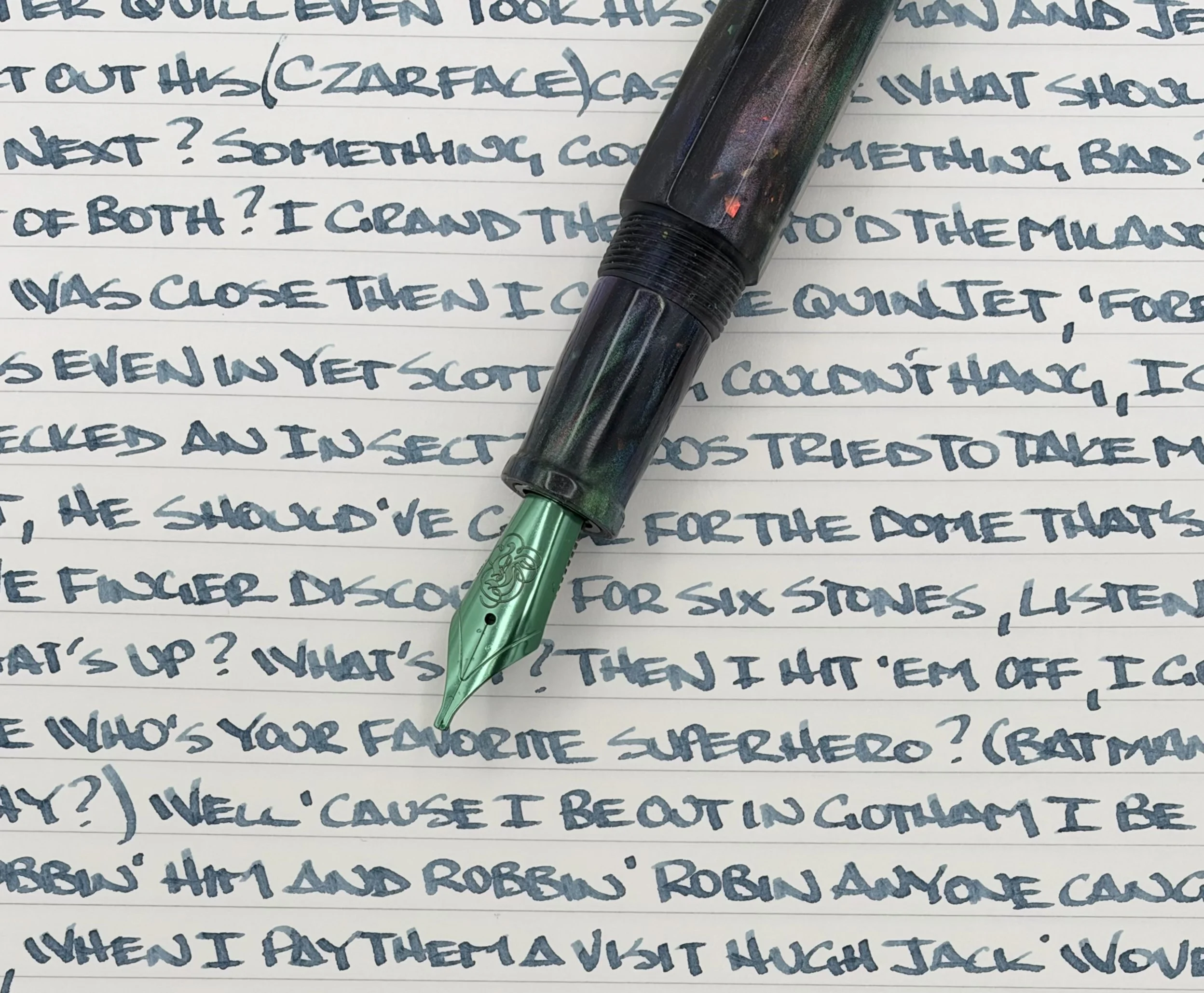
Luckily for me, everything on the Sleipnir works well in hand. I did fit it out with a 1.1 mm stub nib, which is a good size match. It doesn’t hurt that Hinze Pens has fun electroplated options such as this Green that matches the barrel perfectly.
Speaking of the barrel, this Dark Side material I picked out from in-house maker Starry Night Resins is a knockout. It’s Northern Lights-esque, with holographic flakes scattered throughout, and a highlight Orange ring in the cap. This is one of those materials where you see something different every time you pick it up.
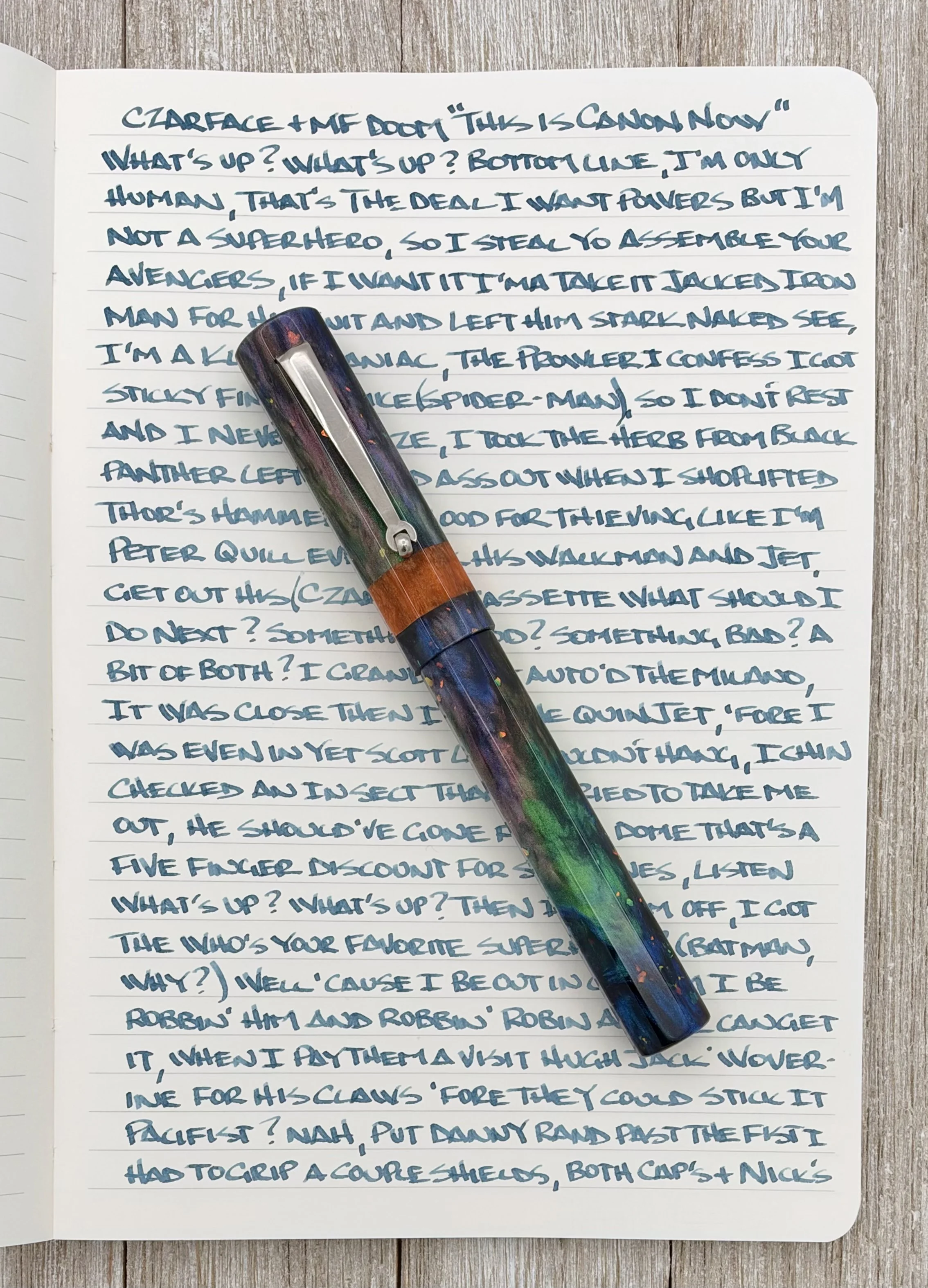
Mitsubishi Bank Paper.
For ink, I’ve exclusively used Inkdependence “Don’t Trust a Bivalve” with it, giving it a perfect match-matchy look. That said, there are dozens of shades that would look right in this pen, so who knows what’s next.
What’s next for now is I’m going to keep writing with the Hinze Pen Co. Sleipnir, and keep looking for my own to keep because I’ve really enjoyed it so far. It runs $320, and comes in many different materials you can see online, and at a pen show near you - including the Dallas Pen Show this upcoming weekend.
Big thanks to Jim, Elyce, and the entire Hinze team for providing this pen at no charge so I could test our their latest model!
Enjoy reading The Pen Addict? Then consider becoming a member to receive additional weekly content, giveaways, and discounts in The Pen Addict shop. Plus, you support me and the site directly, for which I am very grateful.
Membership starts at just $5/month, with a discounted annual option available. To find out more about membership click here and join us!
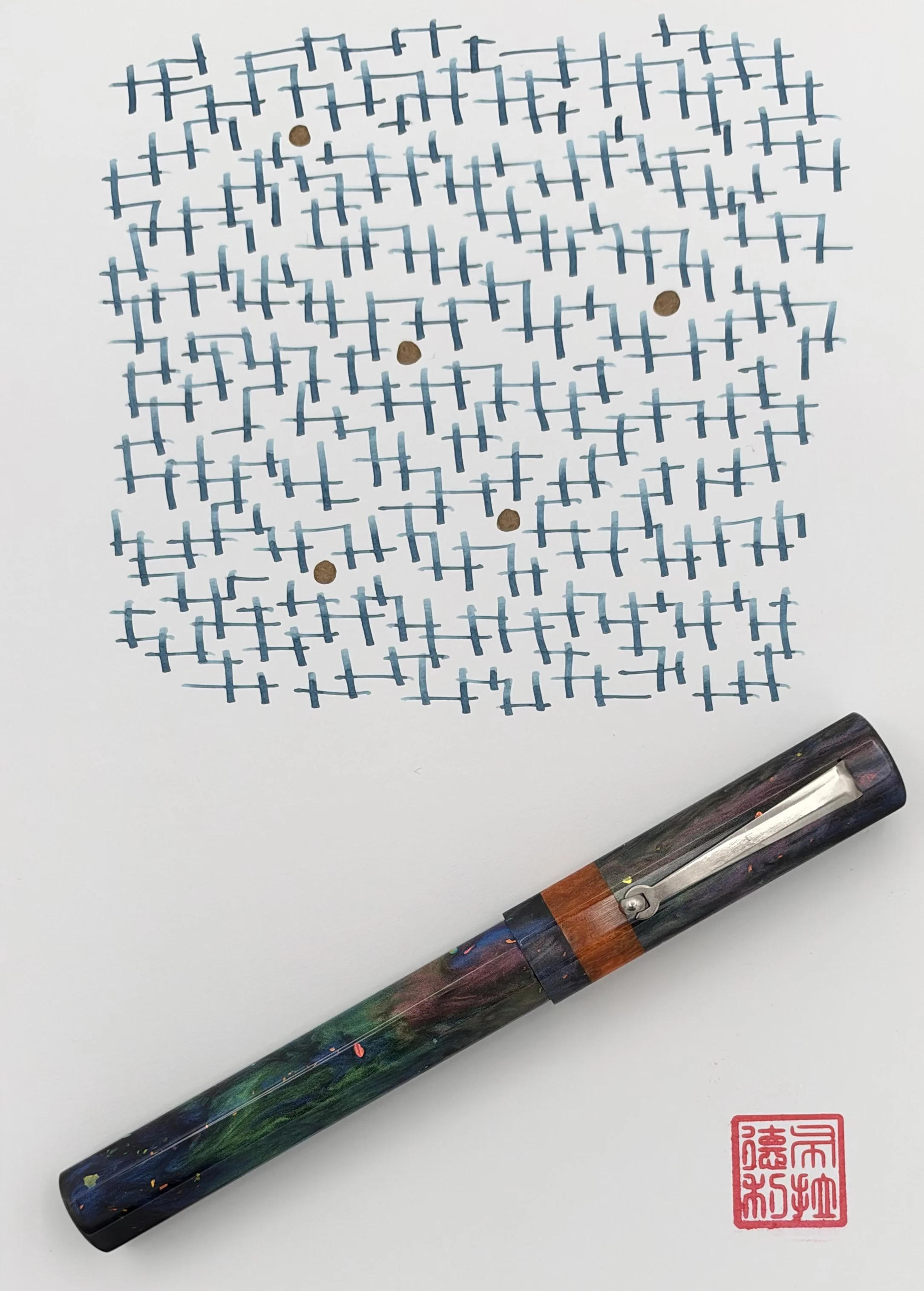
Yoseka Notebook.