Posts filed under Platinum

Platinum 3776 Century Travia - A Quick Look

(Kimberly (she/her) took the express train down the fountain pen/stationery rabbit hole and doesn't want to be rescued. She can be found on Instagram @allthehobbies because there really are many, many hobbies!.)

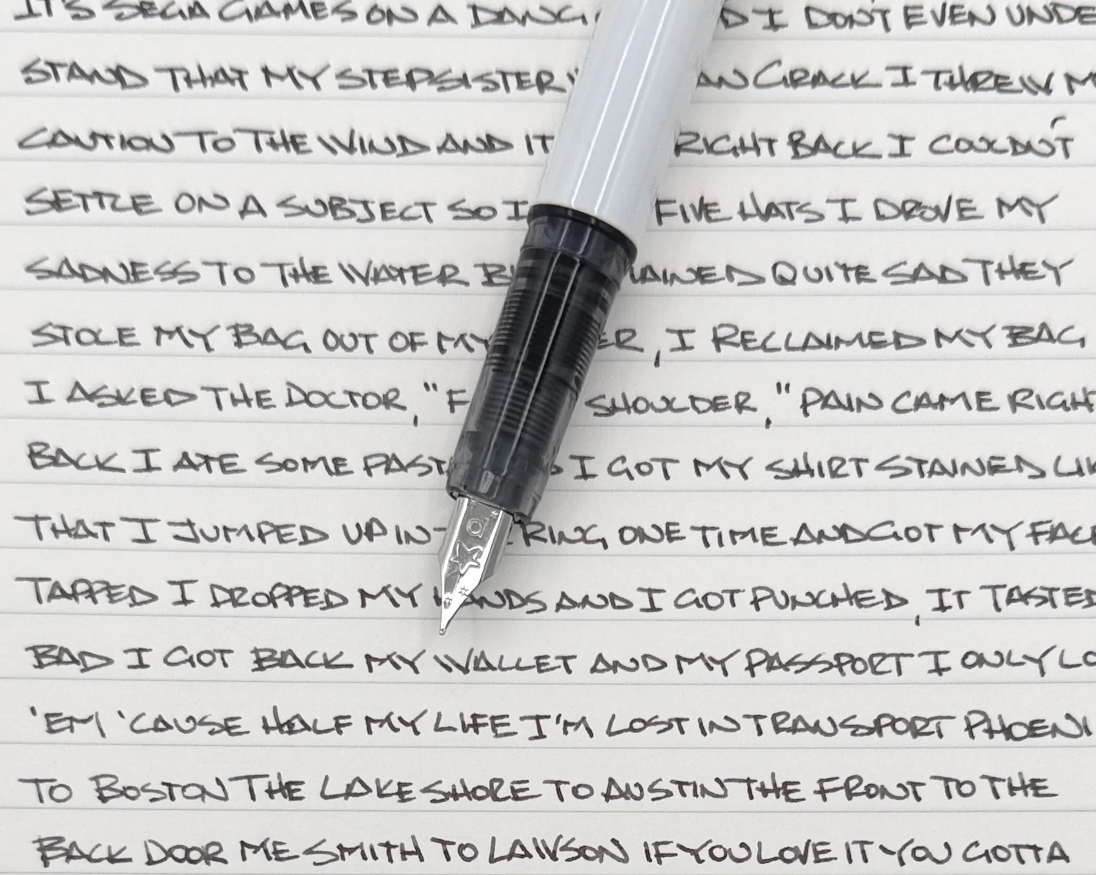
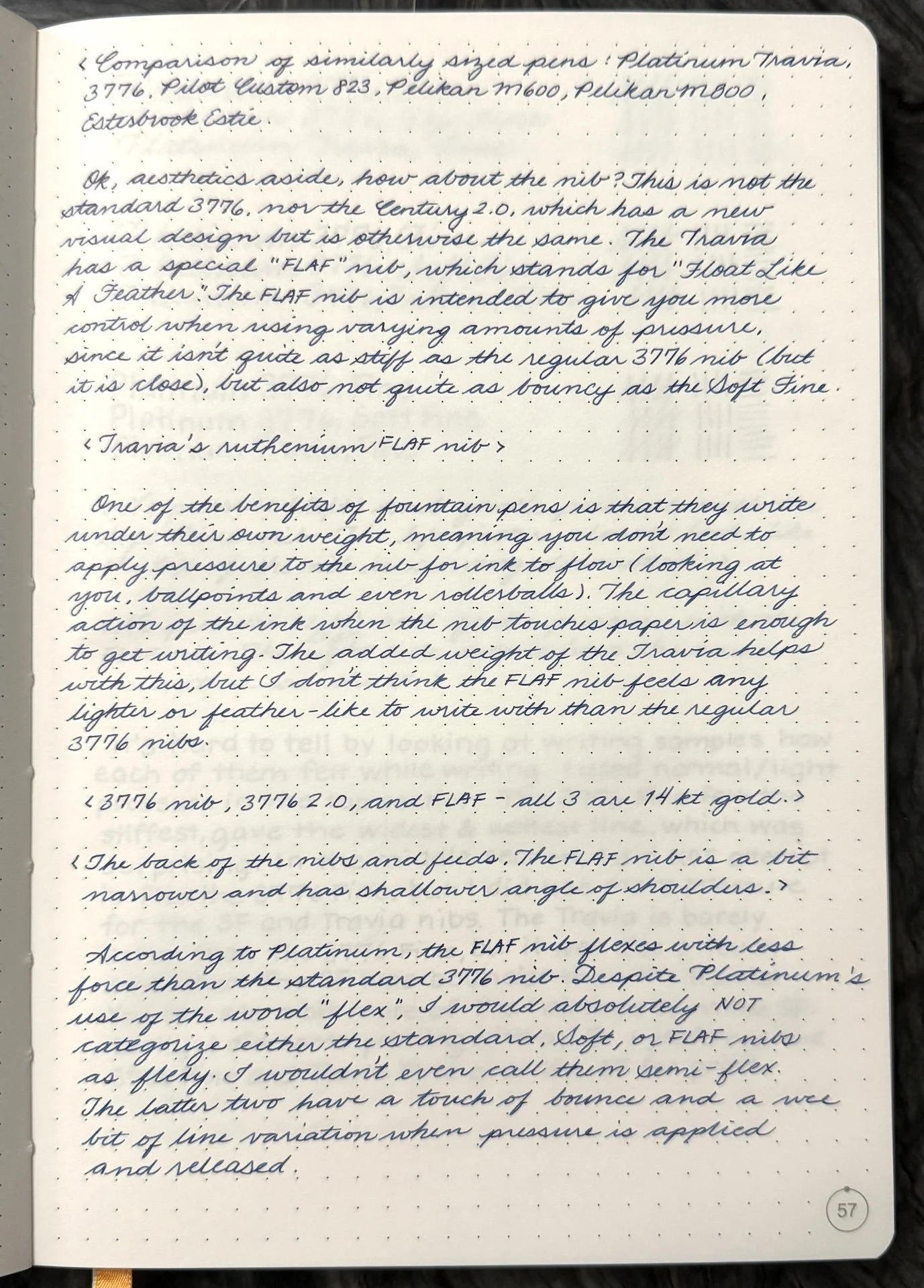
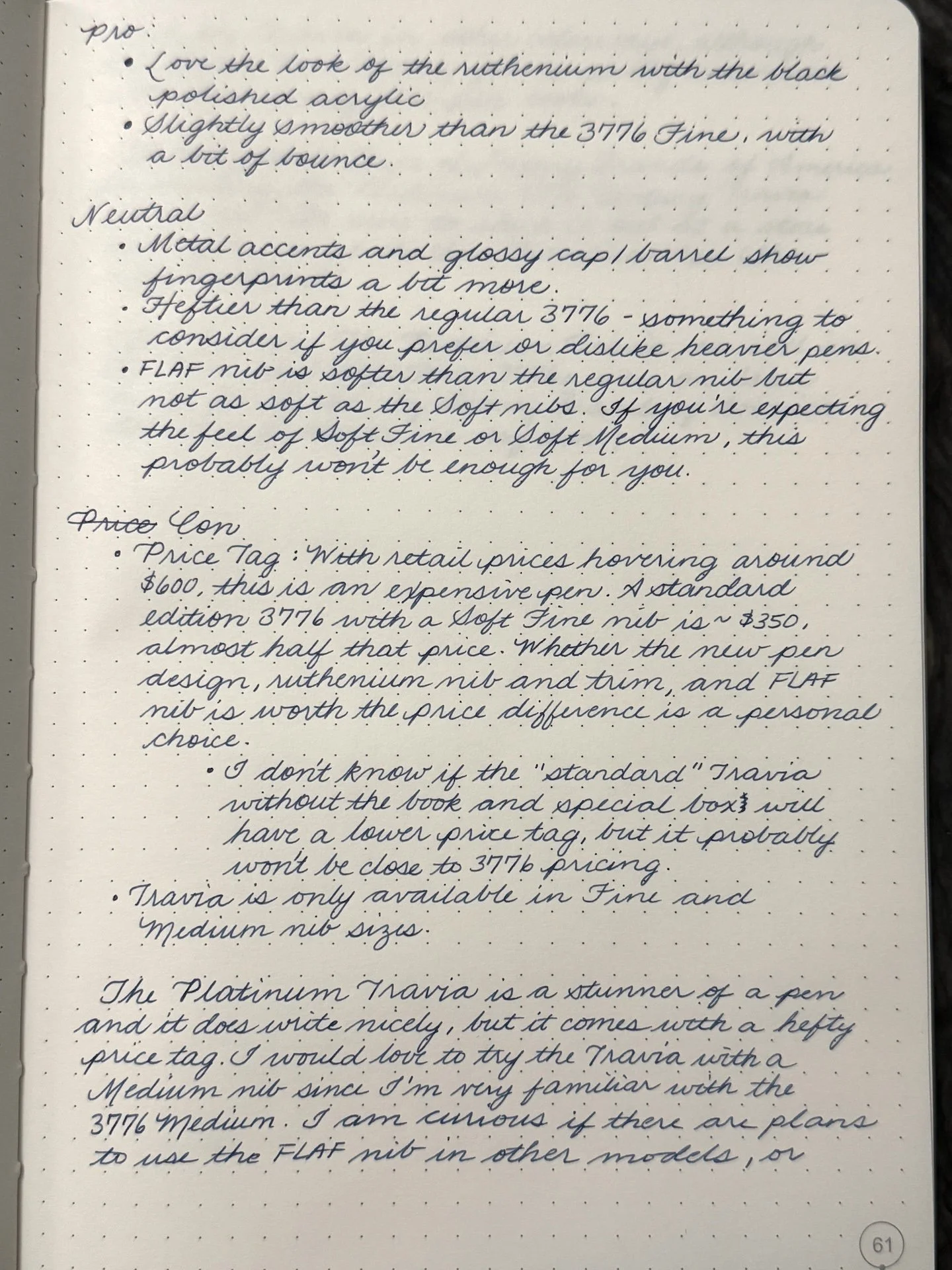
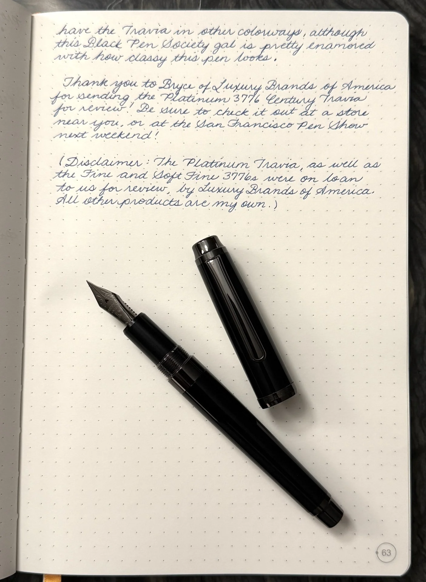
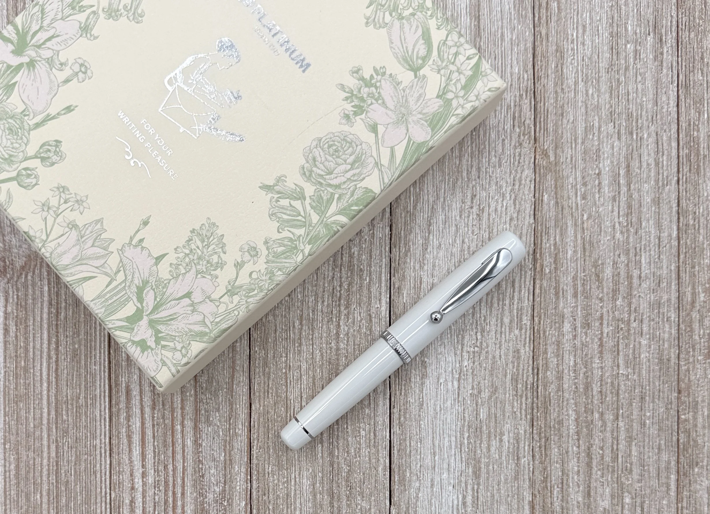
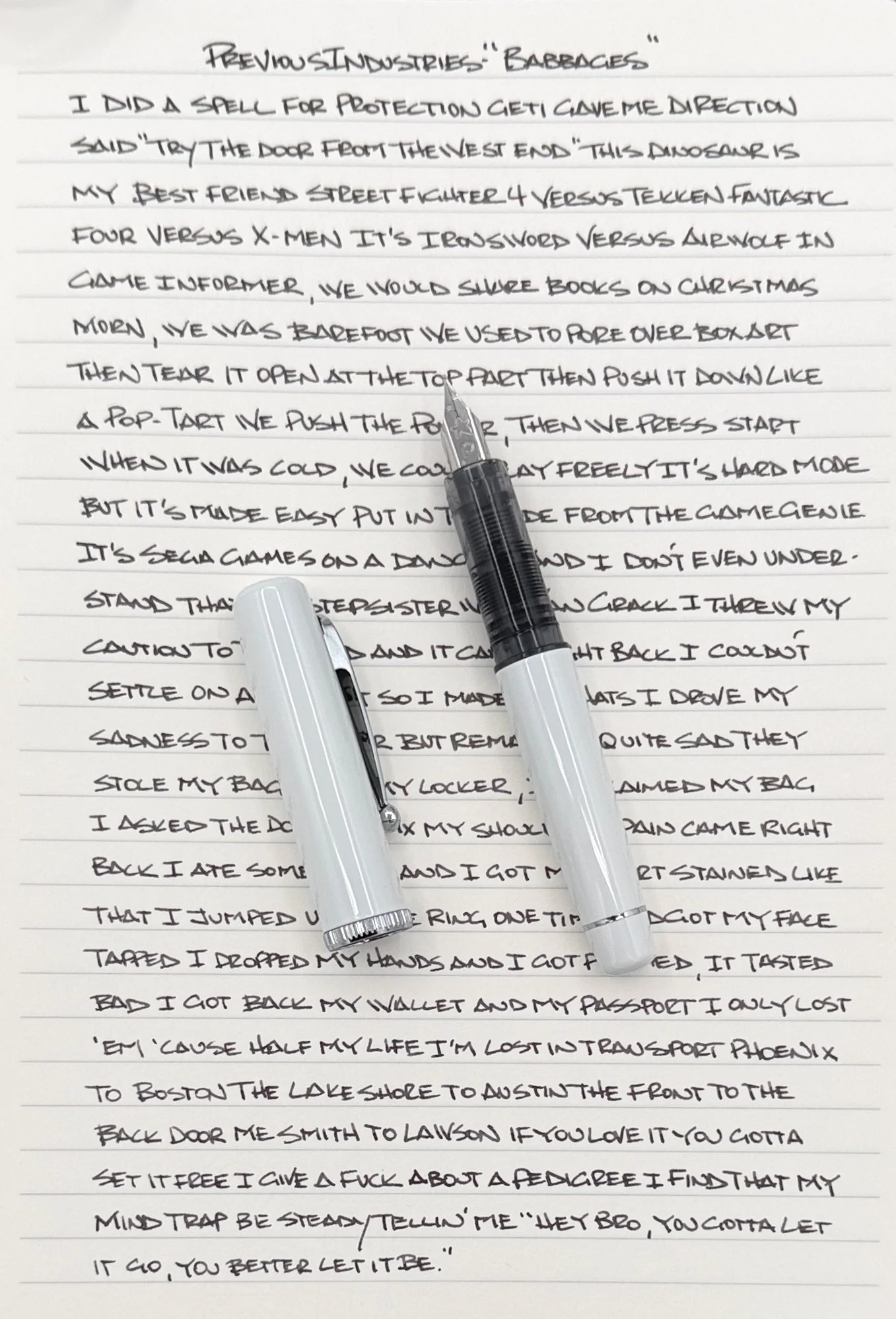
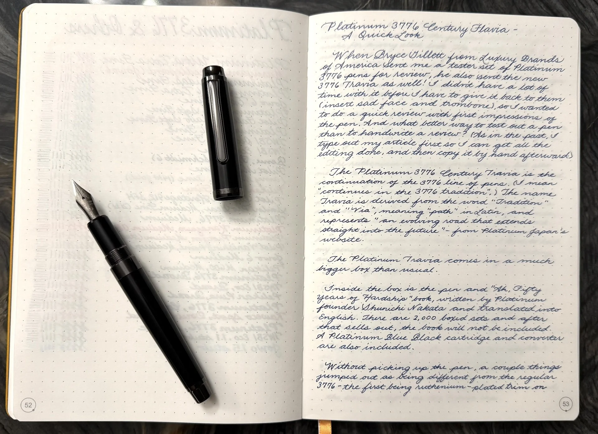
When Bryce Gillet from Luxury Brands of America sent me a tester set of Platinum 3776 pens for review, he also sent the new 3776 Century Travia as well! I didn’t have a lot of time with it before I have to hand it back to them (insert sad face and trombone), so I wanted to do a quick review with first impressions of the pen. And what better way to test out a pen than to handwrite a review? (As in the past, I type out my article first so I can get all the editing done, and then copy it by hand afterward.)

The Platinum 3776 Century Travia continues in the Platinum 3776 tradition. The name Travia is derived from the words “Tradition” and “Via”, meaning “path” in Latin, and represents “an evolving road that extends straight into the future” - from Platinum Japan’s website.

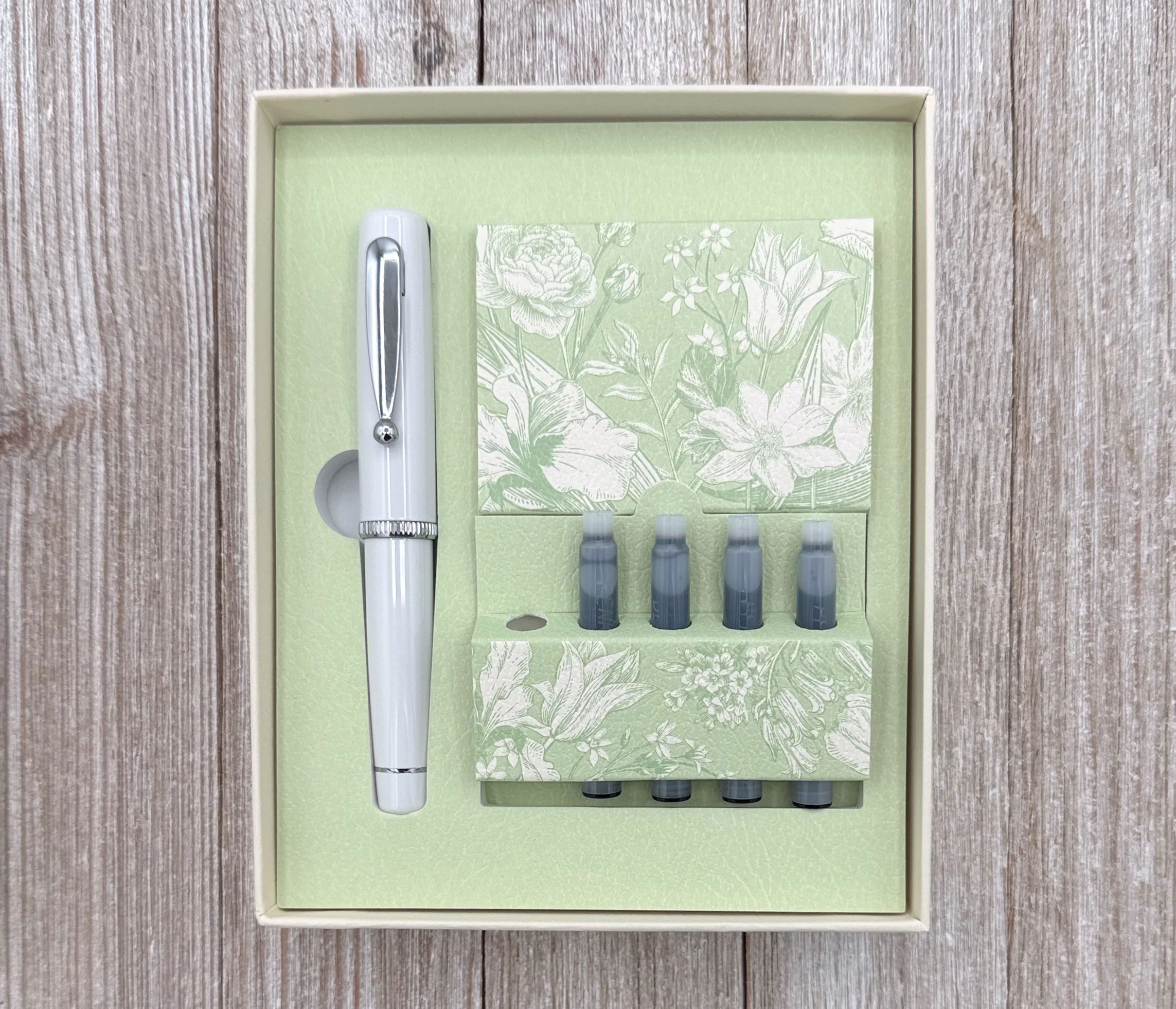
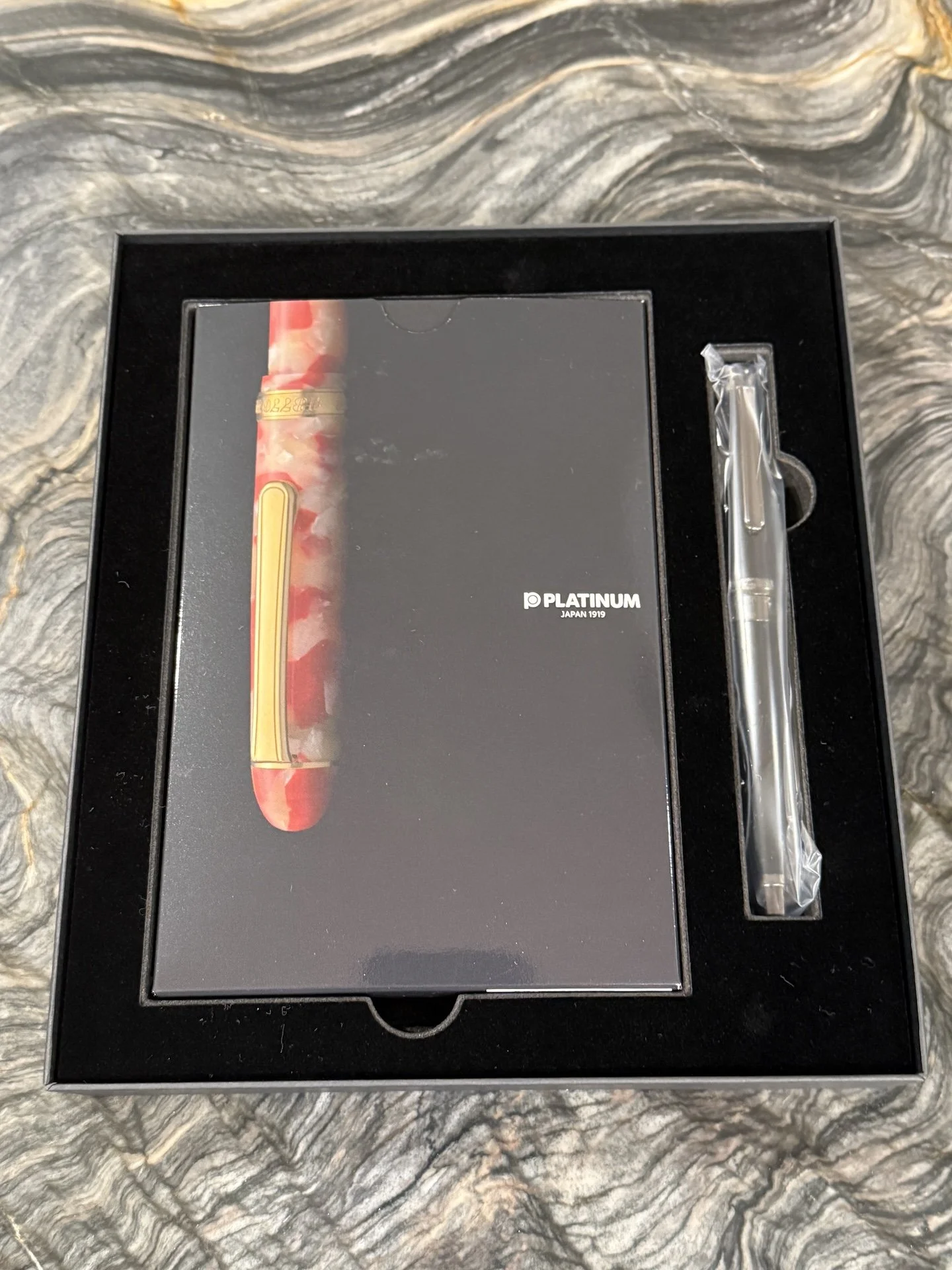
Inside the box is the pen and “Ah, Fifty Years of Hardship” book, written by Platinum founder Shunichi Nakata and translated into English. There are 2,000 boxed sets and after that sells out, the book will not be included. A Platinum Blue Black cartridge and converter are also included.

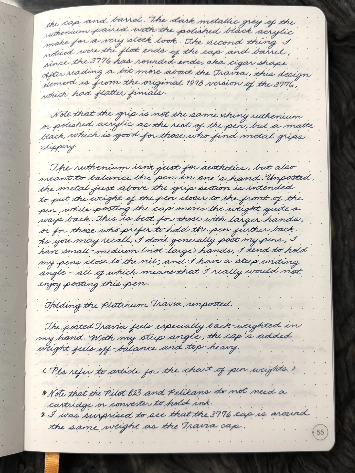
Without picking up the pen, a couple things jumped out as being different from the regular 3776 - the first being ruthenium-plated trim on the cap and barrel. The dark metallic grey of the ruthenium paired with the polished black acrylic make for a very sleek look. The second thing I noticed were the flat ends of the cap and barrel, since the 3776 has rounded ends, aka cigar shape. After reading a bit more about the Travia, this design element is from the original 1978 version of the 3776, which had flatter finials.

Note that the grip is not the same shiny ruthenium or polished acrylic as the rest of the pen, but a matte black, which is good for those who find metal grips slippery.

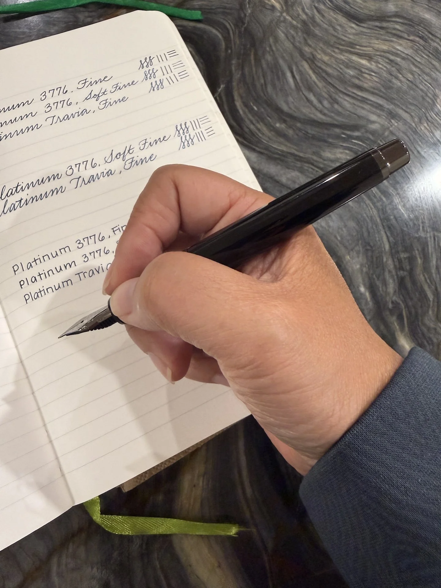
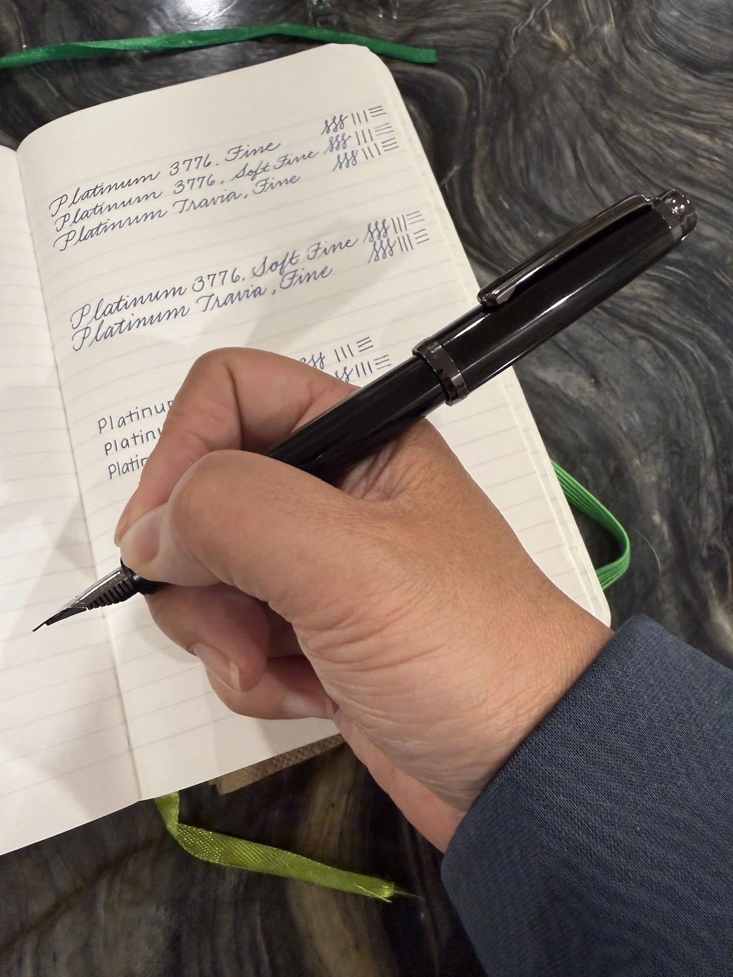
The ruthenium isn’t just for aesthetics, but also meant to balance the pen in one’s hand. Unposted, the metal just above the grip section is intended to put the weight of the pen closer to the front of the pen, while posting the cap moves the weight of the pen quite a ways back. This is best for those with larger hands, or for those who prefer to hold the pen further back. As you may recall, I don’t generally post my pens, I have small-medium (not-large) hands, I tend to hold my pens close to the nib, and I have a steep writing angle - all of which means that I really would not enjoy posting this pen.

Holding the Platinum Travia, unposted.

The posted Travia feels especially back-weighted for my hand. With my steep angle, the cap’s weight feels off-balance and top-heavy.

Specs:

Pen Type

Cap

Rest of pen (empty)

Total (Posted)

Platinum Travia

.361 oz / 10.23 g

.69 oz / 19.57 g

1.051 oz / 29.80 g

Platinum 3776

.368 oz / 10.43 g

.342 oz / 9.71 g

.71 oz / 20.14 g

Pilot Custom 823

.342 oz / 9.68 g

.665 oz / 18.91 g

1.007 oz / 28.59 g

Pelikan M600

.244 oz / 6.93 g

.395 oz / 11.18 g

.639 oz / 18.11 g

Pelikan M800

.305 oz / 8.66 g

.721 oz / 20.44 g

1.026 oz / 29.10 g

Esterbrook Estie

.320 oz / 9.06 g

.573 oz / 16.24 g

.893 oz / 25.3 g

  • Note that the Pilot 823 and Pelikans do not need a cartridge or converter to hold ink.

  • Also, I was surprised to see that the 3776 cap is around the same weight as the Travia cap.

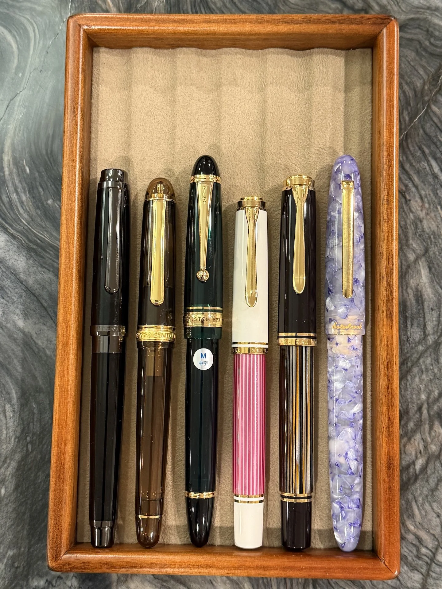
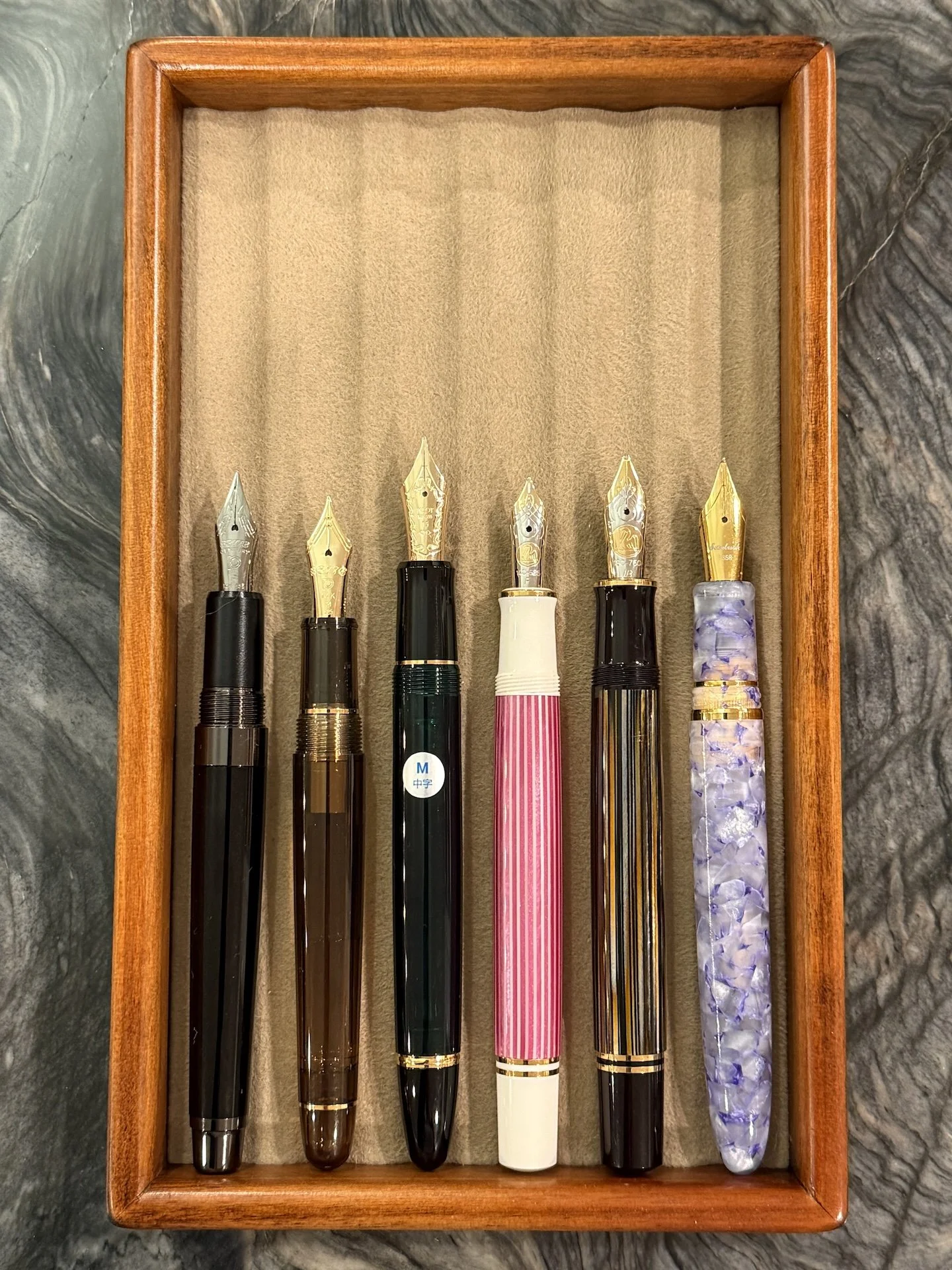
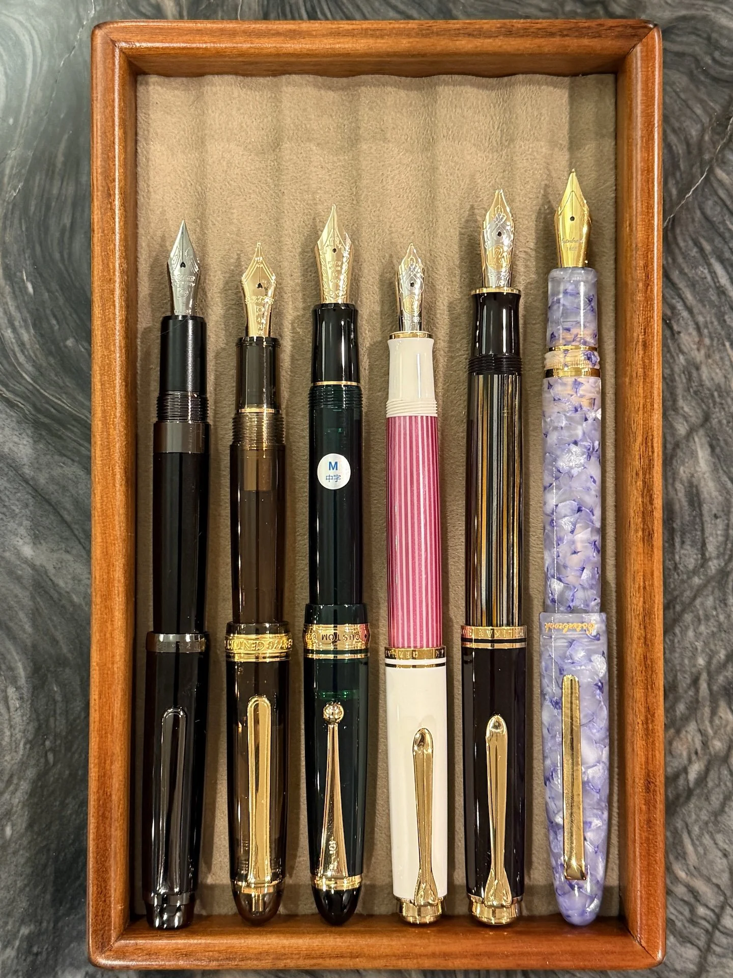
Comparison of similarly sized pens (capped): Platinum Travia, 3776, Pilot Custom 823, Pelikan M600, Pelikan M800, Esterbrook Estie.

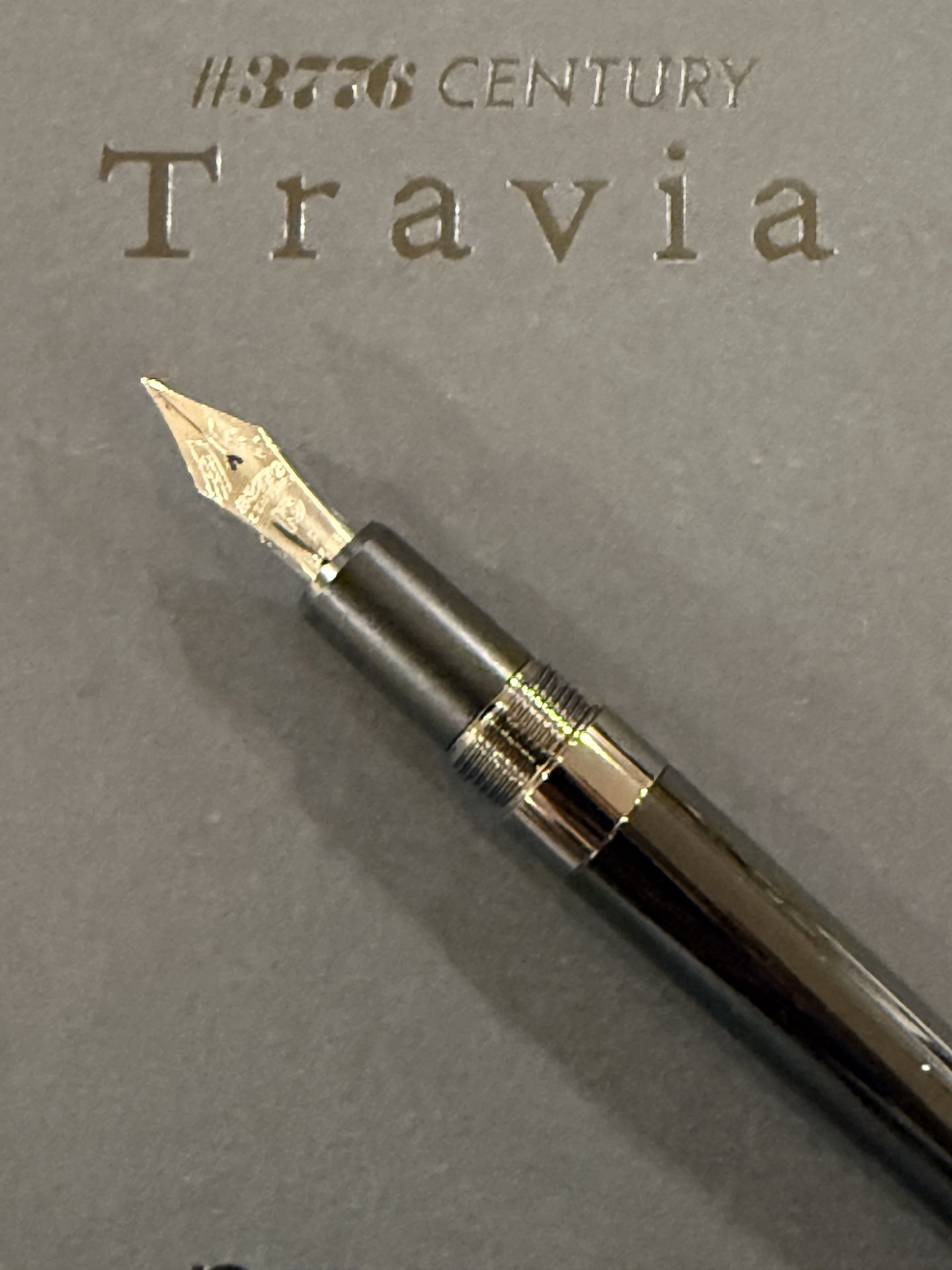
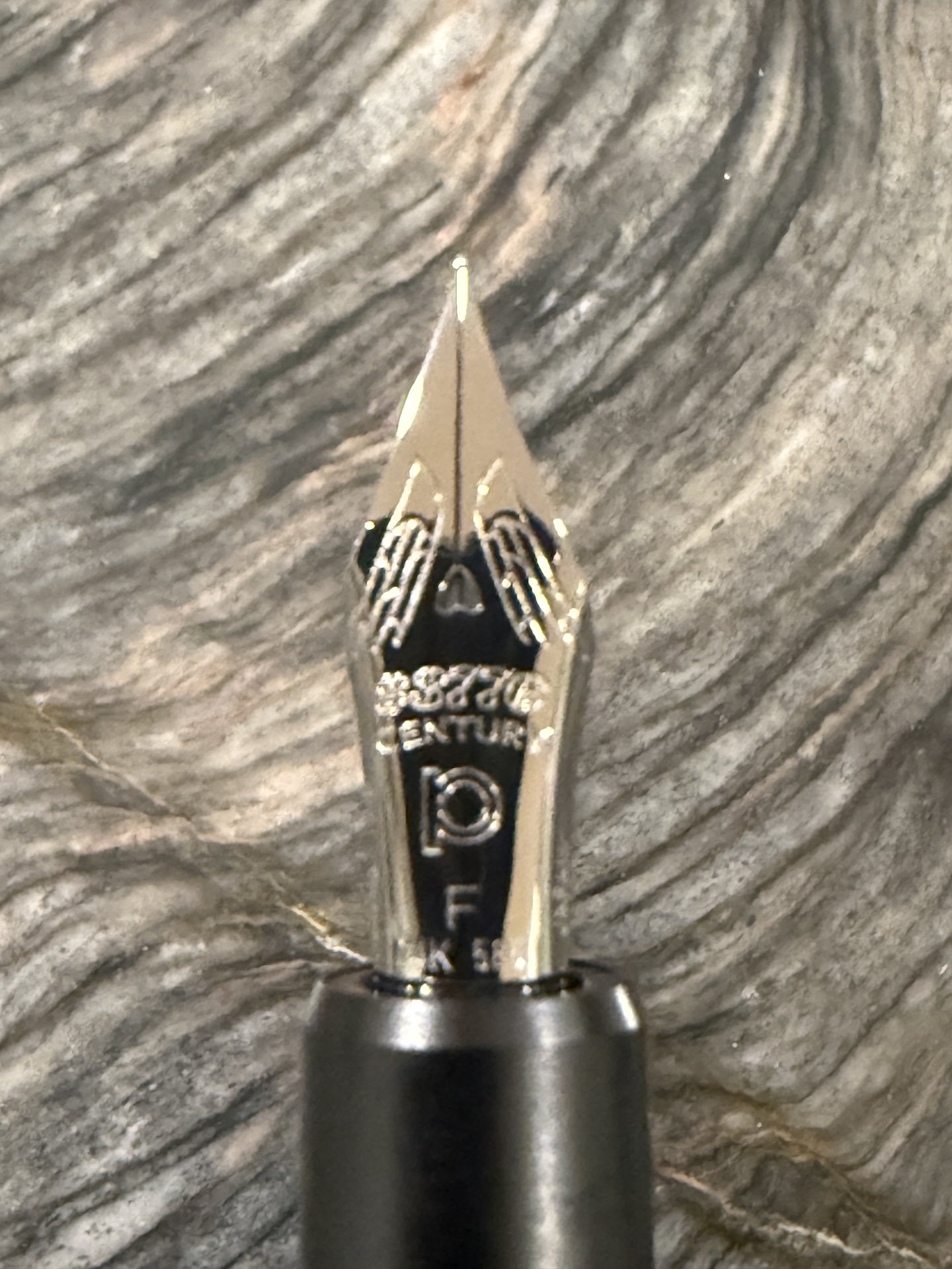
Ok, aesthetics aside, how about the nib? This is not the standard 3776 nib, nor the Century 2.0, which has a new visual design but is otherwise the same.The Travia has a special “FLAF” nib, which stands for “Floats Like A Feather”. The FLAF nib is intended to give you better control when using varying amounts of pressure, since it isn’t quite as stiff as the regular 3776 (but it is close), but also not quite as bouncy as the Soft Fine.

Travia’s ruthenium FLAF nib.

One of the benefits of fountain pens is that they write under their own weight, meaning you don’t need to apply pressure to the nib for ink to flow (looking at you, ballpoints and even rollerballs). The capillary action of the ink when the nib touches paper is enough to get writing. The added weight of the Travia helps with this, but I don’t think the FLAF nib feels any lighter or feather-like to write with than the regular 3776 nib.

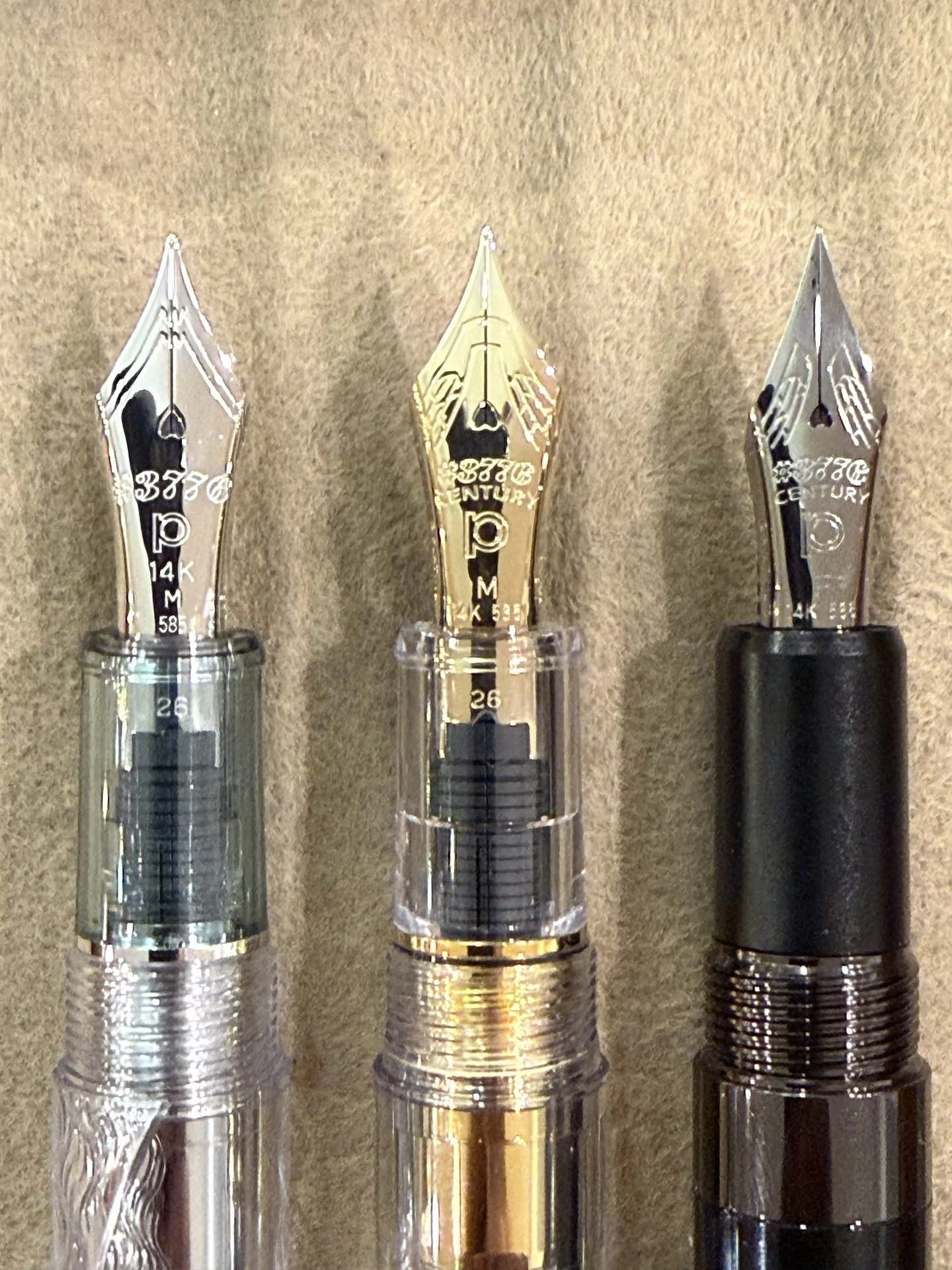
3776 nib (left), 3776 2.0, and FLAF (right) - all 3 nibs are 14kt gold.

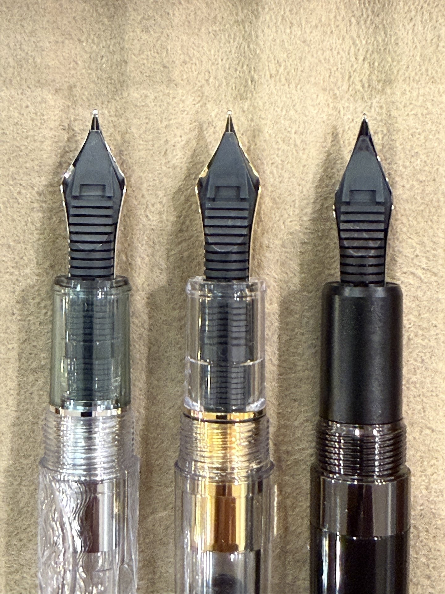
The back of the nibs & feeds. The FLAF nib is a bit narrower and has shallower angle of shoulders.

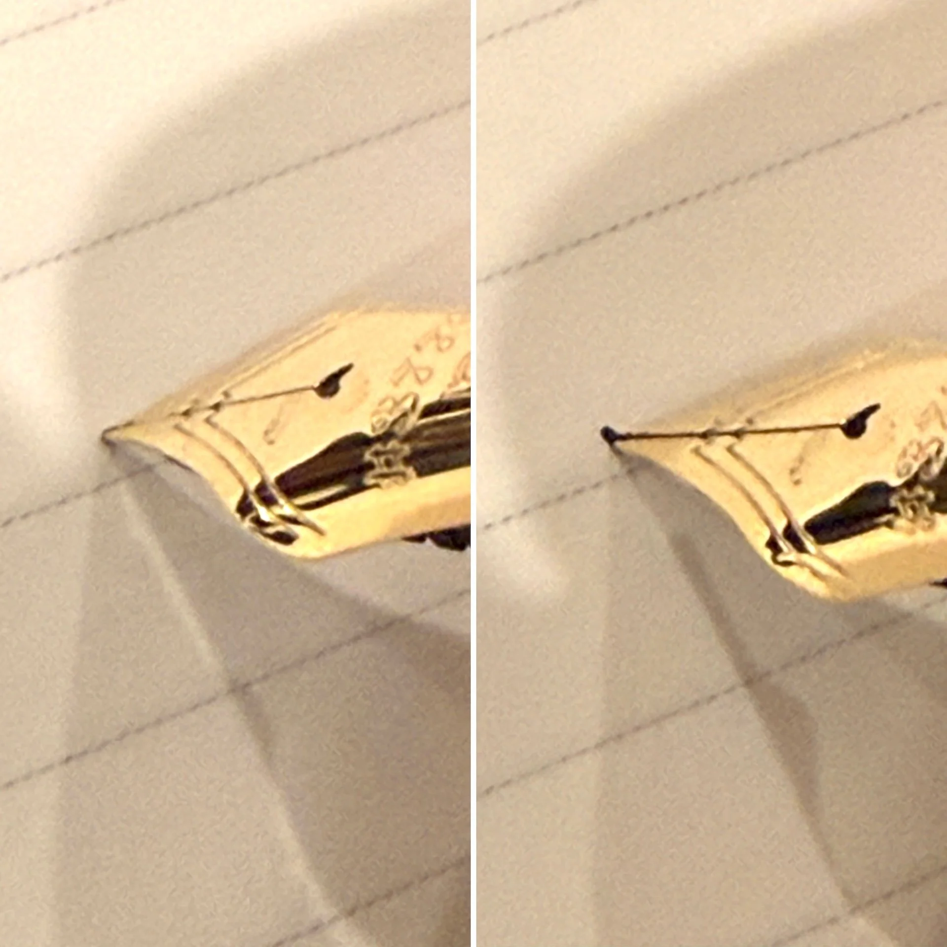
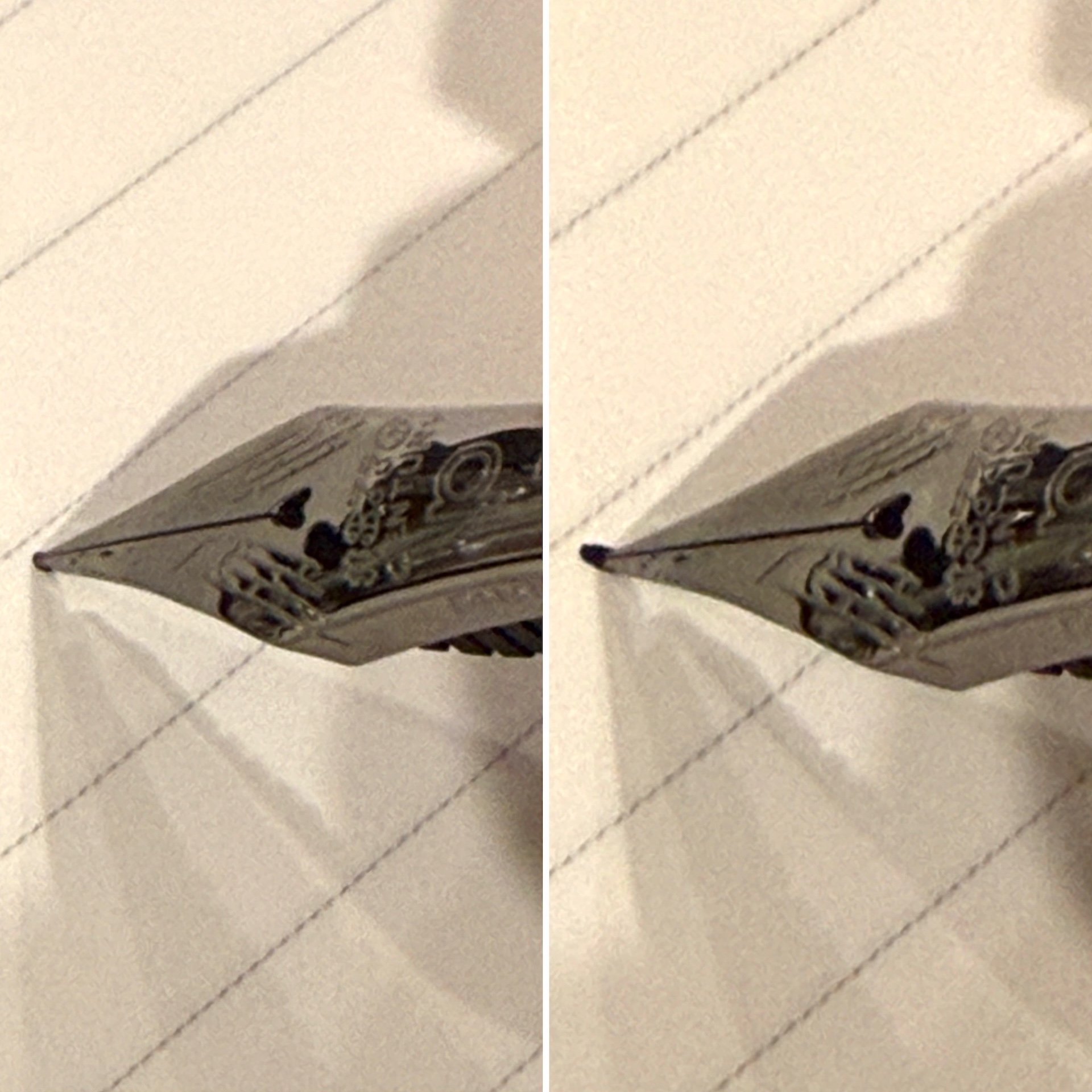
According to Platinum, the FLAF nib flexes with less force than the standard 3776 nib. Despite Platinum’s use of the word “flex”, I would absolutely NOT categorize either the standard, Soft, or FLAF nibs as flexy. I wouldn’t even call them semi-flex. The latter two have a touch of bounce and give a wee bit of line variation when pressure is applied and released.

No pressure (left) and gentle pressure with the Soft Fine nib. The left picture almost looks like the tip of the nib is curving downward.

No pressure (left) and gentle pressure with the FLAF nib. The left side doesn’t have the same curvature as the SF.

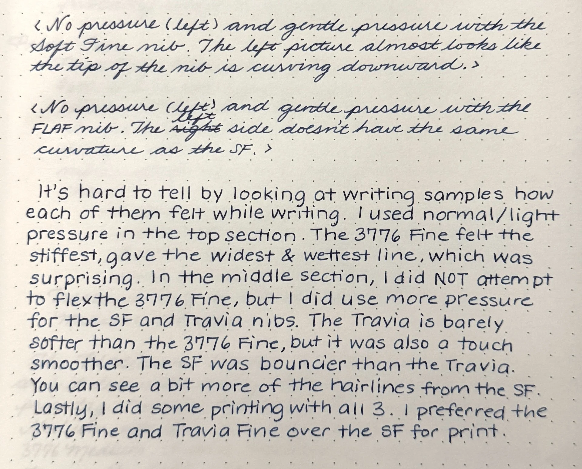
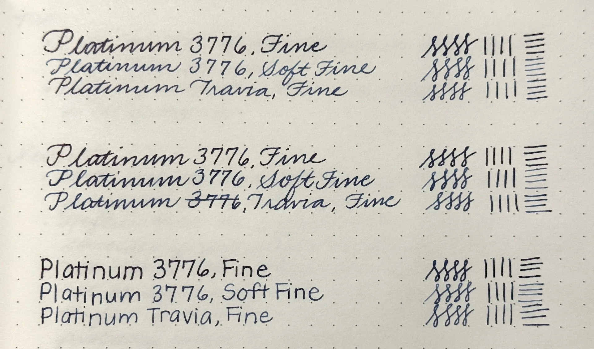
Writing samples of the Platinum 3776 Fine, Soft Fine, and Travia Fine nibs.

It’s hard to tell by looking at writing samples how each of them felt while writing. I used normal/light pressure in the top section. The 3776 Fine felt like stiffest, gave the widest & wettest line, which was surprising. In the middle section, I did NOT attempt to flex the 3776 Fine but I did use more pressure for the SF and Travia nibs. The Travia is barely softer than the 3776 Fine, but it was also a touch smoother. The SF was bouncier than the Travia. You can see a bit more of the hairlines from the SF. Lastly, I did some printing with all 3. I preferred both 3776 the Fine or the Travia Fine over the SF for print.

Pro:

  • Love the look of the ruthenium with the polished black acrylic
  • Slightly smoother than the 3776 Fine, with a bit of bounce

Neutral:

  • Metal accents and glossy cap/barrel show fingerprints a bit more.
  • Heftier than the regular 3776 - something to consider if you prefer or dislike heavier pens.
  • FLAF nib is softer than regular nib but not as soft as the Soft nib. If you’re expecting the feel of Soft Fine (or Soft Medium), this probably won’t be enough for you.

Con:

  • Price tag: With retail prices hovering around $600 (and about to go up,) this is an expensive pen. A standard edition 3776 with a Soft Fine is around $350, almost half that price. Whether the metal accents and FLAF nib is worth the price difference is a personal choice.
  • I don’t know if the “standard” Travia and without the book and special box will have a lower price tag, but it probably still won’t be close to 3776 pricing.
  • Travia is only available in Fine and Medium nib sizes.

The Platinum Travia is a stunner of a pen and it does write nicely, but it comes with a hefty price tag. I am curious to know if there are plans to put the FLAF nib in other models, or have the Travia in other colorways though this Black Pen Society gal is pretty enamored with how classy this pen looks.

Thank you to Bryce of Luxury Brands of America for sending the Platinum 3776 Century Travia for review! Be sure to check it out at a store near you, or at the San Francisco Pen Show next weekend!

(Disclaimer: The Platinum Travia, as well as the Fine and Soft Fine 3776s were on loan to us for review, by Luxury Brands of America. All other products are my own.)


Enjoy reading The Pen Addict? Then consider becoming a member to receive additional weekly content, giveaways, and discounts in The Pen Addict shop. Plus, you support me and the site directly, for which I am very grateful.

Membership starts at just $5/month, with a discounted annual option available. To find out more about membership click here and join us!
Posted on August 21, 2026 and filed under Platinum, Fountain Pens, Pen Reviews.

Platinum 3776 - Ranking the Nibs

(Kimberly (she/her) took the express train down the fountain pen/stationery rabbit hole and doesn't want to be rescued. She can be found on Instagram @allthehobbies because there really are many, many hobbies!.)

Midway through doing the nib comparisons for the Pilot 74, and well after testing the Custom Heritage 912, and the Custom 743, it finally dawned on me that I should also do this for the Platinum 3776. I don’t know why it didn’t occur to me sooner since I love this model so much. I also have all the nib sizes, BUT several of them had been altered either with grinds (where I got the nib second hand), or other modifications, like stacked nibs. Thankfully, Bryce Gillett of Luxury Brands of America was more than happy to send along a tester set for this review!

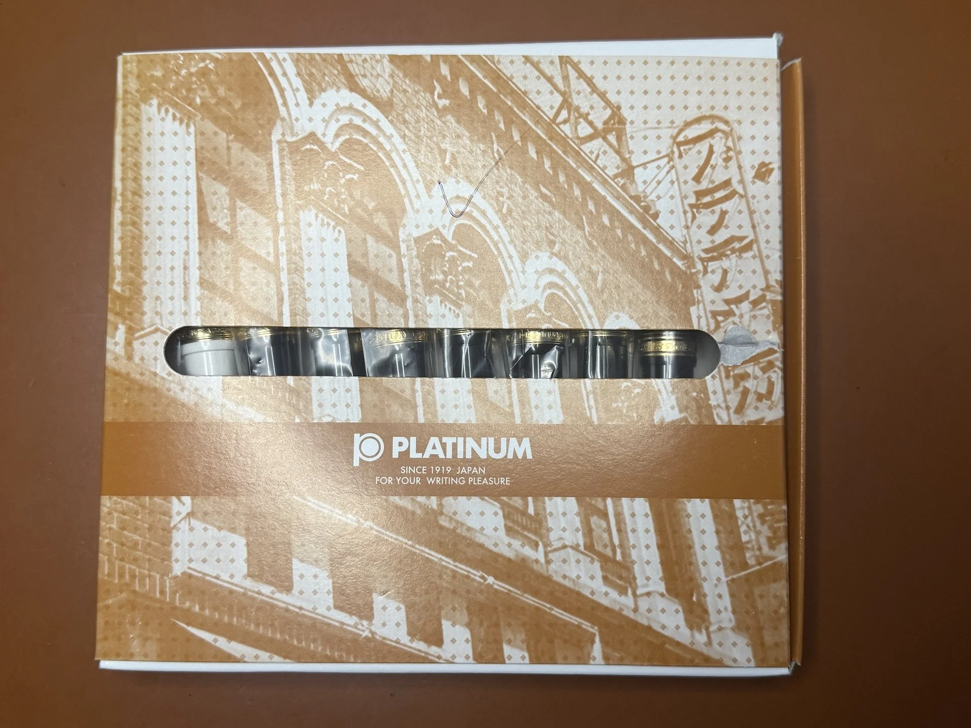
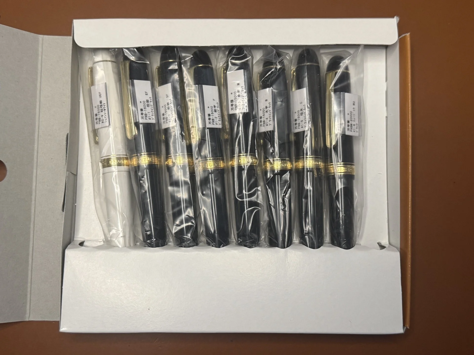
There is room for 10 Platinum 3776 in this box. This is how pens are shipped to distributors, who are then responsible for getting them set up in retail boxes, along with converters, warranty cards, etc.

There are currently 8 nibs options available in production. They range from UEF (Ultra Extra Fine) to Music.

The Platinum 3776 is available in the following 8 nib options: Ultra Extra Fine (UEF), Extra Fine, Fine, Soft Fine, Medium, Broad, Coarse (aka Double Broad), and Music. Unlike Pilot, which has both a Double Broad and a Coarse (which is even broader), Platinum only has the Coarse. In the past, some Platinum models were available with a Soft Medium nib. Unfortunately, this is no longer available, so you might want to pounce on it if you see this nib on a second hand pen.

As with the other nib reviews, I am using a similar “methodology” as those rankings, which were based off of the one the Bossman originally did in his Custom Heritage 912 writeup. As the 3776 has been around for a long time, I won’t go into the details of the pen, but will be focused on the nib.

A few things to keep in mind:

  • I am right-handed but have a “stupid steep” writing angle - 75 degrees isn’t uncommon for me, while most people have a 45-50 degree angle.
  • I tend to write primarily in cursive, and occasionally in print (but not like the Bossman’s block print), typewriter font and calligraphy-esque styles like Copperplate and Italic. My go-to nib size from any maker/country/region is Medium. I also prefer broader nibs as well as stubs/italics. I rarely reach for Extra Fine, especially since I own very few of them.
  • LBA let me ink up these Platinum 3776 pens, so I opted to use Platinum Blue-Black since that’s what you’re likely to get (in cartridge form) with most of their pens. Thank you, Luxury Brands of America, for sending these 3776s so I could do a nib showdown!

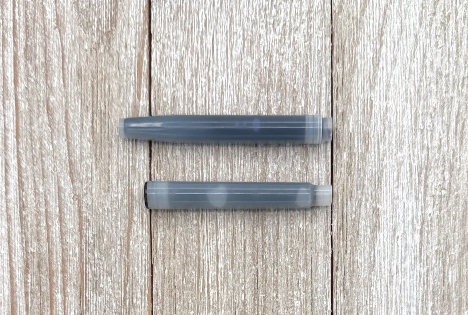
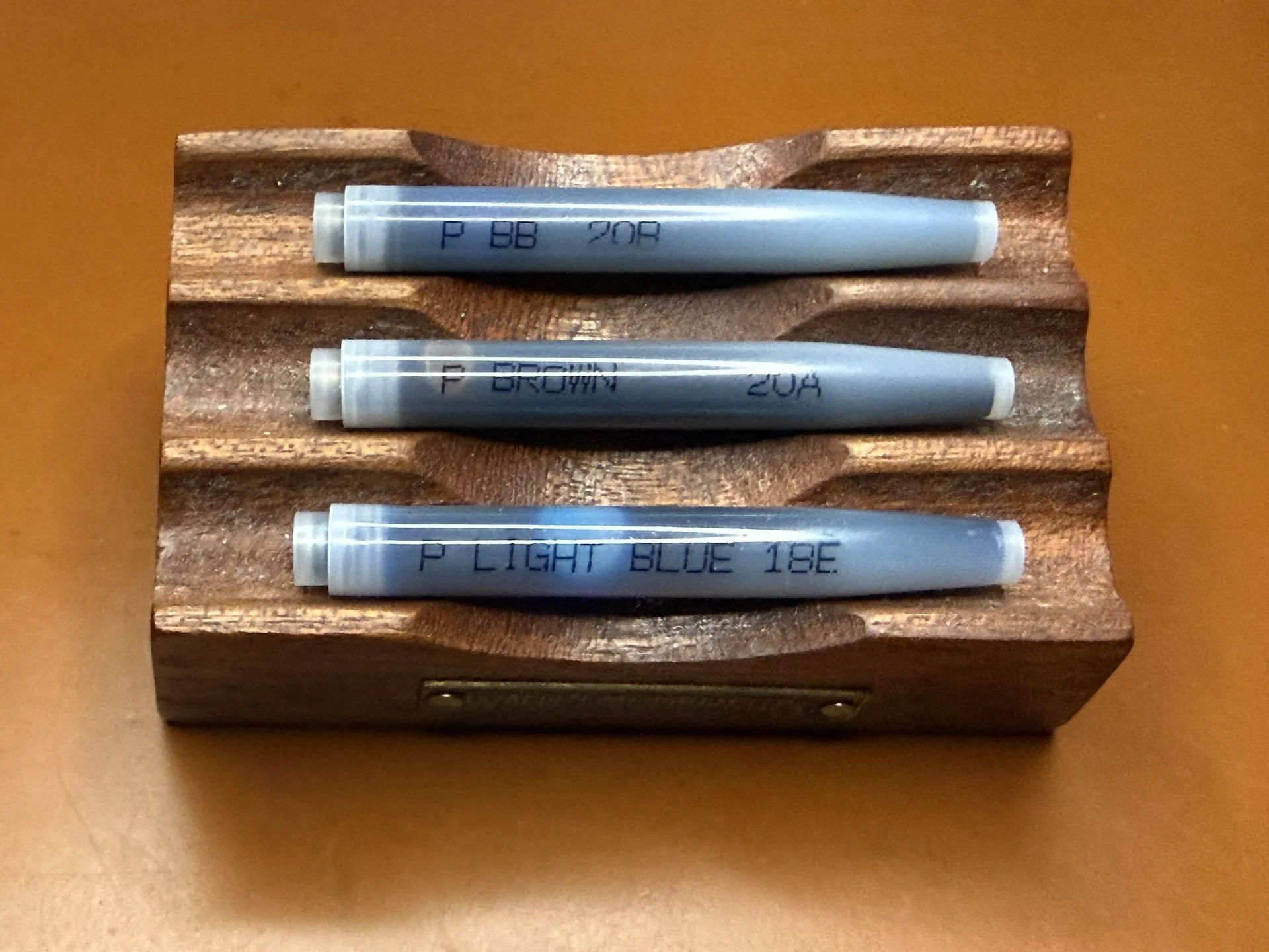
Platinum labels most of their cartridges so you can tell what ink is inside since dark ink cartridges look alike. Top to Bottom: BB = Blue-Black, Brown, Light Blue. If your cartridge says B, that’s Black. Some cartridges aren’t labeled because the color is obvious.

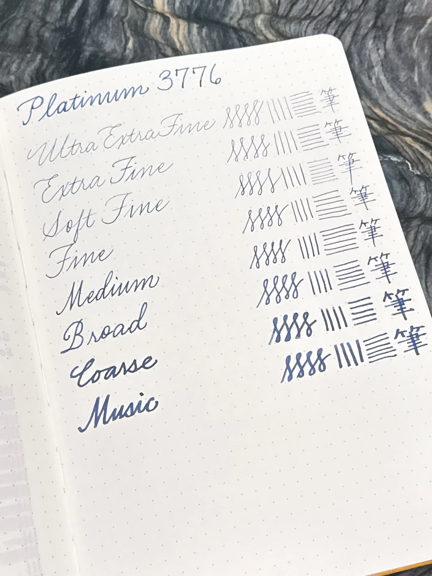
  • The writing sample with all the nibs was done in an Odyssey A5 Notebook with 68 gsm Tomoe River paper.
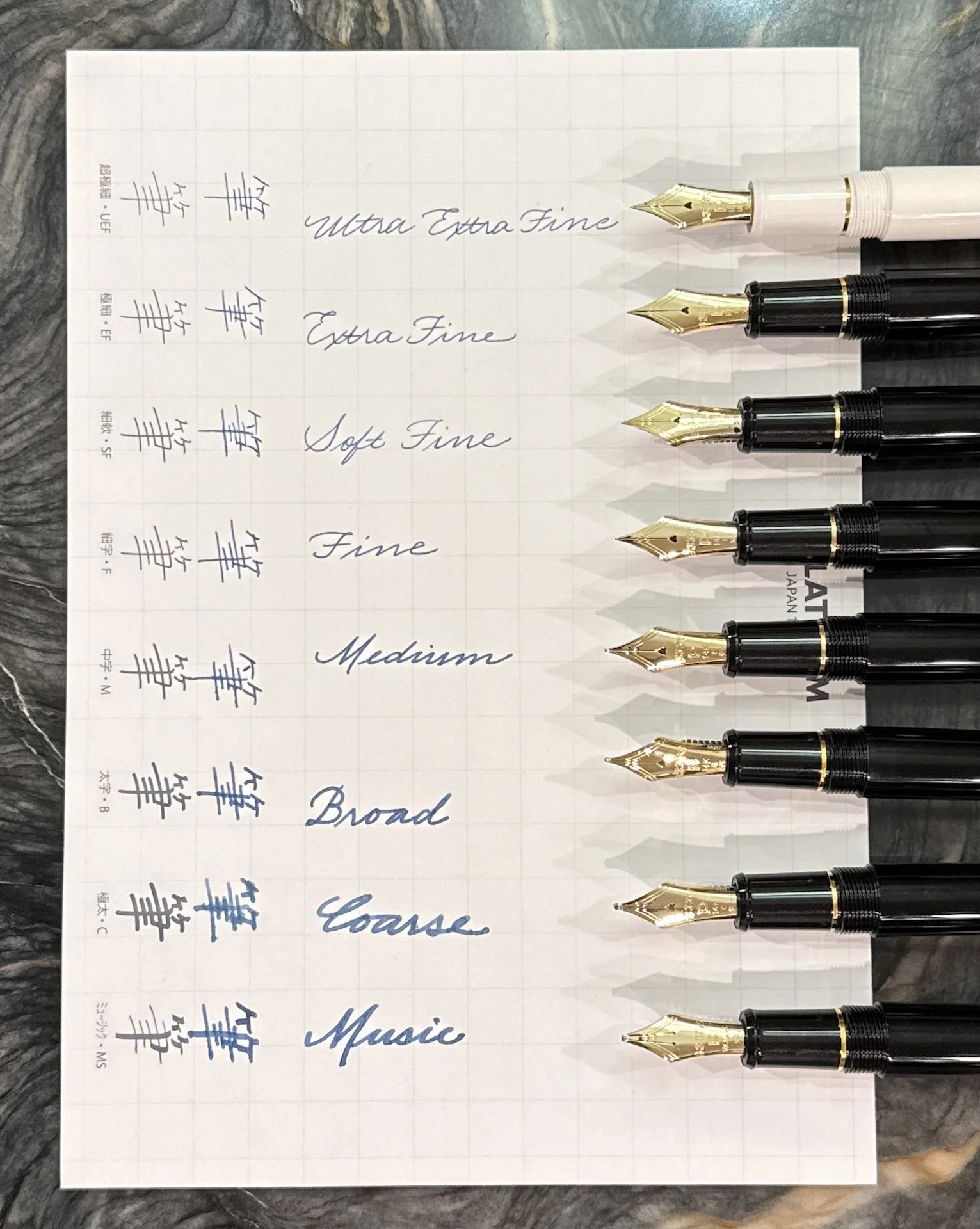
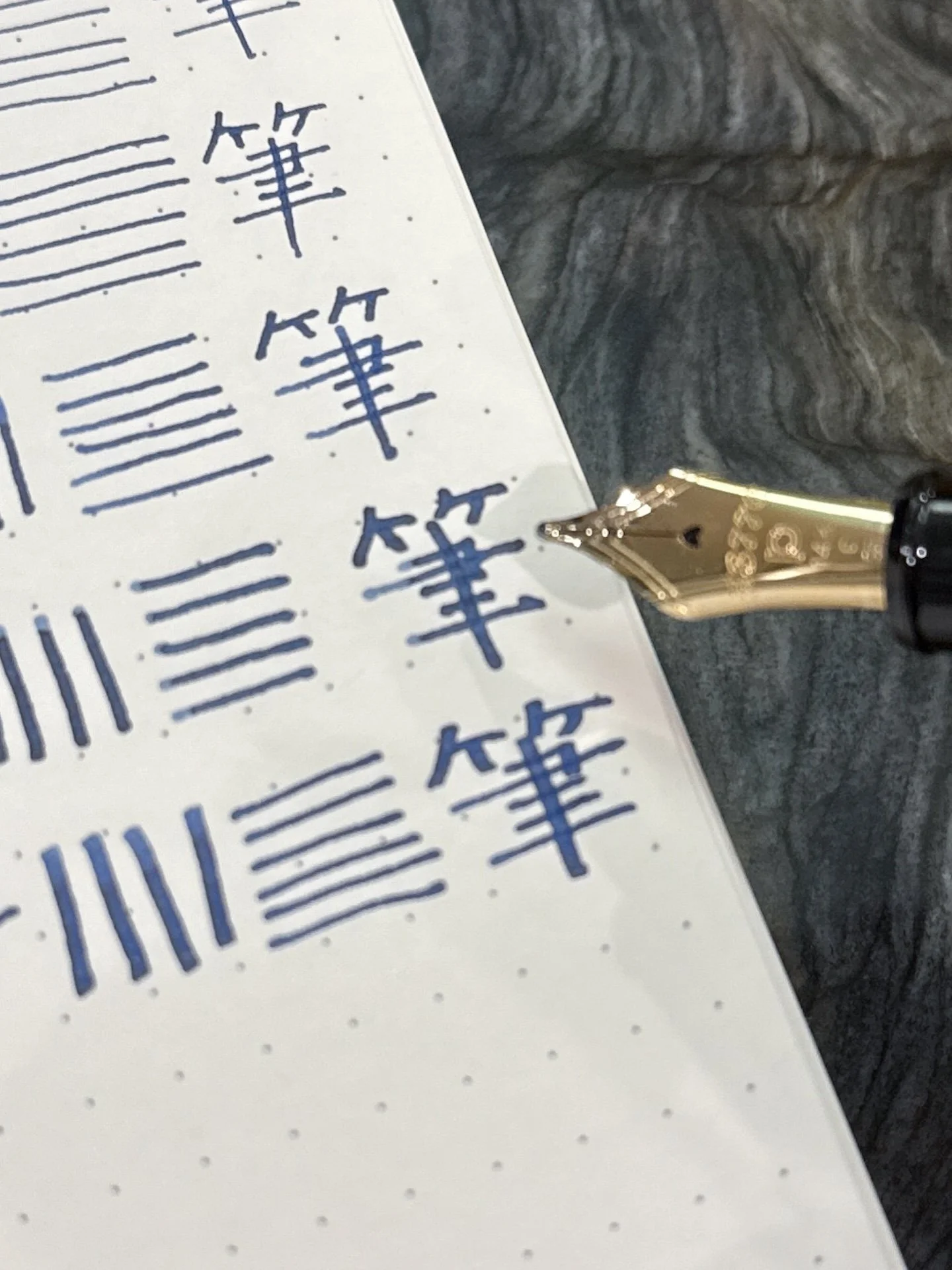
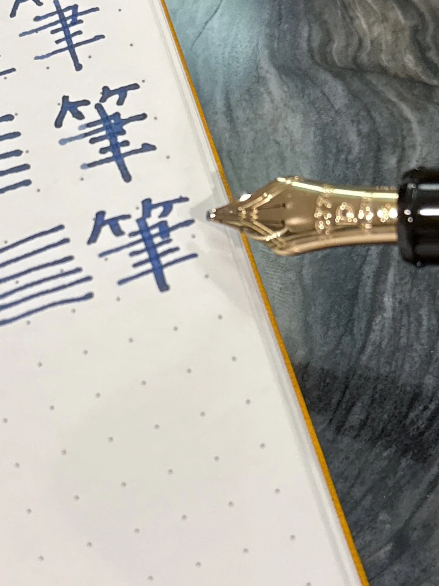
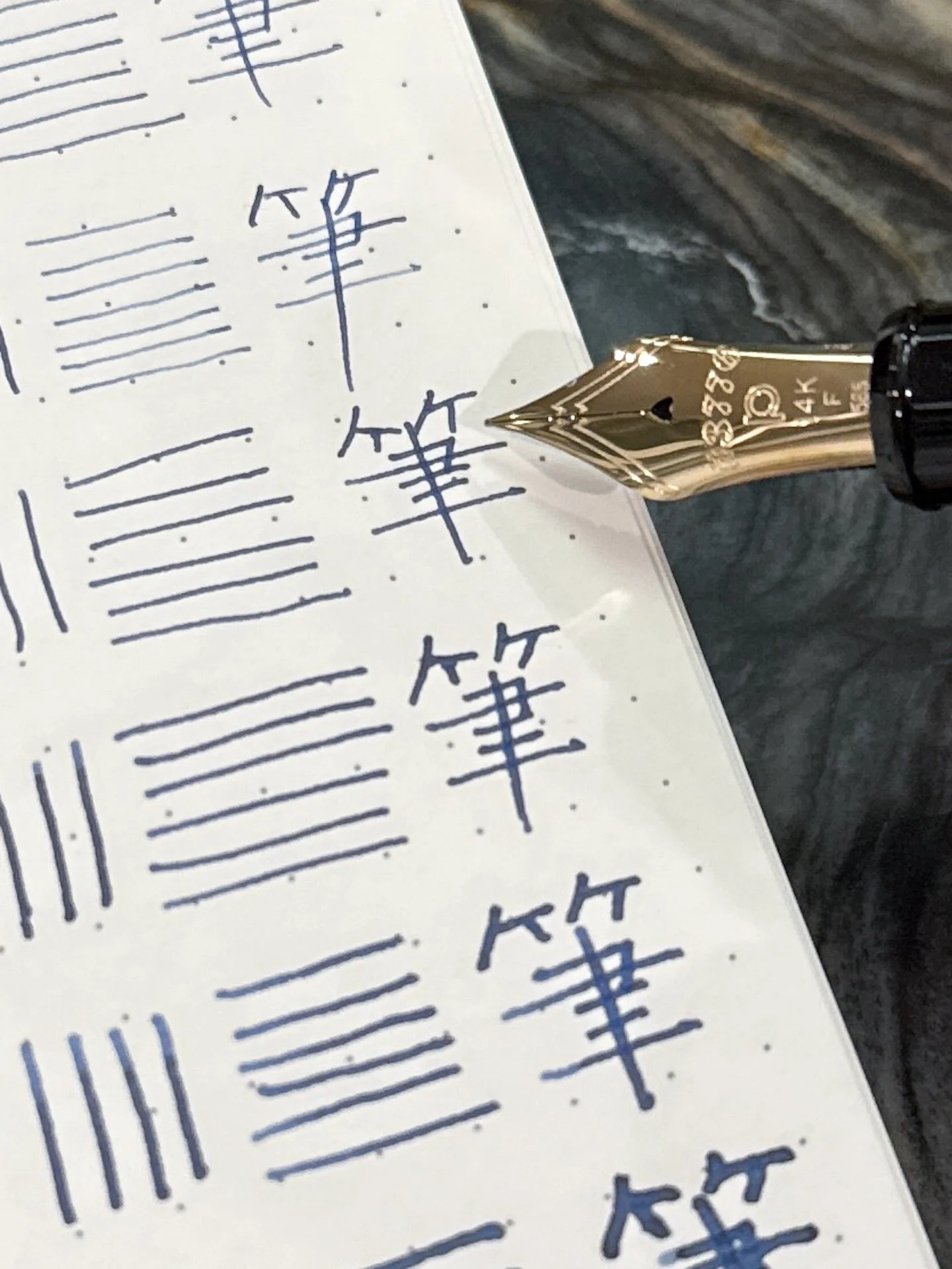
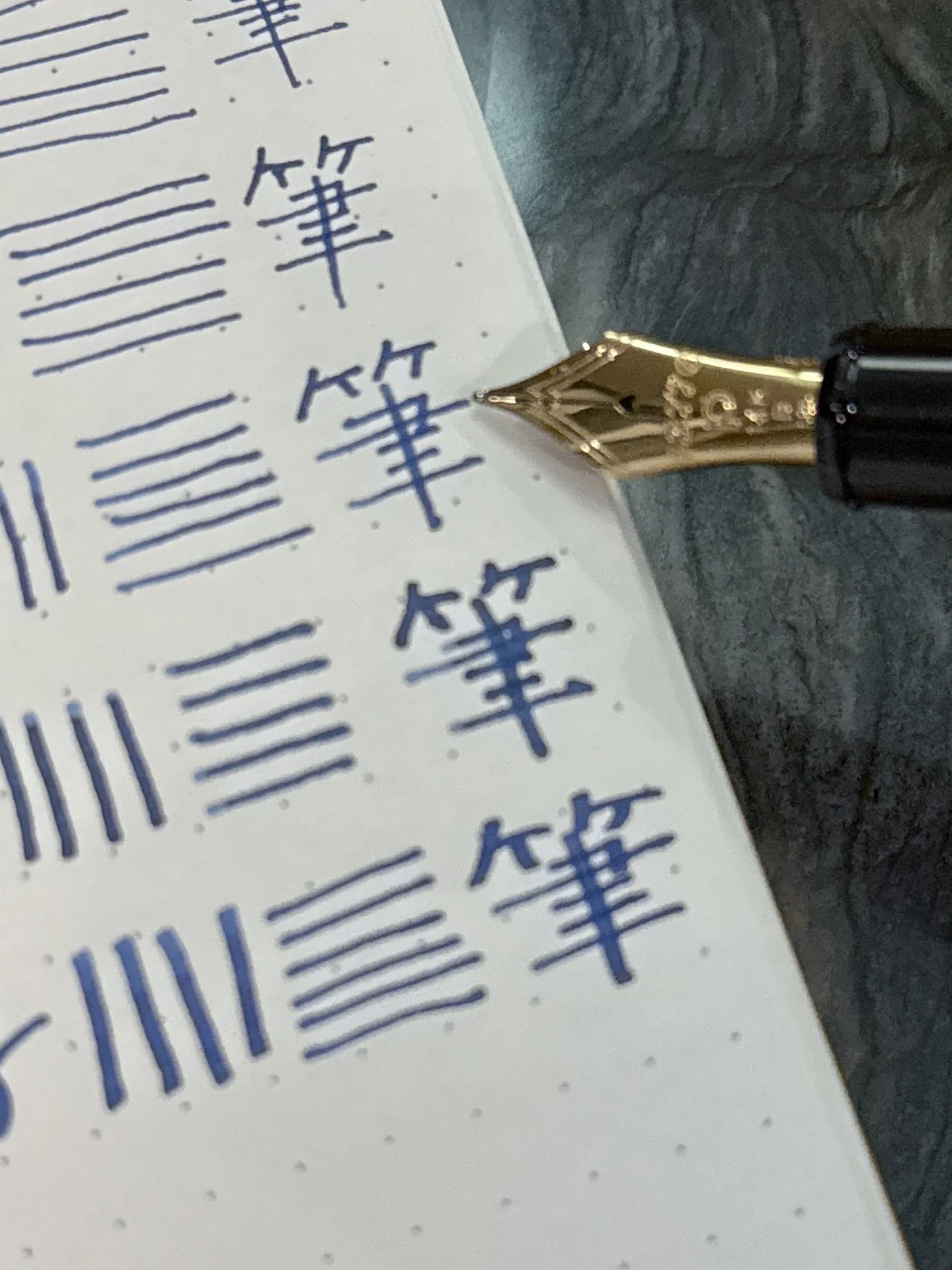
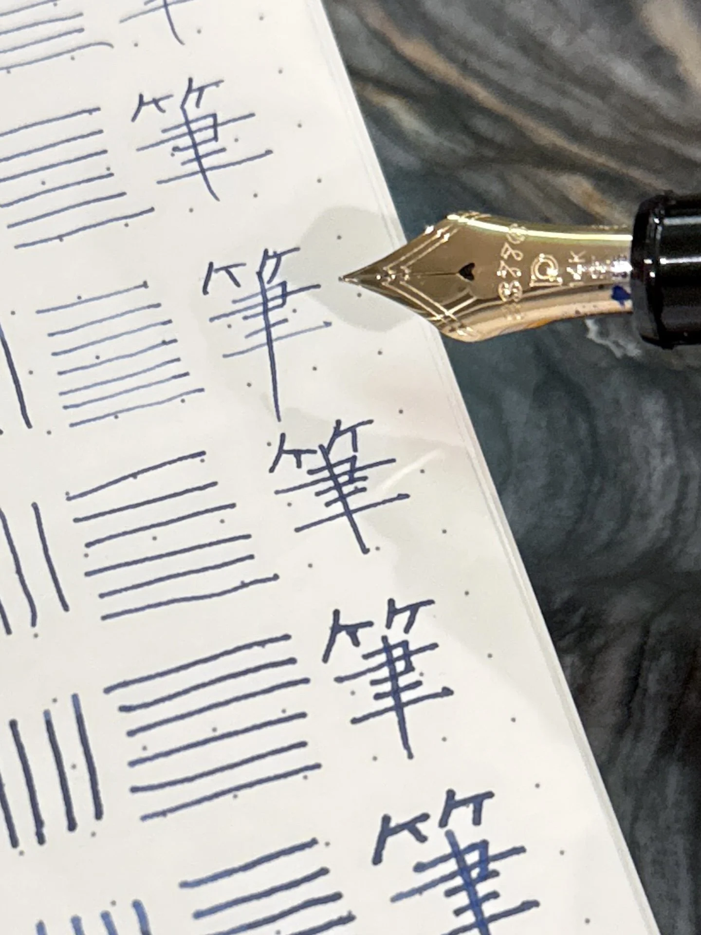
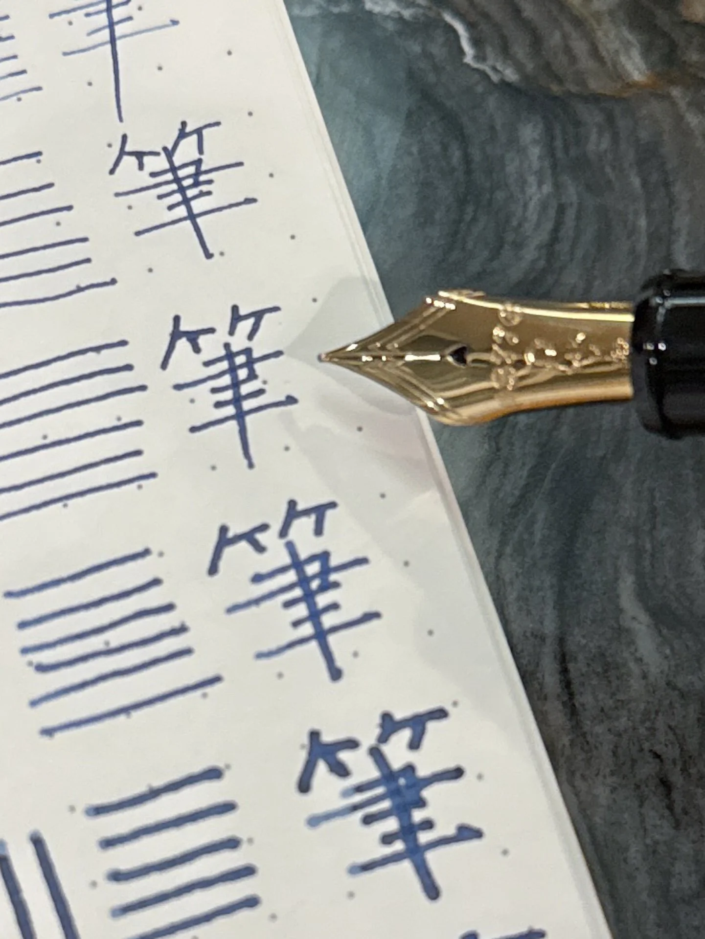
  • My Chinese teachers from high school would be shuddering, but hey, it’s accurate, just not beautiful. The character Platinum uses for their tester pads appropriately means “pen”.
  • Last but not least, I mostly followed Brad’s formatting but I don’t believe he’s done an all-nib review of the 3776, so there’s nothing for me to not-read 😃

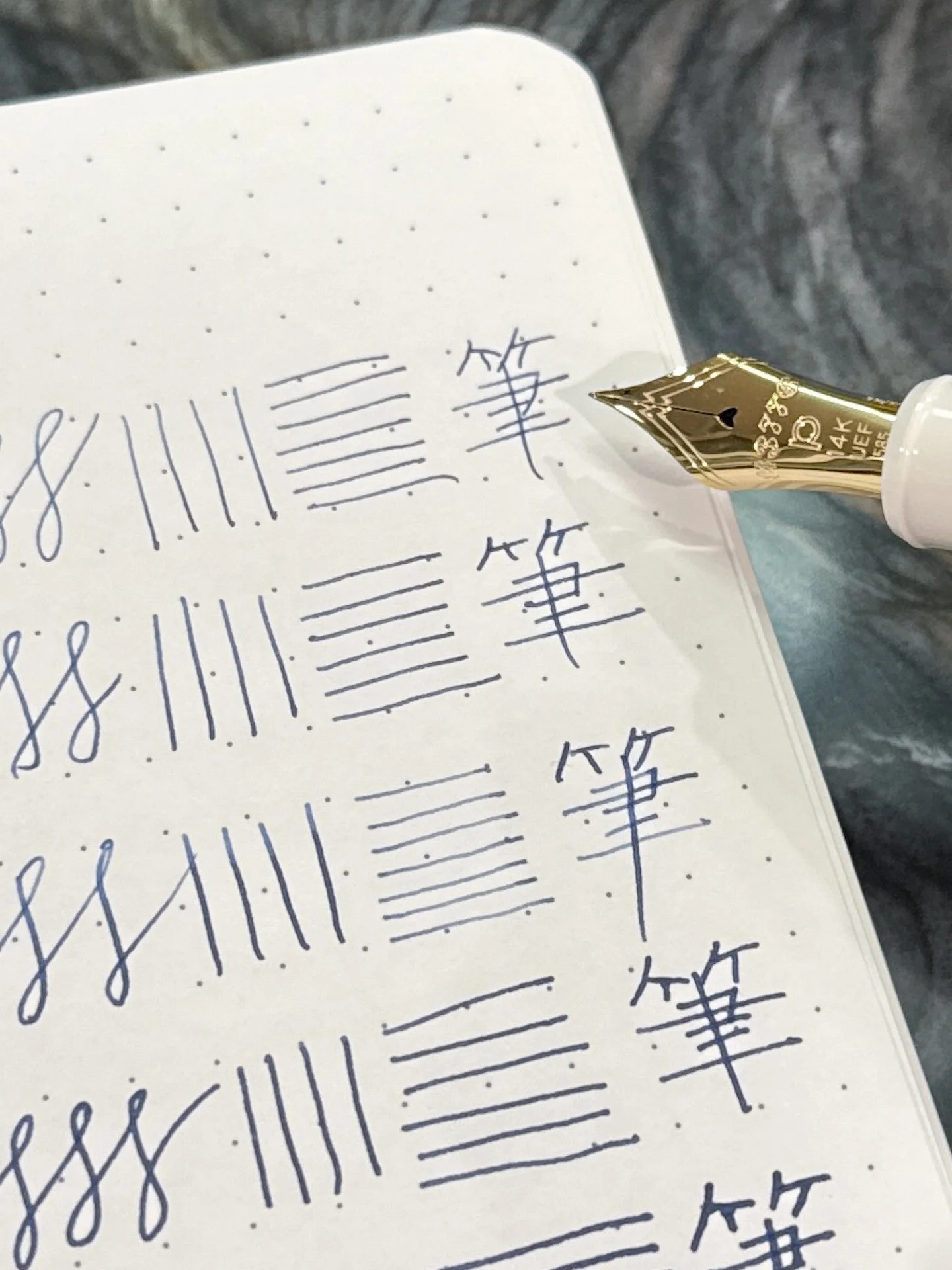
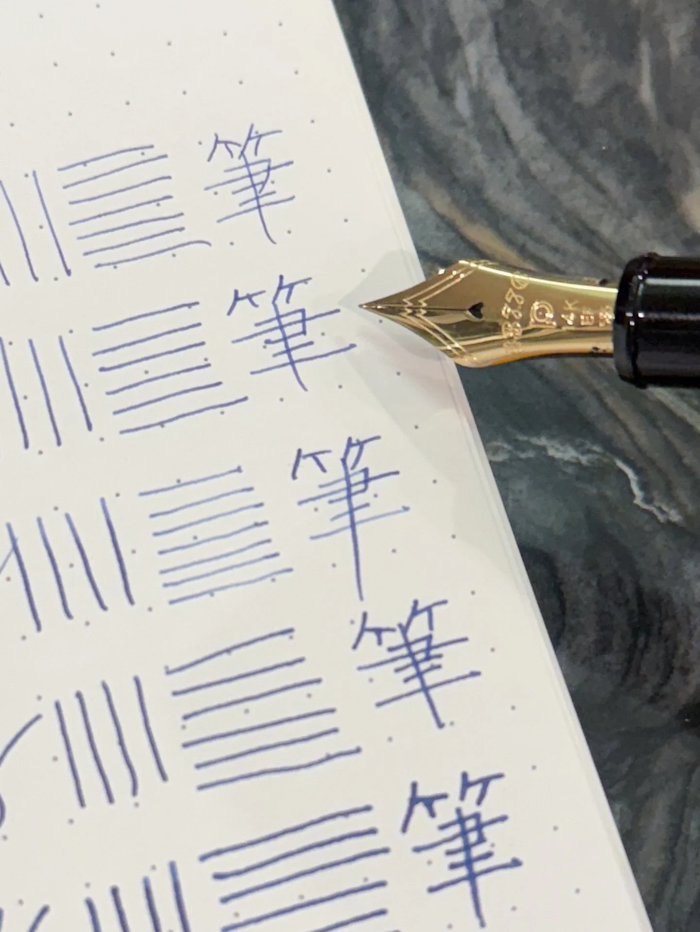
All the nibs on Tomoe River 68 gsm, written with Platinum Blue-Black.

All the nibs on Platinum’s tester pad. I don’t know what kind of paper it is, unfortunately. It is pretty FP-friendly but the Coarse writing looked a little smudgey/feathery, maybe there was an oil or water spot?

8: Ultra Extra Fine

Given that I usually put Extra Fine at the bottom of the list, it should come as no surprise that the Ultra Extra Fine is sadly taking its place here. That said, it’s not that I hate the UEF, if anything, the extra light touch required to use this nib and still have a pleasant experience (for me), makes my writing look extra nice but I’m just really not an extra fine person, let alone ultra extra fine.

7: Extra Fine

Since you knew which nib was last, I’m sure you all knew what was next. But really this nib is really quite nice - I mean, both the UEF and EF are nice writers. Almost to the point of me maybe getting one next time I have the opportunity. But while I did enjoy writing with it, I still want to put down more ink, so sorry, Extra Fine, you’re second to last for me.

Before I move on to #6, I want to add that if I preferred finer nibs, I would probably get the UEF over the EF because of its novelty and uniqueness. Moving on…

6: Coarse (aka BB / Double Broad)

I like big nibs and I cannot lie, but this might be too big (that’s what she said. 🙂)

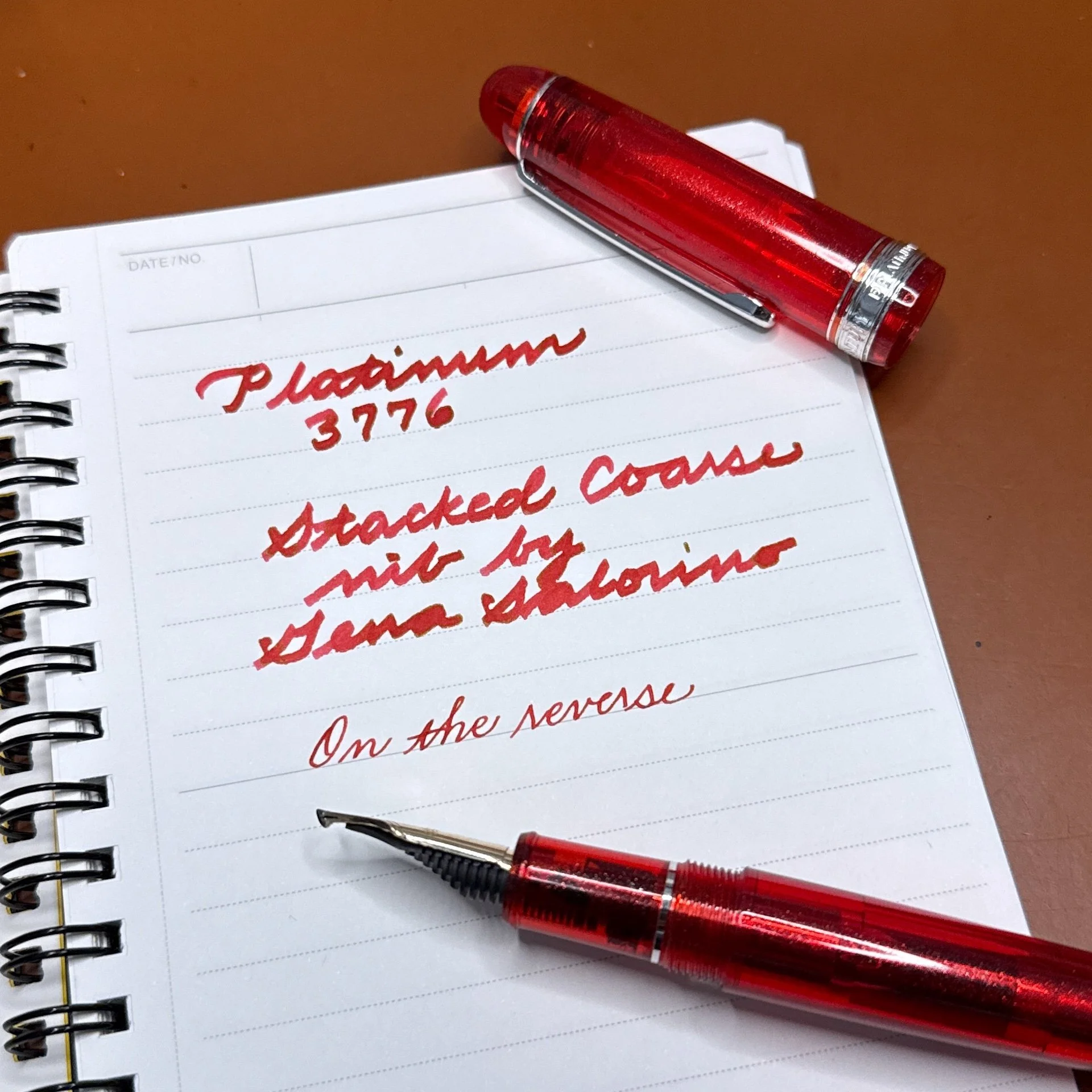
I swear I wasn’t following the ranking from the Pilot Custom 74 article but wow, this Coarse nib is juicy and thicc. I know I literally just said I want more ink on the page, but not like this. It’s like a big ol’ Sharpie (that doesn’t bleed through every paper I’ve ever tested), which is also too broad for my writing. In fact, when I try to write bigger in any nib size, my cursive looks more wobbly and uneven. As with other big nibs, this is perfect for grinds like an Architect or Naginata Togi/Kodachi.

I am now going to contradict myself and say that this stacked Coarse nib by Gena Salorino is even thicker than the regular Coarse nib but it’s still one of my favorite nibs and it’s been inked (and reinked) several times since last August.

5: Music

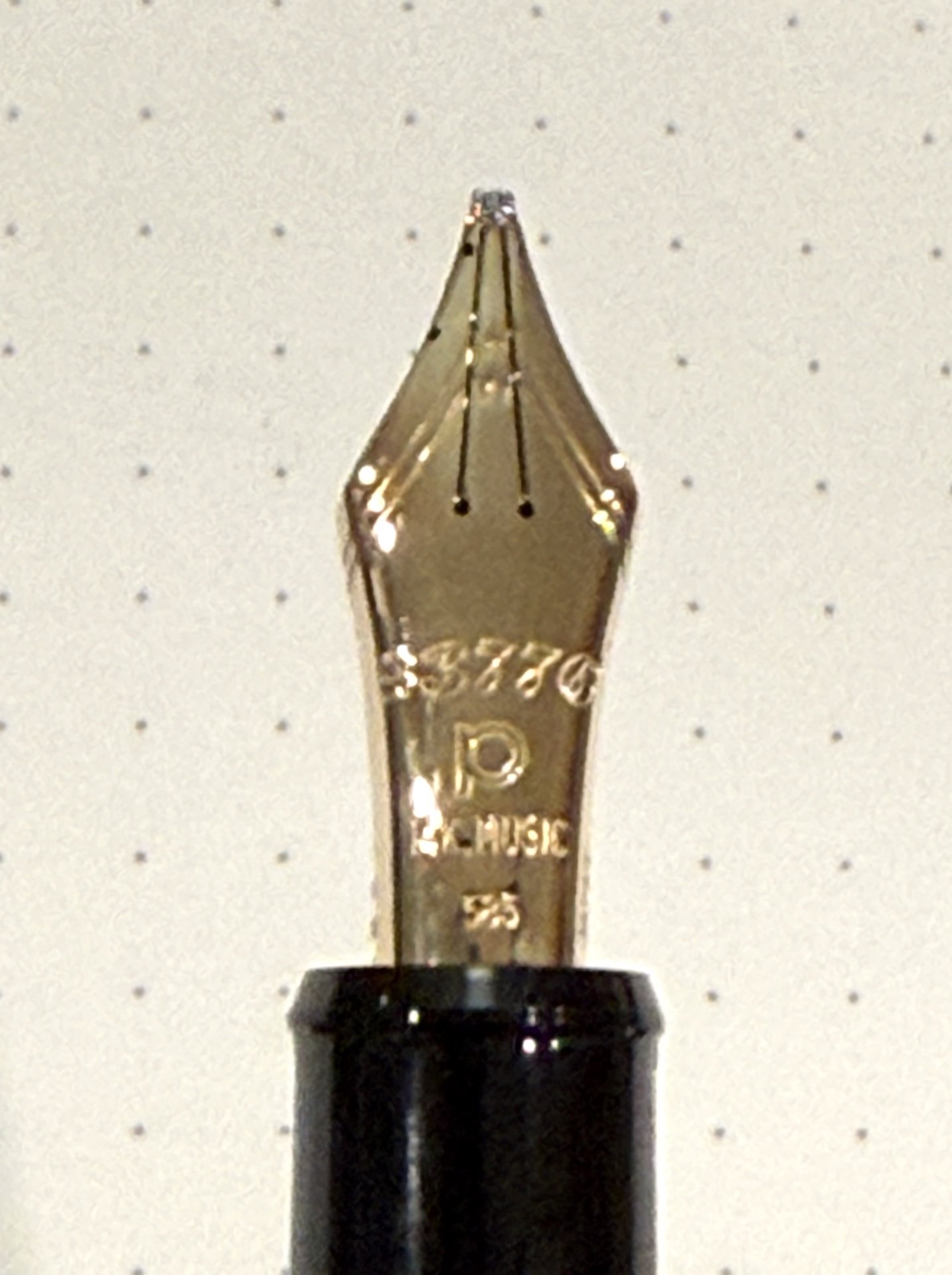
Look at those 3 tines! (Usually, but not always, the tell-tale sign of a Music nib. Sailor, I’m looking at you.)

This was a tough choice because the Music nib is so fun! It’s fat and juicy and gives nice line variation, BUT it isn’t easily swappable with the other nibs because it has a slightly different feed and section. You can swap whole sections with other pens, but you can’t just pull the Music nib and swap in a Medium. This is the biggest reason I put the Music nib in this spot and not one higher. Sad face.

4: Fine

That’s one FINE nib! (I’ll see myself out, haha!)

Anyone getting whiplash yet? Ok, this one and the next one were tough choices because I really could go either way and I’d be ok with it. But I gotta make a choice and I picked Fine. Again, for me, it comes down to showing off the ink and the Fine doesn’t do it as well as the Broad. The Fine nib is still great as an everyday writer. I looked at my pens and realized I have more Broads than Fines, which probably means I must not love Fine as much as Broad.

3: Broad

Broad nibs put down a good amount of ink without being too crazy.

I just realized that none of my Broads have any grinds, which is a shame since it is a great canvas for a nib grinder to work their magic! I would either get a Cursive Italic or an Architect - I’ll check with the nib grinders to get their thoughts - a project for the upcoming SF Pen Show!

2: Soft Fine

I swear I wasn’t drunk when I was making the downstroke with the Soft Fine, but definitely user error, not the nib.

The first few times I tried a Soft Fine, I didn’t get it. Back then it felt so fine (finer than the Fine, unlike Pilot, where the softer nibs were either the same size or slightly broader than their non-soft counterparts), maybe even too fine, and I couldn’t tell the difference (softness-wise) between it and the Fine. Fast forward many years and ah yes, I can definitely feel the difference. It is not a flex nib, but it does have a nice lil’ bounce, which you can use to get lighter upstrokes with less pressure, if you wish.

1: Medium

Medium, you’re number 1 on my list! Kinda, sorta. 😂

I’ve always said that Medium is my go-to nib, and for the 3776, it is my favorite nib. It’s perfect for my size and style of writing and always feels good no matter what ink I put in it (caveat, I don’t really use shimmers in my Platinums. I suppose I should try using a shimmer ink but the flatness of the 3776 nibs against the feed makes me skeptical about how they will be able to channel the shimmer. But that’s an experiment for another time!

I did say the Medium is my #1, but I also said kinda, sorta, because…

1: Soft Medium*

This one is a bit unfair because the Soft Medium nib is no longer available, hence the asterisk. I have a SM which had been ground to a CI before I got it second hand and I love the slight bounciness of the nib, coupled with the Medium nib size that I love so much. I can’t really compare it to the others in the tester kit since it had been ground, but I know a good nib when I use one. If I ever come across another 3776 SM, I might will have to pounce on it.

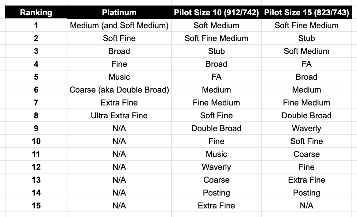
Ranking:

Pilot and Platinum Nib Ranking

As with the other Pilot nibs, I still don’t love the super fine nibs (UEF and Extra Fine) nearly as much as the other nibs. I still don’t love the super broad nibs either, but I enjoyed the Platinum Music nib more than Pilot’s.

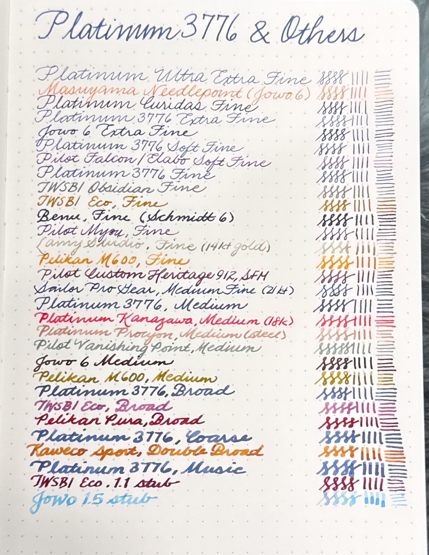
Last but not least, here are some writing samples with other nibs too.

As you can see, the nib sizes may be the same (Fine, Medium, etc), but they definitely don’t feel the same or have the same line width. Ink selection also makes a difference as well as minor inconsistencies from nib to nib.

And there you have it, my ranking of the Platinum 3776 nibs. I think the Bossman needs to test out all these nibs because I’m curious if there’s ANY overlap between the two of us! As I’ve said before, the beauty of this rabbit hole is that we all like different things and there’s plenty of pens and nibs to enjoy for all of us!

I timed this article to come out in time for Yoseka’s Stationery Fest, as well as two of the largest US pen shows (DC and San Francisco), so you should take advantage of the opportunity to try all the nibs for yourself at the Luxury Brands of America tables and let me know which ones are your favorites!

(Disclaimer: Thank you again to Luxury Brands of America, who provided all of the Platinum 3776 tester pens for review. All other pens are my own.)

Posted on July 24, 2026 and filed under Platinum, Fountain Pens, Nibs, Pen Reviews.

In Memoriam: Platinum Curidas, 2020-2026

It was less than a month ago that I shared with Pen Addict Members my grade for the Platinum Curidas. Late last week, news broke that Platinum has decided to retire the Curidas, among other changes to their lineup. While it was not perfect - BY A LONG SHOT - the Curidas held a special place in my heart, and in the stationery world.

To celebrate the times we shared, here is a repost of my recent thoughts on the Platinum Curidas.

Pen Addict Rating: Platinum Curidas Fountain Pen

Three times.

I’ve bought the Platinum Curidas three times. The original launch version, the second version with the rubberized barrel instead of the standard plastic, and the third one back to plastic but OOOOH SHINY!

Platinum Curidas

Oldest to newest, top to bottom.

The first pen had its issues, namely a design flaw that cracked feeds, making the ink flow inconsistent. Platinum did offer to make it right on the affected pens, and while mine was one of those, I opted not to bother because it wrote well. Maybe at some point the feed will split completely and I’ll regret not swapping it out, but I have two more amazing Curidas to use, right?

We say no.

With the second release - around two years after the first - I was hoping to see some design updates based on feedback received from the first. For starters, the “Shark Fin” around the grip section, and the overall size of the pen. Nope. No iteration whatsoever. Just new colors via rubberization of the barrel.

Platinum Curidas Fin

Shark fin? More like Shark-baited two more times.

If colors are your thing, the third release of the Curidas is right up your alley - as long as you are ok with literally no changes once again to the barrel design and functionality. But shiny Green and Purple iridescent barrels? Sign me up …

… to be disappointed again.

Platinum Curidas LAMY Safari

LAMY Safari for scale.

Look, this is a self-inflicted wound. I’m well aware that I’ve met the base definition of insanity, thinking that this pen is going to change and improve and be better than when it first launched. At no point did Platinum ever say any of that, mind you. I just wanted it.

Platinum Curidas Rake Step

Hello. It me.

I wanted it because I like how it writes. That is my own personal failing with the Curidas. The Fine Steel nib, even in this baton of a barrel, works well. My lines are neat and clean, and honestly it feels good to hold, for a short period of time. Fine lines and wide barrels do end up being a long-term usage mismatch, and even though it’s fun for a while, I eventually put it away and forget about it.

Curidas vs Safari

Writing size comparison.

The experience I’ve had is essentially wish casting. I liked it enough to believe either 1. it would change with design iterations over time, or 2. I would change and want to use it more because part of it really suits me. In the end, they are all the same pen, and I only need one of them.

At their current price of $80-$100 (depending on style,) they are not remotely worth it. The Fine Steel nib I love - can I interest you in a $7 Platinum Preppy instead? It’s close enough at a fraction of the price.

In the end, how does the Platinum Curidas grade out on my scale? It is one of the best examples of playing the “This pen, or that pen?” game. As I sit here and type this, I’d choose almost anything over the Curidas.

And I still want to ink it up right now.

Pen Addict Rating: 30

PAR scoring scale:

20 - Avoid this product.

30 - Use sparingly, or specifically.

40 - Good, but there are better options.

50 - Very good, a league average product.

60 - Above average, with only a nitpick or two.

70 - Exceptional across the board.

80 - Best of the best. An elite option.


Enjoy reading The Pen Addict? Then consider becoming a member to receive additional weekly content, giveaways, and discounts in The Pen Addict shop. Plus, you support me and the site directly, for which I am very grateful.

Membership starts at just $5/month, with a discounted annual option available. To find out more about membership click here and join us!
Posted on May 25, 2026 and filed under Platinum, Fountain Pens, Pen Reviews.