Storytelling plays an important role in some of my favorite products, so why not an ink featuring one of the great legends of the Northeastern United States, the Jersey Devil.
My question is this: Has the team at Goldspot actually seen this beast to properly match this ink color? Is it acceptable to call this ink a “beautiful” Reddish-Burgundy color, when tales of the Jersey Devil have haunted children and adults alike for centuries?
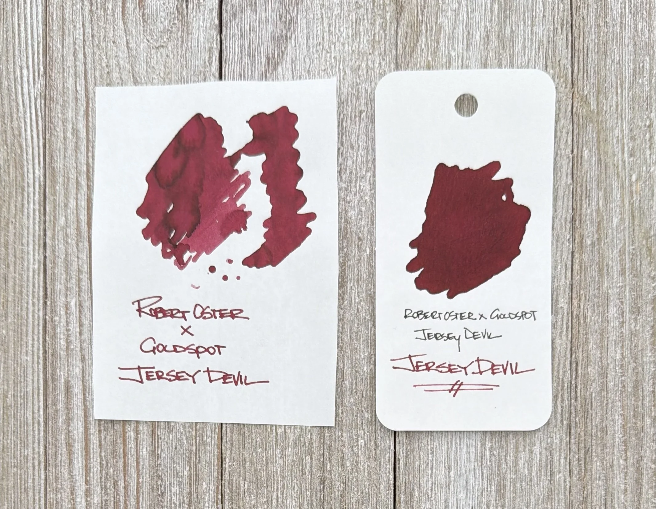
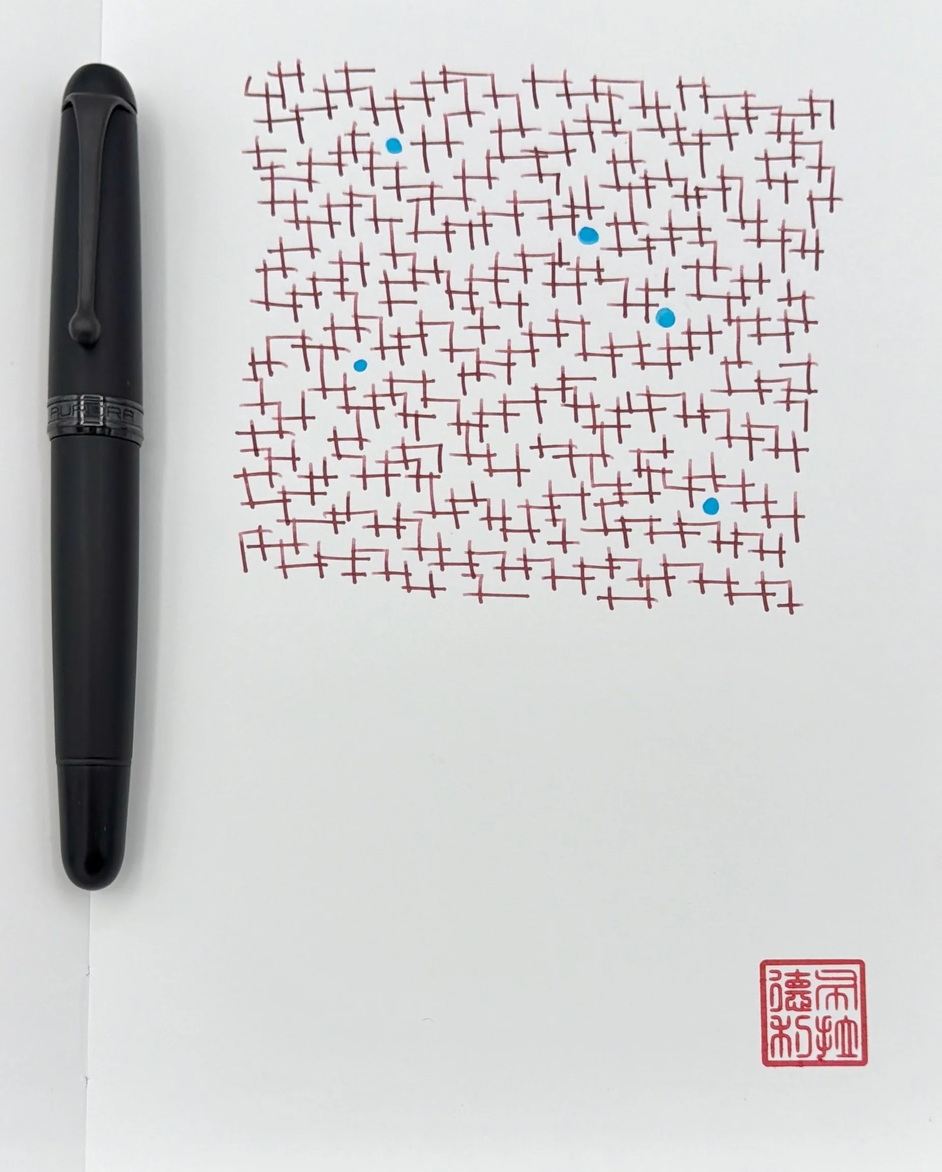
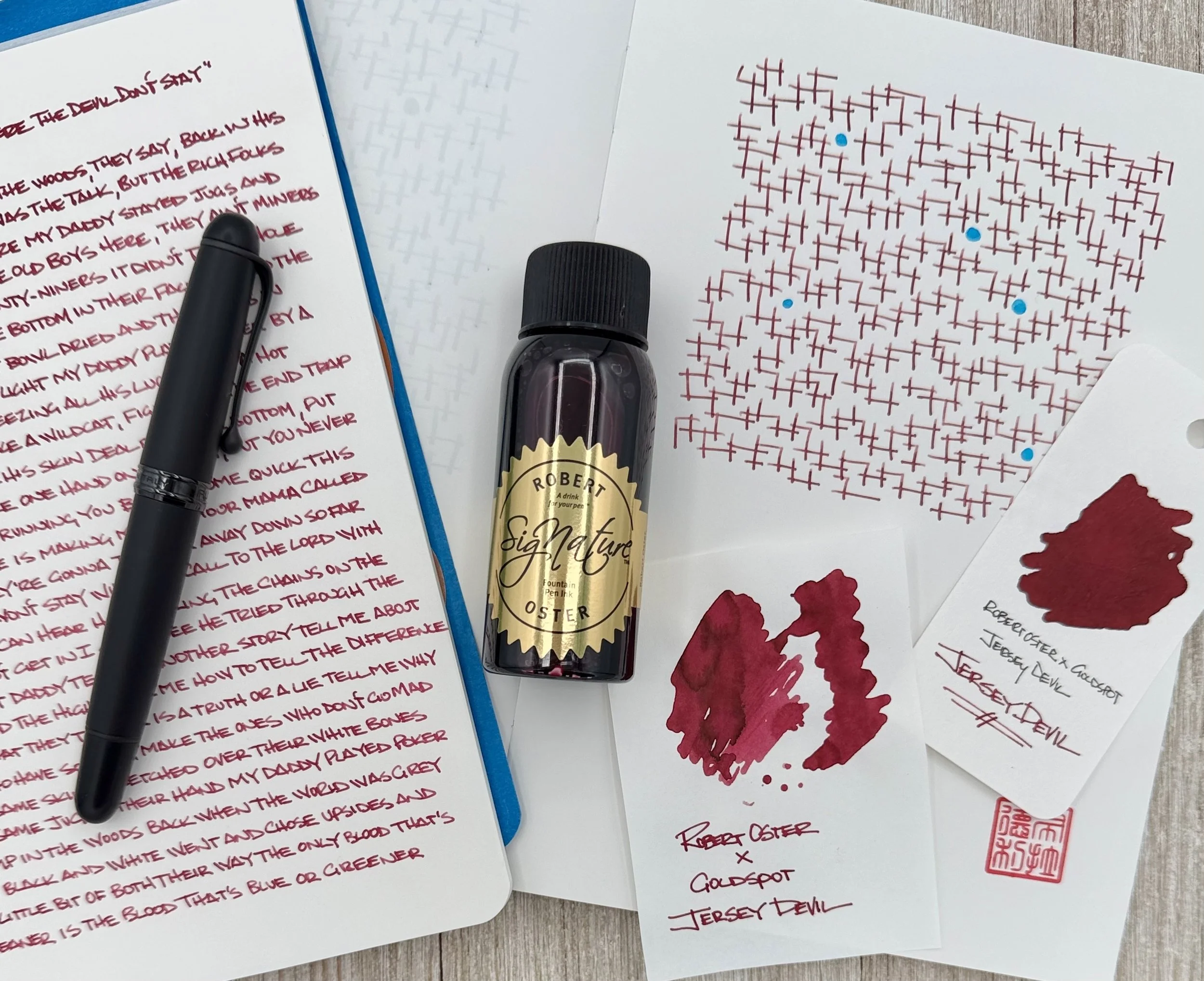
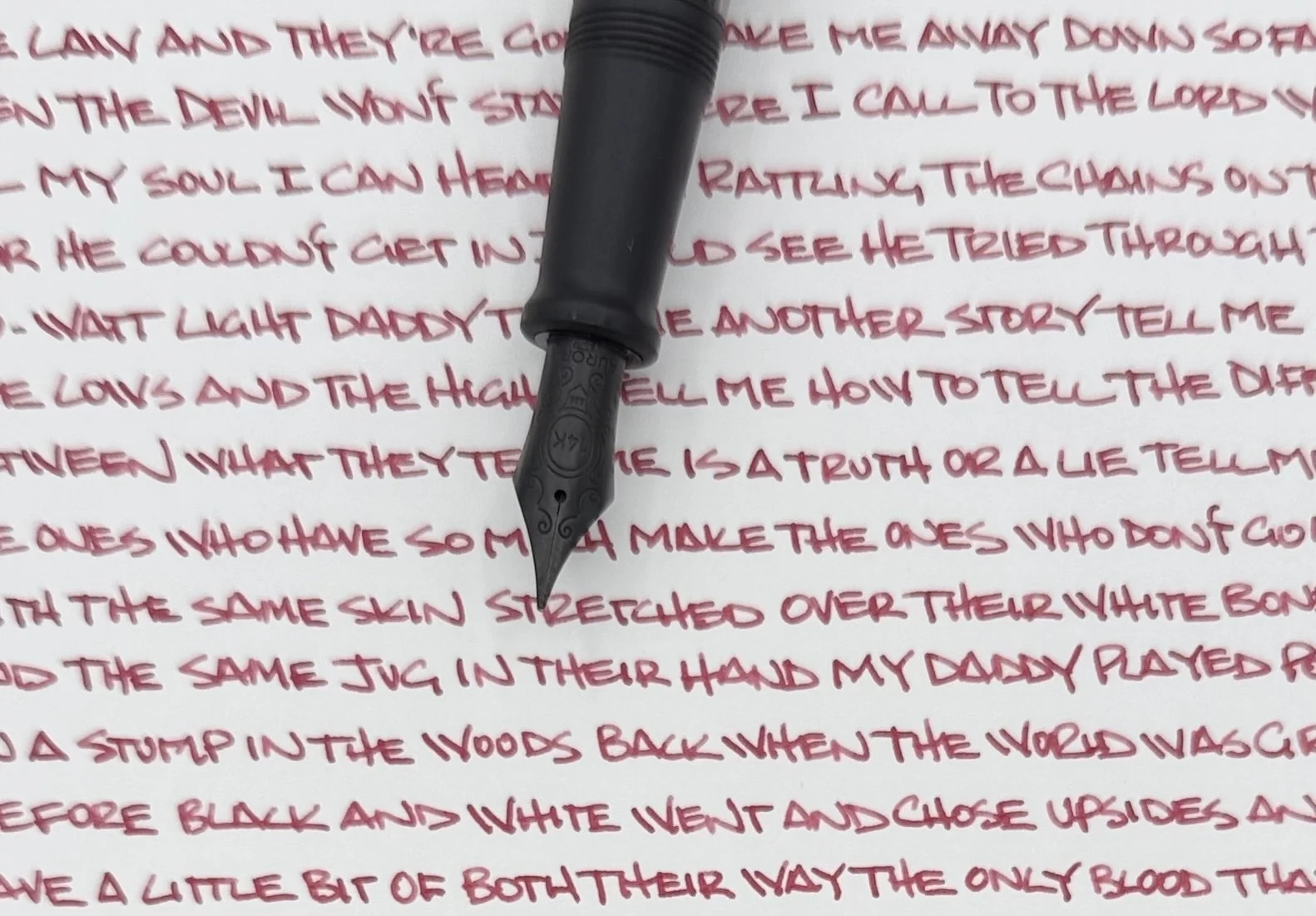
Left to right: Sanzen 52gsm Tomoe River, Col-o-ring.
I say yes, because while the Jersey Devil is a fantastical figure, made for spooky stories, The Jersey Devil ink is designed to be a friend to your pens. No mythical tales required.
My favorite part of The Jersey Devil is that it is a normal, straightforward ink. No bells, no whistles, no shimmer, no pigment - just a good, solid Burgundy with a bit of shading, and some character on the page. If you like the Red ink side of the ledger, then this could be your all-day writing choice for everything from work notes, to journaling.
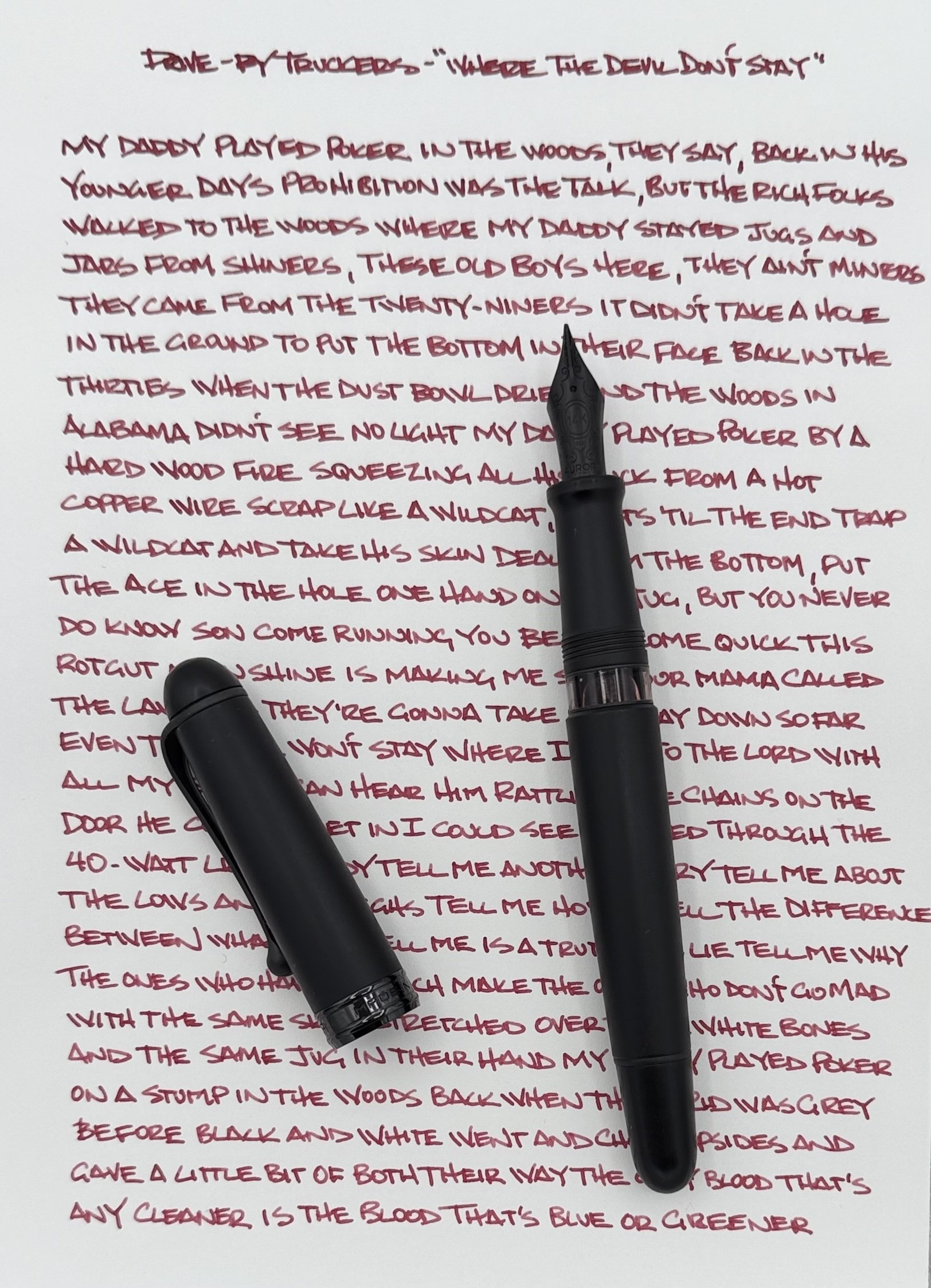
My writing in the Aurora 88 Unica Nera with a 14K Extra Fine nib was consistent, with great flow on the Sanzen Tomoe River 52gsm Yamamoto Pad I used to transcribe one of my favorite Drive-By Truckers songs, “Where the Devil Don’t Stay” (look at baby Isbell in this footage!) The Devil was more Brown inside the Yoseka Notebook I doodle in, so you will see different shades on different papers.
To find The Jersey Devil, just head over to Goldspot, where you can pick up a 50ml bottle for $19. And if you want to learn more about how the legend of the Jersey Devil came to be, check out “A Devil on the Roof” from Aaron Mahnke and the Lore podcast. Aaron is more famously known around these parts as the designer of the original Pen Addict Podcast logo in the 70Decibels days. The more you know!
(Goldspot provided this product at no charge to The Pen Addict for review purposes.)
Enjoy reading The Pen Addict? Then consider becoming a member to receive additional weekly content, giveaways, and discounts in The Pen Addict shop. Plus, you support me and the site directly, for which I am very grateful.
Membership starts at just $5/month, with a discounted annual option available. To find out more about membership click here and join us!