(Kimberly (she/her) took the express train down the fountain pen/stationery rabbit hole and doesn't want to be rescued. She can be found on Instagram @allthehobbies because there really are many, many hobbies!.)
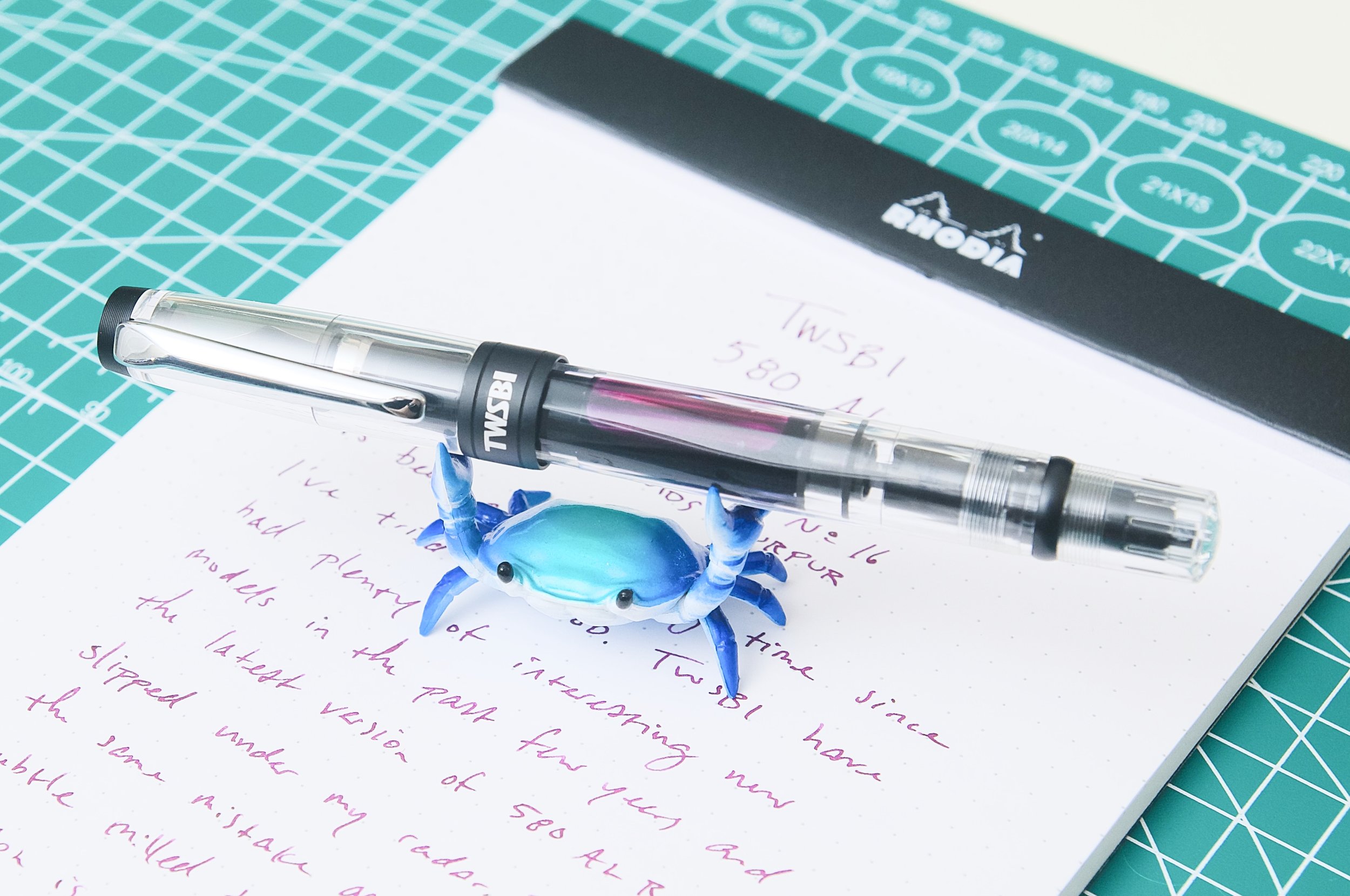
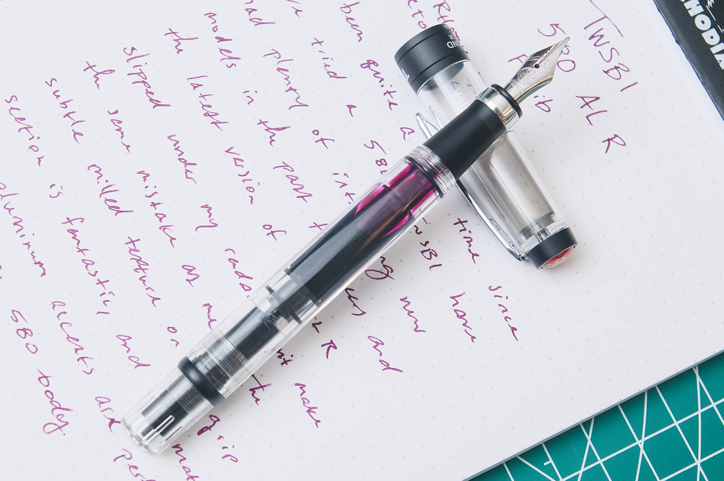
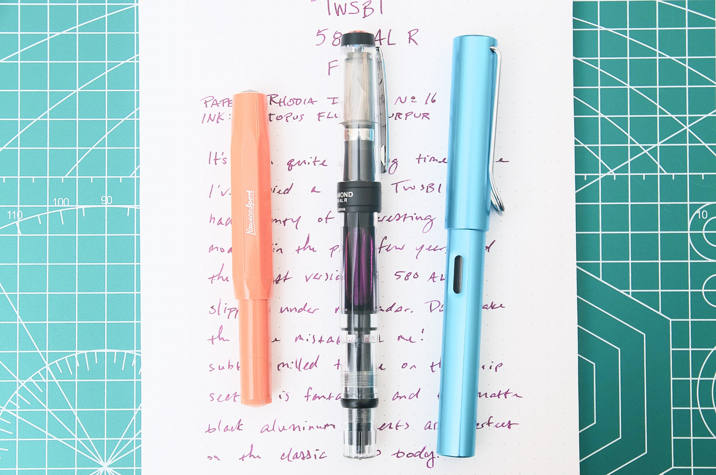
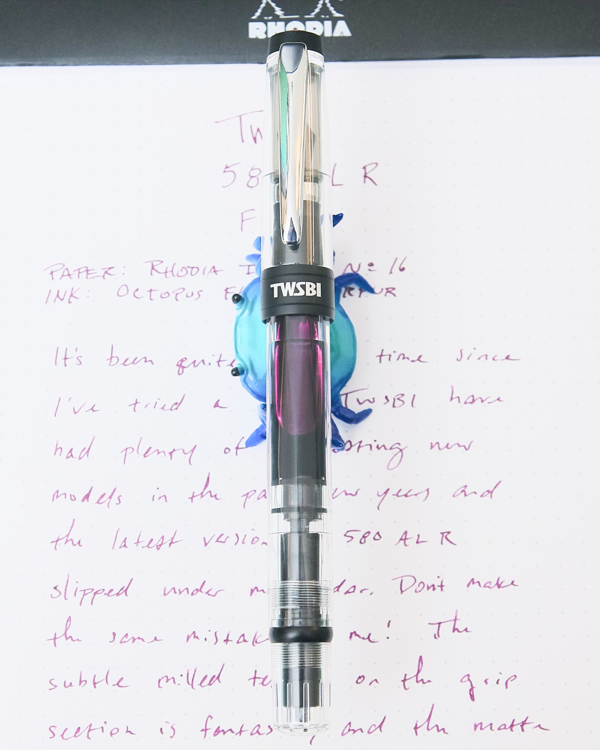
To no one’s surprise, I had to get the latest TWSBI Eco, the Plum with Onyx. It was difficult to tell what the color of the pen would be, since there were Eco photos with different tones of red, pink, purple, and magenta. So I thought it would be fun to walk you through my ink selection process so you can get a sense of the real color (no, I don’t do this for every pen, just some of them). Also spoiler: this pen really is difficult to photograph!
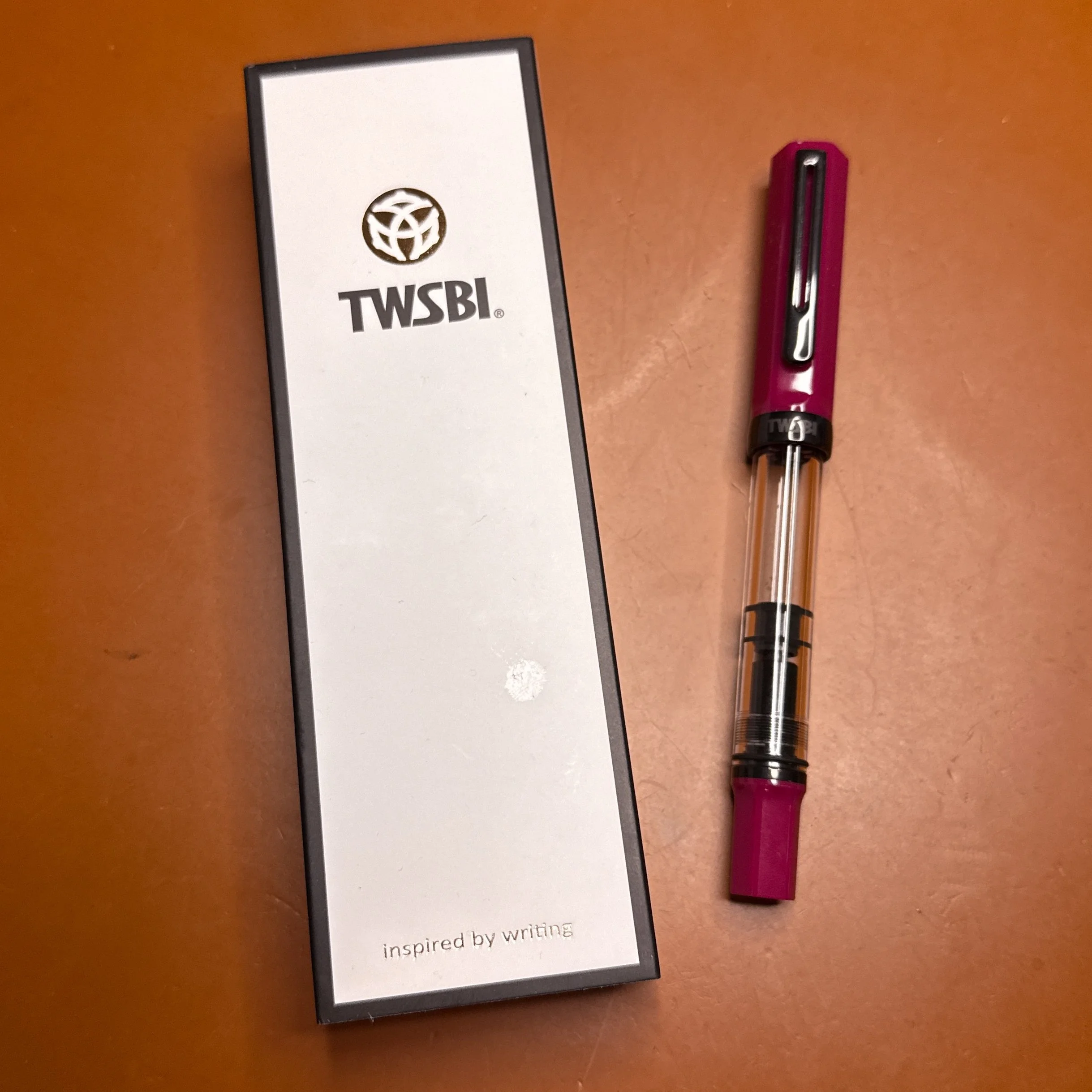
TWSBI Eco Plum with Onyx on Cognac Girologio writing mat.
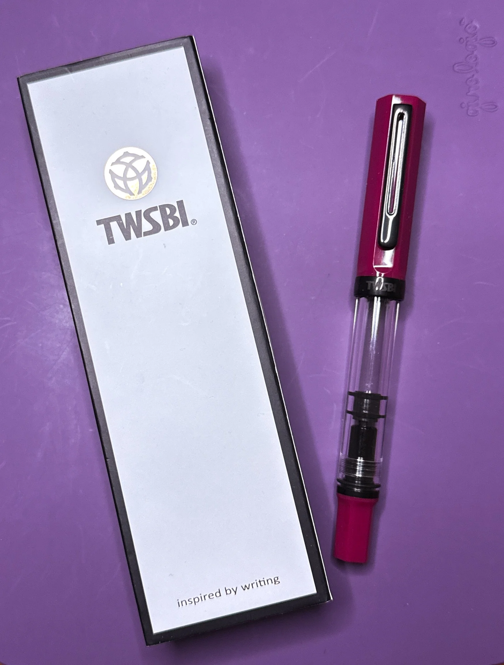
Purple writing mat.
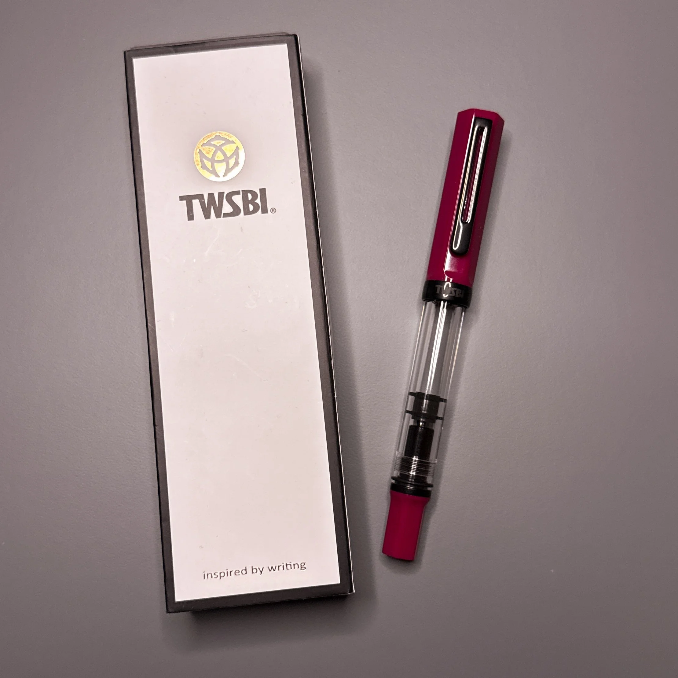
Grey writing mat.
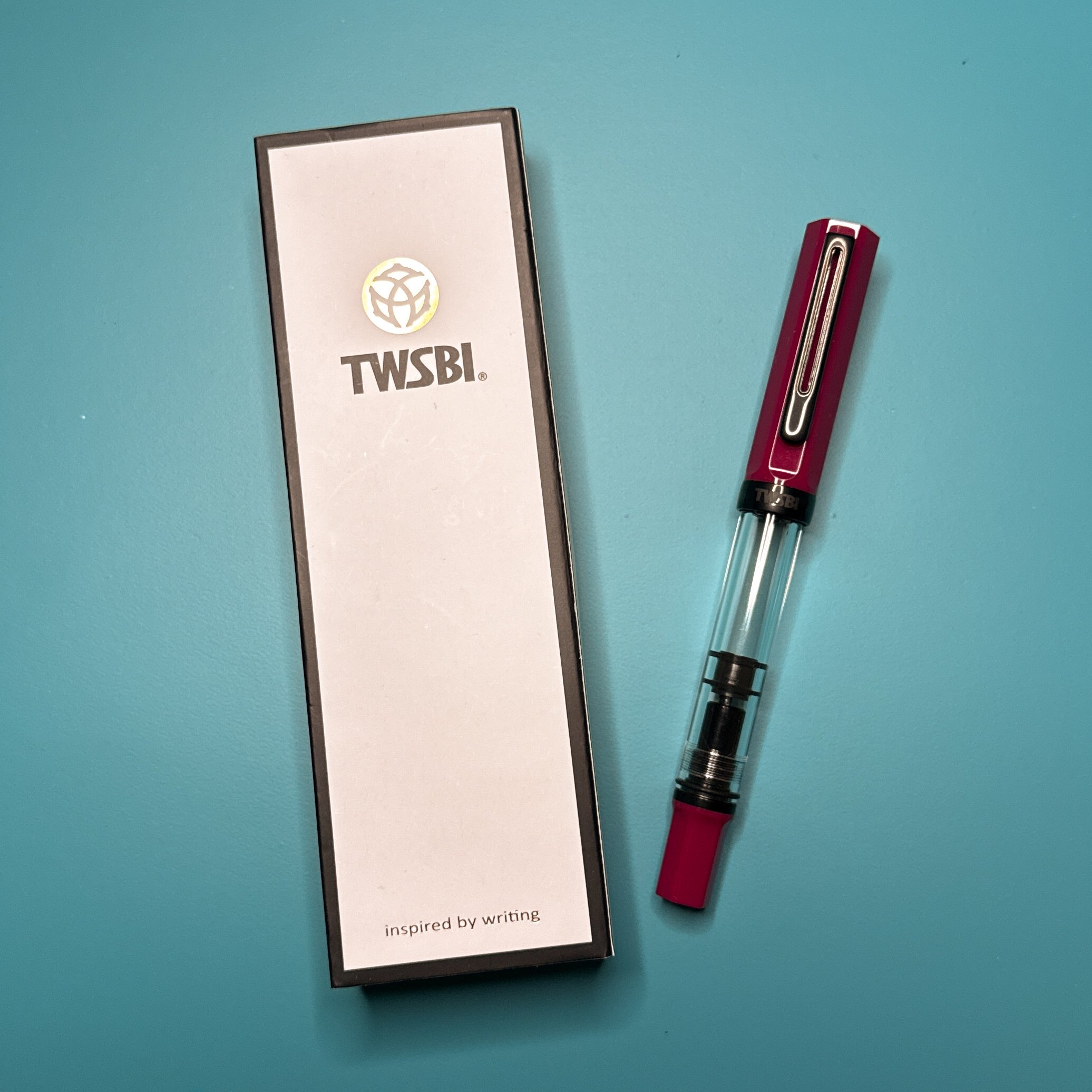
Turquoise writing mat.
The best I can describe the color of the Eco Plum is that it is a magenta-ish color with a bit of pink and purple. The solo pictures make the Eco look more red than it is in real life, regardless of background (and yes, this is with some post-processing already - definitely not my strong suit). And despite using custom white balance with a grey card, the writing mat colors aren’t truly accurate either. This is one reason why ink and pen color photography can be difficult for us amateurs. Of the four photos, I think the closest is the one on the purple mat.
Next, I pulled a bunch of Col-O-Ring swatch cards from my collection and rather than compare the pen to the swatch card, I opted to swatch the inks in a 68 gsm Tomoe River notebook by Odyssey Notebooks. This way I could make sure the ink looks like it would on paper that I use quite often. As with my ink reviews, the swatches were made with a stainless steel Kakimori dip nib in a Kaweco clutch pencil holder.
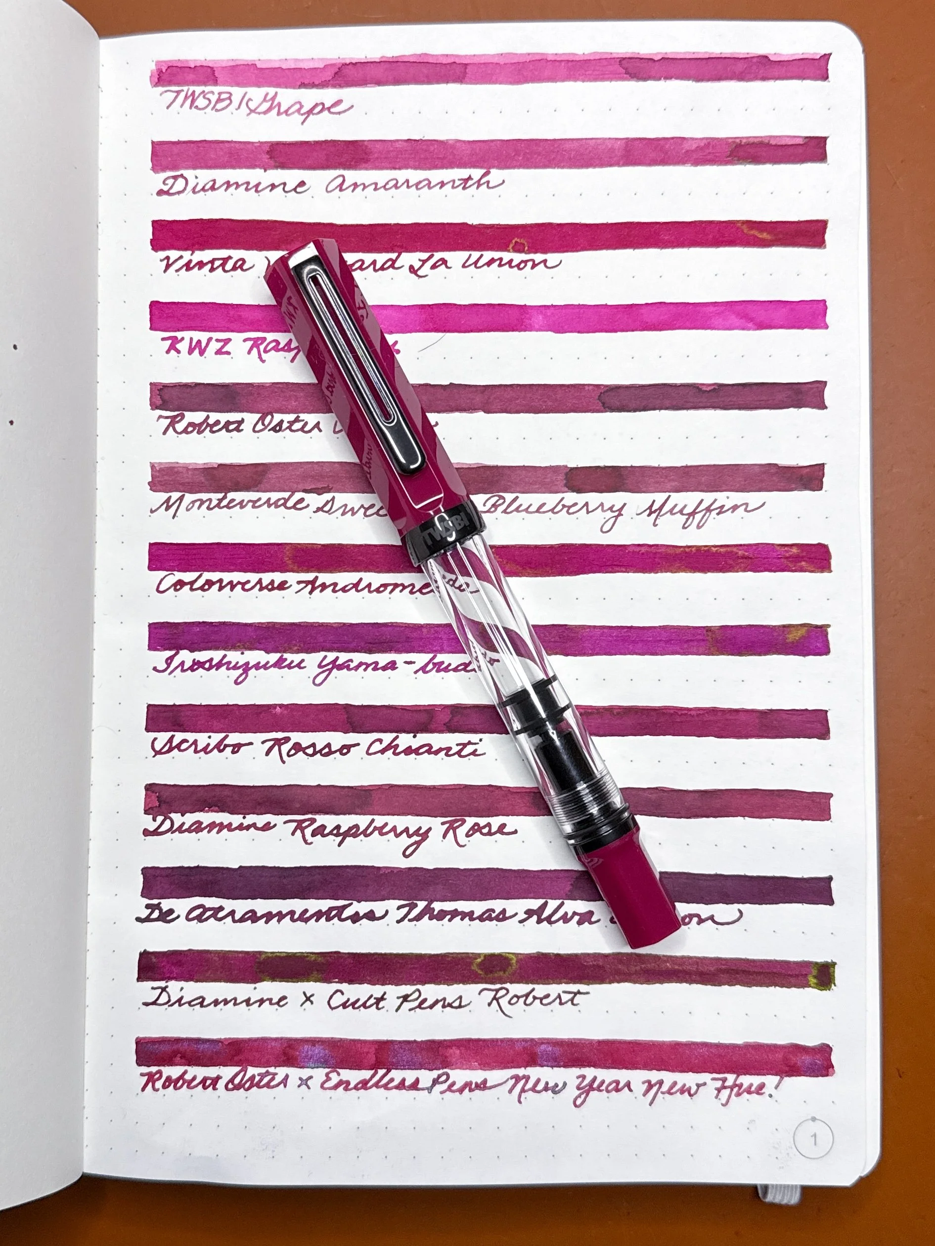
Inks from the top: TWSBI Grape, Diamine Amaranth, Vinta Vineyard La Union, KWZ Raspberry, Robert Oster Napa, Monteverde Sweet Life Blueberry Muffin, Colorverse Andromeda, Pilot Iroshizuku Yama-budo, Scribo Rosso Chianti, Diamine Raspberry Rose, De Atramentis Thomas Alva Edison (Black Red), Diamine x Cult Pens Robert, Robert Oster x EndlessPens New Year New Hue!
After I swatched all the inks and set the pen on top, it was pretty easy to see which ones were close but not close enough. Keep in mind that the closeup photos make the pen cap look darker than it does in real life.

TWSBI Grape, Diamine Amaranth, Vinta Vineyard La Union, KWZ Raspberry, Robert Oster Napa, Monteverde Sweet Life Blueberry Muffin, Colorverse Andromeda.
As much as I would’ve liked TWSBI Grape to be a match, it was too light and a bit too pink. KWZ Raspberry was more of a hot pink, while Robert Oster Napa and Monteverde Blueberry Muffin had some brown tones that didn’t work with the pen. The other three were possibilities.

Iroshizuku Yama-budo, Scribo Rosso Chianti, De Atramentis Thomas Alva Edison, Diamine x Cult Pens Robert, Robert Oster x EndlessPens New Year New Hue!
The Yama-budo was a touch too purple (thank goodness since I already have a pen inked with it), Raspberry Rose a wee bit too brown, De Atramentis was too dark and too purple (reminder that DA’s inks have a “line/theme name” like “Thomas Alva Edison” and a“base ink name” like Black Red). I liked the sheen of Robert and also the shimmer of New Year New Hue! How’s a girl to choose?! Reswatch for the next round!
Since I picked the 1.1 nib for the Eco Plum, I decided to use the Sailor Hocoro 1.0 stub dip nib to see if the ink looks better/different from a stub.
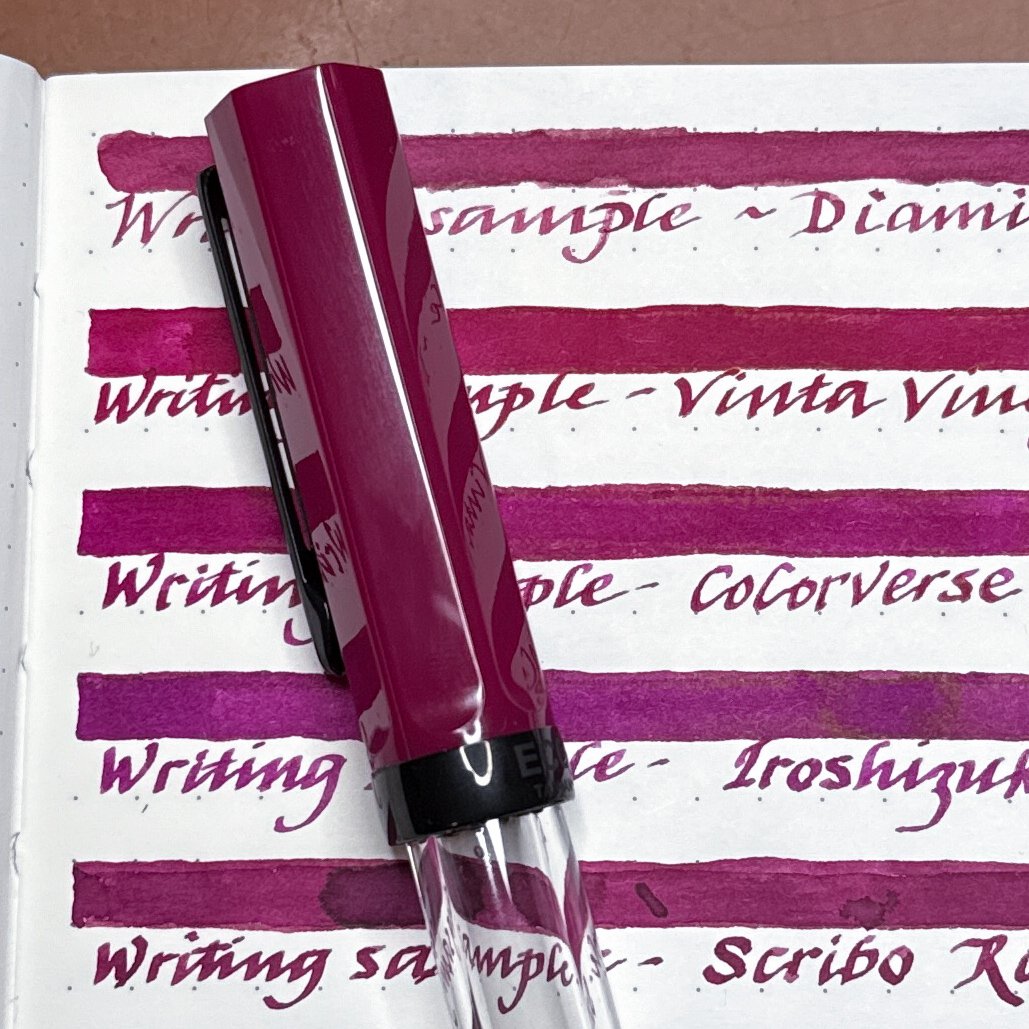
Diamine Amaranth, Vinta Vineyard La Union, Colorverse Andromeda, Iroshizuku Yama-budo, Scribo Rosso Chianti.
I already said Yama-budo was too purple but I must have really wanted to give it a second chance and yes, it’s still too purple for me. Diamine Amaranth was nice but it felt dry from both the Kakimori and Sailor Hocoro dip nibs. I really liked the Vinta, Colorverse, and Scribo from this batch.

Another look at Iroshizuku Yama-budo and Scribo Rosso Chianti, as well as Diamine x Cult Pens Robert, and Robert Oster x EndlessPens New Year New Hue!
The Diamine Robert was a really good match, but just a bit darker. The green sheen would’ve been fun though! The shimmer in the Robert Oster New Year New Hue! Was also really tempting but the base ink was a bit too light and too pink.

It was tough but I whittled it down to these two inks - Colorverse Andromeda and Scribo Rosso Chianti.
I could have gone either way with these two inks, but in the end, the Scribo Rosso Chianti won out because it was the right color and tone, and the Andromeda was just a teensy bit brighter. It also helps that I have a 90ml bottle of the Rosso Chianti and only a sample of the Andromeda.

Really happy with this combo - TWSBI Eco Plum with Onyx and Scribo Rosso Chianti!
(Disclaimer: I purchased the TWSBI at Flax Pen to Paper during Fountain Pen Day, all inks are my own, as well as the dip pens. The Odyssey Notebook was bought by the Bossman at a past pen show at regular price.)
Enjoy reading The Pen Addict? Then consider becoming a member to receive additional weekly content, giveaways, and discounts in The Pen Addict shop. Plus, you support me and the site directly, for which I am very grateful.
Membership starts at just $5/month, with a discounted annual option available. To find out more about membership click here and join us!