Posts filed under Fountain Pens

9 Years in the Rabbit Hole

(Kimberly (she/her) took the express train down the fountain pen/stationery rabbit hole and doesn't want to be rescued. She can be found on Instagram @allthehobbies because there really are many, many hobbies!.)

I noticed this week that my penversary was coming up this weekend! What’s a penversary you ask? Basically, it’s like an anniversary but for when you got into pens. I used to agonize over what I would pick for this occasion but with all the shops and shows that I get to attend as well as all the ongoing sales and deals, I’m practically shopping year-round anyway. So rather than figuring out the 9th penversary pen, I wanted go back to where it started.

So, what were those first fountain pens? Yes, plural, because I couldn’t decide which ones to get, so I ordered a Lamy Safari and Pilot Metropolitan from one vendor and a 7-pack of Platinum Preppies from Amazon ‘cuz I couldn’t pick a color, lol. They all arrived on the same day, May 31, 2017! Oof, that sounds like a long time ago! I did my last triathlon earlier that month and haven’t done one since – coincidence? I think not! 😃

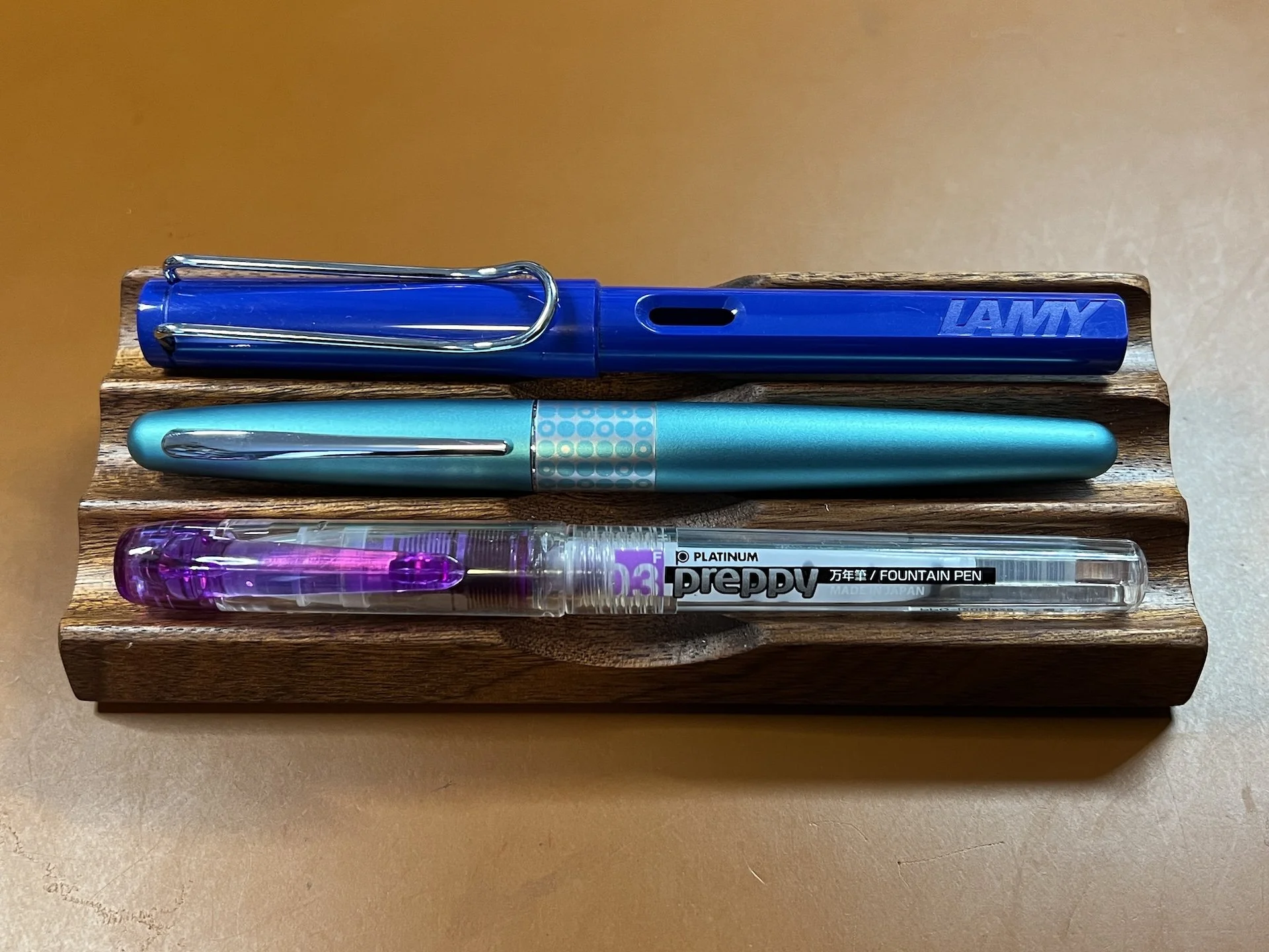
The OG pens that started all this madness: Lamy Safari (top), Pilot Metropolitan and (one of seven) Platinum Preppies.

I will always think fondly of these 3 pens, even if I don’t use them as much as others. I keep saying I should ink these pens up again, so no time like the present!

Even though I really like the Lamy Blue cartridges that come with my Lamy pens, I opted to go for something with a bit more pop for this Blue Safari. One of my favorite bright royal blues is Diamine 150th Anniversary Blue Velvet. I can’t think of a more perfect ink for a penversary inking! (It’s not as bright as usual since the Safari tends to run a bit on the dry side.) Paper is Ayush.

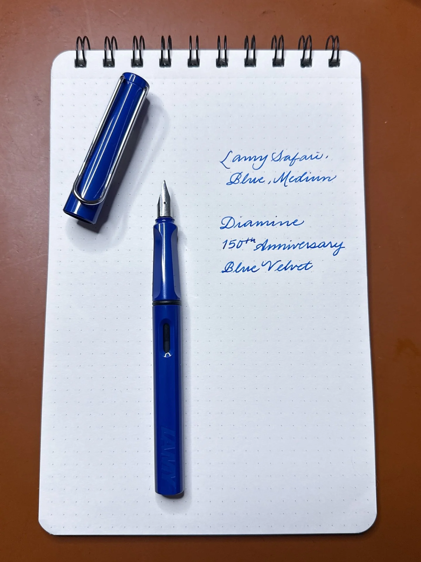
Lamy Safari, Blue, Medium, inked with Diamine 150th Anniversary Blue Velvet.

While I was at it, I decided to ink up a nicer Lamy, the Studio in Palladium, with a fine 14kt gold nib. While this wasn’t my first Studio (which was the Imperial Blue with a steel nib), the 14kt gold nib is such a great upgrade from the steel nibs and feels nothing like the L2K’s gold nib. This nib is a smooth, wet, and buttery writer with just a hint of bounce and will lay down a broader line than the steel nibs.

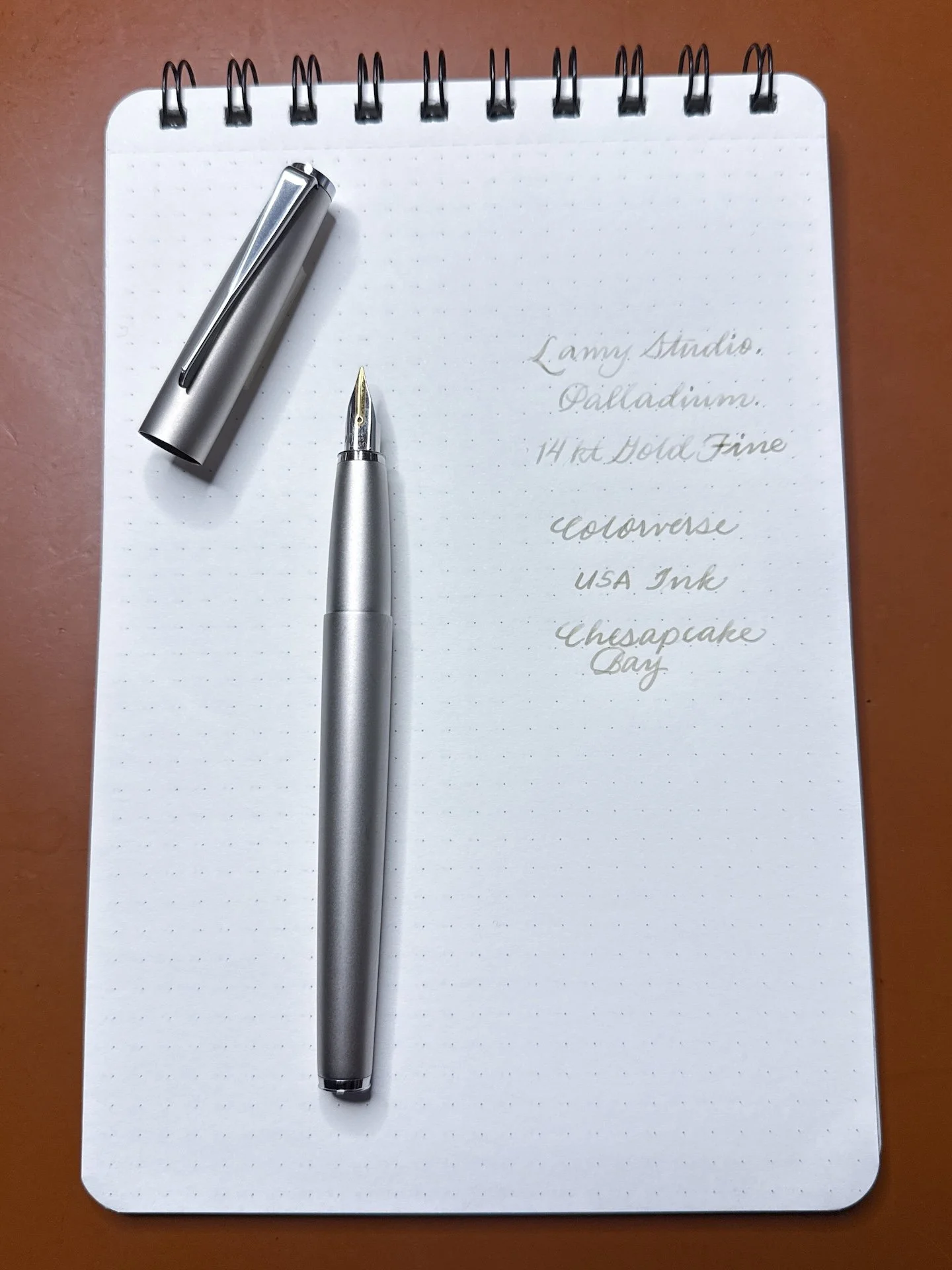
Lamy Studio, Palladium, 14kt gold Fine, inked with Colorverse Chesapeake Bay.

I’ve mentioned that I use my Black Pilot Metropolitan almost daily in my bullet journal but it’s been a really long time since I inked up the Turquoise Metro, so I had fun picking an ink for it. I opted for Montegrappa Turquoise, which sounds very bougie but it wasn’t very expensive (I think it was $20/bottle).

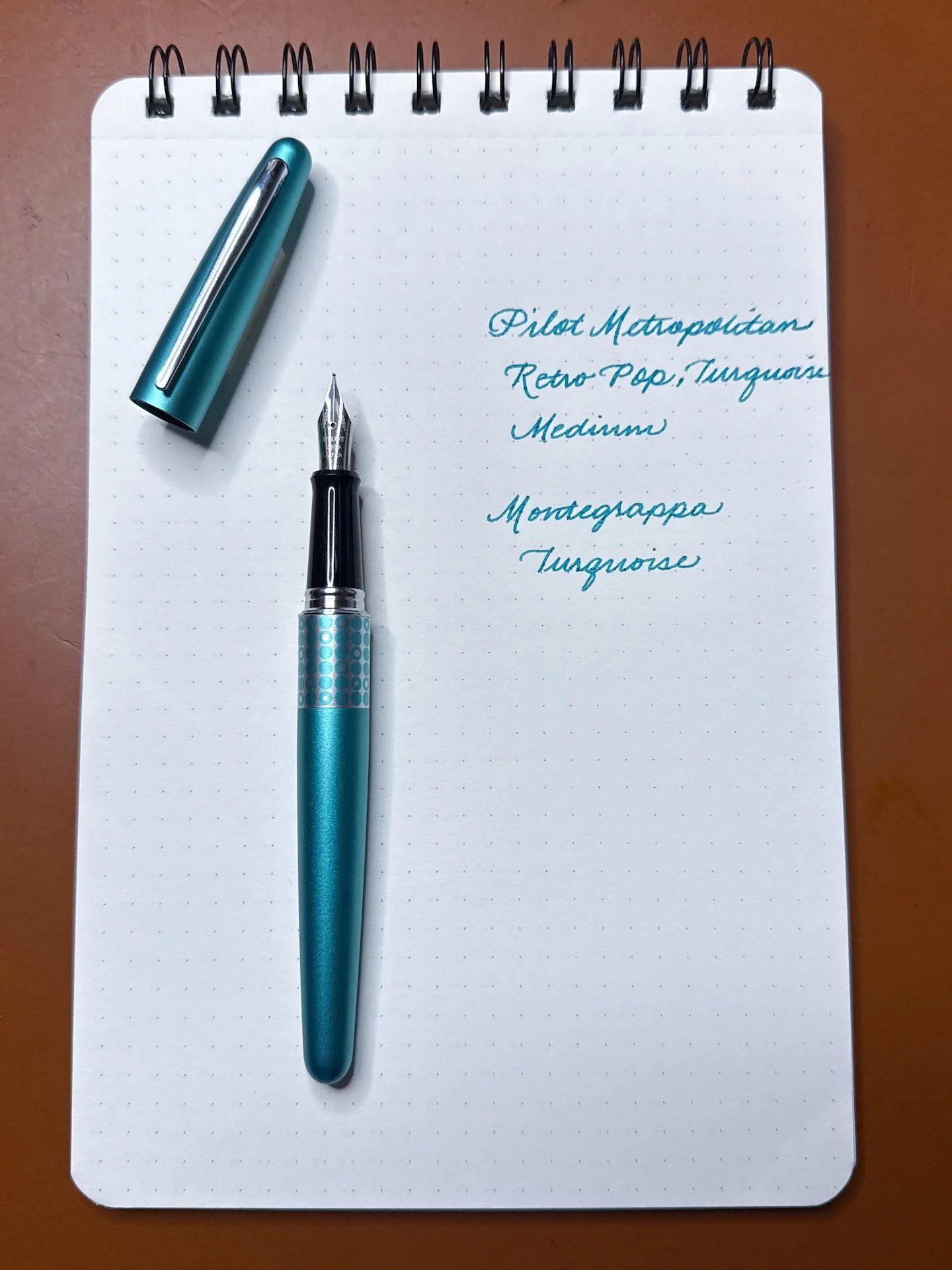
Pilot Metropolitan, Retro Pop Turquoise, Medium, inked with Montegrappa Turquoise.

While I was getting the Metro out of the pen binder, I realized I also hadn’t inked up my first Prera in ages, so I swapped in a ==CM== nib (Calligraphy Medium, more of an italic than a stub) and found a great ink match with Inkdepence Mike’s Don’t Trust a Bivalve!

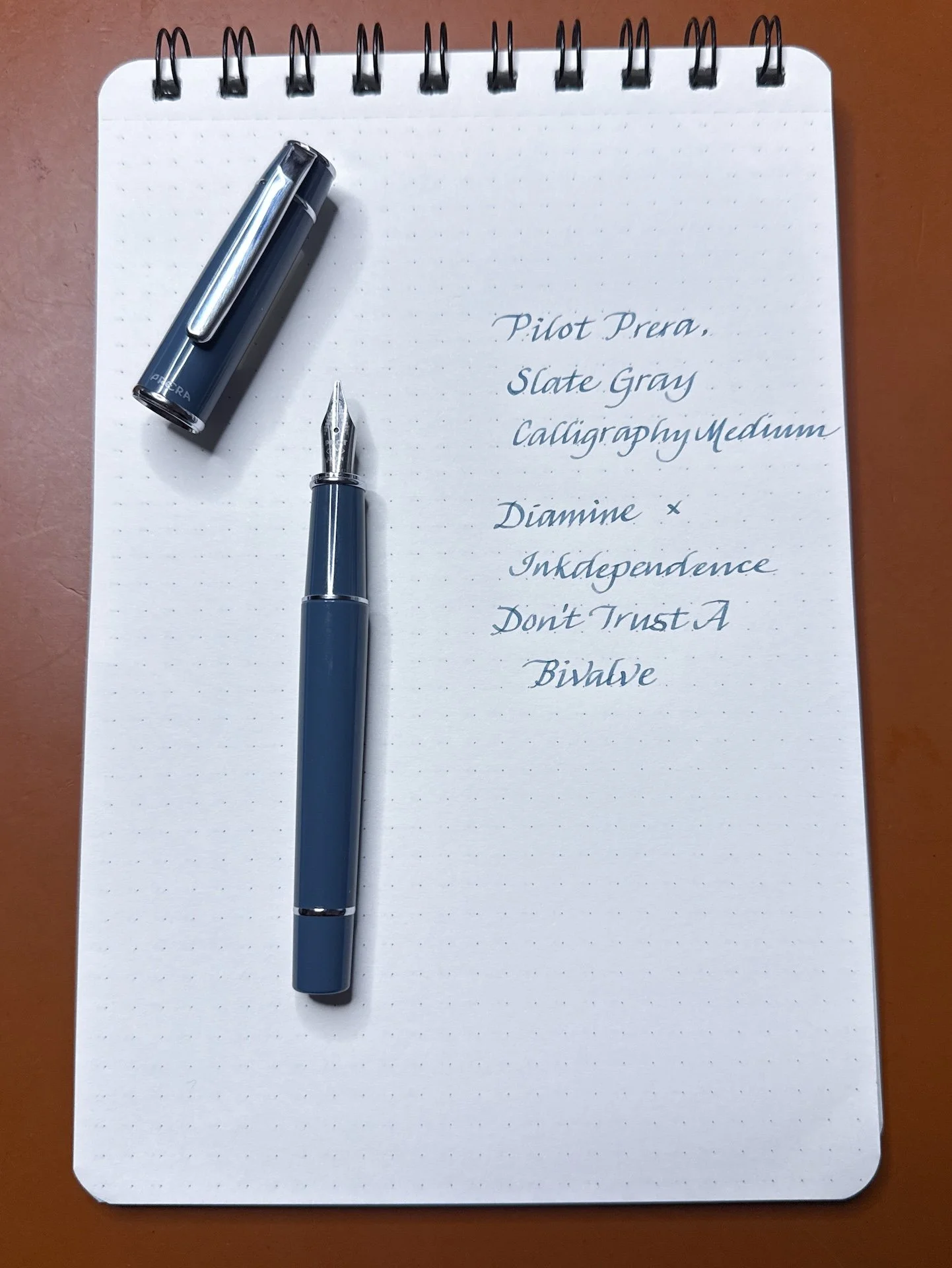
Pilot Prera, Slate Gray, Calligraphy Medium, inked with Inkdependence Don’t Trust a Bivalve (a great match, if I do say so myself!)

I have sold most of the Preppies from the original 7-pen set, but I did keep this one cuz it’s purple (one of my favorite colors)! Apparently, it’s been sitting in my drawer, with the Platinum Violet ink cartridge in it for YEARS because I totally forgot about it. Oops! I added a drop of water to the tip of the nib and it wrote right up! Guess I don’t have to ink it up since there’s already a cartridge in it!

Platinum Preppy, Violet, 03 (EF), inked with Platinum Violet cartridge.

I was in the mood to ink up another Platinum so I picked the Kanazawa Maki-e Goldfish. I was/am unlikely to ever own a real maki-e pen, this is the closest I would ever get. The artwork is screen-printed (instead of hand-painted) onto the pen, which is why it’s much more affordable. The 18kt gold nib is lovely to write with, slightly springy compared to its 3776 sibling.

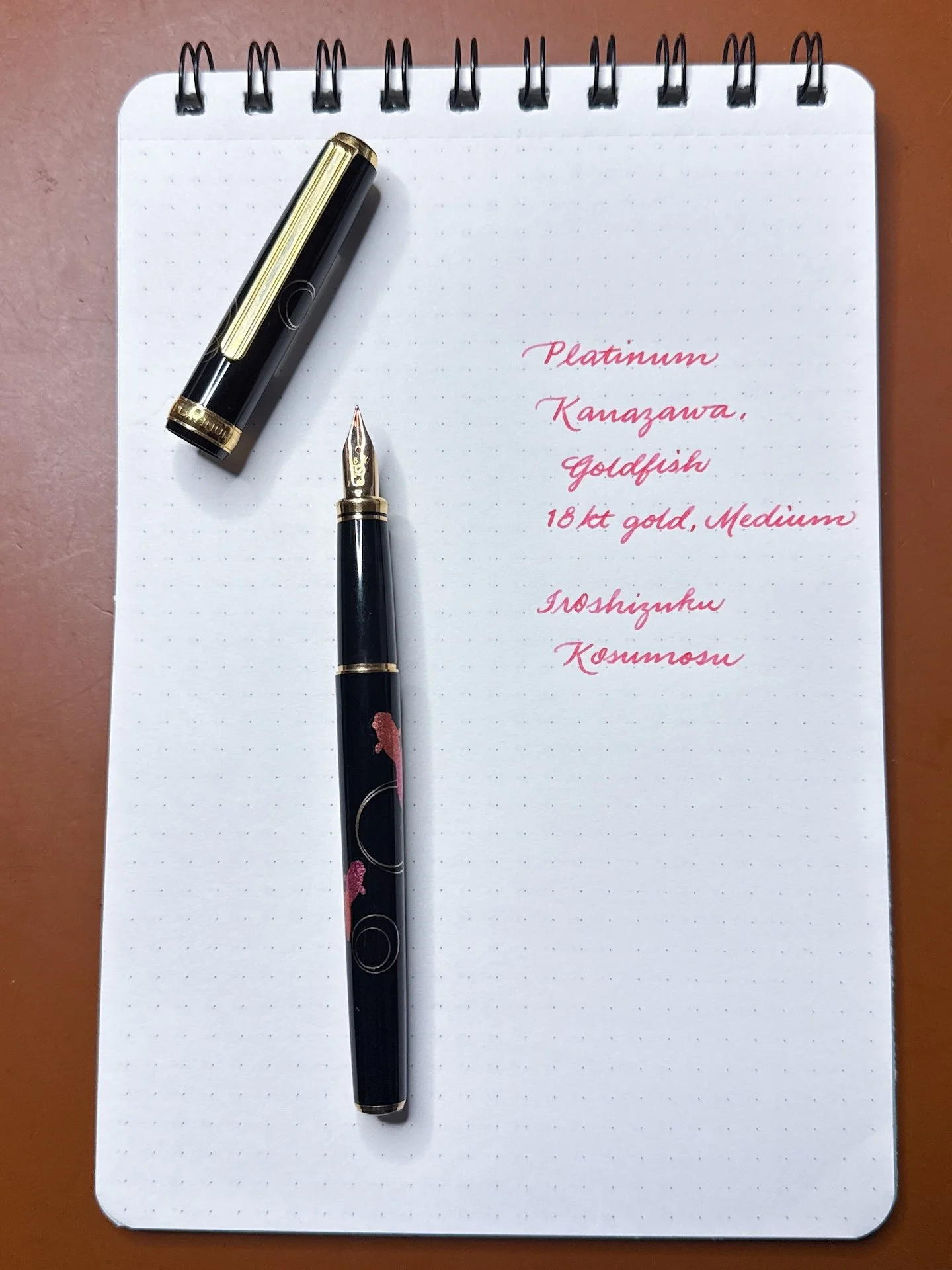
Platinum Kanazawa Maki-e Goldfish, 18kt gold Medium, inked with Iroshizuku Kosumosu.

Inking up these pens that got me into this rabbit hole has given me a renewed sense of discovery. It’s a great reminder that pens don’t have to be expensive to be enjoyable. Of course, this doesn’t mean I’m done buying pens, but I’m so glad that I still get so much out of these pens. What a great way to celebrate my 9th penversary! Can’t wait to see what the next 9 years will bring! Happy writing!


Enjoy reading The Pen Addict? Then consider becoming a member to receive additional weekly content, giveaways, and discounts in The Pen Addict shop. Plus, you support me and the site directly, for which I am very grateful.

Membership starts at just $5/month, with a discounted annual option available. To find out more about membership click here and join us!

Posted on May 29, 2026 and filed under Fountain Pens.

In Memoriam: Platinum Curidas, 2020-2026

It was less than a month ago that I shared with Pen Addict Members my grade for the Platinum Curidas. Late last week, news broke that Platinum has decided to retire the Curidas, among other changes to their lineup. While it was not perfect - BY A LONG SHOT - the Curidas held a special place in my heart, and in the stationery world.

To celebrate the times we shared, here is a repost of my recent thoughts on the Platinum Curidas.

Pen Addict Rating: Platinum Curidas Fountain Pen

Three times.

I’ve bought the Platinum Curidas three times. The original launch version, the second version with the rubberized barrel instead of the standard plastic, and the third one back to plastic but OOOOH SHINY!

Platinum Curidas

Oldest to newest, top to bottom.

The first pen had its issues, namely a design flaw that cracked feeds, making the ink flow inconsistent. Platinum did offer to make it right on the affected pens, and while mine was one of those, I opted not to bother because it wrote well. Maybe at some point the feed will split completely and I’ll regret not swapping it out, but I have two more amazing Curidas to use, right?

We say no.

With the second release - around two years after the first - I was hoping to see some design updates based on feedback received from the first. For starters, the “Shark Fin” around the grip section, and the overall size of the pen. Nope. No iteration whatsoever. Just new colors via rubberization of the barrel.

Platinum Curidas Fin

Shark fin? More like Shark-baited two more times.

If colors are your thing, the third release of the Curidas is right up your alley - as long as you are ok with literally no changes once again to the barrel design and functionality. But shiny Green and Purple iridescent barrels? Sign me up …

… to be disappointed again.

Platinum Curidas LAMY Safari

LAMY Safari for scale.

Look, this is a self-inflicted wound. I’m well aware that I’ve met the base definition of insanity, thinking that this pen is going to change and improve and be better than when it first launched. At no point did Platinum ever say any of that, mind you. I just wanted it.

Platinum Curidas Rake Step

Hello. It me.

I wanted it because I like how it writes. That is my own personal failing with the Curidas. The Fine Steel nib, even in this baton of a barrel, works well. My lines are neat and clean, and honestly it feels good to hold, for a short period of time. Fine lines and wide barrels do end up being a long-term usage mismatch, and even though it’s fun for a while, I eventually put it away and forget about it.

Curidas vs Safari

Writing size comparison.

The experience I’ve had is essentially wish casting. I liked it enough to believe either 1. it would change with design iterations over time, or 2. I would change and want to use it more because part of it really suits me. In the end, they are all the same pen, and I only need one of them.

At their current price of $80-$100 (depending on style,) they are not remotely worth it. The Fine Steel nib I love - can I interest you in a $7 Platinum Preppy instead? It’s close enough at a fraction of the price.

In the end, how does the Platinum Curidas grade out on my scale? It is one of the best examples of playing the “This pen, or that pen?” game. As I sit here and type this, I’d choose almost anything over the Curidas.

And I still want to ink it up right now.

Pen Addict Rating: 30

PAR scoring scale:

20 - Avoid this product.

30 - Use sparingly, or specifically.

40 - Good, but there are better options.

50 - Very good, a league average product.

60 - Above average, with only a nitpick or two.

70 - Exceptional across the board.

80 - Best of the best. An elite option.


Enjoy reading The Pen Addict? Then consider becoming a member to receive additional weekly content, giveaways, and discounts in The Pen Addict shop. Plus, you support me and the site directly, for which I am very grateful.

Membership starts at just $5/month, with a discounted annual option available. To find out more about membership click here and join us!

Posted on May 25, 2026 and filed under Platinum, Fountain Pens, Pen Reviews.

Visconti Mirage Mythos Persephone Fountain Pen Review

Visconti Mirage Mythos Persephone Fountain Pen Review

The Visconti Mirage Mythos series of fountain pens is not new to the market - Sarah first reviewed it on the blog two years ago - but they have remained interesting to me because of their wide range of styles, and the comfort of the pen every time I had the opportunity to try one out.

While I’d argue that comfort is the more important aspect of any writing instrument, I want to talk about the style of the Mythos, because that’s what made me pick up the pen in the first place.

Visconti Mirage Mythos Persephone Fountain Pen

One look at their product page and you’ll see why I gravitated to them. Sarah’s Athena model was tough to pry from my hands, and picking out my own was a challenge as well. The Orange Demeter model was a contender, and the Blue Black Poseidon was nearly the selection, but the Purple Persephone combined the brightness of the Demeter and the darker trim of the Poseidon into a fun pen I want to use all the time.

Visconti Mirage Mythos Persephone Fountain Pen Barrel

A few other points on the style of this pen that I enjoy. One, the finish is matte, which feels great. I wouldn’t care if it were glossy - there is a mixture of both in the series - but this finish works well with the hardware on the pen. Speaking of which, the Ruthenium trim is a perfect compliment to the Purple, Pink, Blue, and Black of the acrylic. I could hear Persephone herself calling to me to pick this one up because it looks so cool.

Visconti Mirage Mythos Persephone Fountain Pen Converter

The fluting on the barrel runs cleanly through the pen from end to end, giving it a good tactile feel to go along with the matte finish. And finally, the famous (or infamous, depending on your preference,) Visconti clip looks to be at a lower profile than what I’ve seen on other models, but it could be a visual trick.

Visconti Mirage Mythos Persephone Fountain Pen Posted

What’s not a trick of the Mirage Mythos is the nib. Only available in three sizes - Fine, Medium, and Broad - and in Steel, mine was perfect out of the box. I went with Fine, and it has been a clean, smooth writer, with a line width meeting my expectation of a European-sized Fine tip. Would I prefer Extra Fine? Sure, but I’m not going to tell the Queen of the Dead that to her face.

Visconti Mirage Mythos Persephone Van Dieman's Nightfall

Van Dieman’s Nightfall on Canopus paper. I think this is the most proper representation of the ink color.

I inked this pen with Van Dieman’s Nightfall from their Natura Dualis dual-shading ink series, and it’s a perfect match. Well, mostly a perfect match, because on some papers - like Mitsubishi Bank - it turns bright Blue. That would be great for Athena, but I prefer the Purple for Persephone. Such is the life of a dual-shading ink!

Van Dieman's Nightfall Ink

This is the same ink!!! The left is Kokuyo Good Tools, and the right is Mitsubishi Bank Paper.

The Mirage Mythos does have one questionable design element I can think of, but mostly it’s a pen of “considerations.” That means it’s great all the way around for me, but may not fit what you are looking for in a pen.

The design element I’m most curious about is the added band on the bottom quarter(-ish) of the grip section. It looks cool, and matches the aesthetic of the cap band specifically, and the hardware overall, but why? I think grip section designs need to be all or nothing. I like textured grips - like knurled or grooved - but a smooth area into a raised, rough area is an odd tactile choice.

Visconti Mirage Mythos Persephone Grip

I say all of this knowing that the grip doesn’t bother me, especially as a rough/knurled grip fan. I’m also a low-gripper and I’m all over the raised edge of this section and it doesn’t affect my comfort, but I’m not sure others will enjoy it.

Another consideration is the magnet cap. The attachment is strong enough to be protective, but light enough to be able to remove the cap without much force. It is also designed to magnetically post with the addition of a metal finial on the end of the barrel. It is a satisfying click, but if you are a fidgeter like myself, don’t keep clicking the cap on and off the front of the pen to prevent pressurized ink burping. I did get a few dots of ink on the nib from playing around too much, but nothing too dramatic.

At $215, the Visconti Mirage Mythos is priced fairly for the design and functionality of the pen. Is it expensive? Yes, but in the category where it resides it is a solid choice, and is far and away my favorite Visconti Steel nib pen. Hopefully they will continue to expand on this lineup in the future.

(This product was purchased from Dromgoole’s at a discounted price.)


Enjoy reading The Pen Addict? Then consider becoming a member to receive additional weekly content, giveaways, and discounts in The Pen Addict shop. Plus, you support me and the site directly, for which I am very grateful.

Membership starts at just $5/month, with a discounted annual option available. To find out more about membership click here and join us!

Van Dieman's Nightfall on Canopus
Posted on May 20, 2026 and filed under Visconti, Fountain Pens, Pen Reviews, Van Dieman's.