Posts filed under Fountain Pens

Pelikan M205 Amethyst Fountain Pen Review

(Jeff Abbott is a regular contributor at The Pen Addict. You can find more from Jeff online at Draft Evolution and Twitter.)

The Pelikan M205 is one of the highly regarded "entry level" fountain pens out there, and one of the best options for an affordable piston-filler pen. Sure, there's TWSBI, but what if you want something in a solid barrel, or with other color options? Pelikan has you covered.

If you remember, I wrote about the new Pelikan Edelstein ink for 2015 last week — Amethyst. Well, Pelikan also created a special version of their popular M205 with the same color for 2015. That's right — a semi-translucent amethyst barrel. It's gorgeous, but it's also my first experience with a Pelikan pen. The Amethyst Pelikan M205 is a pretty pen, but how does it write?

Like I mentioned, the M205 is a piston-filler fountain pen that comes with a steel nib. Pelikan, a German fountain pen and ink company, are known for their beautiful line of fountain pens and inks that many people collect or wish to try. There's always plenty of Pelikans at the pen shows I've attended, so I'm surprised I'm only just getting around to trying one out. First impressions? It's a fantastic pen.

Aesthetics

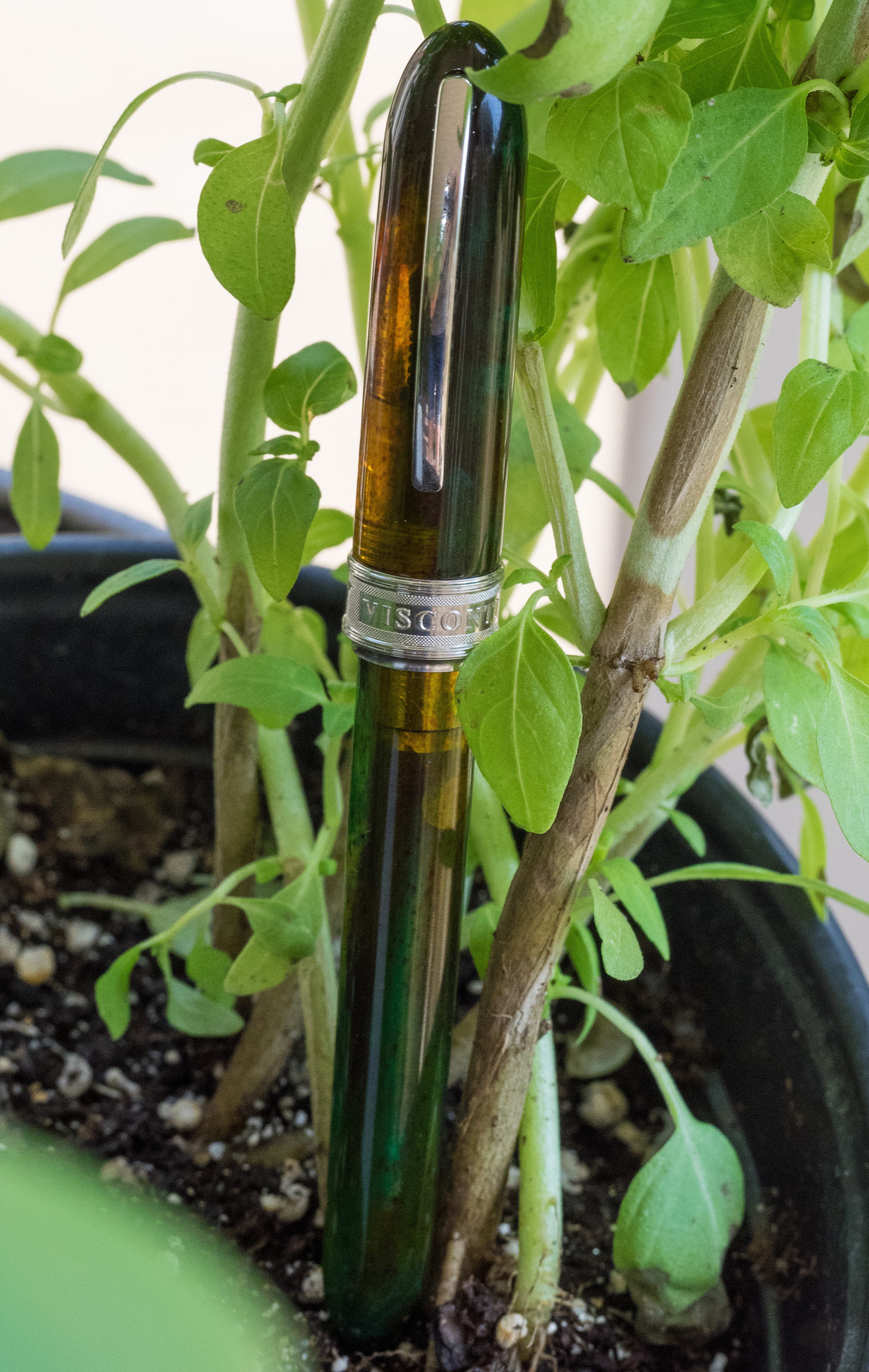
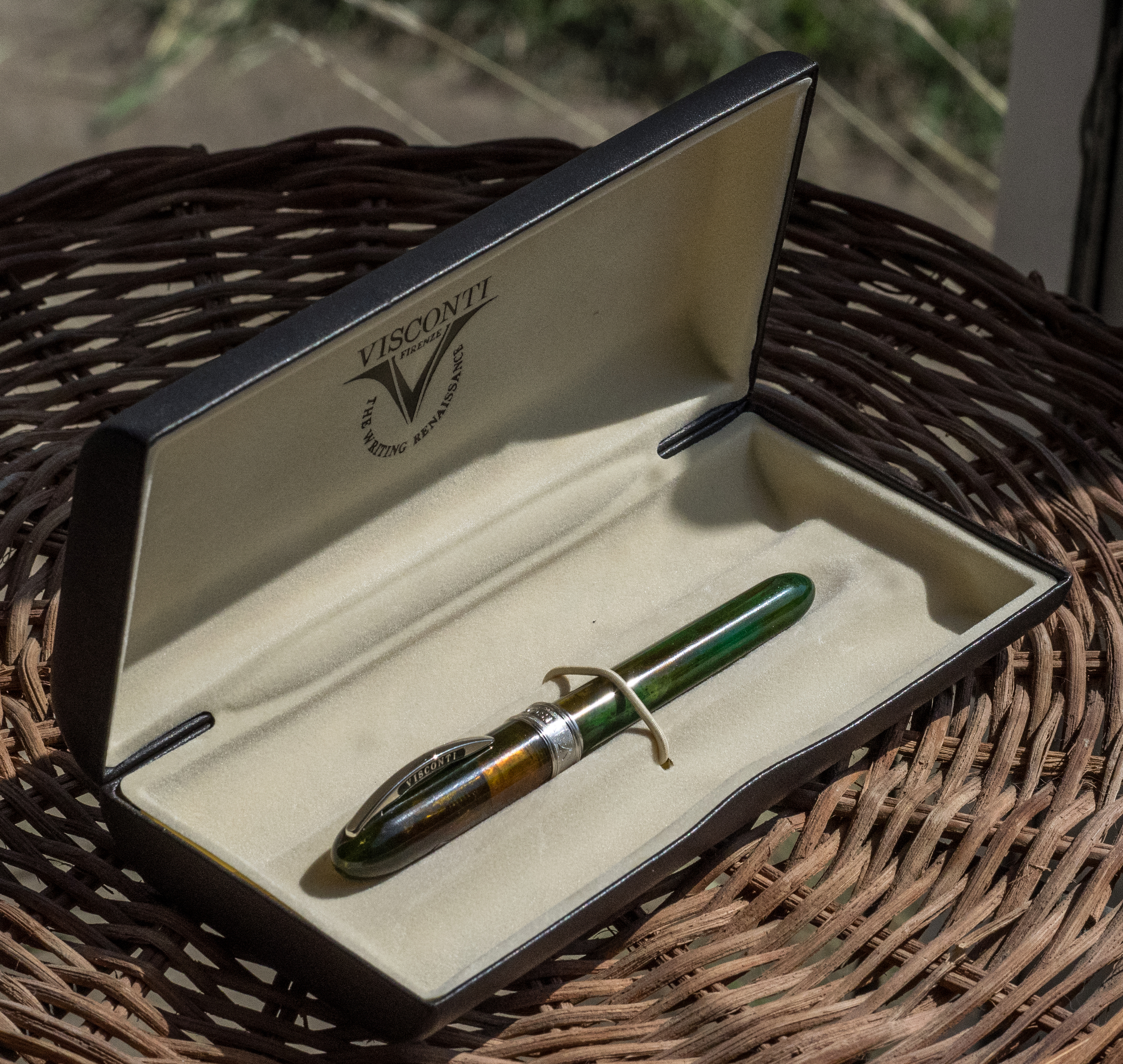
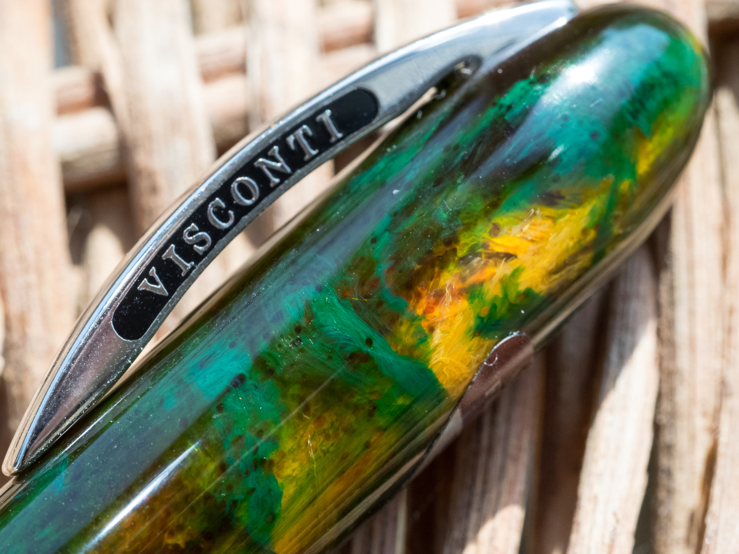
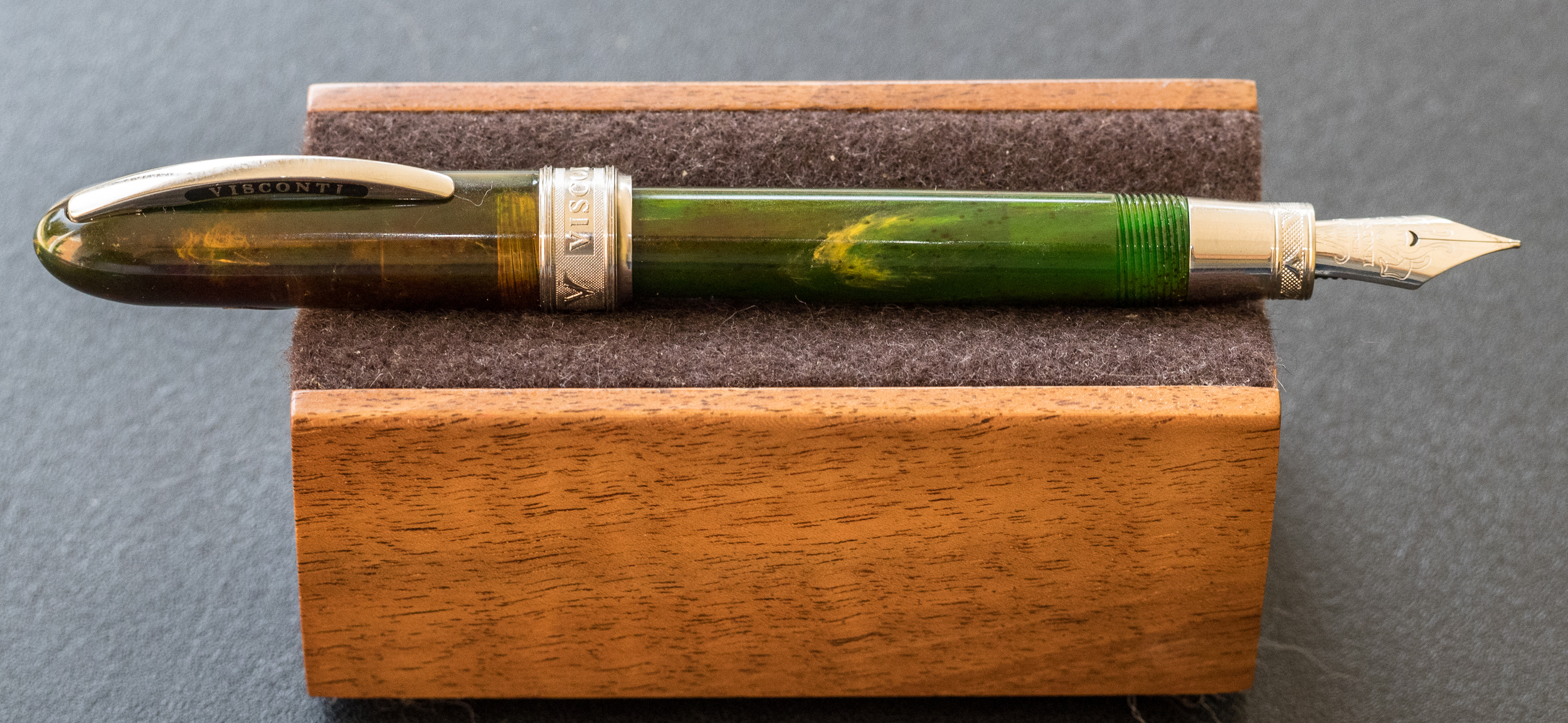
The Amethyst M205 is an amethyst demonstrator. Yeah, you can see the innards of the pen, but the amethyst resin is fairly dark, so you mostly notice the color of the pen instead of the insides. To me, it has to be translucent to give the proper effect. Remember, the color is taken from the gem, which is also translucent. In my opinion, it looks great.

Pelikan M205 Amethyst vs Pearlette.jpg

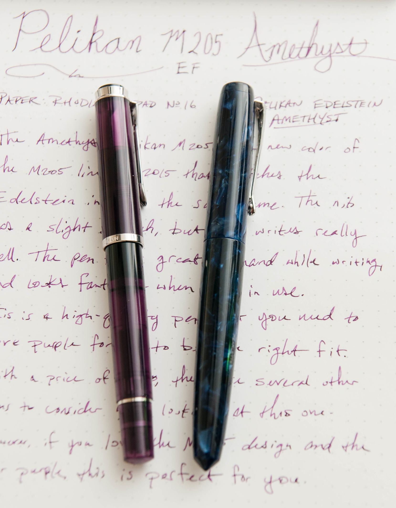
The pen is smaller than I expected. It's much smaller than a TWSBI or Lamy Safari. It's even smaller than a Pilot Metropolitan. The closest sized pen I own is the Edison Pearlette. It's nearly identical in size, which is fairly small. I'd say it's also similar in size to a Pilot Prera.

The Pelikan logo sits atop the cap of the pen and is hard to miss. Personally, I like the logo, so I really appreciate the emblem on top. It's classy — black and white — so I think it goes well with the pen. Then, the clip is another favorite feature of mine. It's strong and works well, but I think it's a great-looking clip. It has a nice swoop at the business end, and it's always really easy to clip the pen to a case, pocket, bag, etc.

The cap screws on and has a good quality feel. The pen can post, but I tend to use it unposted. The piston mechanism also feels really great.

The furniture/accents on this pen are silver, not gold.

The nib is fairly plain compared to other nibs. There's not much on it besides the Pelikan logo and nib size indicator. It's a long and skinny nib, which matches the pen's overall aesthetic.

Overall, I think it's a very handsome pen.

Writing

So, how does it write? It's mediocre. With my copy of the pen, it was a little scratchy at first. Some minor adjustments mostly cleared up the issue, but it's still not perfectly smooth. It's an EF nib, but it's still possible to achieve a glassy feel even in a nib of this size.

If you've owned a few pens in your day, you know that nib issues are fairly standard ground with most pens in this price range. Still, it's disheartening to spend $140 on a pen that doesn't write perfectly since that's the primary function.

Still, with the slight scratch, it writes well. There's never been a flow issue, it does fairly well after being unused for a day or two, and it feels great in the hand.

Overall

The Amethyst Pelikan M205 is a beautiful pen. It's a great size for a small pen, and it has some really nice features. If the color really grabs you, you'll love this pen. If the color isn't your thing, I think you could find something more enjoyable in the same price range. For example, for about $20 or $30 more, you could buy a Lamy 2000 or a Pilot Vanishing Point — both with gold nibs. The Pelikan has a steel nib, but it also features a design that is unique to Pelikan. So, if it calls to you, go for it! It's a timeless design that will never get old.

(Goldspot Pens provided this product at no charge to The Pen Addict for review purposes.)

Posted on October 21, 2015 and filed under Pelikan, Pen Reviews, Fountain Pens.

The Visconti Van Gogh Midi in Green Musk: A Review

(Susan M. Pigott is a fountain pen collector, pen and paperholic, photographer, and professor. You can find more from Susan on her blog Scribalishess.)

Goldspot Pens kindly loaned The Pen Addict a Visconti Van Gogh Midi in Green Musk to review. This fountain pen comes nicely packaged in a faux leather clamshell box.

The pen is made of Italian resin that is semi-transparent. I really like the musk green color with its swirls of yellow, orange, and brown. The resin is stunning and changes with the light.

Rhodium-plated adornments accent the pen. The clip has the usual Visconti name on each side, and it is fully functional.

The cap is encircled at the bottom with a thick band that is engraved with "Visconti" and "Van Gogh" along with decorative texture.

They chose a strange font for "Van Gogh;" it almost looks like Comic Sans.

The portion of the grip nearest the nib is metal with similar engraved patterns.

One strange design element appears on the back side of the cap: a screw. Apparently, you can tighten or loosen the screw to increase or decrease the clip's tension (for a tighter or looser hold). On an otherwise beautiful pen, the screw, though practical, seems an inelegant aberration.

The pen is described as a "midi," but I find it to be a tiny pen, only 4.375 inches in length unposted and 5.5 posted. For comfortable writing, this is one pen you will probably need to post.

The pen is also small in diameter, and the metal is slippery, making it difficult for my fingers to find purchase. I have to hold the pen tightly which eventually results in hand cramps.

The Van Gogh comes with a medium steel nib that writes smoothly–when it writes.

Unfortunately, the nib on my pen performed quite poorly, exhibiting numerous hard starts, skipping, and simply running out of ink. I guess this is a feed problem that might be remedied by tweaking the tines. But, since this isn't my pen, I didn't feel the freedom to manipulate the nib or feed to see if I could get a better flow.

The barrel unscrews to allow you to insert an ink cartridge. This pen does not accept a converter. So, if you decide to order the Van Gogh, be sure to order ink cartridges as well.

For people with small hands or those who want an elegant pocket or purse pen, the Van Gogh Midi is an excellent choice, if you can get it to write consistently. Had the nib not been disappointing, I would have bought this pen for myself. It's absolutely beautiful.

The Visconti Van Gogh retails at Goldspot Pens for $174.95, and you'll need to add the cost of cartridges since only one is provided with the pen ($6.90 for 7 cartridges).

Pros

  • The Van Gogh is an elegant, small pen with gorgeous resin colors.

  • The rhodium-plated accents complement the pen nicely.

  • The pen is light and can be comfortable for those who prefer thinner barrels.
  • When the pen writes, it writes smoothly. The medium steel nib will be a good size for many people, but apparently no other sizes are available, nor are gold nibs offered.
  • For those who like the convenience of cartridges over converters, this pen works well.

Cons

  • The pen seems pretty expensive considering that it is so small, has a steel (rather than gold) nib, and only takes cartridges.
  • I find a cartridge-only pen to be extremely limiting. I much prefer having the converter option so I can use my own bottled ink. Of course, you can refill cartridges with your own ink using a syringe if you wish.
  • I found the pen uncomfortable to write with because of its narrow diameter and slippery grip. But that's just me. Others might find this pen extremely comfortable.
  • Unfortunately, the nib on the loaner pen, though smooth, was fussy. It would not start without me priming it each time, even if I only paused for a moment while writing. In addition it skipped and sometimes stopped writing entirely. I suspect a little widening of the tines might fix this issue, but a pen priced over $100 should come with a nib that just works.

Thank you to Goldspot Pens for loaning me this pen for review.

Posted on October 16, 2015 and filed under Fountain Pens, Pen Reviews, Visconti.

Sailor Pro Gear Regency Stripe Review

I don’t normally buy blingy pens, but when I do, it’s the Sailor Pro Gear Regency Stripe.

I first saw this pen at the 2013 Atlanta Pen Show. Mike Masuyama, who rarely sells pens, had this one sitting on his table. I picked it up, becasue, well, it’s gorgeous, and loved the feel of it. It was my first pen show, and there weren’t many Sailor’s available to purchase, so I asked Mike the price.

“$400.”

I put the pen right back down. Not today, but not forgotten.

I didn’t even know what the name of this particular Sailor pen was, but the design was distinctive and stuck with me. It was shiny, yes, but in a sublte way. And it had a nice heft to it, unlike the Pro Gear Slim (aka Sapporo), which was the extent of my Sailor experience up to that point.

Fast forward to May of this year. I was scrolling through the Fountain Pen Network Classifieds (bad idea for your wallet!) and ran across a Sailor pen I had seen before. And it had a name: The Sailor Pro Gear Regency Stripe. It looked to be in great shape, the price was fair ($350), and I had it on the way nearly as quickly as I found it. I wasn’t passing it up for the second time.

The standout feature of the Regency Stripe is the rhodium stripe and barley corn pattern that adorns the barrel. It is as stunning to look at as it is to hold. There is some weight to it as I mentioned earlier, but it’s not too much. It gives it that “just right” feel when writing with it.

Mine came with a broad nib, which wouldn’t have been my first choice, but I never have an issue getting the pen I want and worrying about the nib later. The broad was ok as-is, but I shipped it off to my friend Dan Smith at The Nibsmith to give it a little cursive italic love to fit my writing style better. Dan delivered a sharp, juicy nib that is a pleasure to write with.

Would I have purchased this pen without the opportunity to have held it in Atlanta several years ago? I think the odds are very low that I would have. That’s a lot of money to shell out sight unseen. This is why pen shows are great. You learn more than you buy, and that is valuable when it comes to making purchasing decisions in the future. This was a decision I was very happy with, and I’m not the only one.

Posted on October 5, 2015 and filed under Pen Reviews, Fountain Pens, Sailor.