Posts filed under Ink Reviews

Platinum Classic Ink Lavender Black Review

January 2017: I need to slow down on buying inks.

March 2017: I bought all six colors of the new Platinum Classic Inks.

Sometimes the planets line up perfectly, and they did for me with Platinum Classic Ink. Unique colors? Check. Iron Gall? Check. Japanese? Check. Overall coolness factor? Check.

This is everything I personally want to see in an ink, so I bought them all. Luckily, that was only six bottles, and my friend Dan Smith from the Nibsmith had them all at the 2017 Arkansas Pen Show. When I told him I wanted one of each he said “Really?” Yes, really.

Let me get this out of the way right up front: Iron gall inks are not for everybody. If you are not able to monitor the ink in your pens and have good pen hygiene, you should not buy iron gall inks. There is a possibility that some damage could occur to your pens, such as staining the barrel or feed.

That said, if you are as particular as I am and pay attention to these types of things, you will be rewarded with unique inks and performance characteristics that you won’t find just anywhere. I trust Platinum to not do anything crazy, but the jury is still out on the long term ramifications of using these inks.

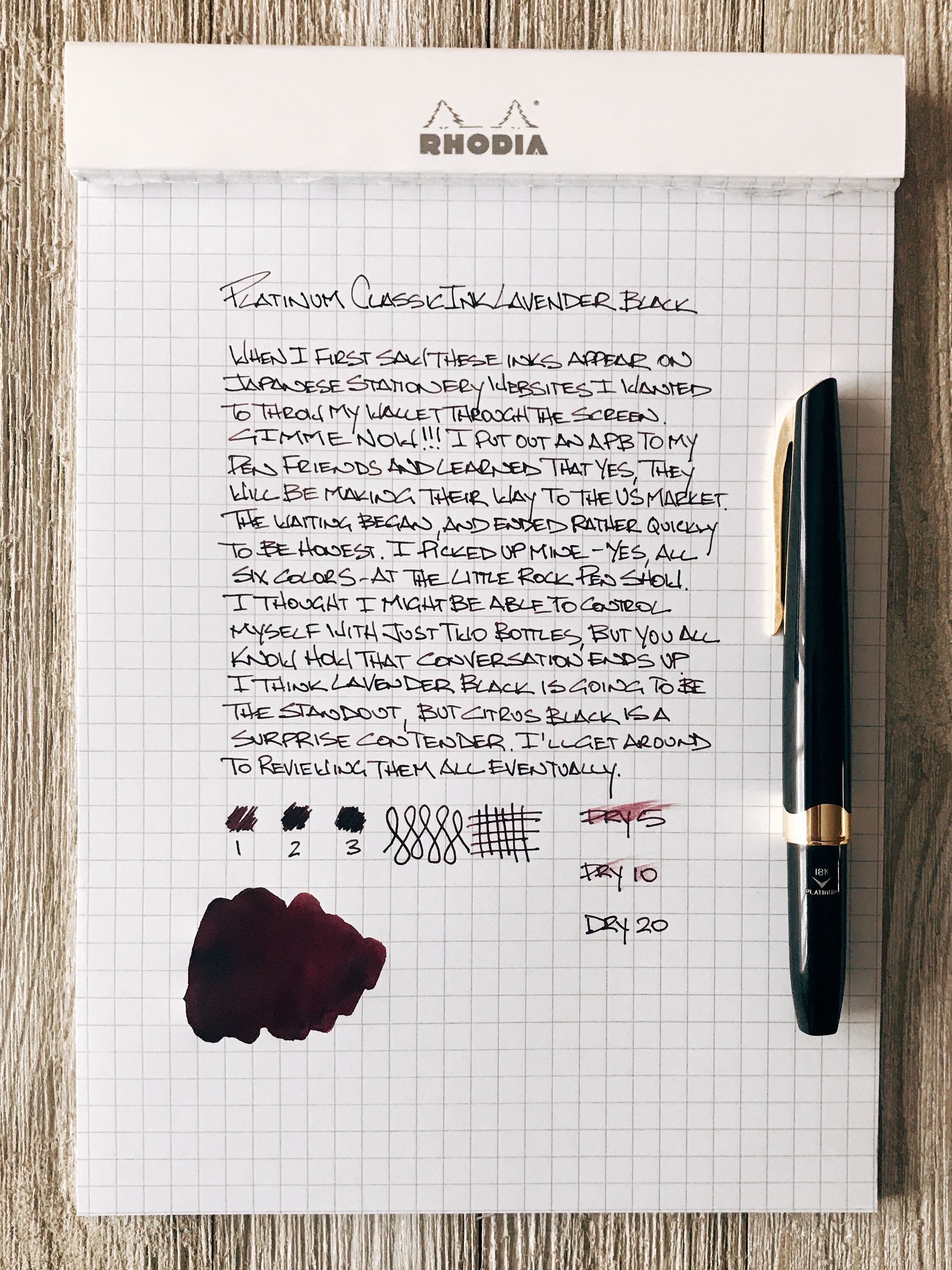
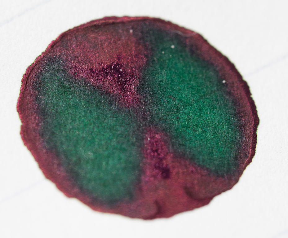
From the Classic Ink lineup, I see two colors getting the most hype: Lavender Black and Citrus Black. The first, because it is a traditionally awesome color that can’t often be found in fountain pen ink, and the second because you rarely see a company try a brighter iron gall ink. KWZ is the only one I can think of offhand.

Wet swab

With Lavender Black, the ink goes down on the page like the skin color of a red grape. There is a brightness to it while still having great depth of color. As it oxidizes, it darkens into more of a dark plum skin color that looks fantastic on the page.

Five minutes later

The ink is wet too, not dry like some iron gall inks I use. The flow from my fine nib Platinum PKB-2000 is exceptional. The color transition happens quickly, too. The shade changes as soon as the ink begins to dry, and then is near its final state within minutes. It dries very fast as well, even on Rhodia paper.

I’m enamored, if you couldn’t tell. But again, this is a product that fits me perfectly. Will it fit you and your preferences as well as it does mine? Only you can answer that, but do your homework and don’t rush into it.


Enjoy reading The Pen Addict? Then consider becoming a member to receive additional weekly content, giveaways, and discounts in The Pen Addict shop. Plus, you support me and the site directly, which I am very grateful for.

Membership starts at just $5/month, with a discounted annual option available. To find out more about membership click here and join us!

Posted on April 3, 2017 and filed under Platinum, Ink Reviews.

Monteverde Yosemite Green Ink: A Review

(Susan M. Pigott is a fountain pen collector, pen and paperholic, photographer, and professor. You can find more from Susan on her blog Scribalishess.)

Monteverde USA recently introduced a whole new line of ink colors, all with their ITF (Ink Treatment Formula) technology. I chose several colors to review, the first of which is Yosemite Green.

The 30ml bottle comes in a clear, flexible plastic box that includes a card explaining the ITF technology in their ink. It states that the ink improves ink flow, extends time with the cap off, lubricates the feed system, and improves dry time.

I tested the ink in my vintage Visconti Manhattan with a medium nib. My ink tests revealed that the ink is a yellow-green with a slightly bluish tint. The ink is wet and flows quite nicely in my medium nib. The ink is not waterproof and exhibits no odor.

I honestly did not notice any difference in ink flow or lubrication with this ink as opposed to other inks I use regularly. It also seemed to have dry times comparable with other inks, such as Robert Oster. I don’t leave my caps off when I’m not writing, especially on my older pens, so I did not test the claim that the ink allows extended time with the cap off.

Chromatography shows that the ink has strong yellow, green, and blue shades in it.

The blue offsets the yellow for a rather unique shade. I compared Yosemite Green with my other green inks and none of them was a match.

The ink exhibits a gorgeous maroon sheen in ink splats.

And the same sheen and good shading comes out nicely in broad nibs. And, at least on Tomoe River Paper, I noticed some sheen even with my medium nib (not pictured).

I honestly didn’t know what to expect with Monteverde inks, but I’m impressed with Yosemite Green. It’s a really nice green with hints of blue and it works well in both narrow and wide nibs, though broader nibs bring out the shading and sheen more.

You can purchase Monteverde inks from JetPens for $8.00 (30 ml bottle).

(JetPens provided this product at no charge to The Pen Addict for review purposes.)

Posted on March 17, 2017 and filed under Monteverde, Ink Reviews.

Monteverde Scotch Brown Ink Review

(Jeff Abbott is a regular contributor at The Pen Addict. You can find more from Jeff online at Draft Evolution and Twitter.)

Brown inks are certainly a rich and deep well of the fountain pen ink options out there today, but I've never really done more than dip my toes in this color. Who wants to use brown ink, right? Well, it's not as bad as it sounds. I've tried a couple, and I've always been pleasantly surprised after using them. Browns can be beautiful, so don't judge them by their name.

I've always had good experiences with my Monteverde pens and gel/roller ball refills, but I've never actually tried any of their many fountain pen inks. When Brad sent over a bottle of Scotch Brown, I was excited to try it out and see how well it performed. Also, I had to see how closely it resembled they whisky color.

Upon opening the clear plastic box that the bottle is packaged in, I noticed some info printed on the back side of the color card that promoted Monteverde ITF technology. Interesting, right? Well, ITF stands for "Ink Treatment Formula," and it really just means that the ink is formulated to flow well, resist drying in the nib, and lubricating the feed. With other inks, this normally isn't advertised as a trademarked ink technology, so it struck me as a bit odd. Despite that, this ink definitely gets a good score in my "does it behave well?" system.

Scotch Brown is a medium brown ink that looks darker than most scotches I've seen. Still, it's a warm, pleasant color that looks great on the page. It's light enough that you can easily tell that you're using a brown ink. In some cases, I can even detect a hint of a green-gold sheen. If you want something more business friendly, you might want to look for a black-brown.

Given the medium hue, that provides opportunities to shade and vary depending on how ink is distributed on the page. I'm happy to report that this ink does a great job of shading from light to medium brown. In certain areas where the ink pools, it takes on a coffee or milk chocolate color, while the lighter areas remind me of rich caramel or whisky. It's a delicious color, but I can't say that I've tasted the ink.

So, how does the Ink Treatment Formula perform? Well, it behaves nicely in the pens I've tried. Ink flow is exactly what I expect, and it has no issue keeping up with fast writing. Dry time is in the unimpressive (but still good) range of about 15-20 seconds. It also does a good job of keeping the ink from drying on the nib when the pen is left uncapped for a couple of minutes. Even when it does dry, it easily starts up again after a couple of squiggles.

Show-through isn't terrible for a medium to dark color. The ink doesn't soak through the page, creating dark impressions on the back page. I've also been unable to detect any signs of feathering on the premium (Rhodia, Apica, Leuchtturm) papers I've tried with it. Overall, a solid performer.

In my book, this is a well-behaved ink, with or without the fancy technology to back it up. It easily ranks with Diamine as far as behavior goes, and that's a compliment. Once again, I'm being drawn in by a brown ink, and it's surprised me again. I'm not sure I'm predisposed against browns, but it's something I aim to cure. This Scotch Brown is a delicious color, and it's working well to change my perceptions. I'll also be delving deeper into the Monteverde line of inks. This Emerald Green is calling my name.

The pricing for Monteverde inks isn't bad, either. Monteverde Scotch Brown is available at JetPens as a 30ml bottle for $8.00, and the big brother 90ml bottle is only $16.00. For those of you following along at home, that's 3 times the ink for only twice the price. I'd recommend trying an ink before buying that much of it, though.

(JetPens provided this product at no charge to The Pen Addict for review purposes.)


Enjoy reading The Pen Addict? Then consider becoming a member to receive additional weekly content, giveaways, and discounts in The Pen Addict shop. Plus, you support me and the site directly, which I am very grateful for.

Membership starts at just $5/month, with a discounted annual option available. To find out more about membership click here and join us!

Posted on March 15, 2017 and filed under Monteverde, Ink Reviews.