Posts filed under Ink Reviews

De Atramentis Black Edition Green Ink Review

(Jeff Abbott is a regular contributor at The Pen Addict. You can find more from Jeff online at Draft Evolution and Twitter.)

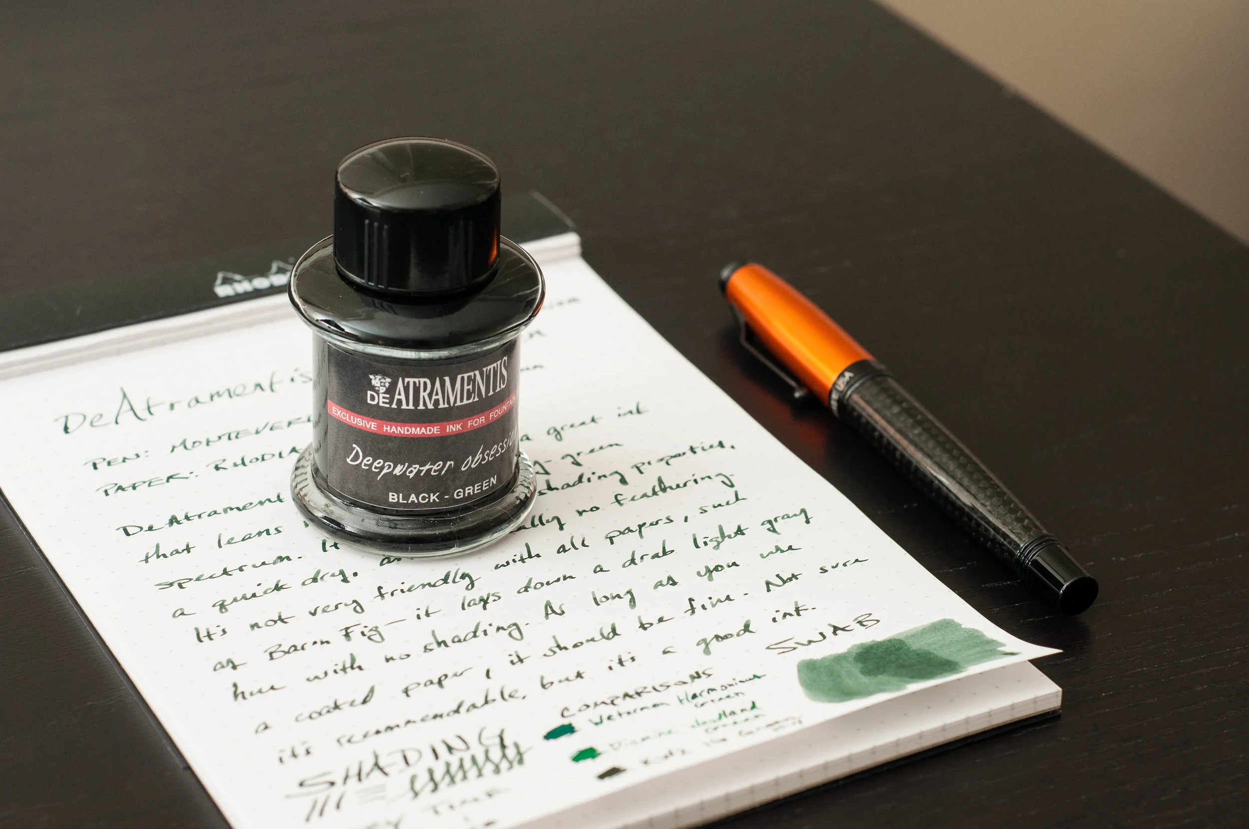
De Atramentis, the German ink company comprised of Dr. Franz-Josef Jansen, is an ink brand that I'm getting more accustomed with. As I try more of their inks, I've found a lot that I like, as well as things I don't care for. In the case of Black Edition Green, I came away a bit disappointed with the color and behavior of the ink. But, as they say, you can't win them all.

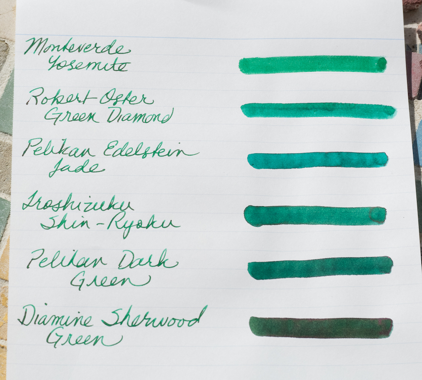
From looking at the name of the ink, I was expecting a rich, deep ink that had hints of green hidden away under a black shroud. Instead, the ink looks like a medium gray-green. It's not a bad color, I just don't think the name matches up with the actual ink color. The green is definitely there, but the black is pretty light. It's an interesting color, for sure, but not what I was expecting.

The next thing I noticed about the ink was how quickly it soaks into the paper when writing. In the 1.1 mm Monteverde stub nib, it felt a bit dry, but some papers soaked up the ink like a sponge, while others behaved normally. This probably has something to do with the coatings on different papers. For example, the ink did great on Rhodia and Clairefontaine, but looked terrible on Baron Fig paper. On the latter, the ink had zero shading and a bland gray-green hue that didn't look very attractive. Overall, the saturation of this ink is on the low side.

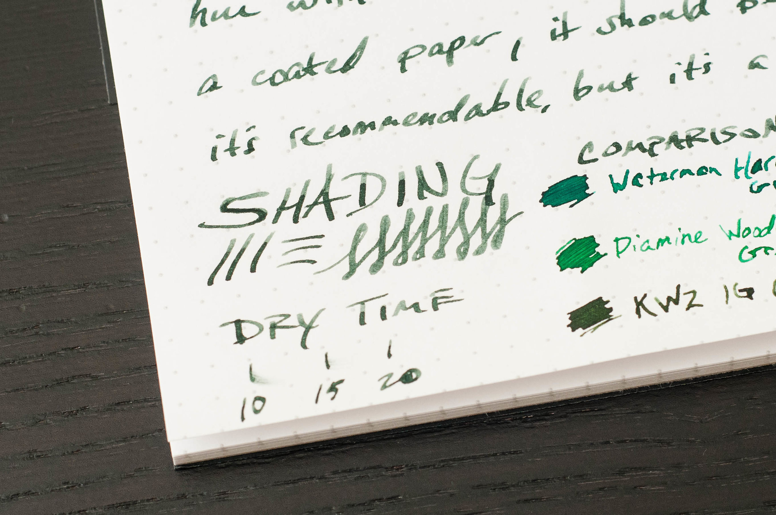
On the plus side, there's a fair amount of shading if you're using the right paper. It shades between a dark green and a lighter gray-green, but it's not dramatic. It's business friendly, especially in finer nibs.

Dry time is somewhere in the 15-second range, depending on the nib and paper. This is fairly standard and positive as far as drying times go for most inks.

I didn't detect any amount of feathering in my testing, with only minimal cases on cheap copy paper. It does an excellent job in that department. Show-through was also minimal, which is pretty impressive for a darker and somewhat wet ink like this one.

Like I mentioned before, I'm not sure what to make of the lubrication qualities in this ink. The pens I've tested with this ink do fine, but they feel slightly less smooth. And, there's the tendency for the ink to soak in on uncoated papers, which is something you need to keep in mind if that's primarily what you use. If I used Baron Fig exclusively with this ink, I would be disappointed. This isn't a knock on Baron Fig — most of my inks perform great on their paper. This has something to do with the formula of this particular ink.

When it comes down to it, it's difficult to recommend De Atramentis Black Edition Green. Dark greens are plentiful, and I can think of 5 inks from memory I'd rather use than this one, let alone if I went ink shopping. Given the price of the De Atramentis inks (about $15 per 35ml bottle), I'd suggest looking at some of the options that Diamine offers as a start. After that, most ink brands have a dark green or gray-green that looks great and performs well.

(JetPens provided this product at no charge to The Pen Addict for review purposes.)


Enjoy reading The Pen Addict? Then consider becoming a member to receive additional weekly content, giveaways, and discounts in The Pen Addict shop. Plus, you support me and the site directly, which I am very grateful for.

Membership starts at just $5/month, with a discounted annual option available. To find out more about membership click here and join us!

Posted on April 5, 2017 and filed under De Atrementis, Ink Reviews.

Platinum Classic Ink Lavender Black Review

January 2017: I need to slow down on buying inks.

March 2017: I bought all six colors of the new Platinum Classic Inks.

Sometimes the planets line up perfectly, and they did for me with Platinum Classic Ink. Unique colors? Check. Iron Gall? Check. Japanese? Check. Overall coolness factor? Check.

This is everything I personally want to see in an ink, so I bought them all. Luckily, that was only six bottles, and my friend Dan Smith from the Nibsmith had them all at the 2017 Arkansas Pen Show. When I told him I wanted one of each he said “Really?” Yes, really.

Let me get this out of the way right up front: Iron gall inks are not for everybody. If you are not able to monitor the ink in your pens and have good pen hygiene, you should not buy iron gall inks. There is a possibility that some damage could occur to your pens, such as staining the barrel or feed.

That said, if you are as particular as I am and pay attention to these types of things, you will be rewarded with unique inks and performance characteristics that you won’t find just anywhere. I trust Platinum to not do anything crazy, but the jury is still out on the long term ramifications of using these inks.

From the Classic Ink lineup, I see two colors getting the most hype: Lavender Black and Citrus Black. The first, because it is a traditionally awesome color that can’t often be found in fountain pen ink, and the second because you rarely see a company try a brighter iron gall ink. KWZ is the only one I can think of offhand.

Wet swab

With Lavender Black, the ink goes down on the page like the skin color of a red grape. There is a brightness to it while still having great depth of color. As it oxidizes, it darkens into more of a dark plum skin color that looks fantastic on the page.

Five minutes later

The ink is wet too, not dry like some iron gall inks I use. The flow from my fine nib Platinum PKB-2000 is exceptional. The color transition happens quickly, too. The shade changes as soon as the ink begins to dry, and then is near its final state within minutes. It dries very fast as well, even on Rhodia paper.

I’m enamored, if you couldn’t tell. But again, this is a product that fits me perfectly. Will it fit you and your preferences as well as it does mine? Only you can answer that, but do your homework and don’t rush into it.


Enjoy reading The Pen Addict? Then consider becoming a member to receive additional weekly content, giveaways, and discounts in The Pen Addict shop. Plus, you support me and the site directly, which I am very grateful for.

Membership starts at just $5/month, with a discounted annual option available. To find out more about membership click here and join us!

Posted on April 3, 2017 and filed under Platinum, Ink Reviews.

Monteverde Yosemite Green Ink: A Review

(Susan M. Pigott is a fountain pen collector, pen and paperholic, photographer, and professor. You can find more from Susan on her blog Scribalishess.)

Monteverde USA recently introduced a whole new line of ink colors, all with their ITF (Ink Treatment Formula) technology. I chose several colors to review, the first of which is Yosemite Green.

The 30ml bottle comes in a clear, flexible plastic box that includes a card explaining the ITF technology in their ink. It states that the ink improves ink flow, extends time with the cap off, lubricates the feed system, and improves dry time.

I tested the ink in my vintage Visconti Manhattan with a medium nib. My ink tests revealed that the ink is a yellow-green with a slightly bluish tint. The ink is wet and flows quite nicely in my medium nib. The ink is not waterproof and exhibits no odor.

I honestly did not notice any difference in ink flow or lubrication with this ink as opposed to other inks I use regularly. It also seemed to have dry times comparable with other inks, such as Robert Oster. I don’t leave my caps off when I’m not writing, especially on my older pens, so I did not test the claim that the ink allows extended time with the cap off.

Chromatography shows that the ink has strong yellow, green, and blue shades in it.

The blue offsets the yellow for a rather unique shade. I compared Yosemite Green with my other green inks and none of them was a match.

The ink exhibits a gorgeous maroon sheen in ink splats.

And the same sheen and good shading comes out nicely in broad nibs. And, at least on Tomoe River Paper, I noticed some sheen even with my medium nib (not pictured).

I honestly didn’t know what to expect with Monteverde inks, but I’m impressed with Yosemite Green. It’s a really nice green with hints of blue and it works well in both narrow and wide nibs, though broader nibs bring out the shading and sheen more.

You can purchase Monteverde inks from JetPens for $8.00 (30 ml bottle).

(JetPens provided this product at no charge to The Pen Addict for review purposes.)

Posted on March 17, 2017 and filed under Monteverde, Ink Reviews.