Posts filed under Ink Reviews

Lamy Crystal Agate Ink: A Review

(Susan M. Pigott is a fountain pen collector, pen and paperholic, photographer, and professor. You can find more from Susan on her blog Scribalishess.)

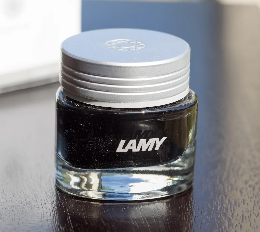
The Lamy Crystal Ink line is named after various gemstones and includes eight colors: Agate, Azurite, Beryl, Obsidian, Peridot, Rhodonite, Ruby, and Topaz.

Lamy Crystal inks come in beautiful triangular-shaped bottles with silver caps. The bottles are deep enough that you can get a good fill even with large nibs.

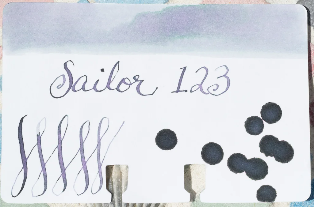
I tested Lamy Crystal Agate on Rhodia Dot paper using Lamy Vistas in various nib sizes. Agate is a gray color that leans toward the green side of gray (unfortunately, I couldn’t capture the green cast to the ink in my photos). It’s fairly light when using fine, medium, and even broad nibs though in swabs it ranges from medium to dark. It’s a dry ink, and it is not waterproof.

On a Col-o-dex card with a dip pen, the ink is much darker, though it does not have much, if any, shading and has absolutely no sheen.

Chromatography reveals a good amount of gray, some lavender, and a tiny hint of blue and yellow. However, despite these other colors, Lamy Agate is a rather flat gray.

In a super wide nib (Handwritmic Ruling Pen), the ink has some shading, especially where it pooled, but, again, no sheen.

I am unimpressed with Lamy Crystal Agate. It’s a bland gray with a hint of green. It lacks any characteristics that might set it apart, such as excellent shading, sheen, or color variations. I reviewed several gray inks here, and I recommend Papier Plume Oyster with its beautiful blue-grey tones and nice shading and Kobe #10 Mikage Grey with its deep purple-grey hue, excellent shading, and sheen.

If you want a basic gray ink and don’t mind the green cast, Lamy Crystal Agate is available for purchase from Vanness Pens $16.00 for a 30ml bottle (and, if you hurry, it’s currently on sale for $14.00).

(Vanness Pens provided this product at no charge to The Pen Addict for review purposes.)

Posted on July 26, 2019 and filed under Lamy, Ink Reviews.

3 Oysters Hwangto Ink Review

(Sarah Read is an author, editor, yarn artist, and pen/paper/ink addict. You can find more about her at her website and on Twitter. And check out her first novel, The Bone Weaver’s Orchard, now available where books are sold!)

I am really digging the lineup of 3 Oysters inks, and the lovely golden yellow of Hwangtowas high on my list to try. Their colors are inspired by the cityscape of Seoul and the bottles and boxes show beautiful Korean designs.

Hwangto means yellow soil, and it refers to the rich clay earth that is believed to purify sacred places and keep bad fortune away. It's a beautiful, saturated color. It's not too pale to read and it shows some gorgeous shading. Chromatography shows it's a pretty pure goldenrod color, with some darker orange added in. It pools in a lovely tangerine color.

The ink is water and dye based and is specially formulated to be pH neutral. It is very safe for pens. I didn't see any sign of sheen on either Clairefontaine paper or the swatch card. The ink does feel a bit dry, but actually has a longer dry time of around 25 seconds. I saw no bleeding or feathering on any fountain pen friendly paper I used. The ink is not water resistant, but my drip test didn't completely wash away the lines, even when the water was wiped away.

The 38 ml bottles are interesting. They're rectangular blown glass, but one back corner of the bottle is flat, so it can be balanced on that edge. This is supposedly to make it easier to get the last drops of ink out of the bottle, even when you need both hands to hold the pen. It makes me a little nervous, though. It isn't super stable balancing on one corner.

This color fits into a noble family of golden-apricot-tangerines. It shares some similarity with Diamine Autumn Oak and Noodler's Apache Sunset, but it's different enough from all the others that you can easily justify adding it to the collection.

(JetPens provided this product at no charge to The Pen Addict for review purposes.)


Enjoy reading The Pen Addict? Then consider becoming a member to receive additional weekly content, giveaways, and discounts in The Pen Addict shop. Plus, you support me and the site directly, for which I am very grateful.

Membership starts at just $5/month, with a discounted annual option available. To find out more about membership click here and join us!

Posted on July 25, 2019 and filed under 3 Oysters, Ink Reviews.

Sailor Ink Studio 123: A Review

(Susan M. Pigott is a fountain pen collector, pen and paperholic, photographer, and professor. You can find more from Susan on her blog Scribalishess.)

Sometimes there’s an ink you see on the Internet in a review or on Instagram that you simply must have. It doesn’t matter if that ink is difficult to obtain or if it comes in a dinky 20ml bottle or if it’s expensive, or if you have to wait weeks for it to arrive from Japan--you buy it anyway. Sailor Ink Studio 123 is one of those inks.

I first saw 123 on Mountain of Ink’s review of Set 1 of Ink Studio inks. I was mesmerized by this strange and magical unicorn ink that shifts between gray, green, and purple depending on its mood.

Sailor Ink Studio is a collection of one hundred inks (out of 20,000 created!) that were blended by inkmeisters at Ink Studio events. Each number represents a unique blending code (source: Sakura Fountain Pen Gallery).

I purchased my 20ml bottle of 123 from an eBay seller who stocks the collection (although you’ll discover that 123 is often out of stock). I paid $21.49 for the bottle (including shipping). It took about two weeks to arrive.

Although the bottle is tiny, I am not disappointed with this ink. It really is unique and magical, but it isn’t necessarily the most practical color for writing since it can be very light and hard to read depending on the paper.

For my initial ink test, I used Rhodia paper and a TWSBI Eco with a 1.1mm stub. The ink shows up well on white paper and looks like a dusty purple with the stub nib. But, the swabs fluctuate between gray, green, and lavender. The ink is not waterproof, but it dries quickly.

Note: The ink is much more washed out in this photo than in person.

In my Lamy Vistas (fine, medium, and broad) the ink looks more gray than lavender, but it sort of depends on the light and angle.

On my Col-o-dex card, the swab looks like a summer storm in Texas, complete with that green tint that promises hail. The ink shades beautifully, but it doesn’t have any sheen.

Chromatography reveals the complexity of this ink blend. I’ve never seen an ink separate out into so many different colors. This really is unicorn ink!

Sailor 123 shines in great, big, juicy nibs. Just look at that gorgeous shading and color shifting on MD Cotton paper:

The only time the ink fell short of expectations was (much to my surprise) on Tomoe River paper. I don’t know why, but the ink comes out as a super light lavender, and all that miraculous shading and color-shifting seems lost. Maybe it’s the cream color of the paper, I’m not sure, but I got the same results in my Kanso Sasshi booklet (picture below) and my Hippo Noto journal (both Tomoe River paper).

Regardless, I am in love with Sailor 123. It looks best on white paper with wide to super-wide nibs so you can see the color shifts. But, even in wet fine, medium, and broad nibs, it’s usable (though it looks more like a simple gray-lavender ink). This is also a terrific ink to use as a wash.

I ordered Sailor 442 as well, which is a darker color than 123. I’ll be reviewing it sometime soon. It’s certainly a more readable color than 123, but it doesn’t show the range of shades that 123 does.


Enjoy reading The Pen Addict? Then consider becoming a member to receive additional weekly content, giveaways, and discounts in The Pen Addict shop. Plus, you support me and the site directly, for which I am very grateful.

Membership starts at just $5/month, with a discounted annual option available. To find out more about membership click here and join us!

Posted on July 12, 2019 and filed under Sailor, Ink Reviews.