Posts filed under Notebook Reviews

Leuchtturm1917 Limited Edition Hardcover Pocket Notebook Review

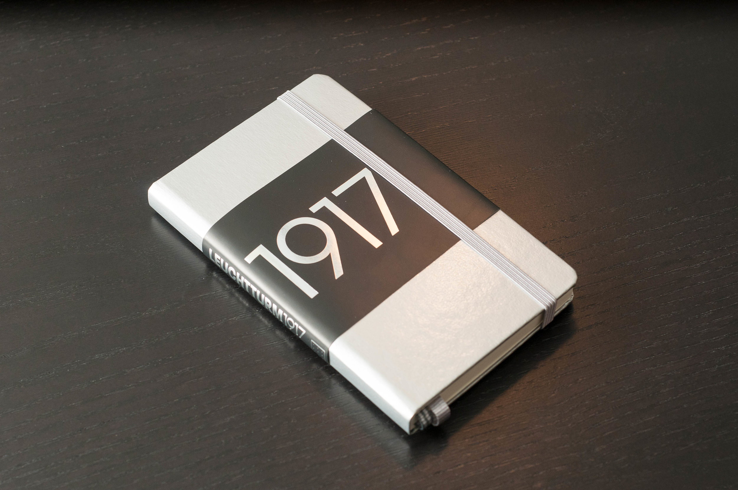
The Leuchtturm1917 limited edition hardcover notebooks are almost exactly like their standard counterparts, but they have just enough extra pizzazz to make it worth the extra couple of bucks. Having been a Leuchtturm fan and customer for many years, I didn't think much about the shiny new colors this year, which mark the company's 100th anniversary, but having one in hand changed my opinion.

If you've never owned a Leuchtturm notebook, you should consider changing that. They're not ground-breaking in any sense, but they just work well and look great at the same time. Want something that looks like a Moleskine but performs well? Leuchtturm is one of the many high-quality options for this category, and the shiny limited edition notebooks take this a step further.

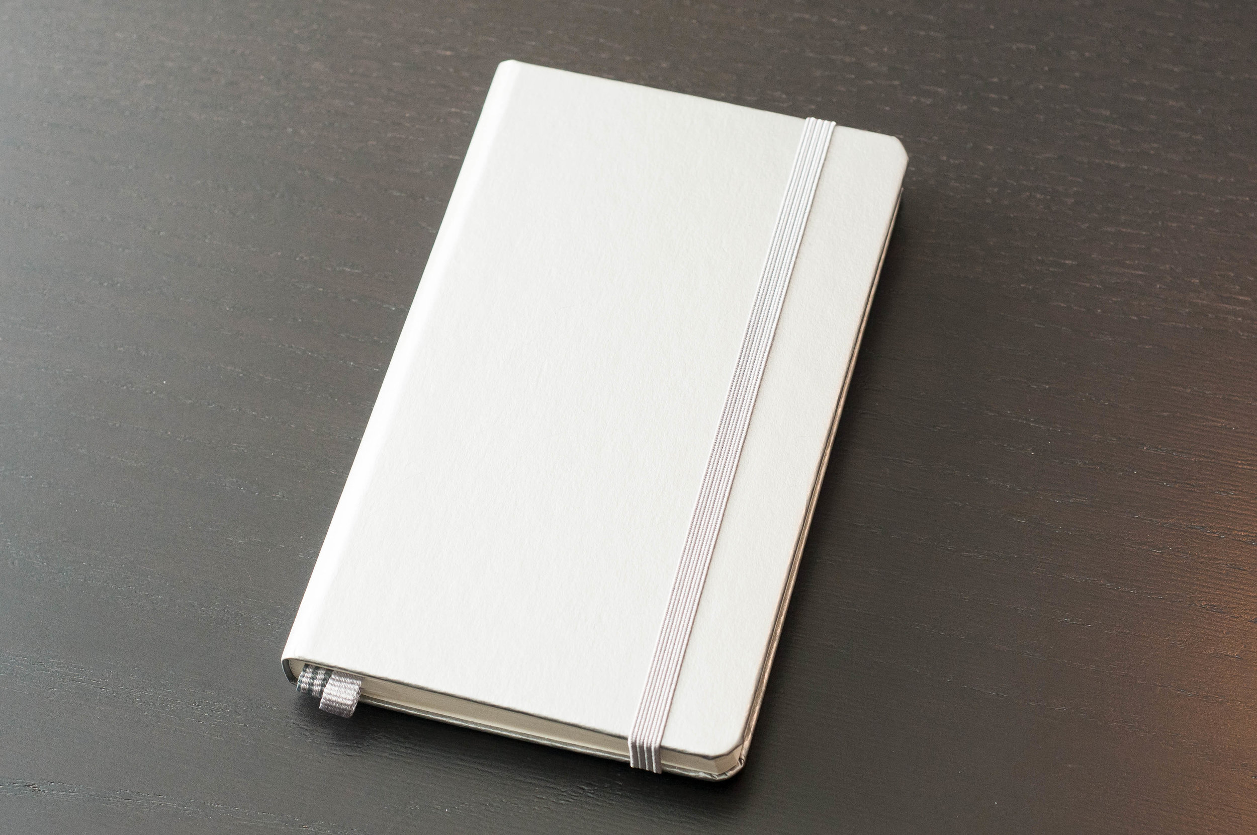
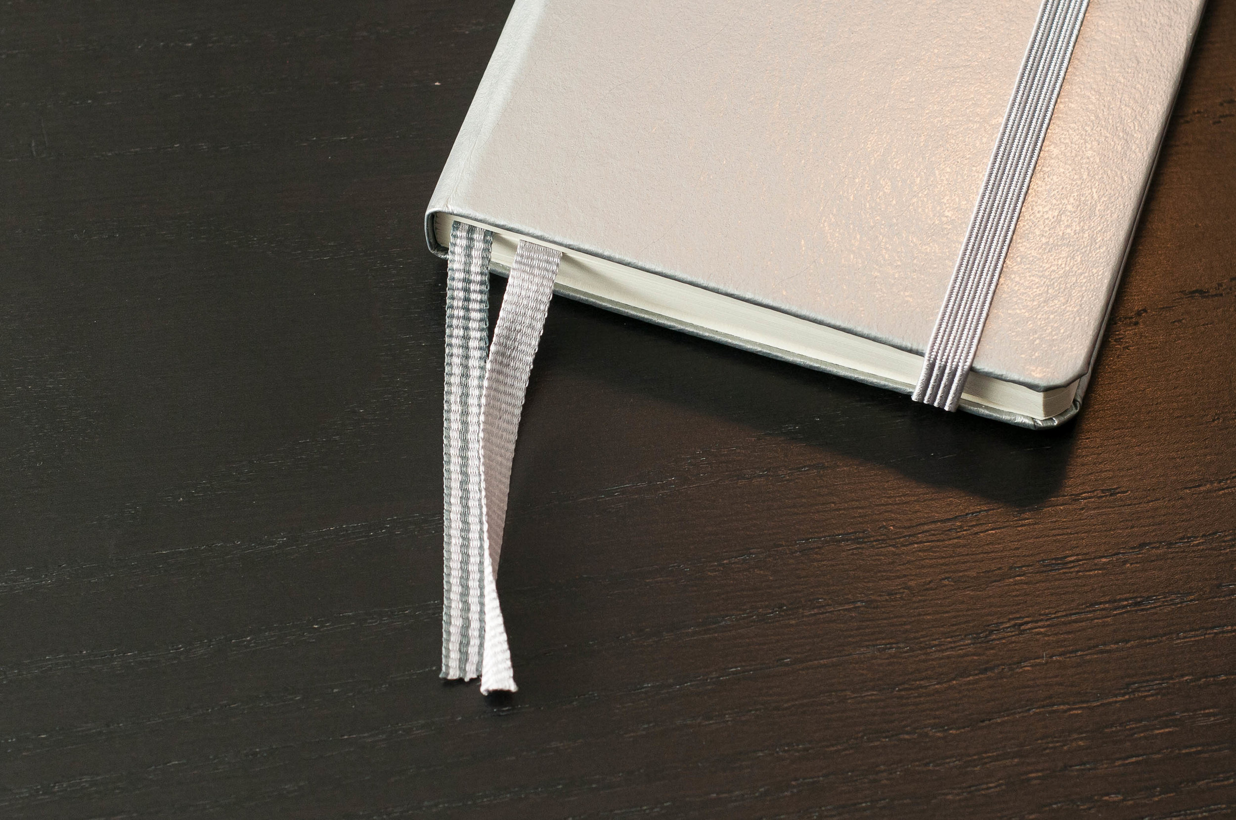
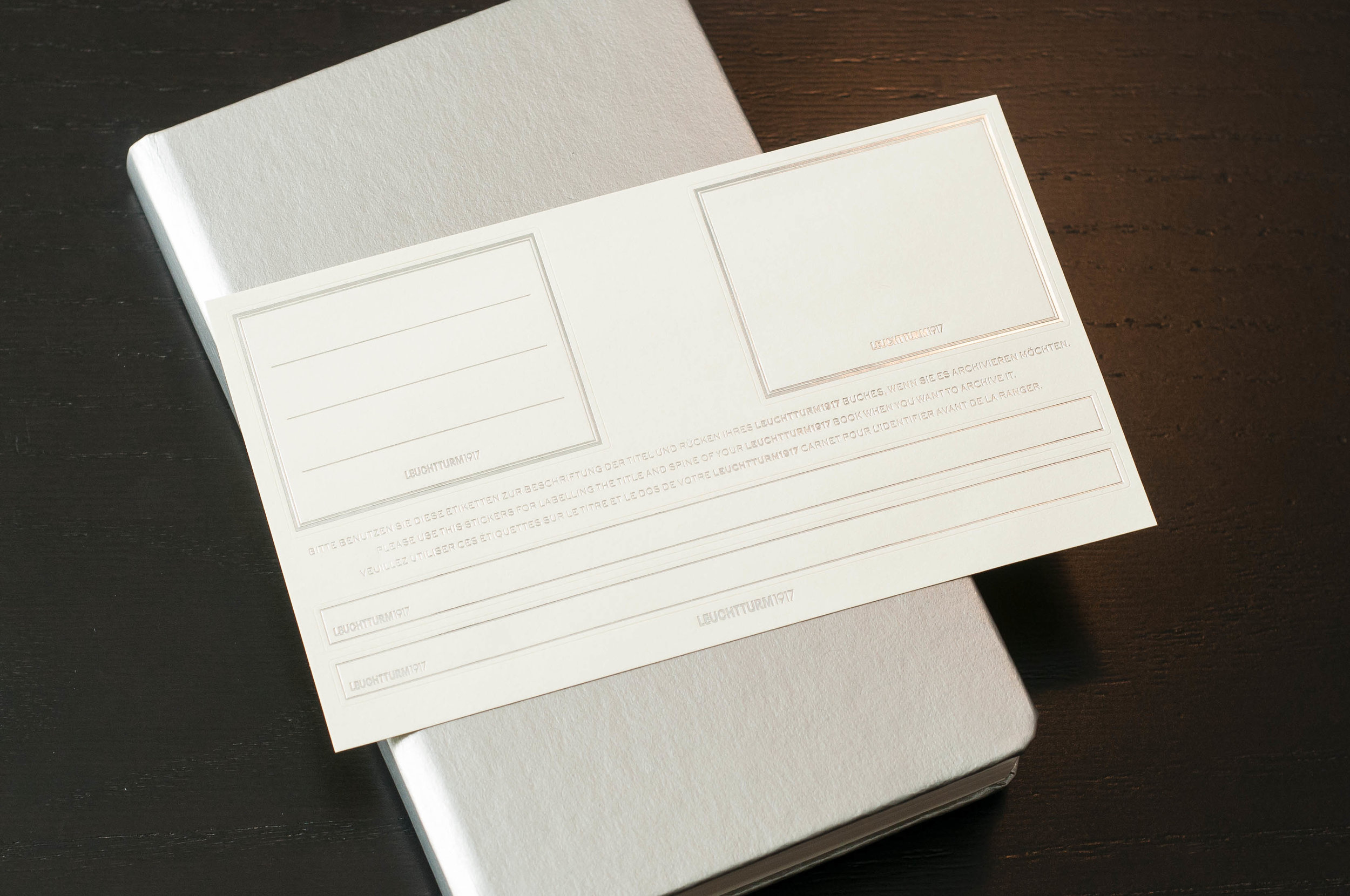
The silver version I have is shiny, smooth, and almost white in direct light. The banding and bookmarks are a matching light gray that work well with the overall color scheme. Color-coordinated banding to match the cover color is nothing new for Leuchtturm, but I'm glad to see that the gray works well with the shiny silver. They even went the extra mile and added silver accents to the included sticker pack for labeling and archiving your notebook. It's small touches like these that make me happy to have one of the limited edition notebooks.

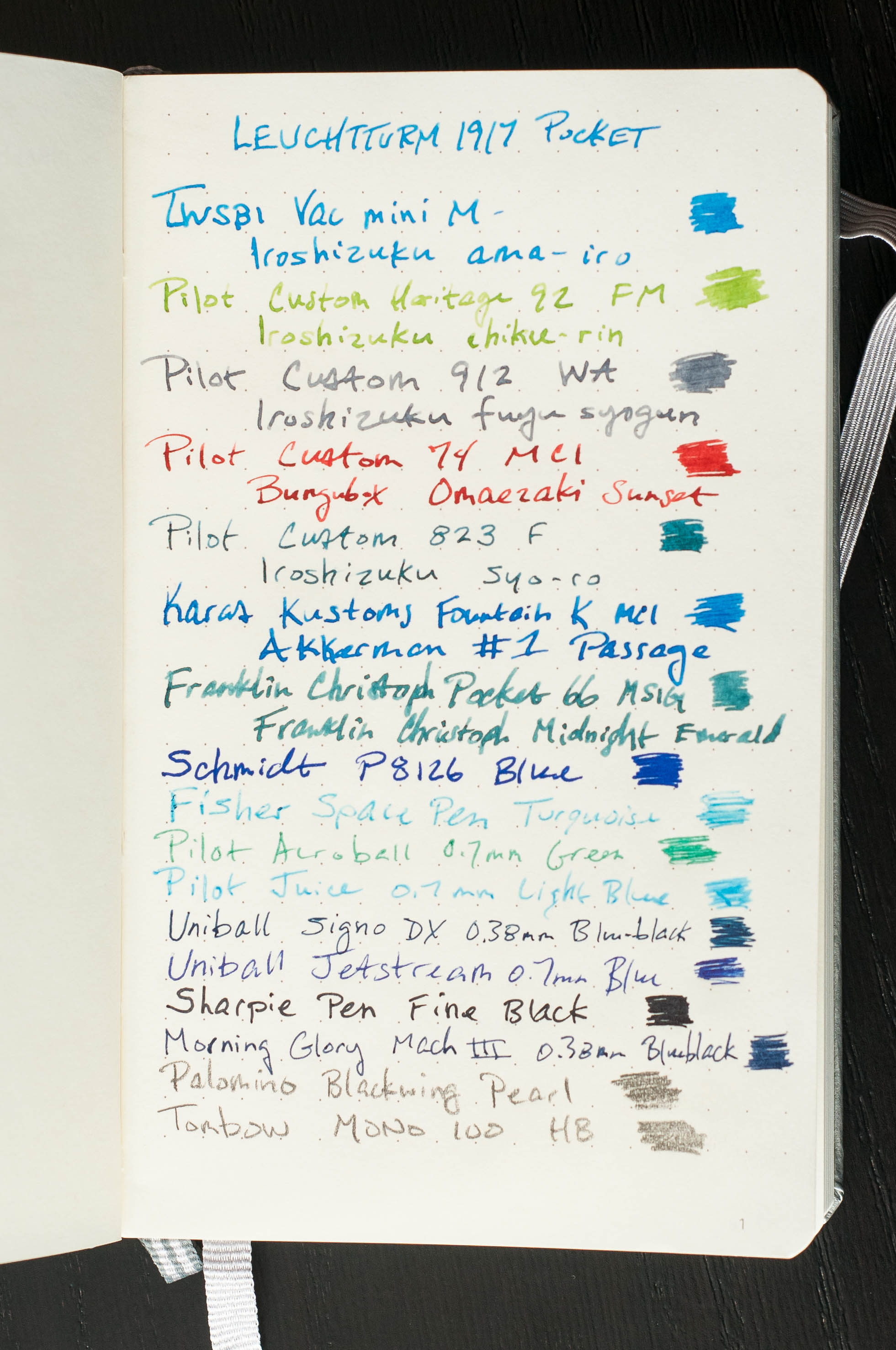
Once you make it to the inside of the notebook, everything is standard. For those who haven't had the pleasure of using a Leuchtturm notebook, the paper is a fantastic acid-free 80gsm with minimal coating, giving it a great feel and fast dry times for most inks. In my testing, you can almost always expect a small amount of show-through on the back of the page with most inks, but it doesn't make the back page unusable. The only ink I normally have trouble with in Leuchtturm paper is the Schmidt P8126 refill — the refill found in the Retro 51 Tornado. Apart from that, mileage will vary depending on the ink and nib combo, but it's reasonably well-behaved with most inks.

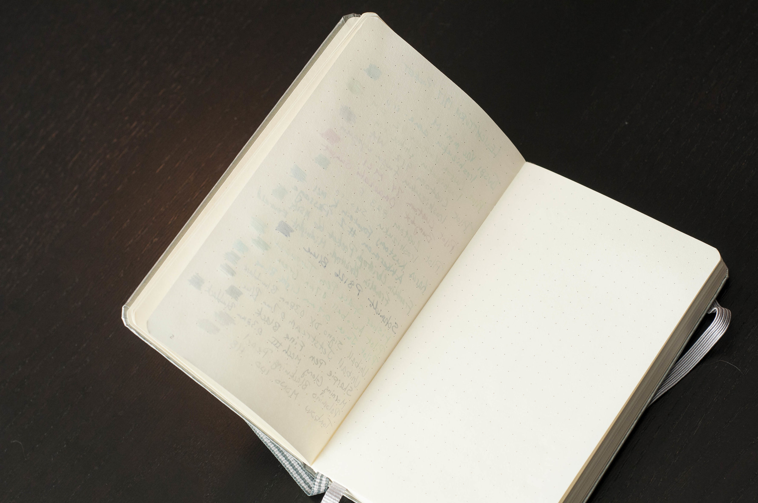
The dot-grid pattern on this paper is perfect — a medium gray dot spaced at about 5mm. Of course, all Leuchtturm books have numbered pages, and this one is no exception.

The notebook features two bookmarks — one is a solid light gray, and the other is a striped gray. This makes it easy to keep track of two different sections of your book. The closure band is also strong and secure, keeping your notebook closed securely when not in use.

Being a pocket notebook (A6), it can have trouble staying open and laying flat on its own. Once the spine is broken in a bit, it stays open easier, but it's always going to have trouble given the small size.

The only exterior branding is located on the lower back cover — a small embossed Leuchtturm1917 logo. There's not much branding on the interior — just the standard information page at the beginning of the book followed by a couple of "contents" pages so that you can organize the notebook into paginated sections for easy reference.

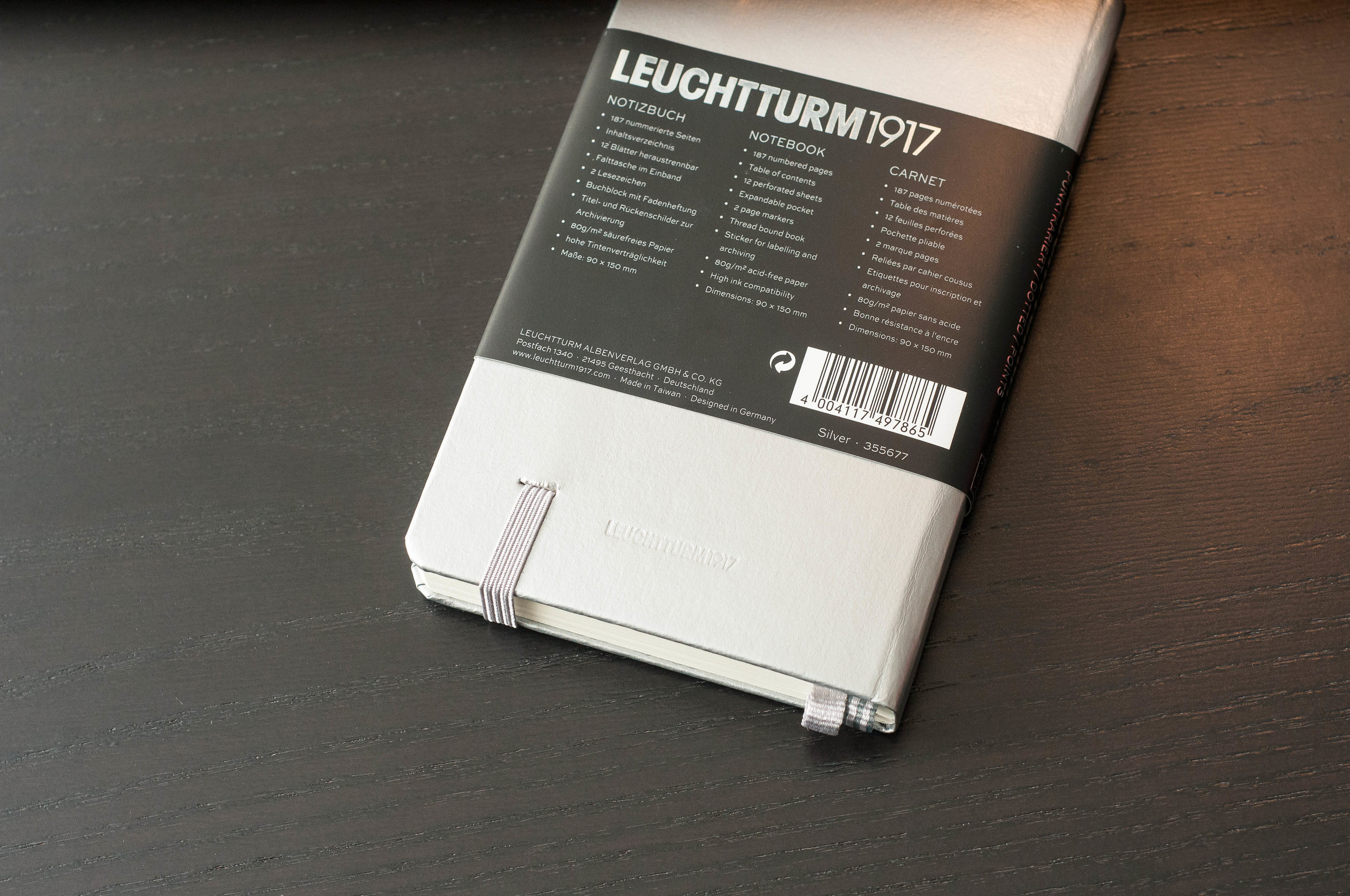
One thing to note is that any information, marketing, or literature is repeated in 3 languages: German, English, and French. It can be a bit distracting to see three versions of the same thing, but it's minimal since 99.9% of the notebook is blank. It's really only noticeable on the packaging.

There are 187 pages in the notebook, along with 12 perforated, detachable sheets in the back.

I've always enjoyed Leuchtturm notebooks, and this one is no exception. They've well-made, perform well, and are affordable. A perfect combination and value!

Along with silver, you can also find the limited edition notebooks in gold and copper in dotted, ruled, and plain style. Each notebook is just under $18, which is about $5 more than the regular colors. If you ask me, the extra money is worth the shiny pop of silver, gold, and copper on the cover, and a great way to support the 100 year anniversary of a beloved stationery company.

(JetPens provided this product at no charge to The Pen Addict for review purposes.)


Enjoy reading The Pen Addict? Then consider becoming a member to receive additional weekly content, giveaways, and discounts in The Pen Addict shop. Plus, you support me and the site directly, for which I am very grateful.

Membership starts at just $5/month, with a discounted annual option available. To find out more about membership click here and join us!

Posted on January 3, 2018 and filed under Leuchtturm, Notebook Reviews.

DesignWorks Standard Issue Notebook Review

(Sarah Read is an author, editor, yarn artist, and pen/paper/ink addict. You can find more about her at her website and on Twitter.)

This is the first time I've used a DesignWorks notebook, and the experience was a bit mixed. There are some features I love about it, and some that didn't work very well for me.

The DesignWorks Standard Issue Notebook is a hardcover, spiral-bound notebook. The spiral is twin-ring, brass colored and is only bound at the top and bottom third of the book. The rings are wide--about an inch in diameter. They're already starting to bend a bit after only light carry--so they're already beginning my primary pet peeve of ring-bound books. They also tend to snag at the cover or pages when I'm closing the book. Of course, the rings allow the book to lay flat or fold over on itself--so there are upsides, too.

The front cover has a pale green crosshatch pattern, the logo, and a sticker label. The sticker on mine is crooked, which drives me a bit crazy. There's also a list of the notebook's specs printed directly on the cardstock. It's useful information to have, but I don't particularly like having it printed on the front. At the upper right is a narrow elastic band that serves as a pen loop. This is one of the features I like. It's not quite stretchy enough to handle a very wide pen, but most will fit fine. One advantage to the wide rings is that you can hide another pen in there if you need to color-code on the go.

The back cover has another crooked sticker that repeats the notebook specs, and the company info. The inside front cover has room for all your contact info and a map of the time zones. The inside back cover has conversion charts. The notebook comes with a removable stencil ruler that has all the marks and icons you need for planning or bullet journaling. The stencil is definitely my favorite feature of the book. It's sturdy and handy, and I think I'll be using it long past when this notebook is full.

There are 192 lined pages that have the months and day numbers listed across the top. The left margin has a column for your bullet icons. The rest is pretty open form--it's not too restrictive of a layout, so it could be used as plain lined paper as well. The pages aren't perforated, so if you need to remove one, it will have the dreaded fuzzy edge.

When I first felt the paper, I thought it would probably be a pencil or ballpoint-only notebook. But the performance totally surprised me. There was light show-through, but no bleed-through for any fountain pen I tried with it. Huzzah! It showed shading nicely, too. The dry time was very long with wetter inks, though. Overall, I'm thrilled with its performance. It's also acid-free, which is always a plus.

When it comes down to it, I don't love the binding, cover, or attention to detail with this product. But the paper is lovely enough that I'm definitely going to check out some of their clothbound books. All their products seem more than fairly priced, especially for good paper. As tempting as the nice paper in this books is, I can't get past my pet peeves with the cover and binding. I'll probably hand this one on to the kids, and they will likely use it for nefarious planning. Except the stencil. I'm keeping that part.

(Vanness Pens provided this product at no charge to The Pen Addict for review purposes.)


Enjoy reading The Pen Addict? Then consider becoming a member to receive additional weekly content, giveaways, and discounts in The Pen Addict shop. Plus, you support me and the site directly, for which I am very grateful.

Membership starts at just $5/month, with a discounted annual option available. To find out more about membership click here and join us!

Posted on December 21, 2017 and filed under DesignWorks, Notebook Reviews.

Netto de Techo Kobo (Online Planner Bindery): A Customized Bound Planner Just for You

(Original Mai-Bun article published on 10/02/2017. Written by Makiko Fukushima. Translated by Bruce Eimon)

This is the time of the year when people start thinking about which datebook/planner to buy for the coming year. Despite all the different products out there, it is frustrating when you can’t quite find that perfect one for you. (There are literally hundreds of different kinds of planners sold in Japan. There is even an event called the 100 Planner General Election, where you get to try 100 different planners and vote for your favorite one!) If you are one of those picky planner users, why not make your very own for next year?

Making my own datebook? That’s gotta be hard, no? No worries, this September, a new service was launched: Netto de Techo Kobo (Online Datebook Bindery).

This is an online service that lets you design a 200 page perfect-bound planner and have it delivered right to your doorsteps. Most custom book binding services like this require a minimum order of 100 copies. What is revolutionary about this service is that it is specifically designed for producing single copies. Each order will put you back 5400 yen (approx. $45 USD).

Oh and by the way, this isn’t a service run by a bunch of twenty-somethings working out of their garage. This is a service offered by Canon IT Solutions, a subsidiary of the company known for producing high quality cameras and printers. It was the winning project of an internal innovation contest, entered by their very own stationery fanatic, Mr. Tadashi Ono.

All you have to do is create an account and follow the instructions. The sign-up and design steps can all be done for free. You can even print out watermarked sample pages at home. Once you confirm your order and enter your payment information, your planner will be delivered to you in 3 to 4 weeks.

The following is my experience of trying this service:

Adding my touch #1: I don’t use the monthly calendar pages.

I usually use a weekly left format (horizontal date pages on the left, note pages on the right), and hardly ever use the monthly calendar pages. Most planners have monthly calendar pages taking up two pages per month. I opted to condense these to a single page per month, covering two months per spread. The system offers a template for this, so the only thing I had to change was the font and the line color to suit my taste.

Adding my touch #2: I don’t want to miss any birthdays, including those of my pets.

The service supports the uploading of CSV files with personal birthdays and anniversaries, so you can easily have these very special dates show up in your monthly or weekly pages. This is super useful! I set it up so that they will show up in both. Not only did I upload the birthdays of my friends and family, but I also uploaded work related anniversaries and the birthdays of my two cats.

Adding my touch #3: I like a simple and clean aesthetic.

I’m a fan of the weekly horizontal format. In order to keep the design simple, I started with the weekly horizontal template and tweaked the fonts and the line colors. I chose gray lines, removed references to auspicious days (Rokuyou), and included only the date numbers. For the right pages, I kept them blank.

Adding my touch #4: I don’t want to wait until January 1.

One nice thing about this service is that you can have your planner start whenever you want it to. So rather than ordering it and having it collect dust for 3 months, I had it start from the projected delivery date in October! You don’t even have to have it span a whole year - you can design a 6 month planner, or even one that starts on your birthday!

Adding my touch #5: Making room for my Washi-tape collection.

Since I like to collect washi-tape, I designed a section to catalog my new acquisitions. I designed a format where I can paste both the tape and the labels. I specifically made sure there would be enough space for both the front and back labels. This is an example where I didn’t use one of the provided formats, but designed my very own format and uploaded it as a PDF file.

Adding my touch #6: For my list pages, I used pink lines.

I like the grid format in general, but I usually don’t like the color of the lines used in most notebooks. Since I get to use whatever color I want, I chose a faint pink line. I couldn’t be happier with how it turned out! It is awesome that I get to choose the colors of the font, the lines, and even the background for every single page.

Adding my touch #7: I made special pages for my two cats.

I uploaded pictures of my two beloved cats, Cookie and Anko, so that I could have pages specifically devoted to write down my favorite memories of them. The colors turned out really nice. I know there are a lot of people who like to paste pictures of their pets in their planners , but this way I don’t have to worry about the bulk from the pasted photographs. It is also a nice way to carry with you the pictures of your loved ones wherever you go.

This is a planner that gives you complete freedom with the format and the content. What I showed you was very specific to my likes and needs, and what you end up designing is going to be completely different from mine. How fun is that!?

Until now, a planner was something we had to choose from what was available at the stores. Yes, there are filofax-type planners where you can pick and choose your refills, but it was impossible to customize a perfect-bound planner to your liking. Of course, you would always have to write in all of your birthdays and anniversaries, and you were bound by the lines and space provided by the publishers.

Netto de Techo Kobo flipped all of these “norms” on its head. Why not make your one-and-only planner that fits you like a glove?

Recommended for:

  • People who aren’t quite happy with the planners available in stores.
  • People who have a meticulous attention to detail and know exactly what they want.
  • People who don’t want to be bothered by having to enter their birthdays and anniversaries into their planners every year. Information Netto de Techo Kobo | Canon IT Solutions
Posted on December 19, 2017 and filed under Planner Reviews, Notebook Reviews, Mai-Bun.