Posts filed under Pen Reviews

Zebra R-301 Review

Zebra R-301.jpg

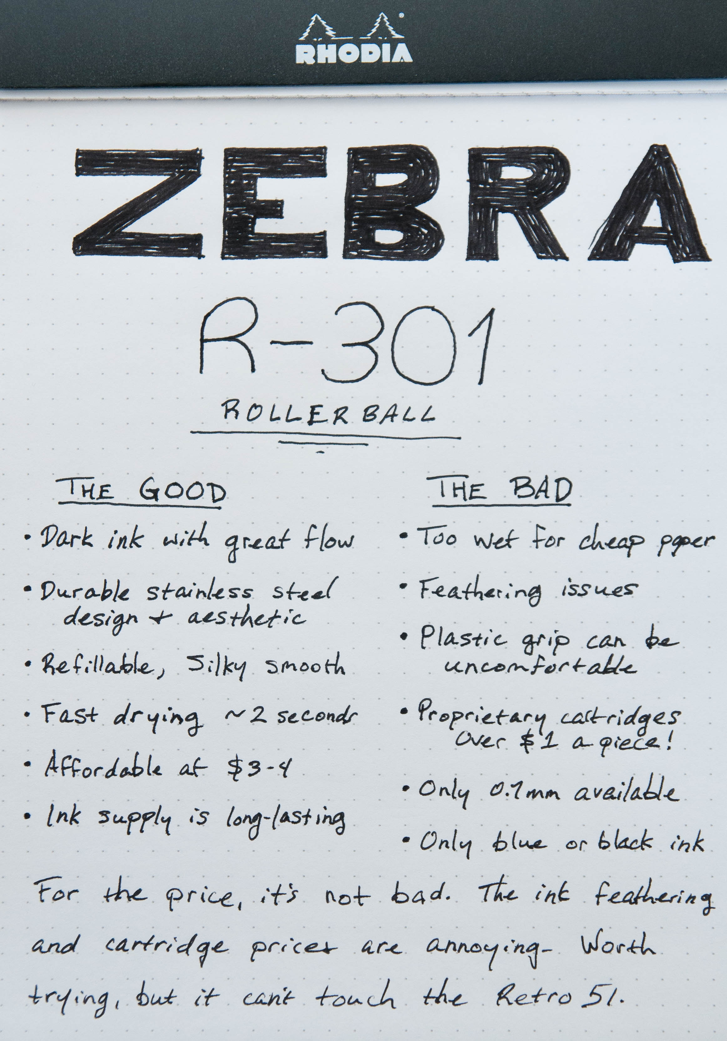
The Zebra R-301 is a metal (mostly) rollerball pen that didn't show up on my radar until I was idly browsing JetPens when I should have been working. I can't lie – this happens more than once a week. I haven't really been interested in rollerballs since I'm really happy with my Retro 51 Tornados, but I wouldn't refuse a new player with a nice design.

Now, the Zebra doesn't really compare to the Retro 51s in quality, but they're also around 15% of the price of a Retro 51. There's a lot to love about this pen, so let's jump in!

Zebra R-301 Open.jpg

Look and feel

The Zebra R-301 doesn't look like a cheap pen in my opinion. The stainless steel give it a great shine and feel. Unfortunately, the stainless steel only covers parts the barrel and cap. The grip section is made of a textured plastic that I imagine creates a great divide in opinion.

Upon first looking at the pen, I was displeased by the grip because its diameter is smaller than the body and cap. It just looks odd. But then I started writing and let that little detail go. I enjoy the grip, and if you're a fan of other Zebra pens that have a similar plastic textured grip, you'll probably like this one just fine. It's the kind of design that fosters a "love it or hate it" response.

The pen is fairly light, so long sessions aren't a problem. The cap secures tightly when the pen is closed, but it tends to wobble a bit when posted. Not a huge issue for me, but this will annoy others. If it were just a fraction of a millimeter tight, it would be perfect.

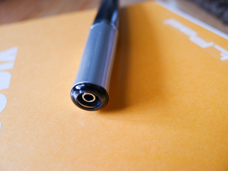
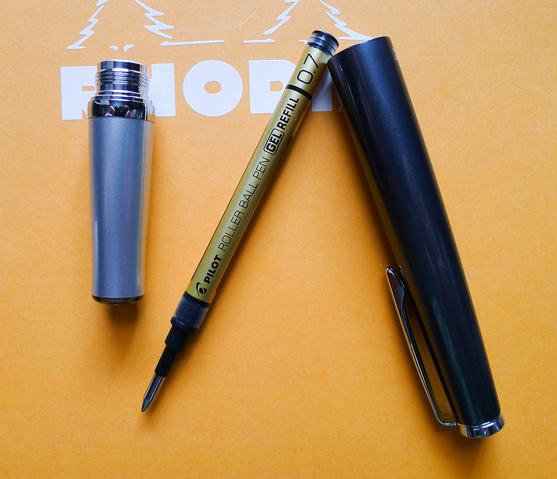
The cartridge on this pen is a good size. It's much longer and wider than an international short cartridge. It pops in with no trouble, and I was able to start writing in seconds.

Zebra R-301 Cartridge.jpg

Writing performance

Now, on to the important part. This pen feels amazing when writing. It glides across all sorts of paper like smooth glass on silk. It's on par with the Retro 51 Schmidt refill. The ink is very dark and bold – something that I love in a black ink.

That said, it's a very wet writer. Zebra claims it's a 0.7mm tip, but the wet ink lays down a wider line. There are absolutely no feed problems with this pen. Ink is always plentiful.

For being such a wet writer, it dries extremely quickly. I did a couple of tests and found that the ink would no longer smudge after 2 or 3 seconds. That's impressive!

On the downside, the ink seems to feather on every paper I tried. Rhodia, Clairefontaine, Apica, or cheap notebook paper – they all suffered from noticeable feathering.

Zebra Retro Kaweco.jpg

Things to note

There are a couple of things to note about the cartridges for this pen. For one, they're proprietary. I didn't look for very long, but I wasn't able to find any satisfactory replacements for this pen. I've thought about trying to refill the cartridge with a syringe, but I don't know if a fountain pen ink would work properly with this pen. Who knows? At this price, I wouldn't be upset if it ruined the pen.

Ah, the price. At JetPens, the Zebra R-301 is currently priced at $3.20. The pen comes with two cartridges. A set of two cartridges (no pen) is priced at $2.30. That's only a $0.90 difference. I guess the pen is worth a lot less than the cartridges. Personally, I wouldn't mind if they made the entire pen out of stainless steel and bumped the price up a bit. That would be an excellent EDC pen.

Overall

Despite the issues that I found with this pen, it's actually real joy to use. It's a great rollerball with great flow, bold ink, and durable body. And at this price, it's easy to try.

(You can find more from Jeff online at Draft Evolution, Twitter, and App.net.)

Zebra R-301 Review.jpg
Posted on March 12, 2014 and filed under Pen Reviews, Rollerball, Zebra.

Pilot Ageless Future Gel Ink Pen Review

The Pilot Ageless is a pen I have been fascinated with for years but was never sure how it would fit into my writing rotation. I was finally able to pick one up courtesy of JetPens and it is an interesting pen. Let's check it out!

The primary selling point of the Pilot Ageless is the barrel design, and specifically, the retractable mechanism. It features a double-twist deployment. Twist the section once and the nose cone appears. Twist again and the ink cartridge pops out and its ready to write. Reverse the twist and it retracts in the same two-stage process.

There are many things I like about this feature. First of all, it can be operated with just one hand. Rest the barrel in your palm, put the grip section between your index finger and thumb, and give it two little flicks to get writing or retract it for storage. The mechanism is smooth and flawless. Secondly, it is integrated seamlessly. There is no visible knock like with traditional retractable pens, and really no indication of how to deploy the nib if you aren't already aware. It is very well designed.

The barrel itself is made of metal and has a good weight to it. If you have a Retro 51 Tornado Laquers Edition it is close to that weight, maybe a touch lighter. It feels great and is well balanced when writing. When fully deployed it is a full length pen, too.

I have the Carbon Black Gray model with the 0.7 mm gel ink refill. It is ultra smooth and dark but I would prefer a finer refill alternative. I'll need to do some research because the refill is an interesting size to fit this pen. If you like 0.7 mm gel ink you will have no issues writing with this pen.

I compare the Pilot Ageless to the Zebra Sharbo X. It is a premium pen at a premium price, and for that reason it is not for everyone. For me personally, I love the design and if I can find an alternate refill I will use it a lot. If not, It will probably sit on my desk, look pretty, and be used sparingly.

(JetPens is an advertiser on The Pen Addict and I received this product at no charge.)

Pilot Ageless Review.jpg
Posted on March 7, 2014 and filed under Pilot, Pen Reviews, Ageless.

Pilot Plumix Review

Pilot Plumix.jpg

I've taken my first dip into the world of squared nibs, and I'm afraid I'll have to jump all the way in before long.

The Pilot Plumix with a medium italic nib is my first experience with an italic nib. From what I understand, the italic nib is different than a stub nib, but similar. I did a little research and found this article on Richard Binder's site that explains the difference. Italic nibs are squared off while stub nibs are rounded off a bit. This information will become relevant a little later in this review.

Pilot Plumix Open.jpg

Looks

The Plumix is made almost entirely of plastic, save the nib. Even though it's made of a cheap material, it doesn't feel cheap. The plastic is sturdy and has a gem-like appearance that makes it pleasing to look at in certain light.

The grip section has a triangular grip that resembles what you find on a Lamy Safari. In my use, I prefer the grip of the Safari over the Plumix. If it were up to me, I'd stick with a plain grip section. I'm sure Pilot representatives are listening and will change their entire design to please me. Right?

There's an interesting bulb further down the body of the pen, just past the grip section. The bulb faces down (opposite the top of the nib) and provides some support when writing by snugging up to the space where your thumb meets your hand. I thought the design was a little odd when I first saw the pen, but I have to admit I really like this feature. An added bonus of this bulb is that it keeps the pen from rolling. This is important since the pen has no clip.

The fact that there is no clip on this pen isn't a huge deal for me, but it does mean I don't want to take it out with me. Pilot did integrate some small tabs on the lid of the pen to keep it from rolling.

One of the strangest things about this pen is the cap. It's tiny. It's only long enough to cover the nib and screw onto the section. I've never seen a cap that's so small. Surprisingly, it posts to the end of the pen, but it's not sturdy enough for my taste. A slight bump will send it tottering across the desk.

Overall, the build of this pen is better than I expected for the price. It's actually quite pleasant to hold and use. The quirky design is endearing to me.

Pilot Plumix Nib.jpg

Writing experience

In my mind, this nib would create a large, dramatic line variation that would rival calligraphy nibs. In reality, a Japanese medium is not that wide to begin with. The nib lays down a line that's a bit thicker than a regular medium nib when drawing with the flat side of the nib square to the paper (the thick end). If you turn the nib sideways, it lays down a really fine line.

The nib is smooth and has no starting or skipping issues. It ran a bit on the dry side for me. I'm not sure if this is a common issue, but it did annoy me several times. On the other hand, it also forced me to slow down to get the adequate ink flow that I wanted. This was good practice and actually improved my handwriting.

The pen ships with a standard blue Pilot cartridge. I skipped that entirely and went with one of the bulb converters from one of my Metropolitans. I tried several inks in the pen, and found that they were all a bit dry. My only guess is that the feed might need an adjustment or that the wide nib is spreading the ink further. I'd love to know if anyone else has mentioned or noticed anything similar.

The italic nib caused some trouble for me. The squared off edges don't play nice with thin or cheap paper. This nib is definitely much happier with a nice, smooth paper. It's because of this nib that I'm convinced one of my next fountain pens will be a stub. I imagine a stub is better suited to everyday writing. I'll keep the Plumix around to help me improve my handwriting.

Pilot Plumix Comparison.jpg

Conclusion

Overall, this is an excellent deal for a quirky little pen that will open your eyes to a different world of nibs. And if you're already a member of this other nib world, it's still fun to try the nib and the shape of the pen.

The Plumix is available in purple, light blue, and black. When I purchased the pen, I was under the impression that purple was the only color. Bummer. That light blue looks awesome. But, it's fairly easy to swap the nib to a Metropolitan or a Prera body, so that opens up a lot of style options.

If you're in the mood for an affordable, quirky italic pen, try out the Plumix.

(You can find more from Jeff online at Draft Evolution, Twitter, and App.net.)

Pilot Plumix Sample.jpg
Posted on March 5, 2014 and filed under Fountain Pens, Pen Reviews, Pilot.