Kuretake Zig Cartoonist Mangaka Outline Pen Review

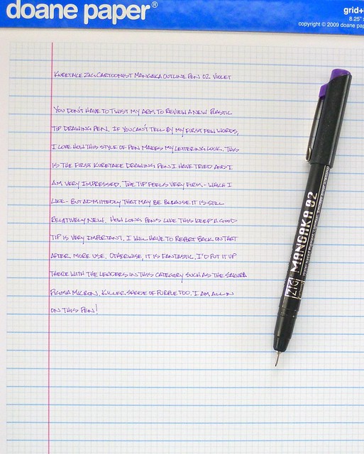
Kuretake Zig Cartoonist Mangaka Outline Pen 02 Violet

Well surprise, surprise, surprise.

Never one to pass up a new art pen, the Kuretake Zig Cartoonist Mangaka Outline Pen is the latest to hit my desk. I have tried many over the years - most are good, a few not so much - but even fewer are elite. The Sakura Pigma Micron comes to mind at the top of the list and it might now have company.

My test subject was the 02 Violet. Like many pens in this category, the barrel is no great shakes. The most important thing it can do is stay out of the way, and the Zig Cartoonist does just that. It is lightweight and comfortable, and even does a nice job in the grip area by not having any sharp edges like so many of its competitors.

Where this pen really shines is in the tip. It is very firm and performs exceptionally. My lines were tight and look great on the page. I haven’t put it through a true use durability test to see how it holds up over the long term but I am not seeing much breakdown in the tip so far. And have you noticed the color? I am a fan of purple inks, and this is one of the best I have seen.

So what’s next for me and the Kuretake Zig Cartoonist? I am going to try a few other colors and tip sizes and see if I can get a better gauge on its durability. Look out Micron - I’m coming for you!

Posted on June 22, 2012 and filed under Drawing Pen, Kuretake, Pen Reviews, Zig.

J. Herbin Vert Pre Fountain Pen Ink Cartridge Review

J. Herbin Vert Pre Ink Cartridges

If I am branching out into more fountain pen inks using cartridges still counts, right? I think so, especially if those cartridges are of the J. Herbin variety. These cartridges are the international short size, which are a perfect match for all of my favorite Kaweco pens. First on the docket for me is Vert Pre.

Being essentially an ink newbie, one of the terms I have not been able to use in previous reviews is shading. Shading, in my own layman’s translation, refers to the differentiation of color within the lines laid down on the page. Since I use mostly darker inks, I haven’t noticed much shading previously. But this Vert Pre - wow - this is what shading is all about!

I wasn’t sure how much I liked it at first in all honesty. I couldn’t focus on my writing for continually looking at the ink on the page. Once I took a step back and looked at the results though I loved it. The color variation even in single letters is something to behold. (Pro Tip: You can always click through my photos to their respective Flickr page to view them in their original size).

This is why branching out into different fountain pen inks is so much fun. I have learned something new by trying this ink out, and discovered how cool a non-traditional ink color can be.

Posted on June 20, 2012 and filed under Ink Review, J. Herbin.