4

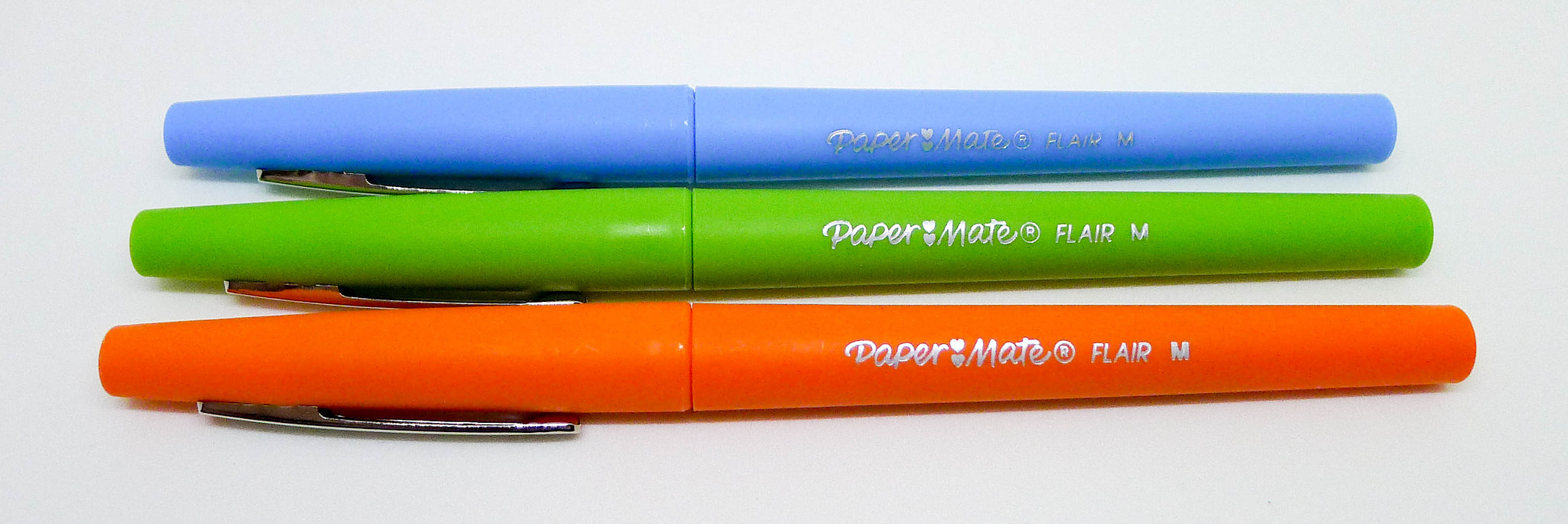
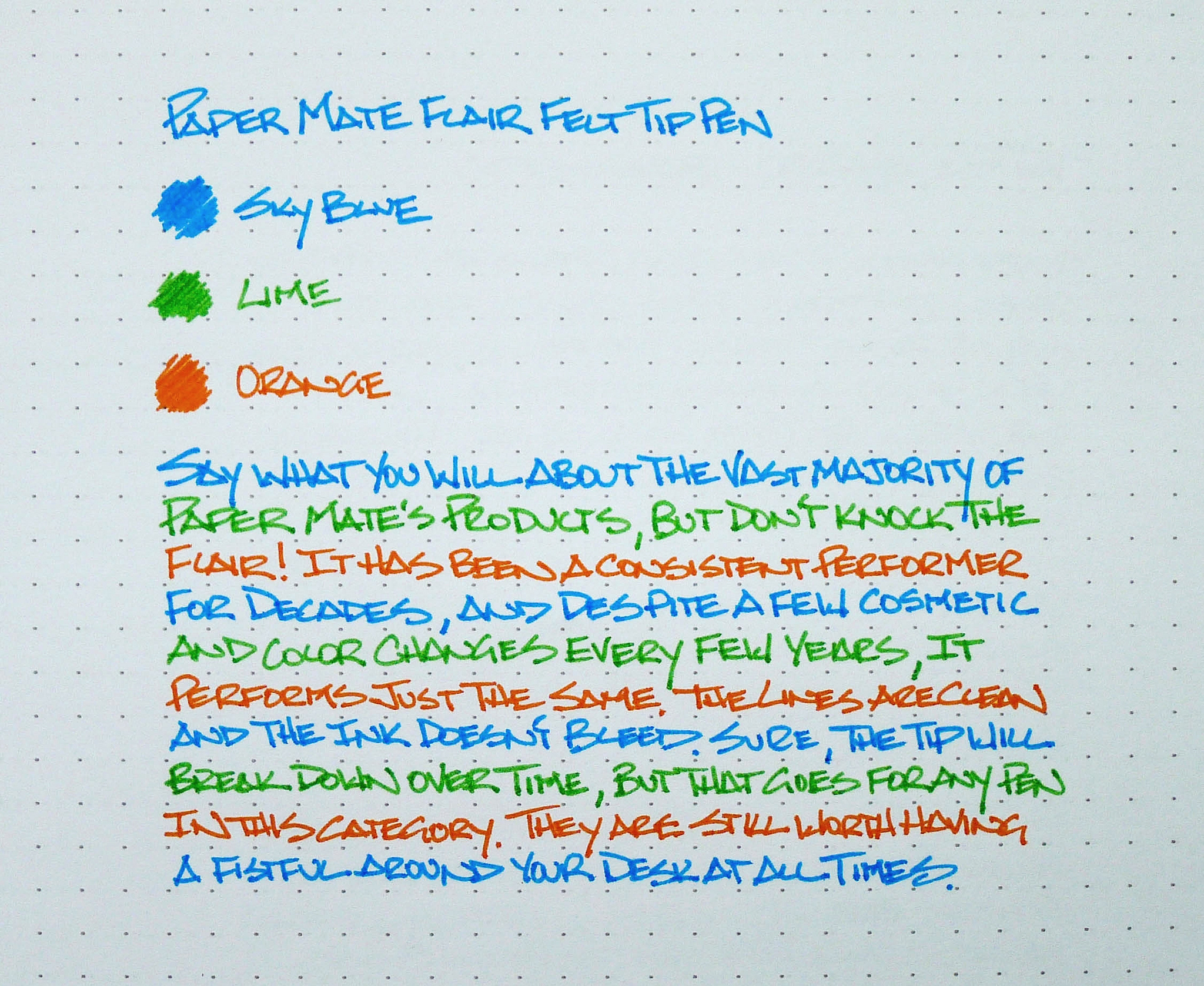
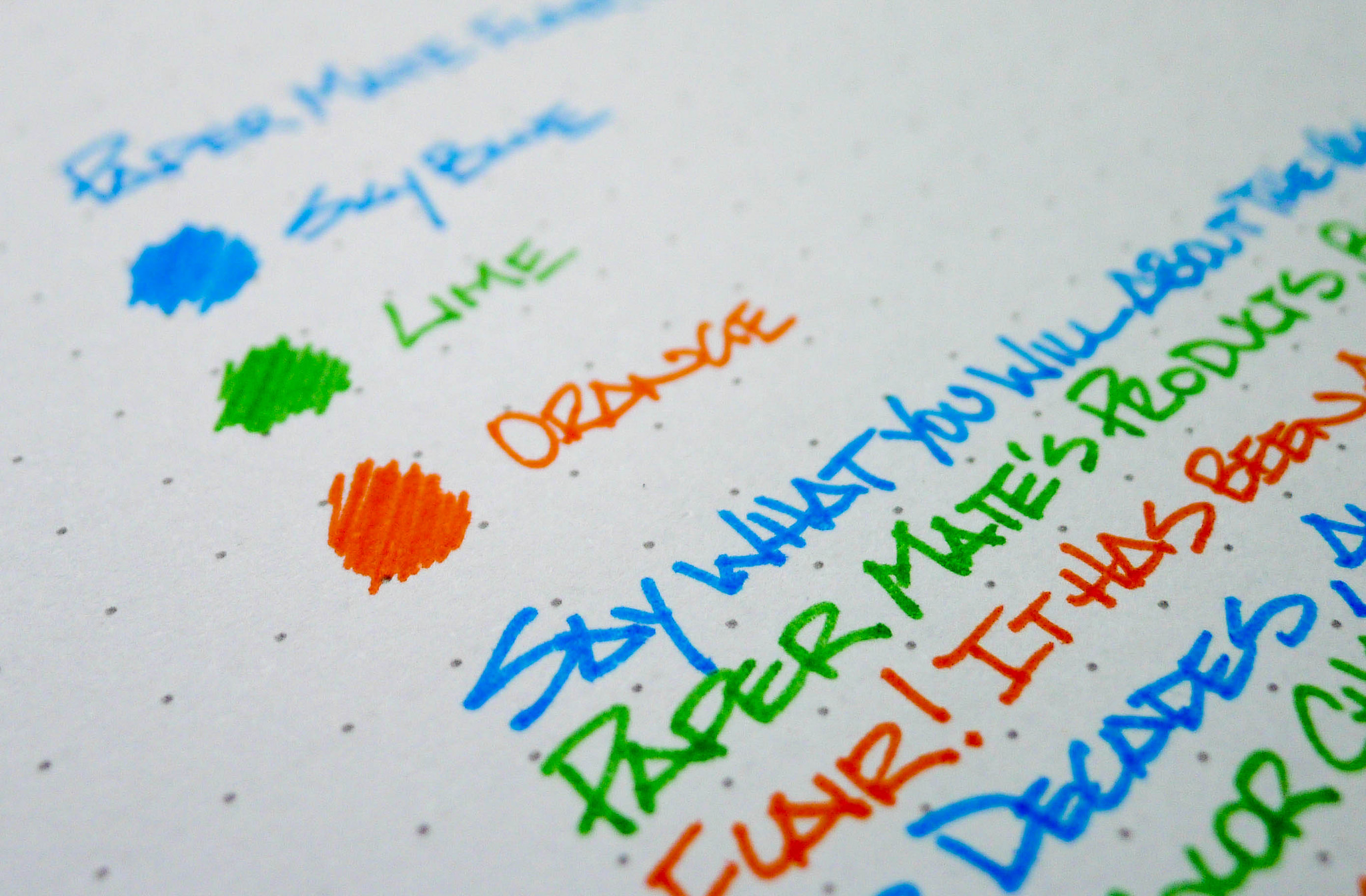
I made a big change in 2014. I changed how I write the number 4.

I have a long history of doing this, dating back to the mid-90's when I morphed my block print into a more architectural style to match the drafting job I had taken. I practiced the alphabet and numbers 0-9 repeatedly, filling up page after page of a legal pad. Some letters came quickly, like Aa, but others were more of a challenge, like Gg.

As one letter would get locked into my muscle memory, I'd resort to practicing the more difficult changes until it all came together. It took some time, but eventually there was no more practicing, only writing. For those who want to improve your handwriting, this is how you do it.

That time was peak handwriting clarity for me. It has slowly deteriorated over the years to what you see now. It's still considered good and I like it, but it could use some refinement. Last year, for reasons I'm still not exactly sure of, I decided to refine my 4.

Growing up, I had mostly been an open top 4 writer and I'm not even sure when I started using the closed top version, but I have been for years and years. At some point last summer, after writing a half-year's worth of 2014's, I decided the closed top 4 was no longer for me. I experimented with the open top 4 and I liked it - a lot - so I worked on changing how I wrote it.

Again, that took me back to repetition and practice. There is no other way to change your handwriting than that. It actually took me longer than I thought to lock in the change, and I'd get frustrated with every closed 4 I would write because they just weren't as nice. Finally, as the year came to a close, I had it locked in. But now I have a new problem.

I hate my 5.

Posted on January 2, 2015 and filed under Writing.

Stipula Splash Fountain Pen Review

(Jeff Abbott is a regular contributor at The Pen Addict. You can find more from Jeff online at Draft Evolution and Twitter.)

My experience with flex nib pens is fairly limited, but it's always been an interest that I'd love to explore. Before owning a proper flex nib fountain pen, I dabbled in dip pens and flexible nibs, but that didn't really help me decide if I like the pens or not – the process of constantly dipping for ink is romantic at heart, but ultimately inconvenient.

So, when Brad sent me the Stipula Splash fountain pen to review, I was delighted. So far, I only own a Pilot Elabo that features a flexible nib, so I was eager to try out more. In short, it's not fair to compare the two because of the price difference, but the Stipula is an enjoyable flex nib pen.

Aesthetics

The Stipula Splash has a very noticeable aesthetic as it's part demonstrator, and part solid. Personally, I think the color choices make it look cheaper than it really is, but that notion completely vanishes once you pick up the pen and start using it. It's a solid pen made of quality parts. I think the biggest drawback for me regarding the pen's looks is the blind cap (the part you twist to operate the piston). It's a bright chrome accent, and it doesn't seem to match the rest of the pen. I'd prefer it to match the color of the cap, but that's a small discretion.

The design of the pen isn't overly flashy or decorative – the only real decoration I can find it on top of the cap, which features an inlay of a leaf. Apart from that, the pen is plain and classy. If it weren't for the unorthodox color, you might believe it's a boring business pen. But who writes business letters with a flex nib, right?

The entire section is clear, so you can see the piston parts working and also get a very good look at the ink supply. As with all demonstrators, this pen looks great with a bright ink in the reservoir.

Feel

The pen isn't light, which leads me to believe that the parts are made of high-quality materials. When operating the piston, everything feels smooth, if not a bit tight. After working the piston a few times, it became less tight, so I imagine it would break in to an even smoother feel once it was used for a while. Overall, I don't worry about any parts on this pen failing under normal use. I haven't tried disassembling the entire pen for cleaning, but it's been a piece of cake to clean without doing so.

Writing

The writing experience with this pen is a bit quirky, but a lot of fun. The unit I have has a nib that can be a tad picky about the angle of attack, but as long as I use the sweet spot it's a great writer.

As a sidenote, this pen will have flow problems if left for a week without being used. Nothing dramatic, but you will have to expel some ink through the feed by moving the piston slightly before the pen will write smoothly. Once I figured that out, it's been a fantastic pen to use. In my case, the symptoms were all about slow starts and skips over quick or long letters. Pushing a bit of ink through the feed cleared it up immediately.

How about that flex? It can flex quite a bit for what I believe to be a fine nib, possibly even an extra fine. In my tests, I could easily flex the nib to a line width the size of a BB nib. Not bad, right?

On the flip-side, the nib is made of steel which can make the flex a bit difficult to control. Again, this is something that can possibly get better with age, but a fair warning is needed. With practice, you can learn how to flex the nib smoothly, but it isn't natural when you first pick it up. I'm comparing my experience to an Elabo, but that's a 14k gold nib that features a much softer flex. Like I said, with practice you can make it flex beautifully and under full control. To achieve a BB line width, you have to press with a great deal of pressure, and I don't think that a thin paper could handle much of it. I haven't tried this pen on any Tomoe River paper, but I would exercise caution if using it.

Overall

This pen is a lot of fun to use. I've used it plenty while writing normal notes, and the added flex adds a unique flair to my handwriting – plus, when you want to flex more on purpose, that choice is also there. The nib does have a sweet spot when writing, but it's a fairly generous one and likely not the same on every unit. If you're looking at trying out a flex nib pen made out of quality materials that doesn't break the bank, give the Stipula Splash a try. If blue isn't your thing, there's also a dark red and a graphite color for your consideration.

Hand-crafted pens from Italy are new to me, and I'm eager to try more.

(Pen Chalet provided this product at no charge to The Pen Addict for review purposes.)

Posted on December 31, 2014 and filed under Fountain Pens, Pen Reviews, Stipula.

Paper Mate Flair Review

The Paper Mate Flair is one of those pens that even your non-pen addict friends know about. It has been around for decades, and with good reason. It is a darn fine pen.

When I was growing up, the black Flair was a weapon of choice, with a bit of blue and red trickiling in over the years. It was a workhorse, although was prone to tip breakdown due to the design. This is normal with felt tip pens like the Flair, and is something you just have to deal with.

The newer model Flair has more of a plastic tip feel, giving it a sharper line and added durability over the original. I'll miss the fuzz I used to get off the original, but there is no doubt this is an upgrade.

I'm not sure when the rainbow of colors first came into the Flair line - I'm guessing the 90's - but the latest models are as good as ever. The colors are vibrant, and exactly what you would expect from the product descriptions. I went with a Sky Blue / Lime / Orange trio as you can see in the images, and I love them all. I use pens like this for notes and lists, not for long writing sessions. Black works for that, and I have enough black felt tip pens to last me a lifetime. Give me the brightness!

All in all, the Paper Mate Flair is a very solid pen. It will never be spectacular, but it will always be useful. That's why I always keep several around.

Posted on December 29, 2014 and filed under Paper Mate, Pen Reviews.