The Visconti Homo Sapiens Bronze Age fountain pen is one of my grail pens. It is one of those pens that catches your eye with its striking bronze embellishments and basaltic lava finish. There's nothing quite like it.

I held off ordering one for quite awhile, simply because the pen looked enormous and heavy. It is a big pen, measuring 5.75 inches, and it is weighty at 45 grams (both measurements are with the pen capped). Nevertheless, it balances perfectly in the hand. A seller on Fountain Pen Network offered this Homo Sapiens for an "I-can't-pass-this-by" price, so I bought it.

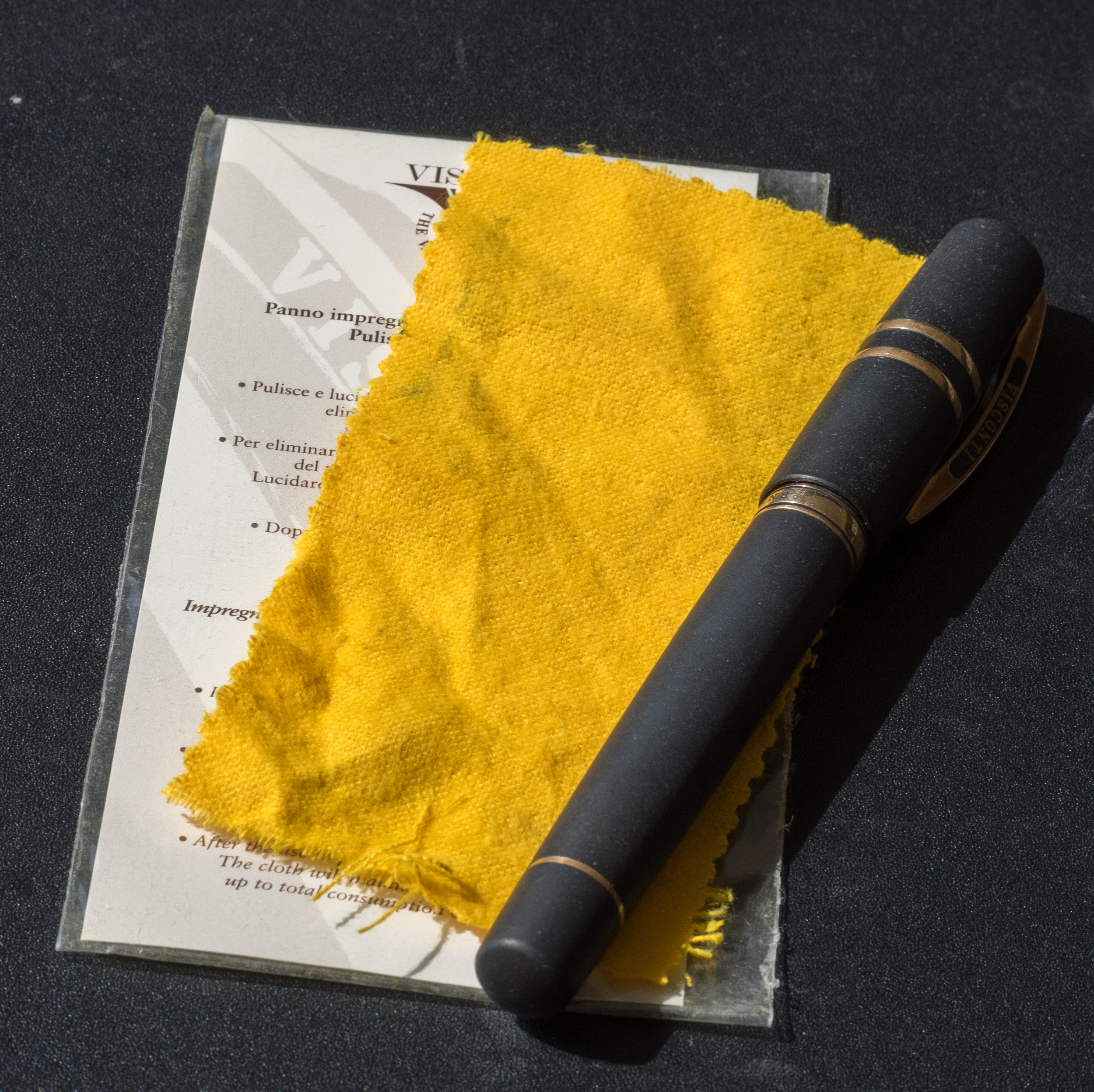
The packaging is sophisticated and suits the pen. The outer cardboard box is cream colored with the Visconti logo. Inside is a large, leather-like clamshell box. When you open it, the Homo Sapiens is encased in cream-colored cloth that contrasts nicely with the pen. The clamshell box has a slide-out drawer that contains information about Visconti pens and a polishing cloth for the bronze.

The cap attaches using Visconti's special "hook safe lock." I like the design and it's certainly quicker than unscrewing a cap, but I haven't found it to be all that "safe." The cap comes off too easily. I wouldn't trust it in a shirt pocket.
A removable bronze finial with the Visconti logo adorns the top of the cap. You can replace it with Visconti's "My Pen" system and choose your initials or a stone. I like the Visconti finial but might someday buy a stone just for variety.

In addition the cap is encircled by two solid bronze bands and the Visconti clip. The Visconti name is painted on both sides of the clip. I think they should have engraved it. If you want to attach the pen to a shirt pocket or papers the clip lifts easily.

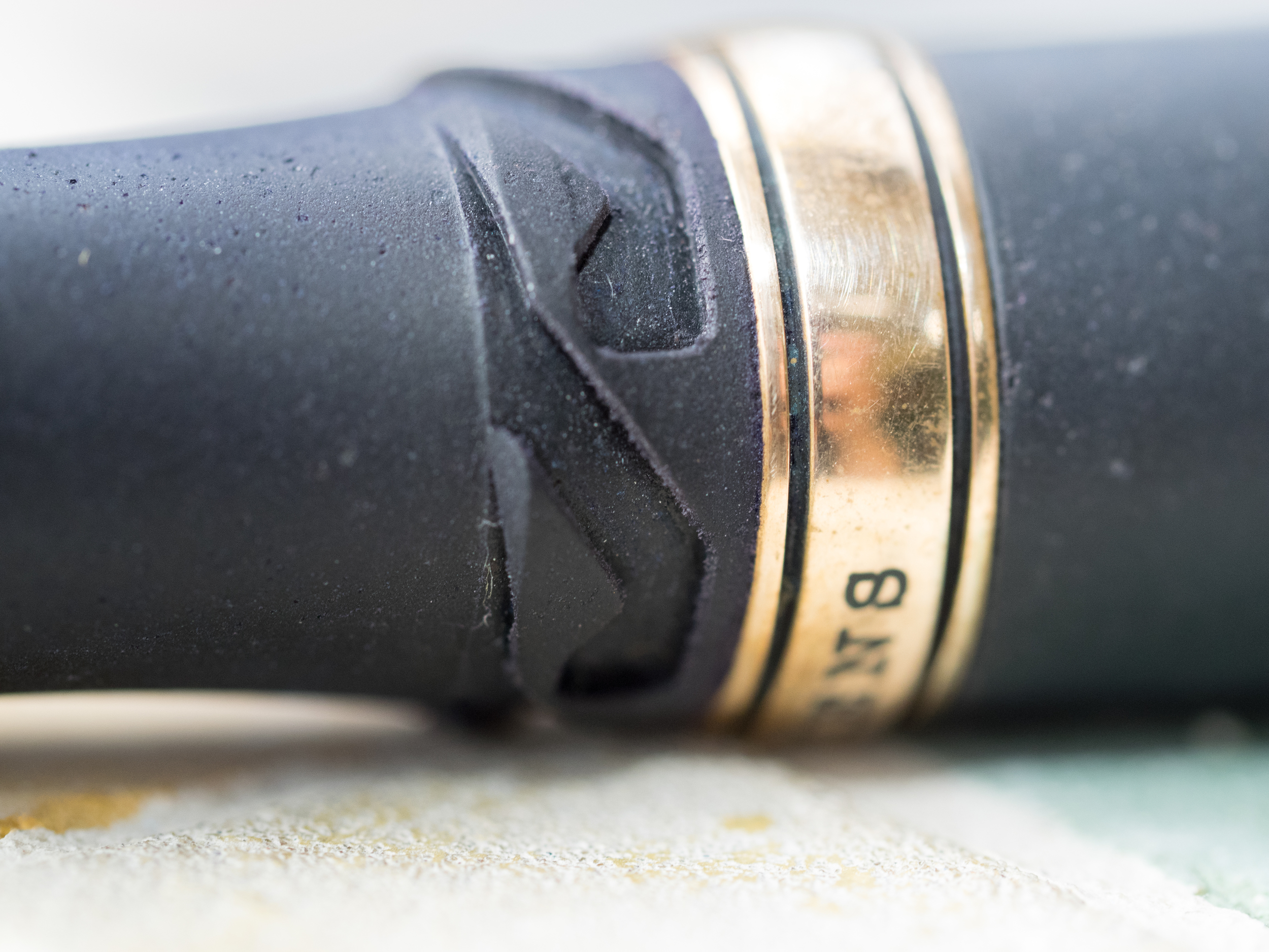
The barrel has two bronze bands. The top band is engraved with "Homo Sapiens." The letters are filled with black ink so they stand out nicely against the bronze.

The bottom band is slender and encircles the piston. It actually popped off when I was cleaning the pen. It's not hard to press it back into place, but I'm not impressed when bronze parts fall off.

The pen uses Visconti's high power vacuum filler system. It's simple to use. You unscrew the piston, pull to extend it, submerge the nib in the ink and push. I do this two or three times to make sure I get a good fill. Unfortunately, the Homo Sapiens does not have an ink window, so you don't know how much ink is in the barrel. And vacuum fillers are notoriously difficult to clean. When I changed ink for this review it took a half hour of plunging to get the water to run semi-clear.

My nib is a 23K palladium stub (1.3mm). It's a beautiful nib with scrollwork and the Visconti name. Visconti calls it a "dreamtouch nib" which means it writes without any pressure being applied. It is definitely a smooth nib. The stub lays down a thick, juicy line. But, I've experienced hard starts and skipping, which is disappointing considering the retail price of this pen ($695.00). I suspect I'll have to send it to a nibmeister to tune it and maybe turn it into an italic.

Over time, the bronze elements tarnish. In fact, I've only had the pen a few months and the bronze has tarnished substantially. I used the included polishing cloth before I took photos for the review. It got some of the tarnish off, but the bronze isn't as shiny as before. The cloth is thin and doesn't seem to work all that well. Some Homo Sapiens owners prefer the look of the tarnished bronze; I prefer it shiny.
The lava body is something you simply have to touch to appreciate. It's a mixture of basaltic lava from Mt. Etna and resin. The lava surface is smooth to the touch, but has tiny pits in it, giving the pen a matte look.

The material quickly warms to your hand. And, if your hand gets sweaty, the lava absorbs the moisture. I've read elsewhere that when you ink the pen you should wipe off any remnants on the grip quickly with a wet cloth so the ink doesn't get absorbed into the lava.

The Visconti Homo Sapiens is an iconic pen. It's unique and beautiful. I've read that Visconti nibs can be hit or miss, and mine definitely has some faults. But, after a trip to a nibmeister, I suspect this will be one of my favorite pens.
Pros
- The basaltic lava composition of this pen is unique and wonderful to touch
- The power-fill system works well, but it's hard to clean thoroughly
- The nib is gorgeous and writes a wet, smooth line (but see below)
- Although the pen is large it balances nicely in the hand
- The matte black and bronze accents are striking
Cons
- Some people might find this pen too heavy
- There's no ink window, so you don't know how much ink is left or if you've gotten a good fill
- The bronze appointments tarnish over time
- The cap is easy to remove accidentally
- My nib exhibits hard starts and skips occasionally
- At retail price, this pen is very expensive