The Pen Addict Podcast: Episode 287 - Internal Sparkle

This was a really good episode, although I’m sure I’ve said that at least 286 times before. Myke and I have a much needed conversation around my voice and the impact it can have on the community at large. Plus, we discuss his newfound right-handedness.

Show Notes & Download Links

This episode of The Pen Addict is sponsored by:

Harry’s: Check out Harry’s Holiday sets!

Squarespace: Make your next move. Enter offer code INK at checkout to get 10% off your first purchase.

Storyworth: A new way to bring the family together.

Posted on December 15, 2017 and filed under Podcast.

Robert Oster Signature Ink Review: Soda Pop Blue

(Susan M. Pigott is a fountain pen collector, pen and paperholic, photographer, and professor. You can find more from Susan on her blog Scribalishess.)

I love Robert Oster inks, and I know I’m not alone. I am especially fond of blue inks, so it’s no surprise that when Soda Pop Blue came out, I wanted some. Soda Pop Blue is a cross between a blue and a turquoise ink. And, like many Robert Oster inks, it has lovely shading and sheen.

I tested Soda Pop Blue on Maruman Septcouleur 75gsm paper, which is a smooth, true white paper. I used a Parker Premier fountain pen with a medium nib. This nib doesn’t exhibit much shading, but in broader nibs (see below) the shading is excellent. Soda Pop Blue isn’t as wet as other Robert Oster Inks I’ve tested, drying quite quickly. But that doesn’t mean that it’s too dry—in fact it flows nicely. The ink is definitely not waterproof.

My chromatography test demonstrates that the ink contains quite a bit of pink, turquoise, and blue.

Robert Oster produces so many beautiful blues. I did a comparison of the colors I have on hand so you can see the subtle variations. The closest match to Soda Pop Blue is Bondi Blue. But do you see that Blue Denim? Yum!

Soda Pop Blue is a gorgeous, saturated blue with stunning pink sheen. I used my Handwritmic Brody Neuenschwander Ruling Pen pen on Midori MD Cotton paper with excellent results as you can see in the photo below:

You can purchase a 50 ml bottle of Robert Oster Soda Pop Blue from Vanness Pens for $17.00 or you can get a 4 ml sample for $2.50.

(Vanness Pens provided this product at no charge to The Pen Addict for review purposes.)


Enjoy reading The Pen Addict? Then consider becoming a member to receive additional weekly content, giveaways, and discounts in The Pen Addict shop. Plus, you support me and the site directly, for which I am very grateful.

Membership starts at just $5/month, with a discounted annual option available. To find out more about membership click here and join us!

Posted on December 15, 2017 and filed under Robert Oster, Ink Reviews.

Faber-Castell Loom Fountain Pen Review

(Sarah Read is an author, editor, yarn artist, and pen/paper/ink addict. You can find more about her at her website and on Twitter.)

Faber-Castell has been in the fine writing instrument business since 1761--an incredible legacy. Many of their pens are very high-end, elegant, and unique--but even their more affordable pens show the design and craftsmanship you'd expect from a company that clearly knows what it's doing. I would consider the Faber-Castell Loom to be slightly above entry-level on the pen enthusiast scale. At $40, it's an expensive jumping-in point. But if your first impression of fountain pens is the Loom, there's a good chance you'll soon be referring to yourself as a pen addict.

This model is the plum color in piano finish. There are a lot of other fun colors to choose from. It took me a little sleuthing to figure out that piano finish are the shiny chrome bodies, and metallic are the matte bodies. It's glossy and looks quite fancy on the desk or when writing, but it collects dust and fingerprints very easily. The body is made from aluminum, so it's also quite heavy, while the plastic cap is very light compared to the rest of the pen. The body is a straight tube that tapers to the grip section, which has a matte texture and five raised ridges meant to aid in grip. As much as I think it looks snazzy, this grip section doesn't work well for me. It's a very wide pen and the tapering is a bit too severe--so my fingers just keep slipping down to the nib. I have to focus on maintaining my grip, and it makes my handwriting look terrible. This may not be a problem for someone with larger hands--but a larger hand may find that the pen feels a bit short to them. The proportions are just a bit unusual. Posting the pen solves this, but there is a risk of scratching that glossy finish.

The pen takes a standard international cartridge or converter, and comes with a short cartridge and a dummy cartridge meant to hold the short cartridge in place. It does not come with a converter, which is a shame.

The cap is wider than the body, tapered at each end. The clip is sturdy and spring-loaded, and my favorite clip ever. It's flexible but sturdy, and feels reliable. It's attached at the finial, which is stamped with the Faber-Castell insignia, the jousting knights. The name and logo are also stamped into the plastic of the cap. The stamping isn't terribly clear--I had to squint a bit to see what it was, but it's a complex image to shrink down to the size of a pen cap. It's a snap cap, and the snap is very aggressive. It takes more force to remove than it feels like it should. It's nice to know it's so secure, but I hope it relaxes a bit over time.

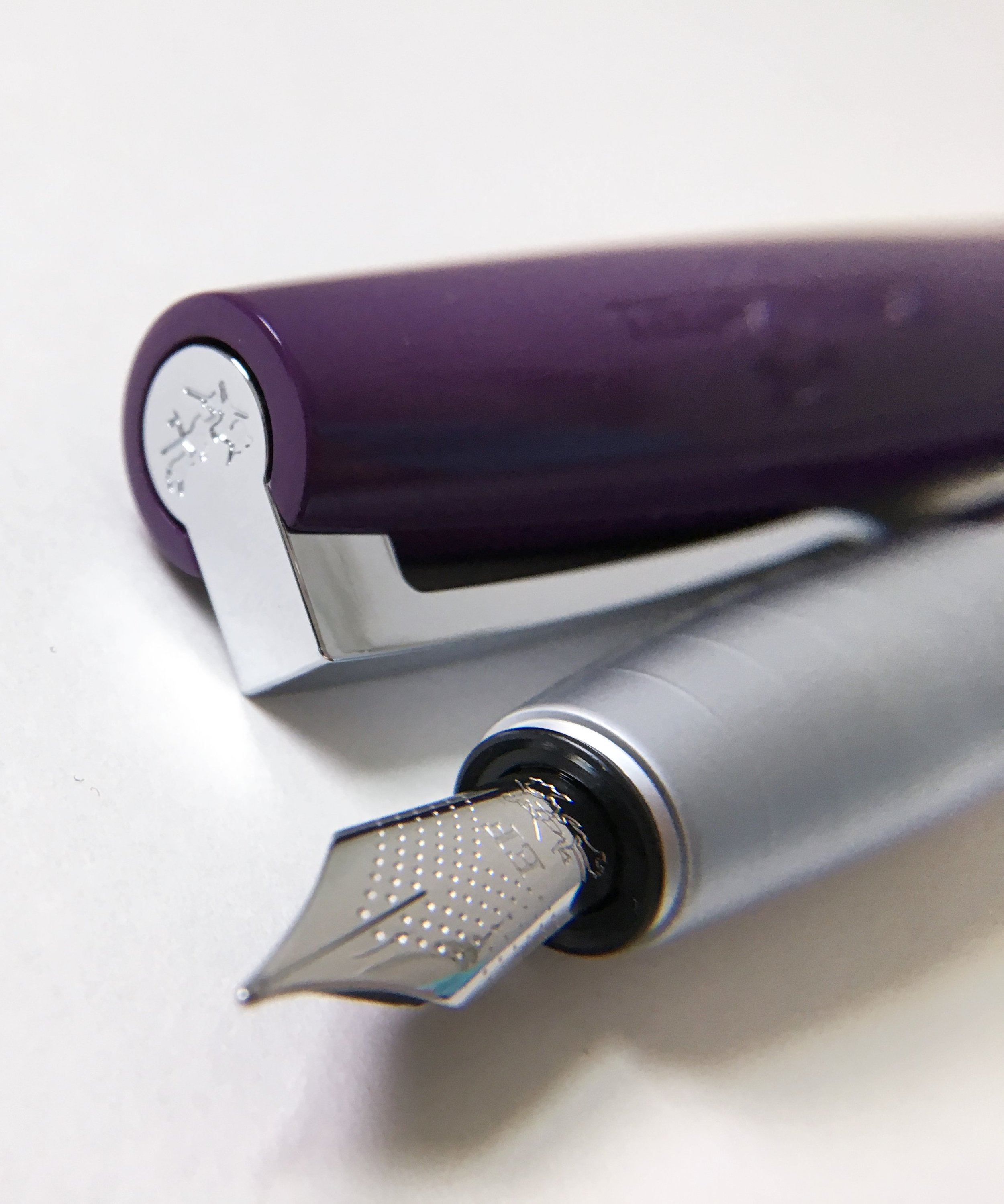
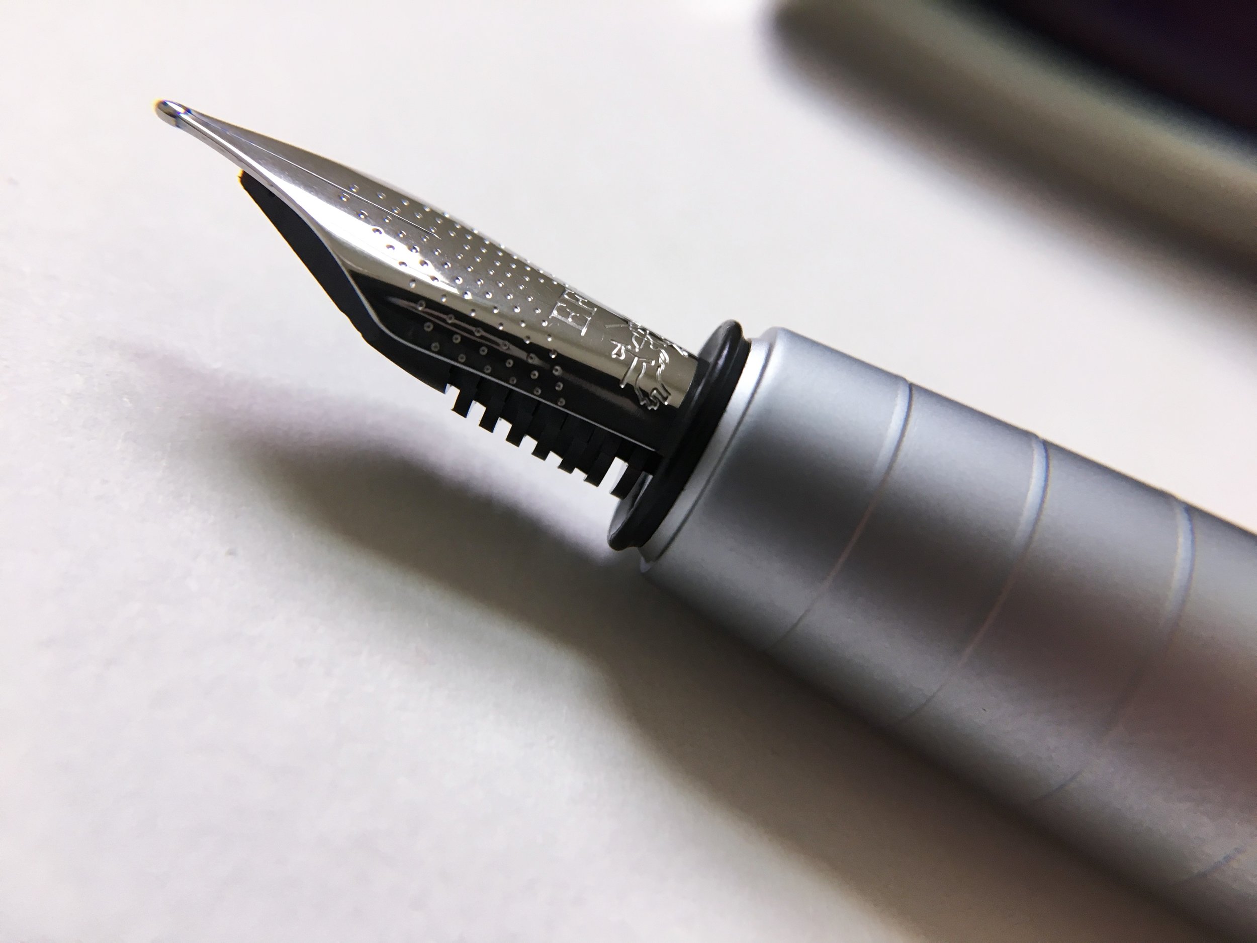
The nib, of course, is where this pen reels you in. It's smooth and perfectly tuned, so it's not too wet, but not at all dry. It has no breather hole, but is dimpled all over. It also attempts to squeeze the jousting knights logo into an even smaller space, with limited success--but it still looks fancy. The EF is definitely a western EF--comparable to a Kaweco, but close to a Japanese M. It's a pleasure to write with. There is just enough feedback to give you control of the pen, but it feels butter smooth. I can see why it's said that Faber-Castell has the best steel nibs on the market.

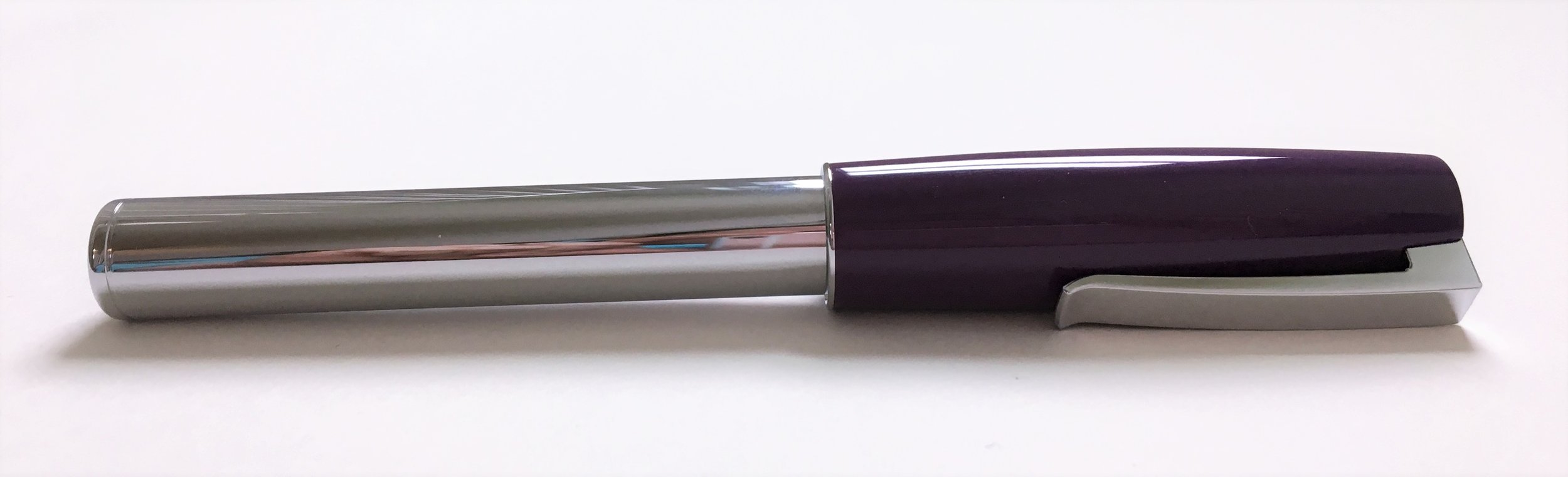
Overall, it's an excellent pen. That wide, tapering grip makes it not work for me, unfortunately. I wish it did, because I can tell I'm missing out on something special. It's definitely a good buy for its cost, and I think it would make an excellent gift--it's in that perfect price range to be something fancy without being extravagant.

I think I'll be trying out more Faber-Castell pens in the near future, looking for one that fits my hand well, and that nib is going to haunt me until I succeed.

(Vanness Pens provided this product at no charge to The Pen Addict for review purposes.)


Enjoy reading The Pen Addict? Then consider becoming a member to receive additional weekly content, giveaways, and discounts in The Pen Addict shop. Plus, you support me and the site directly, for which I am very grateful.

Membership starts at just $5/month, with a discounted annual option available. To find out more about membership click here and join us!

Posted on December 14, 2017 and filed under Faber-Castell, Fountain Pens, Pen Reviews.