(Kimberly (she/her) took the express train down the fountain pen/stationery rabbit hole and doesn't want to be rescued. She can be found on Instagram @allthehobbies because there really are many, many hobbies!.)
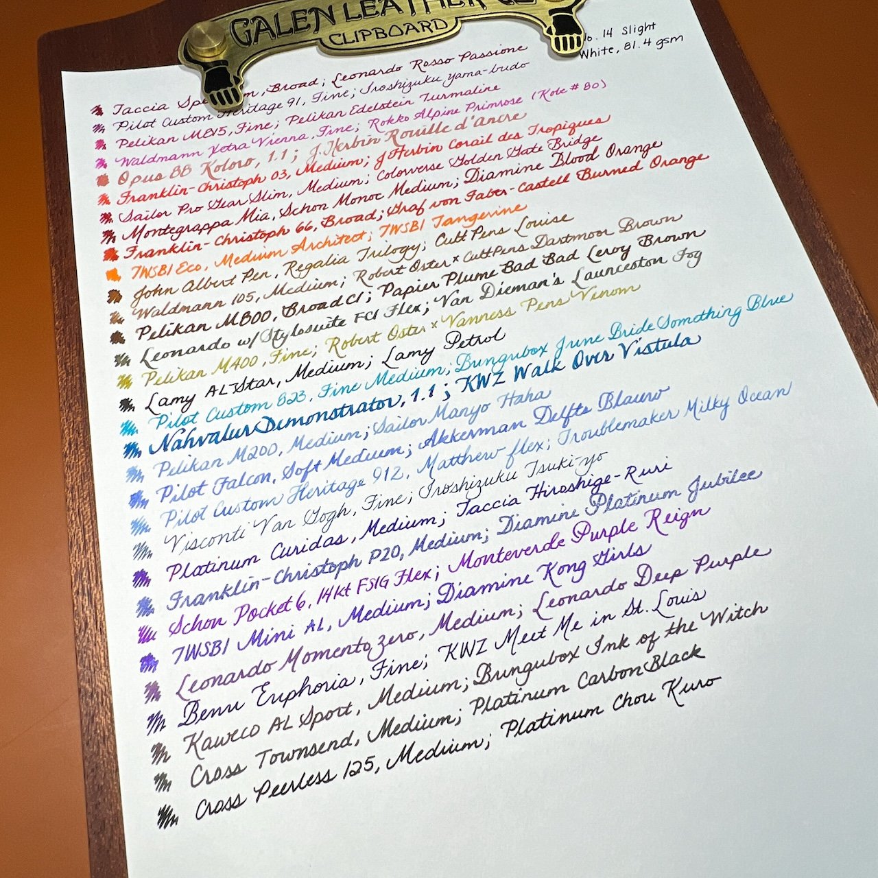
I decided to finish reviewing the second half of the Yamamoto Paper’s Fountain Pen Friendly Paper Collection, Vol. 7 (say that five times fast) as soon as I finished the first half last week, so that I could use the same batch of inked pens. As a reminder, the pack contains 5 sheets each of 16 different papers, all of which are reported to be fountain pen-friendly.
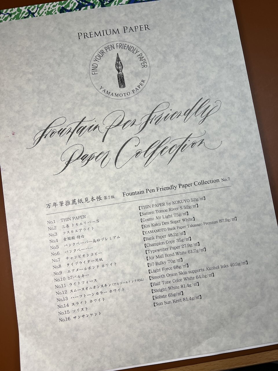
Yamamoto Paper’s Fountain Pen Friendly Paper Collection, Vol. 7 (The cover and the individual cover sheets are a mottled grey color; it’s not my crappy photography skills this time.)
There are 16 papers and they are listed on the front cover as follows:
- THIN PAPER by Kokyuo 52gsm
- SanzenTomoe River S 52 gsm
- Cosmo Air Light 75 gsm
- Kin Kaku Den Super White
- YAMAMOTO Bank Paper Takasago Premium 87.9 gsm
- Bank Paper 48.2 gsm
- Champion Copy 35 gsm
- Typewriter paper 27.9 gsm
- Air Mail Bond White 61.7 gsm
- B7-bulky 70 gsm
- Light Force 68 gsm
- Smooth Onion Skin supports Alcohol Inks 40.0 gsm
- Half Tone Color White 64 gsm
- Sleight White 81.4 gsm
- Soliste 65 gsm
- Sun Sun Kent 81.4 gsm
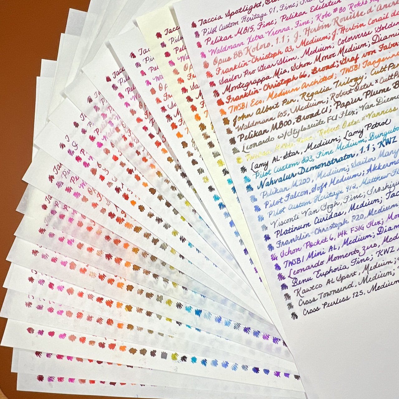
Today’s article will cover papers 9-16. Like last week, I will use my currently inked pens to write the name of the pen/nib/ink combination. I plan to use a mix of shimmer, sheening, shading, chromashading and “regular” inks, as well as gold and steel nibs, wet/average/dry writers, and different nib sizes. Basically, a variety of whatever is inked up without me having to ink more pens up, lol.
Then, I will rate each of them according to texture, fountain pen ink friendliness, color accuracy, weight (using a subjective feel vs the actual gsm). For ghosting, I flipped the paper over and put it on a blank sheet of paper to determine the level of ghosting.
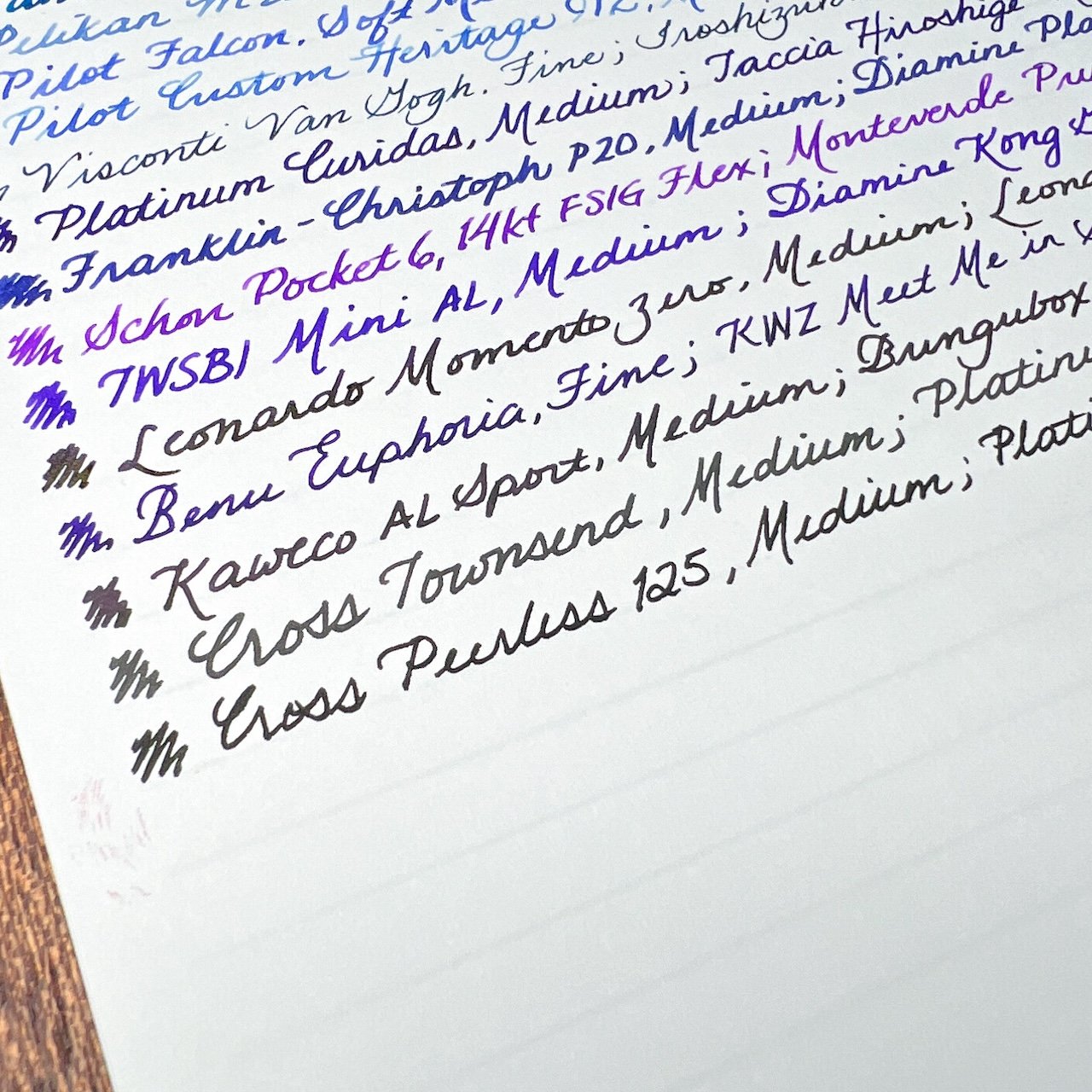
Lastly, there will be pictures of (1) the paper description sheet, (2) the inked page, (3) closeup of some inks, and (4) sheerness (by leaving the guidesheet underneath), and occasionally (5) the back if there’s something worth noting. Let’s get started!
Air Mail Bond White, 61.7 gsm
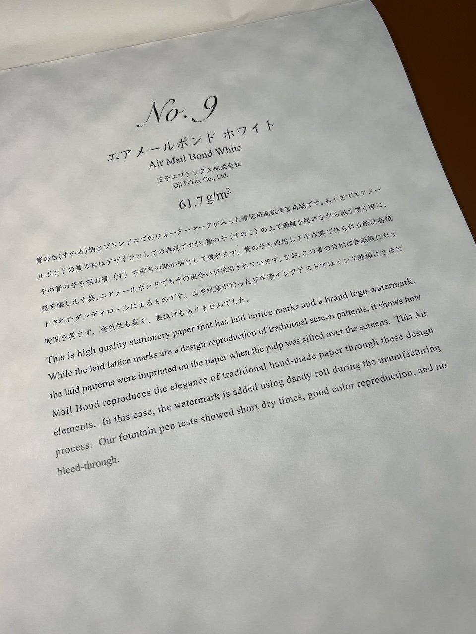

Texture - The paper is textured, much like the laid papers from G. Lalo and others. It did not catch on my flex or finer nibs, nor did it feel like it was bumpy to write on, unless you were using a stub, in which case it might feel like the nib isn’t 100% on the paper.
FP Friendliness - Medium-High - It handled most of the different pens and inks, though it did feather with several of the broader and wetter nibs/inks. And, the KWZ Meet Me in St Louis 2020 also had spots of bleedthrough on the back. Otherwise, there is minimal ghosting, so the back side is usable.
Color Accuracy - Medium-High - The actual ink colors were fine but the paper seemed to “eat” sheen and most of the subtle chromashading properties. Even regular shading inks didn’t shade as much as on other papers.

The feathering was particularly noticeable from this Broad F-C nib and GvFC Burned Orange.
Weight - Medium-weight paper that didn’t feel too flimsy nor too substantial.

You can easily see the texture of the Air Mail paper.

Even with the paper’s texture, you can easily see the guidesheet below.

The bit of bleedthrough from KWZ StL, but that’s about it. The other inks that feathered on the front did not bleed through to the back.
b7 - Bulky, 70 gsm

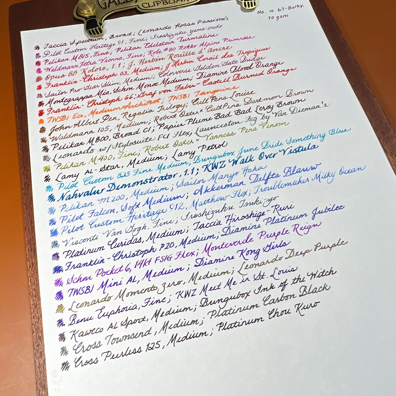
Texture - Similar to Cosmo Air Light in that it is a heavier paper, very slight texture and borderline “squishy” feeling. Though not as squishy as CAL for me, the b7 was fine to write on.
FP Friendliness - High - b7 was able to handle all the inks and nibs with no feathering or bleedthrough. Minimal ghosting so the backside is still usable.
Color Accuracy - High - Colors were accurate, though the more interesting inks like chromashaders or sheeners were a bit subdued/flattened.
Weight - This paper weighs in around the middle of the bunch, and is still lighter and thinner than a sheet of typical copy paper.
Guidelines are still visible, but not as much as others.
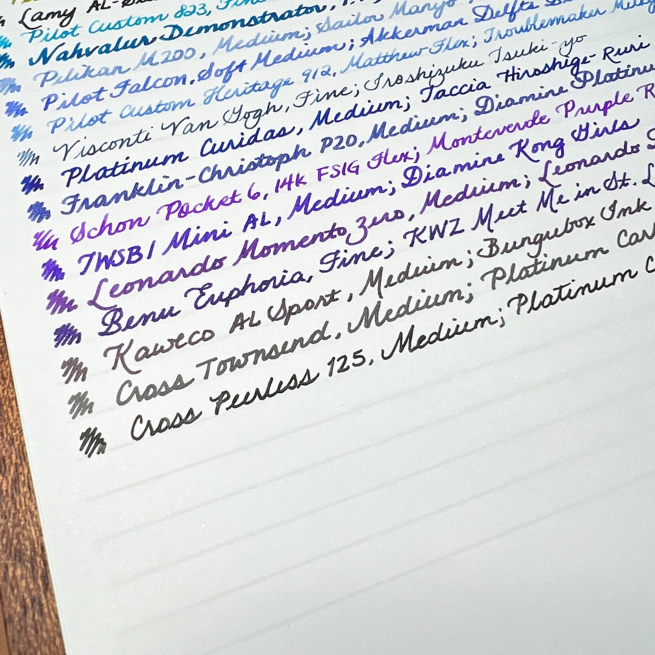
Light Force, 68gsm


Texture - Fairly smooth paper, but not glassy. Similar to CAL and b7 but also is not squishy.
FP Friendliness -High - zero bleedthrough, minimal ghosting. Backside is definitely usable.
Color Accuracy - Medium High to High - Like CAL and b7, the colors were pretty accurate, though the Launceston Fog looked slightly more grey.
Weight - Despite being 2 gsm lighter than b7, it felt almost thicker. I determine thickness by how it feels when I hold the sheet at the top and wave the paper back and forth.

Still able to see the lines (about as much as b7.)
Smooth Onion Skin, 40 gsm
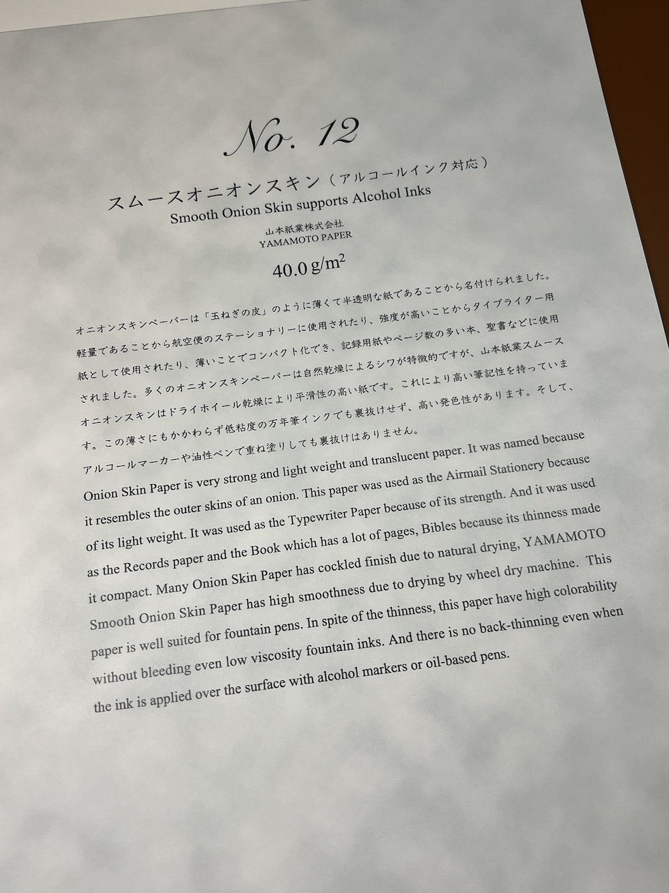

Texture - Fairly smooth and crinkly when “waved around”.
FP Friendliness - Medium - The paper withstood all the different inks and nibs I used on it, but everything felt and looked finer than on the other papers. I had to keep checking the pens to make sure they weren’t running out of ink (spoiler: they weren’t). It seemed to have more problems with the smoother nibs than with the less smooth nibs (like Pilot gold nib or Jowo Broad vs Sailor gold nibs or Cursive Italics). I did not test with any alcohol markers or oil-based pens.
Color Accuracy - Medium - While the color tones were accurate, there seemed to be less ink deposited on the page, so inks didn’t shade or sheen as much.

It struggled to put down a consistent line with the Pilot 912 and Troublemaker Milky Ocean.
Weight - Not surprising that this lightweight paper would be crinkly when I waved it around. Also, to no one’s surprise, it is very sheer, so don’t write on the back.


No problems with guidelines here.
Half Tone Color White, 64 gsm

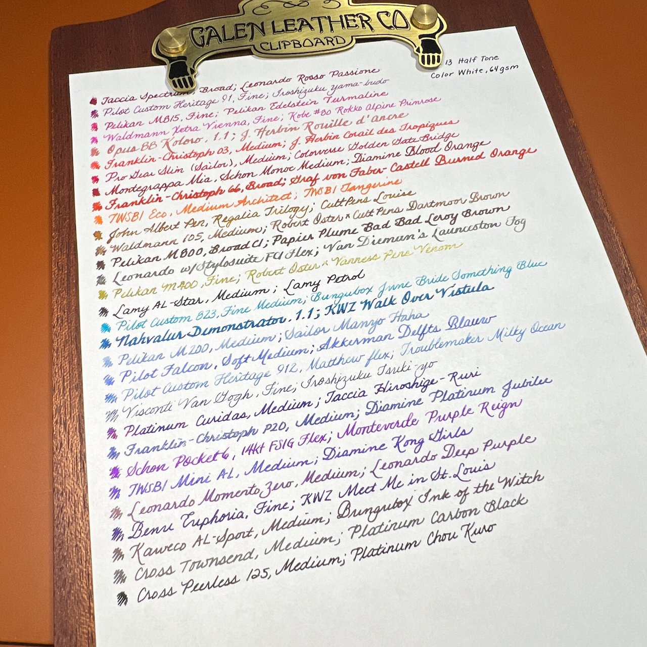
Texture - Fairly smooth, not quite glassy.
FP Friendliness - High, with no major issues, other than a touch of feathering and bleedthrough with the wet KWZ St Louis ink. No other bleedthrough, minimal ghosting.
Color Accuracy - High, though none of the inks really popped. The colors just looked a little flat - not necessarily dull, just not as interesting as they can be.

Just a touch of feathering with the KWZ.

And a touch of bleedthrough from the same ink.
Weight - A nice, medium–weight paper. Not crinkly and not super thick or heavy feeling. Fine to write on the back.
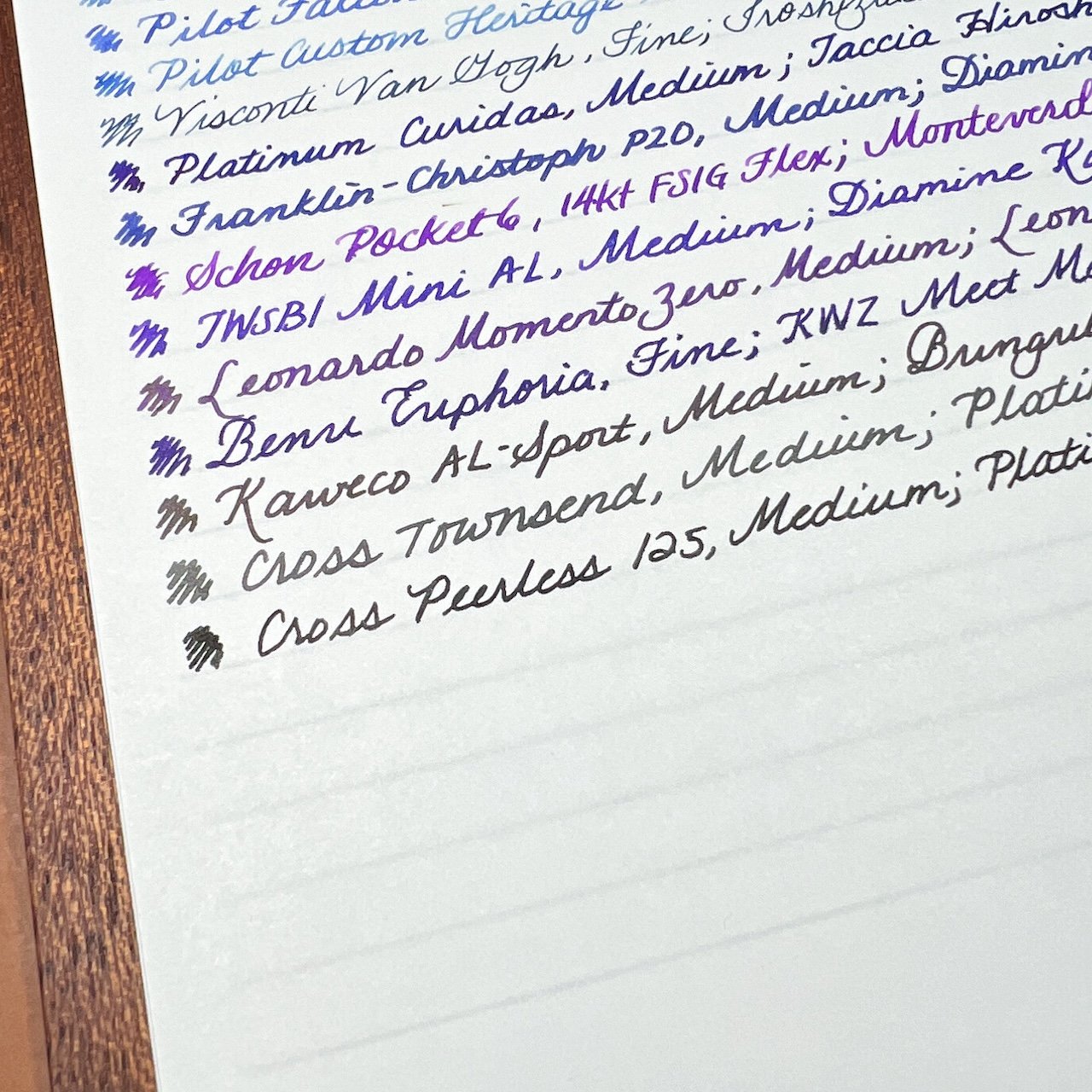
Slight, 81.4 gsm

The front cover calls it “Sleight” but this sheet says “Slight.”
Texture - Minimal texture, like a heavier Midori paper, but not like laid paper and it doesn’t feel glassy smooth either.
FP Friendliness - Medium high, it had similar problems to the heavier Bank Paper from last week where it felt like ink wasn’t being put down as much as on other papers, so the lines seemed a touch finer as well. This is the most noticeable with stubs, where the wide line is “missing” some ink. No bleedthrough and minimal ghosting, so it’s fine to write.on the back.
Color Accuracy - High - As mentioned above, not as much ink was being laid down so some inks weren’t as “interesting” because they were slightly (no pun intended) drier.

You can see that some of the 1.1 lines are much thinner than they should be. The Monoc and the Broad below it didn’t have lines as thick as on other paper.

In a few of the letters of the word “Demonstrator”, you can see that there are parts of the strokes where ink wasn’t laid down evenly.
Weight - One of the heaviest papers, so it wasn’t crinkly.

Can still make out the guidelines but it needed more light when I was writing.
Soliste, 65 gsm


Texture - Smooth, with just a hint of texture, so that it’s not glassy.
FP Friendliness - High, handled all the nibs and inks without issue
Color Accuracy - High, though the paper seems to flatten out the colors and some shaders were less shady. It’s hard for me to tell if it’s the cream color of the paper or the paper itself that is making the inks not pop as much.

Most of these inks are shaders but there’s only a bit of shade on a few of them.
Weight - Medium-weight and not crinkly.
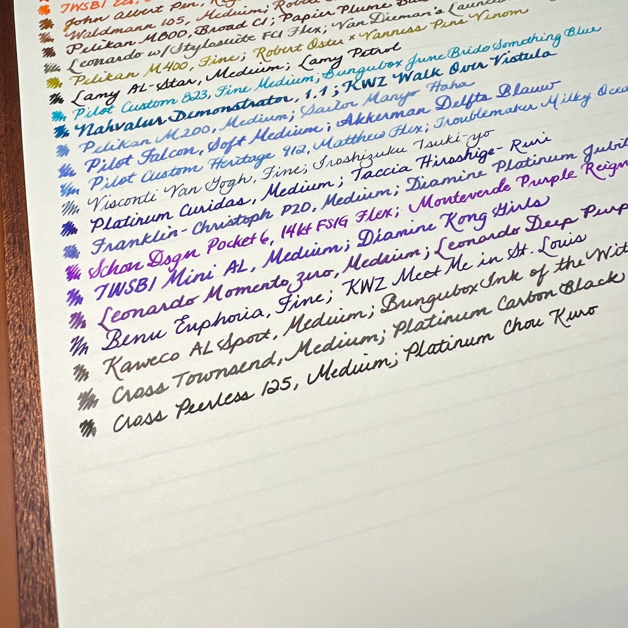

You can really see that this is a cream and not white paper.
Sun Sun Kent, 91.4 gsm


Texture - Smooth, almost glassy - reminded me of Clairefontaine.
FP Friendliness - Medium - a couple of the broader nibs produced some feathering, there wasn’t really any bleedthrough with most of the inks. Many of the nibs, especially the Medium and up, made much wider lines than usual.

Just a bit of bleedthrough from, yep, you guessed it, the KWZ.
Color Accuracy - High, though some of the broader lines wiped out shading.

The Franklin-Christoph Broad nib wrote like a marker, both in width and in feeling. You can see the feathering with that nib, but the others wrote just fine.
Weight - One of the heavier papers, so it wasn’t crinkly.
After all was said and done, this was a very fun exercise and a great way to use a bunch of pens. It was interesting to see how each pen/ink would behave on the different papers.
I have used Kokuyo Campus paper but not the Thin Paper and was surprised at how much I liked it. It was the first paper in the pack and set a high standard for the rest of the first half. This was my first time trying the Sanzen Tomoe River S paper and it was fine. I don’t want to compare it to old Tomoe River because it seems unfair to do so since it’s no longer made, so I only compared it to others in this bundle.
I have used CAL 75 before and liked it but it felt so thick compared to the others, that it was less of a favorite than I thought it would be. The Kin Kaku Den was the only one which I really disliked using because the texture would catch my nibs and make inks not want to flow.
The Yamamoto 87.9 gsm Bank Paper was a bit of a surprise - it felt so smooth and slick that I thought it would be the best paper, but it felt slippery and gave me some trouble with hard starts (it’s not the pen or ink because they behaved well on other papers). I was worried when I got to the 48.2 gsm Bank Paper but I liked it more than the heavier version.
And the last two thin/light papers were sleeper hits for me. I could totally imagine writing letters with these papers, albeit only on one side. I loved the sound of the crinkling and their smoothness was pleasant to write on.
Inky rainbows make me happy, even if one is on cream paper, lol!
This second half of the pack didn’t have any clear “winners” for me. It is difficult for me to pick the cream Soliste paper because inks don’t pop on the paper the same way as they do on white paper - I wish they had either picked the white paper or included other cream papers.
As with the first half, all of the papers were fountain pen-friendly though some handled the wetter inks better than others. Some of them resulted in either finer than usual lines and a few were broader. It seemed like more of them had “flatter” colors than the first batch. Now that I’ve written on all 16 types of paper, here are some things I noticed/rediscovered:
- The Trifecta of Pen/Paper/Ink - ALL THREE MATTER! Given that I used the same pens and inks on all of the papers, it was easier to tell if it was the paper or the nib or the ink. For example, Sailor Manyo Haha is a blue chromashading that has hints of purple. On all papers, it shows up as a light, dusty blue, but on some papers, those hints of purple are visible. This means that it’s the paper that’s the difference. The line width of that Pelikan M200 is fairly uniform across the different papers, except on a few where it wasn’t – and then it wasn’t just that pen/ink, but many of the pens didn’t have the expected line width either. For many of the combinations though, there wasn’t a lot of difference from one paper to another, which is why it’s always good to use a lot of different pens/nibs/inks before “judging” a paper too harshly.
- Thicker isn’t always better - I love shading, chromashading ink, as well as sheening inks, but some of the thicker papers seem to absorb the ink properties. Thankfully, most of that doesn’t result in feathering, but it does dull some of the inks’ unique traits.
- Thin paper is great unless… - If you don’t like the sound of crinkly paper or you want to be able to write on both sides, thinner paper is not for you. But if that doesn’t bother you, a lot of the thinner papers in this collection are really good.
- Weight alone isn’t enough - There were several papers which had similar weights but felt thicker/thinner or lighter/heavier than others. Some felt more or less crinkly as well. Just goes to show that you can’t base FP-friendliness solely on the gsm of a paper.
- Don’t assume you will like my favorites - As I said last week, your preferences for paper smoothness, thickness, texture and crinkliness may give you different favorites. Ditto if you never use chromashading inks or only use EF/Fine nibs, etc. I would definitely give the paper pad a try, so you can discover what your favorites are!
I think my overall favorites are still Kokuyo THIN Paper, Sanzen TR, and Typewriter Paper and also Smooth Onion Skin and Half Tone Color White from the second half of the pack.
This paper pack is available directly through Yamamoto Paper, or through site sponsors JetPens and Vanness Pens.
(Disclaimer: The paper pack was purchased at the 2022 San Francisco Pen Show from the Yamamoto Paper table.)